Alarming
Here are the i4designer Alarming components for your new project created on the i4scada platform.
The i4designer Alarming category contains the Alarm viewer component designed to facilitate alarm monitoring tasks at run-time. More details can be found in the upcoming articles.
Tip
For a set of step-based tutorials describing the usage of the Alarming components, please visit the dedicated tutorials, here.
Alarm viewer
Check out this article to learn more details about the i4designer Alarm viewer component and its properties.
The i4designerAlarm viewer component is an event notification and management extension that allows the user to view and act upon i4scada alarms, providing complex capabilities like alarm acknowledgment, processing, commenting, filtering, and offline alarm viewing.
The Alarm viewer table provides a detailed alarm status representation, using color codes and textual hints. The active alarms can be filtered for both display and processing using the complex filtering criteria available in the contextual menu.
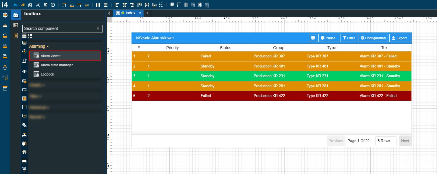
The Alarm viewer component
Category | Property | Description |
|---|---|---|
Common | Name | The name of the component, visible in other Designer locations (such as Page explorer). 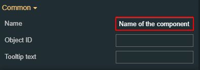 |
Object ID | Sets the Object ID of the component. By defining an object ID for the control, it can be passed as SignalPrefix when using parameter passing in navigation. The value of the Object ID can be used via a placeholder [OID] in other properties of this extension. The placeholder is supported in all signal properties, symbolic text, and states. Example: Setpoint [OID] 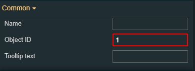 | |
Tooltip text | Optional tooltip text, that will be shown on mouseover at runtime. 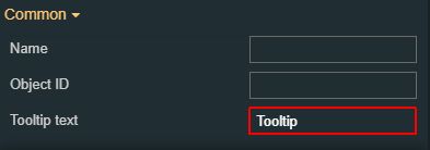 | |
Security | System authorization | The system authorization required to display the component. If the logged in user does not have this system authorization, the component will not be visible or enabled (depending on the set Security access behavior). If the property is left empty, the component will be visible and enabled for all users. Further on, the user can also add multiple System authorizations / Permissions, separated by comma (,). 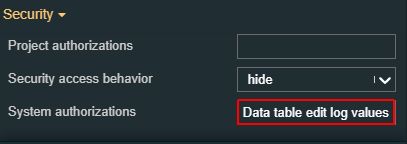 |
Project authorization | The project authorization required for displaying the component. If the logged in user does not have this project authorization, the component will not be visible or enabled (depending on the set Security access behavior). If the property is left empty, the component will be visible and enabled to all users. Further on, the user can also add multiple Project authorizations / Roles, separated by comma (,). 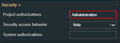 | |
Security access behavior | Sets the behavior of the element to either disabled (grayed out) or hidden, when the logged in user doesn't meet the conditions imposed by the Project authorization / Roles and System authorization / Permissions properties. In case both Project authorization / Roles and System authorization / Permissions properties are set, the logged user needs to meet both conditions to be able to see and utilize the component, at run-time. 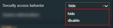 | |
Layout | Layout mode | Sets the behavior of the component related to the page placement. The user can select the component layout from the options available in the drop-down list: Default, Dock top, Dock bottom, Dock left, Dock right, Stretched, Pin top left, Pin top center, Pin top right, Pin right middle, Pin bottom right, Pin bottom center, Pin bottom left, Pin left middle and Pin center. 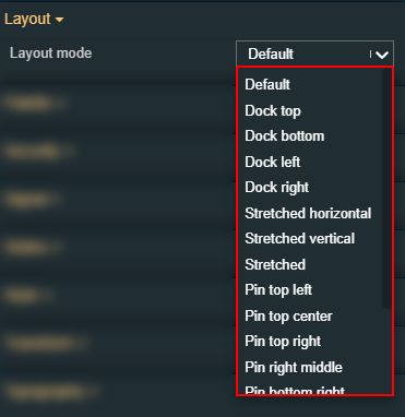 |
Margin | Sets the margin of the component relative to the drawing board area. The supported values are the standard CSS values for the margin. The top, bottom, left and right values can either be typed in the main property field or by using the Margin editor. 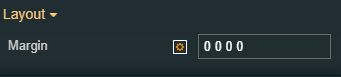 The Margin editor can be opened by clicking the Open button. 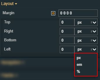 The component's margins can be updated by setting the margin value and selecting the desired unit:
| |
Effects | Opacity | Sets the opacity of the component. The Opacity values should be numbers from 0 to 1 representing the opacity of the component. When the component has a value of 0 the element is completely invisible; a value of 1 is completely opaque (solid). By default, the Component's opacity is set to value 1. Using the up / down arrows the user can control the opacity degree. 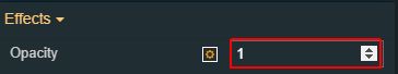 By clicking the Open button the view is extended to display the Opacity slider. 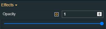 |
Shadow color | Sets the color of the component shadow, either by manually typing in the HEX color code or by using the color picker tool. As the component colors are injected by the default CSS, changing the color will overwrite the CSS. 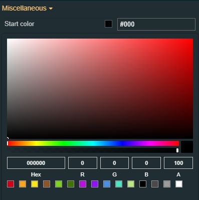 | |
Shadow offset X | Sets the offset of the shadow on the horizontal axis. The default value can be increased or decreased, either by manually typing in the desired value or by using the up and down arrows. 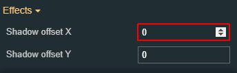 | |
Shadow offset Y | Sets the offset of the shadow on the vertical axis. The default value can be increased or decreased, either by manually typing in the desired value or by using the up and down arrows.  | |
Shadow size | Sets the width of the component shadow. The default value can be increased or decreased, either by manually typing in the desired value or by using the up and down arrows.  | |
Configuration | Configuration namespace | The namespace used by the chart predefined configuration should be applied at run time. By setting this property, the respective configuration will be, by default, applied.  |
DateTime format | Selects the time and date format for the DateTime Signal values. Available tokens are - YYYY, YY, Y, Q, MM, MMM, MMMM, D, DD. Further information is available in the "Year, month, and day tokens" chapter under https://momentjs.com/docs/#/parsing/string-format/. For example: DD.MM.YYYY hh:mm:ss  | |
Group name | Sets the name of the Alarms Group. 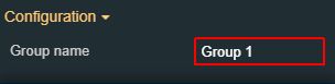 | |
Initial configuration | Sets the name of the existing configuration, that will be initially loaded for the component when opening the run-time project visualization. 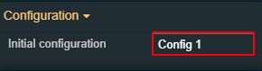 | |
Page size | Sets the number of visible alarms on a single page, by manually filling in the desired value or by using the up / down arrows to increase or decrease the value. 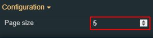 | |
Title text | Sets the text displayed by the component header. 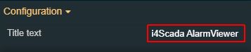 | |
Alarms | Acknowledged alarm sound | Sets the path of the sound to be played for acknowledged alarms. The sound can either be uploaded inside i4designer, or it can be an external link to a sound file. The sound upload accepts only files of type .mp3 and .wav, up to 1 MB in size. The property takes effect only if Play Sound is set to True. 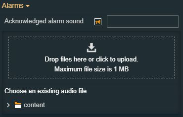 |
Acknowledged and gone alarm sound | Sets the path of the sound to be played for acknowledged and gone alarms. The sound can either be uploaded inside i4designer, or it can be an external link to a sound file. The sound upload accepts only files of type .mp3 and .wav, up to 1 MB in size. The property takes effect only if Play Sound is set to True. 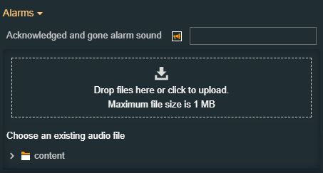 | |
Active alarm sound | Sets the path of the sound to be played for active alarms. The sound can either be uploaded inside i4designer, or it can be an external link to a sound file. The sound upload accepts only files of type .mp3 and .wav, up to 1 MB in size. The property takes effect only if Play Sound is set to True. 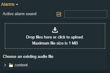 | |
Alarm Types | The Alarm types filter that will be used as the initial alarm filter. This filter will be applied automatically when running the component in the web browser. The Alarm types filters are featured as an array list, accessible by clicking the Expand array list button. 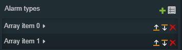 Furthermore, the following actions are available for each array item:
In order to add a new Array item, to the list of Alarm Group filters, the user can click the Add button 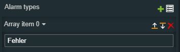 Each array item allows the user the possibility to manually fill in the Alarm type name. | |
Alarm groups | The Alarm Group will be used as the initial alarm filter. This filter will be applied automatically when running the component in the web browser. The Alarm groups filters are featured as an array list, accessible by clicking the Expand array list button. 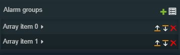 Furthermore, the following actions are available for each array item:
In order to add a new Array item, to the list of Alarm Group filters, the user can click the Add button Each array item allows the user the possibility to manually fill in the Alarm group name. 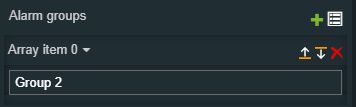 | |
Alarm status filter | Sets the alarm status that will be used as the initial alarm filter. This filter will be applied automatically when running the extension in the web browser. The user can select the desired Alarm status filter from the drop-down list options: All, Gone, Active, NotAcknowledged, ActiveOrNotAcknowledged. 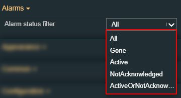 | |
Alarm sort order | Sets the order in which the alarms are displayed, selecting from the drop-down list options: DateDescending, PriorityDescending. 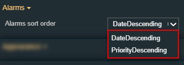 | |
Column filter | Sets the columns that will be used as initial alarm filters. The user can select the desired column filter selecting from the drop-down list options: None, Text, SignalName, OpcItem, Name, HttpLink, HelpCause, HelpEffect, HelpRepair, GeneralCom, OccurrenceComment, AcknowledgeComment, NavigationSource, NavigationTarget, ExtendedProperty#. 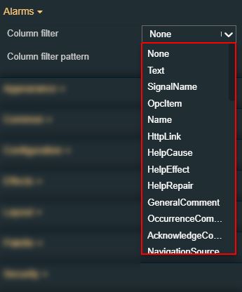 | |
Column filter pattern | Defines the pattern for filtering the specified column. This field also supports the "*" wildcard, as a placeholder, when defining filter patterns. 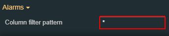 | |
Columns | Sets the columns displayed by the alarm viewer table. By default, the following columns are defined: Priority, Status Text, Group, Type, and Text. The table columns are featured as an array list, accessible by clicking the Expand array list button. 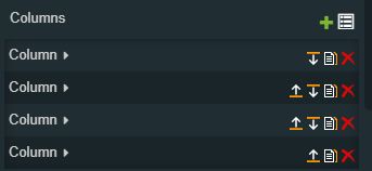 Furthermore, the following actions are available for each array item:
In order to add a new Array item, to the list of Alarm Group filters, the user can click the button Add Each array item allows the user the possibility to select the name of the column.  Furthermore, the user can set the width of the column by manually filling in the desired value  | |
Gone alarm sound | Sets the path of the sound to be played for gone alarms. The sound can either be uploaded inside i4designer, or it can be an external link to a sound file. The sound upload accepts only files of type .mp3 and .wav, up to 1 MB in size. The property takes effect only if Play Sound is set to True.  | |
Loop | Sets whether to loop the alarm sound for incoming alarms. Only has an effect if the Play Sound property is set to True.  | |
Max alarm count | Sets the maximum number of alarms to be retrieved. 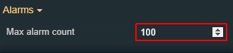 | |
Maximum priority | Sets the maximum priority of the alarms to be displayed. This property acts as a priority filter. 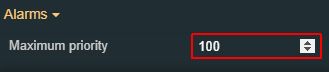 | |
Minimum priority | Sets the minimum priority of the alarms to be displayed. This property acts as a priority filter. 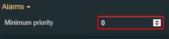 | |
Online mode | Sets the alarm viewer component to display the online alarms, by setting the property to True. 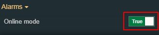 | |
Play sound | Enables or disables sounds for incoming Alarms. If this property is set to True, incoming Alarms will also play a sound. 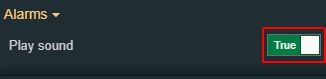 | |
Rolling time window | Boolean value that shows if the time window is rolling and it is not fixed, if the property is set to True. 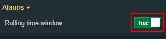 | |
Update rate | Sets the update rate in milliseconds. This property will be taken into consideration only if the Online Mode is enabled. 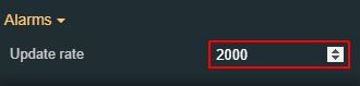 | |
Palette | Acknowledged alarm background | Sets the background color of the alarms after they were acknowledged. The user can either manually type in the HEX color code or use the color picker tool. Applying this property will overwrite the default CSS class. 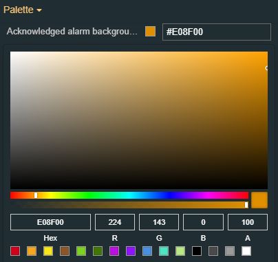 |
Acknowledged alarm foreground | Sets the foreground color of the alarms after they were acknowledged. The user can either manually type in the HEX color code or use the color picker tool. Applying this property will overwrite the default CSS class.  | |
Acknowledged and gone alarm background | Sets the background color of the alarms after they were acknowledged and gone. The user can either manually type in the HEX color code or use the color picker tool. Applying this property will overwrite the default CSS class. 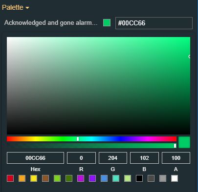 | |
Acknowledged and gone alarm foreground | Sets the foreground color of the alarms after they were acknowledged and gone. The user can either manually type in the HEX color code or use the color picker tool. Applying this property will overwrite the default CSS class. 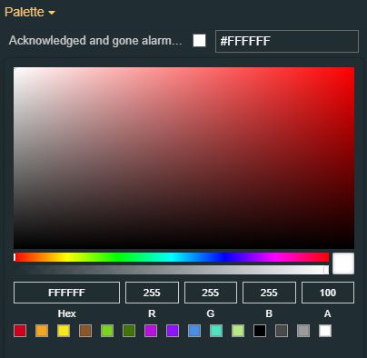 | |
Active alarm background | Sets the background color of the alarms after they were active. The user can either manually type in the HEX color code or use the color picker tool. Applying this property will overwrite the default CSS class. 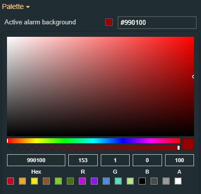 | |
Active alarm foreground | Sets the foreground color of the alarms after they were active. The user can either manually type in the HEX color code or use the color picker tool. Applying this property will overwrite the default CSS class. 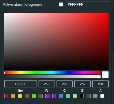 | |
Alarm colors | This feature allows the user to add advanced filtering for different combinations of Alarm groups, priority, status, and type, using custom colors. The user can set a specific color for all the alarms belonging to a particular Alarm group, Alarm type, and Alarm priority, when these are in a particular status. The specific criteria can be accessed by clicking the Expand array list button. The list features the possibility to manage the:
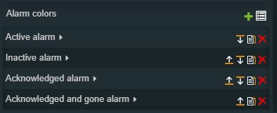 The component can have multiple Alarm colors, each carrying its own set of properties. The user can add Alarm colors, by clicking the Add new item button. Furthermore, the following actions are available for each property:
The user can individually manage the listed buttons, by setting the desired values, for the available properties: Display name, Alarm group, Alarm priority, Alarm status, Alarm type, Background color, and Foreground color. The logic behind this function also considers the order of the Alarm color filters at design time. For example, two objects that refer to different priorities, but belong to the same group, status, and type, will be shown in a different order at run-time, based on the order they have at design-time. As in the below example, the expectation is that purple Alarms are shown first and the blue Alarms come second. 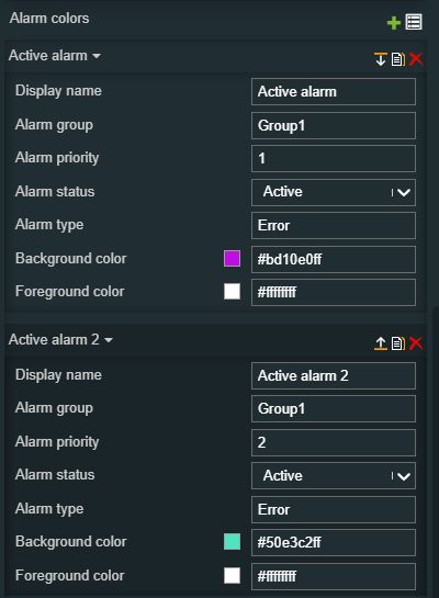 | |
Border color | Sets the border color of the component. The user can either manually type in the HEX color code or use the color picker tool. Applying this property will overwrite the default CSS class. 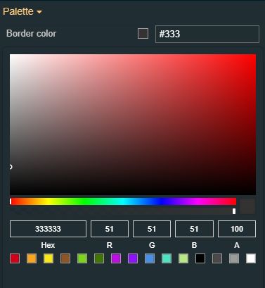 | |
Buttons foreground | Sets the foreground color of the component's buttons. The user can either manually type in the HEX color code or use the color picker tool. Applying this property will overwrite the default CSS class. 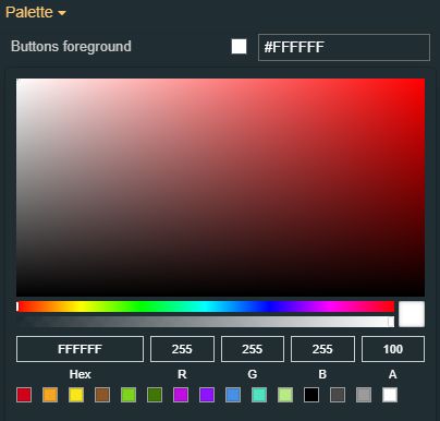 | |
Buttons background | Sets the background color of the component's buttons. The user can either manually type in the HEX color code or use the color picker tool. Applying this property will overwrite the default CSS class. 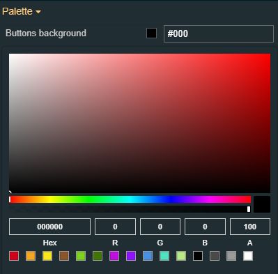 | |
Header background | Sets the background color of the component's header. The user can either manually type in the HEX color code or use the color picker tool. Applying this property will overwrite the default CSS class. 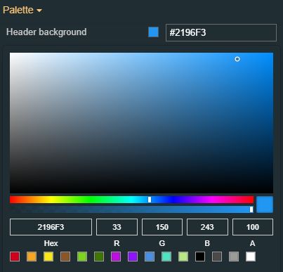 | |
Header foreground | Sets the foreground color of the component's header. The user can either manually type in the HEX color code or use the color picker tool. Applying this property will overwrite the default CSS class. 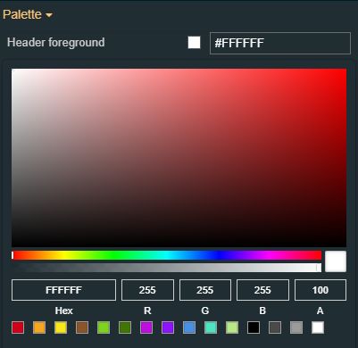 | |
Inactive alarm background | Sets the background color of the alarms after they were inactive. The user can either manually type in the HEX color code or use the color picker tool. Applying this property will overwrite the default CSS class. 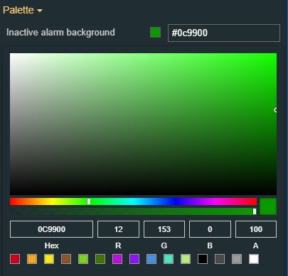 | |
Inactive alarm foreground | Sets the foreground color of the alarms after they were inactive. The user can either manually type in the HEX color code or use the color picker tool. Applying this property will overwrite the default CSS class. 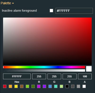 | |
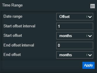
Time Range | End offset | Selects the type of the end offset interval, allowing the user to chose between the drop-down list options: seconds, minutes, days, weeks, months, and years. 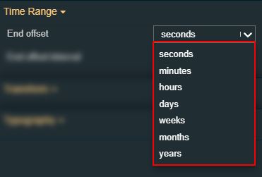 |
End offset interval | Sets the numeric value for the end offset property, by manually filling in the desired value or by using the up / down arrows to increase or decrease the value. 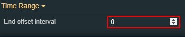 | |
Start offset | Selects the type of the start offset interval, allowing the user to chose between the drop-down list options: seconds, minutes, days, weeks, months, and years. | |
Start offset interval | Sets the numeric value for the start offset property, by manually filling in the desired value or by using the up / down arrows to increase or decrease the value. 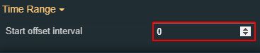 | |
Appearance | Show buttons icons | Toggles the visibility of the button icons. 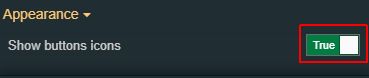 |
Show buttons label | Toggles the visibility of the text of the button. 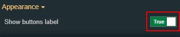 | |
Show footer | Enables the possibility to switch between showing and hiding the Alarm table footer. If the property is set to True, the footer will be visible. 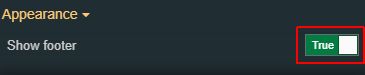 | |
Show header | Enables the possibility to switch between showing and hiding the Alarm table header. If the property is set to True, the header will be visible. 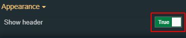 | |
Show index column | Enables display of the index column, as the first table column, if the property is set to true. 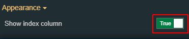 | |
Typography | Header font family | Sets the font family of the component header, selecting from web-safe fonts available in the drop-down list. 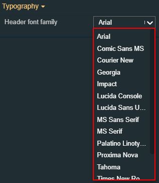 |
Header font size | Sets the size of the component's header font, using the up and down arrows to increase and decrease, or by manually typing the desired value.  | |
Header font-weight | Sets the weight of the component's header font, selecting from the drop-down list options: 900 (fat), 800 (extra-bold), 700 (bold), 600 (semi-bold), 500 (medium), 400 (normal), 300 (light), 200 (extra-light) and 100 (thin). 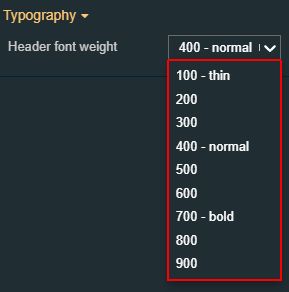 | |
Style | Border width | Sets the width of the component's container. The value is specified in pixels. 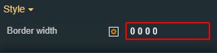 The top, bottom, left and right values can either be typed in the main property field or by using the Border width editor. The Border width editor can be opened by clicking the Open button. 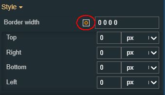 The components border width can be updated by setting the desired value and selecting the unit: 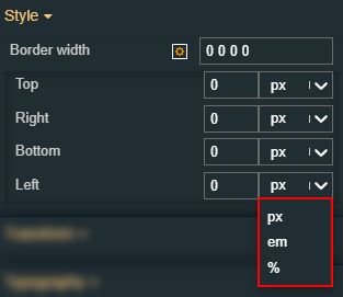
|
Transform | Width | Sets the width of the component using the up and down arrows to increase and decrease, or by manually typing the desired pixels value. The component width can also be adjusted directly on the design surface by means of mouse manipulation. 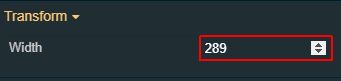 |
Height | Sets the height of the component using the up and down arrows to increase and decrease, or by manually typing the desired pixels value. The component height can also be adjusted directly on the design surface by means of mouse manipulation.  | |
Angle | Sets the rotation angle using the up and down arrows to increase and decrease, or by manually typing the desired degree value. The component angle can also be adjusted directly on the design surface by means of mouse manipulation.  | |
Left | Specifies the X (horizontal) coordinate of the component, on the grid, using the up and down arrows to increase and decrease, or by manually typing the desired value. The component X coordinate can also be adjusted directly on the design surface by means of mouse manipulation.  | |
Top | Specifies the Y (vertical) coordinate of the component, on the grid, using the up and down arrows to increase and decrease, or by manually typing the desired value. The component Y coordinate can also be adjusted directly on the design surface by means of mouse manipulation.  | |
Disable flip | Disables any flip transformation for this component. This keeps the component in the default position even when its container is flipped. 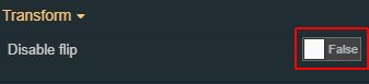 | |
Horizontal flip | Flips the selected component horizontally. 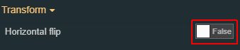 | |
Vertical flip | Flips the selected component vertically. 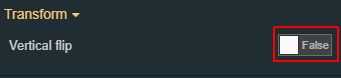 |


Alarm State Manager
Check out this article to learn more details about the i4designer Alarm state manager component and its properties.
The i4designer Alarm State Manager is a component that allows the users the possibility to change the processing state of alarms. Having an integrated security feature only the logged-in users having the appropriate set of permissions will be allowed to actually interact with the Alarm States.
The Alarm State Manager extension provides a straightforward filtering system, at run-time.
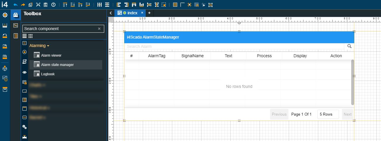
The Alarm State Manager component
Category | Property | Description |
|---|---|---|
Common | Name | The name of the component, visible in other Designer locations (such as Page explorer). |
Object ID | Sets the Object ID of the component. By defining an object ID for the control, it can be passed as SignalPrefix when using parameter passing in navigation. The value of the Object ID can be used via a placeholder [OID] in other properties of this extension. The placeholder is supported in all signal properties, symbolic text, and states. Example: Setpoint [OID] | |
Tooltip text | Optional tooltip text, that will be shown on mouseover at runtime. | |
Security | Project authorization | The project authorization required for displaying the component. If the logged in user does not have this project authorization, the component will not be visible or enabled (depending on the set Security access behavior). If the property is left empty, the component will be visible and enabled to all users. Further on, the user can also add multiple Project authorizations / Roles, separated by comma (,). |
Security access behavior | Sets the behavior of the element to either disabled (grayed out) or hidden, when the logged in user doesn't meet the conditions imposed by the Project authorization / Roles and System authorization / Permissions properties. In case both Project authorization / Roles and System authorization / Permissions properties are set, the logged user needs to meet both conditions to be able to see and utilize the component, at run-time. | |
System authorization | The system authorization required to display the component. If the logged in user does not have this system authorization, the component will not be visible or enabled (depending on the set Security access behavior). If the property is left empty, the component will be visible and enabled for all users. Further on, the user can also add multiple System authorizations / Permissions, separated by comma (,). | |
Layout | Layout mode | Sets the behavior of the component related to the page placement. The user can select the component layout from the options available in the drop-down list: Default, Dock top, Dock bottom, Dock left, Dock right, Stretched, Pin top left, Pin top center, Pin top right, Pin right middle, Pin bottom right, Pin bottom center, Pin bottom left, Pin left middle and Pin center. |
Margin | Sets the margin of the component relative to the drawing board area. The supported values are the standard CSS values for the margin. The top, bottom, left, and right values can either be typed in the main property field or by using the Margin editor. The Margin editor can be opened by clicking the Open button. The component's margins can be updated by setting the margin value and selecting the desired unit:
| |
Effects | Opacity | Sets the opacity of the component. The Opacity values should be numbers from 0 to 1 representing the opacity of the component. When the component has a value of 0 the element is completely invisible; a value of 1 is completely opaque (solid). By default, the Component's opacity is set to value 1. Using the up/down arrows the user can control the opacity degree. By clicking the Open button the view is extended to display the Opacity slider. |
Shadow color | Sets the color of the component shadow, either by manually typing in the HEX color code or by using the color picker tool. As the component colors are injected by the default CSS, changing the color will overwrite the CSS. 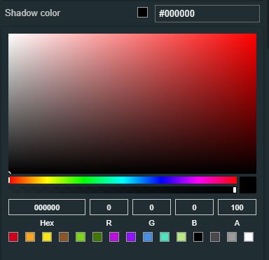 | |
Shadow offset X | Sets the offset of the shadow on the horizontal axis. The default value can be increased or decreased, either by manually typing in the desired value or by using the up and down arrows. | |
Shadow offset Y | Sets the offset of the shadow on the vertical axis. The default value can be increased or decreased, either by manually typing in the desired value or by using the up and down arrows. | |
Shadow size | Sets the width of the component shadow. The default value can be increased or decreased, either by manually typing in the desired value or by using the up and down arrows. | |
Configuration | Title text | Sets the text displayed by the component header. |
Page size | Sets the number of visible alarms on a single page, by manually filling in the desired value or by using the up/down arrows to increase or decrease the value. | |
Alarms | Alarm tag | Sets a predefined tag used for filtering the alarms. The Alarm tag can be changed at run-time. 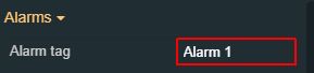 |
Columns | Sets the columns displayed by the alarm state manager table. By default, the following columns are set: AlarmTag, SignalName, Text, Process, Display, and Action. To view and manage the table columns, the user can click on the Expand array list button. 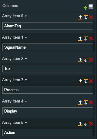 Furthermore, the following actions are available for each state:
| |
Appearance | Header visibility | Enables or disables the visibility of the component's header.  |
Palette | Background color | Sets the background color of the component. The user can either manually type in the HEX color code or use the color picker tool. Applying this property will overwrite the default CSS class.  |
Border color | Sets the border color of the component. The user can either manually type in the HEX color code or use the color picker tool. Applying this property will overwrite the default CSS class. | |
Buttons background | Sets the background color of the component's buttons. The user can either manually type in the HEX color code or use the color picker tool. Applying this property will overwrite the default CSS class.  | |
Buttons foreground | Sets the foreground color of the component's buttons. The user can either manually type in the HEX color code or use the color picker tool. Applying this property will overwrite the default CSS class.  | |
Foreground color | Sets the foreground color of the component. The user can either manually type in the HEX color code or use the color picker tool. Applying this property will overwrite the default CSS class.  | |
Header background | Sets the background color of the component's header. The user can either manually type in the HEX color code or use the color picker tool. Applying this property will overwrite the default CSS class. 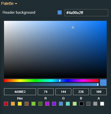 | |
Header foreground | Sets the foreground color of the component's header. The user can either manually type in the HEX color code or use the color picker tool. Applying this property will overwrite the default CSS class. 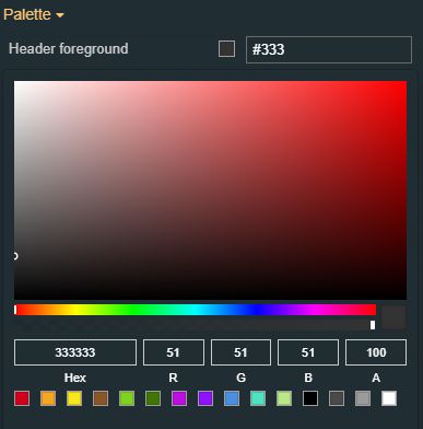 | |
Transform | Angle | Sets the rotation angle using the up and down arrows to increase and decrease, or by manually typing the desired degree value. The component angle can also be adjusted directly on the design surface by means of mouse manipulation. |
Height | Sets the height of the component using the up and down arrows to increase and decrease, or by manually typing the desired pixels value. The component height can also be adjusted directly on the design surface by means of mouse manipulation. | |
Left | Specifies the X (horizontal) coordinate of the component, on the grid, using the up and down arrows to increase and decrease, or by manually typing the desired value. The component X coordinate can also be adjusted directly on the design surface by means of mouse manipulation. | |
Top | Specifies the Y (vertical) coordinate of the component, on the grid, using the up and down arrows to increase and decrease, or by manually typing the desired value. The component Y coordinate can also be adjusted directly on the design surface by means of mouse manipulation. | |
Width | Sets the width of the component using the up and down arrows to increase and decrease, or by manually typing the desired pixels value. The component width can also be adjusted directly on the design surface by means of mouse manipulation. | |
Disable flip | Disables any flip transformation for this component. This keeps the component in the default position even when its container is flipped. | |
Horizontal flip | Flips the selected component horizontally. | |
Vertical flip | Flips the selected component vertically. |
Logbook
Check out this article and learn more details about the Logbook component and how to configure its design-time components.
The Logbook component is a real-time multi-user communication environment for i4designer web applications. It allows chat-like communications in real-time while logging all the messages for later reading.
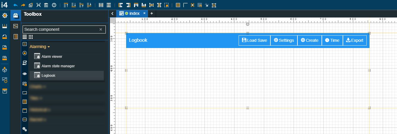
The Logbook component
Category | Property | Description |
|---|---|---|
Common | Name | The name of the component, visible in other Designer locations (such as Page explorer). |
Object ID | Sets the Object ID of the component. By defining an object ID for the control, it can be passed as SignalPrefix when using parameter passing in navigation. The value of the Object ID can be used via a placeholder [OID] in other properties of this extension. The placeholder is supported in all signal properties, symbolic text, and states. Example: Setpoint [OID] | |
Tooltip text | Optional tooltip text, that will be shown on mouseover at runtime. | |
Security | Project authorization | Project authorization is required for displaying the component. If the logged-in user does not have this project authorization, the component will not be visible or enabled (depending on the set Security access behavior). If the property is left empty, the component will be visible and enabled to all users. Further on, the user can also add multiple Project authorizations / Roles, separated by comma (,). |
Security access behavior | Sets the behavior of the element to either be disabled (grayed out) or hidden, when the logged-in user doesn't meet the conditions imposed by the Project authorization / Roles and System authorization / Permissions properties. In case both Project authorization / Roles and System authorization / Permissions properties are set, the logged user needs to meet both conditions to be able to see and utilize the component, at run-time. | |
System authorization | System authorization is required to display the component. If the logged-in user does not have this system authorization, the component will not be visible or enabled (depending on the set Security access behavior). If the property is left empty, the component will be visible and enabled for all users. Further on, the user can also add multiple System authorizations / Permissions, separated by comma (,). | |
Layout | Layout mode | Sets the behavior of the component related to the page placement. The user can select the component layout from the options available in the drop-down list: Default, Dock top, Dock bottom, Dock left, Dock right, Stretched, Pin top left, Pin top center, Pin top right, Pin right middle, Pin bottom right, Pin bottom center, Pin bottom left, Pin left middle and Pin center. |
Margin | Sets the margin of the component relative to the drawing board area. The supported values are the standard CSS values for the margin. The top, bottom, left, and right values can either be typed in the main property field or by using the Margin editor. The Margin editor can be opened by clicking the Open button. The components margins can be updated by setting the margin value and selecting the desired unit:
| |
Effects | Opacity | Sets the opacity of the component. The Opacity values should be numbers from 0 to 1 representing the opacity of the component. When the component has a value of 0 the element is completely invisible; a value of 1 is completely opaque (solid). By default, the Component's opacity is set to value 1. Using the up / down arrows the user can control the opacity degree. By clicking the Open button the view is extended to display the Opacity slider. |
Shadow color | Sets the color of the component shadow, either by manually typing in the HEX color code or by using the color picker tool. As the component colors are injected by the default CSS, changing the color will overwrite the CSS. | |
Shadow offset X | Sets the offset of the shadow on the horizontal axis. The default value can be increased or decreased, either by manually typing in the desired value or by using the up and down arrows. | |
Shadow offset Y | Sets the offset of the shadow on the vertical axis. The default value can be increased or decreased, either by manually typing in the desired value or by using the up and down arrows. | |
Shadow size | Sets the width of the component shadow. The default value can be increased or decreased, either by manually typing in the desired value or by using the up and down arrows. | |
Configuration | Client side configuration | Specifies whether the configurations are saved locally. By default, the property is set to false, hence, all configurations are safely stored on the target server, and can be loaded to the component, regardless of the used browser. If the property is set to true, all configurations are saved on the browser's local storage. When loading configurations saved locally, the system will initially load the configuration that is saved in the local storage, if one exists. If it doesn't exist it will fall back to the Initial configuration field. Further on, configurations saved locally can be lost, if the browser application is uninstalled, or if the user decides to change browser settings and return to factory defaults. 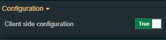 |
Configuration namespace | The namespace used by the chart predefined configuration should be applied at run time. By setting this property, the respective configuration will be, by default, applied. | |
Initial configuration | Sets the name of the existing configuration, that will be initially loaded for the component when opening the run-time project visualization. | |
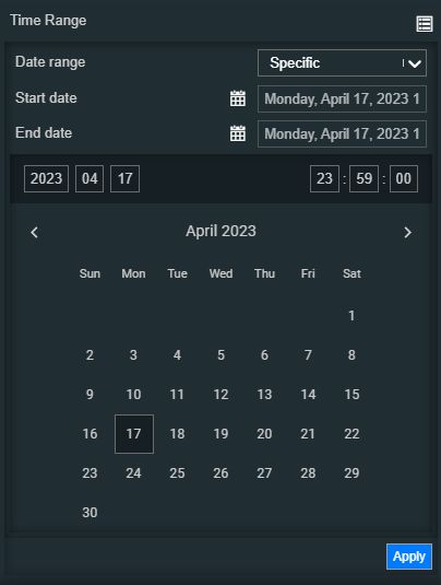
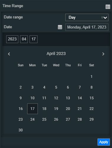
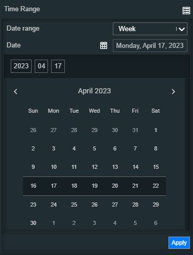
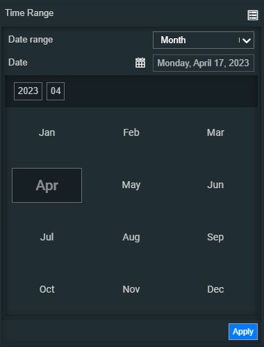
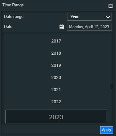
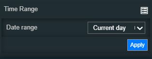
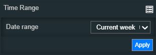
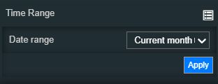
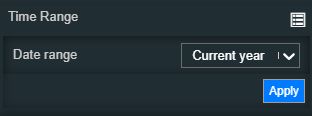
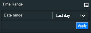
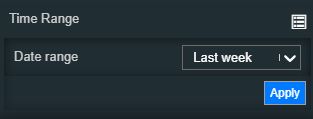
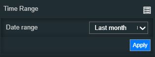
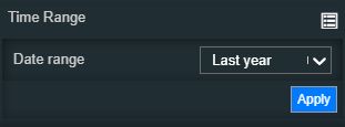
Time range | Contains a set of time range configurations. By clicking the Expand array list button, a list of modular time range properties is exposed. Based on the selection made for the Date range property, the view is updated accordingly, as follows:
| |
Title text | Sets the text displayed by the component header. 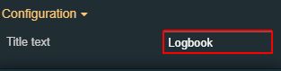 | |
Update rate | Sets the update rate in milliseconds. This property will be taken into consideration only if the Online Mode is enabled. | |
Miscellaneous | Default subject | Defines the default subject used when creating new logbooks. 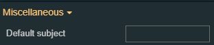 |
Default topic | Defines the default topic selected when creating new logbooks. 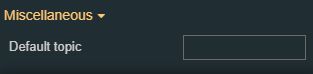 | |
Logbook foreground | Defines the default text color applied for new logbooks. 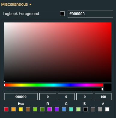 | |
Max entries | Defines the default maximum number of logbooks selection. 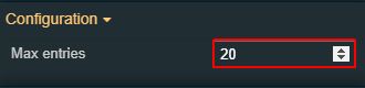 | |
Selected topic | Defines the default selected topic when filtering logbooks. 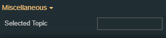 | |
Topic background | Defines the default background color of the logbook's topic. 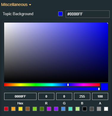 | |
Topic font size | Defines the default font size of the logbook's topic. 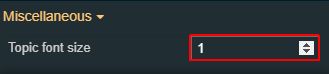 | |
Palette | Buttons background | Sets the background color of the component's buttons. The user can either manually type in the HEX color code or use the color picker tool. Applying this property will overwrite the default CSS class. 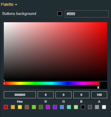 |
Buttons foreground | Sets the foreground color of the component's buttons. The user can either manually type in the HEX color code or use the color picker tool. Applying this property will overwrite the default CSS class. 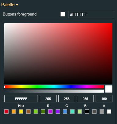 | |
Header background | Sets the background color of the component's header. The user can either manually type in the HEX color code or use the color picker tool. Applying this property will overwrite the default CSS class. | |
Header foreground | Sets the foreground color of the component's header. The user can either manually type in the HEX color code or use the color picker tool. Applying this property will overwrite the default CSS class. | |
Typography | Header font family | Sets the font family of the component header, selecting from web-safe fonts available in the drop-down list. |
Header font size | Sets the size of the component's header font, using the up and down arrows to increase and decrease, or by manually typing the desired value. | |
Header font weight | Sets the weight of the component's header font, selecting from the drop-down list options: normal, 900 (fat), 800 (extra-bold), 700 (bold), 600 (semi-bold), 500 (medium), 400 (regular), 300 (light), 200 (extra-light) and 100 (thin). | |
Transform | Angle | Sets the rotation angle using the up and down arrows to increase and decrease, or by manually typing the desired degree value. The component angle can also be adjusted directly on the design surface by means of mouse manipulation. |
Height | Sets the height of the component using the up and down arrows to increase and decrease, or by manually typing the desired pixels value. The component height can also be adjusted directly on the design surface by means of mouse manipulation. | |
Left | Specifies the X (horizontal) coordinate of the component, on the grid, using the up and down arrows to increase and decrease, or by manually typing the desired value. The component X coordinate can also be adjusted directly on the design surface by means of mouse manipulation. | |
Top | Specifies the Y (vertical) coordinate of the component, on the grid, using the up and down arrows to increase and decrease, or by manually typing the desired value. The component Y coordinate can also be adjusted directly on the design surface by means of mouse manipulation. | |
Width | Sets the width of the component using the up and down arrows to increase and decrease, or by manually typing the desired pixels value. The component width can also be adjusted directly on the design surface by means of mouse manipulation. | |
Disable flip | Disables any flip transformation for this component. This keeps the component in the default position even when its container is flipped. | |
Horizontal flip | Flips the selected component horizontally. | |
Vertical flip | Flips the selected component vertically. |