The global actions area
The i4designer global actions area allows the user the possibility to switch between a set of global operations each serving different purposes.
Located vertically at the left side of the Designer page, the global actions area provides the user with the possibility to switch between the following views:
Further on, the global actions area allows the user the possibility to check the current software version of the i4designer system, by clicking the Info button.
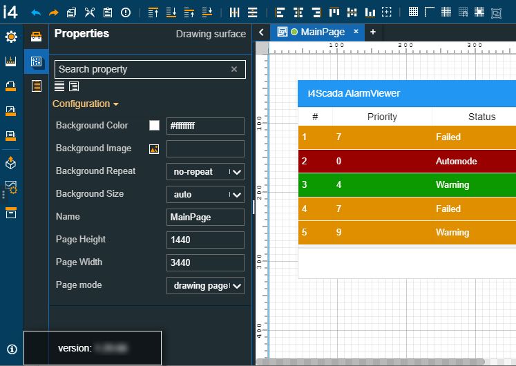
Info on software version
The Settings menu
The global actions toolbar allows the user the possibility to enter the project settings panel, by clicking the Settings menu.
Warning
Based on the current project platform, the contents of the project settings panel will be accordingly adjusted. For more details about the particularities provided by each i4designer platform, please refer to the Designer platforms articles.
In the Settings panel, the user is provided with a set of general information about the Project, such as Project name and Project platform. The user can manage the Project deployment screen size, by manually filling in the Width and Height values. The screen width and height will be reflected in both design and run-time. Further on, the user can turn on and off the Simulation Mode, per project. When the Signal Simulation Mode is set to True all the components using Signals data will simulate values at design time, therefore allowing the user to test a project while designing it.
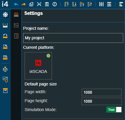
The Settings menu and panel
Warning
Projects created on the i4connected platform, provide the user with the possibility to set the Synchronization mode choosing between Active or Passive modes. For more details about this topic, please also visit the dedicated article, here.
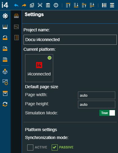
The Settings menu and panel, for i4connected platform projects
The Builds menu
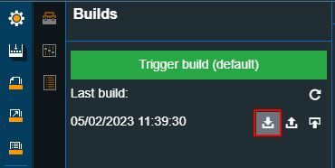
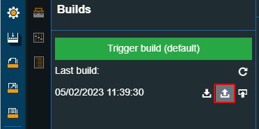
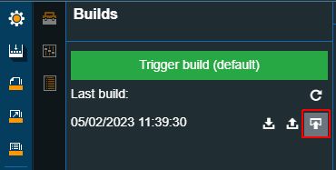
By clicking the Builds menu of the global actions toolbar, the Builds panel is opened. In this view, the user can trigger a build, using the designated button. In this view the last build will be always displayed, allowing the user to organize further actions:
Refresh the builds view in order to get the latest version of the project build;
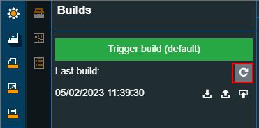
Download the last build in order quickly obtain the project build;
Tip
For more details about the build download please refer to the dedicated article.
Publish the last build over FTP in order to quickly publish your project through FTP;
Tip
For more details about the FTP publish method please refer to the dedicated article.
Automatic publish in order to quickly publish your i4connected project;
Note
Projects created on the i4connected platform provide the user with an additional deployment method that automatically publishes the project to the i4connected server. For more details, please refer to the Automatic publish article.
The Pages menu
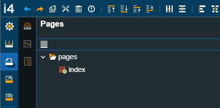
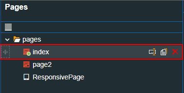
In order to manage a Project page structure, the user can click the Pages menu. In the Pages panel, the currently available structure is displayed.
The Pages menu and panel
By hovering the Project pages folder the user is provided with the possibility to add new pages, new response pages, and new folders. In this view, the user can organize the following operations:
Add file - by clicking this button a new file (project page) is added to the project structure, having a system-generated name.
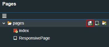
Add file button
Add responsive page - by clicking this button a new responsive page is added to the project structure, having a system-generated name.
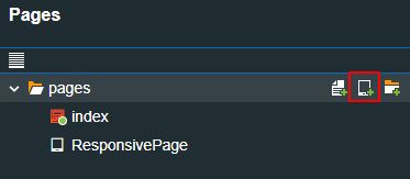
Add Responsive page button
Add folder - by clicking this button a new folder is added under the first listed file in the project structure, having a system-generated name.
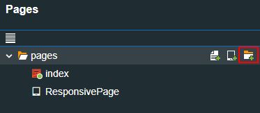
The Add folder button
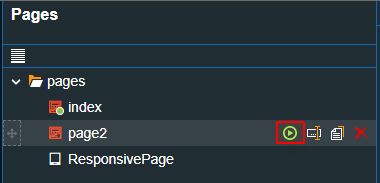
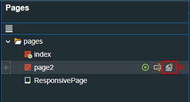
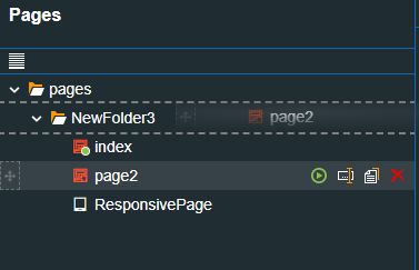
Further on the listed pages can be updated, as follows:
by clicking the Set startup page option, the user can change the default project page.
Tip
The default project page (or the Index page) is highlighted with a green light and the Set startup page button is not available for it.
by clicking the Rename page option, the user can update the page name.
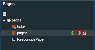
to duplicate a page, the user can click the Copy button
redundant pages can be deleted by clicking the Remove button.

to change the position of a page in the hierarchy, the user can drag and drop pages, to the desired position or add them to a folder.
The Navigations menu
Besides complex page structures, the i4designer supports advanced page navigation structures that are easily managed under the Navigations menu.
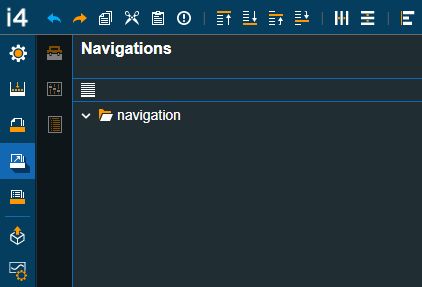
The Navigations menu
The Navigations panel displays the main navigation node that will support the structure. When hovered, the Add file and Add folder options are displayed.
Add file creates a new navigation file with a system-generated name, that can be later on updated.
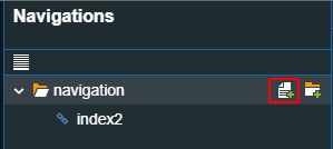
The Add file button
Add folder creates a new navigation folder with a system-generated name, that can be later on updated.
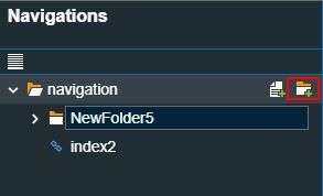
The Add folder button
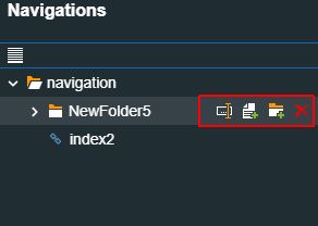
Both, the Navigation files and folders provide the user with a set of actions:
The navigation file allows the user the possibility to Rename, Copy and Delete. Additionally, the user can drag and drop navigation files and folders, in order to change their position, as desired.
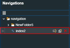
Navigation file actions
The navigation folder allows the user the possibility to Rename, Add file, Add folder and Delete. Further on, the user can drag and drop a navigation folder in order to change its position.
Navigation folder actions
Furthermore, by clicking on a Navigation File, the Navigation page is opened.
The File Navigation page
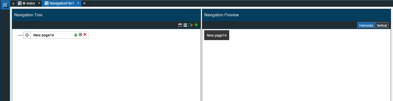
The Navigation page is structured as follows:
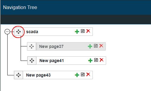
The Navigation Tree panel displays the page structure available for the current i4designer Project.
The Navigation Tree panel
The toolbar of the Navigation Tree panel features the following actions:
The Add page button
 allows the user to create new pages for the Navigation structure
The Synchronize to project button
 allows the user to synchronize the navigation structure to the current project page structure. As soon as the synchronize button is clicked, a dialog pops up informing the user that the operation can not be reverted and asking for confirmation to proceed.
The Collapse all button
 allows the user to collapse the navigation tree.
The Expand all button
 allows the user to expand the navigation tree.
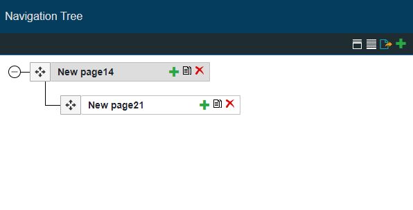
Each sub-file in the Navigation tree allows the user to add further subordinated pages or to remove them by means of the Add page, Clone, and Delete page buttons.
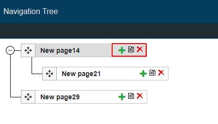
The Add page, Clone page and Delete page buttons
The Add page button
allows the user to create pages and subpages for the Navigation structure.The Clone page button
 allows the user to make an exact copy of a page, subpage, or, the entire structure.
The Delete page button
 allows the user to delete subpages, or pages with their entire structure.
The page's position in the navigation structure can be manually adjusted by means of drag-and-drop
 .
.
Adjust page position by dragging and dropping it on the desired structure level
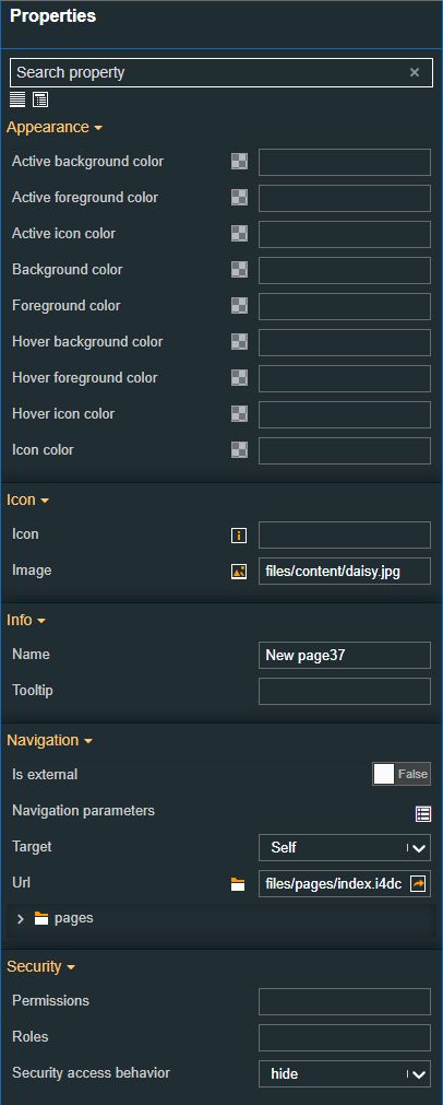
By clicking on a Navigation page, in the Navigation Tree, the Navigation Properties panel is opened at the left side of the screen. In this view, the user can define the following settings:
The Navigation page properties
Security - allows the user with the possibility to apply security for the run-time navigation pages, as follows:
Project authorization /Role - The project authorization/role required for displaying the component. If the logged-in user does not have this project authorization/role, the navigation page will not be visible or enabled (depending on the set Security access behavior). If the property is left empty, the component will be visible and enabled to all users. Further on, the user can also add multiple Project authorizations / Roles, separated by comma (,).
Security access behavior - Sets the behavior of the element to either be disabled (grayed out) or hidden, when the logged-in user doesn't meet the conditions imposed by the Project authorization / Roles and System authorization / Permissions properties. In case both Project authorization / Roles and System authorization / Permissions properties are set, the logged user needs to meet both conditions to be able to see and utilize the component, at run-time. In case both Project authorization / Roles and System authorization / Permissions properties are set, the logged user needs to meet both conditions to be able to see and utilize the component, at run-time.
System authorization/Permission - The system authorization/permission required to display the component. If the logged-in user does not have this system authorization/permission, the navigation page will not be visible or enabled (depending on the set Security access behavior). If the property is left empty, the component will be visible and enabled for all users. Further on, the user can also add multiple System authorizations/Permissions, separated by comma (,).
Navigation - allows the user with the possibility to customize the navigation behavior, as follows:
URL - sets the path pointing to the navigation page.
Target - sets the navigation target element, by allowing the user to choose from the following options:
Self - Default. Opens the link in the same frame as it was clicked.
Blank - Opens the link in a new window or tab.
Parent - Opens the link in the parent frame.
Top - Opens the link in the full body of the window.
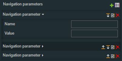
Navigation Parameters - sets additional parameters for the navigation, by clicking the Add new item button. In order to see the list of items, the user can click on the Expand array list button. The user can also rearrange the list of Navigation parameters, by using the Move up / Move down, Clone , and Remove item buttons.
The user can define the parameter name (e.g. "panelSize") and the value (e.g. "sm", "md", "lg", etc), that will be passed to the source page.
Is External - Allows the possibility to set the link target to internal or external. If this property is set to False, a current project page can be set as a target. If this property is set to True, the user can manually fill in the target URL.
Info - allows the user to customize the general information of the Navigation page:
Tooltip - sets the tooltip of the navigation page, displayed at run-time when hovering over the page.
Name - sets the name of the navigation page, displayed at run-time.
Appearance - allows the user the possibility to fully customize the colors of the Navigation bar, such as the icon color, hover icon color, hover foreground color, hover background color, foreground color, background color, active icon color, active foreground color, and active background color.
The user can either manually type in the HEX color code or use the color picker tool. As the color palette is injected into this component by means of the default CSS class, applying this property the CSS class settings will be overwritten.
Icon - allows the user the possibility to upload an image to be persisted in the Navigation bar, or to select an icon from the predefined list of icons. Additionally, the user can personalize the icon color, using the provided color picker tool.
Icon - The icon can be selected from a large number of icons accessible by clicking the Open panel to see the icon list button.
The list of icons allows the user to toggle between actual icons and icon names. A simple filtering mechanism is also provided to support the user to easily pinpoint the desired icon.
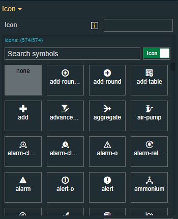
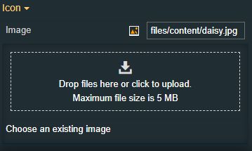
Image - Allows selection of the image source. By clicking the Upload image button, the user can either drop files in the designated area or click to upload the image from the local machine. Additionally, if any images have been previously uploaded they will be displayed under the content folder and reused.
The maximum image size is 1MB.
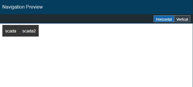
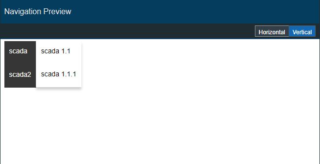
The Navigation Preview panel displays in real-time a preview of the navigation bar that the user can achieve.
The Navigation Preview panel
Hence, the Navigation Preview panel will always reflect the Navigation Tree, allowing the user to select between:
a horizontal view
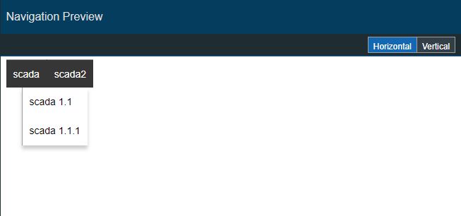
a vertical view
The Content menu
The Content Manager is a storage location for all the project files of type .jpg, .jpeg, .png. By clicking the Content menu, the Content panel is opened allowing the user to manage the list of project images.
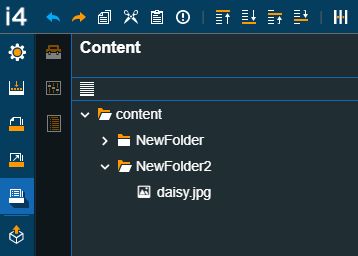
The Content Manager
Important
The Content manager does NOT allow the user the possibility to upload new files. In this view, the user can edit file names, delete or copy existing files and distribute them in folders.
New projects feature an empty content manager, that gets populated as the user uploads new images to the project.
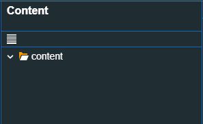
Example of an empty Content Manager
By hovering the default "content" folder the user is allowed to create new folders by clicking the Add folder button.
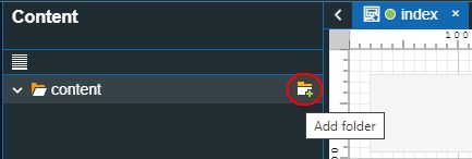
Add folder button
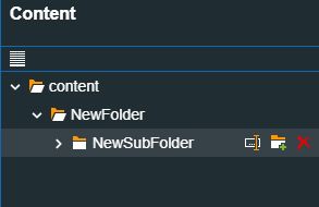
Each content folder features the following actions:
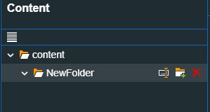
Content folder and sub-folder
Change folder position by means of drag and drop;
Rename folder;
Add a new sub-folder;
Delete folder.
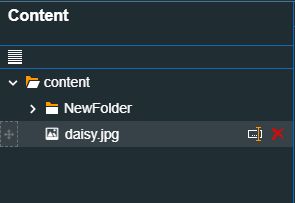
The Content manager panel is populated with new files as the user uploads files to the i4designer project. Each file features the following actions:
Content file
Change file position or add it to a folder, by means of drag and drop;
Rename file;
Delete file.
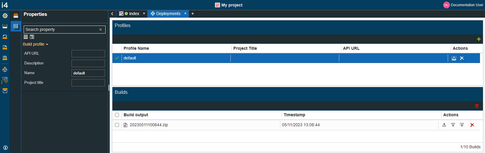
The Deployments menu
By clicking the Deployments menu, the Deployments page is opened.
The Deployments menu
This view is structured as follows:
the Deployments contextual menus
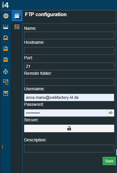
The FTP configuration panel, where the user needs to set up the needed FTP settings required by the Publish over FTP deployment.
The FTP configuration panel
Tip
For more details on how to configure the FTP settings, please check the designated article.
The Build profile panel, where the user can set up the build profile settings.
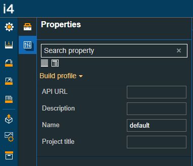
The Build profile panel
the Deployments page
The Profiles panel, where the user can see the list of Build profiles. The listed Build profiles can be used to trigger a new project build, can be removed or set as default.
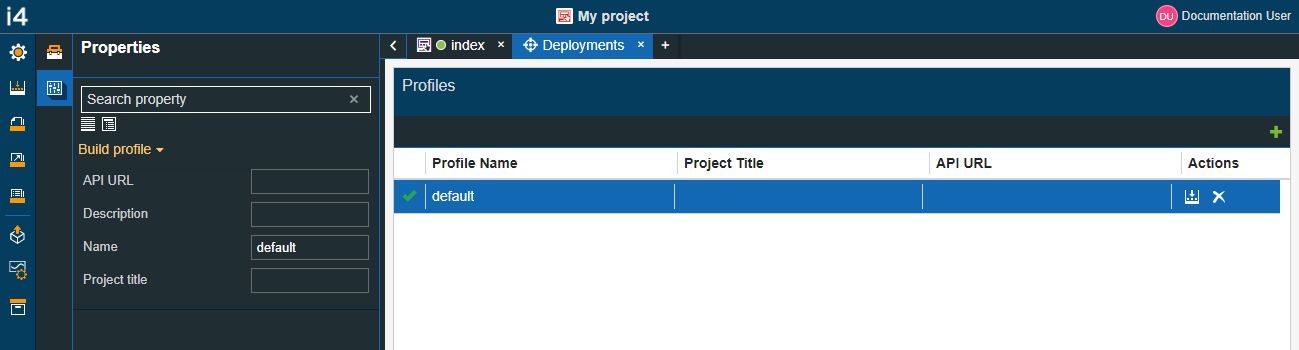
The Build configuration panel
The Builds panel where the user can download a build chose to publish it over FTP or automatically publish it.
Additionally, in this view, the user can delete redundant builds.
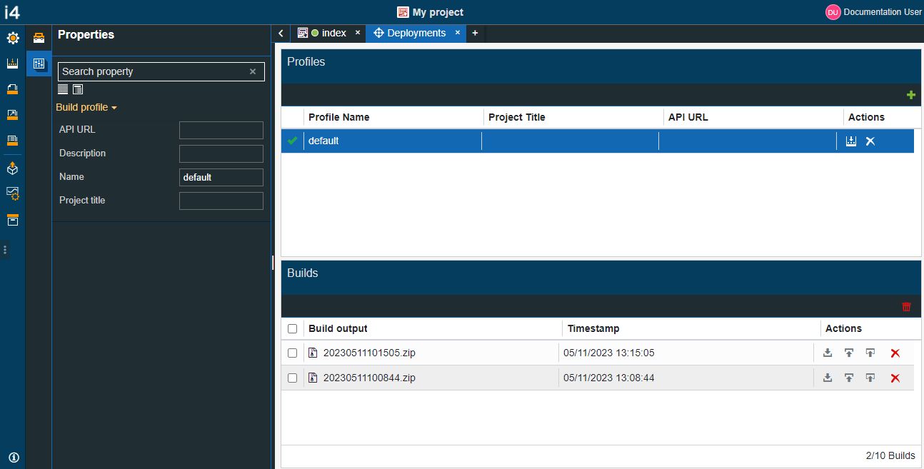
The Builds panel
Tip
For more details about the Deployments page, please refer to the Project Deployment article.
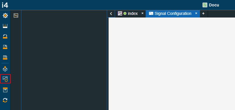
The Signals configuration menu
By clicking the Signal configuration menu, the Signal operations panel is opened.
The Signal operations panel displays the Signal import or Signal synchronize options, automatically adjusted on basis of the project platform:
i4scada Signal operations panel allows the user with the possibility to import Signals via an XML file or directly synchronize them, from a preconfigured i4scada database.
The import file can be either dragged from the local machine and dropped in the Signal import panel, or manually uploaded.
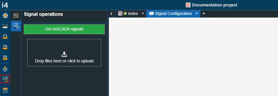
i4scada Signal Configuration
i4connected Signal operations panel is, by default, displayed as empty. As soon as the user synchronizes the desired Signals, from the preconfigured i4connected database, the list of Signals will be populated.
i4connected Signal Configuration
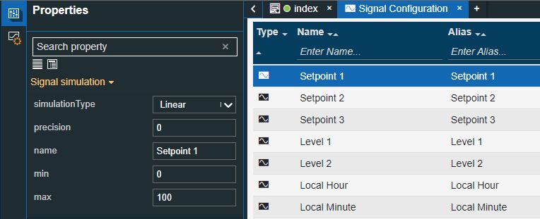
The uploaded/synchronized Signals will be listed on the Signal Configuration page.
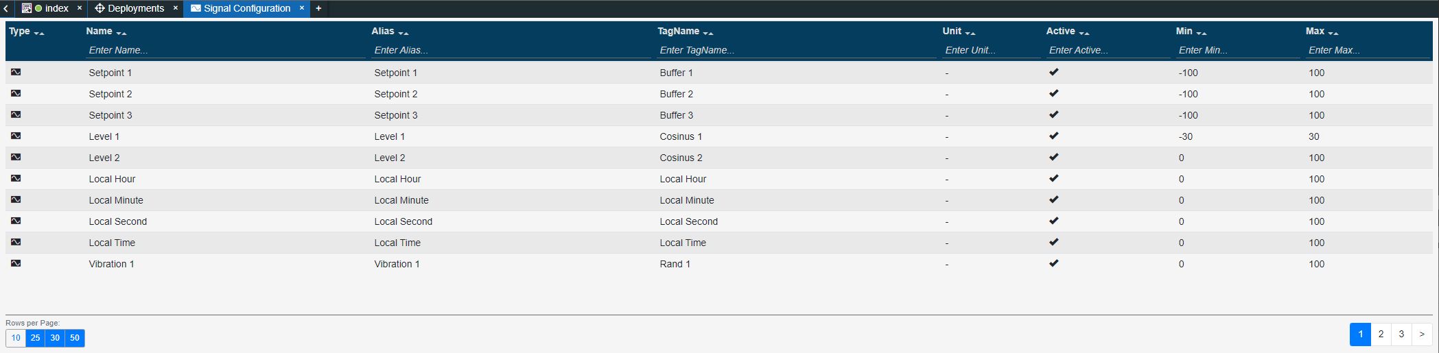
The Signal configuration page
Each column of the Signal Configuration table features a simple filtering mechanism allowing the user to easily establish the availability of a Signal.
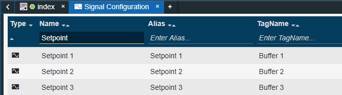
Filter signals
At the bottom left side of the Signals table, the user can use the Page rows selector to choose the number of rows displayed by the table. The user can choose to display 10, 25, 30, or 50 rows.
The user can navigate from one Signals page to another by using the toggle switch buttons displayed at the bottom right side of the table.
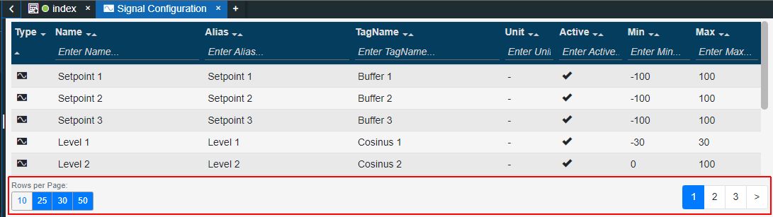
Page rows drop-down selector
A more detailed view, upon the Project Signals, can be accessed by clicking the Properties editor contextual option, or by double-clicking on a specifically listed signal. The Properties editor menu opens the Signal Simulation panel, providing the user with the possibility to manage the following Signal simulation properties.
The Signal Simulation panel
max - the highest Signal value, used by the i4designer controls at design-time.
min - the lowest Signal value, used by the i4designer controls at design-time.
name - the name of the Signal, used by the i4designer controls at design-time.
precision - the number of the digits after the decimal point
simulation type - can be selected from the drop-down list choosing between:
Important
These simulation patterns are ONLY applied in simulation mode. After publishing a project, the behavior of the online signal will be applied.
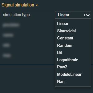
Linear - returns values that are ranged between the Min / Max interval.
Sinusoidal - returns amplitude values, randomly selecting the start point value from the Min / Max interval.
Constant - returns a value that remains constant throughout the simulation. The value is randomly selected from the Min/ Max interval.
Random - returns randomly generated values ranged between the Min / Max interval.
Bit - returns either value 0, or 1.
Logarithmic - returns values by raising them to a power randomly selected from the Min / Max interval. It is usually used for a signal providing high gain for low-level signals and progressively lower gain for higher signal levels.
Pow2 - returns values by randomly selecting values from the Min / Max interval and exponents for the next power of 2 higher than the randomly selected value.
ModuloLinear - returns values that are ranged between 0 and the defined precision point, if precision is higher than 0. Otherwise, the value will be 0.
Nan - stands for Not-A-Number. This simulation type specifies that the signal returns invalid inputs.
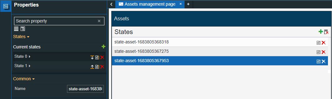
The Assets management menu
By clicking the Assets management menu the Assets management page is opened. When opening the Assets management page for the first time the Assets Library will be displayed as empty.
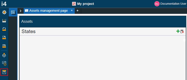
The Assets management
Tip
The i4designer Assets are reusable states definitions.
One or multiple Assets form an Assets Library.
The Add asset button  allows the user to create a new Asset. New State assets are listed in the States panel.
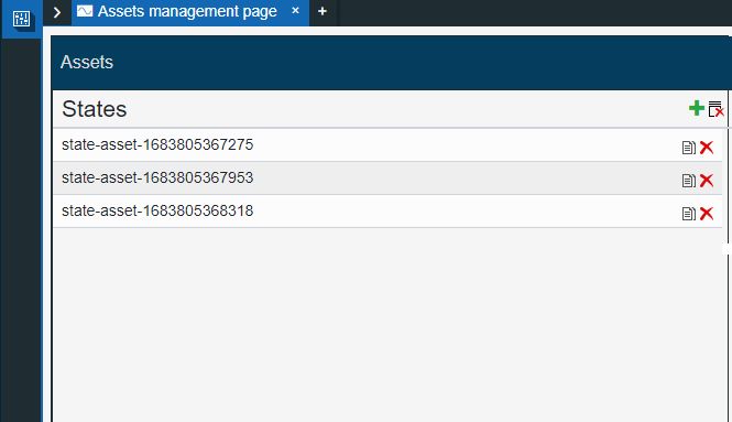
State assets library
By selecting a listed State asset, the Properties panel is automatically expanded at the left side of the Library.
The Assets properties panel
In this view, the user can start configuring the following parameters:
Category | Property | Description |
|---|---|---|
States | Current states | An Asset can have multiple states, each carrying its own set of properties. The user can add states, by clicking the Add new state button. Furthermore, the following actions are available for each state:
|
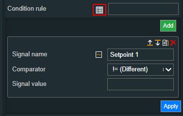
State# Condition rule | The required rule for the extension to enter the state. The signal names must be always surrounded by percentage (%) characters, followed by logical operators and the Signal value. For example: %Setpoint 1 % ! = 0 The Condition rule can be either manually typed in or generated, using the State editor. The State editor can be opened by clicking the Expand array list button. This way, the user can easily generate a Condition rule, as follows:
 | |
State # CSS class name | The style of the icon for the current state. The CSS class name selection can be done by choosing from the drop-down list values: none, normal, danger, hand, writing, and running. 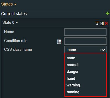 | |
State # Symbolic state | The language-agnostic text (which is automatically translated) is displayed by the extension. 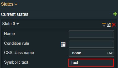 | |
State # Foreground | Sets the foreground color of the button. Applying this property will override the default CSS class. 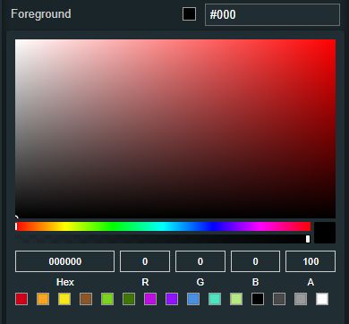 | |
State # Background | Sets the background color of the button. Applying this property will override the default CSS class. 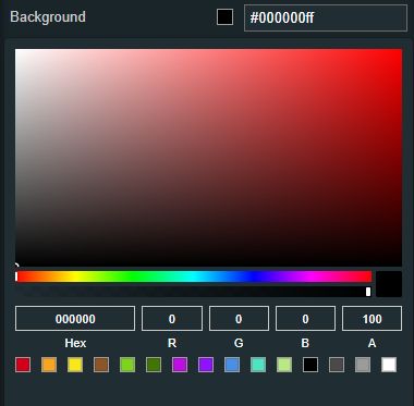 | |
State # Animation | Sets the component animation class when the state evolution passed. The user can select the animation class from the drop-down list options: Fade in, Fade out, or Blink. 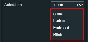 | |
State # Background image | Sets the image of the background state. By clicking the Upload image button, the user can either drop files in the designated area or click to upload the image from the local machine. Additionally, if any images have been previously uploaded they will be displayed under the content folder and reused. The image upload accepts files of type "jpeg", "jpg", "jpe", "gif", "png", "svg", "ico", "webp", up to 5 MB in size. 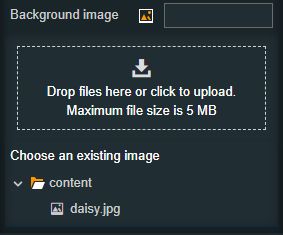 | |
Common | Name | The name of the new State asset, which will be available under the States management page 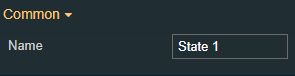 |


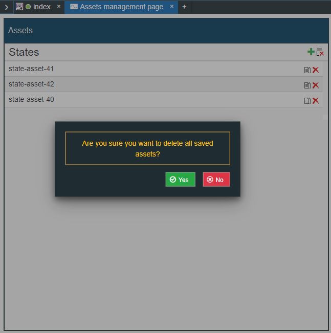
In order to delete an Assets Library, the user can click the Remove button  . To proceed with the Assets Library deletion the user needs to confirm the operation by clicking the option Yes, in the pop-up dialog.
Delete all Assets in the Library
As soon as the deletion was processed a confirmation toast message is displayed at the bottom of the screen.
Successful Asset deletion operation - Toast message
The listed State assets can also be managed independently as follows:
The Clone state button allows the user to create a clone of the selected State asset, along with all its parameters.
The Clone state option
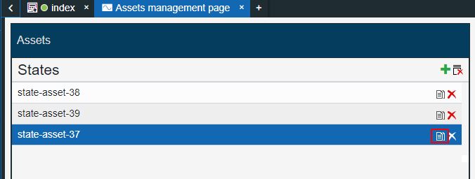
The Remove button allows the user to delete redundant State assets. To confirm the deletion operation the user needs to select the Yes option in the pop-up dialog.
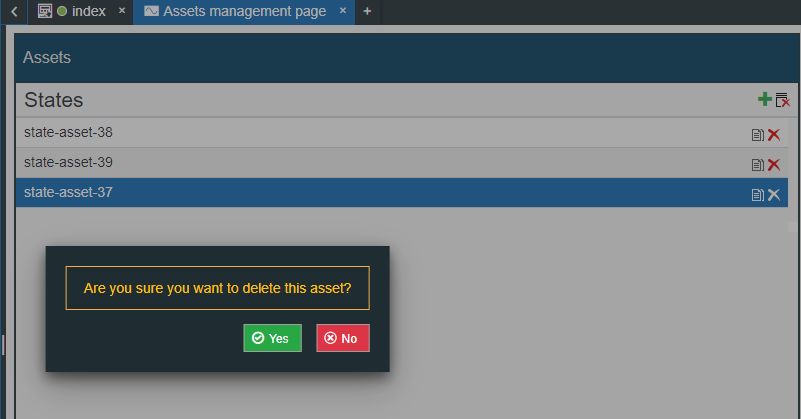
The Delete State asset confirmation dialog
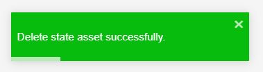
A successful operation is confirmed by means of the toast message "Delete state asset successfully".
As earlier indicated, Assets defined under the Assets management page can be uploaded and reused as the Components States
Note
As earlier indicated, Assets defined under the Assets management page can be uploaded and reused as the Components States.
Deletion confirmation pop-up
The Connected entities page
The Connected entities page menu entry is displayed explicitly for projects created for the i4connected platform.
The Connected entities page panel
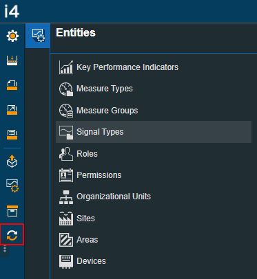
The Entities panel, lists the following i4connected entities, that can be synchronized with an i4designer project:
Key Performance Indicators
Measure Types
Measure Groups
Signal types
Roles
Permissions
Organizational Units
Sites
Areas
Devices
Important
As soon as the project is linked to an i4connected Application, the global i4connected entities will be automatically synchronized with the i4designer project.
The global entities are Key Performance Indicators, Measure Types, Measure Groups, Signal Types, Roles, and Permissions.
The Organizational Units, Sites, Areas, and Devices can be individually synchronized with the i4designer project.
The i4connected Entities are listed in a tabular format, where each column features a simple filtering mechanism, allowing the user to easily establish the availability of an entity.
At the bottom left side of the Entities tables, the user can choose the number of rows displayed by the table, by clicking on the listed options: 10, 25, 30, or 50 rows. Next, the user can navigate from one page to another, by using the toggle switch buttons, displayed at the bottom right side of the table.
The i4connected Entities table
Tip
More details about the i4connected Entities can be found in this article here.