The design area
Check out this article to learn more about the areas and behaviors we can distinguish in the i4designer workspace.
The main view of the Designer page is the design area which is the actual work-space, split up between:
The design area
The navigation page bar
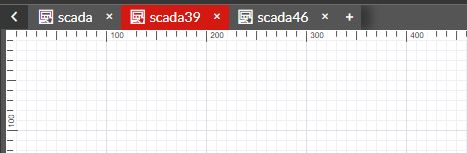
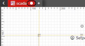
At the top of the design area, the page navigation bar is available. When building projects with multiple pages and navigation structures, the user can easily switch between pages or add new ones. Even though multiple pages can be opened at the same time, the number of page tabs is limited by the amount of space required by the quick actions toolbar.
Note
When opening multiple pages, the pages will be opened as tabs. When refreshing the browser or logging out of I4designer, the last edited page will be active and selected.
To avoid confusion, when multiple pages are being managed, the page that is currently in work can be easily distinguished due to the red highlight.
The navigation page bar
The user can also add pages to the current project, without switching to the Pages entry. By clicking the  button in the navigation page bar, a new page with a system-allocated name is added.
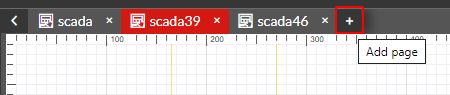
The Add page button
Further on, the navigation page bar allows the user to hide the contextual and global actions area, by using the  button and to unhide them by clicking the
  button.
The drawing surface
The drawing surface is the area where the actual design actions take place. Depending on the project page size and the user's screen resolution, the i4designer drawing surface is equipped with a vertical and a horizontal scroll bar, hence allowing the user to have a complete overview of the project in work.
This view is also split up into two sections:
The whiteboard
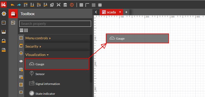
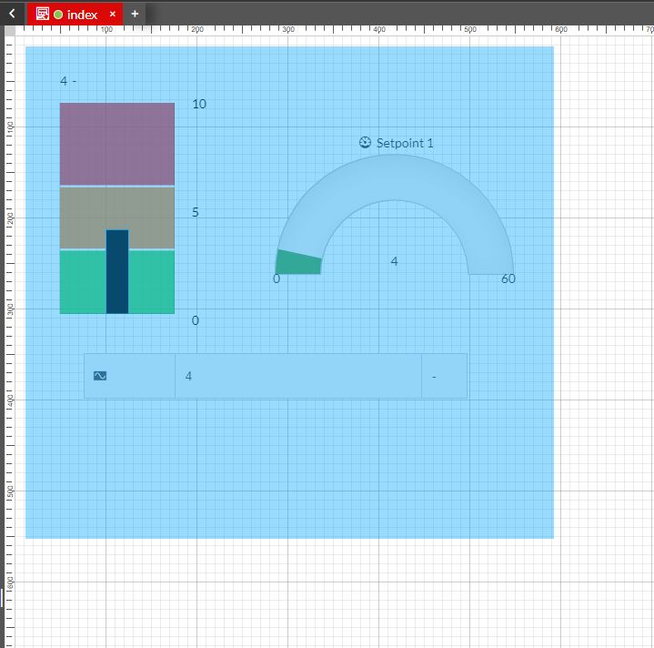
The so-called whiteboard is the actual workspace, where the user can start building the project, by adding components to the page. Components can be added to the page either by double-clicking them in the Toolbox panel or by dragging and dropping them on the page.
Dragging and dropping components on the page
The user can easily interact with the i4designer components available on the project page in multiple ways:
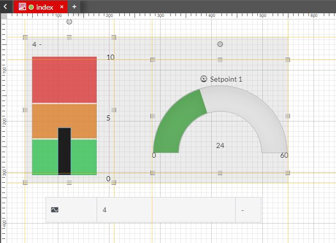
Editing the properties of a component - by clicking or double-clicking on component the Properties panel is opened in the i4designer global actions area. Here, the user can change the component configuration, appearance, size, typography, layout, security, color pallet, and many others. Each component features its own set of properties, which will be described in the upcoming chapters.
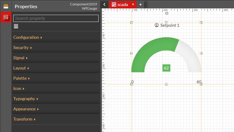
The Component properties editor
Manually adjusting a component position on the project page by clicking and dragging the component.
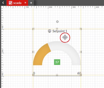
Drag component on the project page
Manually adjusting the size of a component by clicking and dragging the component's margins and edges. During the resizing process, a text overlay is displayed over the component indicating the width and height of the component. The resize behavior can be constrained to only one direction (e.g. only width resizing) or to aspect ratio-based resizing (e.g. keeping the shape square).
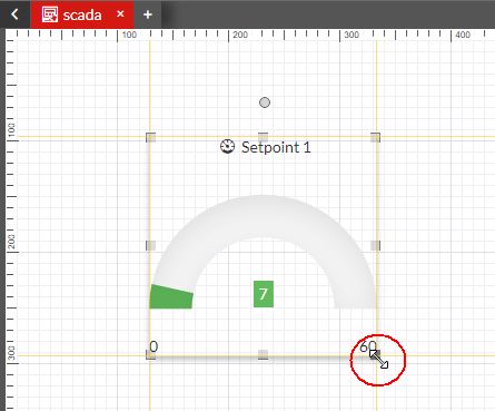
Resize component
Rotating a component by clicking and dragging the rotate handle on the top of the component. The rotate handle allows the user to drag it with the mouse and applying rotation to the shape.
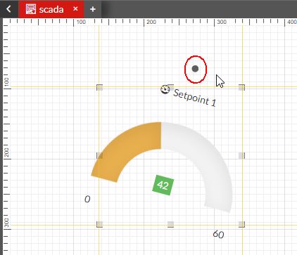
Rotate component
Due to the multi-select functionality, the user can interact with multiple page components, as follows:
via mouse selection - by holding down the right or left mouse button and dragging a selection rectangle over the components of interest. Once the button is released, the contained components are selected for further actions.
Selecting multiple components via mouse selection
via Control click - by holding the CTRL key and alternatively clicking on the component(s) of interest, with the left mouse button. The selected components can be positioned anywhere on the drawing surface, not necessarily next to each other. To deselect any of the components in the collection, the user can click it again, while holding the CTRL key.
Selecting multiple components via Coontrol click
via Control all - By clicking the CTRL key and alternatively clicking the A key, applies a selection upon all page components. To deselect any of the components in the collection, the user can click it again, while holding the CTRL key.
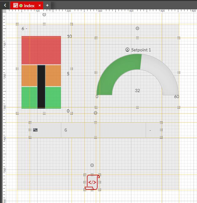
Selecting multiple components via Control All
Once multiple components have been selected, the user can manage them as follows:
move them on the drawing surface (via drag and drop)
copy all the selected components (via CTRL + C keys) and paste them (via CTRL + V keys)
cut all the selected components (via CTRL + X keys) and paste them elsewhere (via CTRL + V keys)
duplicate all the selected components (via CTRL + D keys)
remove all the selected components (via Delete key)
When selecting multiple components, the user can access the Components group Properties panel. In this view the user can manipulate the position of the components group, by changing the values of the following properties:
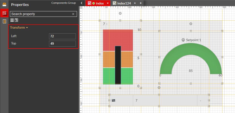
The Components group Properties
Left - adjusts the components group position horizontally.
Top - adjusts the components group position vertically.
As we learned by reading the quick actions area article, the user can enable or disable further visual aids such as the grid view, the ruler views, and the guidelines.
To avoid data loss due to a crash, freeze, or user error, each of the above-listed changes is saved automatically by the i4designer. A visual cue is also provided each time changes on the whiteboard occur.
Autosave visual cue
Important
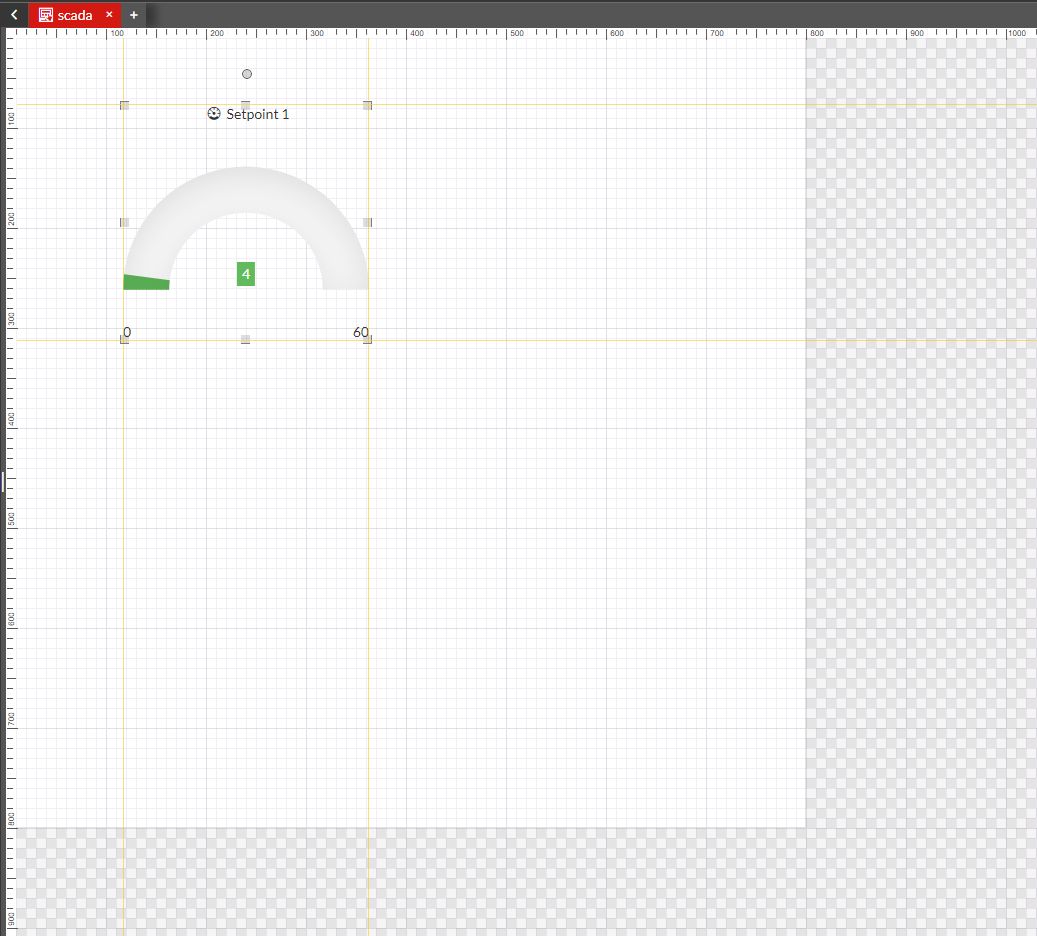
Objects positioned outside the whiteboard will not be visible at run-time.
The "chess" board
The so-called "chess" board is the area surrounding the whiteboard. Unlike the whiteboard, elements positioned on this area will not be visible at run-time.
Besides serving as a frame for the whiteboard, the chessboard area does not provide further actions or settings to the user.