Core
Here are the i4designer Navigation components for your new project created on the i4scada, i4connected or OPC-UA platforms.
The components available in the Core category of the i4designer Toolbox panel are described, individually, in the upcoming articles.
Tip
For of step-based tutorial describing the usage of the KPI component, please visit the dedicated tutorial, here.
Kpi
Check out this article describing the core component, allowing i4designer users with the possibility to takes the KPI's parameters over time and write local signals with the result.
The i4designer Kpi component allows users the possibility to apply conventional patterns, in order to write analysis data using local signals. Similar to the Utilities components, the Kpi component will not be visible at run-time.
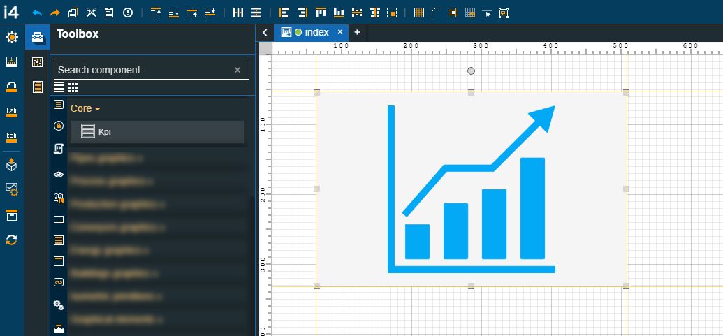
The KPI component
Category | Property | Description |
|---|---|---|
Configuration | Aggregate totals | If the toggle button is set to true all the measurements of the respective media and KPIs will be summed up. 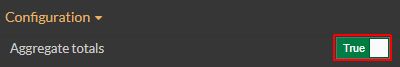 |
Areas | Allows the user with the possibility to set one or multiple patterns used to select the corresponding areas. To see the Area filters, the user can click the Expand array list button. New Area filters can be added by clicking the Add new item button. A list of all the synchronized i4connected Areas is displayed, allowing the user to choose the desired Areas. 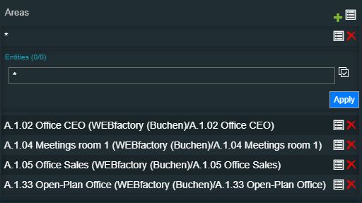 NoteThe list of entities is by default filtered to show all possible combinations. The "*" wildcard means "any". 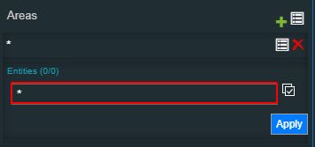 The user can define filter patterns, as follows:
To preserve the selection, the Apply button needs to be clicked. | |
Auto-update | Allows the user to specify whether the updating should happen automatically or not. When this option is enabled the chart pulls interval for data and updates it automatically. The Filter object property must be also filled when enabling the Auto-update property. 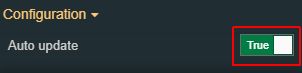 | |
Devices | Allows the user with the possibility to set one or multiple patterns used to select the corresponding devices. To see the Device filters, the user can click the Expand array list button. New Device filters can be added by clicking the Add new item button. A list of all the synchronized i4connected Devices is displayed, allowing the user to choose the desired Devices. 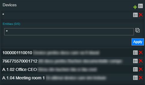 NoteThe list of entities is by default filtered to show all possible combinations. The "*" wildcard means "any". 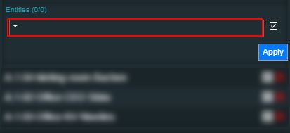 The user can define filter patterns, as follows:
To preserve the selection, the Apply button needs to be clicked. | |
Direction | Sets the chart label direction measured in pixels. The value can be increased or decreased using the up / down arrows or manually added. 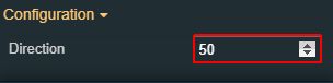 | |
KPI Properties | Allows the user with the possibility to set properties, inside the analysis data model, used to generate the local signals, based on the predefined conventional patterns. The view the list of KPI Data Properties, the user can click the Expand array list button. 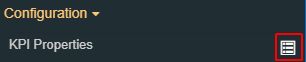 To add new KPI Data Properties, the user click the Add new item button. 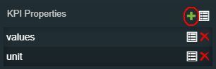 By clicking the Expand the list button, a list of predefined KPI Data Properties is made visible. The list features the following options: key, aggregate, aggregateUnit, values, chartType, color, description, goals, icon, name, object, timestamps, type , and unit. 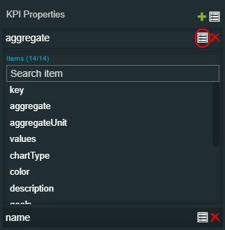 After choosing the desired KPI Data Property, it will be listed here. By clicking the Remove button, the KPI Data Property can be deleted from the list. | |
KPIs | Allows the user with the possibility to add one or multiple patterns used to select the corresponding KPIs. To add KPIs filter patterns, the user can click the Expand array list button.  The view is updated to display the Add new item button. As soon as the Add new item button is clicked, the user can click on the Expand the list button, to view the list of KPIs, available for the current project. NoteThe list of entities is by default filtered to show all possible combinations. The "*" wildcard means "any". 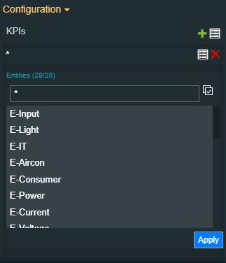 The user can define filter patterns, as follows:
To preserve the selection, the Apply button needs to be clicked. | |
Local Signal Pattern | Sets the proposed naming convention. The pattern can be changed, in order to build a new naming convention. NotePlease keep in mind that the original values (placeholder names) inside the brackets, should be kept the same. 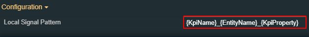 | |
Organizational Units | Allows the user to add one or multiple patterns used to select the corresponding organizational units. To add Organizational Units filter patterns, the user can click the Expand array list button. 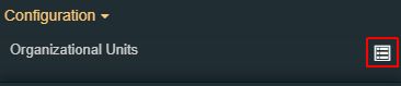 The view is updated to display the Add new item button. As soon as the Add new item button is clicked, the user can click on the Expand the list button, to view the list of Organizational Units, available for the current project. NoteThe list of entities is by default filtered to show all possible combinations. The "*" wildcard means "any". 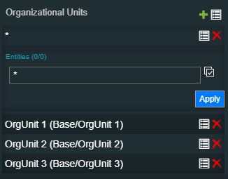 The user can define filter patterns, as follows:
To preserve the selection, the Apply button needs to be clicked. | |
Resolution | Allows the user to select the resolution of the data rendered in the chart (the time interval between two consecutive measurements displayed on the time axis). The user can choose between five predefined resolutions (15 minutes, one hour, one day, one month, and one year) or can set the option on Auto. When the Resolution is set to Auto, the system automatically adjusts the resolution based on the active Time range setting and the current zoom level. 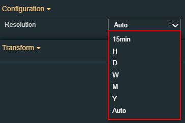 | |
Sites | Allows the user to add one or multiple patterns used to select the corresponding sites. To add Sites filter patterns, the user can click the Expand array list button. 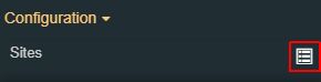 The view is updated to display the Add new item button. As soon as the Add new item button is clicked, the user can click on the Expand the list button, to view the list of Sites, available for the current project. NoteThe list of entities is by default filtered to show all possible combinations. The "*" wildcard means "any". 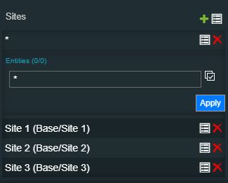 The user can define filter patterns, as follows:
To preserve the selection, the Apply button needs to be clicked. | |
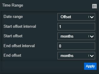
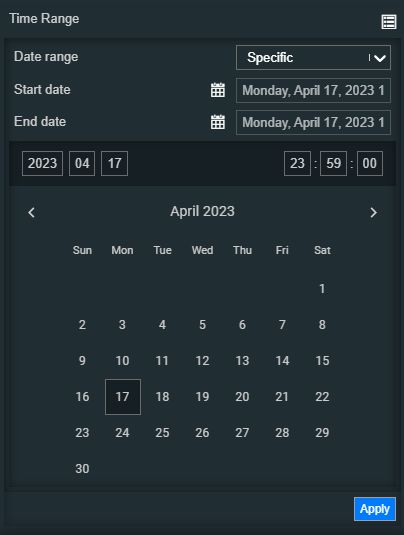
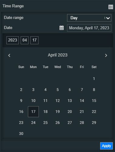
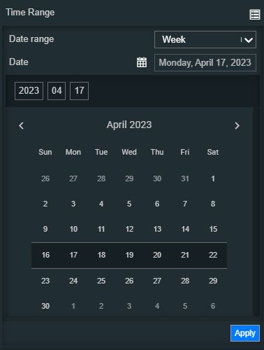
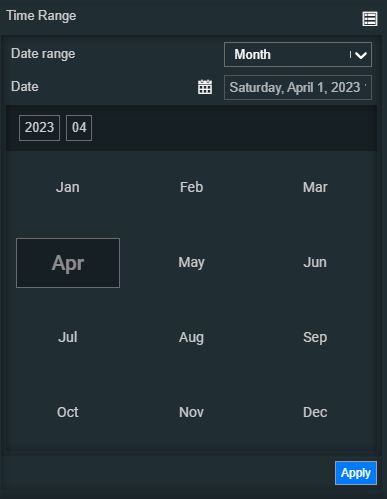
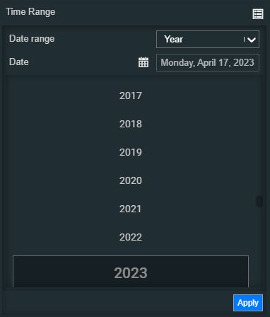
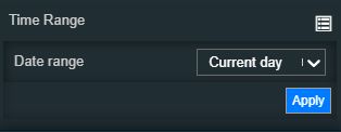
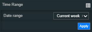
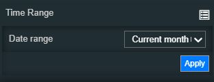
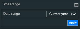
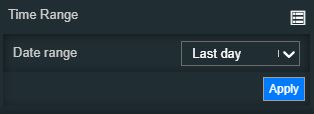
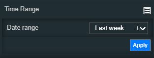
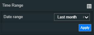
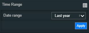
Time Range | Contains a set of time range configurations. By clicking the Expand array list button, a list of modular time range properties is exposed. Based on the selection made for the Date range property, the view is updated accordingly, as follows:
| |
Update rate | Allows the user to specify the update rate in milliseconds. This property will be taken into consideration only if the Alarms Mode is set to Online. 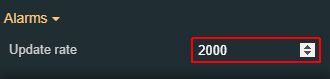 | |
Transform | Angle | Sets the rotation angle using the up and down arrows to increase and decrease, or by manually typing the desired degree value. The component angle can also be adjusted directly on the design surface by means of mouse manipulation. 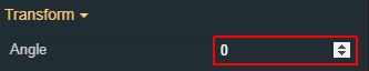 |
Height | Sets the height of the component using the up and down arrows to increase and decrease, or by manually typing the desired pixels value. The component height can also be adjusted directly on the design surface by means of mouse manipulation. 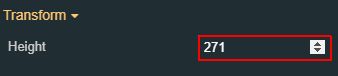 | |
Left | Specifies the X (horizontal) coordinate of the component, on the grid, using the up and down arrows to increase and decrease, or by manually typing the desired value. The component X coordinate can also be adjusted directly on the design surface by means of mouse manipulation.  | |
Top | Specifies the Y (vertical) coordinate of the component, on the grid, using the up and down arrows to increase and decrease, or by manually typing the desired value. The component Y coordinate can also be adjusted directly on the design surface by means of mouse manipulation.  | |
Width | Sets the width of the component using the up and down arrows to increase and decrease, or by manually typing the desired pixels value. The component width can also be adjusted directly on the design surface by means of mouse manipulation.  | |
Disable flip | Disables any flip transformation for this component. This keeps the component in the default position even when its container is flipped.  | |
Horizontal flip | Flips the selected component horizontally.  | |
Vertical flip | Flips the selected component vertically.  |