Input
Here are the i4designer Input components for your new project created on the i4scada platform.
The components under the Input category are a collection of buttons and switches allowing the user to control data or devices, due to their straightforward configurations. Each component will be described in the upcoming articles.
Buffer button
Check out this article and learn more details about the i4designer Buffer button component and the properties it features.
The i4designer Buffer button component is a configurable button used for writing signal values from buffer to signal. The Buffer Button is merely used in the context of buffer writing actions.
Note
When Buffer writing, the user can make changes to as many signals needed, without actually modifying the signal values, but storing those changes in a buffer, ready to be written all at once. This allows the user to take time to fine-tune the signal values and applying all the changes at once, using the Buffer Button.
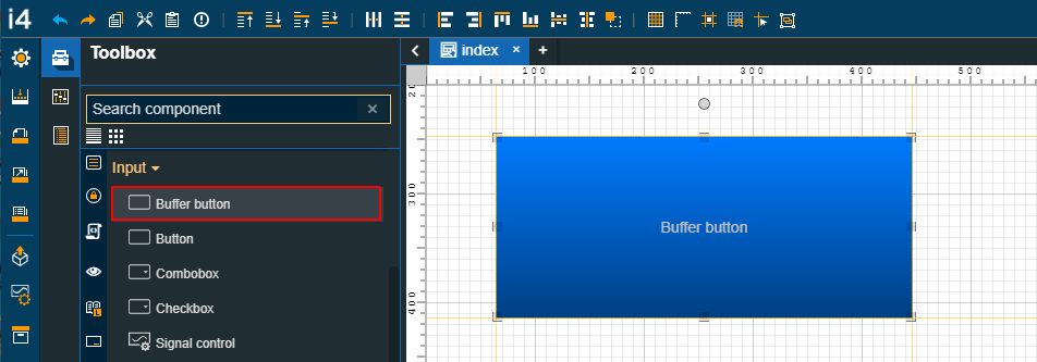
The Buffer button component
Category | Property | Description |
|---|---|---|
Common | Name | The name of the component, visible in other Designer locations (such as Page explorer).  |
Object ID | Sets the Object ID of the component. By defining an object ID for the control, it can be passed as SignalPrefix when using parameter passing in navigation. The value of the Object ID can be used via a placeholder [OID] in other properties of this extension. The placeholder is supported in all signal properties, symbolic text, and states. Example: Setpoint [OID]  | |
Tooltip text | Optional tooltip text, that will be shown on mouseover at runtime.  | |
Security | System authorizations / Permissions | The system authorization required to display the component. If the logged in user does not have this system authorization, the component will not be visible or enabled (depending on the set Security access behavior). If the property is left empty, the component will be visible and enabled for all users. Further on, the user can also add multiple System authorizations / Permissions, separated by comma (,). This property is named "System authorization" for projects created on i4scada platform. 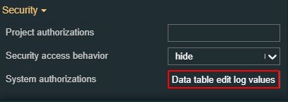 This property is named "Permissions" for projects created on i4connected platform.  |
Project authorizations / Roles | The project authorization required for displaying the component. If the logged in user does not have this project authorization, the component will not be visible or enabled (depending on the set Security access behavior). If the property is left empty, the component will be visible and enabled to all users. Further on, the user can also add multiple Project authorizations / Roles, separated by comma (,). This property is named "Project authorization" for projects created on i4scada platform. 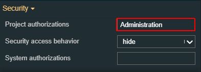 This property is named "Role" for projects created on i4connected platform.  | |
Security access behavior | Sets the behavior of the element to either disabled (grayed out) or hidden, when the logged in user doesn't meet the conditions imposed by the Project authorization / Roles and System authorization / Permissions properties. In case both Project authorization / Roles and System authorization / Permissions properties are set, the logged user needs to meet both conditions to be able to see and utilize the component, at run-time.  | |
Layout | Layout mode | Sets the behavior of the component related to the page placement. The user can select the component layout from the options available in the drop-down list: Default, Dock top, Dock bottom, Dock left, Dock right, Stretched, Pin top left, Pin top center, Pin top right, Pin right middle, Pin bottom right, Pin bottom center, Pin bottom left, Pin left middle and Pin center.  |
Margin | Sets the margin of the component relative to the drawing board area. The supported values are the standard CSS values for the margin. The top, bottom, left and right values can either be typed in the main property field or by using the Margin editor.  The Margin editor can be opened by clicking the Open button  The components margins can be updated by setting the margin value and selecting the desired unit:
| |
Effects | Opacity | Sets the opacity of the component. The Opacity values should be numbers from 0 to 1 representing the opacity of the component. When the component has a value of 0 the element is completely invisible; a value of 1 is completely opaque (solid). By default, the Component's opacity is set to value 1. Using the up/down arrows the user can control the opacity degree.  By clicking the Open button the view is extended to display the Opacity slider.  |
Shadow color | Sets the color of the component's shadow. The user can either manually type in the HEX color code or use the color picker tool.  | |
Shadow offset X | Sets the offset of the shadow on the horizontal axis. The default value can be increased or decreased, either by manually typing in the desired value or by using the up and down arrows.  | |
Shadow offset Y | Sets the offset of the shadow on the vertical axis. The default value can be increased or decreased, either by manually typing in the desired value or by using the up and down arrows.  | |
Shadow size | Sets the width of the component shadow. The default value can be increased or decreased, either by manually typing in the desired value or by using the up and down arrows.  | |
Miscellaneous | Clear Buffer | Indicates if the buffer of the signal values will be cleared or not after the write operation occurs.  |
Configuration | Button text | Sets the text displayed by the button.  |
Image | Allows selection of the image source. By clicking the Upload image button, the user can either drop files in the designated area or click to upload the image from the local machine. Additionally, if any images have been previously uploaded they will be displayed under the content folder and reused. The image upload accepts files of type "jpeg", "jpg", "jpe", "gif", "png", "svg", "ico", "webp", up to 5 MB in size.. 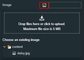 | |
Appearance | CSS Class | Sets the CSS class of the button, selecting from the drop-down list items: btn-primary, btn-warning, btn-success and btn-danger. 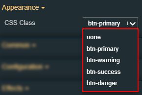 |
Flat | Removes additional visual elements such as shadow or gloss from the component, if the property is set to False.  | |
Padding | Sets the padding of the component (defines the space between the component contents and its border). The top, bottom, left and right values can either be typed in the main property field or by using the Padding editor.  The Padding editor can be opened by clicking the Open button. 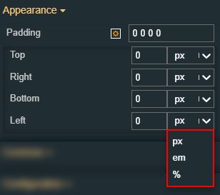 The components padding can be updated by setting the value and the desired unit:
| |
Palette | Background color | Sets the background color of the button. The user can either manually type in the HEX color code or use the color picker tool. As the color palette is injected into this component by means of the default CSS class, applying this property the CSS class settings will be overwritten.  |
Foreground | Sets the foreground color of the button. The user can either manually type in the HEX color code or use the color picker tool. As the color palette is injected into this component by means of the default CSS class, applying this property the CSS class settings will be overwritten. 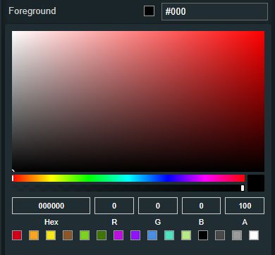 | |
Icon color | Sets the color of the component icon. The user can either manually type in the HEX color code or use the color picker tool. As the color palette is injected into this component by means of the default CSS class, applying this property the CSS class settings will be overwritten. 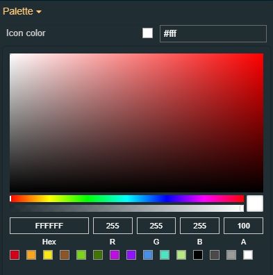 | |
Border color | Sets the color of the component border. The user can either manually type in the HEX color code or use the color picker tool. As the color palette is injected into this component by means of the default CSS class, applying this property the CSS class settings will be overwritten. 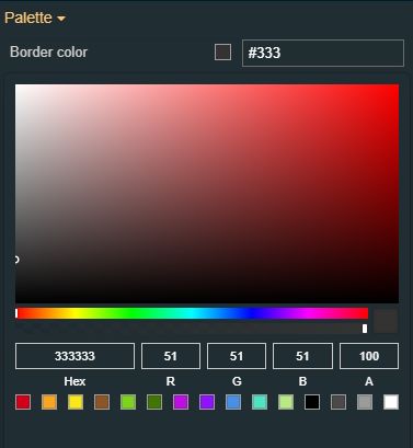 | |
Style | Border radius | Sets the curvature of the border corners expressed in pixels or percentages. The border-radius value can be either manually typed in the designated field or increased/decreased by clicking the up and down arrows.  |
Border width | Sets the width of the container border in pixels. The border width value can be either manually typed in the designated field or increased/decreased by clicking the up and down arrows. 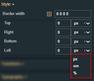 The components border width can be updated by setting the value and the desired unit:
| |
Typography | Font size | Sets the size of the component font, using the up and down arrows to increase and decrease, or by manually typing the desired value.  |
Text alignment | Sets the alignment of the text on the component surface. The text alignment options can be selected from the drop-down list options: auto, left, right and center (default). 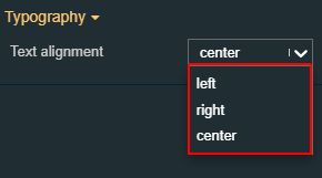 | |
Font weight | Sets the weight of the component font, selecting from the drop-down list options: 900 (fat), 800 (extra-bold), 700 (bold), 600 (semi-bold), 500 (medium), 400 (normal), 300 (light), 200 (extra-light) and 100 (thin). 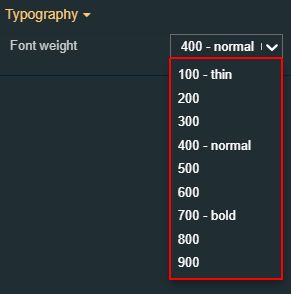 | |
Font family | Sets the font family of the component font, selecting from web-safe fonts available in the drop-down list.  | |
Icon | Icon class | Sets the CSS class for the icon of the component. The icon can be selected from a large number of icons accessible by clicking the Open panel to see the icon list button. The list of icons allows the user to toggle between actual icons and icon names. A simple filtering mechanism is also provided to support the user to easily pinpoint the desired icon. 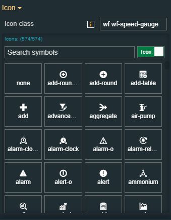 |
States | Current States | A component can have multiple states, each carrying its own set of properties. The user can add states, by clicking the Add new state button. 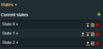 Furthermore, the following actions are available for each state:
|
State Name | By setting the Name property, the respective state will inherit that name, making the States easier to read. 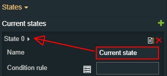 | |
State# Condition rule | The rule to be met in order for the extension to enter the state. The signal names must be always surrounded by percentage (%) characters, followed by logical operators and the Signal value. For example: %Setpoint 1% != 0 The Condition rule can be either manually typed in or generated, using the State editor. The State editor can be opened by clicking the Expand array list button. This way, the user can easily generate a Condition rule, as follows:
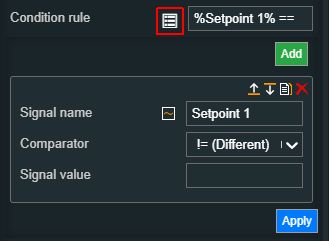 | |
State# CSS class name | Sets the behavior of the element when the logged-in user doesn't belong to the project authorization indicated by the projectAuthorization property. In this case, the element can be either disabled or hidden. 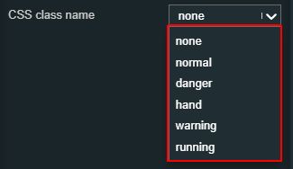 | |
State# Symbolic text | The language-agnostic text (which is automatically translated) is displayed by the extension. 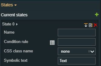 | |
State# Display state | Sets the component visibility and accessibility when the state evolution passed. The user can choose from the following options:
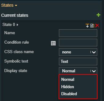 | |
State# Foreground | Sets the foreground color of the button. Applying this property will override the default CSS class. 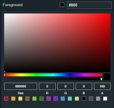 | |
State# Background | Sets the background color of the button. Applying this property will override the default css class. 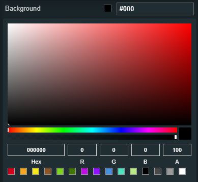 | |
State# Animation | Sets the component animation class when the state evolution passed. The user can select the animation class from the drop-down list options: Fade in, Fade out or Blink. 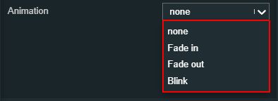 | |
Load from assets | Lists the State assets defined under the Assets management page, of the global actions area. A simple filtering mechanism is also provided to support the user to easily pinpoint the desired state asset. After selecting an asset from the list view, the user can click the Load button to apply it. 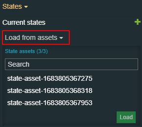 | |
Save to assets | Allows the user the possibility to save a state asset defined during the current session. In this view, the user can either click the Generate name button to set a name for the asset or type in the name in the designated field. By clicking the Apply button, the new state asset will be made available for further management actions in the Assets management page, of the global actions area. Also, the asset can be reused for other Component states. 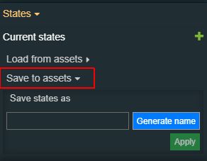 | |
Transform | Width | Sets the width of the component using the up and down arrows to increase and decrease, or by manually typing the desired pixels value. The component width can also be adjusted directly on the design surface by means of mouse manipulation.  |
Height | Sets the height of the component using the up and down arrows to increase and decrease, or by manually typing the desired pixels value. The component height can also be adjusted directly on the design surface by means of mouse manipulation.  | |
Angle | Sets the rotation angle using the up and down arrows to increase and decrease, or by manually typing the desired degree value. The component angle can also be adjusted directly on the design surface by means of mouse manipulation.  | |
Left | Specifies the X (horizontal) coordinate of the component, on the grid, using the up and down arrows to increase and decrease, or by manually typing the desired value. The component X coordinate can also be adjusted directly on the design surface by means of mouse manipulation.  | |
Top | Specifies the Y (vertical) coordinate of the component, on the grid, using the up and down arrows to increase and decrease, or by manually typing the desired value. The component Y coordinate can also be adjusted directly on the design surface by means of mouse manipulation.  | |
Disable flip | Disables any flip transformation for this component. This keeps the component in the default position even when its container is flipped.  | |
Horizontal flip | Flips the selected component horizontally.  | |
Vertical flip | Flips the selected component vertically.  |
Button
Check out this article and learn more details about the i4designer Button component and its properties.
The i4designerButton component is a button-type control that can write values to predefined signals.
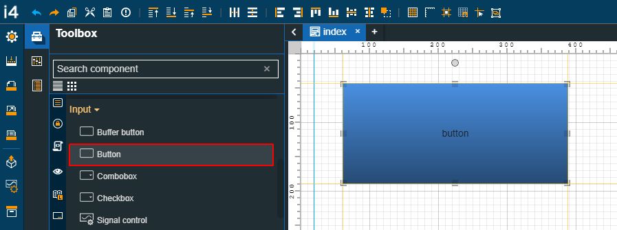
The Button component
Category | Property | Description |
|---|---|---|
Common | Name | The name of the component, visible in other Designer locations (such as Page explorer).  |
Object ID | Sets the Object ID of the component. By defining an object ID for the control, it can be passed as SignalPrefix when using parameter passing in navigation. The value of the Object ID can be used via a placeholder [OID] in other properties of this extension. The placeholder is supported in all signal properties, symbolic texts, and states. Example: Setpoint [OID]  | |
Tooltip text | Optional tooltip text, that will be shown on mouseover at runtime.  | |
Security | System authorizations / Permissions | The system authorization required to display the component. If the logged in user does not have this system authorization, the component will not be visible or enabled (depending on the set Security access behavior). If the property is left empty, the component will be visible and enabled for all users. Further on, the user can also add multiple System authorizations / Permissions, separated by comma (,). This property is named "System authorization" for projects created on i4scada platform.  This property is named "Permissions" for projects created on i4connected platform. 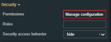 |
Project authorizations / Roles | The project authorization required for displaying the component. If the logged in user does not have this project authorization, the component will not be visible or enabled (depending on the set Security access behavior). If the property is left empty, the component will be visible and enabled to all users. Further on, the user can also add multiple Project authorizations / Roles, separated by comma (,). This property is named "Project authorization" for projects created on i4scada platform.  This property is named "Role" for projects created on i4connected platform.  | |
Security access behavior | Sets the behavior of the element to either disabled (grayed out) or hidden, when the logged in user doesn't meet the conditions imposed by the Project authorization / Roles and System authorization / Permissions properties. In case both Project authorization / Roles and System authorization / Permissions properties are set, the logged user needs to meet both conditions to be able to see and utilize the component, at run-time.  | |
Layout | Layout mode | Sets the behavior of the component related to the page placement. The user can select the component layout from the options available in the drop-down list: Default, Dock top, Dock bottom, Dock left, Dock right, Stretched, Pin top left, Pin top center, Pin top right, Pin right middle, Pin bottom right, Pin bottom center, Pin bottom left, Pin left middle and Pin center.  |
Margin | Sets the margin of the component relative to the drawing board area. The supported values are the standard CSS values for the margin. The top, bottom, left and right values can either be typed in the main property field or by using the Margin editor.  The Margin editor can be opened by clicking the Open button.  The components margins can be updated by setting the margin value and selecting the desired unit:
| |
Effects | Opacity | Sets the opacity of the component. The Opacity values should be numbers from 0 to 1 representing the opacity of the component. When the component has a value of 0 the element is completely invisible; a value of 1 is completely opaque (solid). By default, the Component's opacity is set to value 1. Using the up / down arrows the user can control the opacity degree.  By clicking the Open button the view is extended to display the Opacity slider.  |
Shadow color | Sets the color of the component's shadow. The user can either manually type in the HEX color code or use the color picker tool. 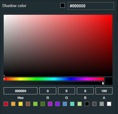 | |
Shadow offset X | Sets the offset of the shadow on the horizontal axis. The default value can be increased or decreased, either by manually typing in the desired value or by using the up and down arrows.  | |
Shadow offset Y | Sets the offset of the shadow on the vertical axis. The default value can be increased or decreased, either by manually typing in the desired value or by using the up and down arrows.  | |
Shadow size | Sets the width of the component shadow. The default value can be increased or decreased, either by manually typing in the desired value or by using the up and down arrows.  | |
Miscellaneous | Signal write items | Allows possibility to add additional items for writing multiple signals, by clicking the Add new item button. 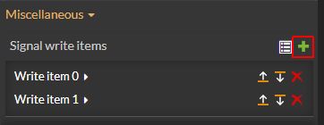 In order to see the list of items, the user can click on the Expand array list button. 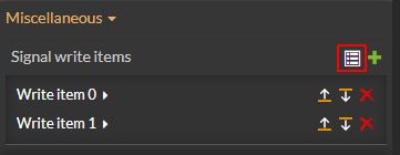 Furthermore, the following actions are available for each item:
|
Write item# Name | Sets the name of the signal that will be represented or manipulated by the component. 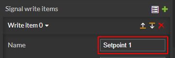 | |
Write item# Value | Sets the signal value that will be considered, at run-time, by the component. 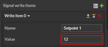 | |
Configuration | Button text | Sets the text displayed by the button.  |
Image | Allows selection of the image source. By clicking the Upload image button, the user can either drop files in the designated area or click to upload the image from the local machine. Additionally, if any images have been previously uploaded they will be displayed under the content folder and reused. The image upload accepts files of type "jpeg", "jpg", "jpe", "gif", "png", "svg", "ico", "webp", up to 5 MB in size.  | |
Increment mode | Activates the increment mode of the button. On writing the value of the property "writeValue" will be added to the current signal value.  | |
Push-button mode | If the property is set to True, the button will write the Write-Up-Value when releasing the mouse button.  | |
Reset on overflow | On writing the value of the signal will be reset, as follows:
This property will be considered only if increment mode is enabled.  | |
Write secure | The signal value will be written into the signal after confirming the password.  | |
Write to buffer | Enables the possibility to locally buffer the signal value, rather than writing it directly into the signal, if the property is set to True.  | |
Write up delay | Sets the delay, in milliseconds, before writing the signal value when releasing the button (on MouseUp event). The delay can be defined by using the up/down values or by manually typing in the desired value.  | |
Appearance | CSS Class | Sets the CSS class of the button, selecting from the drop-down list items: btn-primary, btn-warning, btn-success, and btn-danger.  |
Flat | Enables possibility remove additional visual elements or gloss from the component.  | |
Padding | Sets the padding of the component (defines the space between the component contents and its border). The top, bottom, left and right values can either be typed in the main property field or by using the Padding editor.  The Padding editor can be opened by clicking the Open button.  The components padding can be updated by setting the value and the desired unit:
| |
Icon | Icon class | Sets the CSS class for the icon of the component. The icon can be selected from a large number of icons accessible by clicking the Open panel to see the icon list button. The list of icons allows the user to toggle between actual icons and icon names. A simple filtering mechanism is also provided to support the user to easily pinpoint the desired icon.  |
Signal | Array Delimiter | Defines the delimiter of the values in the array. By default, the comma delimiter is set.  |
Array Index | Defines the index of the displayed value from the array.  | |
Is Array | Sets the values as an array. If the value is true, the property format will no longer be taken into account.  | |
Signal name | Sets the name of the signal that will be represented or manipulated by the component. The user can select the Signal from the list view, by clicking the Open file explorer button, or by directly typing in the name of the desired Signal.  | |
Write value | Sets the value of the signal to be written by the component to the specified signal.  | |
Min value | Sets the minimum value written by the component.  | |
Max value | Sets the maximum value written by the component.  | |
Write up value | The value is written when releasing the button (on the MouseUp event).  | |
Palette | Background color | Sets the background color of the button. The user can either manually type in the HEX color code or use the color picker tool. As the color palette is injected into this component by means of the default CSS class, applying this property the CSS class settings will be overwritten.  |
Foreground | Sets the foreground color of the button. The user can either manually type in the HEX color code or use the color picker tool. As the color palette is injected into this component by means of the default CSS class, applying this property the CSS class settings will be overwritten.  | |
Icon color | Sets the color of the component icon. The user can either manually type in the HEX color code or use the color picker tool. As the color palette is injected into this component by means of the default CSS class, applying this property the CSS class settings will be overwritten.  | |
Border color | Sets the color of the component border. The user can either manually type in the HEX color code or use the color picker tool. As the color palette is injected into this component by means of the default CSS class, applying this property the CSS class settings will be overwritten.  | |
Style | Border radius | Sets the curvature of the border corners expressed in pixels or percentages. The border-radius value can be either manually typed in the designated field or increased/decreased by clicking the up and down arrows.  |
Border width | Sets the width of the container border in pixels. The border width values can be either manually typed in the designated field or increased/decreased by clicking the up and down arrows.  The components border width can be updated by setting the values and the desired unit.
| |
Typography | Font size | Sets the size of the component font, using the up and down arrows to increase and decrease, or by manually typing the desired value.  |
Text alignment | Sets the alignment of the text on the component surface. The text alignment options can be selected from the drop-down list options: auto, left, right and center (default).  | |
Font weight | Sets the weight of the component font, selecting from the drop-down list options: 900 (fat), 800 (extra-bold), 700 (bold), 600 (semi-bold), 500 (medium), 400 (normal), 300 (light), 200 (extra-light) and 100 (thin).  | |
Font family | Sets the font family of the component font, selecting from web-safe fonts available in the drop-down list. 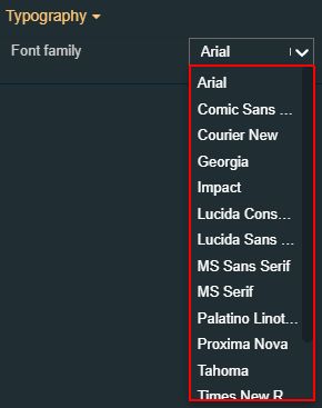 | |
States | Current States | A component can have multiple states, each carrying its own set of properties. The user can add states, by clicking the Add new state button.  Furthermore, the following actions are available for each state:
|
State Name | By setting the Name property, the respective state will inherit that name, making the States easier to read.  | |
State# Condition rule | The rule to be met in order for the extension to enter the state. The signal names must be always surrounded by percentage (%) characters, followed by logical operators and the Signal value. For example: %Setpoint 1% != 0 The Condition rule can be either manually typed in or generated, using the State editor. The State editor can be opened by clicking the Expand array list button. This way, the user can easily generate a Condition rule, as follows:
 | |
State# CSS class name | Sets the behavior of the element when the logged-in user doesn't belong to the project authorization indicated by the projectAuthorization property. In this case, the element can be either disabled or hidden.  | |
State# Symbolic text | The language-agnostic text (which is automatically translated) is displayed by the extension.  | |
State# Display state | Sets the component visibility and accessibility when the state evolution passed. The user can choose from the following options:
 | |
State# Foreground | Sets the foreground color of the button. Applying this property will override the default CSS class. 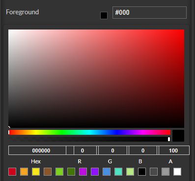 | |
State# Background | Sets the background color of the button. Applying this property will override the default CSS class. 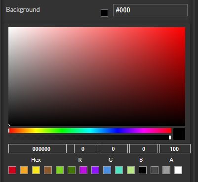 | |
State# Animation | Sets the component animation class when the state evolution passed. The user can select the animation class from the drop-down list options: Fade in, Fade out or Blink.  | |
Load from assets | Lists the State assets defined under the Assets management page, of the global actions area. A simple filtering mechanism is also provided to support the user to easily pinpoint the desired state asset. After selecting an asset from the list view, the user can click the Load button to apply it.  | |
Save to assets | Allows the user the possibility to save a state asset defined during the current session. In this view, the user can either click the Generate name button to set a name for the asset or type in the name in the designated field. By clicking the Apply button, the new state asset will be made available for further management actions in the Assets management page, of the global actions area. Also, the asset can be reused for other Component states.  | |
Transform | Width | Sets the width of the component using the up and down arrows to increase and decrease, or by manually typing the desired pixels value. The component width can also be adjusted directly on the design surface by means of mouse manipulation.  |
Height | Sets the height of the component using the up and down arrows to increase and decrease, or by manually typing the desired pixels value. The component height can also be adjusted directly on the design surface by means of mouse manipulation.  | |
Angle | Sets the rotation angle using the up and down arrows to increase and decrease, or by manually typing the desired degree value. The component angle can also be adjusted directly on the design surface by means of mouse manipulation.  | |
Left | Specifies the X (horizontal) coordinate of the component, on the grid, using the up and down arrows to increase and decrease, or by manually typing the desired value. The component X coordinate can also be adjusted directly on the design surface by means of mouse manipulation.  | |
Top | Specifies the Y (vertical) coordinate of the component, on the grid, using the up and down arrows to increase and decrease, or by manually typing the desired value. The component Y coordinate can also be adjusted directly on the design surface by means of mouse manipulation.  | |
Disable flip | Disables any flip transformation for this component. This keeps the component in the default position even when its container is flipped.  | |
Horizontal flip | Flips the selected component horizontally.  | |
Vertical flip | Flips the selected component vertically.  |
Combobox
Check out this article in order to learn more details about the i4designer Combobox component and the properties it provides.
The Combobox component serves as a drop-down button that can be used for writing various values to signals. The Combobox allows the user to write predefined values by selecting them from the options list. Each option can write a value to the same or different signal, of another i4designer component.
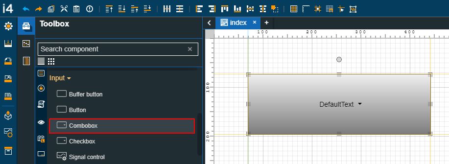
The Combobox component
Category | Property | Description |
|---|---|---|
Common | Name | The name of the component, visible in other Designer locations (such as Page explorer).  |
Object ID | Sets the Object ID of the component. By defining an object ID for the control, it can be passed as SignalPrefix when using parameter passing in navigation. The value of the Object ID can be used via a placeholder [OID] in other properties of this extension. The placeholder is supported in all signal properties, symbolic texts and states. Example: Setpoint [OID]  | |
Tooltip text | Optional tooltip text, that will be shown on mouseover at runtime.  | |
Security | System authorizations / Permissions | The system authorization required to display the component. If the logged in user does not have this system authorization, the component will not be visible or enabled (depending on the set Security access behavior). If the property is left empty, the component will be visible and enabled for all users. Further on, the user can also add multiple System authorizations / Permissions, separated by comma (,). This property is named "System authorization" for projects created on i4scada platform.  This property is named "Permissions" for projects created on i4connected platform.  |
Project authorizations / Roles | The project authorization required for displaying the component. If the logged in user does not have this project authorization, the component will not be visible or enabled (depending on the set Security access behavior). If the property is left empty, the component will be visible and enabled to all users. Further on, the user can also add multiple Project authorizations / Roles, separated by comma (,). This property is named "Project authorization" for projects created on i4scada platform.  This property is named "Role" for projects created on i4connected platform.  | |
Security access behavior | Sets the behavior of the element to either disabled (grayed out) or hidden, when the logged in user doesn't meet the conditions imposed by the Project authorization / Roles and System authorization / Permissions properties. In case both Project authorization / Roles and System authorization / Permissions properties are set, the logged user needs to meet both conditions to be able to see and utilize the component, at run-time.  | |
Layout | Layout mode | Sets the behavior of the component related to the page placement. The user can select the component layout from the options available in the drop-down list: Default, Dock top, Dock bottom, Dock left, Dock right, Stretched, Pin top left, Pin top center, Pin top right, Pin right middle, Pin bottom right, Pin bottom center, Pin bottom left, Pin left middle and Pin center.  |
Margin | Sets the margin of the component relative to the drawing board area. The supported values are the standard CSS values for the margin. The top, bottom, left and right values can either be typed in the main property field or by using the Margin editor.  The Margin editor can be opened by clicking the Open button.  The components margins can be updated by setting the margin value and selecting the desired unit:
| |
Effects | Opacity | Sets the opacity of the component. The Opacity values should be numbers from 0 to 1 representing the opacity of the component. When the component has a value of 0 the element is completely invisible; a value of 1 is completely opaque (solid). By default, the Component's opacity is set to value 1. Using the up / down arrows the user can control the opacity degree.  By clicking the Open button the view is extended to display the Opacity slider.  |
Shadow color | Sets the color of the component's shadow. The user can either manually type in the HEX color code or use the color picker tool.  | |
Shadow offset X | Sets the offset of the shadow on the horizontal axis. The default value can be increased or decreased, either by manually typing in the desired value or by using the up and down arrows.  | |
Shadow offset Y | Sets the offset of the shadow on the vertical axis. The default value can be increased or decreased, either by manually typing in the desired value or by using the up and down arrows.  | |
Shadow size | Sets the width of the component shadow. The default value can be increased or decreased, either by manually typing in the desired value or by using the up and down arrows.  | |
Appearance | CSS Class | Sets the CSS class displayed when the component is in a normal (default) state. The CSS class can be selected from the drop-down list options: btn-primary, btn-warning, btn-success, btn-danger.  |
Padding | Sets the padding of the component (defines the space between the component contents and its border). The top, bottom, left and right values can either be typed in the main property field or by using the Padding editor.  The Padding editor can be opened by clicking the Open button.  The components padding can be updated by setting the value and the desired unit:
| |
Configuration | Symbolic text normal state | Sets a language-agnostic text (which is automatically translated) displayed by the component when it is in normal (default) state.  |
Write to buffer | Enables the possibility to locally buffer the signal value, rather than writing it directly into the signal, if the property is set to True. Writing should be done via the Buffer button component.  | |
Write secure | The signal value will be written to the signal only after confirming the password of the user.  | |
Palette | Background color | Sets the background color of the button. The user can either manually type in the HEX color code or use the color picker tool. As the color palette is injected into this component by means of the default CSS class, applying this property the CSS class settings will be overwritten.  |
Foreground | Sets the foreground color of the button. The user can either manually type in the HEX color code or use the color picker tool. As the color palette is injected into this component by means of the default CSS class, applying this property the CSS class settings will be overwritten.  | |
Border color | Sets the color of the component border. The user can either manually type in the HEX color code or use the color picker tool. As the color palette is injected into this component by means of the default CSS class, applying this property the CSS class settings will be overwritten.  | |
Style | Border radius | Sets the width of the container border in pixels. The border width values can be either manually typed in the designated field or increased/decreased by clicking the up and down arrows.  |
Border width | Sets the curvature of the border corners expressed in pixels or percentages. The border-radius value can be either manually typed in the designated field or increased/decreased by clicking the up and down arrows.  The components border width can be updated by setting the values and the desired unit:
| |
Typography | Font size | Sets the size of the component font, using the up and down arrows to increase and decrease, or by manually typing the desired value.  |
Text alignment | Sets the alignment of the text on the component surface. The text alignment options can be selected from the drop-down list options: auto, left, right and center (default).  | |
Font weight | Sets the weight of the component font, selecting from the drop-down list options: 900 (fat), 800 (extra-bold), 700 (bold), 600 (semi-bold), 500 (medium), 400 (normal), 300 (light), 200 (extra-light) and 100 (thin).  | |
Font family | Sets the font family of the component font, selecting from web-safe fonts available in the drop-down list.  | |
Signal | Signal write items | Allows possibility to add additional items for writing multiple signals, by clicking the Add new item button.  To see the list of items the user can click on the Expand array list button.  Furthermore, the following actions are available for each item:
|
Write item# Name | Sets the name of the signal that will be represented or manipulated by the component.  | |
Write item# Value | Sets the signal value that will be considered, at run-time, by the component.  | |
Transform | Width | Sets the width of the component using the up and down arrows to increase and decrease, or by manually typing the desired pixels value. The component width can also be adjusted directly on the design surface by means of mouse manipulation.  |
Height | Sets the height of the component using the up and down arrows to increase and decrease, or by manually typing the desired pixels value. The component height can also be adjusted directly on the design surface by means of mouse manipulation.  | |
Angle | Sets the rotation angle using the up and down arrows to increase and decrease, or by manually typing the desired degree value. The component angle can also be adjusted directly on the design surface by means of mouse manipulation.  | |
Left | Specifies the X (horizontal) coordinate of the component, on the grid, using the up and down arrows to increase and decrease, or by manually typing the desired value. The component X coordinate can also be adjusted directly on the design surface by means of mouse manipulation.  | |
Top | Specifies the Y (vertical) coordinate of the component, on the grid, using the up and down arrows to increase and decrease, or by manually typing the desired value. The component Y coordinate can also be adjusted directly on the design surface by means of mouse manipulation.  | |
Disable flip | Disables any flip transformation for this component. This keeps the component in the default position even when its container is flipped.  | |
Horizontal flip | Flips the selected component horizontally.  | |
Vertical flip | Flips the selected component vertically.  |
Checkbox
Check out this article in order to learn more details about the i4designer Checkbox component and the properties it features.
The i4designer Checkbox component can be configured to write a predefined value to a predefined signal for its checked position and a different value for its unchecked position. The control can also start (at run-time) in a predefined position, writing the corresponding value to the signal.
The checked and unchecked position toggling can be done with a single click (check on mouse down and uncheck on mouse up) or it can have the standard behavior where clicking once checks the box and clicking the second time unchecks the box.
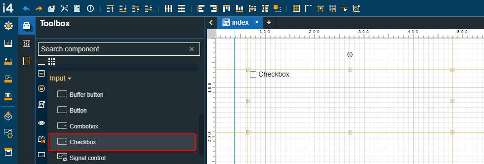
The Checkbox component
Category | Property | Description |
|---|---|---|
Common | Name | The name of the component, visible in other Designer locations (such as Page explorer).  |
Object ID | Sets the Object ID of the component. By defining an object ID for the control, it can be passed as SignalPrefix when using parameter passing in navigation. The value of the Object ID can be used via a placeholder [OID] in other properties of this extension. The placeholder is supported in all signal properties, symbolic texts, and states. Example: Setpoint [OID]  | |
Tooltip text | Optional tooltip text, that will be shown on mouseover at runtime.  | |
Security | System authorization / Permission | The system authorization required to display the component. If the logged in user does not have this system authorization, the component will not be visible or enabled (depending on the set Security access behavior). If the property is left empty, the component will be visible and enabled for all users. Further on, the user can also add multiple System authorizations / Permissions, separated by comma (,). This property is named "System authorization" for projects created on i4scada platform.  This property is named "Permissions" for projects created on i4connected platform.  |
Project authorization / Role | The system authorization required to display the component. If the logged in user does not have this system authorization, the component will not be visible or enabled (depending on the set Security access behavior). If the property is left empty, the component will be visible and enabled for all users. Further on, the user can also add multiple System authorizations / Permissions, separated by comma (,). This property is named "Project authorization" for projects created on i4scada platform.  This property is named "Role" for projects created on i4connected platform.  | |
Security access behavior | Sets the behavior of the element to either disabled (grayed out) or hidden, when the logged in user doesn't meet the conditions imposed by the Project authorization / Roles and System authorization / Permissions properties. In case both Project authorization / Roles and System authorization / Permissions properties are set, the logged user needs to meet both conditions to be able to see and utilize the component, at run-time.  | |
Layout | Layout mode | Sets the behavior of the component related to the page placement. The user can select the component layout from the options available in the drop-down list: Default, Dock top, Dock bottom, Dock left, Dock right, Stretched, Pin top left, Pin top center, Pin top right, Pin right middle, Pin bottom right, Pin bottom center, Pin bottom left, Pin left middle and Pin center.  |
Margin | Sets the margin of the component relative to the drawing board area. The supported values are the standard CSS values for the margin. The top, bottom, left and right values can either be typed in the main property field or by using the Margin editor.  The Margin editor can be opened by clicking the Open button.  The components margins can be updated by setting the margin value and selecting the desired unit:
| |
Effects | Opacity | Sets the opacity of the component. The Opacity values should be numbers from 0 to 1 representing the opacity of the component. When the component has a value of 0 the element is completely invisible; a value of 1 is completely opaque (solid). By default, the Component's opacity is set to value 1. Using the up / down arrows the user can control the opacity degree.  By clicking the Open button the view is extended to display the Opacity slider.  |
Shadow color | Sets the color of the component's shadow. The user can either manually type in the HEX color code or use the color picker tool. 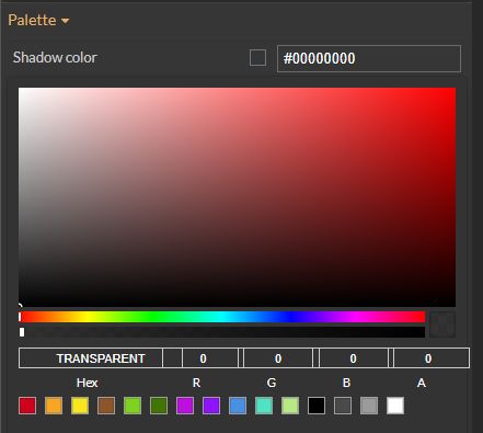 | |
Shadow offset X | Sets the offset of the shadow on the horizontal axis. The default value can be increased or decreased, either by manually typing in the desired value or by using the up and down arrows.  | |
Shadow offset Y | Sets the offset of the shadow on the vertical axis. The default value can be increased or decreased, either by manually typing in the desired value or by using the up and down arrows.  | |
Shadow size | Sets the width of the component shadow. The default value can be increased or decreased, either by manually typing in the desired value or by using the up and down arrows.  | |
Signal | Checked value | Allows the user to set the value to be written to the signal when the checkbox state is checked.  |
Signal name | Sets the name of the signal that will be represented or manipulated by the component. The user can select the Signal from the list view, by clicking the Open file explorer button, or by directly typing in the name of the desired Signal. 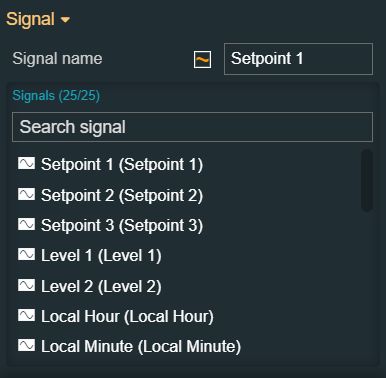 | |
Unchecked value | Allows the user to set the value to be written to the signal when the checkbox state is unchecked. 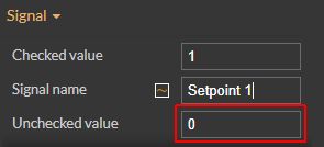 | |
Configuration | Checkbox text | Allows the user to set the text displayed by the checkbox element.  |
Datetime format | Selects the time and date format for the DateTime Signal values. Available tokens are - YYYY, YY, Y, Q, MM, MMM, MMMM, D, DD. Further information is available in the "Year, month, and day tokens" chapter under https://momentjs.com/docs/#/parsing/string-format/. For example: M/d/yyyy  | |
Is alphanumeric | Defines the signal value as alphanumeric. If true the signal value will not be considered pure numeric and will be displayed without taking into account the Format property.  | |
Is datetime | Defines if the signal value should be shown as a DateTime type format. This property should be enabled only if a DateTime format was previously selected.  | |
Write secure | The signal value will be written to the signal only after confirming the password of the user.  | |
Write to buffer | Enables the possibility to locally buffer the signal value, rather than writing it directly into the signal, if the property is set to True. Writing should be done via the Buffer button component.  | |
Transform | Angle | Sets the rotation angle using the up and down arrows to increase and decrease, or by manually typing the desired degree value. The component angle can also be adjusted directly on the design surface by means of mouse manipulation.  |
Height | Sets the height of the component using the up and down arrows to increase and decrease, or by manually typing the desired pixels value. The component height can also be adjusted directly on the design surface by means of mouse manipulation.  | |
Left | Specifies the X (horizontal) coordinate of the component, on the grid, using the up and down arrows to increase and decrease, or by manually typing the desired value. The component X coordinate can also be adjusted directly on the design surface by means of mouse manipulation.  | |
Top | Specifies the Y (vertical) coordinate of the component, on the grid, using the up and down arrows to increase and decrease, or by manually typing the desired value. The component Y coordinate can also be adjusted directly on the design surface by means of mouse manipulation.  | |
Width | Sets the width of the component using the up and down arrows to increase and decrease, or by manually typing the desired pixels value. The component width can also be adjusted directly on the design surface by means of mouse manipulation.  | |
Disable flip | Disables any flip transformation for this component. This keeps the component in the default position even when its container is flipped.  | |
Horizontal flip | Flips the selected component horizontally.  | |
Vertical flip | Flips the selected component vertically.  |
Radio buttons
Check out this article in order to learn more details about the i4designer Radio buttons component and the properties it provides.
The Radio buttons component allows the user to select and write multiple values to a preselected Signal.
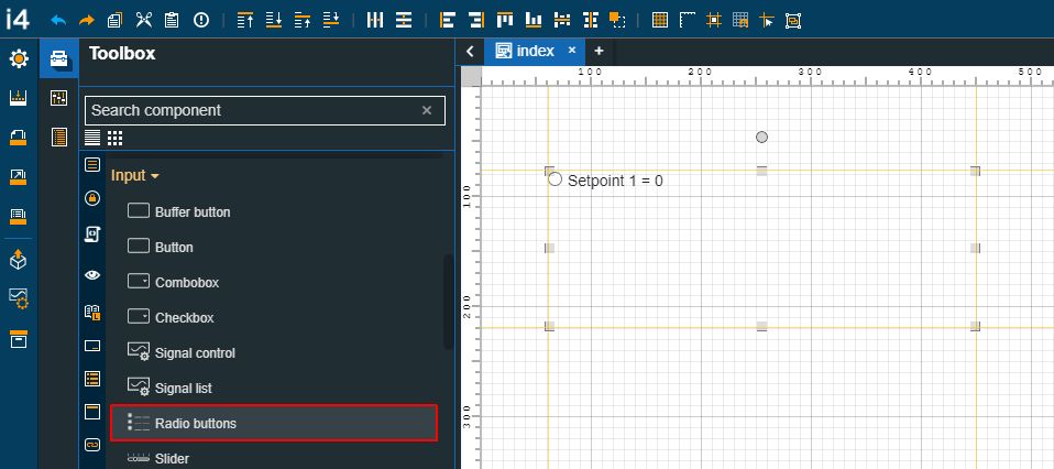
The Radio buttons component
Category | Property | Description |
|---|---|---|
Common | Name | The name of the component, visible in other Designer locations (such as Page explorer).  |
Object ID | Sets the Object ID of the component. By defining an object ID for the control, it can be passed as SignalPrefix when using parameter passing in navigation. The value of the Object ID can be used via a placeholder [OID] in other properties of this extension. The placeholder is supported in all signal properties, symbolic texts, and states. Example: Setpoint [OID]  | |
Tooltip text | Optional tooltip text, that will be shown on mouseover at runtime.  | |
Security | System authorizations / Permissions | The system authorization required to display the component. If the logged in user does not have this system authorization, the component will not be visible or enabled (depending on the set Security access behavior). If the property is left empty, the component will be visible and enabled for all users. Further on, the user can also add multiple System authorizations / Permissions, separated by comma (,). This property is named "System authorization" for projects created on i4scada platform.  This property is named "Permissions" for projects created on i4connected platform.  |
Project authorizations / Roles | The project authorization required for displaying the component. If the logged in user does not have this project authorization, the component will not be visible or enabled (depending on the set Security access behavior). If the property is left empty, the component will be visible and enabled to all users. Further on, the user can also add multiple Project authorizations / Roles, separated by comma (,). This property is named "Project authorization" for projects created on i4scada platform.  This property is named "Role" for projects created on i4connected platform.  | |
Security access behavior | Sets the behavior of the element to either disabled (grayed out) or hidden, when the logged in user doesn't meet the conditions imposed by the Project authorization / Roles and System authorization / Permissions properties. In case both Project authorization / Roles and System authorization / Permissions properties are set, the logged user needs to meet both conditions to be able to see and utilize the component, at run-time.  | |
Layout | Layout mode | Sets the behavior of the component related to the page placement. The user can select the component layout from the options available in the drop-down list: Default, Dock top, Dock bottom, Dock left, Dock right, Stretched, Pin top left, Pin top center, Pin top right, Pin right middle, Pin bottom right, Pin bottom center, Pin bottom left, Pin left middle and Pin center.  |
Margin | Sets the margin of the component relative to the drawing board area. The supported values are the standard CSS values for the margin. The top, bottom, left and right values can either be typed in the main property field or by using the Margin editor.  The Margin editor can be opened by clicking the Open button.  The components margins can be updated by setting the margin value and selecting the desired unit:
| |
Effects | Opacity | Sets the opacity of the component. The Opacity values should be numbers from 0 to 1 representing the opacity of the component. When the component has a value of 0 the element is completely invisible; a value of 1 is completely opaque (solid). By default, the Component's opacity is set to value 1. Using the up / down arrows the user can control the opacity degree.  By clicking the Open button the view is extended to display the Opacity slider.  |
Shadow color | Sets the color of the component's shadow. The user can either manually type in the HEX color code or use the color picker tool.  | |
Shadow offset X | Sets the offset of the shadow on the horizontal axis. The default value can be increased or decreased, either by manually typing in the desired value or by using the up and down arrows.  | |
Shadow offset Y | Sets the offset of the shadow on the vertical axis. The default value can be increased or decreased, either by manually typing in the desired value or by using the up and down arrows.  | |
Shadow size | Sets the width of the component shadow. The default value can be increased or decreased, either by manually typing in the desired value or by using the up and down arrows.  | |
Signal | Signal name | Sets the name of the signal that will be represented or manipulated by the component. The user can select the Signal from the list view, by clicking the Open file explorer button, or by directly typing in the name of the desired Signal.  |
Values | Sets the Signal values, allowing the user to define as many Signal values as needed. By clicking the Expand array list 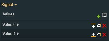 By using the following action buttons, the user can manage the list of Signal values:
Each Signal value item allows the user to insert a value for the Signal. 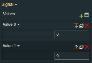 | |
Configuration | Write secure | Enables the possibility to locally buffer the signal value, rather than writing it directly into the signal, if the property is set to True.  |
Write to buffer | The signal value will be written to the signal only after confirming the password of the user.  | |
Miscellaneous | Show inline | Changes the display of the radio buttons array into a single line and not as a list, as they are by default parsed.  |
Transform | Width | Sets the width of the component using the up and down arrows to increase and decrease, or by manually typing the desired pixels value. The component width can also be adjusted directly on the design surface by means of mouse manipulation.  |
Height | Sets the height of the component using the up and down arrows to increase and decrease, or by manually typing the desired pixels value. The component height can also be adjusted directly on the design surface by means of mouse manipulation.  | |
Angle | Sets the rotation angle using the up and down arrows to increase and decrease, or by manually typing the desired degree value. The component angle can also be adjusted directly on the design surface by means of mouse manipulation.  | |
Left | Specifies the X (horizontal) coordinate of the component, on the grid, using the up and down arrows to increase and decrease, or by manually typing the desired value. The component X coordinate can also be adjusted directly on the design surface by means of mouse manipulation.  | |
Top | Specifies the Y (vertical) coordinate of the component, on the grid, using the up and down arrows to increase and decrease, or by manually typing the desired value. The component Y coordinate can also be adjusted directly on the design surface by means of mouse manipulation.  | |
Disable flip | Disables any flip transformation for this component. This keeps the component in the default position even when its container is flipped.  | |
Horizontal flip | Flips the selected component horizontally.  | |
Vertical flip | Flips the selected component vertically.  |
Signal control
Check out this article in order to learn more details about the i4designer Signal control component and the properties it provides.
The Signal control component is a date display control that can display a preselected Signal value. If a set of conditions are fulfilled, the user can also change the Signal value at run-time. More details of the properties used by this component, at design time can be read in the below table.

The Signal control component
Category | Property | Description |
|---|---|---|
Common | Name | The name of the component, visible in other Designer locations (such as Page explorer).  |
Object ID | Sets the Object ID of the component. By defining an object ID for the control, it can be passed as SignalPrefix when using parameter passing in navigation. The value of the Object ID can be used via a placeholder [OID] in other properties of this extension. The placeholder is supported in all signal properties, symbolic text, and states. Example: Setpoint [OID]  | |
Tooltip text | Optional tooltip text, that will be shown on mouseover at runtime.  | |
Security | System authorizations / Permissions | The system authorization required to display the component. If the logged in user does not have this system authorization, the component will not be visible or enabled (depending on the set Security access behavior). If the property is left empty, the component will be visible and enabled for all users. Further on, the user can also add multiple System authorizations / Permissions, separated by comma (,). This property is named "System authorization" for projects created on i4scada platform.  This property is named "Permissions" for projects created on i4connected platform.  |
Project authorizations / Roles | The project authorization required for displaying the component. If the logged in user does not have this project authorization, the component will not be visible or enabled (depending on the set Security access behavior). If the property is left empty, the component will be visible and enabled to all users. Further on, the user can also add multiple Project authorizations / Roles, separated by comma (,). This property is named "Project authorization" for projects created on i4scada platform.  This property is named "Role" for projects created on i4connected platform.  | |
Security access behavior | Sets the behavior of the element to either disabled (grayed out) or hidden, when the logged in user doesn't meet the conditions imposed by the Project authorization / Roles and System authorization / Permissions properties. In case both Project authorization / Roles and System authorization / Permissions properties are set, the logged user needs to meet both conditions to be able to see and utilize the component, at run-time.  | |
Layout | Layout mode | Sets the behavior of the component related to the page placement. The user can select the component layout from the options available in the drop-down list: Default, Dock top, Dock bottom, Dock left, Dock right, Stretched, Pin top left, Pin top center, Pin top right, Pin right middle, Pin bottom right, Pin bottom center, Pin bottom left, Pin left middle and Pin center.  |
Margin | Sets the margin of the component relative to the drawing board area. The supported values are the standard CSS values for the margin. The top, bottom, left and right values can either be typed in the main property field or by using the Margin editor.  The Margin editor can be opened by clicking the Open button.  The component's margins can be updated by setting the margin value and selecting the desired unit:
| |
Popover position | Sets the position of the confirmation popover. 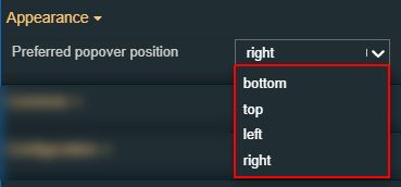 | |
Effects | Opacity | Sets the opacity of the component. The Opacity values should be numbers from 0 to 1 representing the opacity of the component. When the component has a value of 0 the element is completely invisible; a value of 1 is completely opaque (solid). By default, the Component's opacity is set to value 1. Using the up / down arrows the user can control the opacity degree.  By clicking the Open button the view is extended to display the Opacity slider.  |
Shadow color | Sets the color of the component's shadow. The user can either manually type in the HEX color code or use the color picker tool.  | |
Shadow offset X | Sets the offset of the shadow on the horizontal axis. The default value can be increased or decreased, either by manually typing in the desired value or by using the up and down arrows.  | |
Shadow offset Y | Sets the offset of the shadow on the vertical axis. The default value can be increased or decreased, either by manually typing in the desired value or by using the up and down arrows.  | |
Shadow size | Sets the width of the component shadow. The default value can be increased or decreased, either by manually typing in the desired value or by using the up and down arrows.  | |
Icon | Icon class | Sets the CSS class for the icon of the component. The icon can be selected from a large number of icons accessible by clicking the Open panel to see the icon list button. The list of icons allows the user to toggle between actual icons and icon names. A simple filtering mechanism is also provided to support the user to easily pinpoint the desired icon. 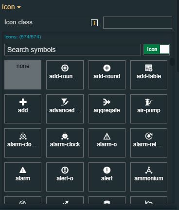 |
Signal | Signal name | Sets the name of the signal that will be represented or manipulated by the component. The user can select the Signal from the list view, by clicking the Open file explorer button, or by directly typing in the name of the desired Signal.  |
Signal name format | Defines the format in which the signal information appears. The Signal name format property supports these formats, written between square brackets: [name] [value] [unit] [description], therefore, at run-time, the Signal name, current value, unit of measure, and description will be displayed. By default, these components will have the Signal name format property populated with the “[name]” value. The user can add other available formats, such as [value] [unit] [description], with or without space between them, separated by any type of separator (e.g. dot, comma, or semicolon). The information will be visible at both run-time and design time.  | |
Signal name label | Enables the possibility to show the Signal name, if the property is set to True.  | |
Configuration | Show confirmation | Enables the possibility to show the confirmation button used to ensure that the new value will be written if the property is set to True.  |
DateTime format | Selects the format in which the date and time are displayed by the component, at run-time. Available tokens are - YYYY, YY, Y, Q, MM, MMM, MMMM, D, DD. Further information is available in the "Year, month, and day tokens" chapter under https://momentjs.com/docs/#/parsing/string-format/. For example: DD.MM.YYYY hh:mm:ss  | |
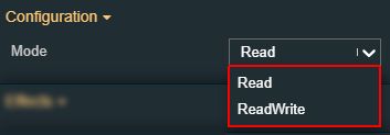
Mode | Sets Read/Write permissions applied to the Signal used by the component. The user can select from the following drop-down list options:
 | |
Is alphanumeric | Defines the signal value as alphanumeric. If true the signal value will not be considered as pure numeric and will be displayed without taking into account the Format property.  | |
Is datetime | Defines if the signal value should be shown as a DateTime type format. This property should be enabled only if a DateTime format was previously selected.  | |
Label text | Defines if the signal value should be shown as a DateTime type format. This property should be enabled only if a DateTime format was previously selected.  | |
Static unit text | Replaces the signal unit with the defined static string. The Unit label property has to be true to display the Static unit text property.  | |
Signal changed duration | Sets the amount of time required by the additional CSS class to be applied to the control by the signal value change, using the up and down arrows to increase and decrease, or by manually typing the desired value.  | |
Signal changed class | Sets the CSS class that will be applied to the component when the designated signal changes value. The user can select from the predefined options none, warning, danger, or success. 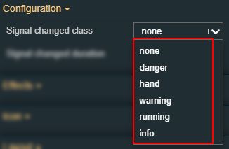 | |
Write to buffer | Enables the possibility to locally buffer the signal value, rather than writing it directly into the signal, if the property is set to True. Writing should be done via the Buffer button component.  | |
Write secure | The signal value will be written into the signal after confirming the password.  | |
Value format | Sets the format of numerical values. The available numeric formats can be found under https://github.com/adamwdraper/Numeral-js.  | |
Appearance | Label text-align | Sets the text alignment of the component label. 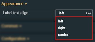 |
Label visibility | Allows the possibility to enable /disable the visibility of the Signal name label. If the property is set to True the Signal label will be visible.  | |
Unit text-align | Sets the text alignment for the component unit, by selecting from the drop-down list options: left, right, or center. 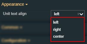 | |
Unit visibility | Allows the possibility to enable /disable the visibility of the Signal unit. If the property is set to True the unit label will be visible.  | |
Value text-align | Sets the text alignment of the component value. 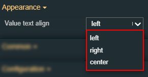 | |
Palette | Label background | Sets the background color for the label of the component. The user can either manually type in the HEX color code or use the color picker tool. As the color palette is injected into this component by means of the default CSS class, applying this property the CSS class settings will be overwritten. 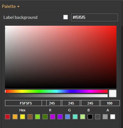 |
Label foreground | Sets the foreground color for the label of the component. The user can either manually type in the HEX color code or use the color picker tool. As the color palette is injected into this component by means of the default CSS class, applying this property the CSS class settings will be overwritten. 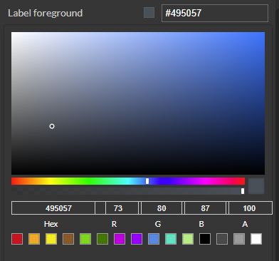 | |
Label border-color | Sets the foreground color for the label of the component. The user can either manually type in the HEX color code or use the color picker tool. As the color palette is injected into this component by means of the default CSS class, applying this property the CSS class settings will be overwritten. 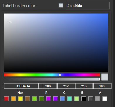 | |
Value background | Sets the background color for the component value area. The user can either manually type in the HEX color code or use the color picker tool. As the color palette is injected to this component by means of the default CSS class, applying this property the CSS class settings will be overwritten. 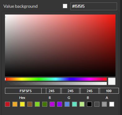 | |
Value foreground | Sets the border color for the component value area. The user can either manually type in the HEX color code or use the color picker tool. As the color palette is injected into this component by means of the default CSS class, applying this property the CSS class settings will be overwritten.  | |
Value border color | Sets the border color for the component value area. The user can either manually type in the HEX color code or use the color picker tool. As the color palette is injected into this component by means of the default CSS class, applying this property the CSS class settings will be overwritten.  | |
Unit background | Sets the background color for the component unit label. The user can either manually type in the HEX color code or use the color picker tool. As the color palette is injected into this component by means of the default CSS class, applying this property the CSS class settings will be overwritten.  | |
Unit foreground | Sets the background color for the component unit label. The user can either manually type in the HEX color code or use the color picker tool. As the color palette is injected into this component by means of the default CSS class, applying this property the CSS class settings will be overwritten. 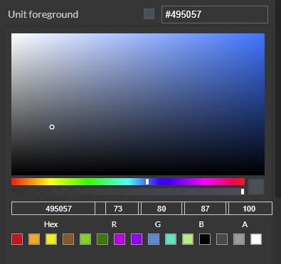 | |
Unit border-color | Sets the border color for the component unit label. The user can either manually type in the HEX color code or use the color picker tool. As the color palette is injected into this component by means of the default CSS class, applying this property the CSS class settings will be overwritten. 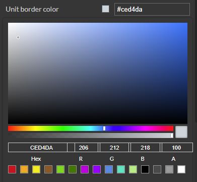 | |
Typography | Font size | Sets the size of the component font, using the up and down arrows to increase and decrease, or by manually typing the desired value.  |
Font weight | Sets the weight of the component font, selecting from the drop-down list options: 900 (fat), 800 (extra-bold), 700 (bold), 600 (semi-bold), 500 (medium), 400 (normal), 300 (light), 200 (extra-light) and 100 (thin).  | |
Font family | Sets the font family of the component font, selecting from web-safe fonts available in the drop-down list.  | |
Style | Label border width | Sets the width of the space designated for the label border. The Label border editor can be opened by clicking the Open button. 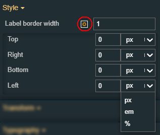 The border width of the component's label can be updated by setting the desired value and selecting the unit:
|
Label width | Sets the width of the space designated for the label, expressed in pixels. The user can increase or decrease the value, using the up / down arrows or by manually typing in the desired value.  | |
Unit border width | Sets the width of the space designated for the unit border. The Unit border editor can be opened by clicking the Open button. 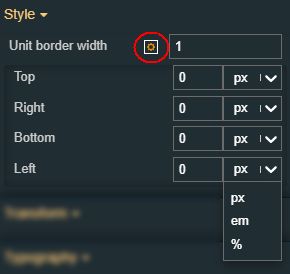 The border width of the unit can be updated by setting the desired value and selecting the unit:
| |
Unit width | Sets the width of the space designated for the unit expressed in pixels. The user can increase or decrease the value, using the up / down arrows by manually typing in the desired value.  | |
Value border width | Sets the width of the space designated for the signal value border. The Value border editor can be opened by clicking the Open button. 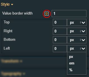 The border width of the value can be updated by setting the desired value and selecting the unit:
| |
States | Current States | A component can have multiple states, each carrying its own set of properties. The user can add states, by clicking the Add new state button.  Furthermore, the following actions are available for each state:
|
State Name | By setting the Name property, the respective state will inherit that name, making the States easier to read.  | |
State# Condition rule | The required rule in order for the extension to enter the state. The signal names must be always surrounded by percentage (%) characters, followed by logical operators and the Signal value. For example: %Setpoint 1% != 0 The Condition rule can be either manually typed in or generated, using the State editor. The State editor can be opened by clicking the Expand array list button. This way, the user can easily generate a Condition rule, as follows:
 | |
State# CSS class name | Sets the behavior of the element when the logged-in user doesn't belong to the project authorization indicated by the projectAuthorization property. In this case, the element can be either disabled or hidden.  | |
State# Symbolic text | The language-agnostic text (which is automatically translated) is displayed by the extension.  | |
State# Display state | Sets the component visibility and accessibility when the state evolution passed. The user can choose from the following options:
 | |
State# Foreground | Sets the foreground color of the button. Applying this property will override the default CSS class.  | |
State# Background | Sets the background color of the button. Applying this property will override the default CSS class.  | |
State# Animation | Sets the component animation class when the state evolution passed. The user can select the animation class from the drop-down list options: Fade in, Fade out or Blink.  | |
Load from assets | Lists the State assets defined under the Assets management page, of the global actions area. A simple filtering mechanism is also provided to support the user to easily pinpoint the desired state asset. After selecting an asset from the list view, the user can click the Load button to apply it.  | |
Save to assets | Allows the user the possibility to save a state asset defined during the current session. In this view, the user can either click the Generate name button to set a name for the asset or type in the name in the designated field. By clicking the Apply button, the new state asset will be made available for further management actions in the Assets management page, of the global actions area. Also, the asset can be reused for other Component states.  | |
Transform | Width | Sets the width of the component using the up and down arrows to increase and decrease, or by manually typing the desired pixels value. The component width can also be adjusted directly on the design surface by means of mouse manipulation.  |
Height | Sets the height of the component using the up and down arrows to increase and decrease, or by manually typing the desired pixels value. The component height can also be adjusted directly on the design surface by means of mouse manipulation.  | |
Angle | Sets the rotation angle using the up and down arrows to increase and decrease, or by manually typing the desired degree value. The component angle can also be adjusted directly on the design surface by means of mouse manipulation.  | |
Left | Specifies the X (horizontal) coordinate of the component, on the grid, using the up and down arrows to increase and decrease, or by manually typing the desired value. The component X coordinate can also be adjusted directly on the design surface by means of mouse manipulation.  | |
Top | Specifies the Y (vertical) coordinate of the component, on the grid, using the up and down arrows to increase and decrease, or by manually typing the desired value. The component Y coordinate can also be adjusted directly on the design surface by means of mouse manipulation.  | |
Disable flip | Disables any flip transformation for this component. This keeps the component in the default position even when its container is flipped.  | |
Horizontal flip | Flips the selected component horizontally.  | |
Vertical flip | Flips the selected component vertically.  |
Signal list
Check out this article and learn more details about the Signal List component and how to add project signals and check their values, while at run-time.
The Signal List component is a collection of numeric and textual display extensions that can display signal values with labels and icons.

The Signal List component
Tip
For a step-based tutorial describing the usage of the Signal list component, please visit the dedicated tutorials, here.
Category | Property | Description |
|---|---|---|
Common | Name | The name of the component, visible in other Designer locations (such as Page explorer). 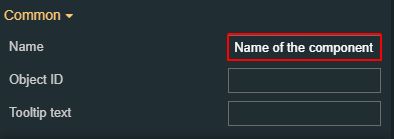 |
Object ID | Sets the Object ID of the component. By defining an object ID for the control, it can be passed as SignalPrefix when using parameter passing in navigation. The value of the Object ID can be used via a placeholder [OID] in other properties of this extension. The placeholder is supported in all signal properties, symbolic text, and states. Example: Setpoint [OID] 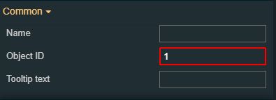 For details, please visit the dedicated tutorials, here. | |
Tooltip text | Optional tooltip text, that will be shown on mouseover at runtime. 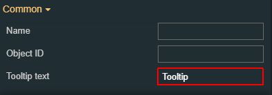 | |
Security | System authorizations / Permissions | The system authorization required to display the component. If the logged in user does not have this system authorization, the component will not be visible or enabled (depending on the set Security access behavior). If the property is left empty, the component will be visible and enabled for all users. Further on, the user can also add multiple System authorizations / Permissions, separated by comma (,). This property is named "System authorization" for projects created on i4scada platform.  This property is named "Permissions" for projects created on i4connected platform.  |
Project authorizations / Roles | The project authorization required for displaying the component. If the logged in user does not have this project authorization, the component will not be visible or enabled (depending on the set Security access behavior). If the property is left empty, the component will be visible and enabled to all users. Further on, the user can also add multiple Project authorizations / Roles, separated by comma (,). This property is named "Project authorization" for projects created on i4scada platform.  This property is named "Role" for projects created on i4connected platform. 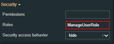 | |
Security access behavior | Sets the behavior of the element to either disabled (grayed out) or hidden, when the logged in user doesn't meet the conditions imposed by the Project authorization / Roles and System authorization / Permissions properties. In case both Project authorization / Roles and System authorization / Permissions properties are set, the logged user needs to meet both conditions to be able to see and utilize the component, at run-time.  | |
Layout | Layout mode | Sets the behavior of the component related to the page placement. The user can select the component layout from the options available in the drop-down list: Default, Dock top, Dock bottom, Dock left, Dock right, Stretched, Pin top left, Pin top center, Pin top right, Pin right middle, Pin bottom right, Pin bottom center, Pin bottom left, Pin left middle and Pin center. 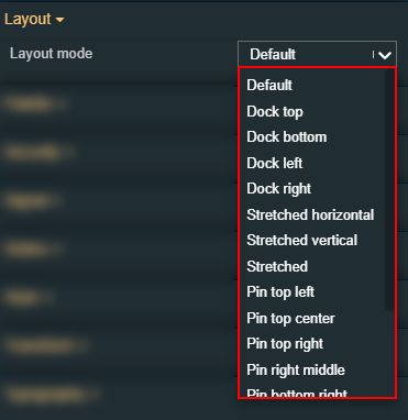 |
Margin | Sets the margin of the component relative to the drawing board area. The supported values are the standard CSS values for the margin. The top, bottom, left and right values can either be typed in the main property field or by using the Margin editor.  The Margin editor can be opened by clicking the Open button. 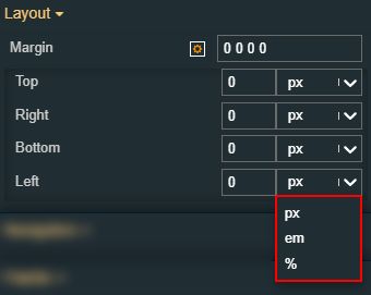 The components margins can be updated by setting the margin value and selecting the desired unit:
| |
Effects | Opacity | Sets the opacity of the component. The Opacity values should be numbers from 0 to 1 representing the opacity of the component. When the component has a value of 0 the element is completely invisible; a value of 1 is completely opaque (solid). By default, the Component's opacity is set to value 1. Using the up / down arrows the user can control the opacity degree.  By clicking the Open button the view is extended to display the Opacity slider.  |
Shadow color | Sets the color of the component's shadow. The user can either manually type in the HEX color code or use the color picker tool.  | |
Shadow offset X | Sets the offset of the shadow on the horizontal axis. The default value can be increased or decreased, either by manually typing in the desired value or by using the up and down arrows.  | |
Shadow offset Y | Sets the offset of the shadow on the vertical axis. The default value can be increased or decreased, either by manually typing in the desired value or by using the up and down arrows.  | |
Shadow size | Sets the width of the component shadow. The default value can be increased or decreased, either by manually typing in the desired value or by using the up and down arrows.  | |
Signal | Default signal configuration | Defines a set of default configuration settings for all new signals: 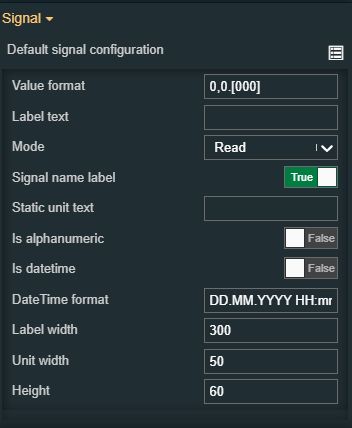
|
Override signals configuration | Overrides the default configuration with a specific one, by defining an individual set of configuration settings for each signal added to the list: 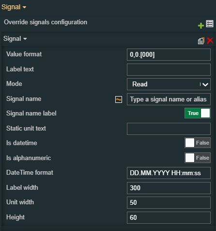
| |
Signals | Defines a list of Signals, configured as an array list of items. The user can either manually input the name of the Signal or select it from the list of Signals. The user can add multiple array items (Signals) by clicking the Add new item button. 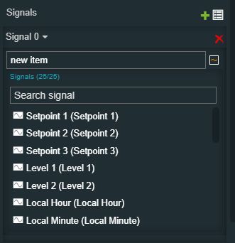 Furthermore, the following actions are available for each array item:
| |
Signal name patterns | Allows the user with the possibility to easily apply the design-time signal filter patterns using strings to be matched with the asterisk wildcard (*), where the wildcard means "any". Example: “Buffer *” - lists all Signals matching the “Buffer” text, “Device1 *” - lists all Signals belonging to a device matching the “Device1” text.  The signal filter pattern also allows the possibility to apply array filter patterns. Example: “siGNal 1*|siGnAl 2*” - lists an array of Signals matching the “signal 1” and “signal 2” texts, treating the uppercase and lowercase letters as equivalent. NoteThe filter applied as a Signal name pattern will only be considered if no Signal items were added to a Signal List at design time. If at least one Signal item was already added, the filter pattern will be ignored. | |
Signal name format | Defines the format in which the signal information appears. This property can be used to extract the following Signal information, written between square brackets: [name] [value] [unit] [description], therefore, at run-time, the Signal name, current value, unit of measure, and description will be displayed. By default, these components will have the Signal name format property populated with the “[name]” value. The user can add other available formats, such as [value] [unit] [description], with or without space between them, separated by any type of separator (e.g. dot, comma, or semicolon). The information will be visible at both run-time and design time.  | |
Configuration | Configuration namespace | The namespace used by the component predefined configuration. By setting this property, the respective configuration will be, by default, applied.  |
Initial configuration | Sets the name of an existing configuration, that will be initially loaded for the component when opening the run-time project visualization.  | |
Title text | Sets the title of the component. The defined title will be displayed both at design and run-time, by the component's header.  | |
Palette | Buttons background | Sets the color of the background of the buttons. As the color palette is injected into this component by means of the default CSS class, applying this property the CSS class settings will be overwritten. 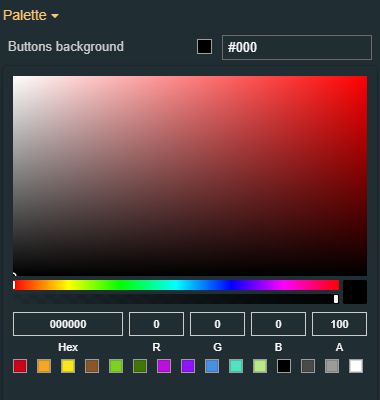 |
Buttons foreground | Sets the color of the foreground of the buttons. As the color palette is injected into this component by means of the default CSS class, applying this property the CSS class settings will be overwritten. 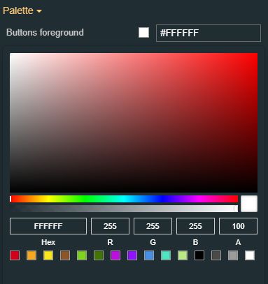 | |
Header background | Sets the color of the header background. As the color palette is injected into this component by means of the default CSS class, applying this property the CSS class settings will be overwritten. 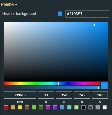 | |
Header foreground | Sets the color of the header foreground. As the color palette is injected into this component by means of the default CSS class, applying this property the CSS class settings will be overwritten. 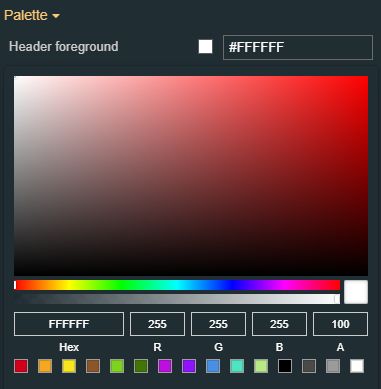 | |
Typography | Header font family | Sets the font family of the component font, selecting from web-safe fonts available in the drop-down list. 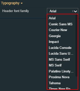 |
Header font size | Sets the size of the header font. The header font-size value can be either manually typed in the designated field or increased/decreased by clicking the up and down arrows.  | |
Header font weight | Sets the thickness of the chart title displayed by the component header, , selecting from the drop-down list options: 900 (fat), 800 (extra-bold), 700 (bold), 600 (semi-bold), 500 (medium), 400 (normal), 300 (light), 200 (extra-light) and 100 (thin). 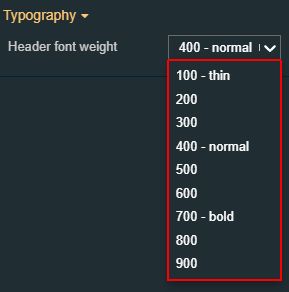 | |
Transform | Width | Sets the width of the component using the up and down arrows to increase and decrease, or by manually typing the desired pixels value. The component width can also be adjusted directly on the design surface by means of mouse manipulation.  |
Height | Sets the height of the component using the up and down arrows to increase and decrease, or by manually typing the desired pixels value. The component height can also be adjusted directly on the design surface by means of mouse manipulation.  | |
Angle | Sets the rotation angle using the up and down arrows to increase and decrease, or by manually typing the desired degree value. The component angle can also be adjusted directly on the design surface by means of mouse manipulation.  | |
Left | Specifies the X (horizontal) coordinate of the component, on the grid, using the up and down arrows to increase and decrease, or by manually typing the desired value. The component X coordinate can also be adjusted directly on the design surface by means of mouse manipulation.  | |
Top | Specifies the Y (vertical) coordinate of the component, on the grid, using the up and down arrows to increase and decrease, or by manually typing the desired value. The component Y coordinate can also be adjusted directly on the design surface by means of mouse manipulation.  | |
Disable flip | Disables any flip transformation for this component. This keeps the component in the default position even when its container is flipped.  | |
Horizontal flip | Flips the selected component horizontally.  | |
Vertical flip | Flips the selected component vertically.  |
Slider
Check out this article and learn more details about the i4designer Slider component and the properties it provides.
The i4designerSlider component is a slider control that can update the value of a signal based on a predefined range and steps.
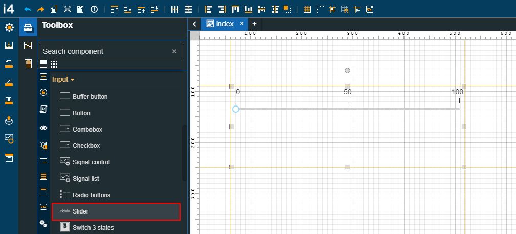
The Slider component
Category | Property | Description |
|---|---|---|
Common | Name | The name of the component, visible in other Designer locations (such as Page explorer).  |
Object ID | Sets the Object ID of the component. By defining an object ID for the control, it can be passed as SignalPrefix when using parameter passing in navigation. The value of the Object ID can be used via a placeholder [OID] in other properties of this extension. The placeholder is supported in all signal properties, symbolic texts, and states. Example: Setpoint [OID]  | |
Tooltip text | Optional tooltip text, that will be shown on mouseover at runtime.  | |
Security | System authorization / Permission | The system authorization required to display the component. If the logged in user does not have this system authorization, the component will not be visible or enabled (depending on the set Security access behavior). If the property is left empty, the component will be visible and enabled for all users. Further on, the user can also add multiple System authorizations / Permissions, separated by comma (,). This property is named "Project authorization" for projects created on i4scada platform.  This property is named "Role" for projects created on i4connected platform.  |
Project authorization / Role | The project authorization required for displaying the component. If the logged in user does not have this project authorization, the component will not be visible or enabled (depending on the set Security access behavior). If the property is left empty, the component will be visible and enabled to all users. Further on, the user can also add multiple Project authorizations / Roles, separated by comma (,). This property is named "Project authorization" for projects created on i4scada platform.  This property is named "Role" for projects created on i4connected platform.  | |
Security access behavior | Sets the behavior of the element to either disabled (grayed out) or hidden, when the logged in user doesn't meet the conditions imposed by the Project authorization / Roles and System authorization / Permissions properties. In case both Project authorization / Roles and System authorization / Permissions properties are set, the logged user needs to meet both conditions to be able to see and utilize the component, at run-time.  | |
Layout | Layout mode | Sets the behavior of the component related to the page placement. The user can select the component layout from the options available in the drop-down list: Default, Dock top, Dock bottom, Dock left, Dock right, Stretched, Pin top left, Pin top center, Pin top right, Pin right middle, Pin bottom right, Pin bottom center, Pin bottom left, Pin left middle and Pin center.  |
Margin | Sets the margin of the component relative to the drawing board area. The supported values are the standard CSS values for the margin. The top, bottom, left and right values can either be typed in the main property field or by using the Margin editor.  The Margin editor can be opened by clicking the Open button.  The components margins can be updated by setting the margin value and selecting the desired unit:
| |
Effects | Opacity | Sets the opacity of the component. The Opacity values should be numbers from 0 to 1 representing the opacity of the component. When the component has a value of 0 the element is completely invisible; a value of 1 is completely opaque (solid). By default, the Component's opacity is set to value 1. Using the up / down arrows the user can control the opacity degree.  By clicking the Open button the view is extended to display the Opacity slider.  |
Shadow color | Sets the color of the component's shadow. The user can either manually type in the HEX color code or use the color picker tool.  | |
Shadow offset X | Sets the offset of the shadow on the horizontal axis. The default value can be increased or decreased, either by manually typing in the desired value or by using the up and down arrows.  | |
Shadow offset Y | Sets the offset of the shadow on the vertical axis. The default value can be increased or decreased, either by manually typing in the desired value or by using the up and down arrows.  | |
Shadow size | Sets the width of the component shadow. The default value can be increased or decreased, either by manually typing in the desired value or by using the up and down arrows.  | |
Icon | Icon class | Sets the CSS class for the icon of the component. The icon can be selected from a large number of icons accessible by clicking the Open panel to see the icon list button. The list of icons allows the user to toggle between actual icons and icon names. A simple filtering mechanism is also provided to support the user to easily pinpoint the desired icon.  |
Signal | Array delimiter | Defines the delimiter of the values in the array.  |
Array index | Defines the index of the displayed array value. By default, the Array index starts from value 0, but it can be increased or decreased, using the up / down arrows or by manually typing in the desired value.  | |
Is array | Defines if the displayed value is an array. If the property is set to True, the property Format will not be considered.  | |
Signal value factor | Sets the number that the signal value is multiplied with.  | |
Signal name | Sets the name of the signal that will be represented or manipulated by the component. The user can select the Signal from the list view, by clicking the Open file explorer button, or by directly typing in the name of the desired Signal.  | |
Signal name label | Replaces the component label with the selected Signal name, if the property is set to True.  | |
Configuration | Event | Defines the event for writing values allowing the user to select from the drop-down list options:
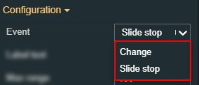 |
Label text | Sets the text of the component label. If the Signal name label property is set to False, the textual information set for the label text will be displayed. If both the Label text and the Signal name label are empty and false, nothing will be displayed in this field.  | |
Max range | Sets the top value of the selected signal. The default value can be increased or decreased, using the up / down arrows or by manually typing in the desired value.  | |
Min range | Sets the bottom value of the selected value. The default value can be increased or decreased, using the up / down arrows or by manually typing in the desired value.  | |
Static unit text | Replaces the signal unit with the defined static string. The Unit label property has to be true to display the Static unit text property.  | |
Step | The increment value is applied to the signal value when using the slider. The default value can be increased or decreased, using the up / down arrows or by manually typing in the desired value.  | |
Ticks number | Sets the number of slider ticks displayed by the component. The default value can be increased or decreased, using the up / down arrows or by manually typing in the desired value.  | |
Value format | The format of the numeric values. For more details about the available numeric formats, the user can be found on the Github.  | |
Write delay | Sets the delay, in milliseconds, applied when changing the signal value using the slider. Used only when the Event property is set to Change. The default value can be increased or decreased, using the up / down arrows or by manually typing in the desired value.  | |
Write secure | The signal value will be written to the signal only after confirming the password of the user.  | |
Write to buffer | Enables the possibility to locally buffer the signal value, rather than writing it directly into the signal, if the property is set to True. Writing should be done via the Buffer button component.  | |
Typography | Label font size | Sets the size of the component label font, using the up and down arrows to increase and decrease, or by manually typing the desired value.  |
Label font weight | Sets the thickness of the component label font, selecting from the drop-down list options: 900 (fat), 800 (extra-bold), 700 (bold), 600 (semi-bold), 500 (medium), 400 (normal), 300 (light), 200 (extra-light) and 100 (thin). 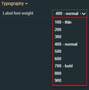 | |
Text alignment | Sets the alignment of the text on the component surface. The text alignment options can be selected from the drop-down list options: auto, left, right and center (default). 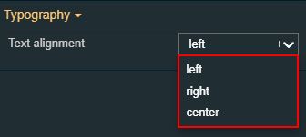 | |
Appearance | Show ticks label | Enables the display of ticks labels if the property is set to True.  |
Class name | Sets the CSS class of component. The desired CSS class can be selected from the drop-down list options: default, danger, primary, warning, success. 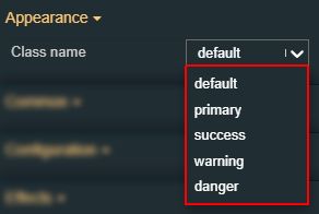 | |
Display vertical | Enables possibility to change the slider orientation from horizontal to vertical, by setting property to True.  | |
Reverse | Enables the possibility to change the slider direction (left to right, right to left, up to down, down to up), if setting the property to True.  | |
Unit visibility | Sets the visibility of the unit label, if the property is set to True.  | |
Palette | Rail background | Sets the color of the slider rail. The user can either manually type in the HEX color code or use the color picker tool. As the component colors are injected by the default CSS, changing the color will overwrite the CSS. 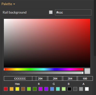 |
Ticks color | Sets the color of the slider ticks. The user can either manually type in the HEX color code or use the color picker tool. As the component colors are injected by the default CSS, changing the color will overwrite the CSS. 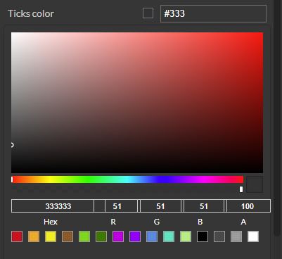 | |
Label foreground | Sets the foreground color for the label of the indicator. The user can either manually type in the HEX color code or use the color picker tool. As the component colors are injected by the default CSS, changing the color will overwrite the CSS. 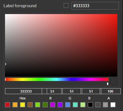 | |
Transform | Width | Sets the width of the component using the up and down arrows to increase and decrease, or by manually typing the desired pixels value. The component width can also be adjusted directly on the design surface by means of mouse manipulation.  |
Height | Sets the height of the component using the up and down arrows to increase and decrease, or by manually typing the desired pixels value. The component height can also be adjusted directly on the design surface by means of mouse manipulation.  | |
Angle | Sets the rotation angle using the up and down arrows to increase and decrease, or by manually typing the desired degree value. The component angle can also be adjusted directly on the design surface by means of mouse manipulation.  | |
Left | Specifies the X (horizontal) coordinate of the component, on the grid, using the up and down arrows to increase and decrease, or by manually typing the desired value. The component X coordinate can also be adjusted directly on the design surface by means of mouse manipulation.  | |
Top | Specifies the Y (vertical) coordinate of the component, on the grid, using the up and down arrows to increase and decrease, or by manually typing the desired value. The component Y coordinate can also be adjusted directly on the design surface by means of mouse manipulation.  | |
Disable flip | Disables any flip transformation for this component. This keeps the component in the default position even when its container is flipped.  | |
Horizontal flip | Flips the selected component horizontally.  | |
Vertical flip | Flips the selected component vertically.  |
Switch
Check out this article in order to learn more details about the i4designer Switch component and the properties it provides.
The Switch component is a button-type control that can toggle between two values for the same signal.
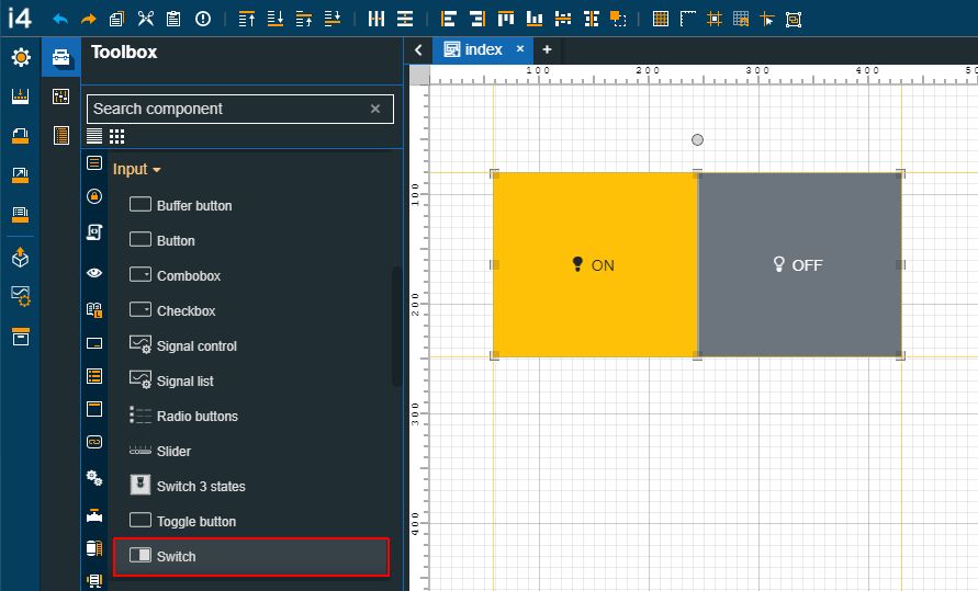
The Switch component
Category | Property | Description |
|---|---|---|
Common | Name | The name of the component, visible in other Designer locations (such as Page explorer).  |
Object ID | Sets the Object ID of the component. By defining an object ID for the control, it can be passed as SignalPrefix when using parameter passing in navigation. The value of the Object ID can be used via a placeholder [OID] in other properties of this extension. The placeholder is supported in all signal properties, symbolic texts and states. Example: Setpoint [OID]  | |
Tooltip text | Optional tooltip text, that will be shown on mouseover at runtime.  | |
Security | System authorizations / Permissions | The system authorization required to display the component. If the logged in user does not have this system authorization, the component will not be visible or enabled (depending on the set Security access behavior). If the property is left empty, the component will be visible and enabled for all users. Further on, the user can also add multiple System authorizations / Permissions, separated by comma (,). This property is named "System authorization" for projects created on i4scada platform.  This property is named "Permissions" for projects created on i4connected platform.  |
Project authorizations / Roles | The project authorization required for displaying the component. If the logged in user does not have this project authorization, the component will not be visible or enabled (depending on the set Security access behavior). If the property is left empty, the component will be visible and enabled to all users. Further on, the user can also add multiple Project authorizations / Roles, separated by comma (,). This property is named "Project authorization" for projects created on i4scada platform.  This property is named "Role" for projects created on i4connected platform.  | |
Security access behavior | Sets the behavior of the element to either disabled (grayed out) or hidden, when the logged in user doesn't meet the conditions imposed by the Project authorization / Roles and System authorization / Permissions properties. In case both Project authorization / Roles and System authorization / Permissions properties are set, the logged user needs to meet both conditions to be able to see and utilize the component, at run-time.  | |
Layout | Layout mode | Sets the behavior of the component related to the page placement. The user can select the component layout from the options available in the drop-down list: Default, Dock top, Dock bottom, Dock left, Dock right, Stretched, Pin top left, Pin top center, Pin top right, Pin right middle, Pin bottom right, Pin bottom center, Pin bottom left, Pin left middle and Pin center.  |
Margin | Sets the margin of the component relative to the drawing board area. The supported values are the standard CSS values for the margin. The top, bottom, left and right values can either be typed in the main property field or by using the Margin editor.  The Margin editor can be opened by clicking the Open button.  The components margins can be updated by setting the margin value and selecting the desired unit:
| |
Effects | Opacity | Sets the opacity of the component. The Opacity values should be numbers from 0 to 1 representing the opacity of the component. When the component has a value of 0 the element is completely invisible; a value of 1 is completely opaque (solid). By default, the Component's opacity is set to value 1. Using the up / down arrows the user can control the opacity degree.  By clicking the Open button the view is extended to display the Opacity slider.  |
Shadow color | Sets the color of the component's shadow. The user can either manually type in the HEX color code or use the color picker tool.  | |
Shadow offset X | Sets the offset of the shadow on the horizontal axis. The default value can be increased or decreased, either by manually typing in the desired value or by using the up and down arrows.  | |
Shadow offset Y | Sets the offset of the shadow on the vertical axis. The default value can be increased or decreased, either by manually typing in the desired value or by using the up and down arrows.  | |
Shadow size | Sets the width of the component shadow. The default value can be increased or decreased, either by manually typing in the desired value or by using the up and down arrows.  | |
Appearance | Display vertical | Sets the switch component orientation to vertical, if the property is set to True.  |
Padding | Sets the padding of the component (defines the space between the component contents and its border). The top, bottom, left and right values can either be typed in the main property field or by using the Padding editor.  The Padding editor can be opened by clicking the Open button.  The components padding can be updated by setting the value and the desired unit:
| |
Palette | Off background | Sets the background color of the Off button. The user can either manually type in the HEX color code or use the color picker tool. As the component colors are injected by the default CSS, changing the color will overwrite the CSS.  |
Off border color | Sets the border color of the Off button. The user can either manually type in the HEX color code or use the color picker tool. As the component colors are injected by the default CSS, changing the color will overwrite the CSS.  | |
Off foreground | Sets the text color of the Off button. The user can either manually type in the HEX color code or use the color picker tool. As the component colors are injected by the default CSS, changing the color will overwrite the CSS.  | |
Off icon color | Sets the icon color of the Off button. The user can either manually type in the HEX color code or use the color picker tool. As the component colors are injected by the default CSS, changing the color will overwrite the CSS.  | |
On background | Sets the background color of the On button. The user can either manually type in the HEX color code or use the color picker tool. As the component colors are injected by the default CSS, changing the color will overwrite the CSS. 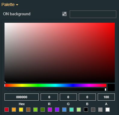 | |
On border color | Sets the border color of the On button. The user can either manually type in the HEX color code or use the color picker tool. As the component colors are injected by the default CSS, changing the color will overwrite the CSS. 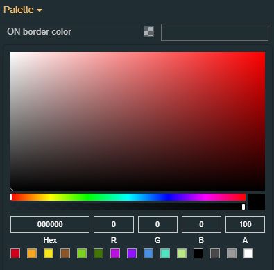 | |
On foreground | Sets the text color of the On button. The user can either manually type in the HEX color code or use the color picker tool. As the component colors are injected by the default CSS, changing the color will overwrite the CSS. 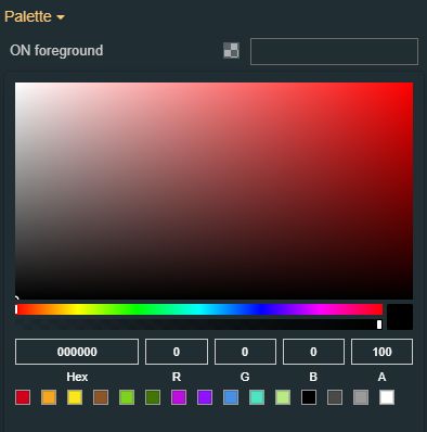 | |
On icon color | Sets the icon color of the on button. The user can either manually type in the HEX color code or use the color picker tool. As the component colors are injected by the default CSS, changing the color will overwrite the CSS. 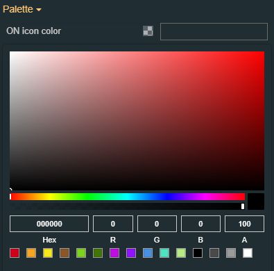 | |
Style | Border radius | Sets the curvature of the border corners expressed in pixels or percentages. The border-radius value can be either manually typed in the designated field or increased/decreased by clicking the up and down arrows.  |
Border width | Sets the width of the container border in pixels. The border width value can be either manually typed in the designated field or increased/decreased by clicking the up and down arrows. 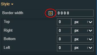 The components border width can be updated by setting the values and the desired unit:
| |
Typography | Font size | Sets the size of the component font, using the up and down arrows to increase and decrease, or by manually typing the desired value.  |
Text alignment | Sets the alignment of the text of the component surface, selecting from the drop-down list options: auto, left, right and center (default).  | |
Font weight | Sets the weight of the component font, selecting from the drop-down list options: 900 (fat), 800 (extra-bold), 700 (bold), 600 (semi-bold), 500 (medium), 400 (normal), 300 (light), 200 (extra-light) and 100 (thin). 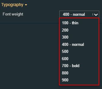 | |
Font family | Sets the font family of the component font, selecting from web-safe fonts available in the drop-down list. 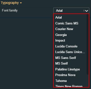 | |
Configuration | Off CSS class | Sets the icon displayed by the component when in Off state, selecting from the drop-down list options: primary, success, warning and danger. 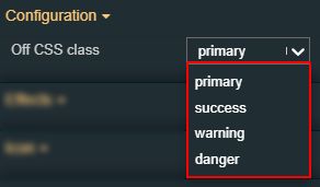 |
Off label text | Sets the text displayed by the component when in Off state.  | |
On CSS class | Sets the icon displayed by the component when in On state, selecting from the drop-down list options: primary, success, warning and danger. 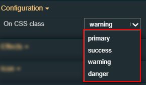 | |
On label text | Sets the text displayed by the component when in On state.  | |
Write to buffer | Enables the possibility to locally buffer the signal value, rather than writing it directly into the signal, if the property is set to True. Writing should be done via the Buffer button component.  | |
Write secure | The signal value will be written to the signal only after confirming the password of the user.  | |
Icon | Off icon | Sets the CSS class for the Off icon of the component. The icon can be selected from a large number of icons accessible by clicking the Open panel to see the icon list button. The list of icons allows the user to toggle between actual icons and icon names. A simple filtering mechanism is also provided to support the user to easily pinpoint the desired icon. 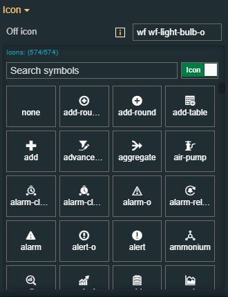 |
On icon | Sets the CSS class for the On icon of the component. The icon can be selected from a large number of icons accessible by clicking the Open panel to see the icon list button. The list of icons allows the user to toggle between actual icons and icon names. A simple filtering mechanism is also provided to support the user to easily pinpoint the desired icon. 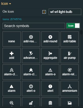 | |
Signal | Off value | Sets the signal value for the Off state of the component. The default value can be increased or decreased, using the up / down arrows or by manually typing in the desired value.  |
On value | Sets the signal value for the On state of the component. The default value can be increased or decreased, using the up / down arrows or by manually typing in the desired value.  | |
Signal name | Sets the name of the signal that will be represented or manipulated by the component. The user can select the Signal from the list view, by clicking the Open file explorer button, or by directly typing in the name of the desired Signal.  | |
Transform | Width | Sets the width of the component using the up and down arrows to increase and decrease, or by manually typing the desired pixels value. The component width can also be adjusted directly on the design surface by means of mouse manipulation.  |
Height | Sets the height of the component using the up and down arrows to increase and decrease, or by manually typing the desired pixels value. The component height can also be adjusted directly on the design surface by means of mouse manipulation.  | |
Angle | Sets the rotation angle using the up and down arrows to increase and decrease, or by manually typing the desired degree value. The component angle can also be adjusted directly on the design surface by means of mouse manipulation.  | |
Left | Specifies the X (horizontal) coordinate of the component, on the grid, using the up and down arrows to increase and decrease, or by manually typing the desired value. The component X coordinate can also be adjusted directly on the design surface by means of mouse manipulation.  | |
Top | Specifies the Y (vertical) coordinate of the component, on the grid, using the up and down arrows to increase and decrease, or by manually typing the desired value. The component Y coordinate can also be adjusted directly on the design surface by means of mouse manipulation.  | |
Disable flip | Disables any flip transformation for this component. This keeps the component in the default position event when its container is flipped.  | |
Horizontal flip | Flips the selected component horizontally.  | |
Vertical flip | Flips the selected component vertically.  |
Switch 3 states
Check out this article in order to learn more details about the i4designer Switch 3 states component and the properties it provides.
The Switch 3 states component is a toggle button with a vertical switch design, which allows the user to toggle between two predefined values that are written to a selected signal.
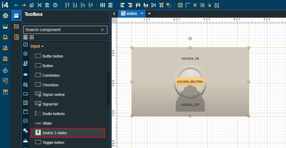
The Switch 3 states component
Category | Property | Description |
|---|---|---|
Common | Name | The name of the component, visible in other Designer locations (such as Page explorer).  |
Object ID | Sets the Object ID of the component. By defining an object ID for the control, it can be passed as SignalPrefix when using parameter passing in navigation. The value of the Object ID can be used via a placeholder [OID] in other properties of this extension. The placeholder is supported in all signal properties, symbolic texts, and states. Example: Setpoint [OID]  | |
Tooltip text | Optional tooltip text, that will be shown on mouseover at runtime.  | |
Security | System authorizations / Permissions | The system authorization required to display the component. If the logged in user does not have this system authorization, the component will not be visible or enabled (depending on the set Security access behavior). If the property is left empty, the component will be visible and enabled for all users. Further on, the user can also add multiple System authorizations / Permissions, separated by comma (,). This property is named "System authorization" for projects created on i4scada platform.  This property is named "Permissions" for projects created on i4connected platform.  |
Project authorizations / Roles | The project authorization required for displaying the component. If the logged in user does not have this project authorization, the component will not be visible or enabled (depending on the set Security access behavior). If the property is left empty, the component will be visible and enabled to all users. Further on, the user can also add multiple Project authorizations / Roles, separated by comma (,). This property is named "Project authorization" for projects created on i4scada platform.  This property is named "Role" for projects created on i4connected platform.  | |
Security access behavior | Sets the behavior of the element to either disabled (grayed out) or hidden, when the logged in user doesn't meet the conditions imposed by the Project authorization / Roles and System authorization / Permissions properties. In case both Project authorization / Roles and System authorization / Permissions properties are set, the logged user needs to meet both conditions to be able to see and utilize the component, at run-time.  | |
Layout | Layout mode | Sets the behavior of the component related to the page placement. The user can select the component layout from the options available in the drop-down list: Default, Dock top, Dock bottom, Dock left, Dock right, Stretched, Pin top left, Pin top center, Pin top right, Pin right middle, Pin bottom right, Pin bottom center, Pin bottom left, Pin left middle and Pin center.  |
Margin | Sets the margin of the component relative to the drawing board area. The supported values are the standard CSS values for the margin. The top, bottom, left and right values can either be typed in the main property field or by using the Margin editor.  The Margin editor can be opened by clicking the Open button.  The components margins can be updated by setting the margin value and selecting the desired unit:
| |
Effects | Opacity | Sets the opacity of the component. The Opacity values should be numbers from 0 to 1 representing the opacity of the component. When the component has a value of 0 the element is completely invisible; a value of 1 is completely opaque (solid). By default, the Component's opacity is set to value 1. Using the up / down arrows the user can control the opacity degree.  By clicking the Open button the view is extended to display the Opacity slider.  |
Shadow color | Sets the color of the component's shadow. The user can either manually type in the HEX color code or use the color picker tool.  | |
Shadow offset X | Sets the offset of the shadow on the horizontal axis. The default value can be increased or decreased, either by manually typing in the desired value or by using the up and down arrows.  | |
Shadow offset Y | Sets the offset of the shadow on the vertical axis. The default value can be increased or decreased, either by manually typing in the desired value or by using the up and down arrows.  | |
Shadow size | Sets the width of the component shadow. The default value can be increased or decreased, either by manually typing in the desired value or by using the up and down arrows.  | |
Palette | Neutral color | Sets the color of the neutral state of the component. The user can either manually type in the HEX color code or use the color picker tool. Applying this property will overwrite the default CSS class. 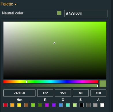 |
Off color | Sets the color of the OFF state of the component. The user can either manually type in the HEX color code or use the color picker tool. Applying this property will overwrite the default CSS class. 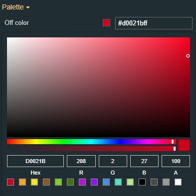 | |
ON color | Sets the color of the ON state of the component. The user can either manually type in the HEX color code or use the color picker tool. Applying this property will overwrite the default CSS class. 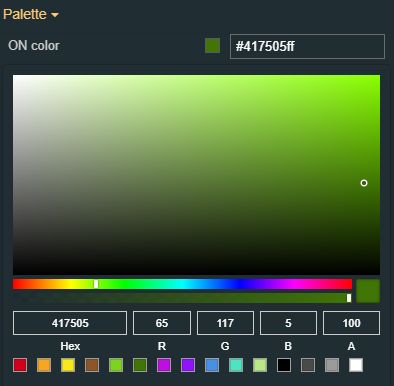 | |
Stroke color | Sets the color of the element outline. The user can either manually type in the HEX color code or use the color picker tool. Applying this property will overwrite the default CSS class. 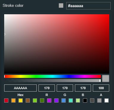 | |
Background color | Sets the color of the element background. The user can either manually type in the HEX color code or use the color picker tool. Applying this property will overwrite the default CSS class. 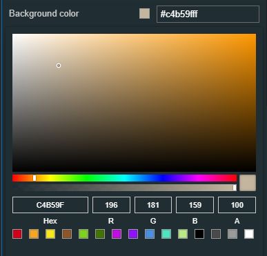 | |
Style | Border radius | Sets the radius of the border corners measures in pixels or percentage. The default value can be increased or decreased, using the up / down arrows or by manually typing in the desired value.  |
Stroke width | Sets the width of the component outline. The default value can be increased or decreased, using the up / down arrows or by manually typing in the desired value.  | |
Signal | Neutral value | Sets the signal value for the neutral state of the component. The default value can be increased or decreased, using the up / down arrows or by manually typing in the desired value.  |
Off value | Sets the signal value for the Off state of the component. The default value can be increased or decreased, using the up / down arrows or by manually typing in the desired value.  | |
On value | Sets the signal value for the On state of the component. The default value can be increased or decreased, using the up / down arrows or by manually typing in the desired value.  | |
Signal name | Sets the name of the signal that will be represented or manipulated by the component. The user can select the Signal from the list view, by clicking the Open file explorer button, or by directly typing in the name of the desired Signal.  | |
Configuration | Neutral text | Sets the text displayed by the component when in neutral state.  |
Off text | Sets the text displayed by the component when in Off state.  | |
On text | Sets the text displayed by the component when in On state.  | |
Write to buffer | Enables the possibility to locally buffer the signal value, rather than writing it directly into the signal, if property is set to True. Writing should be done via the Buffer button component.  | |
Write secure | The signal value will be written into the signal after the user confirms the password.  | |
Icon | Neutral icon | Sets the icon displayed by the component when in neutral state. The icon can be selected from a large number of icons accessible by clicking the Open panel to see the icon list button. The list of icons allows the user to toggle between actual icons and icon names. A simple filtering mechanism is also provided to support the user to easily pin-point the desired icon. 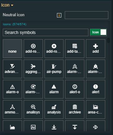 |
Off icon | Sets the icon displayed by the component when it is in the off state. The icon can be selected from a large amount of icons accessible by clicking the Open panel to see the icon list button. The list of icons allows the user to toggle between actual icons and icon names. A simple filtering mechanism is also provided to support the user to easily pin-point the desired icon.  | |
On icon | Sets the icon displayed by the component when it is in on state. The icon can be selected from a large number of icons accessible by clicking the Open panel to see the icon list button. The list of icons allows the user to toggle between actual icons and icon names. A simple filtering mechanism is also provided to support the user to easily pinpoint the desired icon.  | |
Transform | Width | Sets the width of the component using the up and down arrows to increase and decrease, or by manually typing the desired pixels value. The component width can also be adjusted directly on the design surface by means of mouse manipulation.  |
Height | Sets the height of the component using the up and down arrows to increase and decrease, or by manually typing the desired pixels value. The component height can also be adjusted directly on the design surface by means of mouse manipulation.  | |
Angle | Sets the rotation angle using the up and down arrows to increase and decrease, or by manually typing the desired degree value. The component angle can also be adjusted directly on the design surface by means of mouse manipulation.  | |
Left | Specifies the X (horizontal) coordinate of the component, on the grid, using the up and down arrows to increase and decrease, or by manually typing the desired value. The component X coordinate can also be adjusted directly on the design surface by means of mouse manipulation.  | |
Top | Specifies the Y (vertical) coordinate of the component, on the grid, using the up and down arrows to increase and decrease, or by manually typing the desired value. The component Y coordinate can also be adjusted directly on the design surface by means of mouse manipulation.  | |
Disable flip | Disables any flip transformation for this component. This keeps the component in the default position even when its container is flipped.  | |
Horizontal flip | Flips the selected component horizontally.  | |
Vertical | Flips the selected component vertically.  |
Toggle button
Check out this article in order to learn more details about the i4designer Toggle button component and the properties it provides.
The Toggle button component can be configured to write predefined values to a predefined signal for it's checked position and a different value for its unchecked position. The position toggling can be done on a single click (checked position on mouse down and unchecked position on mouse up) or it can have the standard behavior, where clicking once, it toggles the checked position, and clicking the second time, it toggles the unchecked position.
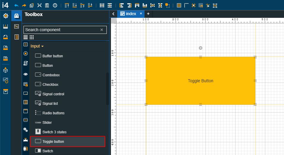
The Toggle button component
Category | Property | Description |
|---|---|---|
Common | Name | The name of the component, visible in other Designer locations (such as Page explorer).  |
Object ID | Sets the Object ID of the component. By defining an object ID for the control, it can be passed as SignalPrefix when using parameter passing in navigation. The value of the Object ID can be used via a placeholder [OID] in other properties of this extension. The placeholder is supported in all signal properties, symbolic texts, and states. Example: Setpoint [OID]  | |
Tooltip text | Optional tooltip text, that will be shown on mouseover at runtime.  | |
Security | System authorizations / Permissions | The system authorization required to display the component. If the logged in user does not have this system authorization, the component will not be visible or enabled (depending on the set Security access behavior). If the property is left empty, the component will be visible and enabled for all users. Further on, the user can also add multiple System authorizations / Permissions, separated by comma (,). This property is named "System authorization" for projects created on i4scada platform.  This property is named "Permissions" for projects created on i4connected platform.  |
Project authorizations / Roles | The project authorization required for displaying the component. If the logged in user does not have this project authorization, the component will not be visible or enabled (depending on the set Security access behavior). If the property is left empty, the component will be visible and enabled to all users. Further on, the user can also add multiple Project authorizations / Roles, separated by comma (,). This property is named "Project authorization" for projects created on i4scada platform.  This property is named "Role" for projects created on i4connected platform.  | |
Security access behavior | Sets the behavior of the element to either disabled (grayed out) or hidden, when the logged in user doesn't meet the conditions imposed by the Project authorization / Roles and System authorization / Permissions properties. In case both Project authorization / Roles and System authorization / Permissions properties are set, the logged user needs to meet both conditions to be able to see and utilize the component, at run-time.  | |
Layout | Layout mode | Sets the behavior of the component related to the page placement. The user can select the component layout from the options available in the drop-down list: Default, Dock top, Dock bottom, Dock left, Dock right, Stretched, Pin top left, Pin top center, Pin top right, Pin right middle, Pin bottom right, Pin bottom center, Pin bottom left, Pin left middle and Pin center.  |
Margin | Sets the margin of the component relative to the drawing board area. The supported values are the standard CSS values for the margin. The top, bottom, left and right values can either be typed in the main property field or by using the Margin editor.  The Margin editor can be opened by clicking the Open button.  The components margins can be updated by setting the margin value and selecting the desired unit:
| |
Effects | Opacity | Sets the opacity of the component. The Opacity values should be numbers from 0 to 1 representing the opacity of the component. When the component has a value of 0 the element is completely invisible; a value of 1 is completely opaque (solid). By default, the Component's opacity is set to value 1. Using the up / down arrows the user can control the opacity degree.  By clicking the Open button the view is extended to display the Opacity slider.  |
Shadow color | Sets the color of the component's shadow. The user can either manually type in the HEX color code or use the color picker tool.  | |
Shadow offset X | Sets the offset of the shadow on the horizontal axis. The default value can be increased or decreased, either by manually typing in the desired value or by using the up and down arrows.  | |
Shadow offset Y | Sets the offset of the shadow on the vertical axis. The default value can be increased or decreased, either by manually typing in the desired value or by using the up and down arrows.  | |
Shadow size | Sets the width of the component shadow. The default value can be increased or decreased, either by manually typing in the desired value or by using the up and down arrows.  | |
Appearance | CSS Class | Sets the CSS class of the button, selecting from the drop-down list items: btn-primary, btn-warning, btn-success and btn-danger.  |
Padding | Sets the padding of the component (defines the space between the component contents and its border). The top, bottom, left and right values can either be typed in the main property field or by using the Padding editor.  The Padding editor can be opened by clicking the Open button.  The components padding can be updated by setting the value and the desired unit:
| |
Configuration | Buffered CSS Class | Sets the CSS class of the button while the signal value is written to buffer. The CSS class can be selected from the drop-down list options: btn-primary, btn-warning, btn-success, and btn-danger. The value of this property will only be applied if the Write to buffer property is enabled. 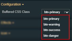 |
Button text | Sets the text displayed by the button.  | |
DateTime format | Selects the time and date format for the DateTime Signal values. Available tokens are - YYYY, YY, Y, Q, MM, MMM, MMMM, D, DD. Further information is available in the "Year, month, and day tokens" chapter under https://momentjs.com/docs/#/parsing/string-format/.  | |
Image | Allows selection of the image source. By clicking the Upload image button, the user can either drop files in the designated area or click to upload the image from the local machine. Additionally, if any images have been previously uploaded they will be displayed under the content folder and reused. The image upload accepts files of type "jpeg", "jpg", "jpe", "gif", "png", "svg", "ico", "webp", up to 5 MB in size.  | |
Is alphanumeric | Defines the signal value as alphanumeric. If true, the signal value will not be considered as pure numeric and can be displayed without taking into account the property format.  | |
Is datetime | Defines the signal value as DateTime. If true, the signal value will be considered as date time and will consider the value of the DateTime format property.  | |
Write to buffer | Enables the possibility to locally buffer the signal value, rather than writing it directly into the signal, if the property is set to True. Writing should be done via the Buffer button component.  | |
Write secure | The signal value will be written to the signal only after confirming the password of the user.  | |
Icon | Icon class | Sets the CSS class for the icon of the component. The icon can be selected from a large number of icons accessible by clicking the Open panel to see the icon list button. The list of icons allows the user to toggle between actual icons and icon names. A simple filtering mechanism is also provided to support the user to easily pinpoint the desired icon.  |
Signal | Signal name | Sets the name of the signal that will be represented or manipulated by the component. The user can select the Signal from the list view, by clicking the Open file explorer button, or by directly typing in the name of the desired Signal.  |
Toggle value 1 | Sets the value that will be written to the signal name when the button is in the checked position.  | |
Toggle value 2 | Sets the value that will be written to the signal name when the button is in an un-checked position. 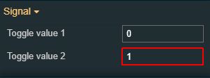 | |
Palette | Background color | Sets the button background color. The user can either manually type in the HEX color code or use the color picker tool. As the component colors are injected by the default CSS, changing the color will overwrite the CSS.  |
Foreground | Sets the button foreground color. The user can either manually type in the HEX color code or use the color picker tool. As the component colors are injected by the default CSS, changing the color will overwrite the CSS.  | |
Icon color | Sets the color of the component icon. The user can either manually type in the HEX color code or use the color picker tool. As the component colors are injected by the default CSS, changing the color will overwrite the CSS.  | |
Border color | Sets the color for the border of the component. The user can either manually type in the HEX color code or use the color picker tool. As the component colors are injected by the default CSS, changing the color will overwrite the CSS.  | |
Style | Border radius | Sets the curvature of the border corners expressed in pixels or percentages. The border-radius value can be either manually typed in the designated field or increased/decreased by clicking the up and down arrows.  |
Border width | Sets the width of the container border in pixels. The border width value can be either manually typed in the designated field or increased/decreased by clicking the up and down arrows.  The components border width can be updated by setting the values and the desired unit:
| |
Typography | Font size | Sets the size of the component font, using the up and down arrows to increase and decrease, or by manually typing the desired value.  |
Text alignment | Sets the alignment of the text of the component surface, selecting from the drop-down list options: auto, left, right and center (default).  | |
Font weight | Sets the weight of the component font, selecting from the drop-down list options: 900 (fat), 800 (extra-bold), 700 (bold), 600 (semi-bold), 500 (medium), 400 (normal), 300 (light), 200 (extra-light) and 100 (thin).  | |
Font family | Sets the font family of the component font, selecting from web-safe fonts available in the drop-down list.  | |
States | Current States | A component can have multiple states, each carrying its own set of properties. The user can add states, by clicking the Add new state button.  Furthermore, the following actions are available for each state:
|
State Name | By setting the Name property, the respective state will inherit that name, making the States easier to read.  | |
State# Condition rule | The rule to be met in order for the extension to enter the state. The signal names must be always surrounded by percentage (%) characters, followed by logical operators and the Signal value. For example: %Setpoint 1% != 0 The Condition rule can be either manually typed in or generated, using the State editor. The State editor can be opened by clicking the Expand array list button. This way, the user can easily generate a Condition rule, as follows:
 | |
State# CSS class name | Sets the behavior of the element when the logged-in user doesn't belong to the project authorization indicated by the projectAuthorization property. In this case, the element can be either disabled or hidden.  | |
State# Symbolic text | The language-agnostic text (which is automatically translated) is displayed by the extension.  | |
State# Display state | Sets the component visibility and accessibility when the state evolution passed. The user can choose from the following options:
 | |
State# Foreground | Sets the foreground color of the button. Applying this property will override the default CSS class.  | |
State# Background | Sets the background color of the button. Applying this property will override the default CSS class.  | |
State# Animation | Sets the component animation class when the state evolution passed. The user can select the animation class from the drop-down list options: Fade in, Fade out or Blink.  | |
Load from assets | Lists the State assets defined under the Assets management page, of the global actions area. A simple filtering mechanism is also provided to support the user to easily pinpoint the desired state asset. After selecting an asset from the list view, the user can click the Load button to apply it.  | |
Load from assets | Allows the user with the possibility to save a state asset defined during the current session. In this view, the user can either click the Generate name button to set a name for the asset or type in the name in the designated field. By clicking the Apply button, the new state asset will be made available for further management actions in the Assets management page, of the global actions area. Also, the asset can be reused for other Component states.  | |
Transform | Width | Sets the width of the component using the up and down arrows to increase and decrease, or by manually typing the desired pixels value. The component width can also be adjusted directly on the design surface by means of mouse manipulation.  |
Height | Sets the height of the component using the up and down arrows to increase and decrease, or by manually typing the desired pixels value. The component height can also be adjusted directly on the design surface by means of mouse manipulation.  | |
Angle | Sets the rotation angle using the up and down arrows to increase and decrease, or by manually typing the desired degree value. The component angle can also be adjusted directly on the design surface by means of mouse manipulation.  | |
Left | Specifies the X (horizontal) coordinate of the component, on the grid, using the up and down arrows to increase and decrease, or by manually typing the desired value. The component X coordinate can also be adjusted directly on the design surface by means of mouse manipulation.  | |
Top | Specifies the Y (vertical) coordinate of the component, on the grid, using the up and down arrows to increase and decrease, or by manually typing the desired value. The component Y coordinate can also be adjusted directly on the design surface by means of mouse manipulation.  | |
Disable flip | Disables any flip transformation for this component. This keeps the component in the default position even when its container is flipped.  | |
Horizontal flip | Flips the selected component horizontally.  | |
Vertical flip | Flips the selected component vertically.  |


