Menu controls
Here are the i4designer Menu Controls components for your new project created on the i4scada platform.
The Menu Controls category provides the user the possibility to insert navigation components, hence creating big-scale visualizations. The two components from this category provide the core navigation functionality.
Tip
For a set of step-based tutorials describing the usage of the Navigation menu and the Navigation tabs components, please visit the dedicated tutorials, here.
Navigation menu
Open this article to learn more details about the Navigation menu control of the i4designer set up on i4scada platform.
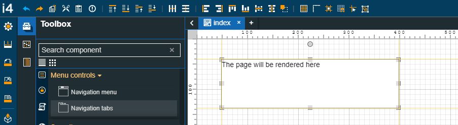
The i4deisgner Navigation menu component is the frame in which the navigation pages (or SubPages) are displayed. The Navigation menu component is the parent of one or more navigation pages. A navigation page can be added only if this component is placed on the page and selected.
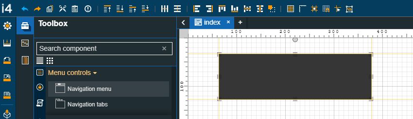
The Navigation menu component
Category | Property | Description |
|---|---|---|
Layout | Breakpoint | Sets the width in pixels, in order to change the menu layout to mobile view. The available drop-down options are: unset, 320px, 480px, 575px, 768px, 992px, 1024px, 1400px. 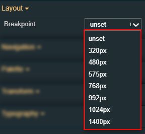 |
Layout mode | Sets the behavior of the component related to the page placement. The user can select the component layout from the options available in the drop-down list: Default, Dock top, Dock bottom, Dock left, Dock right, Stretched, Pin top left, Pin top center, Pin top right, Pin right middle, Pin bottom right, Pin bottom center, Pin bottom left, Pin left middle and Pin center. 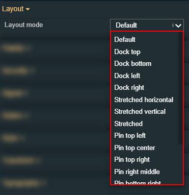 | |
Margin | Sets the margin of the component relative to the drawing board area. The supported values are the standard CSS values for the margin. The top, bottom, left and right values can either be typed in the main property field or by using the Margin editor. 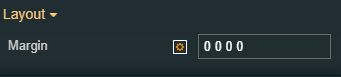 The Margin editor can be opened by clicking the Open button. 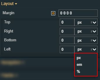 The component's margins can be updated by setting the margin value and selecting the desired unit:
| |
Opacity | Sets the opacity of the component. The Opacity values should be numbers from 0 to 1 representing the opacity of the component. When the component has a value of 0 the element is completely invisible; a value of 1 is completely opaque (solid). By default, the Component's opacity is set to value 1. Using the up / down arrows the user can control the opacity degree. 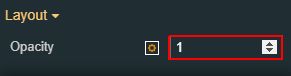 By clicking the Open button the view is extended to display the Opacity slider. 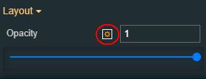 The component's margins can be updated by setting the margin value and selecting the desired unit:
| |
Orientation | Sets the orientation of the component to Vertical or Horizontal. The user can select the orientation from the options available in the designated drop-down list. 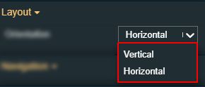 | |
Reverse | Reverses the menu orientation from left to right, by toggling the switch from True to False. 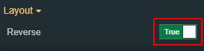 | |
Shadow offset X | Sets the offset of the shadow on the horizontal axis. The default value can be increased or decreased, either by manually typing in the desired value or by using the up and down arrows. 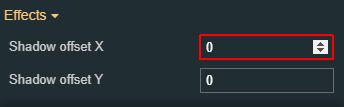 | |
Shadow offset Y | Sets the offset of the shadow on the vertical axis. The default value can be increased or decreased, either by manually typing in the desired value or by using the up and down arrows. 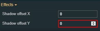 | |
Shadow size | Sets the width of the component shadow. The default value can be increased or decreased, either by manually typing in the desired value, or by using the up and down arrows. 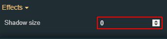 | |
Navigation | Navigation file | Sets the navigation structure to be displayed by the menu. The navigation structure can be either directly typed in the designated field, or selected from the navigation tree, enabled by clicking the Open file explorer button. 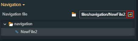 For easier management of the project pages, the "Navigate to page" button allows the user to open a tab showing the linked navigation page. |
Palette | Shadow color | Sets the color of the component's shadow. The user can either manually type in the HEX color code or use the color picker tool. 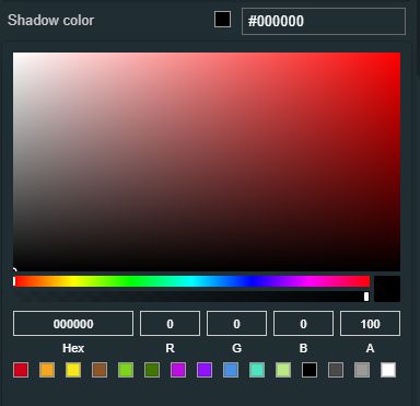 |
Background color | Sets the background color of the menu component. The user can either manually type in the HEX color code or use the color picker tool. 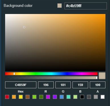 | |
Separator color | Sets the color of the link separators. The user can either manually type in the HEX color code or use the color picker tool. 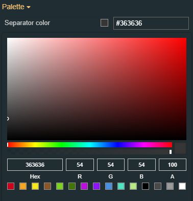 | |
Appearance | Text alignment | Sets the text alignment of the menu links, selecting from the drop-down list options: Left, Center and Right. 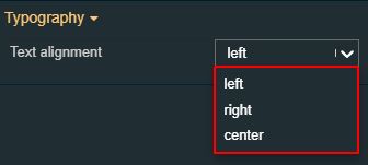 |
Padding | Sets the padding of the component (defines the space between the component contents and its border). The top, bottom, left and right values can either be typed in the main property field or by using the Padding editor. 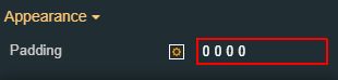 The Padding editor can be opened by clicking the Open button. 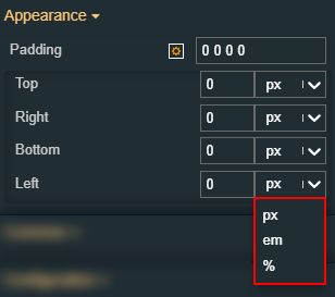 The components padding can be updated by setting the value and the desired unit:
| |
Link padding | Sets the pixels for the menu links padding, hence defining the space between the link contents and the link border. The Link padding value can be either manually typed in the designated field or increased/decreased by clicking the up and down arrows. 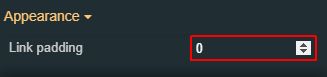 | |
Icon | Icon padding | Sets the menu links icons padding, hence defining the space between the menu links icons and their border. The Menu links icons value can be either manually typed in the designated field or increased/decreased by clicking the up and down arrows. 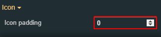 |
Icon position | Sets the position of the menu links icons, selecting from the drop-down list options: left or top. 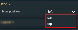 | |
Icon size | Sets the size of the menu links icons, using the up and down arrows to increase and decrease, or by manually typing the desired value. 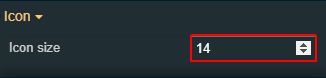 | |
Typography | Font size | Sets the size of the menu links font, using the up and down arrows to increase and decrease, or by manually typing the desired value. 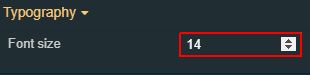 |
Font weight | Sets the weight of the menu links font, selecting from the drop-down list options: 900 (fat), 800 (extra-bold), 700 (bold), 600 (semi-bold), 500 (medium), 400 (normal), 300 (light), 200 (extra-light) and 100 (thin). 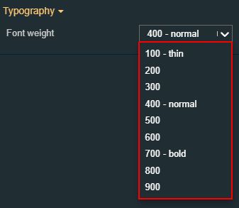 | |
Configuration | Logo Image | Sets the image for the menu logo. The image source can be selected by clicking the Upload image button, the user can either drop files in the designated area or click to upload the image from the local machine. Additionally, if any images have been previously uploaded they will be displayed under the content folder and reused. The image upload accepts files of type "jpeg", "jpg", "jpe", "gif", "png", "svg", "ico", "webp", up to 5 MB in size. 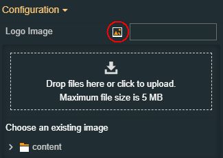 |
Logo Image Width | Sets the width of the menu logo. 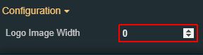 | |
Transform | Width | Sets the width of the component using the up and down arrows to increase and decrease, or by manually typing the desired pixel value. The component width can also be adjusted directly on the design surface by means of mouse manipulation. 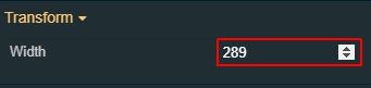 |
Height | Sets the height of the component using the up and down arrows to increase and decrease, or by manually typing the desired pixels value. The component height can also be adjusted directly on the design surface by means of mouse manipulation.  | |
Angle | Sets the rotation angle using the up and down arrows to increase and decrease, or by manually typing the desired degree value. The component angle can also be adjusted directly on the design surface by means of mouse manipulation.  | |
Left | Specifies the X (horizontal) coordinate of the component, on the grid, using the up and down arrows to increase and decrease, or by manually typing the desired value. The component X coordinate can also be adjusted directly on the design surface by means of mouse manipulation.  | |
Top | Specifies the Y (vertical) coordinate of the component, on the grid, using the up and down arrows to increase and decrease, or by manually typing the desired value. The component Y coordinate can also be adjusted directly on the design surface by means of mouse manipulation.  | |
Disable flip | Disables any flip transformation for this component. This keeps the component in the default position even when its container is flipped.  | |
Horizontal flip | Flips the selected component horizontally. 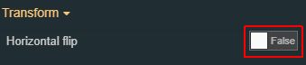 | |
Vertical flip | Flips the selected component vertically. 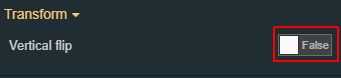 |
Navigation tabs
Check out this article and read all you need to know about the i4designer Navigation tabs component of the i4scada Platform.
The Navigation tabs component offers the basic functionality of opening a specified navigation structure path, allowing the user to navigate between multiple project pages and rendering their contents.
Note
The main functionality of the Navigation tab is to render the contents of a specific page, within a page view. Therefore, the structure of the selected Navigation file should NOT use the current page in its path to avoid circular references.
The Navigation tabs component
Category | Property | Description |
|---|---|---|
Configuration | Layout mode | Sets the behavior of the component related to the page placement. The user can select the component layout from the options available in the drop-down list: Default, Dock top, Dock bottom, Dock left, Dock right, Stretched, Pin top left, Pin top center, Pin top right, Pin right middle, Pin bottom right, Pin bottom center, Pin bottom left, Pin left middle and Pin center. |
Palette | Shadow color | Sets the color of the component's shadow. The user can either manually type in the HEX color code or use the color picker tool. |
Tab header background | Sets the background color or the navigation tab header. The user can either manually type in the HEX color code or use the color picker tool. 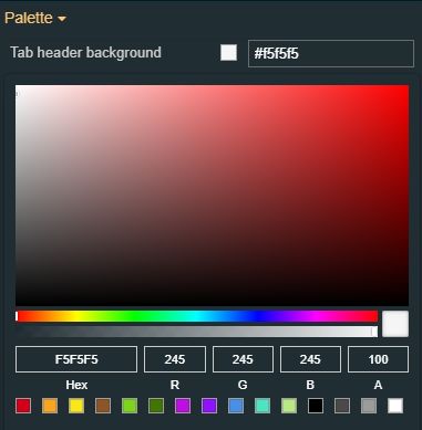 | |
Tabs foreground | Sets the color of the text displayed in the navigation tab header. The user can either manually type in the HEX color code or use the color picker tool. 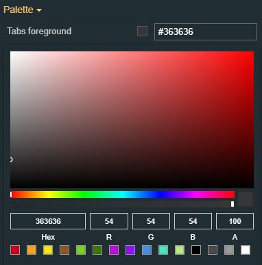 | |
Tab body background | Sets the background color of the navigation tab body. The user can either manually type in the HEX color code or use the color picker tool. 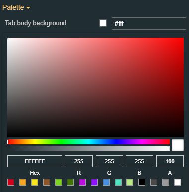 | |
Border color | Sets the border color of the navigation tab component. The user can either manually type in the HEX color code or use the color picker tool. 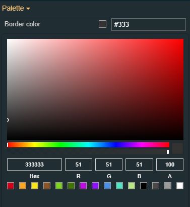 | |
Layout | Opacity | Sets the opacity of the component. The Opacity values should be numbers from 0 to 1 representing the opacity of the component. When the component has a value of 0 the element is completely invisible; a value of 1 is completely opaque (solid). By default, the Component's opacity is set to value 1. Using the up / down arrows the user can control the opacity degree. 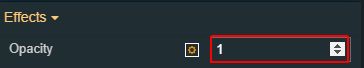 By clicking the Open button the view is extended to display the Opacity slider. 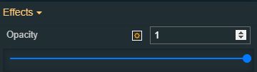 |
Margin | Sets the margin of the component relative to the drawing board area. The supported values are the standard CSS values for the margin. The top, bottom, left and right values can either be typed in the main property field or by using the Margin editor. The Margin editor can be opened by clicking the Open button. The components margins can be updated by setting the margin value and selecting the desired unit:
| |
Shadow offset X | Sets the offset of the shadow on the horizontal axis. The default value can be increased or decreased, either by manually typing in the desired value or by using the up and down arrows. | |
Shadow offset Y | Sets the offset of the shadow on the vertical axis. The default value can be increased or decreased, either by manually typing in the desired value or by using the up and down arrows. | |
Shadow size | Sets the width of the component shadow. The default value can be increased or decreased, either by manually typing in the desired value or by using the up and down arrows. | |
Navigation | Navigation Structure File Path | Allows the user to either select or type in the path toward the navigation structure file. For easier management of the project pages, the "Navigate to page" button allows the user to open a tab showing the navigation page. 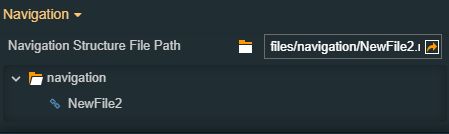 Upon navigation structure selection, the component will be updated accordingly. 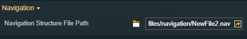 |
Transform | Width | Sets the width of the component using the up and down arrows to increase and decrease, or by manually typing the desired pixels value. The component width can also be adjusted directly on the design surface by means of mouse manipulation. |
Height | Sets the height of the component using the up and down arrows to increase and decrease, or by manually typing the desired pixel value. The component height can also be adjusted directly on the design surface by means of mouse manipulation. | |
Angle | Sets the rotation angle using the up and down arrows to increase and decrease, or by manually typing the desired degree value. The component angle can also be adjusted directly on the design surface by means of mouse manipulation. | |
Left | Specifies the X (horizontal) coordinate of the component, on the grid, using the up and down arrows to increase and decrease, or by manually typing the desired value. The component X coordinate can also be adjusted directly on the design surface by means of mouse manipulation. 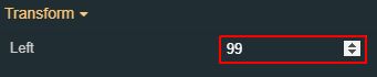 | |
Top | Specifies the Y (vertical) coordinate of the component, on the grid, using the up and down arrows to increase and decrease, or by manually typing the desired value. The component Y coordinate can also be adjusted directly on the design surface by means of mouse manipulation. | |
Disable flip | Disables any flip transformation for this component. This keeps the component in the default position even when its container is flipped. | |
Horizontal flip | Flips the selected component horizontally. | |
Vertical flip | Flips the selected component vertically. |