Security
Check out this article and learn more details about the i4scada security-specific components and how to set them up, for your projects.
The Security category provides the list of components that allow the user to control access to the project visualization.
Tip
For a set of step-based tutorials describing the usage of the i4scada Security components, please visit the dedicated tutorials, here.
User actions list
Check out this article in order to learn more details about the i4designer User actions list component and its properties.
The User actions list component is a simple output control that displays the list of actions performed by the i4scada system users.
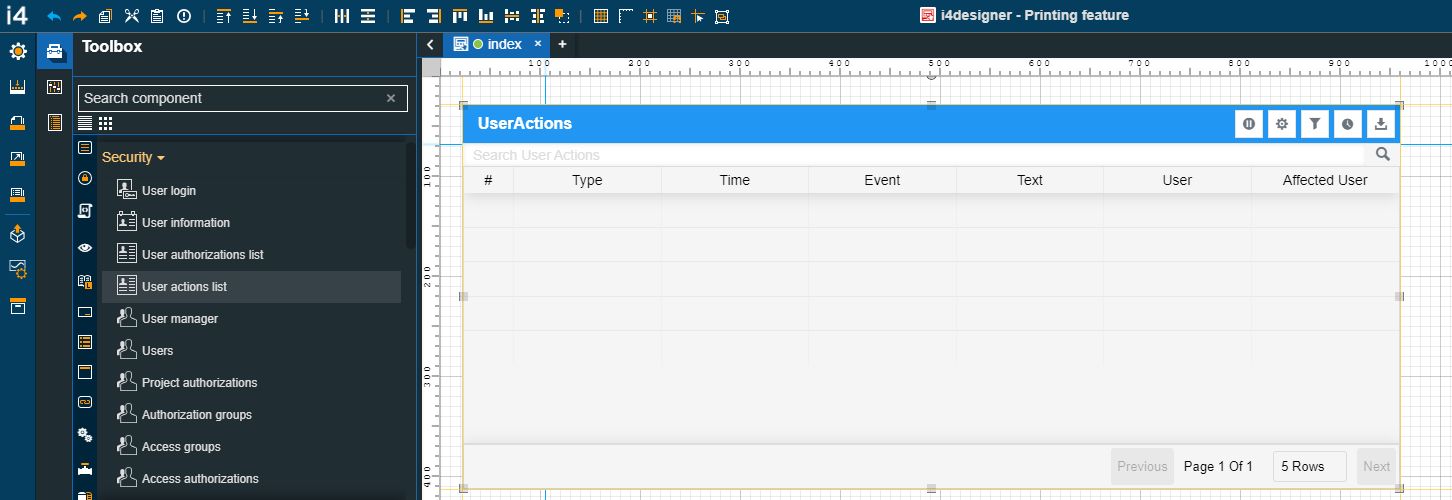
The User actions list component
Category | Property | Description |
|---|---|---|
Common | Name | The name of the component, visible in other Designer locations (such as Page explorer).  |
Object ID | Sets the Object ID of the component. By defining an object ID for the control, it can be passed as SignalPrefix when using parameter passing in navigation. The value of the Object ID can be used via a placeholder [OID] in other properties of this extension. The placeholder is supported in all signal properties, symbolic texts, and states. Example: Setpoint [OID]  | |
Tooltip text | Optional tooltip text, that will be shown on mouseover at runtime.  | |
Security | System authorization | The system authorization required to display the component. If the logged in user does not have this system authorization, the component will not be visible or enabled (depending on the set Security access behavior). If the property is left empty, the component will be visible and enabled for all users. Further on, the user can also add multiple System authorizations / Permissions, separated by comma (,). 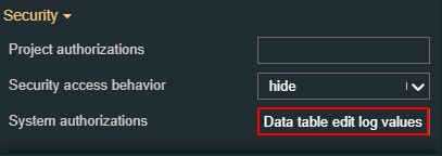 |
Project authorizations | The project authorization required for displaying the component. If the logged in user does not have this project authorization, the component will not be visible or enabled (depending on the set Security access behavior). If the property is left empty, the component will be visible and enabled to all users. Further on, the user can also add multiple Project authorizations / Roles, separated by comma (,).  | |
Security access behavior | Sets the behavior of the element to either disabled (grayed out) or hidden, when the logged in user doesn't meet the conditions imposed by the Project authorization / Roles and System authorization / Permissions properties. In case both Project authorization / Roles and System authorization / Permissions properties are set, the logged user needs to meet both conditions to be able to see and utilize the component, at run-time. 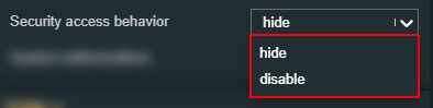 | |
Layout | Layout mode | Sets the behavior of the component related to the page placement. The user can select the component layout from the options available in the drop-down list: Default, Dock top, Dock bottom, Dock left, Dock right, Stretched, Pin top left, Pin top center, Pin top right, Pin right middle, Pin bottom right, Pin bottom center, Pin bottom left, Pin left middle and Pin center. 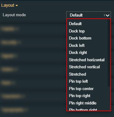 |
Margin | Sets the margin of the component relative to the drawing board area. The supported values are the standard CSS values for the margin. The top, bottom, left and right values can either be typed in the main property field or by using the Margin editor. 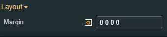 The Margin editor can be opened by clicking the Open button. 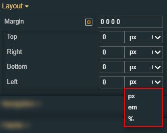 The components margins can be updated by setting the margin value and selecting the desired unit:
| |
Effects | Opacity | Sets the opacity of the component. The Opacity values should be numbers from 0 to 1 representing the opacity of the component. When the component has a value of 0 the element is completely invisible; a value of 1 is completely opaque (solid). By default, the Component's opacity is set to value 1. Using the up/down arrows the user can control the opacity degree. 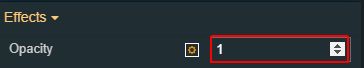 By clicking the Open button the view is extended to display the Opacity slider. 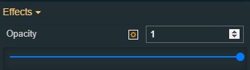 |
Shadow color | Sets the color of the component's shadow. The user can either manually type in the HEX color code or use the color picker tool. 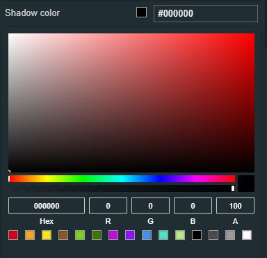 | |
Shadow offset X | Sets the offset of the shadow on the horizontal axis. The default value can be increased or decreased, either by manually typing in the desired value or by using the up and down arrows. 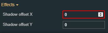 | |
Shadow offset Y | Sets the offset of the shadow on the vertical axis. The default value can be increased or decreased, either by manually typing in the desired value or by using the up and down arrows. 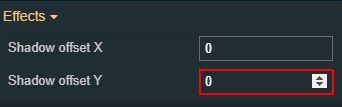 | |
Shadow size | Sets the width of the component shadow. The default value can be increased or decreased, either by manually typing in the desired value or by using the up and down arrows. 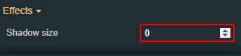 | |
Configuration | Auto update | By enabling the Auto-refresh toggle button, the list will be refreshed automatically at certain predefined time intervals. 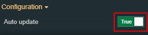 |
Configuration namespace | The namespace used by the chart predefined configuration should be applied at run time. By setting this property, the respective configuration will be, by default, applied. 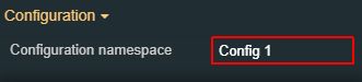 | |
DateTime format | Selects the time and date format for the DateTime Signal values. Available tokens are - YYYY, YY, Y, Q, MM, MMM, MMMM, D, DD. Further information are available in the "Year, month, and day tokens" chapter under https://momentjs.com/docs/#/parsing/string-format/ 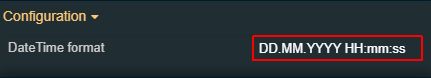 | |
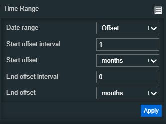
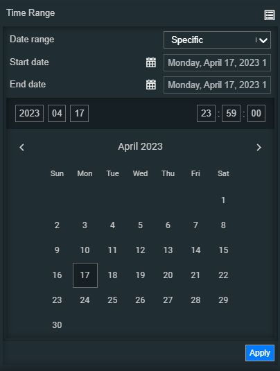
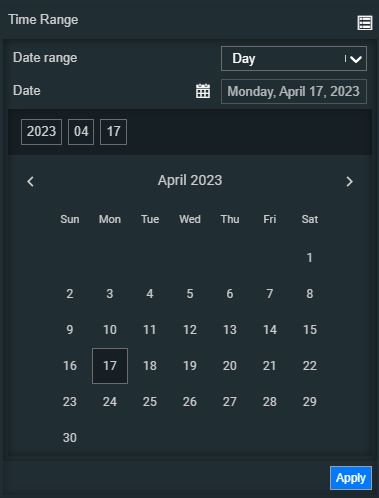
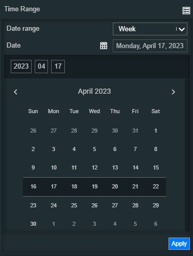
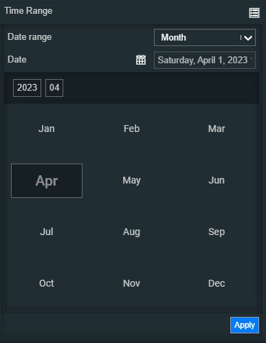
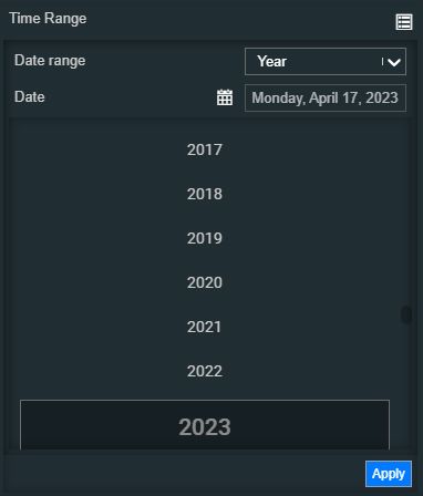
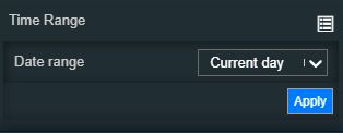
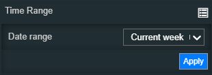
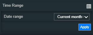
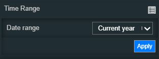
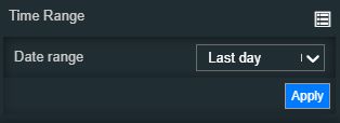
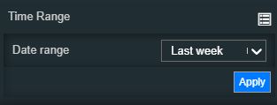
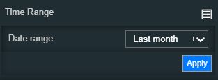
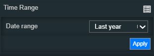
Time Range | Contains a set of time range configurations. By clicking the Expand array list button, a list of modular time range properties is exposed. Based on the selection made for the Date range property, the view is updated accordingly, as follows:
| |
Title text | Sets the text displayed as title in the component's header.  | |
Update rate | Sets the update rate (expressed in milliseconds). The update rate (expressed in milliseconds). This property will be taken into consideration only if the Auto Refresh property is set to True. 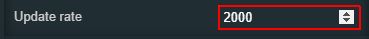 | |
Appearance | Page size | Sets the number of visible user actions on a single page. By default, the value of this field is set to 5, but the number can be increased or decreased, by manually typing in the new value or by using the up / down arrows. 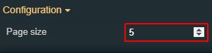 |
Show footer | Allows the user to enable or disable the display of the User Actions List footer. 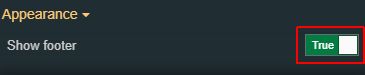 | |
Show header | Allows the user to enable or disable the display of the User Actions List header. 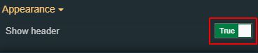 | |
Show index column | Allows the user to enable or disable the display of the index column. 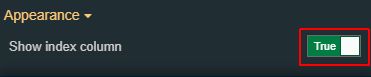 | |
Palette | Background color | Sets the background color of the component. The user can either manually type in the HEX color code or use the color picker tool. As the color palette is injected into this component by means of the default CSS class, applying this property the CSS class settings will be overwritten. 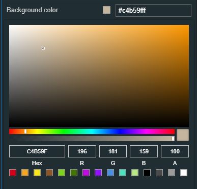 |
Border color | Sets the color of the component border. The user can either manually type in the HEX color code or use the color picker tool. As the color palette is injected into this component by means of the default CSS class, applying this property the CSS class settings will be overwritten. 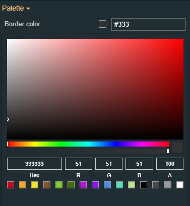 | |
Buttons background | Sets the background color of the component buttons. The user can either manually type in the HEX color code or use the color picker tool. As the color palette is injected into this component by means of the default CSS class, applying this property the CSS class settings will be overwritten. 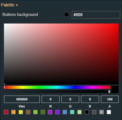 | |
Buttons foreground | Sets the foreground color of the component buttons. The user can either manually type in the HEX color code or use the color picker tool. As the color palette is injected into this component by means of the default CSS class, applying this property the CSS class settings will be overwritten. 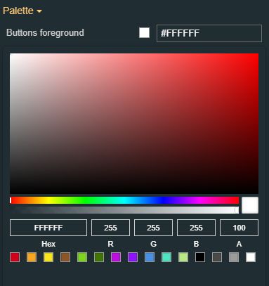 | |
Header background | Sets the background color of the component header. The user can either manually type in the HEX color code or use the color picker tool. As the color palette is injected into this component by means of the default CSS class, applying this property the CSS class settings will be overwritten. 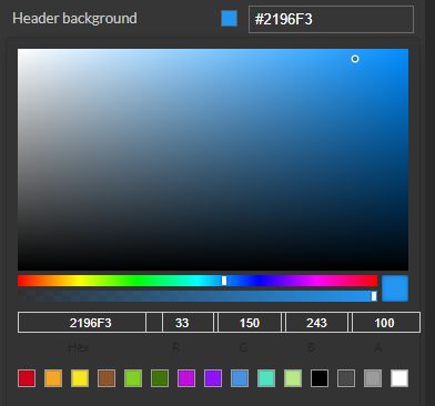 | |
Header foreground | Sets the foreground color of the component header. The user can either manually type in the HEX color code or use the color picker tool. As the color palette is injected into this component by means of the default CSS class, applying this property the CSS class settings will be overwritten. 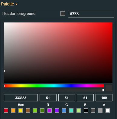 | |
Typography | Header font family | Sets the font family of the textual information displayed by the component header, selecting from web-safe fonts available in the drop-down list. 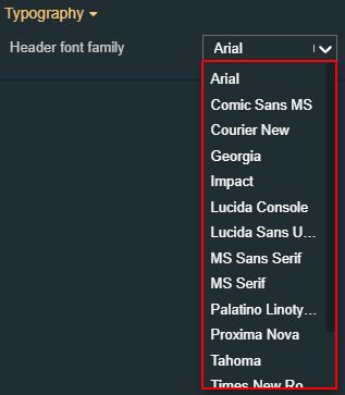 |
Header font size | Sets the font size of the textual information displayed by the component header, using the up and down arrows to increase and decrease, or by manually typing the desired value. 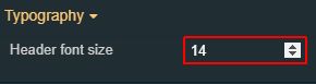 | |
Header font weight | Sets the weight of the textual information displayed by the component header, selecting from the drop-down list options: 900 (fat), 800 (extra-bold), 700 (bold), 600 (semi-bold), 500 (medium), 400 (normal), 300 (light), 200 (extra-light) and 100 (thin). 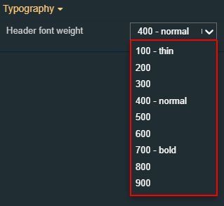 | |
Style | Border width | Sets the width of the component's container. The value is specified in pixels.  The top, bottom, left, and right values can either be typed in the main property field or by using the Border width editor. The Border width editor can be opened by clicking the Open button. The component's border width can be updated by setting the desired value and selecting the unit: 
|
Transform | Angle | Sets the rotation angle using the up and down arrows to increase and decrease, or by manually typing the desired degree value. The component angle can also be adjusted directly on the design surface by means of mouse manipulation.  |
Height | Sets the height of the component using the up and down arrows to increase and decrease, or by manually typing the desired pixel value. The component height can also be adjusted directly on the design surface by means of mouse manipulation.  | |
Left | Specifies the X (horizontal) coordinate of the component, on the grid, using the up and down arrows to increase and decrease, or by manually typing the desired value. The component X coordinate can also be adjusted directly on the design surface by means of mouse manipulation.  | |
Top | Specifies the Y (vertical) coordinate of the component, on the grid, using the up and down arrows to increase and decrease, or by manually typing the desired value. The component Y coordinate can also be adjusted directly on the design surface by means of mouse manipulation.  | |
Width | Sets the width of the component using the up and down arrows to increase and decrease, or by manually typing the desired pixel value. The component width can also be adjusted directly on the design surface by means of mouse manipulation.  | |
Disable flip | Disables any flip transformation for this component. This keeps the component in the default position even when its container is flipped.  | |
Horizontal flip | Flips the selected component horizontally.  | |
Vertical flip | Flips the selected component vertically.  |
Users
Check out this article and learn more details about the i4scada Users component and what settings can be configured.
The Users component allows the possibility to view and manage i4scada users, define user default settings and password policies.
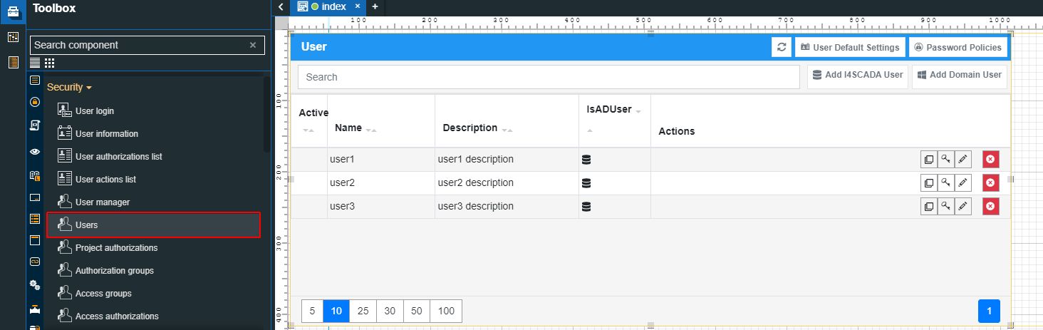
The Users component
Category | Property | Description |
|---|---|---|
Common | Name | The name of the component, visible in other Designer locations (such as Page explorer). |
Object ID | Sets the Object ID of the component. By defining an object ID for the control, it can be passed as SignalPrefix when using parameter passing in navigation. The value of the Object ID can be used via a placeholder [OID] in other properties of this extension. The placeholder is supported in all signal properties, symbolic texts, and states. Example: Setpoint [OID] | |
Tooltip text | Optional tooltip text, that will be shown on mouseover at runtime. | |
Security | Project authorization | The project authorization required for displaying the component. If the logged in user does not have this project authorization, the component will not be visible or enabled (depending on the set Security access behavior). If the property is left empty, the component will be visible and enabled to all users. Further on, the user can also add multiple Project authorizations / Roles, separated by comma (,). |
Security access behavior | Sets the behavior of the element to either disabled (grayed out) or hidden, when the logged in user doesn't meet the conditions imposed by the Project authorization / Roles and System authorization / Permissions properties. In case both Project authorization / Roles and System authorization / Permissions properties are set, the logged user needs to meet both conditions to be able to see and utilize the component, at run-time. | |
System authorization | The system authorization required to display the component. If the logged in user does not have this system authorization, the component will not be visible or enabled (depending on the set Security access behavior). If the property is left empty, the component will be visible and enabled for all users. Further on, the user can also add multiple System authorizations / Permissions, separated by comma (,). | |
Layout | Layout mode | Sets the behavior of the component related to the page placement. The user can select the component layout from the options available in the drop-down list: Default, Dock top, Dock bottom, Dock left, Dock right, Stretched, Pin top left, Pin top center, Pin top right, Pin right middle, Pin bottom right, Pin bottom center, Pin bottom left, Pin left middle and Pin center. |
Margin | Sets the margin of the component relative to the drawing board area. The supported values are the standard CSS values for the margin. The top, bottom, left and right values can either be typed in the main property field or by using the Margin editor. The Margin editor can be opened by clicking the Open button. The components margins can be updated by setting the margin value and selecting the desired unit:
| |
Effects | Opacity | Sets the opacity of the component. The Opacity values should be numbers from 0 to 1 representing the opacity of the component. When the component has a value of 0 the element is completely invisible; a value of 1 is completely opaque (solid). By default, the Component's opacity is set to value 1. Using the up/down arrows the user can control the opacity degree. By clicking the Open button the view is extended to display the Opacity slider. |
Shadow color | Sets the color of the component's shadow. The user can either manually type in the HEX color code or use the color picker tool. | |
Shadow offset X | Sets the offset of the shadow on the horizontal axis. The default value can be increased or decreased, either by manually typing in the desired value or by using the up and down arrows. | |
Shadow offset Y | Sets the offset of the shadow on the vertical axis. The default value can be increased or decreased, either by manually typing in the desired value or by using the up and down arrows. | |
Shadow size | Sets the width of the component shadow. The default value can be increased or decreased, either by manually typing in the desired value or by using the up and down arrows. | |
Configuration | Title text | Sets the text displayed by the component's header. By default, the title text is "Users". 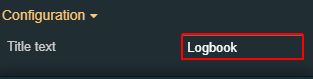 |
Appearance | Page size | Sets the number of visible user actions on a single page. By default, the value of this field is set to 5, but the number can be increased or decreased, by manually typing in the new value or by using the up / down arrows. |
Show header | Allows the user to enable or disable the display of the User Actions List header. | |
Show index column | Allows the user to enable or disable the display of the index column. | |
Palette | Background color | Sets the background color of the component. The user can either manually type in the HEX color code or use the color picker tool. As the color palette is injected into this component by means of the default CSS class, applying this property the CSS class settings will be overwritten. |
Border color | Sets the color of the component border. The user can either manually type in the HEX color code or use the color picker tool. As the color palette is injected into this component by means of the default CSS class, applying this property the CSS class settings will be overwritten. | |
Buttons background | Sets the background color of the component buttons. The user can either manually type in the HEX color code or use the color picker tool. As the color palette is injected into this component by means of the default CSS class, applying this property the CSS class settings will be overwritten. | |
Buttons foreground | Sets the foreground color of the component buttons. The user can either manually type in the HEX color code or use the color picker tool. As the color palette is injected into this component by means of the default CSS class, applying this property the CSS class settings will be overwritten. | |
Header background | Sets the background color of the component header. The user can either manually type in the HEX color code or use the color picker tool. As the color palette is injected into this component by means of the default CSS class, applying this property the CSS class settings will be overwritten. 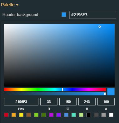 | |
Header foreground | Sets the foreground color of the component header. The user can either manually type in the HEX color code or use the color picker tool. As the color palette is injected into this component by means of the default CSS class, applying this property the CSS class settings will be overwritten. | |
Typography | Header font family | Sets the font family of the textual information displayed by the component header, selecting from web-safe fonts available in the drop-down list. |
Header font size | Sets the font size of the textual information displayed by the component header, using the up and down arrows to increase and decrease, or by manually typing the desired value. | |
Header font-weight | Sets the weight of the textual information displayed by the component header, selecting from the drop-down list options: 900 (fat), 800 (extra-bold), 700 (bold), 600 (semi-bold), 500 (medium), 400 (normal), 300 (light), 200 (extra-light) and 100 (thin). | |
Style | Border width | Sets the width of the component's container. The value is specified in pixels. The top, bottom, left, and right values can either be typed in the main property field or by using the Border width editor. The Border width editor can be opened by clicking the Open button. The component's border width can be updated by setting the desired value and selecting the unit: 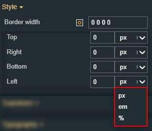
|
Transform | Angle | Sets the rotation angle using the up and down arrows to increase and decrease, or by manually typing the desired degree value. The component angle can also be adjusted directly on the design surface by means of mouse manipulation. |
Height | Sets the height of the component using the up and down arrows to increase and decrease, or by manually typing the desired pixels value. The component height can also be adjusted directly on the design surface by means of mouse manipulation. | |
Left | Specifies the X (horizontal) coordinate of the component, on the grid, using the up and down arrows to increase and decrease, or by manually typing the desired value. The component X coordinate can also be adjusted directly on the design surface by means of mouse manipulation. | |
Top | Specifies the Y (vertical) coordinate of the component, on the grid, using the up and down arrows to increase and decrease, or by manually typing the desired value. The component Y coordinate can also be adjusted directly on the design surface by means of mouse manipulation. | |
Width | Sets the width of the component using the up and down arrows to increase and decrease, or by manually typing the desired pixels value. The component width can also be adjusted directly on the design surface by means of mouse manipulation. | |
Disable flip | Disables any flip transformation for this component. This keeps the component in the default position even when its container is flipped. | |
Horizontal flip | Flips the selected component horizontally. | |
Vertical flip | Flips the selected component vertically. |
User Manager
Check out this article and learn more details about the i4scada User Manager component and what settings can be configured.
The User Manager component allows the possibility to view and manage i4scada users, define user default settings and password policies. Additionally, this component provides the possibility to switch between the User's management panels, using the drop-down list of the container header.
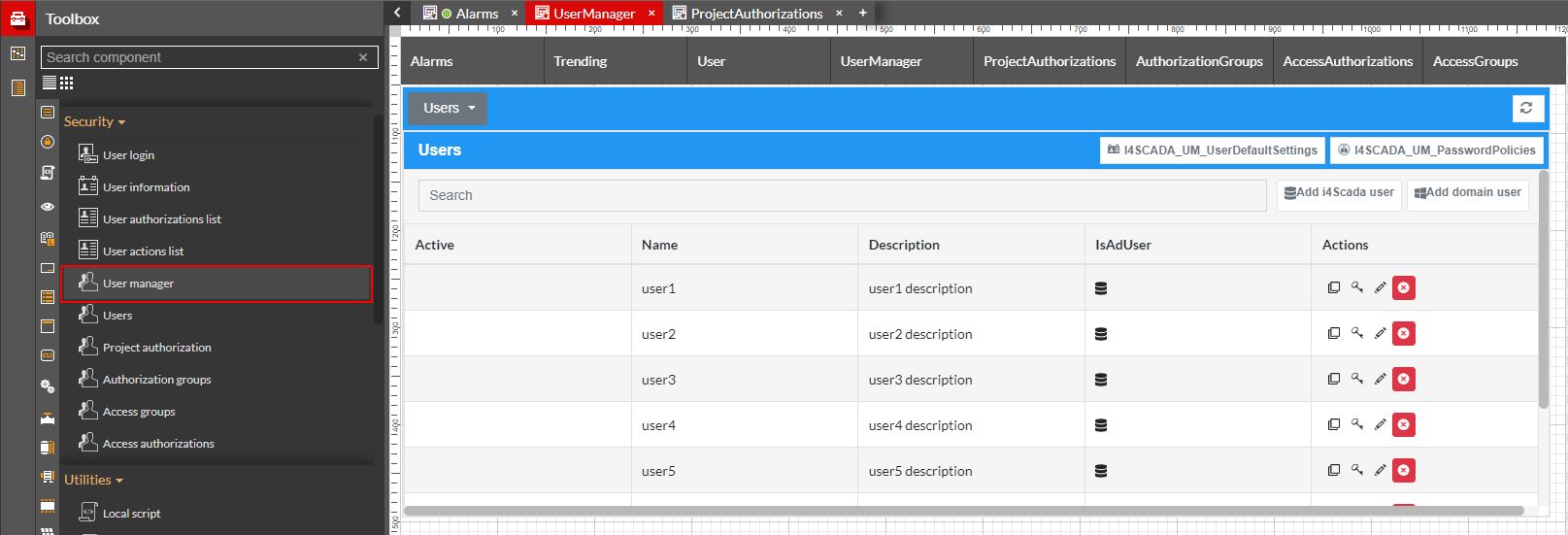
The User Manager component
Category | Property | Description |
|---|---|---|
Common | Name | The name of the component, visible in other Designer locations (such as Page explorer). |
Object ID | Sets the Object ID of the component. By defining an object ID for the control, it can be passed as SignalPrefix when using parameter passing in navigation. The value of the Object ID can be used via a placeholder [OID] in other properties of this extension. The placeholder is supported in all signal properties, symbolic texts, and states. Example: Setpoint [OID] | |
Tooltip text | Optional tooltip text, that will be shown on mouseover at runtime. | |
Security | Project authorization | The project authorization required for displaying the component. If the logged in user does not have this project authorization, the component will not be visible or enabled (depending on the set Security access behavior). If the property is left empty, the component will be visible and enabled to all users. Further on, the user can also add multiple Project authorizations / Roles, separated by comma (,). |
Security access behavior | Sets the behavior of the element to either disabled (grayed out) or hidden, when the logged in user doesn't meet the conditions imposed by the Project authorization / Roles and System authorization / Permissions properties. In case both Project authorization / Roles and System authorization / Permissions properties are set, the logged user needs to meet both conditions to be able to see and utilize the component, at run-time. | |
System authorization | The system authorization required to display the component. If the logged in user does not have this system authorization, the component will not be visible or enabled (depending on the set Security access behavior). If the property is left empty, the component will be visible and enabled for all users. Further on, the user can also add multiple System authorizations / Permissions, separated by comma (,). | |
Layout | Layout mode | Sets the behavior of the component related to the page placement. The user can select the component layout from the options available in the drop-down list: Default, Dock top, Dock bottom, Dock left, Dock right, Stretched, Pin top left, Pin top center, Pin top right, Pin right middle, Pin bottom right, Pin bottom center, Pin bottom left, Pin left middle and Pin center. |
Margin | Sets the margin of the component relative to the drawing board area. The supported values are the standard CSS values for the margin. The top, bottom, left and right values can either be typed in the main property field or by using the Margin editor. The Margin editor can be opened by clicking the Open button. The components margins can be updated by setting the margin value and selecting the desired unit:
| |
Effects | Opacity | Sets the opacity of the component. The Opacity values should be numbers from 0 to 1 representing the opacity of the component. When the component has a value of 0 the element is completely invisible; a value of 1 is completely opaque (solid). By default, the Component's opacity is set to value 1. Using the up / down arrows the user can control the opacity degree. By clicking the Open button the view is extended to display the Opacity slider. |
Shadow color | Sets the color of the component's shadow. The user can either manually type in the HEX color code or use the color picker tool. | |
Shadow offset X | Sets the offset of the shadow on the horizontal axis. The default value can be increased or decreased, either by manually typing in the desired value or by using the up and down arrows. | |
Shadow offset Y | Sets the offset of the shadow on the vertical axis. The default value can be increased or decreased, either by manually typing in the desired value or by using the up and down arrows. | |
Shadow size | Sets the width of the component shadow. The default value can be increased or decreased, either by manually typing in the desired value or by using the up and down arrows. | |
Appearance | Page size | Sets the number of visible user actions on a single page. By default, the value of this field is set to 5, but the number can be increased or decreased, by manually typing in the new value or by using the up/down arrows. |
Show container header | Allows the user to enable or disable the display of the component container header. The component container header stores the list of User manager-specific panels, hence allowing the user to access other panels from this view. 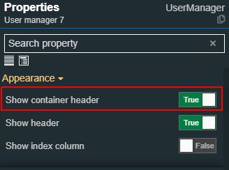 | |
Show header | Allows the user to enable or disable the display of the User Actions List header. | |
Show index column | Allows the user to enable or disable the display of the index column. | |
Configuration | Title text | Sets the text displayed by the component's header. By default, the title text is "Users". 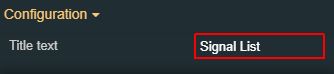 |
Palette | Background color | Sets the background color of the component. The user can either manually type in the HEX color code or use the color picker tool. As the color palette is injected into this component by means of the default CSS class, applying this property the CSS class settings will be overwritten. |
Border color | Sets the color of the component border. The user can either manually type in the HEX color code or use the color picker tool. As the color palette is injected into this component by means of the default CSS class, applying this property the CSS class settings will be overwritten. | |
Buttons background | Sets the background color of the component buttons. The user can either manually type in the HEX color code or use the color picker tool. As the color palette is injected into this component by means of the default CSS class, applying this property the CSS class settings will be overwritten. 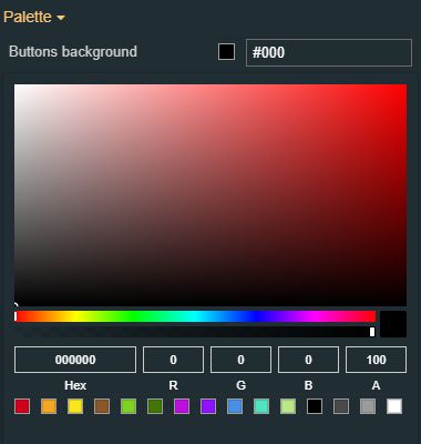 | |
Buttons foreground | Sets the foreground color of the component buttons. The user can either manually type in the HEX color code or use the color picker tool. As the color palette is injected into this component by means of the default CSS class, applying this property the CSS class settings will be overwritten. | |
Header background | Sets the background color of the component header. The user can either manually type in the HEX color code or use the color picker tool. As the color palette is injected into this component by means of the default CSS class, applying this property the CSS class settings will be overwritten. | |
Header foreground | Sets the foreground color of the component header. The user can either manually type in the HEX color code or use the color picker tool. As the color palette is injected into this component by means of the default CSS class, applying this property the CSS class settings will be overwritten. | |
Typography | Header font family | Sets the font family of the textual information displayed by the component header, selecting from web-safe fonts available in the drop-down list. |
Header font size | Sets the font size of the textual information displayed by the component header, using the up and down arrows to increase and decrease, or by manually typing the desired value. | |
Header font-weight | Sets the weight of the textual information displayed by the component header, selecting from the drop-down list options: 900 (fat), 800 (extra-bold), 700 (bold), 600 (semi-bold), 500 (medium), 400 (normal), 300 (light), 200 (extra-light) and 100 (thin). | |
Style | Border width | Sets the width of the component's container. The value is specified in pixels. 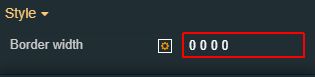 The top, bottom, left and right values can either be typed in the main property field or by using the Border width editor. The Border width editor can be opened by clicking the Open button. The components border width can be updated by setting the desired value and selecting the unit: 
|
Transform | Angle | Sets the rotation angle using the up and down arrows to increase and decrease, or by manually typing the desired degree value. The component angle can also be adjusted directly on the design surface by means of mouse manipulation. |
Height | Sets the height of the component using the up and down arrows to increase and decrease, or by manually typing the desired pixels value. The component height can also be adjusted directly on the design surface by means of mouse manipulation. | |
Left | Specifies the X (horizontal) coordinate of the component, on the grid, using the up and down arrows to increase and decrease, or by manually typing the desired value. The component X coordinate can also be adjusted directly on the design surface by means of mouse manipulation. | |
Top | Specifies the Y (vertical) coordinate of the component, on the grid, using the up and down arrows to increase and decrease, or by manually typing the desired value. The component Y coordinate can also be adjusted directly on the design surface by means of mouse manipulation. | |
Width | Sets the width of the component using the up and down arrows to increase and decrease, or by manually typing the desired pixels value. The component width can also be adjusted directly on the design surface by means of mouse manipulation. | |
Disable flip | Disables any flip transformation for this component. This keeps the component in the default position even when its container is flipped. | |
Horizontal flip | Flips the selected component horizontally. | |
Vertical flip | Flips the selected component vertically. |
Project authorization
Check out this article and learn more details about the i4scada Project authorization component and what settings can be configured.
The Project authorization component allows the possibility to view and manage i4scada Project authorizations.
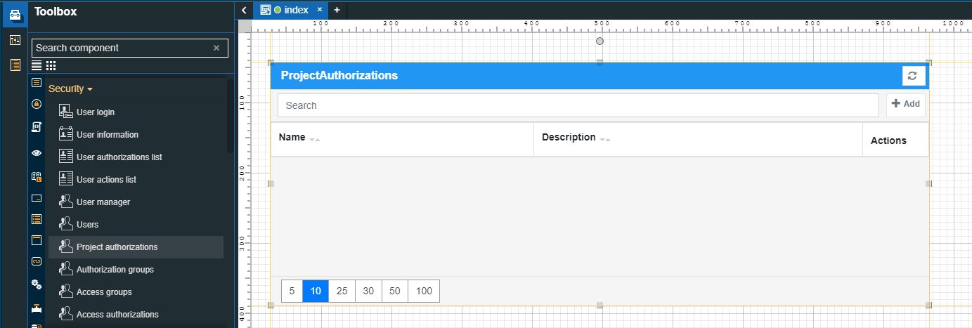
The Project authorization component
Category | Property | Description |
|---|---|---|
Common | Name | The name of the component, visible in other Designer locations (such as Page explorer). |
Object ID | Sets the Object ID of the component. By defining an object ID for the control, it can be passed as SignalPrefix when using parameter passing in navigation. The value of the Object ID can be used via a placeholder [OID] in other properties of this extension. The placeholder is supported in all signal properties, symbolic texts, and states. Example: Setpoint [OID] | |
Tooltip text | Optional tooltip text, that will be shown on mouseover at runtime. | |
Security | Project authorization | The project authorization required for displaying the component. If the logged in user does not have this project authorization, the component will not be visible or enabled (depending on the set Security access behavior). If the property is left empty, the component will be visible and enabled to all users. Further on, the user can also add multiple Project authorizations / Roles, separated by comma (,). |
Security access behavior | Sets the behavior of the element to either disabled (grayed out) or hidden, when the logged in user doesn't meet the conditions imposed by the Project authorization / Roles and System authorization / Permissions properties. In case both Project authorization / Roles and System authorization / Permissions properties are set, the logged user needs to meet both conditions to be able to see and utilize the component, at run-time. | |
System authorization | The system authorization required to display the component. If the logged in user does not have this system authorization, the component will not be visible or enabled (depending on the set Security access behavior). If the property is left empty, the component will be visible and enabled for all users. Further on, the user can also add multiple System authorizations / Permissions, separated by comma (,). | |
Layout | Layout mode | Sets the behavior of the component related to the page placement. The user can select the component layout from the options available in the drop-down list: Default, Dock top, Dock bottom, Dock left, Dock right, Stretched, Pin top left, Pin top center, Pin top right, Pin right middle, Pin bottom right, Pin bottom center, Pin bottom left, Pin left middle and Pin center. |
Margin | Sets the margin of the component relative to the drawing board area. The supported values are the standard CSS values for the margin. The top, bottom, left and right values can either be typed in the main property field or by using the Margin editor. The Margin editor can be opened by clicking the Open button. The components margins can be updated by setting the margin value and selecting the desired unit:
| |
Effects | Opacity | Sets the opacity of the component. The Opacity values should be numbers from 0 to 1 representing the opacity of the component. When the component has a value of 0 the element is completely invisible; a value of 1 is completely opaque (solid). By default, the Component's opacity is set to value 1. Using the up / down arrows the user can control the opacity degree. By clicking the Open button the view is extended to display the Opacity slider. |
Shadow color | Sets the color of the component's shadow. The user can either manually type in the HEX color code or use the color picker tool. | |
Shadow offset X | Sets the offset of the shadow on the horizontal axis. The default value can be increased or decreased, either by manually typing in the desired value or by using the up and down arrows. | |
Shadow offset Y | Sets the offset of the shadow on the vertical axis. The default value can be increased or decreased, either by manually typing in the desired value or by using the up and down arrows. | |
Shadow size | Sets the width of the component shadow. The default value can be increased or decreased, either by manually typing in the desired value or by using the up and down arrows. | |
Configuration | Title text | Sets the text displayed by the component's header. By default, the title text is "Project Authorizations". |
Appearance | Page size | Sets the number of visible user actions on a single page. By default, the value of this field is set to 5, but the number can be increased or decreased, by manually typing in the new value or by using the up / down arrows. |
Show header | Allows the user to enable or disable the display of the User Actions List header. | |
Show index column | Allows the user to enable or disable the display of the index column. | |
Palette | Background color | Sets the background color of the component. The user can either manually type in the HEX color code or use the color picker tool. As the color palette is injected into this component by means of the default CSS class, applying this property the CSS class settings will be overwritten. |
Border color | Sets the color of the component border. The user can either manually type in the HEX color code or use the color picker tool. As the color palette is injected into this component by means of the default CSS class, applying this property the CSS class settings will be overwritten. | |
Buttons background | Sets the background color of the component buttons. The user can either manually type in the HEX color code or use the color picker tool. As the color palette is injected into this component by means of the default CSS class, applying this property the CSS class settings will be overwritten. 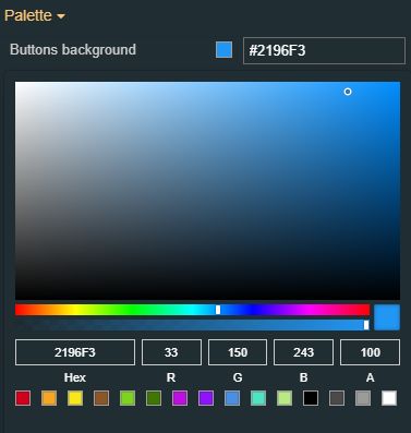 | |
Buttons foreground | Sets the foreground color of the component buttons. The user can either manually type in the HEX color code or use the color picker tool. As the color palette is injected into this component by means of the default CSS class, applying this property the CSS class settings will be overwritten. | |
Header background | Sets the background color of the component header. The user can either manually type in the HEX color code or use the color picker tool. As the color palette is injected into this component by means of the default CSS class, applying this property the CSS class settings will be overwritten. | |
Header foreground | Sets the foreground color of the component header. The user can either manually type in the HEX color code or use the color picker tool. As the color palette is injected into this component by means of the default CSS class, applying this property the CSS class settings will be overwritten. | |
Typography | Header font family | Sets the font family of the textual information displayed by the component header, selecting from web-safe fonts available in the drop-down list. |
Header font size | Sets the font size of the textual information displayed by the component header, using the up and down arrows to increase and decrease, or by manually typing the desired value. | |
Header font-weight | Sets the weight of the textual information displayed by the component header, selecting from the drop-down list options: 900 (fat), 800 (extra-bold), 700 (bold), 600 (semi-bold), 500 (medium), 400 (normal), 300 (light), 200 (extra-light) and 100 (thin). 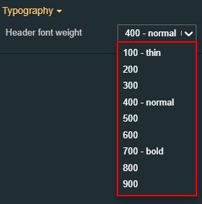 | |
Style | Border width | Sets the width of the component's container. The value is specified in pixels. The top, bottom, left and right values can either be typed in the main property field or by using the Border width editor. The Border width editor can be opened by clicking the Open button. The components border width can be updated by setting the desired value and selecting the unit:
|
Transform | Angle | Sets the rotation angle using the up and down arrows to increase and decrease, or by manually typing the desired degree value. The component angle can also be adjusted directly on the design surface by means of mouse manipulation. |
Height | Sets the height of the component using the up and down arrows to increase and decrease, or by manually typing the desired pixels value. The component height can also be adjusted directly on the design surface by means of mouse manipulation. | |
Left | Specifies the X (horizontal) coordinate of the component, on the grid, using the up and down arrows to increase and decrease, or by manually typing the desired value. The component X coordinate can also be adjusted directly on the design surface by means of mouse manipulation.  | |
Top | Specifies the Y (vertical) coordinate of the component, on the grid, using the up and down arrows to increase and decrease, or by manually typing the desired value. The component Y coordinate can also be adjusted directly on the design surface by means of mouse manipulation. | |
Width | Sets the width of the component using the up and down arrows to increase and decrease, or by manually typing the desired pixels value. The component width can also be adjusted directly on the design surface by means of mouse manipulation. | |
Disable flip | Disables any flip transformation for this component. This keeps the component in the default position even when its container is flipped. | |
Horizontal flip | Flips the selected component horizontally. | |
Vertical flip | Flips the selected component vertically. |
Authorization groups
Check out this article and learn more details about the i4scada Authorization groups component and what settings can be configured.
The Authorization groups component allows the possibility to view and manage i4scada Authorization groups.
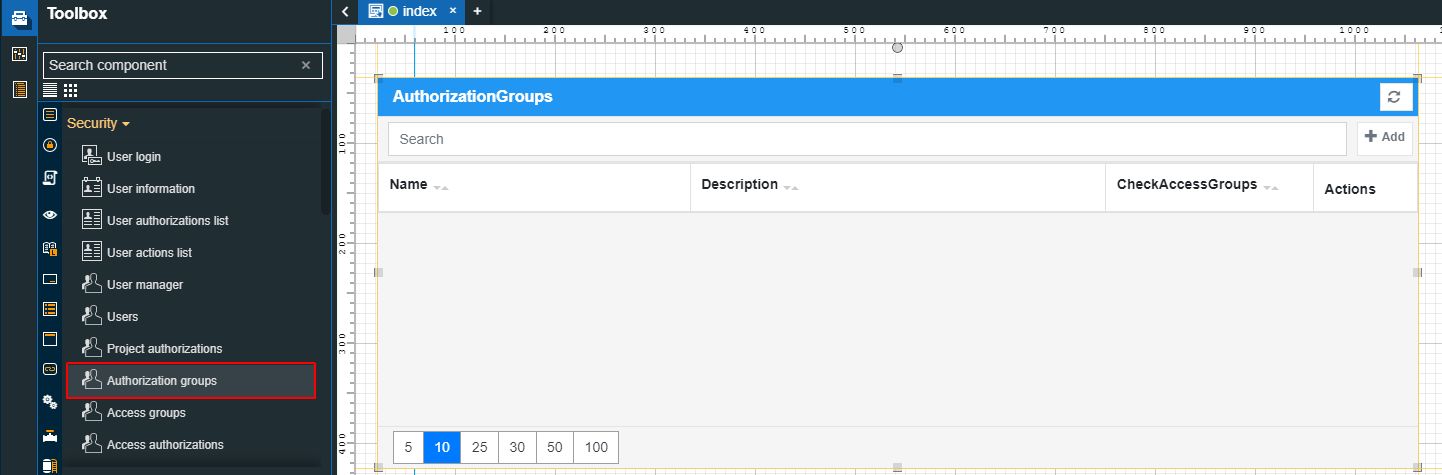
The Authorization groups component
Category | Property | Description |
|---|---|---|
Common | Name | The name of the component, visible in other Designer locations (such as Page explorer). |
Object ID | Sets the Object ID of the component. By defining an object ID for the control, it can be passed as SignalPrefix when using parameter passing in navigation. The value of the Object ID can be used via a placeholder [OID] in other properties of this extension. The placeholder is supported in all signal properties, symbolic texts, and states. Example: Setpoint [OID] | |
Tooltip text | Optional tooltip text, that will be shown on mouseover at runtime. | |
Security | Project authorization | The project authorization required for displaying the component. If the logged in user does not have this project authorization, the component will not be visible or enabled (depending on the set Security access behavior). If the property is left empty, the component will be visible and enabled to all users. Further on, the user can also add multiple Project authorizations / Roles, separated by comma (,). |
Security access behavior | Sets the behavior of the element to either disabled (grayed out) or hidden, when the logged in user doesn't meet the conditions imposed by the Project authorization / Roles and System authorization / Permissions properties. In case both Project authorization / Roles and System authorization / Permissions properties are set, the logged user needs to meet both conditions to be able to see and utilize the component, at run-time. | |
System authorization | The system authorization required to display the component. If the logged in user does not have this system authorization, the component will not be visible or enabled (depending on the set Security access behavior). If the property is left empty, the component will be visible and enabled for all users. Further on, the user can also add multiple System authorizations / Permissions, separated by comma (,). | |
Layout | Layout mode | Sets the behavior of the component related to the page placement. The user can select the component layout from the options available in the drop-down list: Default, Dock top, Dock bottom, Dock left, Dock right, Stretched, Pin top left, Pin top center, Pin top right, Pin right middle, Pin bottom right, Pin bottom center, Pin bottom left, Pin left middle and Pin center. |
Margin | Sets the margin of the component relative to the drawing board area. The supported values are the standard CSS values for the margin. The top, bottom, left and right values can either be typed in the main property field or by using the Margin editor. The Margin editor can be opened by clicking the Open button. The components margins can be updated by setting the margin value and selecting the desired unit:
| |
Effects | Opacity | Sets the opacity of the component. The Opacity values should be numbers from 0 to 1 representing the opacity of the component. When the component has a value of 0 the element is completely invisible; a value of 1 is completely opaque (solid). By default, the Component's opacity is set to value 1. Using the up / down arrows the user can control the opacity degree. By clicking the Open button the view is extended to display the Opacity slider. |
Shadow color | Sets the color of the component's shadow. The user can either manually type in the HEX color code or use the color picker tool. | |
Shadow offset X | Sets the offset of the shadow on the horizontal axis. The default value can be increased or decreased, either by manually typing in the desired value or by using the up and down arrows. | |
Shadow offset Y | Sets the offset of the shadow on the vertical axis. The default value can be increased or decreased, either by manually typing in the desired value or by using the up and down arrows. | |
Shadow size | Sets the width of the component shadow. The default value can be increased or decreased, either by manually typing in the desired value or by using the up and down arrows. | |
Configuration | Title text | Sets the text displayed by the component's header. By default, the title text is "Users". |
Appearance | Page size | Sets the number of visible user actions on a single page. By default, the value of this field is set to 5, but the number can be increased or decreased, by manually typing in the new value or by using the up / down arrows. |
Show header | Allows the user to enable or disable the display of the User Actions List header. | |
Show index column | Allows the user to enable or disable the display of the index column.  | |
Palette | Background color | Sets the background color of the component. The user can either manually type in the HEX color code or use the color picker tool. As the color palette is injected into this component by means of the default CSS class, applying this property the CSS class settings will be overwritten.  |
Border color | Sets the color of the component border. The user can either manually type in the HEX color code or use the color picker tool. As the color palette is injected into this component by means of the default CSS class, applying this property the CSS class settings will be overwritten. | |
Buttons background | Sets the background color of the component buttons. The user can either manually type in the HEX color code or use the color picker tool. As the color palette is injected into this component by means of the default CSS class, applying this property the CSS class settings will be overwritten. | |
Buttons foreground | Sets the foreground color of the component buttons. The user can either manually type in the HEX color code or use the color picker tool. As the color palette is injected into this component by means of the default CSS class, applying this property the CSS class settings will be overwritten. | |
Header background | Sets the background color of the component header. The user can either manually type in the HEX color code or use the color picker tool. As the color palette is injected into this component by means of the default CSS class, applying this property the CSS class settings will be overwritten. | |
Header foreground | Sets the foreground color of the component header. The user can either manually type in the HEX color code or use the color picker tool. As the color palette is injected into this component by means of the default CSS class, applying this property the CSS class settings will be overwritten. | |
Typography | Header font family | Sets the font family of the textual information displayed by the component header, selecting from web-safe fonts available in the drop-down list. |
Header font size | Sets the font size of the textual information displayed by the component header, using the up and down arrows to increase and decrease, or by manually typing the desired value. | |
Header font-weight | Sets the weight of the textual information displayed by the component header, selecting from the drop-down list options: 900 (fat), 800 (extra-bold), 700 (bold), 600 (semi-bold), 500 (medium), 400 (normal), 300 (light), 200 (extra-light) and 100 (thin). | |
Style | Border width | Sets the width of the component's container. The value is specified in pixels. The top, bottom, left and right values can either be typed in the main property field or by using the Border width editor. The Border width editor can be opened by clicking the Open button. The components border width can be updated by setting the desired value and selecting the unit:
|
Transform | Angle | Sets the rotation angle using the up and down arrows to increase and decrease, or by manually typing the desired degree value. The component angle can also be adjusted directly on the design surface by means of mouse manipulation. |
Height | Sets the height of the component using the up and down arrows to increase and decrease, or by manually typing the desired pixels value. The component height can also be adjusted directly on the design surface by means of mouse manipulation. | |
Left | Specifies the X (horizontal) coordinate of the component, on the grid, using the up and down arrows to increase and decrease, or by manually typing the desired value. The component X coordinate can also be adjusted directly on the design surface by means of mouse manipulation. | |
Top | Specifies the Y (vertical) coordinate of the component, on the grid, using the up and down arrows to increase and decrease, or by manually typing the desired value. The component Y coordinate can also be adjusted directly on the design surface by means of mouse manipulation. | |
Width | Sets the width of the component using the up and down arrows to increase and decrease, or by manually typing the desired pixels value. The component width can also be adjusted directly on the design surface by means of mouse manipulation. | |
Disable flip | Disables any flip transformation for this component. This keeps the component in the default position even when its container is flipped. | |
Horizontal flip | Flips the selected component horizontally. | |
Vertical flip | Flips the selected component vertically. |
Access groups
Check out this article and learn more details about the i4scada Access groups component and what settings can be configured.
The Access groups component allows the possibility to view and manage i4scada Access groups.
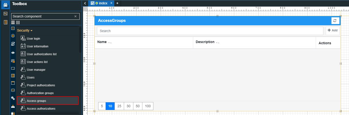
The Access groups component
Category | Property | Description |
|---|---|---|
Common | Name | The name of the component, visible in other Designer locations (such as Page explorer). |
Object ID | Sets the Object ID of the component. By defining an object ID for the control, it can be passed as SignalPrefix when using parameter passing in navigation. The value of the Object ID can be used via a placeholder [OID] in other properties of this extension. The placeholder is supported in all signal properties, symbolic texts, and states. Example: Setpoint [OID] | |
Tooltip text | Optional tooltip text, that will be shown on mouseover at runtime. | |
Security | Project authorization | The project authorization required for displaying the component. If the logged in user does not have this project authorization, the component will not be visible or enabled (depending on the set Security access behavior). If the property is left empty, the component will be visible and enabled to all users. Further on, the user can also add multiple Project authorizations / Roles, separated by comma (,). |
Security access behavior | Sets the behavior of the element to either disabled (grayed out) or hidden, when the logged in user doesn't meet the conditions imposed by the Project authorization / Roles and System authorization / Permissions properties. In case both Project authorization / Roles and System authorization / Permissions properties are set, the logged user needs to meet both conditions to be able to see and utilize the component, at run-time. | |
System authorization | The system authorization required to display the component. If the logged in user does not have this system authorization, the component will not be visible or enabled (depending on the set Security access behavior). If the property is left empty, the component will be visible and enabled for all users. Further on, the user can also add multiple System authorizations / Permissions, separated by comma (,). | |
Layout | Layout mode | Sets the behavior of the component related to the page placement. The user can select the component layout from the options available in the drop-down list: Default, Dock top, Dock bottom, Dock left, Dock right, Stretched, Pin top left, Pin top center, Pin top right, Pin right middle, Pin bottom right, Pin bottom center, Pin bottom left, Pin left middle and Pin center. |
Margin | Sets the margin of the component relative to the drawing board area. The supported values are the standard CSS values for the margin. The top, bottom, left and right values can either be typed in the main property field or by using the Margin editor. The Margin editor can be opened by clicking the Open button. The components margins can be updated by setting the margin value and selecting the desired unit:
| |
Effects | Opacity | Sets the opacity of the component. The Opacity values should be numbers from 0 to 1 representing the opacity of the component. When the component has a value of 0 the element is completely invisible; a value of 1 is completely opaque (solid). By default, the Component's opacity is set to value 1. Using the up / down arrows the user can control the opacity degree. By clicking the Open button the view is extended to display the Opacity slider. |
Shadow color | Sets the color of the component's shadow. The user can either manually type in the HEX color code or use the color picker tool. | |
Shadow offset X | Sets the offset of the shadow on the horizontal axis. The default value can be increased or decreased, either by manually typing in the desired value or by using the up and down arrows. | |
Shadow offset Y | Sets the offset of the shadow on the vertical axis. The default value can be increased or decreased, either by manually typing in the desired value or by using the up and down arrows. | |
Shadow size | Sets the width of the component shadow. The default value can be increased or decreased, either by manually typing in the desired value or by using the up and down arrows. | |
Configuration | Title text | Sets the text displayed by the component's header. By default, the title text is "Project Authorizations". |
Appearance | Page size | Sets the number of visible user actions on a single page. By default, the value of this field is set to 5, but the number can be increased or decreased, by manually typing in the new value or by using the up / down arrows. |
Show header | Allows the user to enable or disable the display of the User Actions List header. | |
Show index column | Allows the user to enable or disable the display of the index column. | |
Palette | Background color | Sets the background color of the component. The user can either manually type in the HEX color code or use the color picker tool. As the color palette is injected into this component by means of the default CSS class, applying this property the CSS class settings will be overwritten. |
Border color | Sets the color of the component border. The user can either manually type in the HEX color code or use the color picker tool. As the color palette is injected into this component by means of the default CSS class, applying this property the CSS class settings will be overwritten. | |
Buttons background | Sets the background color of the component buttons. The user can either manually type in the HEX color code or use the color picker tool. As the color palette is injected into this component by means of the default CSS class, applying this property the CSS class settings will be overwritten. | |
Buttons foreground | Sets the foreground color of the component buttons. The user can either manually type in the HEX color code or use the color picker tool. As the color palette is injected into this component by means of the default CSS class, applying this property the CSS class settings will be overwritten. | |
Header background | Sets the background color of the component header. The user can either manually type in the HEX color code or use the color picker tool. As the color palette is injected into this component by means of the default CSS class, applying this property the CSS class settings will be overwritten. | |
Header foreground | Sets the foreground color of the component header. The user can either manually type in the HEX color code or use the color picker tool. As the color palette is injected into this component by means of the default CSS class, applying this property the CSS class settings will be overwritten. 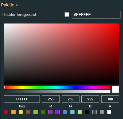 | |
Typography | Header font family | Sets the font family of the textual information displayed by the component header, selecting from web-safe fonts available in the drop-down list. |
Header font size | Sets the font size of the textual information displayed by the component header, using the up and down arrows to increase and decrease, or by manually typing the desired value. | |
Header font weight | Sets the weight of the textual information displayed by the component header, selecting from the drop-down list options: 900 (fat), 800 (extra-bold), 700 (bold), 600 (semi-bold), 500 (medium), 400 (normal), 300 (light), 200 (extra-light) and 100 (thin). | |
Style | Border width | Sets the width of the component's container. The value is specified in pixels. The top, bottom, left and right values can either be typed in the main property field or by using the Border width editor. The Border width editor can be opened by clicking the Open button. The components border width can be updated by setting the desired value and selecting the unit:
|
Transform | Angle | Sets the rotation angle using the up and down arrows to increase and decrease, or by manually typing the desired degree value. The component angle can also be adjusted directly on the design surface by means of mouse manipulation. |
Height | Sets the height of the component using the up and down arrows to increase and decrease, or by manually typing the desired pixels value. The component height can also be adjusted directly on the design surface by means of mouse manipulation. | |
Left | Specifies the X (horizontal) coordinate of the component, on the grid, using the up and down arrows to increase and decrease, or by manually typing the desired value. The component X coordinate can also be adjusted directly on the design surface by means of mouse manipulation. | |
Top | Specifies the Y (vertical) coordinate of the component, on the grid, using the up and down arrows to increase and decrease, or by manually typing the desired value. The component Y coordinate can also be adjusted directly on the design surface by means of mouse manipulation. | |
Width | Sets the width of the component using the up and down arrows to increase and decrease, or by manually typing the desired pixels value. The component width can also be adjusted directly on the design surface by means of mouse manipulation. | |
Disable flip | Disables any flip transformation for this component. This keeps the component in the default position even when its container is flipped. | |
Horizontal flip | Flips the selected component horizontally. | |
Vertical flip | Flips the selected component vertically. |
Access authorizations
Check out this article and learn more details about the i4scada Access authorizations component and what settings can be configured.
The Access authorization component allows the possibility to view and manage i4scada Access authorizations.
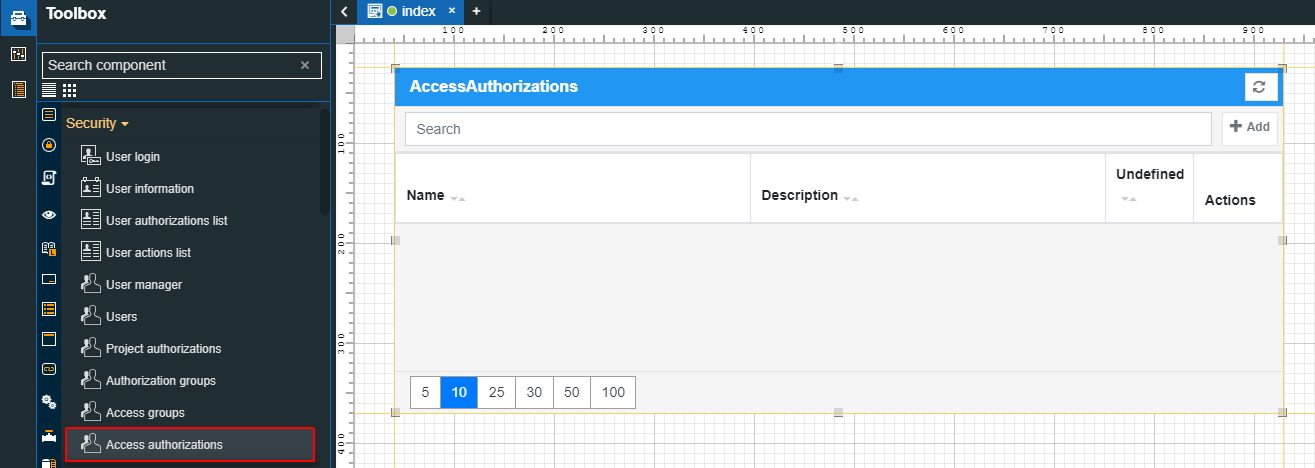
The Access authorizations component
Category | Property | Description |
|---|---|---|
Common | Name | The name of the component, visible in other Designer locations (such as Page explorer). |
Object ID | Sets the Object ID of the component. By defining an object ID for the control, it can be passed as SignalPrefix when using parameter passing in navigation. The value of the Object ID can be used via a placeholder [OID] in other properties of this extension. The placeholder is supported in all signal properties, symbolic texts, and states. Example: Setpoint [OID] | |
Tooltip text | Optional tooltip text, that will be shown on mouseover at runtime. | |
Security | Project authorization | The project authorization required for displaying the component. If the logged in user does not have this project authorization, the component will not be visible or enabled (depending on the set Security access behavior). If the property is left empty, the component will be visible and enabled to all users. Further on, the user can also add multiple Project authorizations / Roles, separated by comma (,). |
Security access behavior | Sets the behavior of the element to either disabled (grayed out) or hidden, when the logged in user doesn't meet the conditions imposed by the Project authorization / Roles and System authorization / Permissions properties. In case both Project authorization / Roles and System authorization / Permissions properties are set, the logged user needs to meet both conditions to be able to see and utilize the component, at run-time. | |
System authorization | The system authorization required to display the component. If the logged in user does not have this system authorization, the component will not be visible or enabled (depending on the set Security access behavior). If the property is left empty, the component will be visible and enabled for all users. Further on, the user can also add multiple System authorizations / Permissions, separated by comma (,). | |
Layout | Layout mode | Sets the behavior of the component related to the page placement. The user can select the component layout from the options available in the drop-down list: Default, Dock top, Dock bottom, Dock left, Dock right, Stretched, Pin top left, Pin top center, Pin top right, Pin right middle, Pin bottom right, Pin bottom center, Pin bottom left, Pin left middle and Pin center. |
Margin | Sets the margin of the component relative to the drawing board area. The supported values are the standard CSS values for the margin. The top, bottom, left and right values can either be typed in the main property field or by using the Margin editor. The Margin editor can be opened by clicking the Open button. The components margins can be updated by setting the margin value and selecting the desired unit:
| |
Effects | Opacity | Sets the opacity of the component. The Opacity values should be numbers from 0 to 1 representing the opacity of the component. When the component has a value of 0 the element is completely invisible; a value of 1 is completely opaque (solid). By default, the Component's opacity is set to value 1. Using the up / down arrows the user can control the opacity degree. By clicking the Open button the view is extended to display the Opacity slider. |
Shadow color | Sets the color of the component's shadow. The user can either manually type in the HEX color code or use the color picker tool. | |
Shadow offset X | Sets the offset of the shadow on the horizontal axis. The default value can be increased or decreased, either by manually typing in the desired value or by using the up and down arrows. | |
Shadow offset Y | Sets the offset of the shadow on the vertical axis. The default value can be increased or decreased, either by manually typing in the desired value or by using the up and down arrows. | |
Shadow size | Sets the width of the component shadow. The default value can be increased or decreased, either by manually typing in the desired value or by using the up and down arrows. | |
Configuration | Title text | Sets the text displayed by the component's header. By default, the title text is "Project Authorizations".  |
Appearance | Page size | Sets the number of visible user actions on a single page. By default, the value of this field is set to 5, but the number can be increased or decreased, by manually typing in the new value or by using the up / down arrows. 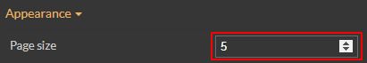 |
Show header | Allows the user to enable or disable the display of the User Actions List header. 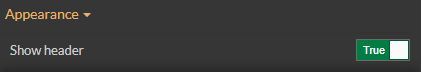 | |
Show index column | Allows the user to enable or disable the display of the index column. | |
Palette | Background color | Sets the background color of the component. The user can either manually type in the HEX color code or use the color picker tool. As the color palette is injected into this component by means of the default CSS class, applying this property the CSS class settings will be overwritten. |
Border color | Sets the color of the component border. The user can either manually type in the HEX color code or use the color picker tool. As the color palette is injected into this component by means of the default CSS class, applying this property the CSS class settings will be overwritten. | |
Buttons background | Sets the background color of the component buttons. The user can either manually type in the HEX color code or use the color picker tool. As the color palette is injected into this component by means of the default CSS class, applying this property the CSS class settings will be overwritten. | |
Buttons foreground | Sets the foreground color of the component buttons. The user can either manually type in the HEX color code or use the color picker tool. As the color palette is injected into this component by means of the default CSS class, applying this property the CSS class settings will be overwritten. | |
Header background | Sets the background color of the component header. The user can either manually type in the HEX color code or use the color picker tool. As the color palette is injected into this component by means of the default CSS class, applying this property the CSS class settings will be overwritten. | |
Header foreground | Sets the foreground color of the component header. The user can either manually type in the HEX color code or use the color picker tool. As the color palette is injected into this component by means of the default CSS class, applying this property the CSS class settings will be overwritten. | |
Typography | Header font family | Sets the font family of the textual information displayed by the component header, selecting from web-safe fonts available in the drop-down list. |
Header font size | Sets the font size of the textual information displayed by the component header, using the up and down arrows to increase and decrease, or by manually typing the desired value. | |
Header font-weight | Sets the weight of the textual information displayed by the component header, selecting from the drop-down list options: 900 (fat), 800 (extra-bold), 700 (bold), 600 (semi-bold), 500 (medium), 400 (normal), 300 (light), 200 (extra-light) and 100 (thin). | |
Style | Border width | Sets the width of the component's container. The value is specified in pixels. The top, bottom, left and right values can either be typed in the main property field or by using the Border width editor. The Border width editor can be opened by clicking the Open button. The components border width can be updated by setting the desired value and selecting the unit:
|
Transform | Angle | Sets the rotation angle using the up and down arrows to increase and decrease, or by manually typing the desired degree value. The component angle can also be adjusted directly on the design surface by means of mouse manipulation. |
Height | Sets the height of the component using the up and down arrows to increase and decrease, or by manually typing the desired pixels value. The component height can also be adjusted directly on the design surface by means of mouse manipulation. | |
Left | Specifies the X (horizontal) coordinate of the component, on the grid, using the up and down arrows to increase and decrease, or by manually typing the desired value. The component X coordinate can also be adjusted directly on the design surface by means of mouse manipulation. | |
Top | Specifies the Y (vertical) coordinate of the component, on the grid, using the up and down arrows to increase and decrease, or by manually typing the desired value. The component Y coordinate can also be adjusted directly on the design surface by means of mouse manipulation. | |
Width | Sets the width of the component using the up and down arrows to increase and decrease, or by manually typing the desired pixels value. The component width can also be adjusted directly on the design surface by means of mouse manipulation. | |
Disable flip | Disables any flip transformation for this component. This keeps the component in the default position even when its container is flipped. | |
Horizontal flip | Flips the selected component horizontally. | |
Vertical flip | Flips the selected component vertically. |