The quick actions area
Check out this article to read more details about each of the options provided by the i4designer quick actions toolbar.
The quick actions area is positioned at the top of the Designer page allowing the user to perform a set of commands oriented toward the controls available in the currently opened project.

The quick actions area
This toolbar provides the user with the following commands:
Action | Icon | Description |
|---|---|---|
Undo |  | Erases the last changes done to the project. |
Redo |  | As opposed to the undo action, it reverses the undo or advances the project buffer to a more recent state. |
Copy |  | Copies a component and allows the user to reuse it in an alternate location. The user can copy a i4designer control with different purposes:
|
Cut |  | Cuts a control and allows the user to move it to an alternate location. |
Paste |  | Inserts a previously copied or cut control to an alternate position in the Designer project page. |
Show errors |  | Allows the user to check the project control settings for errors. By enabling the toolbar button a visual indication about erroneous settings is displayed. 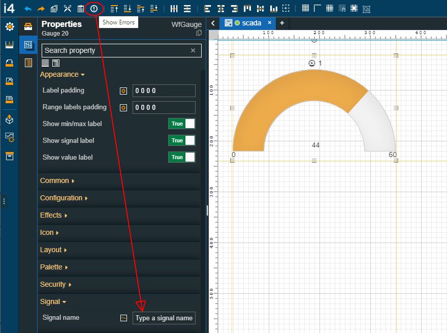 Example of highlighted error |
Bring to Front |  | Determines the placement of an i4designer component, so that it appears in front of another control. |
Send to Back |  | Determines the placement of an i4designer component so that it appears behind another control. |
Bring Forward |  | Brings a component one step toward the front. |
Send Backward |  | Sends a component one step towards the back. |
Horizontal distribution |  | Horizontally distributes the selected components |
Vertical distribution |  | Vertically distributes the selected components |
Align to left |  | Aligns the selected components to the left side of the drawing space |
Align to right |  | Aligns the selected components to the right side of the drawing space |
Align to top |  | Aligns the selected components to the top of the drawing space |
Align to bottom |  | Aligns the selected components to the bottom of the drawing space |
Vertical centering |  | Centers the component vertically. The component is positioned at the center of the drawing space, by equally splitting the remaining space available at the top and the bottom side of the page. |
Horizontal centering |  | Centers the component horizontally. The component is positioned at the center of the drawing space, by equally splitting the remaining space available on the left and the right side of the page |
Relative to page / Relative to last selected item |   | Allows the user to toggle between relative to page and relative to last selected item alignment. This option is used when aligning multiple components The Relative to page option aligns the selected objects relative to the page borders When spacing and aligning objects, using the Relative to the last selected item option, the selection should be made via Ctrl+Click. This way, the user can decide which is the last selected item. 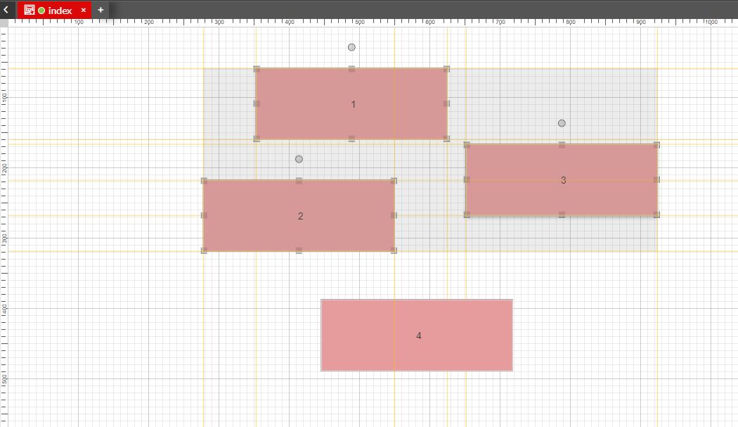 If multiple items are selected by drawing a rectangle on the drawing surface, the system will align the selected components relative to the last component added to the project page 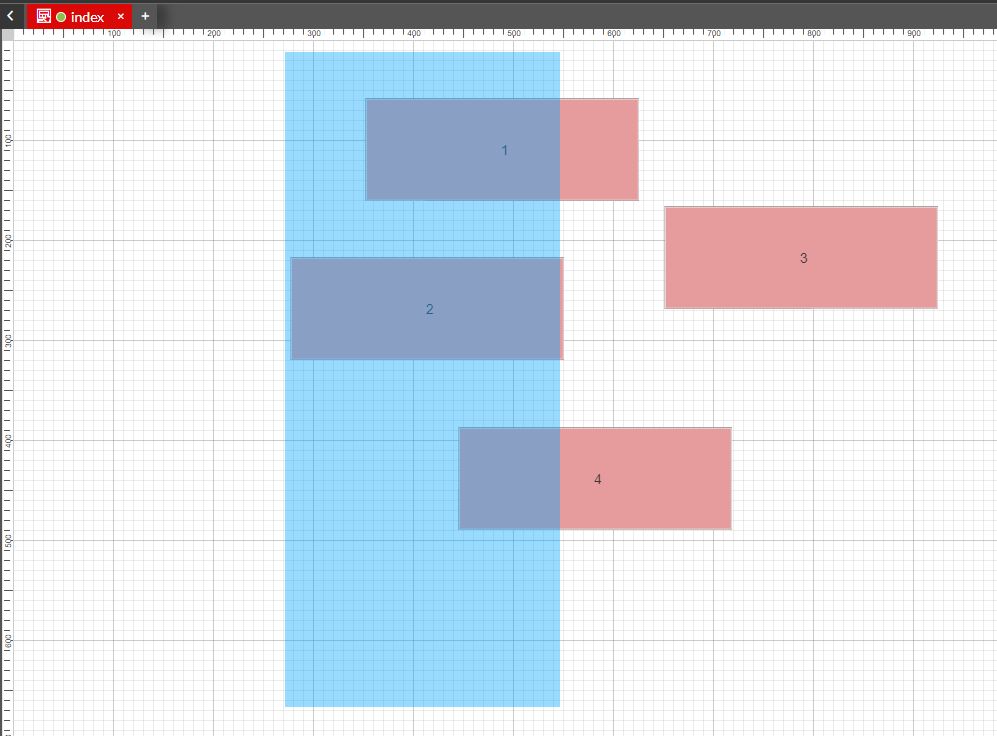 |
Toggle grid view |  | Allows the user to enable or disable the grid view of the Designer's surface  |
Toggle ruler |  | Allows the user to enable or disable the ruler view of the Designer's surface 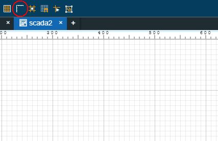 |
Toggle guide lines |  | Allows the user to enable or disable the control position on the Designer page surface 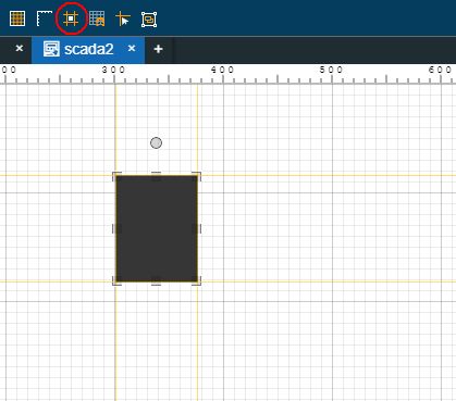 |
Enable snap to grid |  | Allows the user to enable or disable the snap to grid function. When the snap to grid function is enabled the component will be automatically fitted on the drawing surface, to the closest cell 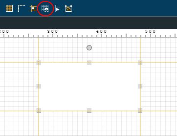 |
Toggle cursor guidelines |  | Allows the user to enable or disable the mouse location pointer on the Designer page surface 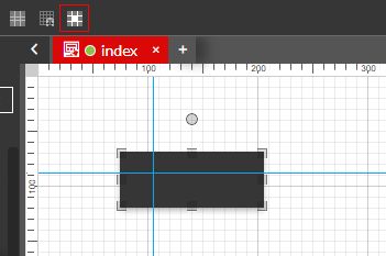 |
Group selected components |  | Allows the user to group the selected components in a frame, which is linked to an automatically created page. For more details about this function, please also visit the dedicated tutorials here 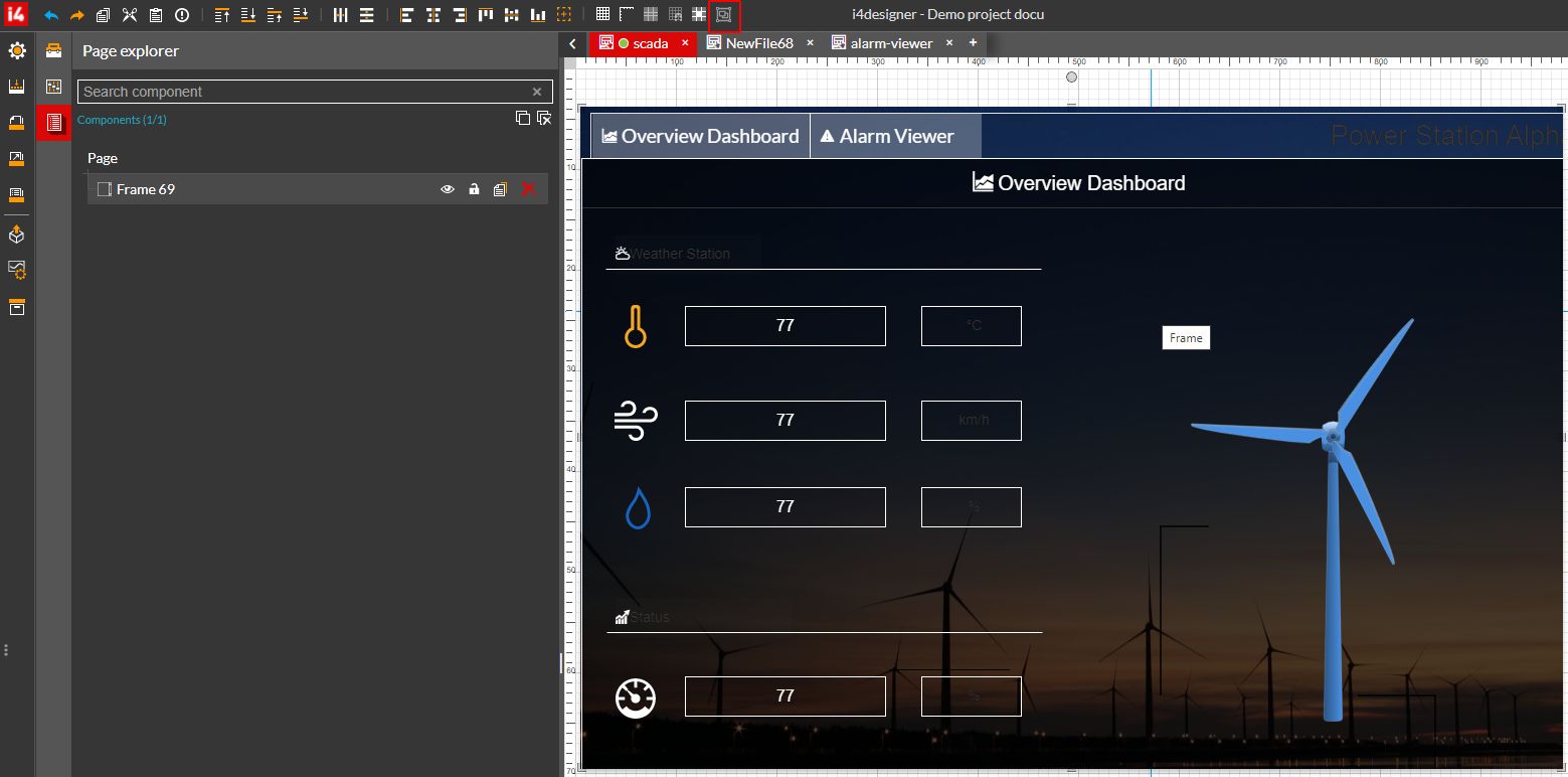 |
Some of the quick actions area commands can also be used by means of keyboard shortcuts:
Designer command | Windows keyboard shortcut | Mac keyboard shortcut |
|---|---|---|
Undo | Ctrl+Z | Command+Z |
Redo | Ctrl+Y | Command+Y |
Copy | Ctrl+C | Command+C |
Cut | Ctrl+X | Command+X |
Paste | Ctrl+V | Command+V |
Duplicate | Ctrl+D | Command+D |
Delete | Delete | Command+Delete |
Objects selection (used when selecting multiple objects) | Ctrl+click | Command+Click |