Navigation
Here are the i4designer Navigation components for your new project created on the i4scada, i4connected or OPC-UA platforms.
The components under this category ensure further navigation options allowing the user to navigate to other locations in and outside the i4designer project.
Tip
For a set of step-based tutorials describing the usage of the Navigation components, please visit the dedicated tutorials, here.
Link button
Check out this article in order to learn more details about the i4designer Link button component and the properties provided by it.
The Link button component offers the basic functionality of a hyperlink button.
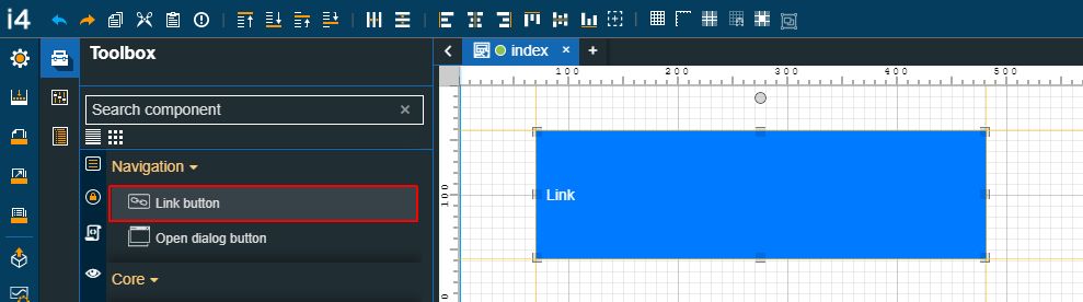
The Link button component
Category | Property | Description |
|---|---|---|
Common | Name | The name of the component, visible in other Designer locations (such as Page explorer). 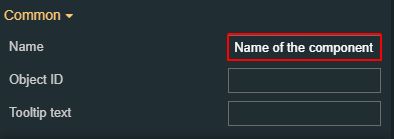 |
Object ID | Sets the Object ID of the component. By defining an object ID for the control, it can be passed as SignalPrefix when using parameter passing in navigation. The value of the Object ID can be used via a placeholder [OID] in other properties of this extension. The placeholder is supported in all signal properties, symbolic text and states. Example: Setpoint [OID] 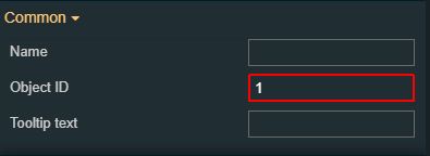 | |
Tooltip text | Optional tooltip text, that will be shown on mouseover at runtime. 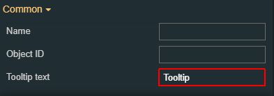 | |
Security | System authorizations / Permissions | The system authorization required to display the component. If the logged in user does not have this system authorization, the component will not be visible or enabled (depending on the set Security access behavior). If the property is left empty, the component will be visible and enabled for all users. Further on, the user can also add multiple System authorizations / Permissions, separated by comma (,). This property is named "System authorization" for projects created on i4scada platform. 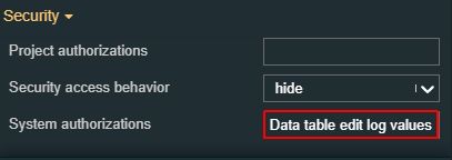 This property is named "Permissions" for projects created on i4connected platform. 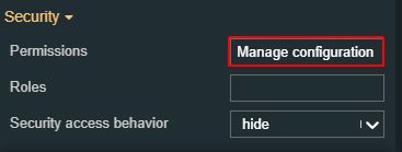 |
Project authorizations / Roles | The project authorization required for displaying the component. If the logged in user does not have this project authorization, the component will not be visible or enabled (depending on the set Security access behavior). If the property is left empty, the component will be visible and enabled to all users. Further on, the user can also add multiple Project authorizations / Roles, separated by comma (,). This property is named "Project authorization" for projects created on i4scada platform. 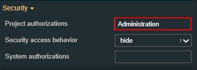 This property is named "Role" for projects created on i4connected platform. 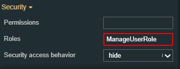 | |
Security access behavior | Sets the behavior of the element to either disabled (grayed out) or hidden, when the logged in user doesn't meet the conditions imposed by the Project authorization / Roles and System authorization / Permissions properties. In case both Project authorization / Roles and System authorization / Permissions properties are set, the logged user needs to meet both conditions to be able to see and utilize the component, at run-time. 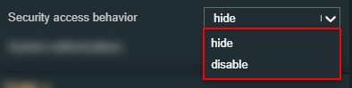 | |
Layout | Layout mode | Sets the behavior of the component related to the page placement. The user can select the component layout from the options available in the drop-down list: Default, Dock top, Dock bottom, Dock left, Dock right, Stretched, Pin top left, Pin top center, Pin top right, Pin right middle, Pin bottom right, Pin bottom center, Pin bottom left, Pin left middle and Pin center. 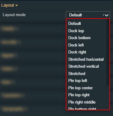 |
Margin | Sets the margin of the component relative to the drawing board area. The supported values are the standard CSS values for the margin. The top, bottom, left and right values can either be typed in the main property field or by using the Margin editor. 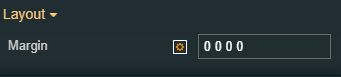 The Margin editor can be opened by clicking the Open button. 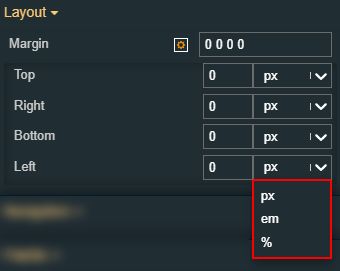 The components margins can be updated by setting the margin value and selecting the desired unit:
| |
Effects | Opacity | Sets the opacity of the component. The Opacity values should be numbers from 0 to 1 representing the opacity of the component. When the component has a value of 0 the element is completely invisible; a value of 1 is completely opaque (solid). By default, the Component's opacity is set to value 1. Using the up / down arrows the user can control the opacity degree. 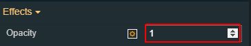 By clicking the Open button the view is extended to display the Opacity slider. 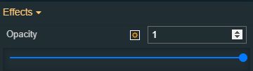 |
Shadow color | Sets the color of the component's shadow. The user can either manually type in the HEX color code or use the color picker tool. 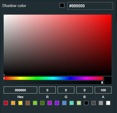 | |
Shadow offset X | Sets the offset of the shadow on the horizontal axis. The default value can be increased or decreased, either by manually typing in the desired value or by using the up and down arrows. 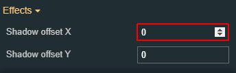 | |
Shadow offset Y | Sets the offset of the shadow on the vertical axis. The default value can be increased or decreased, either by manually typing in the desired value or by using the up and down arrows. 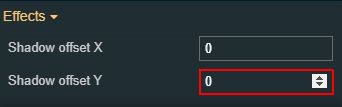 | |
Shadow size | Sets the width of the component shadow. The default value can be increased or decreased, either by manually typing in the desired value or by using the up and down arrows. 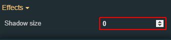 | |
Navigation | Is internal link | Allows possibility to set the link target to internal or external. If the property is set to False, the user can manually fill in the target URL, to the Link property. 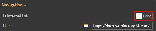 If the property is set to True a current project page can be set as a target. The user can select the project page for the Link property or manually type in the path pointing to it. 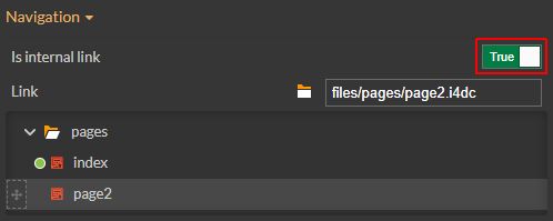 |
Link | The URL to an internal or external page, that will be opened at run-time, when clicking the Link button. For an easier management of the project pages, the "Navigate to page" button allows the user to open a tab showing the linked page. 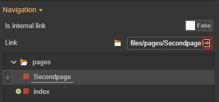 | |
Navigation parameters | Allows possibility to add additional parameters for the navigation, by clicking the Add new item button. 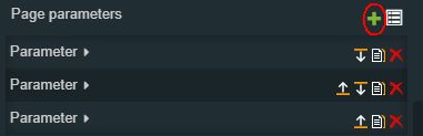 In order to see the list of items, the user can click on the Expand array list button. 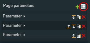 Furthermore, the following actions are available for each item:
| |
Write item# Parameter name | Defines the name of the parameter(s) that will be passed to the source page (e.g. "panelSize"). 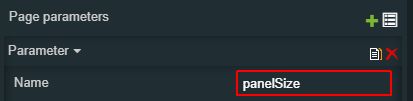 | |
Write item# Value | Defines the value of the inserted parameter(s) that will be passed to the source page (e.g. - when passing the size of the panel - sm, md, lg, xlg, xxlg, 3xlg, 6xlg). 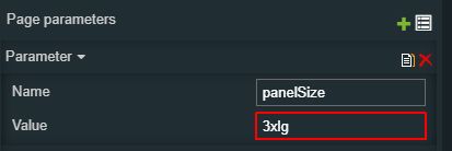 | |
Palette | Background color | Sets the background color of the button. The user can either manually type in the HEX color code or use the color picker tool. As the color palette is injected into this component by means of the default CSS class, applying this property the CSS class settings will be overwritten. 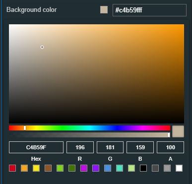 |
Foreground | Sets the foreground color of the button. The user can either manually type in the HEX color code or use the color picker tool. As the color palette is injected into this component by means of the default CSS class, applying this property the CSS class settings will be overwritten. 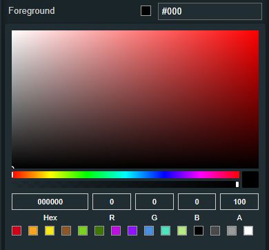 | |
Hover background | Sets the background color when hovering over the component. The user can either manually type in the HEX color code or use the color picker tool. As the color palette is injected into this component by means of the default CSS class, applying this property the CSS class settings will be overwritten.  | |
Hover border-color | Sets the border color when hovering over the component. The user can either manually type in the HEX color code or use the color picker tool. As the color palette is injected into this component by means of the default CSS class, applying this property the CSS class settings will be overwritten.  | |
Hover foreground | Sets the foreground color when hovering over the component. The user can either manually type in the HEX color code or use the color picker tool. As the color palette is injected into this component by means of the default CSS class, applying this property the CSS class settings will be overwritten.  | |
Icon color | Sets the color of the icon. The user can either manually type in the HEX color code or use the color picker tool. Applying this property will overwrite the default CSS class. 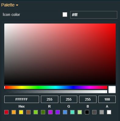 | |
Border color | Sets the color of the component border. The user can either manually type in the HEX color code or use the color picker tool. As the color palette is injected into this component by means of the default CSS class, applying this property the CSS class settings will be overwritten. 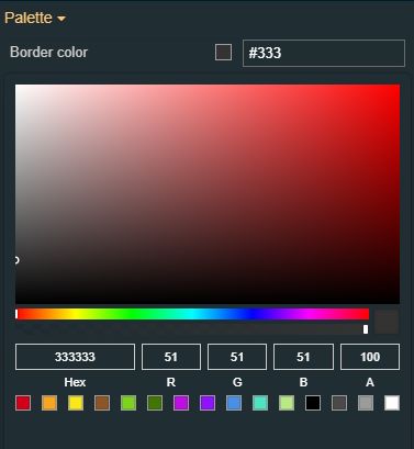 | |
Focus background | Sets the background color of the component focus. The user can either manually type in the HEX color code or use the color picker tool. Applying this property will overwrite the default CSS class. 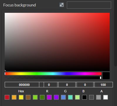 | |
Focus border color | Sets the border color of the component focus. The user can either manually type in the HEX color code or use the color picker tool. Applying this property will overwrite the default CSS class.  | |
Focus foreground | Sets the foreground color of the component focus. The user can either manually type in the HEX color code or use the color picker tool. Applying this property will overwrite the default CSS class.  | |
Active background | Sets the background color of the component when in active mode. The user can either manually type in the HEX color code or use the color picker tool. Applying this property will overwrite the default CSS class. 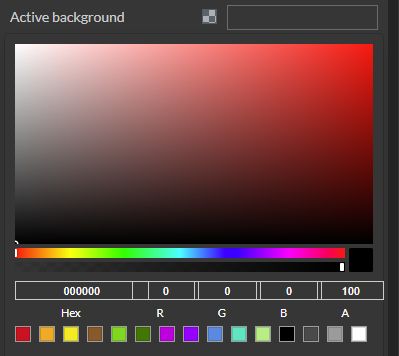 | |
Active border color | Sets the border color of the component when in active mode. The user can either manually type in the HEX color code or use the color picker tool. Applying this property will overwrite the default CSS class. 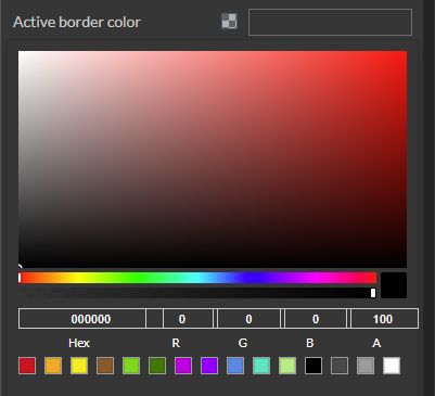 | |
Active foreground | Sets the foreground color of the component when in active mode. The user can either manually type in the HEX color code or use the color picker tool. Applying this property will overwrite the default CSS class. 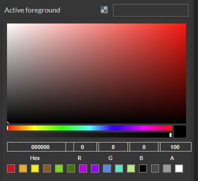 | |
Appearance | Class name | Sets the CSS class of the button, selecting from the drop-down list items: btn-primary, btn-warning, btn-success, and btn-danger. 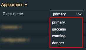 |
Padding | Sets the padding of the component (defines the space between the component contents and its border). The top, bottom, left and right values can either be typed in the main property field or by using the Padding editor. 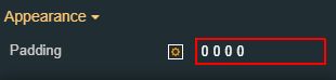 The Padding editor can be opened by clicking the Open button. 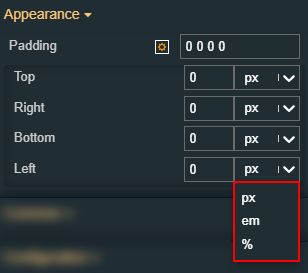 The components padding can be updated by setting the value and the desired unit:
| |
Text alignment | Sets the alignment of the text of the component surface, selecting from the drop-down list options: left, right, and center (default). 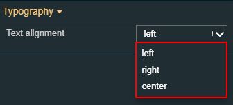 | |
Configuration | Current page button style | Sets the style of the current link button, selecting from the drop-down list options: primary, warning, success, and danger. 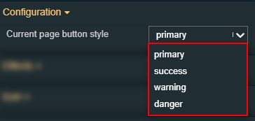 |
Button text | Sets the text displayed by the button. 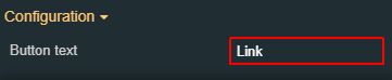 | |
Typography | Font size | Sets the size of the component font, using the up and down arrows to increase and decrease, or by manually typing the desired value. 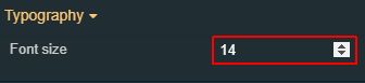 |
Font weight | Sets the weight of the component font, selecting from the drop-down list options: 900 (fat), 800 (extra-bold), 700 (bold), 600 (semi-bold), 500 (medium), 400 (normal), 300 (light), 200 (extra-light) and 100 (thin). 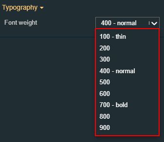 | |
Font family | Sets the font family of the component font, selecting from web-safe fonts available in the drop-down list.  | |
Icon font size | Sets the font size of the icon.  | |
Style | Border radius | Sets the curvature of the border corners expressed in pixels or percentages. The border-radius value can be either manually typed in the designated field or increased/decreased by clicking the up and down arrows. 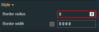 |
Border width | Sets the width of the container border in pixels. The border width value can be either manually typed in the designated field or increased/decreased by clicking the up and down arrows. 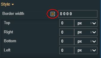 The components can be updated by setting the value and the desired unit:
| |
Content orientation | Sets the orientation of the component content to horizontal or vertical. 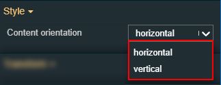 | |
Icon | Icon class | Sets the CSS class for the icon of the component. The icon can be selected from a large number of icons accessible by clicking the Open panel to see the icon list button. The list of icons allows the user to toggle between actual icons and icon names. A simple filtering mechanism is also provided to support the user to easily pinpoint the desired icon. 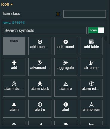 |
States | Current states | A component can have multiple states, each carrying its own set of properties. The user can add states, by clicking the Add new state button. 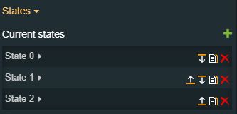 Furthermore, the following actions are available for each state:
|
State Name | By setting the Name property, the respective state will inherit that name, making the States easier to read. 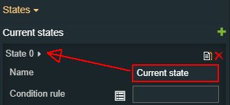 | |
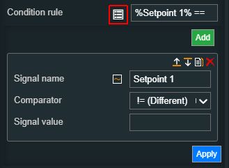
State# Condition rule | The rule to be met in order for the extension to enter the state. The signal names must be always surrounded by percentage (%) characters, followed by logical operators and the Signal value. For example: %Setpoint 1% != 0 The Condition rule can be either manually typed in or generated, using the State editor. The State editor can be opened by clicking the Expand array list button. This way, the user can easily generate a Condition rule, as follows:
 | |
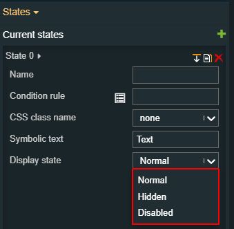
State# Display state | Sets the component visibility and accessibility when the state evolution passed. The user can choose from the following options:
 | |
State# Foreground | Sets the foreground color of the button. Applying this property will override the default CSS class. 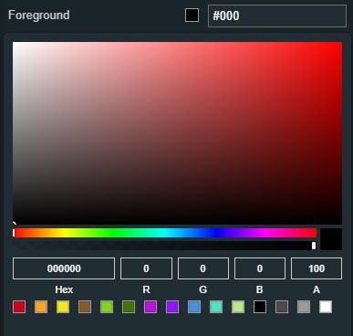 | |
State# Background | Sets the background color of the button. Applying this property will override the default CSS class. 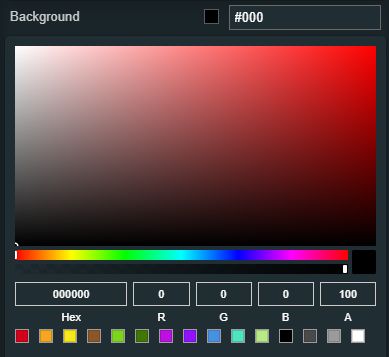 | |
State# Animation | Sets the component animation class when the state evolution passed. The user can select the animation class from the drop-down list options: Fade in, Fade out or Blink. 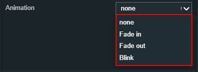 | |
Load from assets | Lists the State assets defined under the Assets management page, of the global actions area. A simple filtering mechanism is also provided to support the user to easily pinpoint the desired state asset. After selecting an asset from the list view, the user can click the Load button to apply it. 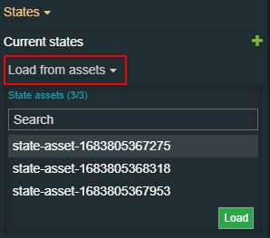 | |
Save to assets | Allows the user the possibility to save a state asset defined during the current session. In this view, the user can either click the Generate name button to set a name for the asset or type in the name in the designated field. By clicking the Apply button, the new state asset will be made available for further management actions in the Assets management page, of the global actions area. Also, the asset can be reused for other Component states. 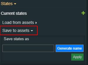 | |
Transform | Angle | Sets the rotation angle using the up and down arrows to increase and decrease, or by manually typing the desired degree value. The component angle can also be adjusted directly on the design surface by means of mouse manipulation. 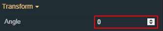 |
Disable flip | Disables any flip transformation for this component. This keeps the component in the default position even when its container is flipped.  | |
Height | Sets the height of the component using the up and down arrows to increase and decrease, or by manually typing the desired pixels value. The component height can also be adjusted directly on the design surface by means of mouse manipulation.  | |
Horizontal flip | Flips the selected component horizontally.  | |
Left | Specifies the X (horizontal) coordinate of the component, on the grid, using the up and down arrows to increase and decrease, or by manually typing the desired value. The component X coordinate can also be adjusted directly on the design surface by means of mouse manipulation.  | |
Top | Specifies the Y (vertical) coordinate of the component, on the grid, using the up and down arrows to increase and decrease, or by manually typing the desired value. The component Y coordinate can also be adjusted directly on the design surface by means of mouse manipulation. 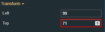 | |
Vertical flip | Flips the selected component vertically. 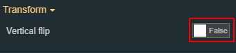 | |
Width | Sets the width of the component using the up and down arrows to increase and decrease, or by manually typing the desired pixels value. The component width can also be adjusted directly on the design surface by means of mouse manipulation. 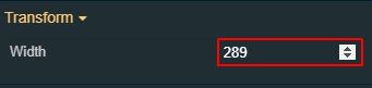 |


Open dialog button
Check out this article in order to learn more details about the i4designer Open dialog button component and the properties provided by it.
The Open dialog button component offers the basic functionality of a hyperlink button.
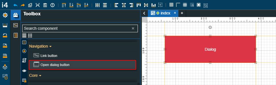
The Open dialog button component
Category | Property | Description |
|---|---|---|
Common | Name | The name of the component, visible in other Designer locations (such as Page explorer). |
Object ID | Sets the Object ID of the component. By defining an object ID for the control, it can be passed as SignalPrefix when using parameter passing in navigation. The value of the Object ID can be used via a placeholder [OID] in other properties of this extension. The placeholder is supported in all signal properties, symbolic text, and states. Example: Setpoint [OID] | |
Tooltip text | Optional tooltip text, that will be shown on mouseover at runtime. | |
Security | System authorizations / Permissions | The system authorization required to display the component. If the logged in user does not have this system authorization, the component will not be visible or enabled (depending on the set Security access behavior). If the property is left empty, the component will be visible and enabled for all users. Further on, the user can also add multiple System authorizations / Permissions, separated by comma (,). This property is named "System authorization" for projects created on i4scada platform. This property is named "Permissions" for projects created on i4connected platform. |
Project authorizations / Roles | The project authorization required for displaying the component. If the logged in user does not have this project authorization, the component will not be visible or enabled (depending on the set Security access behavior). If the property is left empty, the component will be visible and enabled to all users. Further on, the user can also add multiple Project authorizations / Roles, separated by comma (,). This property is named "Project authorization" for projects created on i4scada platform. This property is named "Role" for projects created on i4connected platform. | |
Security access behavior | Sets the behavior of the element to either disabled (grayed out) or hidden, when the logged in user doesn't meet the conditions imposed by the Project authorization / Roles and System authorization / Permissions properties. In case both Project authorization / Roles and System authorization / Permissions properties are set, the logged user needs to meet both conditions to be able to see and utilize the component, at run-time. | |
Layout | Layout mode | Sets the behavior of the component related to the page placement. The user can select the component layout from the options available in the drop-down list: Default, Dock top, Dock bottom, Dock left, Dock right, Stretched, Pin top left, Pin top center, Pin top right, Pin right middle, Pin bottom right, Pin bottom center, Pin bottom left, Pin left middle and Pin center. |
Margin | Sets the margin of the component relative to the drawing board area. The supported values are the standard CSS values for the margin. The top, bottom, left and right values can either be typed in the main property field or by using the Margin editor. The Margin editor can be opened by clicking the Open button. The components margins can be updated by setting the margin value and selecting the desired unit:
| |
Effects | Opacity | Sets the opacity of the component. The Opacity values should be numbers from 0 to 1 representing the opacity of the component. When the component has a value of 0 the element is completely invisible; a value of 1 is completely opaque (solid). By default, the Component's opacity is set to value 1. Using the up / down arrows the user can control the opacity degree. By clicking the Open button the view is extended to display the Opacity slider. |
Shadow color | Sets the color of the component's shadow. The user can either manually type in the HEX color code or use the color picker tool. | |
Shadow offset X | Sets the offset of the shadow on the horizontal axis. The default value can be increased or decreased, either by manually typing in the desired value or by using the up and down arrows. | |
Shadow offset Y | Sets the offset of the shadow on the vertical axis. The default value can be increased or decreased, either by manually typing in the desired value or by using the up and down arrows. | |
Shadow size | Sets the width of the component shadow. The default value can be increased or decreased, either by manually typing in the desired value or by using the up and down arrows. | |
Navigation | Is external | Allows the possibility to set the link target to internal or external. If the property is set to False, a current project page can be set as a target. The user can select the project page for the Link property or manually type in the path pointing to it. For an easier management of the project pages, the "Navigate to page" button allows the user to open a tab showing the linked page. 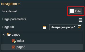 If the property is set to True, the user can manually fill in the target URL, to the Link property. |
Page parameters | Allows possibility to add additional parameters for the navigation, by clicking the Add new item button.  In order to see the list of items, the user can click on the Expand array list button. 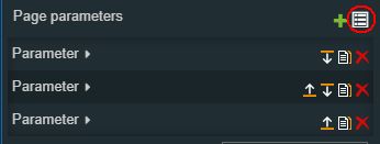 Furthermore, the following actions are available for each item:
| |
Write item# Parameter name | Defines the name of the parameter(s) that will be passed to the source page (e.g. "panelSize"). | |
Write item# Value | Defines the value of the inserted parameter(s) that will be passed to the source page (e.g. - when passing the size of the panel - sm, md, lg, xlg, xxlg, 3xlg, 6xlg). | |
Page URL | Sets the URL of the external or internal page, that will be opened at run-time when clicking the Open dialog button. 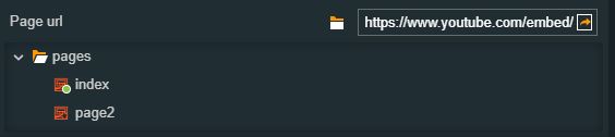 | |
Configuration | Dialog title | Sets the text displayed on the dialog header. 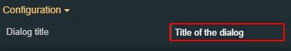 |
Button text | Sets the text displayed by the button. 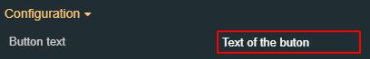 | |
Draggable | Sets the capability to drag the component on the page surface for both Modal and Popover behaviors. By default, the property is set to False 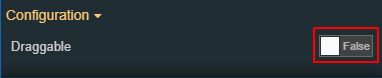 | |
Image | Allows selection of the image source. By clicking the Upload image button, the user can either drop files in the designated area or click to upload the image from the local machine. Additionally, if any images have been previously uploaded they will be displayed under the content folder and reused. The maximum image size is of 1MB. 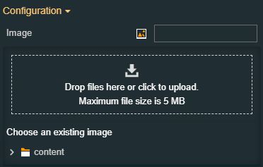 | |
Page behavior | Sets the runtime behavior of the opened dialog, allowing the user to choose between Modal (modal dialog) and Popover (contextual dialog). 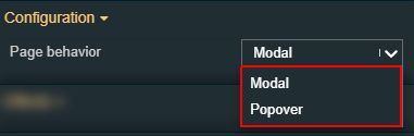 | |
Appearance | CSS Class | Sets the CSS class of the button component, selecting from the drop-down list items. 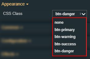 |
Dialog height | Sets the height of the dialog measured in pixels. 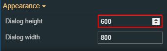 | |
Dialog width | Sets the width of the dialog measured in pixels. 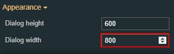 | |
Flat | Removes additional visual elements or flattens from the component. 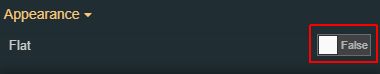 | |
Padding | Sets the padding of the component (defines the space between the component contents and its border). The top, bottom, left and right values can either be typed in the main property field or by using the Padding editor. The Padding editor can be opened by clicking the Open button. The components padding can be updated by setting the value and the desired unit:
| |
Preferred popover position | Sets the positioning of the Open dialog popover panel. The position can be selected from the drop-down list options: bottom (default), top, left, and right. 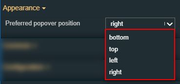 | |
Icon | Icon class | Sets the CSS class for the icon of the component. The icon can be selected from a large number of icons accessible by clicking the Open panel to see the icon list button. The list of icons allows the user to toggle between actual icons and icon names. A simple filtering mechanism is also provided to support the user in easily pinpointing the desired icon. |
Palette | Header background | Sets the header background color of the button. The user can either manually type in the HEX color code or use the color picker tool. As the color palette is injected into this component by means of the default CSS class, applying this property the CSS class settings will be overwritten. 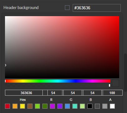 |
Header foreground | Sets the header foreground color of the button. The user can either manually type in the HEX color code or use the color picker tool. As the color palette is injected into this component by means of the default CSS class, applying this property the CSS class settings will be overwritten. 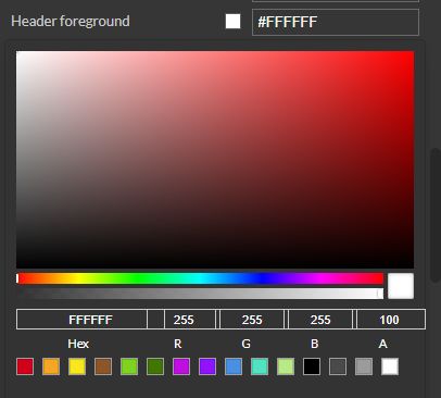 | |
Background color | Sets the background color of the button. The user can either manually type in the HEX color code or use the color picker tool. As the color palette is injected into this component by means of the default CSS class, applying this property the CSS class settings will be overwritten. | |
Foreground | Sets the foreground color of the button. The user can either manually type in the HEX color code or use the color picker tool. As the color palette is injected into this component by means of the default CSS class, applying this property the CSS class settings will be overwritten. | |
Icon color | Sets the color of the icon. The user can either manually type in the HEX color code or use the color picker tool. Applying this property will overwrite the default CSS class. | |
Border color | Sets the color of the component border. The user can either manually type in the HEX color code or use the color picker tool. As the color palette is injected into this component by means of the default CSS class, applying this property the CSS class settings will be overwritten. | |
Style | Border radius | Sets the curvature of the border corners expressed in pixels or percentages. The border-radius value can be either manually typed in the designated field or increased/decreased by clicking the up and down arrows. |
Border width | Sets the width of the container border in pixels. The border width values can be either manually typed in the designated field or increased/decreased by clicking the up and down arrows. The components border width can be updated by setting the values and the desired unit:
| |
Typography | Font size | Sets the size of the component font, using the up and down arrows to increase and decrease, or by manually typing the desired value. |
Text alignment | Sets the alignment of the text of the component surface, selecting from the drop-down list options: left, right and center (default). | |
Font weight | Sets the weight of the component font, selecting from the drop-down list options: 900 (fat), 800 (extra-bold), 700 (bold), 600 (semi-bold), 500 (medium), 400 (normal), 300 (light), 200 (extra-light) and 100 (thin). | |
Font family | Sets the font family of the component font, selecting from web-safe fonts available in the drop-down list. 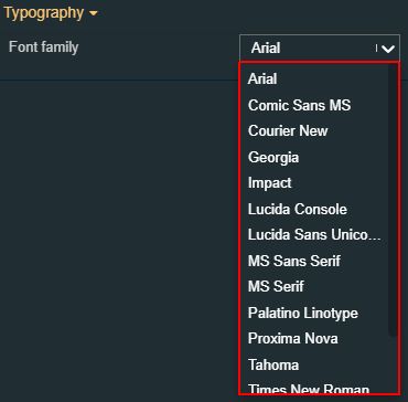 | |
Transform | Width | Sets the width of the component using the up and down arrows to increase and decrease, or by manually typing the desired pixels value. The component width can also be adjusted directly on the design surface by means of mouse manipulation. |
Height | Sets the height of the component using the up and down arrows to increase and decrease, or by manually typing the desired pixels value. The component height can also be adjusted directly on the design surface by means of mouse manipulation. | |
Angle | Sets the rotation angle using the up and down arrows to increase and decrease, or by manually typing the desired degree value. The component angle can also be adjusted directly on the design surface by means of mouse manipulation. | |
Left | Specifies the X (horizontal) coordinate of the component, on the grid, using the up and down arrows to increase and decrease, or by manually typing the desired value. The component X coordinate can also be adjusted directly on the design surface by means of mouse manipulation. | |
Top | Specifies the Y (vertical) coordinate of the component, on the grid, using the up and down arrows to increase and decrease, or by manually typing the desired value. The component Y coordinate can also be adjusted directly on the design surface by means of mouse manipulation. | |
Disable flip | Disables any flip transformation for this component. This keeps the component in the default position even when its container is flipped. | |
Horizontal flip | Flips the selected component horizontally. | |
Vertical flip | Flips the selected component vertically. |