The contextual actions area
The i4designer contextual actions area allows the user the possibility to switch between a set of contextually relevant operations each serving different purposes.
The so-called contextual actions area is the toolbar next to the global actions area. This view is dedicated to the actual design actions and consists of the following options:
The Toolbox menu
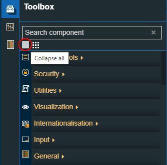
The second left-side panel called the Toolbox displays all the Components available for the currently active platform. The controls are stored in categories that can be:
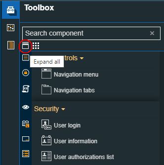
expanded
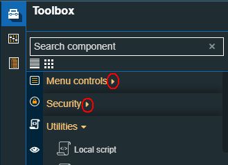
The expand option
collapsed
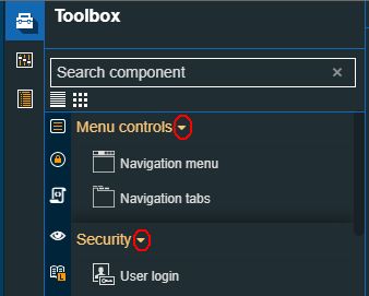
The collapse option
accessed through the group components list
The Group components list
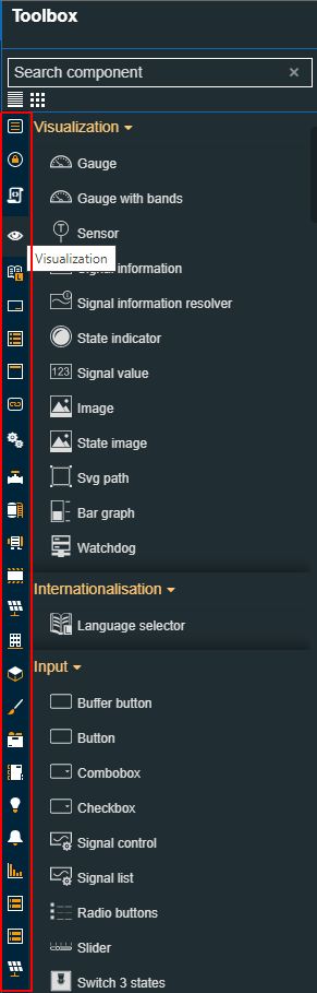
The Toolbox provides the user with the possibility to switch between several view modes:
the collapsed mode can be set by clicking the Collapse all option, located at the top of the items list view.
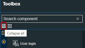
The Collapse all option
the expanded mode can be set by clicking the Expand all option, located at the top of the items list view.
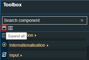
The Expand all option
thumbs mode can be set by clicking the Show thumbs option.
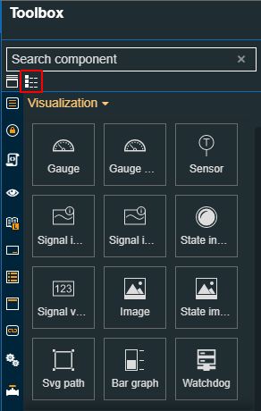
The thumbs mode
list mode can be set by clicking the Show list option.
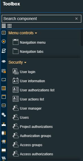
The list mode
The Toolbox panel also features a simple filtering mechanism allowing the user to easily pinpoint controls. By typing the name or a part of the control name, the list is filtered to display the matching controls.
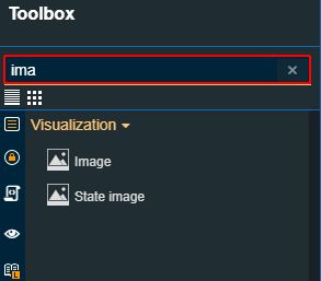
The search field
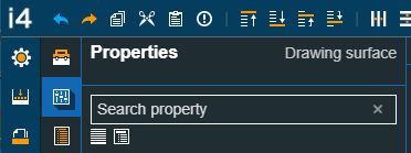
The Properties menu
By clicking the Properties menu on the second left-side toolbar the Properties panel is opened. The contents of the Properties panel are adjusted in relation to the selection in the design area.
The Properties menu
Filtering and sorting properties
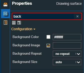
The Properties panel provides the user with the possibility to filter the properties list by typing in the designated search field a part of the entire name of the property. Without taking any further action, the list will be filtered to display only the matching results.
Filtering the list of properties
When the Components Properties panel is displayed, the user can Collapse all or Expand all the listed properties.
Collapse all properties
Expand all properties
Page properties panel
By default, when opening the Properties panel, the Page configuration properties panel is displayed. Also, by clicking anywhere in the design area, where no control is available the Page configuration panel is displayed.
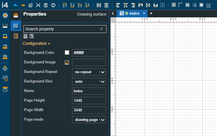
The Page Configuration Properties panel
In this view, the user can adjust the current Project page by changing its configuration:
Background image - allows the user to set a background image. By clicking on the Upload image button the view is extended. In this view, the user can either drag and drop an image or manually upload it. The image upload accepts files of type "jpeg", "jpg", "jpe", "gif", "png", "svg", "ico", "webp", up to 5 MB in size.
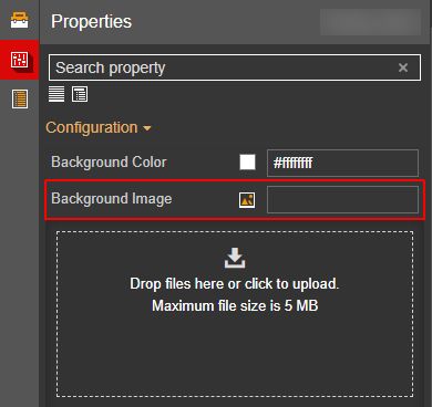
The Background Image component
The Content folder lists all existing images that the user uploaded so far, for the currently opened project. If the project is new and no images have been loaded so far, the content folder will be empty.
Column number - Sets the number of grid columns when the Page mode property is set to the "grid page" option.
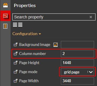
The Column number component
Based on the selected number of columns, the project components will be displayed as grid columns. The components ordering in each column are injected by means of the default CSS class. Hence, when dragging a new component to a page split up in multiple columns, will be methodically distributed to fill the space of the column.
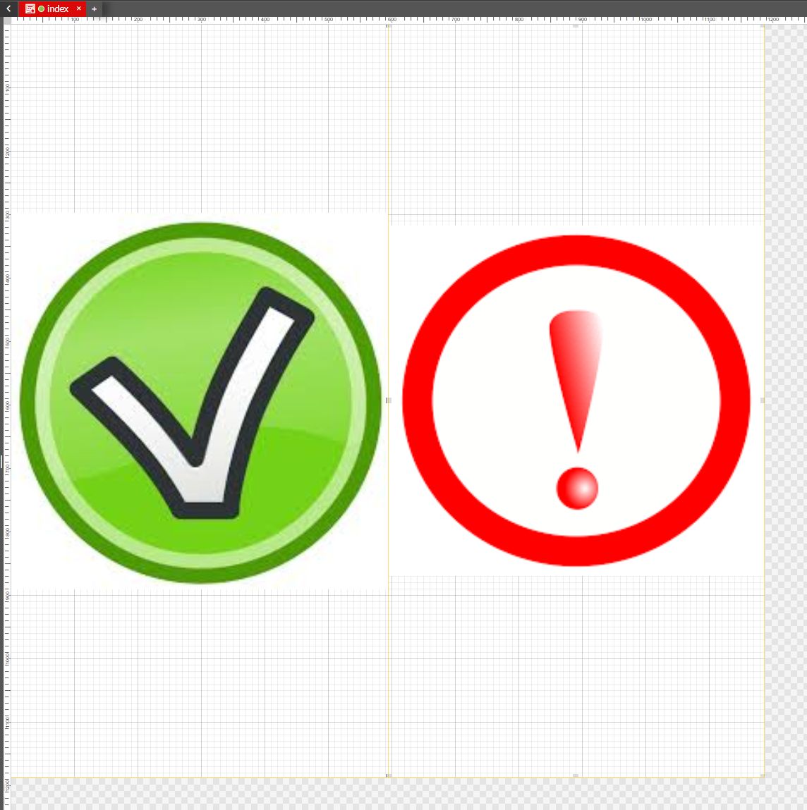
Components displayed as columns
Page height -sets the page height of the drawing surface, measured in pixels.
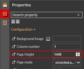
The Page height property
Page width - sets the page width of the drawing surface, measured in pixels.
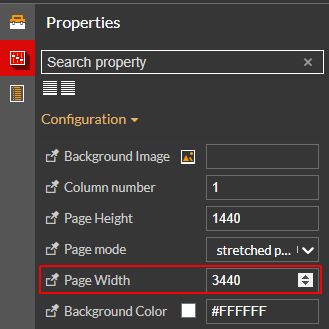
The Page width property
Page mode - sets the page display mode, allowing the user to chose from the following modes:
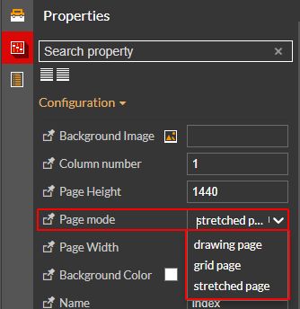
The Page mode property
drawing page - the page is displayed as a simple drawing surface, where each component occupies its space.
grid page - allows the user to split the page into multiple columns. The display mode works in combination with the Column number property.
stretched page - the page is displayed a stretched-out drawing surface, suitable for widescreen monitors.
Background color - allows the user to set a different background color. By default, the color is set to white, but by clicking the Color picker button the view is extended allowing the user to select another color. The RGBA color picker allows the user to easily select the desired page color.
Tip
An RGBA color value is specified with RGBA values (red, green, blue, alpha).
An alpha parameter is a number between 0.0 (fully transparent) and 1.0 (fully opaque).
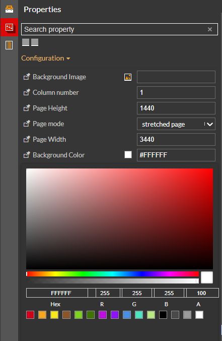
The Background color property
Name - allows the user to change the name of the current Project page.
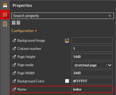
The Name property
Background Repeat - allows the user to set if and how a background image will be repeated, selecting from a set of predefined options:
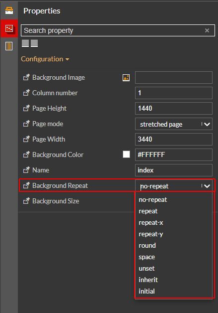
The Background repeat property
no-repeat - By default, the background image is not repeated. The image will only be shown once
repeat - The background image is repeated both vertically and horizontally. The last image will be clipped if it does not fit.
repeat-x - The background image is repeated only horizontally
repeat-y - The background image is repeated only vertically
round - The background image is repeated and squished or stretched to fill the space (no gaps)
space - The background image is repeated as much as possible without clipping. The first and last images are pinned to either side of the element, and whitespace is distributed evenly between the images
unset - Resets the background image to its inherited value if it inherits from its parent, and to its initial value if not. In other words, it behaves like the inherit keyword in the first case, and like the initial keyword in the second case.
inherit - Inherits this property from its parent element.
initial - Sets this property to its default value.
Background size - allows the user to change the size of the element's background image, selecting from a set of predefined options:
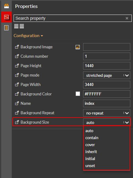
The Background size property
auto - Retains its original size.
contain - Scales the image, while preserving its intrinsic aspect ratio (if any), to the largest size such that both its width and its height can fit inside the background positioning area.
cover - Scales the image, while preserving its intrinsic aspect ratio (if any), to the smallest size such that both its width and its height can completely cover the background positioning area.
inherit - Inherits the value of the background size specified on its parent element.
initial - Sets this property to its default value.
unset - Resets a property to its inherited value if it inherits from its parent, and to its initial value if not. In other words, it behaves like the inherit keyword in the first case, and like the initial keyword in the second case.
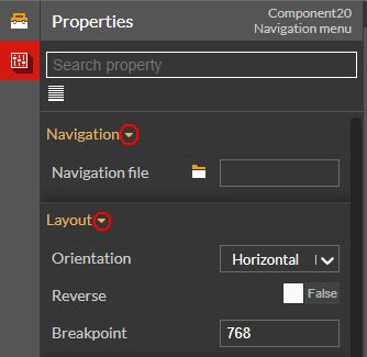
Components properties panel
Further on, the Properties panel also serves as a Components configuration panel. The Components Configuration Properties panel is displayed as soon as a Component available on the drawing surface is selected.
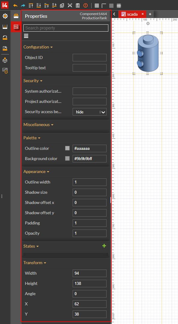
Example of a Component configuration panel
The Components Properties can be split up into multiple categories that the user can collapse or expand, using the respective options.
Collapse category
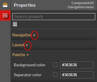
Expand category
By default, Components Properties are sorted by categories, but the user can choose to show them as flat properties by clicking the toolbar button Show properties as a flat list. The list will be then sorted and properties will be displayed in alphabetical order.
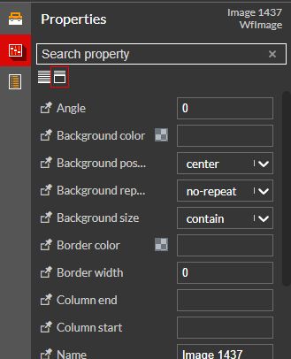
Show properties as a flat list
To return to the categories view list the user can click the Show properties by categories button.
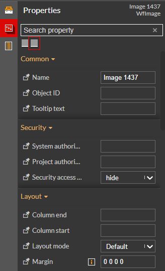
Show properties by categories
Note
Each component has its own set of properties that we shall discuss separately, in the upcoming articles.
Pin properties function
Both Page Properties and Components Properties can be grouped as favorites by using the Pin property function.
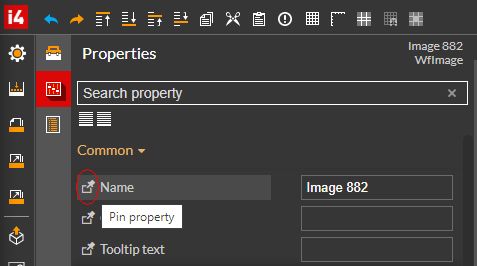
The Pin property button
As soon as at least one property has been pinned, a new category will be added to the Properties panel, listing the pinned properties.
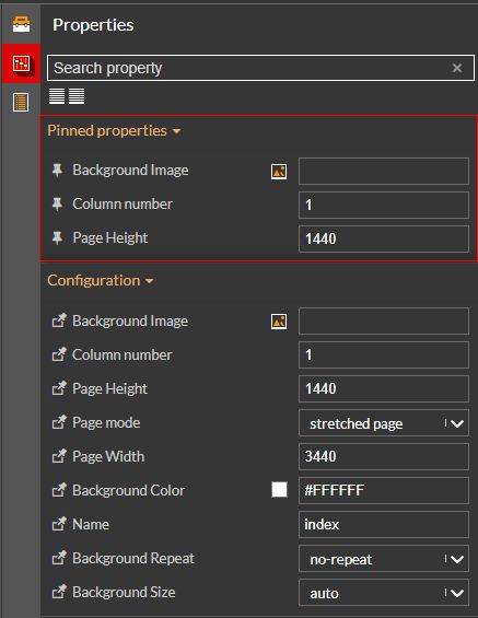
Pinned properties category
Note
A pinned property cannot be pinned again.
To remove a property from the pinned properties list, the user can click the Unpin property button.
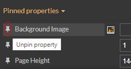
The Unpin property button
The Page explorer menu
By clicking the Page explorer menu a list of all the current project page components is displayed.
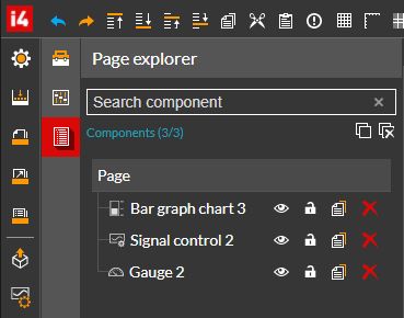
The Page Explorer menu
Besides the general overview of the page project components, the Page explorer feature can be used to easily pinpoint a component, by clicking it in the list view.
Note
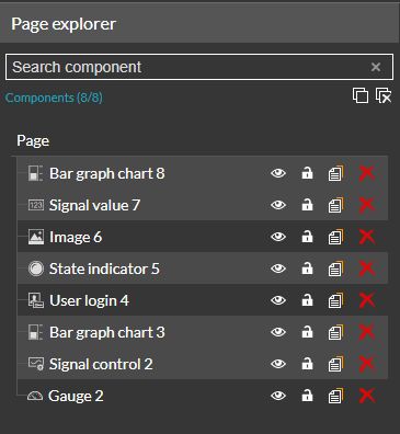
If the current project has multiple pages, the Page explorer can be opened for each page, separately.
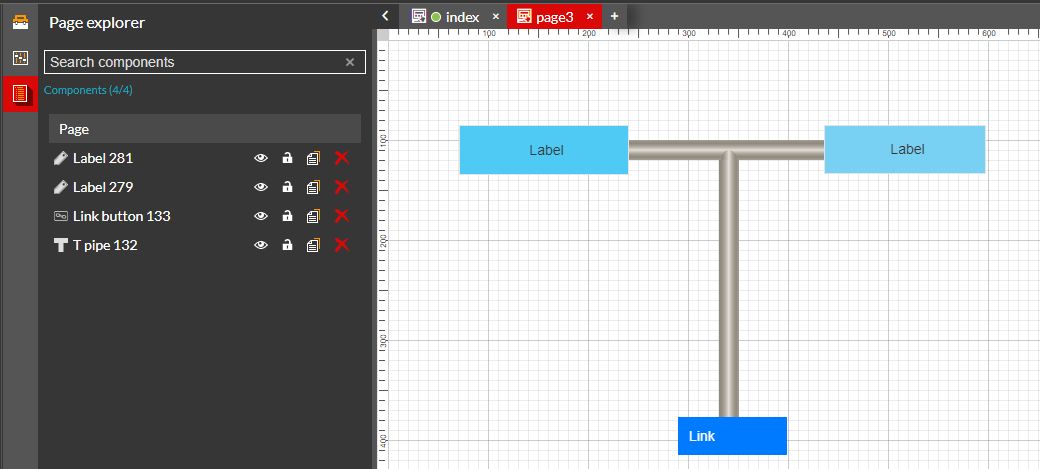
Example: The Page explorer of "Page 3"
The list of components under the Page explorer menu does not display the components of all project pages.
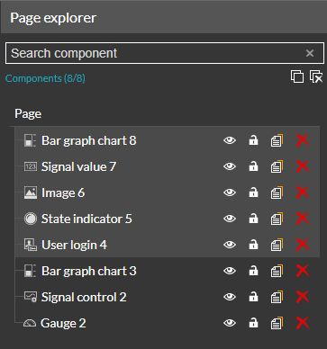
The Page explorer also features a simple filtering mechanism, allowing the user to search for a specific component of the project page. By typing in the name or part of the component name in the designated search field, the list is filtered to display only the relevant results.
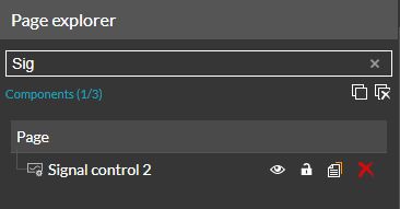
Filtering the Page explorer list of components
Each component listed in the Page explorer panel features a set of action buttons allowing the user to manage the page components.
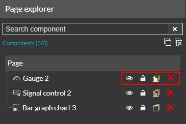
Page components actions
The Visible component icon
 is by default active for all components. By clicking it, the user can decide to hide that particular component, from the page view, marking it as a Hidden component
 .
.Further on, the Lock component
 option allows the user to lock a component. Once a component has been locked, the icon changes its appearance, restricting the user to change the component position and deactivates the duplicate. To unlock a component the user can click the Unlock component icon
  .
.The Duplicate component
 option can be useful when the user desires to add more components with the same set of parameters to the project page.
Redundant components can be deleted from the project page, by clicking the Remove component icon
 .
.
A set of bulk operations can also be performed, by using the panel's toolbar buttons:
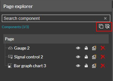
Bulk operations toolbar buttons
Select all / Deselect all - applies the selection to all the listed components.
Remove all - removes all the listed components.
The user can also select multiple components under the Page explorer panel, as follows:
via Control-click - the user can select multiple components, by holding the CTRL key and alternatively clicking on the components of interest, with the left mouse button. The selected components can be positioned anywhere in the list view, not necessarily next to each other. To deselect any of the components in the collection, the user can click it again, while holding the CTRL key.
Multi-select function - Control clicking
via Shift-click - the user can determine a range of components, first by selecting a component in the list with one mouse click and next by holding down the Shift key and clicking another listed component. The component selected first will be the start point of your selected range and the second component will define where the range ends.
Multi-select function - Shift-clicking