Bacnet
Here is a brief presentation of the BACnet components provided to you by WEBfactory.
BACnet components provide a quick and easy visualization of data in a BACnet environment. The following BACnet components will be described from a design-time point of view in the upcoming articles.
Scheduler
Trend log
Bacnet object Property exposer
Bacnet object Property explorer
Scheduler
Check out this article in order to learn more details about the BACnet Scheduler component and the properties provided by it.
The i4designer BACnet Scheduler component provides the user with the possibility to define a standardization object used to describe a periodic schedule that may recur during a range of dates, with optional exceptions at arbitrary times on arbitrary dates. The Schedule object also serves as a binding between these scheduled times and the writing of specified "values" to specific properties of specific objects at those times.
Schedules are divided into days, of which there are two types: normal days within a week and exception days. Both types of days can specify scheduling events for either the full day or portions of a day.
The table below describes the design-time properties of the Scheduler component.
Category | Property | Description |
|---|---|---|
Common | Name | The name of the component, visible in other Designer locations (such as Page explorer). 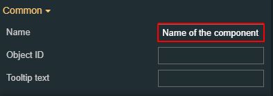 |
Object ID | Sets the Object ID of the component. By defining an object ID for the control, it can be passed as SignalPrefix when using parameter passing in navigation. The value of the Object ID can be used via a placeholder [OID] in other properties of this extension. The placeholder is supported in all signal properties, symbolic text, and states. Example: Setpoint [OID] 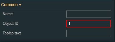 | |
Tooltip text | Optional tooltip text, that will be shown on mouseover at runtime. 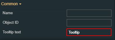 | |
Configuration | Auto Refresh | By default, this option is not activated. By enabling Auto Refresh, the data displayed in the Scheduler will be regenerated based on the defined refresh interval. If the option is disabled, the user may manually refresh data by pressing the toolbar Refresh button. 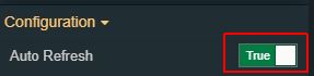 |
Bacnet Broker Url | Sets the URL of the BACnet broker with which the service will communicate. The URL should be built on the basis of the following syntax: BACnet Broker URL + “/SignalR“ suffix. The BrokerUrl field is required. 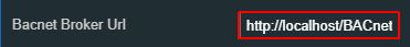 NoteThe default value (localhost) points to a local broker installation. This should be changed if the broker runs in a different location. | |
Bacnet Object Id | Sets the Object ID of the component. By defining an object ID for the control, it can be passed as SignalPrefix when using parameter passing in navigation. The value of the Object ID can be used via a placeholder [OID] in other properties of this extension. The placeholder is supported in all signal properties, symbolic text, and states. 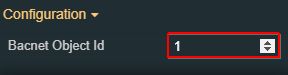 | |
Client side configuration | Defines whether configurations are saved locally. By default, the property is set to false, hence, all configurations are safely stored on the target server, and can be loaded to the component, regardless of the used browser. If the property is set to True, all configurations are saved on the browser's local storage. When loading configurations are saved locally, the system will initially load the configuration that is saved in the local storage, if one exists. If it doesn't exist, it will fall back to the initial configuration field. Further on, configurations saved locally can be lost. If the browser application is uninstalled, or if the user decides to change browser settings can return to factory defaults. 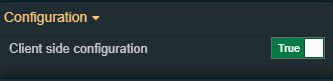 | |
Configuration namespace | The namespace used by the component predefined configuration, that will be initially loaded for the component when opening the run-time visualization. 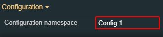 | |
Initial configuration | Sets the name of the existing configuration, that will be initially loaded for the component when opening the run-time project visualization. 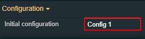 | |
Mac | Mac of the pre-selected device that will be used by the Scheduler component, at run-time. 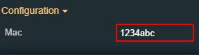 | |
Net | Allows the user to add the desired network number. 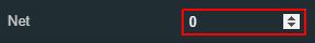 | |
Effects | Opacity | Sets the opacity of the component. The Opacity values should be numbers from 0 to 1 representing the opacity of the component. When the component has a value of 0, the element is completely invisible; a value of 1 is completely opaque (solid). By default, the component's opacity is set to value 1. Using the up/down arrows, the user can control the opacity degree. 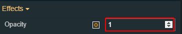 By clicking the Open button, the view is extended to display the Opacity slider. 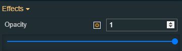 |
Shadow color | Sets the color of the component's shadow. The user can either manually type in the HEX color code or use the color picker tool. 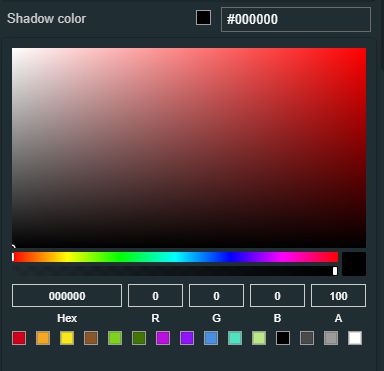 | |
Shadow offset X | Sets the offset of the shadow on the horizontal axis. The default value can be increased or decreased, either by manually typing in the desired value or by using the up and down arrows.  | |
Shadow offset Y | Sets the offset of the shadow on the vertical axis. The default value can be increased or decreased, either by manually typing in the desired value, or by using the up and down arrows.  | |
Shadow size | Sets the width of the component shadow. The default value can be increased or decreased, either by manually typing in the desired value or by using the up and down arrows. 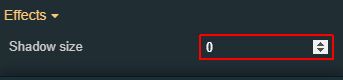 | |
Layout | Layout mode | Sets the behavior of the element to either disable (grayed out) or hide, when the logged-in user does not meet the conditions imposed by the Project authorizations and System authorizations. 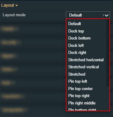 |
Margin | Sets the margin of the components relative to the drawing board area. The supported values are the standard CSS values for the margin. The top, bottom, left and right values can either be typed in the main property field or by using the Margin editor. 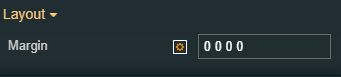 The Margin editor can be opened by clicking the Open button. 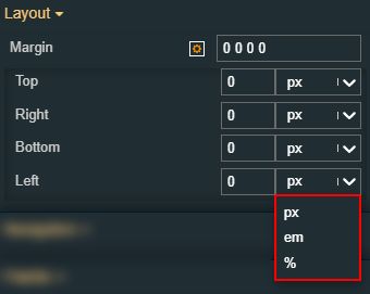 | |
Palette | Background color | Sets the background color of the component. As the color palette is injected into the component by means of the default CSS class, applying this property the CSS class settings will be overwritten. 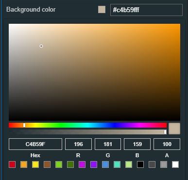 |
Border color | Sets the color of the component border. As the color palette is injected into this component by means of the default CSS class, applying this property the CSS class settings will be overwritten. 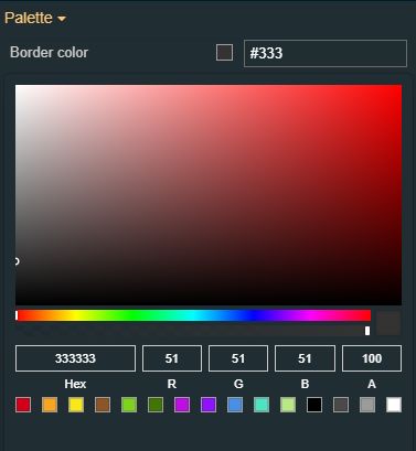 | |
Foreground color | Sets the foreground color of the component. As the color palette is injected into this component by means of the default CSS class, applying this property the CSS class setting will be overwritten. 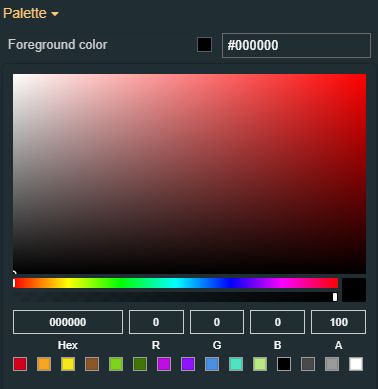 | |
Security | Project authorizations | The project authorization required for displaying the component. If the logged in user does not have the project authorization, the component will not be visible or enabled (depending on the set Security access behavior). If the property is left empty, the component will be visible and enabled to all users. Further on, the user can also add multiple Project authorizations, separated by a comma (,). 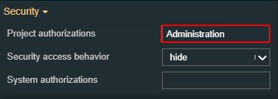 |
Security access behavior | Sets the behavior of the element to either disabled (grayed out) or hidden, when the logged in user does not meet the conditions imposed by the Project authorization and System authorization properties. In case both Project authorization and System authorization properties are set, the logged in user needs to meet both conditions to be able to see and utilize the component, at run-time. 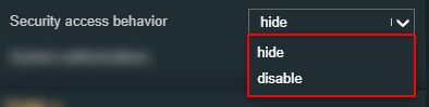 | |
System authorizations | The system authorization required to display the component. If the logged in user does not have this system authorization, the component will not be visible or enabled (depending on the set Security access behavior). If the property is left empty, the component will be visible and enabled for all users. Further on, the user can also add multiple System authorizations, separated by a comma (,). 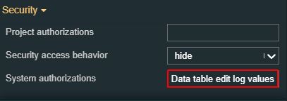 | |
Style | Border style | The Border style property specifies what kind of border to display. The user can select the style from the options available in the drop-down list: 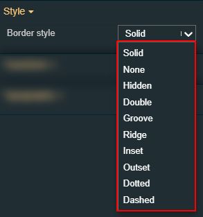
|
Border width | Sets the width of the container border in pixels. The border width value can be either manually typed in the desired field or increased/decreased by clicking the up and down arrows. 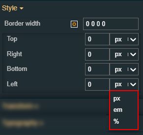 The component's border width can be updated by setting the values and the desired unit:
| |
Typography | Font family | Sets the font family of the component font, selecting from web-fonts available in the drop-down list. 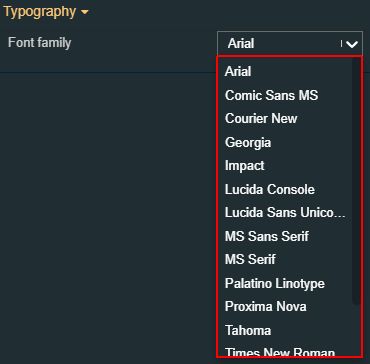 |
Font size | Sets the size of the component font, using the up and down arrows to increase and decrease, or by manually typing the desired value. 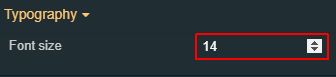 | |
Font weight | Sets the weight of the component font, selecting from the drop-down list options: 900 (fat), 800 (extra-bold), 600 (semi-bold), 500 (medium), 400 (normal), 300 (light), 200 (extra-light), and 100 (thin). 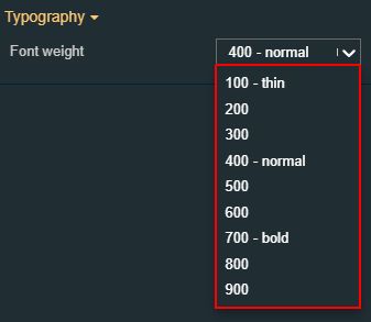 | |
Transform | Width | Sets the width of the component using the up and down arrows to increase and decrease, or by manually typing the desired pixel value. The component width can also be adjusted directly on the design surface by means of mouse manipulation. 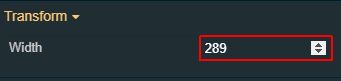 |
Height | Sets the height of the component using the up and down arrows to increase and decrease, or by manually typing the desired pixels value. The component height can also be adjusted directly on the design surface by means of mouse manipulation.  | |
Angle | Sets the rotation angle using the up and down arrows to increase and decrease, or by manually typing the desired degree value. The component angle can also be adjusted directly on the design surface by means of mouse manipulation.  | |
Left | Specifies the X (horizontal) coordinate of the component, on the grid, using the up and down arrows to increase and decrease, or by manually typing the desired value. The component X coordinate can also be adjusted directly on the design surface by means of mouse manipulation.  | |
Top | Specifies the Y (vertical) coordinate of the component, on the grid, using the up and down arrows to increase and decrease, or by manually typing the desired value. The component Y coordinate can also be adjusted directly on the design surface by means of mouse manipulation.  | |
Disable flip | Disables any flip transformation for this component. This keeps the component in the default position even when its container is flipped.  | |
Horizontal flip | Flips the component horizontally. 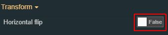 | |
Vertical flip | Flips the component vertically. 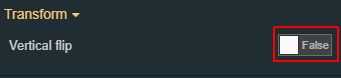 |
Trend log
Check out this article in order to learn more details about the BACnet Trend log component and the properties provided by it.
The i4designer BACnet Trend log component is defined as a monitor for a specific object. When certain conditions are reached, a log is produced based on property value and a date/time stamp. The data may be logged periodically, upon a change of value, or when "triggered" by a write to the Trigger property.
The table below describes the design-time properties of the Trend log component.
Category | Property | Description |
|---|---|---|
Common | Name | The name of the component, visible in other Designer locations (such as Page explorer). |
Object ID | Sets the Object ID of the component. By defining an object ID for the control, it can be passed as SignalPrefix when using parameter passing in navigation. The value of the Object ID can be used via a placeholder [OID] in other properties of this extension. The placeholder is supported in all signal properties, symbolic texts, and states. Example: Setpoint [OID] | |
Tooltip text | Sets the component's tooltip, to be displayed when hovering the component, at run-time. | |
Configuration | Auto Refresh | By default, this option is not activated. By enabling Auto Refresh, the data displayed in the Trend log will be regenerated based on the defined refresh interval. If the option is disabled, the user may manually refresh data by pressing the toolbar Refresh button. |
Bacnet Broker Url | Sets the URL of the BACnet broker with which the service will communicate. The URL should be built on the basis of the following syntax: BACnet Broker URL + “/SignalR“ suffix. The BrokerUrl field is required. NoteThe default value (localhost) points to a local broker installation. This should be changed if the broker runs in a different location. | |
Bacnet Object Id | Sets the Object ID of the component. By defining an object ID for the control, it can be passed as SignalPrefix when using parameter passing in navigation. The value of the Object ID can be used via a placeholder [OID] in other properties of this extension. The placeholder is supported in all signal properties, symbolic text, and states. | |
Mac | Mac of the pre-selected device that will be used by the Trend log component, at run-time. | |
Net | Allows the user to add the desired network number | |
Effects | Opacity | Sets the opacity of the component. The Opacity values should be numbers from 0 to 1 representing the opacity of the component. When the component has a value of 0, the element is completely invisible; a value of 1 is completely opaque (solid). By default, the component's opacity is set to value 1. Using the up/down arrows, the user can control the opacity degree. By clicking the Open button, the view is extended to display the Opacity slider. |
Shadow color | Sets the color of the component's shadow. The user can either type in the HEX color code or use the color picker tool. | |
Shadow offset X | Sets the offset of the shadow on the horizontal axis. The default value can be increased or decreased, either by manually typing in the desired value or by using the up and down arrows. | |
Shadow offset Y | Sets the offset of the shadow on the vertical axis. The default value can be increased or decreased, either by manually typing in the desired value or by using the up and down arrows. | |
Shadow size | Sets the width of the component shadow. The default value can be increased or decreased, either by manually typing in the desired value, or by using the up and down arrows. | |
Layout | Layout mode | Sets the behavior of the element to either disabled (grayed out) or hidden, when the logged in user does not meet the conditions imposed by the Project authorizations and System authorizations. |
Margin | Sets the margin of the component relative to the drawing board area. The supported values are the standard CSS values for the margin. The top, bottom, left and right values can either be typed in the main property field or by using the Margin editor. The Margin editor can be opened by clicking the Open button. The component's margins can be updated by setting the margin value and selecting the desired unit:
| |
Palette | Background color | Sets the background color of the component, either by manually typing in the HEX color code or by using the color picker tool. Applying this property will overwrite the default CSS class. |
Border color | Sets the color of the component border. The user can either manually type in the HEX color code or use the color picker tool. As the color palette is injected into this component by means of the default CSS class, applying this property the CSS settings will be overwritten. | |
Foreground color | Sets the foreground color of the component. The user can either manually type in the HEX color code or use the picker tool. As the color pallette is injected into this component by means of the default CSS class, applying this property the CSS class setting will be overwritten. | |
Security | Project authorizations | The Project authorization required for displaying the component. If the logged in user does not have the project authorization, the component will not be visible or enabled (depending on the set Security access behavior). If the property is left empty, the component will be visible and enabled to all users. Further on, the user can also add multiple Project authorizations, separated by comma (,). |
Security access behavior | Sets the behavior of the element to either disable (grayed out) or hidden, when the logged-in user does not meet the conditions imposed by the Project authorizations and System authorizations properties. In case both Project authorizations and System authorizations are set, the logged in user needs to meet both conditions to be able to see and utilize the component, at run-time. | |
System authorizations | The System authorizations required to display the component. If the logged in user does not have this system authorization, the component will not be visible or enabled (depending on the set Security access behavior). If the property is left empty, the component will be visible and enabled for all users. Further on, the user can also add multiple System authorizations, separated by comma (,). | |
Transform | Width | Sets the width of the component using the up and down arrows to increase and decrease, or by manually typing the desired pixel value. The component width can also be adjusted directly on the design surface by means of mouse manipulation. |
Height | Sets the height of the component using the up and down arrows to increase and decrease, or by manually typing the desired pixel value. The component height can also be adjusted directly on the design surface by means of mouse manipulation. | |
Angle | Sets the rotation angle using the up and down arrows to increase and decrease, or by manually typing the desired degree value. The component angle can also be adjusted directly on the design surface by means of mouse manipulation. | |
Left | Specifies the X (horizontal) coordinate of the component, on the grid, using the up and down arrows to increase and decrease, or by manually typing the desired value. The component X coordinate can also be adjusted directly on the design surface by means of mouse manipulation. | |
Top | Specifies the Y (vertical) coordinate of the component, on the grid, using the up and down arrows to increase and decrease, or by manually typing the desired value. The component Y coordinate can also be adjusted directly on the design surface by means of mouse manipulation. | |
Disable flip | Disables any flip transformation for this component. This keeps the component in the default position even when its container is flipped. | |
Horizontal flip | Flips the component horizontally. | |
Vertical flip | Flips the component vertically. |
BACnet Browser
Check out this article to learn more details about the BACnet Browser component and the properties provided by it.
The i4designer BACnet Browser component is defined as
The table below describes the design-time properties of the BACnet Browser component.
Category | Property | Description |
|---|---|---|
Common | Name | The name of the component, visible in other Designer locations (such as Page explorer). |
Object ID | Sets the Object ID of the component. By defining an object ID for the control, it can be passed as SignalPrefix when using parameter passing in navigation. The value of the Object ID can be used via a placeholder [OID] in other properties of this extension. The placeholder is supported in all signal properties, symbolic texts, and states. Example: Setpoint [OID] | |
Tooltip text | Optional tooltip text, that will be shown on mouseover at runtime. | |
Configuration | Auto Refresh | By default, this option is not activated. By enabling Auto Refresh, the data displayed in the BACnet Browser will be regenerated based on the defined refresh interval. If the option is disabled, the user may manually refresh data by pressing the toolbar Refresh button. 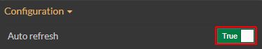 |
Bacnet Broker URL | The URL of the broker with which the service will communicate. The Broker Url field is required. The default value points to a local broker installation. Change this field if the broker runs in a different location. 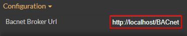 | |
Effects | Opacity | Sets the opacity of the component. The Opacity values should be numbers from 0 to 1 representing the opacity of the component. When the component has a value of 0, the element is completely invisible; a value of 1 is completely opaque (solid). By default, the component's opacity is set to value 1. Using up/down arrows, the user can control the opacity degree. By clicking the Open button, the view is extended to display the Opacity slider. |
Shadow color | Sets the color of the component's shadow. The user can either manually type in the HEX color code or use the color picker tool. | |
Shadow offset X | Sets the offset of the shadow on the horizontal axis. The default value can be increased or decreased, either by manually typing in the desired value or by using the up and down arrows. | |
Shadow offset Y | Sets the offset of the shadow on the vertical axis. The default value can be increased or decreased, either by manually typing in the desired value or by using the up and down arrows. | |
Shadow size | Sets the width of the component shadow. The default value can be increased or decreased, either by manually typing in the desired value or by using the up and down arrows. | |
Layout | Layout mode | Sets the behavior of the element to either disabled (grayed out) or hidden, when the logged in user doesn't meet the conditions imposed by the Project authorizations and System authorizations properties. |
Margin | Sets the margin of the component relative to the drawing board area. The supported values are the standard CSS values for the margin. The top, bottom, left and right values can either be typed in the main property field or by using the Margin editor. The Margin editor can be opened by clicking the Open button. The components margins can be updated by setting the margin value and selecting the desired unit:
| |
Palette | Background color | Sets the background color of the component, either by manually typing in the HEX color code or by using the color picker tool. Applying this property will overwrite the default CSS class. |
Border color | Sets the color of the component border. The user can either manually type in the HEX color code or use the color picker tool. As the color palette is injected into this component by means of the default CSS class, applying this property the CSS class settings will be overwritten. | |
Foreground color | Sets the foreground color of the button. The user can either manually type in the HEX color code or use the color picker tool. As the color palette is injected into this component by means of the default CSS class, applying this property the CSS class settings will be overwritten. | |
Security | Project authorizations | The project authorization required for displaying the component. If the logged in user does not have this project authorization, the user will not be visible or enabled (depending on the set Security access behavior). If the property is left empty, the component will be visible and enabled for all users. Further on, the user can also add multiple Project authorizations, separated by comma (,). |
Security access behavior | Sets the behavior of the element to either disabled (grayed out) or hidden, when the logged in user does not meet the conditions imposed by the Project authorizations and System authorizations properties. In case both Project authorizations and System authorizations properties are set, the logged user needs to meet both conditions to be able to see and utilize the component, at run-time. | |
System authorizations | The system authorization required to display the component. If the logged in user does not have this system authorization, the component will not be visible or enabled depending on the set Security access behavior). If the property is left empty, the component will be visible and enabled for all users. Further on, the user can also add multiple System authorizations, separated by comma (,). | |
Style | Border style | The Border Style property specifies what kind of border to display. The following values can be manually typed in:
|
Border width | Sets the width of the container border in pixels. The border width values can be either manually typed in the designated field or increased/decreased by clicking the up and down arrows. 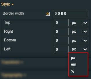 The components border width can be updated by setting the values and the desired unit.
| |
Typography | Font family | Sets the font family of the component font, selecting from web-safe fonts available in the drop-down list.  |
Font size | Sets the size of the menu links font, using the up and down arrows to increase and decrease, or by manually typing the desired value. 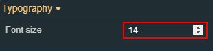 | |
Font weight | Sets the weight of the menu links font, selecting from the drop-down list options: 900 (fat), 800 (extra-bold), 700 (bold), 600 (semi-bold), 500 (medium), 400 (normal), 300 (light), 200 (extra-light) and 100 (thin). | |
Transform | Angle | Sets the rotation angle using the up and down arrows to increase and decrease, or by manually typing the desired degree value. The component angle can also be adjusted directly on the design surface by means of mouse manipulation. |
Disable flip | Disables any flip transformation for this component. This keeps the component in the default position even when its container is flipped. | |
Height | Sets the height of the component using the up and down arrows to increase and decrease, or by manually typing the desired pixels value. The component height can also be adjusted directly on the design surface by means of mouse manipulation. | |
Horizontal flip | Flips the component horizontally. | |
Left | Specifies the X (horizontal) coordinate of the component, on the grid, using the up and down arrows to increase and decrease, or by manually typing the desired value. The component X coordinate can also be adjusted directly on the design surface by means of mouse manipulation. 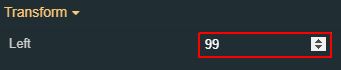 | |
Top | Specifies the Y (vertical) coordinate of the component, on the grid, using the up and down arrows to increase and decrease, or by manually typing the desired value. The component Y coordinate can also be adjusted directly on the design surface by means of mouse manipulation. | |
Vertical flip | Flips the component vertically. | |
Width | Sets the width of the component using the up and down arrows to increase and decrease, or by manually typing the desired pixel value. The component width can also be adjusted directly on the design surface by means of mouse manipulation. |
BACnet object Property exposer
Check out this article in order to learn more details about the BACnet object Property exposer component and the properties provided by it.
The i4designer BACnet object Property Exposer is a utility component allowing the user to append output patterns to generate local signals, with the scope to expose BACnet object properties, at run-time. This component needs to co-exist on the same page with other signal-specific components, such as the Signal control.
The table below describes the design-time properties of the BACnet object Property exposer component.
Category | Property | Description |
|---|---|---|
Configuration | ||
Bacnet Broker Url | Sets the URL of the BACnet broker with which the service will communicate. The URL should be built on the basis of the following syntax: BACnet Broker URL + “/SignalR“ suffix. The BrokerUrl field is required. NoteThe default value (localhost) points to a local broker installation. This should be changed if the broker runs in a different location. “ | |
Bacnet Object Id | Sets the Object ID of the component. By defining an object ID for the control, it can be passed as SignalPrefix when using parameter passing in navigation. The value of the Object ID can be used via a placeholder [OID] in other properties of this extension. The placeholder is supported in all signal properties, symbolic text, and states. | |
Bacnet Object Type | BACnet object types will be pre-selected at runtime. The available options are: Schedule, TrendLog, AnalogInput, AnalogOutput, AnalogValue, BinaryInput, BinaryOutput, BinaryValue, Calendar, Command, Device, EventEnrollment, File, Group, Loop, MultiStateInput, MultiStateOutput, NotificationClass, Program, Averaging, MultiStateValue, LifeSafetyPoint, LifeSafetyZone, Accumulator, PulseConverter, EventLog, GlobalGroup, TrendLogMultiple, LoadControl, StructuredView, AccessDoor, AccessCredential, AccessPoint, AccessRights,AccessUser, AccessZone, CredentialDataInp, NetworkSecurity, BitStringValue, CharStringValue, DatePatternValue, DateValue, DatetimePatternValue, DatetimeValue, IntegerValue, LargeAnalogValue, OctetStringValue, PozitiveIntegerValue, TimePatternValue, TimeValue, NotificationForwarder, AlertEnrollment, Channel, LightingOutput, PrivateValue, MaxValue. 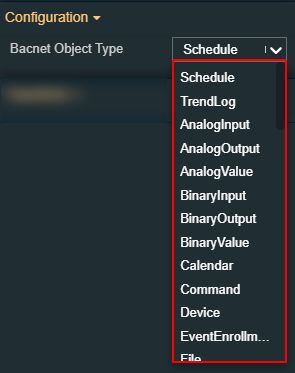 | |
Mac | Mac of the pre-selected device that will be used by the BACnet object Property exposer component, at run-time. | |
Net | Allows the user to add the desired network number. | |
Output Pattern Name | The pattern used to generate local signals with the BACnet property. 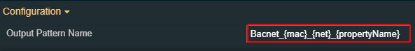 | |
Common | Name | Displays the name of the component.  |
Object ID | Sets the Object ID of the component. By defining an object ID for the control, it can be passed as SignalPrefix when using parameter passing in navigation. The value of the Object ID can be used via a placeholder [OID] in other properties of this extension. The placeholder is supported in all signal properties, symbolic text, and states. Example: Setpoint [OID] | |
Transform | Width | Sets the width of the component using the up and down arrows to increase and decrease, or by manually typing the desired pixels value. The component width can also be adjusted directly on the design surface by means of mouse manipulation. |
Height | Sets the height of the component using the up and down arrows to increase and decrease, or by manually typing the desired pixels value. The component height can also be adjusted directly on the design surface by means of mouse manipulation. | |
Angle | Sets the rotation angle using the up and down arrows to increase and decrease, or by manually typing the desired degree value. The component angle can also be adjusted directly on the design surface by means of mouse manipulation. | |
Left | Specifies the X (horizontal) coordinate of the component, on the grid, using the up and down arrows to increase and decrease, or by manually typing the desired value. The component X coordinate can also be adjusted directly on the design surface by means of mouse manipulation. | |
Top | Specifies the Y (vertical) coordinate of the component, on the grid, using the up and down arrows to increase and decrease, or by manually typing the desired value. The component Y coordinate can also be adjusted directly on the design surface by means of mouse manipulation. | |
Disable flip | Disables any flip transformation for this component. This keeps the component in the default position even when its container is flipped. | |
Horizontal flip | Flips the component horizontally. | |
Vertical flip | Flips the component vertically. |
BACnet object Property explorer
Check out this article in order to learn more details about the BACnet object Property explorer component and the properties provided by it.
The BACnet object Property explorer component is used to generate the complete list of object properties on basis of self-generated local signals. The Signal list will only be visible at run-time.
The table below describes the design-time properties of the BACnet object Property explorer component.
Category | Property | Description |
|---|---|---|
Common | Name | The name of the component, visible in other Designer locations (such as Page explorer). |
Object ID | Sets the Object ID of the component. By defining an object ID for the control. it can be passed as SignalPrefix when using parameter passing in navigation. The value of the Object ID can be used via a placeholder [OID] in other properties of this extension. The placeholder is supported in all signal properties, symbolic text, and states. Example: Setpoint [OID] | |
Tooltip text | Optional tooltip text, that will be shown on mouseover at runtime. | |
Configuration | Bacnet Broker Url | Sets the URL of the BACnet broker with which the service will communicate. The URL should be built on the basis of the following syntax: BACnet Broker URL + “/SignalR“ suffix. The BrokerUrl field is required. NoteThe default value (localhost) points to a local broker installation. This should be changed if the broker runs in a different location. |
Bacnet Object Type | BACnet object types will be pre-selected at runtime. The available options are: Schedule, TrendLog, AnalogInput, AnalogOutput, AnalogValue, BinaryInput, BinaryOutput, BinaryValue, Calendar, Command, Device, EventEnrollment, File, Group, Loop, MultiStateInput, MultiStateOutput, NotificationClass, Program, Averaging, MultiStateValue, LifeSafetyPoint, LifeSafetyZone, Accumulator, PulseConverter, EventLog, GlobalGroup, TrendLogMultiple, LoadControl, StructuredView, AccessDoor, AccessCredential, AccessPoint, AccessRights, AccessUser, AccessZone, CredentialDataInp, NetworkSecurity, BitStringValue, CharStringValue, DatePatternValue, DateValue, DatetimePatternValue, DatetimeValue, IntegerValue, LargeAnalogValue, OctetStringValue, PozitiveIntegerValue, TimePatternValue, TimeValue, NotificationForwarder, AlertEnrollment, Channel, LightingOutput, PrivateValue, MaxValue. | |
Bacnet Object Id | Sets the Object ID of the component. By defining an object ID for the control, it can be passed as SignalPrefix when using parameter passing in navigation. The value of the Object ID can be used via a placeholder [OID] in other properties of this extension. The placeholder is supported in all signal properties, symbolic text, and states. | |
Mac | Mac of the pre-selected device that will be used by the BACnet object Property explorer component, at run-time. | |
Net | Allows the user to add the desired network number | |
Output Pattern Name | The pattern is used to generate local signals with the BACnet property. | |
Effects | Opacity | Sets the opacity of the component. The Opacity values should be numbers from 0 to 1 representing the opacity of the component. When the component has a value of 0, the element is completely invisible; a value of 1 is completely opaque (solid). By default, the component's opacity is set to value 1. Using the up/down arrows, the user can control the opacity degree. By clicking the Open button, the view is extended to display the Opacity slider. |
Shadow color | Sets the color of the component's shadow. The user can either manually type in the HEX color code or use the color picker tool. | |
Shadow offset X | Sets the offset of the shadow on the horizontal axis. The default value can be increased or decreased, either by manually typing in the desired value or by using the up and down arrows. | |
Shadow offset Y | Sets the offset of the shadow on the vertical axis. The default value can be increased or decreased, either by manually typing in the desired value or by using the up and down arrows. | |
Shadow size | Sets the width of the component shadow. The default value can be increased or decreased, either by manually typing in the desired value or by using the up and down arrows. | |
Layout | Layout mode | Sets the behavior of the element to either disable (grayed out) or hidden, when the logged in user does not meet the conditions imposed by the Project authorizations / System authorization properties. In case both Project authorization and System authorizations are set, the logged in user needs to meet both conditions to be able to see and utilize the component, at run-time. |
Margin | Sets the margin of the component relative to the drawing board area. The supported values are the standard CSS values for the margin. The top, bottom, left and right values can either be typed in the main property field or by using the Margin editor. The Margin editor can be opened by clicking the Open button. The components margin can be updated by setting the margin value and selecting the desired unit:
| |
Palette | Background color | Sets the background color of the component, either by manually typing in the HEX color code or by using the color picker tool. Applying this property will overwrite the default CSS class. |
Border color | Sets the color of the component border. The user can either manually type in the HEX color code or use the color picker tool. As the color palette is injected into this component by means of the default CSS class, applying this property the CSS class settings will be overwritten. | |
Foreground color | Sets the foreground color of the button. The user can either manually type in the HEX color code or use the color picker tool. As the color palette is injected into this component by means of the default CSS class, applying this property the CSS class settings will be overwritten. | |
Security | Project authorizations | The project authorizations required for displaying the component. If the logged in user does not have this project authorization, the component will not be visible or enabled (depending on the set Security access behavior). If the property is left empty, the component will be visible and enabled to all users. Further on, the user can also add multiple Project authorizations, separated by comma (,). |
Security access behavior | Sets the behavior of the element to either disabled (grayed out) or hidden, when the logged in user doesn't meet the conditions imposed by the Project authorization / Roles and System authorization / Permissions properties. In case both Project authorization and System authorization properties are set, the logged user needs to meet both conditions to be able to see and utilize the component, at run-time. | |
System authorizations | The system authorization required to display the component. If the logged in user does not have this system authorization, the component will not be visible or enabled (depending on the set Security access behavior). If the property is left empty, the component will be visible and enabled for all users. Further on, the user can also add multiple System authorizations, separated by comma (,). | |
Transform | Width | Sets the width of the component using the up and down arrows to increase and decrease, or by manually typing the desired pixel value. The component width can also be adjusted directly on the design surface by means of mouse manipulation. |
Height | Sets the height of the component using the up and down arrows to increase and decrease, or by manually typing the desired pixels value. The component height can also be adjusted directly on the design surface by means of mouse manipulation. | |
Angle | Sets the rotation angle using the up and down arrows to increase and decrease, or by manually typing the desired degree value. The component angle can also be adjusted directly on the design surface by means of mouse manipulation. | |
Left | Specifies the X (horizontal) coordinate of the component, on the grid, using the up and down arrows to increase and decrease, or by manually typing the desired value. The component X coordinate can also be adjusted directly on the design surface by means of mouse manipulation. | |
Top | Specifies the Y (vertical) coordinate of the component, on the grid, using the up and down arrows to increase and decrease, or by manually typing the desired value. The component Y coordinate can also be adjusted directly on the design surface by means of mouse manipulation. | |
Disable flip | Disables any flip transformation for this component. This keeps the component in the default position even when its container is flipped. | |
Horizontal flip | Flips the component horizontally. | |
Vertical flip | Flips the component vertically. |