Tiles
Here are the i4designer Tiles components for your new project created on the i4connected platform.
The i4designer Tiles category features the i4connected platform specific charts. More details can be found in the upcoming article.
Tiles
Check out this article in order to learn more details about the i4designer Tiles component and the properties it features.
The i4designerTiles component provides the user with the possibility to display a set of tiles presented as detailed cards providing information about certain recorded values, specified by the component's predefined filter. The filter of the Tiles component is based on a set of specific parameters. More details about the configuration properties, can be found in the table below:
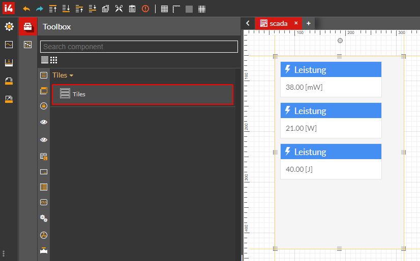
The Tiles component
Category | Property | Description |
|---|---|---|
Configuration | Aggregate totals | If the toggle button is set to true all the measurements of the respective media and KPIs will be summed up. 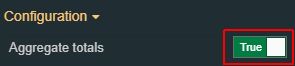 |
Areas | Allows the user to add one or multiple patterns used to select the corresponding areas. To add the Areas filter patterns, the user can click the Expand array list button. 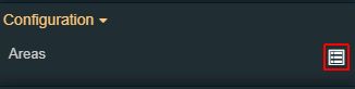 The view is updated to display the Add new item button. As soon as the Add new item button is clicked, the user can click on the Expand the list button, to view the list of Areas, available for the current project. NoteThe list of entities is by default filtered to show all possible combinations. The "*" wildcard means "any". 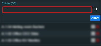 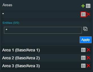 The user can define filter patterns, as follows:
To preserve the selection, the Apply button needs to be clicked. | |
Auto update | Allows the user to specify whether the updating should happen automatically or not. When this option is enabled the component pulls interval for data and updates it automatically. The Filter object property must be also filled when enabling the Auto-update property. 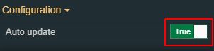 | |
Devices | Allows the user to add one or multiple patterns used to select the corresponding Devices. To add Devices filter patterns, the user can click the Expand array list button. 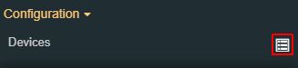 The view is updated to display the Add new item button. As soon as the Add new item button is clicked, the user can click on the Expand the list button, to view the list of Devices, available for the current project. NoteThe list of entities is by default filtered to show all possible combinations. The "*" wildcard means "any". 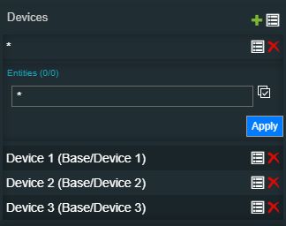 The user can define filter patterns, as follows:
To preserve the selection, the Apply button needs to be clicked. | |
Direction | Sets the chart label direction measured in pixels. The value can be increased or decreased using the up / down arrows or manually added. 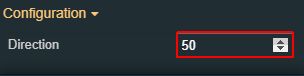 | |
KPIs | Allows the user to add one or multiple patterns used to select the corresponding KPIs. To add KPIs filter patterns, the user can click the Expand array list button. 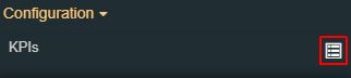 The view is updated to display the Add new item button. As soon as the Add new item button is clicked, the user can click on the Expand the list button, to view the list of KPIs, available for the current project. NoteThe list of entities is by default filtered to show all possible combinations. The "*" wildcard means "any". 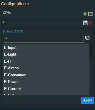 The user can define filter patterns, as follows:
To preserve the selection, the Apply button needs to be clicked. | |
Organizational Units | Allows the user to add one or multiple patterns used to select the corresponding Organizationa Units. To add Organizational Units filter patterns, the user can click the Expand array list button. 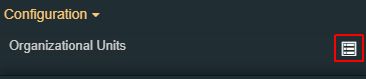 The view is updated to display the Add new item button. As soon as the Add new item button is clicked, the user can click on the Expand the list button, to view the list of Organizational Units, available for the current project. NoteThe list of entities is by default filtered to show all possible combinations. The "*" wildcard means "any".  The user can define filter patterns, as follows:
To preserve the selection, the Apply button needs to be clicked. | |
Resolution | Allows the user to select the resolution of the data rendered in the chart (the time interval between two consecutive measurements displayed on the time axis). The user can choose between five predefined resolutions (15 minutes, one hour, one day, one month, and one year) or can set the option on Auto. When the Resolution is set to Auto, the system automatically adjusts the resolution based on the active Time range setting and the current zoom level. 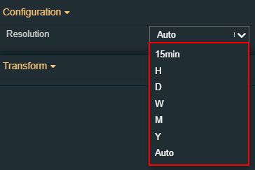 | |
Sites | Allows the user to add one or multiple patterns used to select the corresponding Sites. To add Sites filter patterns, the user can click the Expand array list button. 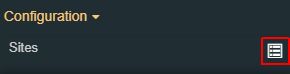 The view is updated to display the Add new item button. As soon as the Add new item button is clicked, the user can click on the Expand the list button, to view the list of Sites, available for the current project. NoteThe list of entities is by default filtered to show all possible combinations. The "*" wildcard means "any". 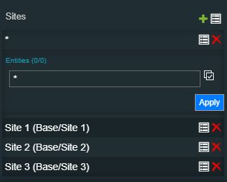 The user can define filter patterns, as follows:
To preserve the selection, the Apply button needs to be clicked. | |
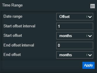
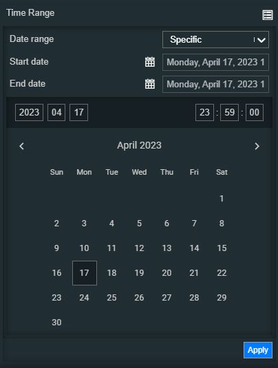
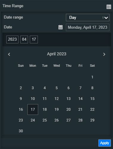
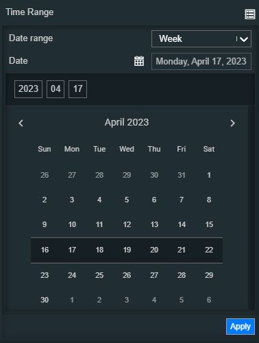
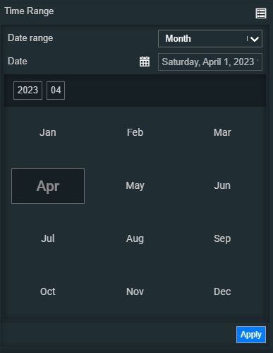
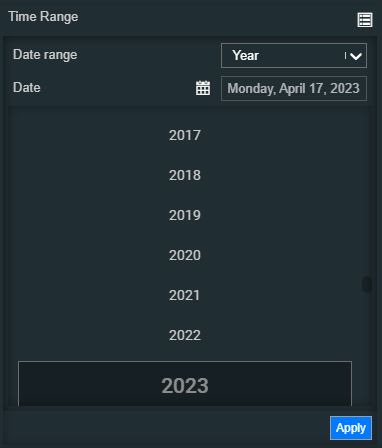
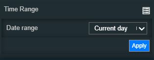
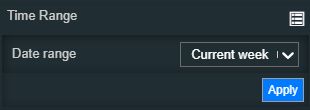
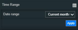
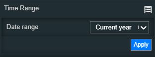
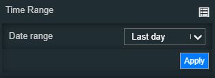
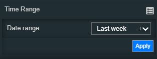
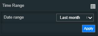
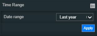
Time Range | Contains a set of time range configurations. By clicking the Expand array list button, a list of modular time range properties is exposed. Based on the selection made for the Date range property, the view is updated accordingly, as follows:
| |
Update rate | Allows the user to specify the update rate in milliseconds. This property will be taken into consideration only if the Alarms Mode is set to Online. 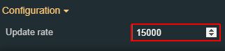 | |
Palette | Tiles background | Sets the background color of the tiles. The user can either manually type in the HEX color code or use the color picker tool. As the color palette is injected into this component by means of the default CSS class, applying this property the CSS class settings will be overwritten. 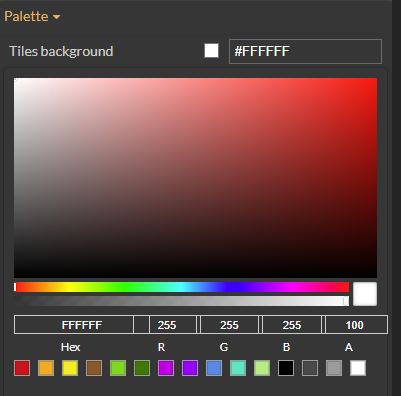 |
Tiles border color | Sets the border color of the tiles. The user can either manually type in the HEX color code or use the color picker tool. As the color palette is injected into this component by means of the default CSS class, applying this property the CSS class settings will be overwritten. 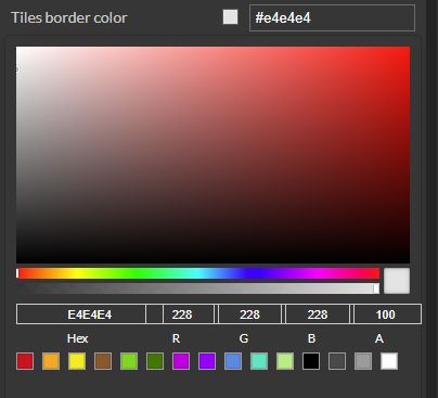 | |
Tiles foreground | Sets the foreground color of the tiles. The user can either manually type in the HEX color code or use the color picker tool. As the color palette is injected into this component by means of the default CSS class, applying this property the CSS class settings will be overwritten. 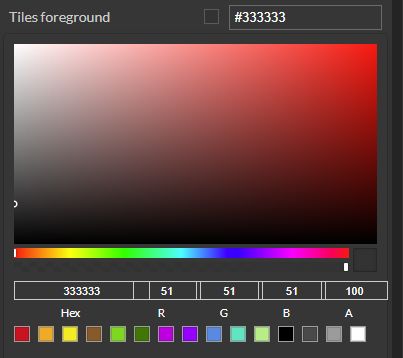 | |
Tiles header background | Sets the background color of the tiles header. The user can either manually type in the HEX color code or use the color picker tool. As the color palette is injected into this component by means of the default CSS class, applying this property the CSS class settings will be overwritten. 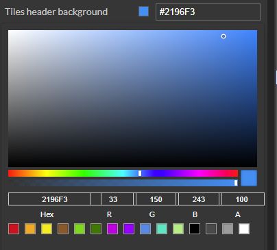 | |
Tiles header foreground | Sets the foreground color of the tiles header. The user can either manually type in the HEX color code or use the color picker tool. As the color palette is injected into this component by means of the default CSS class, applying this property the CSS class settings will be overwritten. 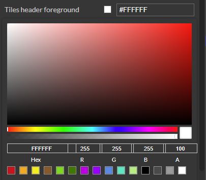 | |
Tiles icon color | Sets the icon color of the tiles. The user can either manually type in the HEX color code or use the color picker tool. As the color palette is injected into this component by means of the default CSS class, applying this property the CSS class settings will be overwritten. 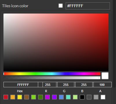 | |
Background color | Sets the background color of the component. The user can either manually type in the HEX color code or use the color picker tool. As the color palette is injected into this component by means of the default CSS class, applying this property the CSS class settings will be overwritten. 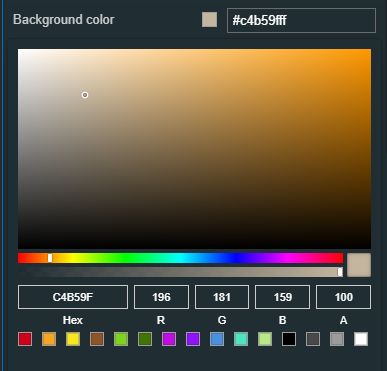 | |
Border color | Sets the border color of the component. The user can either manually type in the HEX color code or use the color picker tool. As the color palette is injected into this component by means of the default CSS class, applying this property the CSS class settings will be overwritten. 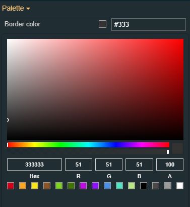 | |
Layout | Display header icon | Enables display of the header icon if the property is set to True. 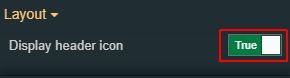 |
Display mode | Sets the display mode of the tiles, selecting from the drop-down list options: tiles or list. 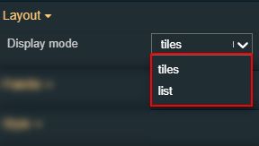 | |
Typography | Header font size | Sets the font size of the chart title, displayed in the component header, using the up and down arrows to increase and decrease, or by manually typing the desired value. 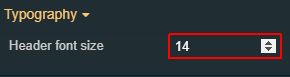 |
Font size | Sets the font size of the chart title, displayed in the component header, using the up and down arrows to increase and decrease, or by manually typing the desired value. 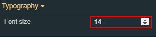 | |
Font family | Sets the font thickness of the chart title, displayed in the component header, selecting from the drop-down list options: normal, 900 (fat), 800 (extra-bold), 700 (bold), 600 (semi-bold), 500 (medium), 400 (regular), 300 (light), 200 (extra-light) and 100 (thin). 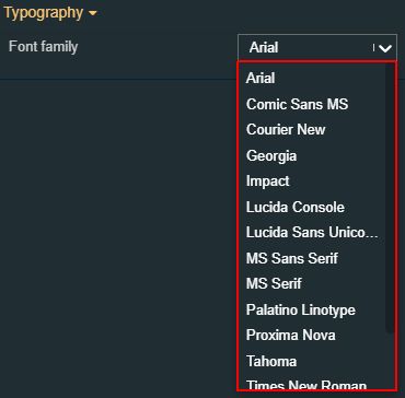 | |
Style | Border width | Sets the width of the components contained. The value is specified in pixels. The Border width editor can be opened by clicking the Open button. 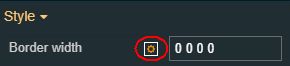 The top, bottom, left and right values can either be typed in the main property field or by using the Border width editor. 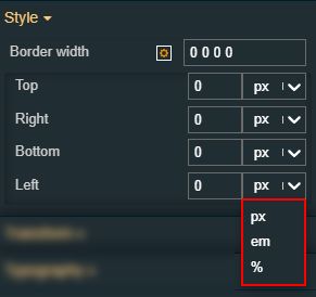 The component's border width can be updated by setting the desired value and selecting the unit:
|
Transform | Angle | Sets the rotation angle using the up and down arrows to increase and decrease, or by manually typing the desired degree value. The component angle can also be adjusted directly on the design surface by means of mouse manipulation. 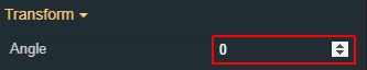 |
Height | Sets the height of the component using the up and down arrows to increase and decrease, or by manually typing the desired pixels value. The component height can also be adjusted directly on the design surface by means of mouse manipulation. 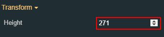 | |
Left | Specifies the X (horizontal) coordinate of the component, on the grid, using the up and down arrows to increase and decrease, or by manually typing the desired value. The component X coordinate can also be adjusted directly on the design surface by means of mouse manipulation. 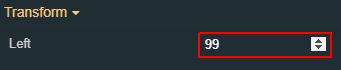 | |
Top | Specifies the Y (vertical) coordinate of the component, on the grid, using the up and down arrows to increase and decrease, or by manually typing the desired value. The component Y coordinate can also be adjusted directly on the design surface by means of mouse manipulation. 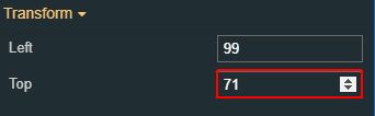 | |
Width | Sets the width of the component using the up and down arrows to increase and decrease, or by manually typing the desired pixels value. The component width can also be adjusted directly on the design surface by means of mouse manipulation. 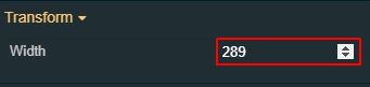 | |
Disable flip | Disables any flip transformation for this component. This keeps the component in the default position even when its container is flipped. 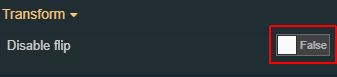 | |
Horizontal flip | Flips the selected component horizontally.  | |
Vertical flip | Flips the selected component vertically.  |