i4designer Historical components tutorials
Check out these articles and learn more details about how you can define and use your i4designer Historical components project.
The HTML Trending functionality overview
Check out this article to gain more knowledge about the HTML Trending functionality, its components and how they are managed, at the level of i4designer.
The Trending functionality is composed of smaller pieces that can be managed independently, providing the user with flexibility, in terms of layout and functionality, since the independent parts can be placed anywhere on the screen, to observe different perspectives of the same data.
The HTML Trending visualization can be built using the following components:
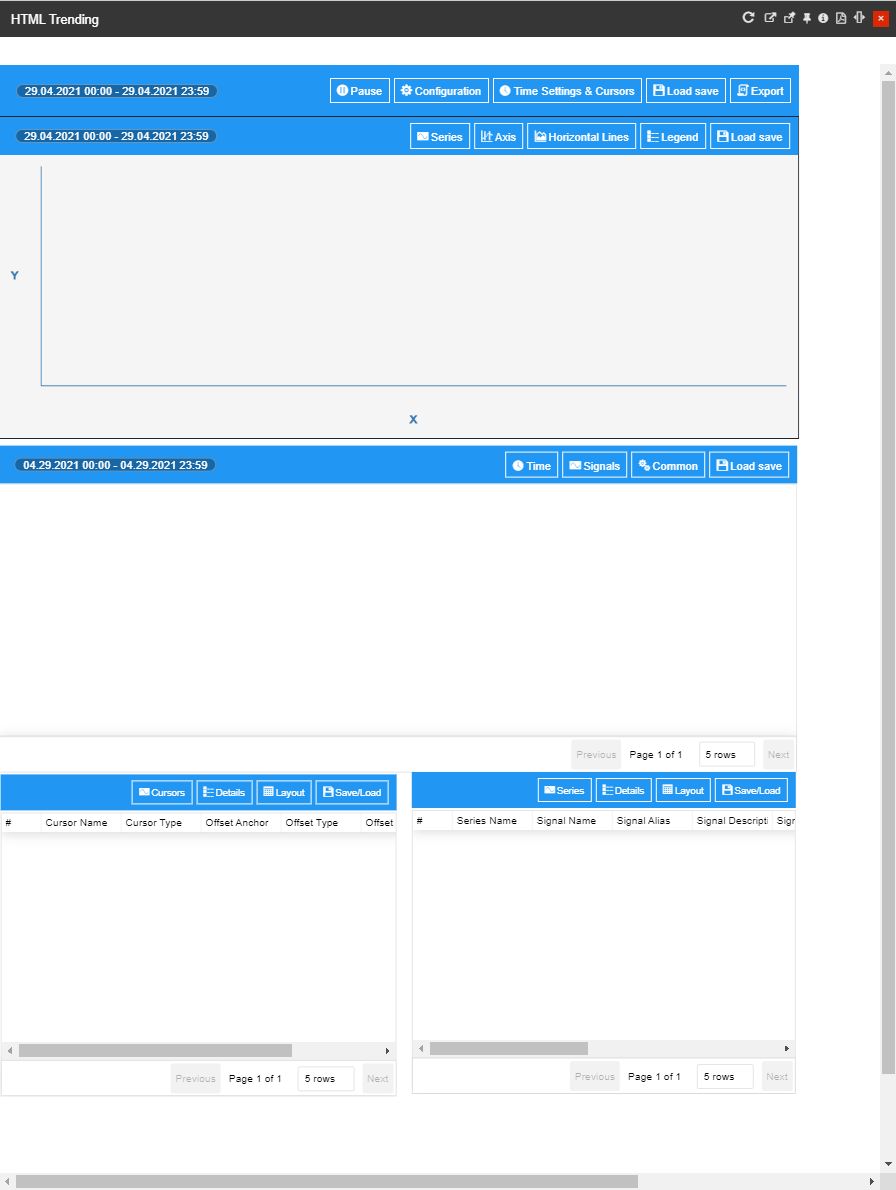
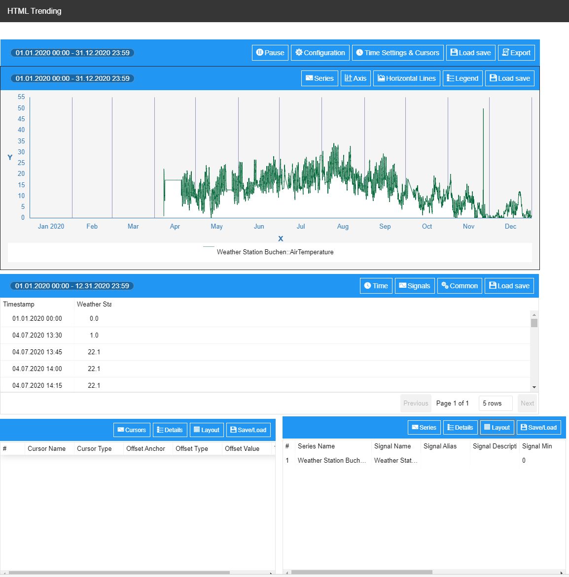
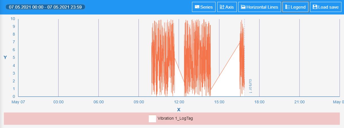
Time series toolbox component - a visual component that contains the time series data providers. Visually, it provides a set of buttons, which perform actions on the time series data: Pause / Resume updates, Export, Save / Load configuration, Online / Offline mode, and time configurations options.
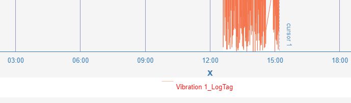
At run-time, when more than one trend control is connected to the toolbox, it will act as a synchronization mechanism for the mouse cursor indicator of the trends. This means that when the user moves the cursor above one chart, a synchronized vertical line is displayed to all other linked trend charts.
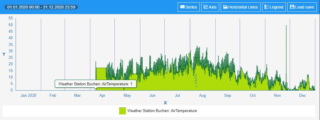
Trend chart component - the main visual component of the trending functionality, that provides a visual chart view, over the data provided by a time series data provider. It can be set as either an analog chart or a digital chart.
Data table component - a visual component that provides a table view, over the data provided by a time series data provider.
Series details component - is a lightweight component that can display information regarding the data series configured inside a time series provider. The component can be configured to display information about each data series, such as Signal name, Signal alias, Signal average, Signal description, Signal min / Signal max, Last timestamp, Last value, Series name, and Unit of measure.
Cursor details component - is a lightweight component, that works in a very similar fashion to the series details component, but instead of showing series information, it displays cursor information. For a better understanding, please also visit the dedicated section, here.
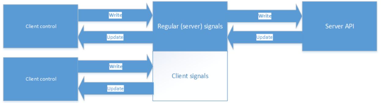
Client-side Signals
The Client signals are regular signals that go through the standard connector but are not processed through the server-side. They can be used in any component that uses signals and is a form of inter-component communication.
Historical client-side signals can be used by other i4designer components, with the scope to enhance your visualization.
When the connector is requested, the signal will be internally registered, without being included in the server signals list.
Client-side signals
The client-side Signals can use the following syntaxes:
Syntaxes used to extract information displayed by the Data Table and Chart components:
local://${this.groupName}_Data - extracts general historical information, plotted by the Chart / listed in the Data Table. The extracted information is based on two JAVA arrays, of the same size:
timestamps: Date[];
data: Series[];
local://${this.groupName}_Min - extracts information about the minimum registered value, of all the project series.
local://${this.groupName}_Max - extracts information about the maximum registered value, of all the project series.
local://${this.groupName}_Average - extracts information about the average registered value, of all the project series.
Syntaxes used to extract statistical information displayed by the Series Details component:
local://${this.groupName}_${serieInformation.identifier}_Data - extracts information about the data series (all numerical values of the project series).
local://${this.groupName}_${serieInformation.identifier}_Timestamps - extracts information about the first timestamp, when numerical values were registered.
local://${this.groupName}_${serieInformation.identifier}_Min - extracts information about the minimum registered value of the series.
local://${this.groupName}_${serieInformation.identifier}_Max - extracts information about the maximum value of the series.
local://${this.groupName}_${serieInformation.identifier}_Average - extracts information about the average value of the series.
Syntaxes used to extract statistical information displayed by the Cursors details component:
local://${this.groupName}_${serie.name}_Cursor_${cursor.name}_Value - extracts information about a Cursor's value.
local://${this.groupName}_${serie.name}_Cursor_${cursor.name}_Timestamp - extracts information about a Cursor's timestamp.
Tip
Please note that the above-listed syntaxes, use a set of placeholders, as follows:
${this.groupName} - the name of the common group, used by the historical components
${serieInformation.identifier} - name of the data Series
${serie.name} - the name of the data Series
${cursor.name} - name of the Cursor
Time series handling
The time-series data providers are able to store and update multiple data series, coming from:
Signals
Logs - used for i4scada visualizations
The provider will only request data, based on the resolution specified by the time series components, by reducing the number of data points, using a peak detection algorithm.
Time handling
The time series can be configured to work in two modes:
Offline (historical) - when the component is configured to work in offline mode, the data is loaded once and then rendered. A new reload will only occur when the zoom area is changed or when the time interval is changed.
Online - in online mode, the chart will be automatically updated with the latest values, but the user can also specify the size of the online time window and the start offset. The time window will advance as time passes by, but will always have the specified size. The start offset is used at the beginning and it allows preloading historical data:
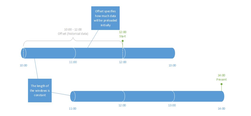
In online mode, the chart will display new data points as time elapses and new values come in. When the chart display is full to the right, the chart will advance the time window by 25% to make room for new incoming data points. Old data that goes outside the length of the specified time window will be discarded from the chart.
The label time format will be chosen automatically by the chart depending on the length of the interval and it relies on symbolic text translations for displaying it in the language-specific format.
If the polling interval is manually set, it will override the built-in polling interval calculation used for cyclic acquisition.
Play / Pause updates - In the case of online mode, the updating of the chart can be paused/resumed.
This will temporarily switch the time series to offline mode and no requests for updates will occur. When resuming the updates, it will adjust itself based on the online configuration and resume normal operation.
Time reference - There are three types of time references that can be used for the series timestamps: UTC, Client time , and Server time.
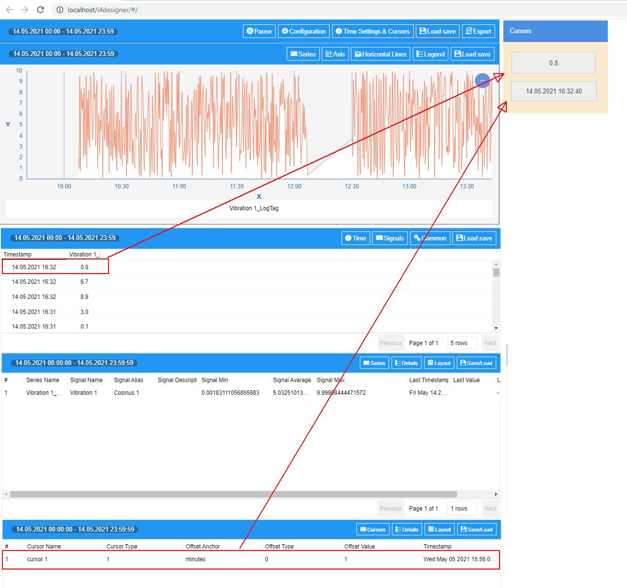
Cursors
The time series provider can expose series data as client signals by creating data cursors. Cursors can be of two types:
Fixed - defined with a fixed timestamp, meaning that the cursor will stay attached to the timestamp;
Moving - defined with an offset from now. As time will advance, the cursor will also advance in time and keep the relative offset to now.
Configuration management
The built-in configuration management allows the user to perform the following actions:
Save configuration to the database
Load configuration from the database
Save configuration to local storage
Load configuration from local storage
Set initial configuration.
Further on, the Historical components offer the possibility to specify configuration namespaces. The configuration name is case-insensitive and if the user saves another configuration with the same name, it will replace an existing one.
If a configuration namespace is provided, then only the configurations in that specific namespace can be used. Also, when a namespace is provided, the configuration with the same name and namespace will be overwritten on save.
Once a configuration is saved on the server-side, it is available to all users that have access to the global configurations or the specific namespace.
Client-side configurations are available on the current machine to all users with access to the global configurations or the specific namespace.
Setting up the Historical components, at design-time
Check out this article and learn how to configure the historical components, in order to define an HTML Trending functionality.
This tutorial will guide you through the needed steps to configure a simple HTML Trending project, using all five Historical components.
Open your project in Designer and go to the Toolbox panel, in the contextual actions area.
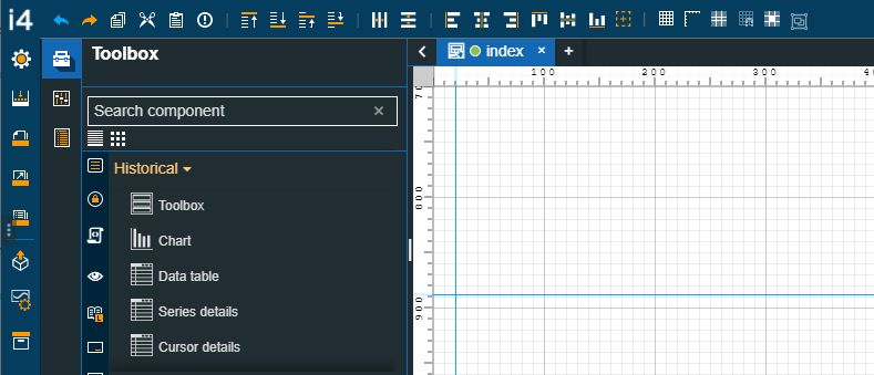
Drag the Toolbox component on the drawing surface of the page and double-click it, to open the Properties panel. Next, proceed with the following settings:
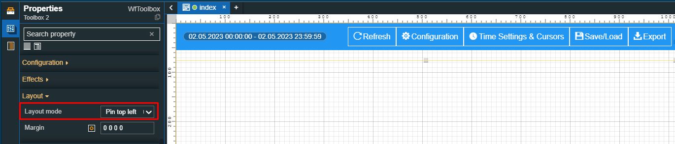
Using the drop-down list, of the Layout mode property, under the Layout category, select the Pin top left option. This will pin the component to the top-left side of the project page.
Move along to the properties under the Configuration category:
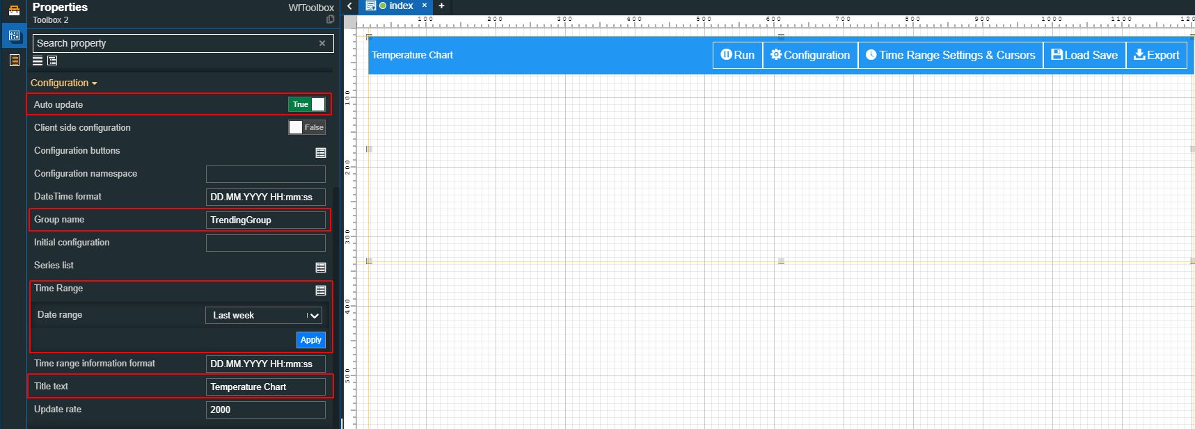
Enable the Auto-update property.
Type in the Group name field, the name of your group.
Important
The same group name will have to be used for all other Historical components.
Set the Time range to value Last month.
Type in the Title text field, the label that should be displayed by the component header.
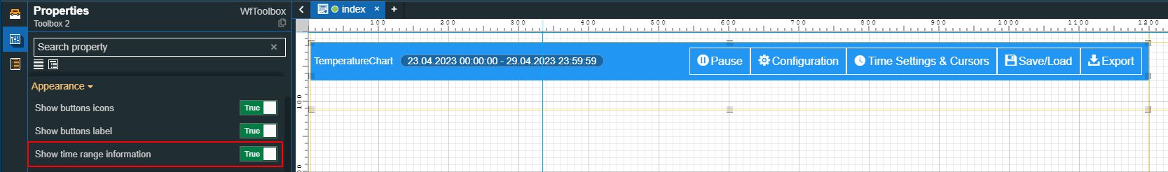
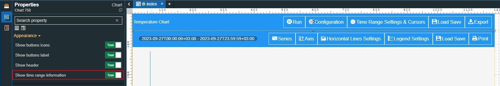
Enable the Show time range information property, under the Appearance category.
Tip
You can further adjust the Toolbox component style, appearance, and colors or enable security settings, effects, and many more. For more details about the properties of the Toolbox component, please visit the dedicated article here.
Drag the Chart component on the drawing surface of the page and double click it, to open the Properties panel. Next, proceed with the following settings:
Go to the Configuration properties and make the following changes:
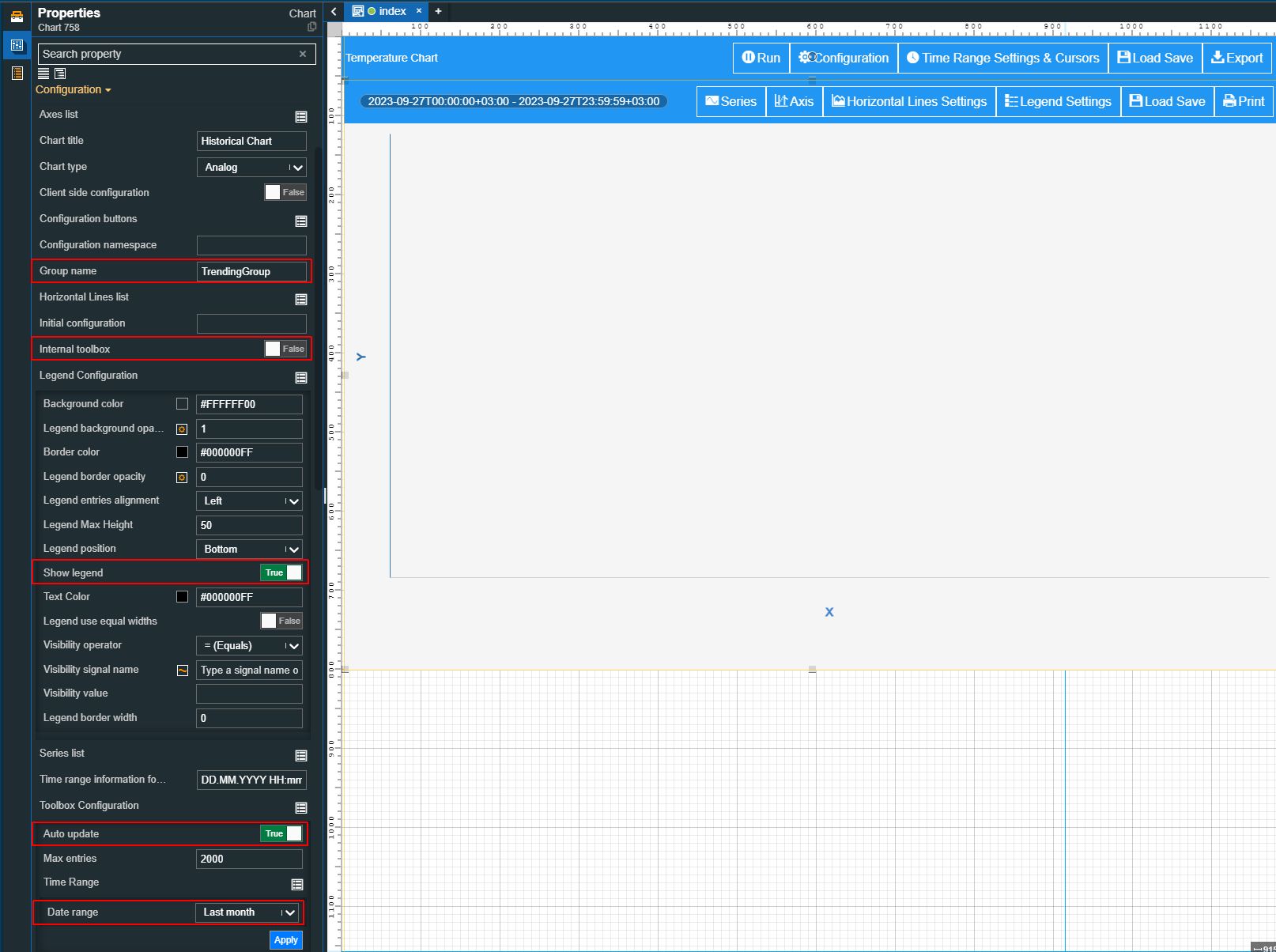
Type in the Group name field, the name of your group.
Important
Make sure that the group name is correctly spelled.
Disable the Internal toolbox property.
Note
For the current project, we shall use the Toolbox component, to control the general chart settings.
Enable the Show legend property.
Enable the Auto-update property.
Set the Time range property to value Last month.
Move on to the Appearance category and enable the Show time range information property.
Tip
More details about the properties of the Chart component can be found in the dedicated article, here.
Drag the Data table component on the drawing surface of the page and double click it, to open the Properties panel. Next, proceed with the following settings:
Go to the Configuration properties and make the following changes:
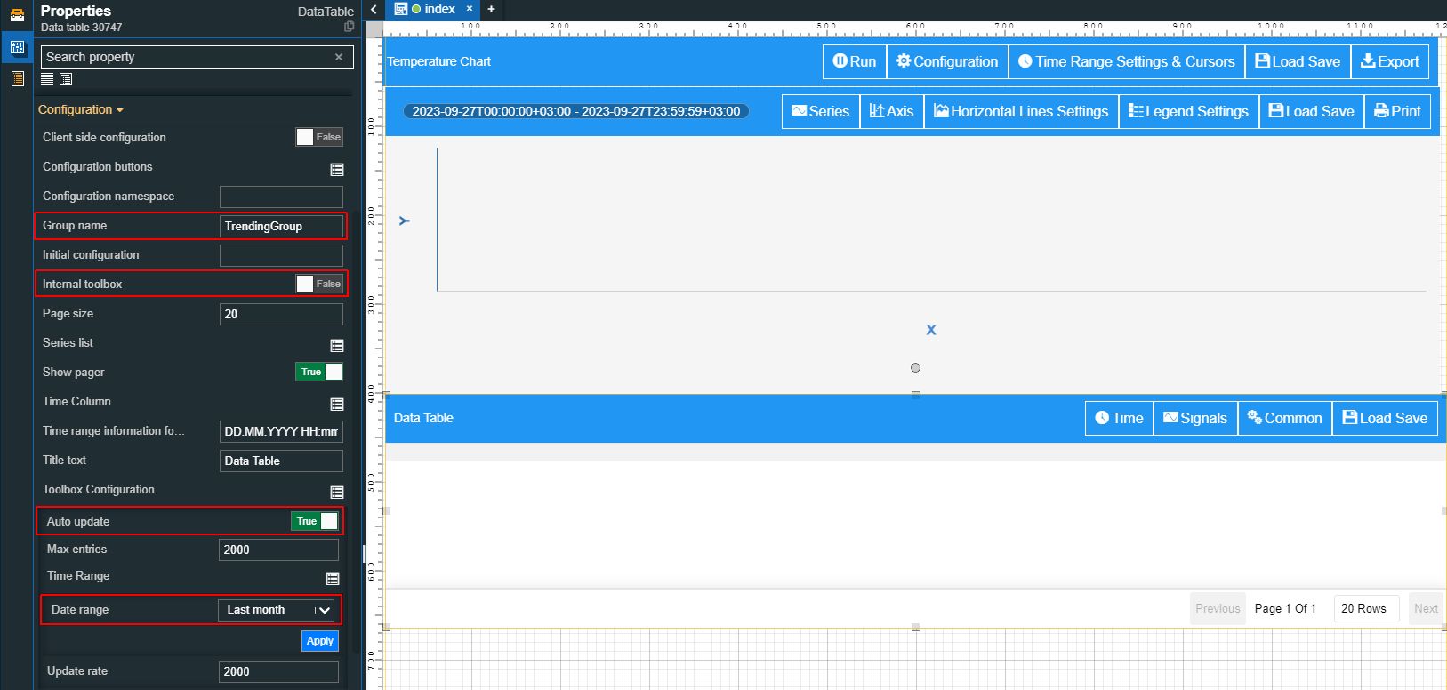
Type in the Group name field, the name of your group.
Important
Make sure that the group name is correctly spelled.
Disable the Internal toolbox property.
Note
For the current project, we shall use the Toolbox component, to control the general chart settings.
Enable the Auto-update property.
Set the Time range property to value Last month.
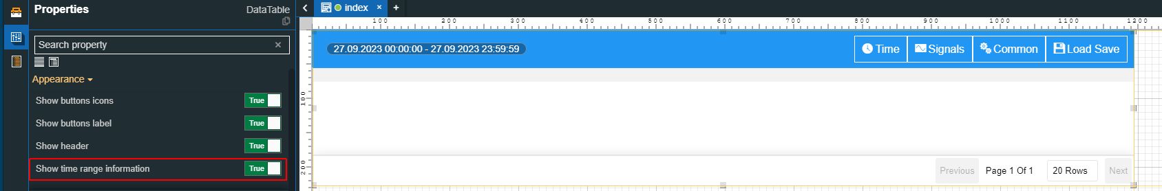
Enable the Show time range information property, under the Appearance category.
Tip
Check out the Data table article, for more details about the properties of this component.
Drag the Series details component on the drawing surface of the page and proceed with the following settings:
Go to the Configuration properties and make the following changes:
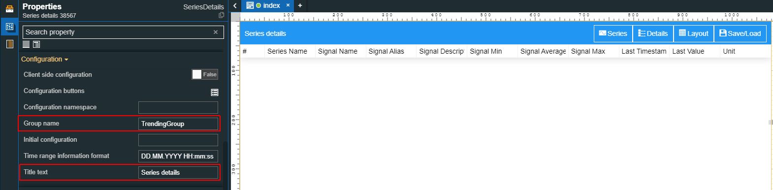
Type in the Group name field, the name of your group.
Important
Make sure that the group name is correctly spelled.
Type in the Title text field, the label that should be displayed by the component header.
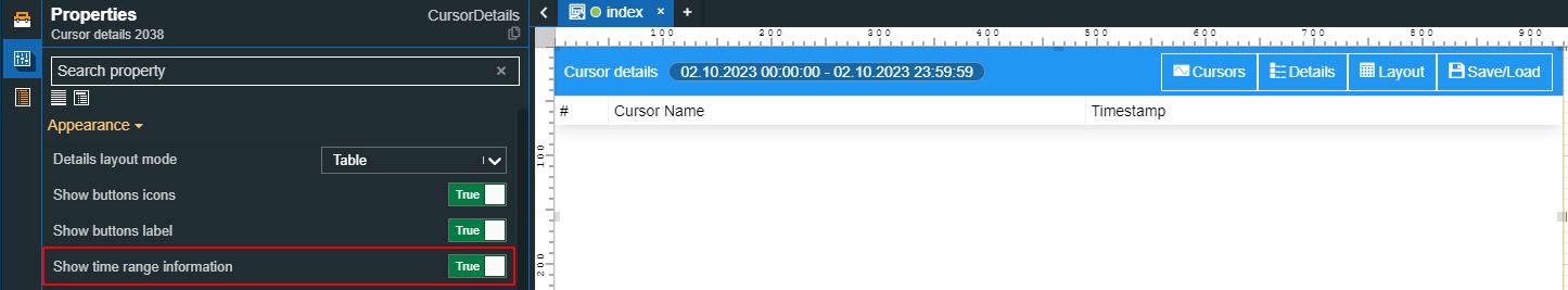
Next, let's proceed with some changes in the Appearance category:
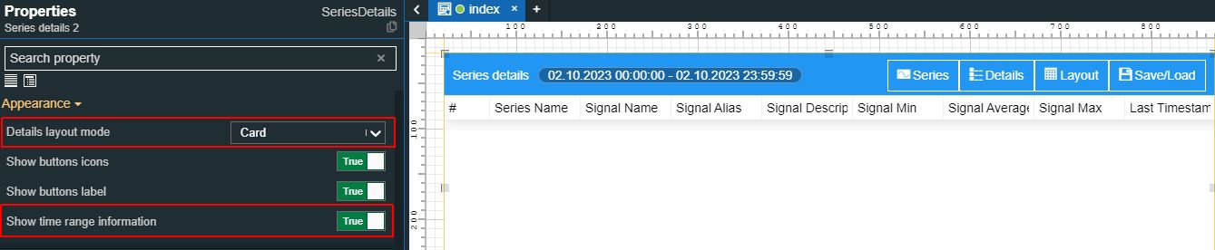
Set the Card option, for the Details layout mode property.
Enable the Show time range information property.
Tip
More detail about the Series details component can be found in the dedicated article here.
Drag the Cursor details component on the drawing surface of the page and proceed with the following settings:
Go to the Configuration properties and make the following changes:
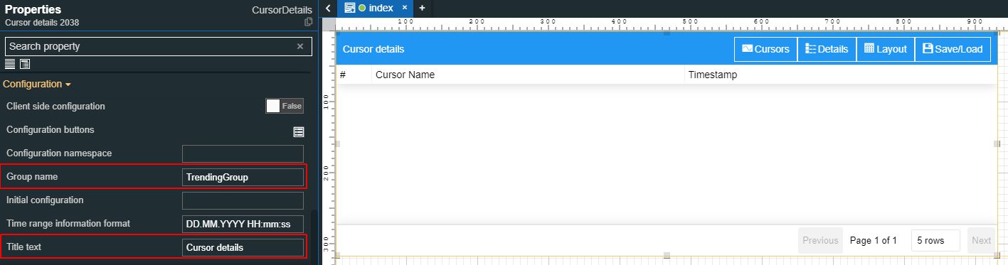
Type in the Group name field, the name of your group.
Important
Make sure that the group name is correctly spelled.
Type in the Title text field, the label that should be displayed by the component header.
Enable the Show time range information property.
Tip
Check out the Cursors detailed article, for more details about the properties of this component.
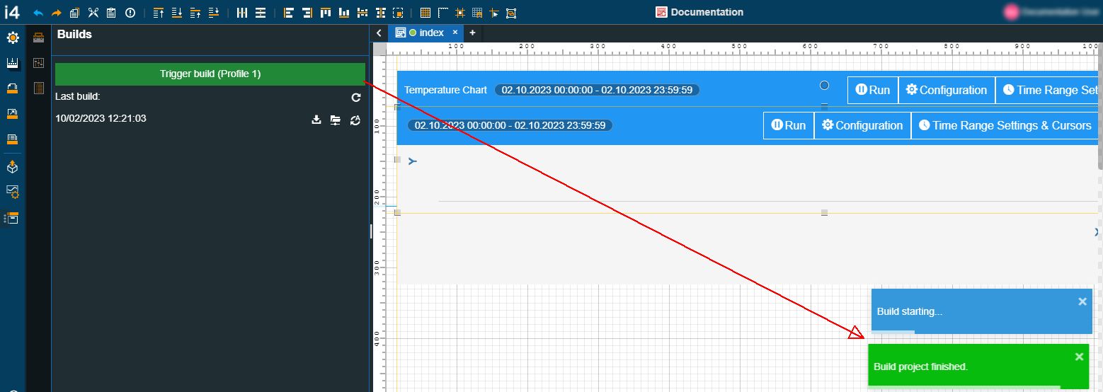
After making sure that all your settings have been saved, go to the Builds panel, in the global actions area.
Build your project.
Tip
For more details about i4designer project builds, please visit the dedicated articles here.
Next, proceed with publishing the project to the target environment.
Tip
For more details about i4scada platform deployments, please visit the dedicated article here.
If your project is targeting an i4connected environment, please read more details about i4connected platform details, please visit the dedicated article here.
Using the Historical components, at run-time
Check out this article and learn more details on how to use a basic HTML trending visualization, that has been published on an i4connected or i4scada environment.
After publishing your HTML Trending project, here is how you can use the run-time components, to obtain different perspectives on multiple data series.
Access your target environment and open the visualization containing the i4designer HTML Trending project.
Tip
For more details about i4connected Applications, please visit the dedicated article, here.
For more details about i4designer integration with i4scada, please visit the dedicated tutorials, here.
First, let's manipulate the project, by using the Toolbox component, as follows:
Tip
If the Internal toolbox property for the historical components (Chart, Data Table, and Series details) was set to False, at design-time, the time and data series of your project, can be coordinated from the Toolbox component.
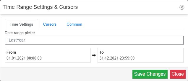
Click the Time settings and Cursors button of the Toolbox component, in order to apply the time frame series.
For this tutorial, we shall leave the "Last year" time range setting, as defined at design time.
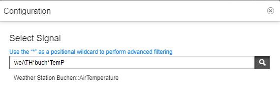
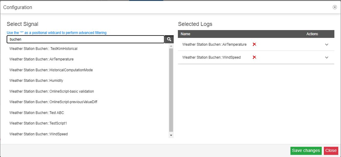
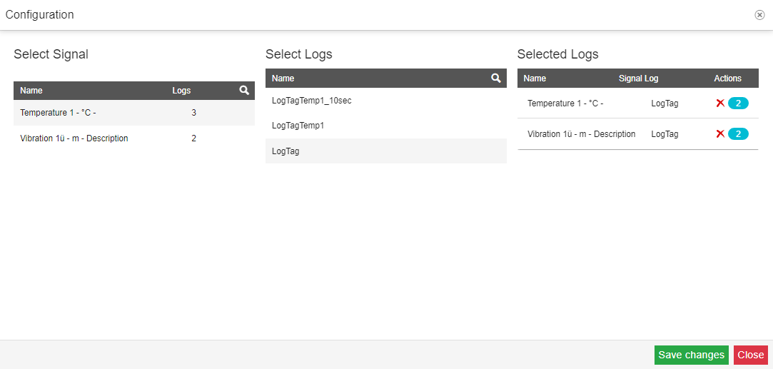
Next, we shall select a Signal, to view its measurements, by clicking the Configuration button of the Toolbox component. The list of Signals will be, by default, filtered, to only display the signals to which the currently logged-in i4connected user has access.
Tip
The Signal Selector dialog allows the user to search for Signals.
For advanced positional filtering the wildcard "*" symbol can be used to search among all the visible signals. The search is case insensitive, but the user needs to be aware that the bits of signal information visible in the Configuration / Signals settings dialogs of the Chart / DataTable should follow the order as it is displayed in UI.
Note
When working with an HTML Trending project on an i4scada environment, the Signal Selector dialog will only expose Signals that are assigned to Logs. Further on, you will be required to select the Signal and the Log, to apply the data series.
As soon as time and data series have been selected, the Toolbox component will pass over the information to the other components, such as the Chart, the Data Table, and the Series details.
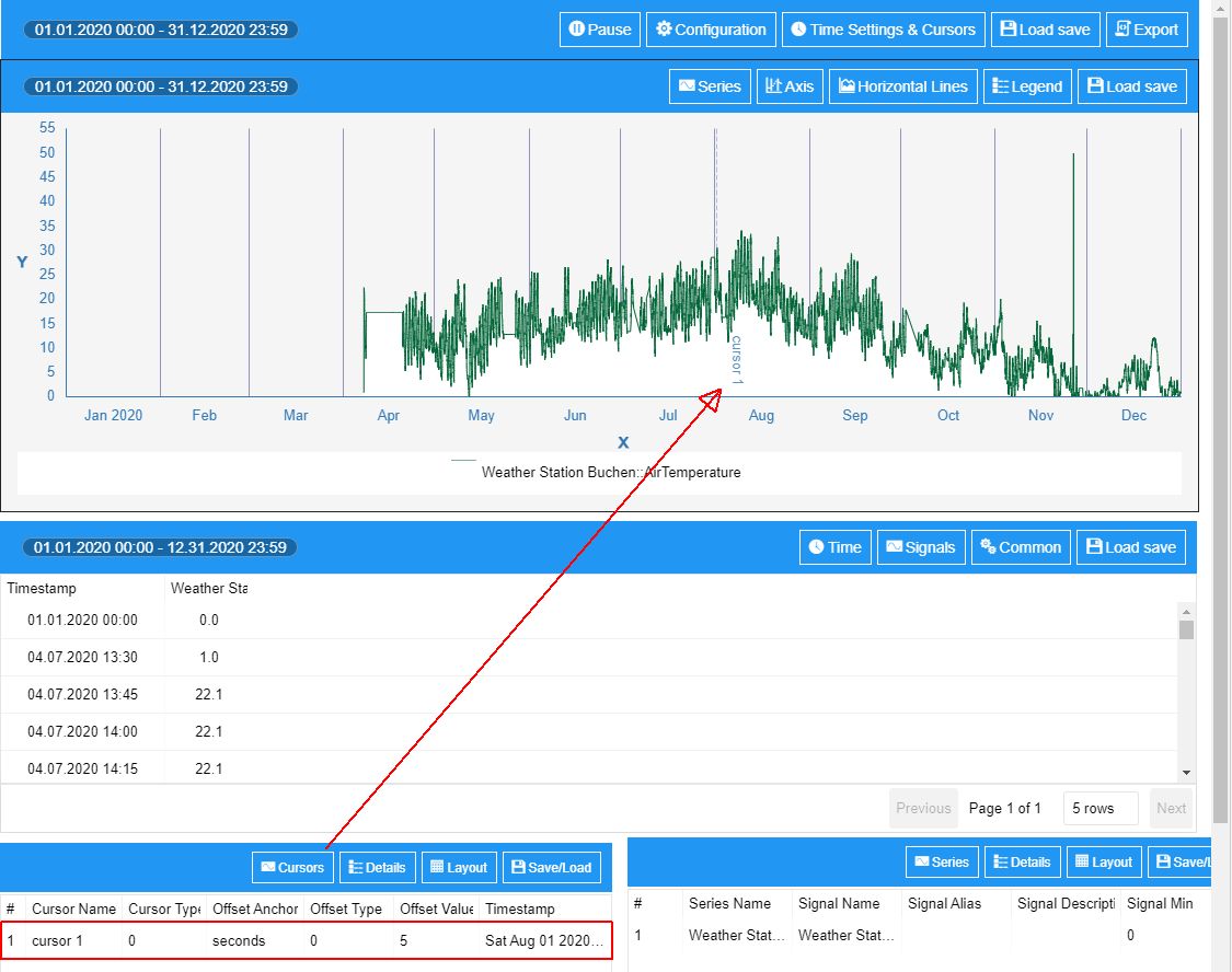
To add cursors to the Cursor details component, click the Time Settings and Cursors button of the Toolbox component. In the Time Range Settings & Cursors dialog, switch to the Cursors tab and click the Add button.
Tip
For more details about Cursors, please also read the HTML Trending functionality overview article, here.
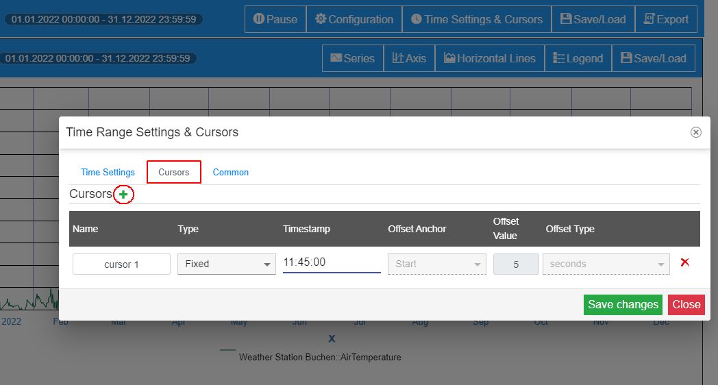
After setting the Cursor, click the Save Changes button of the Time Range Settings and Cursors dialog.
Tip
The Time Range Settings and Cursors dialog allows the user the possibility to also select the desired Maximum Count Entries, which defines the maximum number of data points displayed by the chart. The default value is 2000.
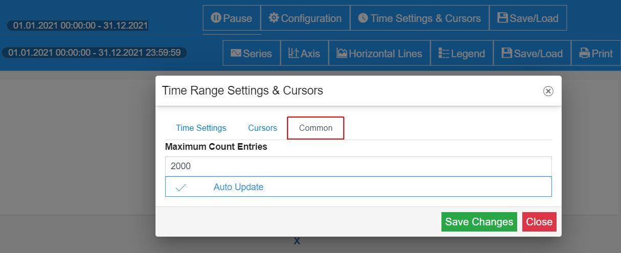
Additionally, the user can enable or disable the Auto Update setting.
The new Cursor will be displayed by the Cursors details component. The Chart will also display the Cursor, considering the Cursor's timestamp.
Next, let's save this configuration, by clicking the Save / Load toolbar button, of the Toolbox component.
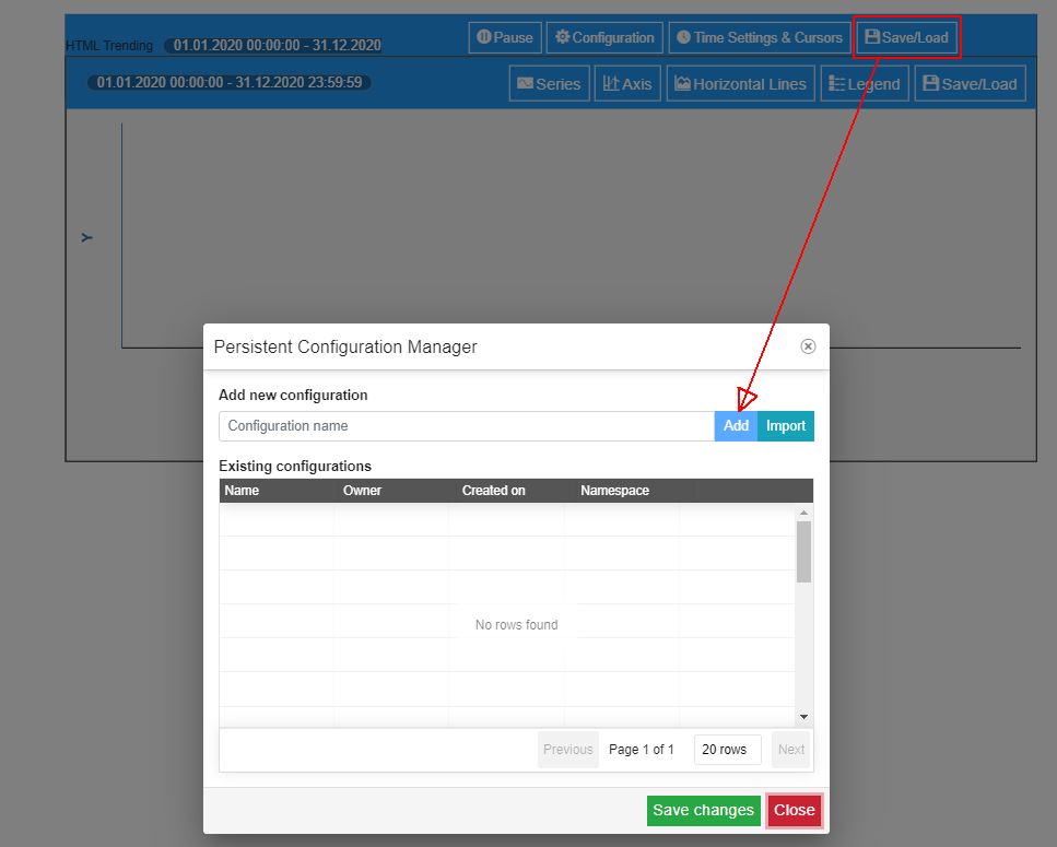
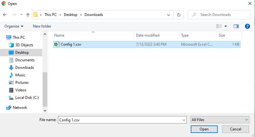
Clicking on the Import button, will allow you to browse for the import file, on your local computer.
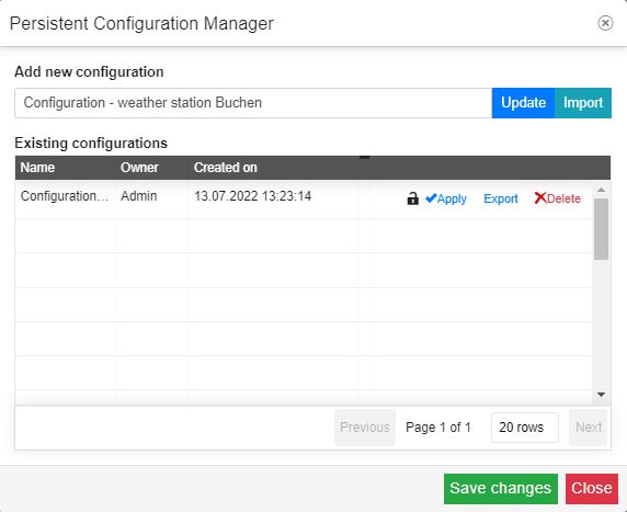
The Persistent Configuration Manager dialog is opened. In the Add new configuration field, type in the name of your configuration and click the Add button. The configuration will be made available in the list of Existing configurations.
Tip
For more details about the Persistent Configuration Manager dialog, please also visit the dedicated i4connected article, here.
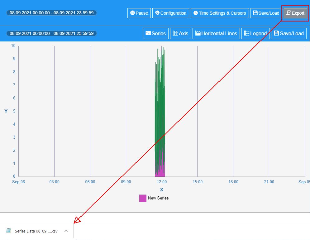
Click the Export toolbar button of the Toolbox component, to obtain an output of the currently configured data. The exported content will be saved on your local machine, to a storage location of your choice.
The Series Data document is saved in CSV format.
Further on, you can customize the Series, Axis, Horizontal Line, and Chart Legend, using the Chart component toolbar buttons, as follows:
Click the Series button of the Chart component.
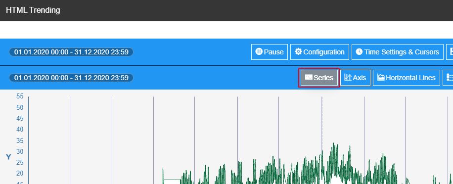
Using the Series settings dialog, you can either add new series or customize the existing ones.
For the current tutorial, we shall customize the previously defined Series, that we have previously added, using the following settings:
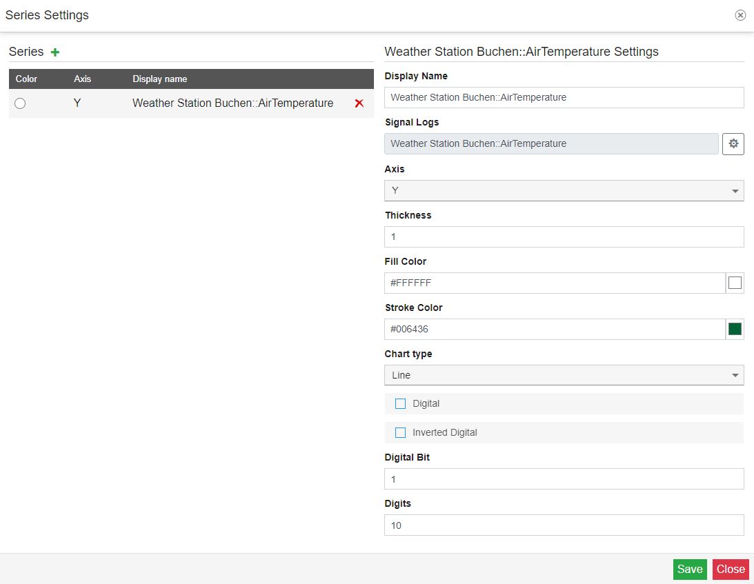
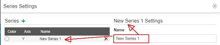
Name - sets the name of the Series. By default, the name of the series is automatically provided, by the system, considering the signal constituting the data series.
Signal Logs - allows the user to change the Signal(s) used for the historical chart.
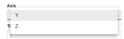
Axis - allows the user the possibility to change the current axis, by using the drop-down list.
The Y-axis is by default available, but the user can add more axis, in the Axis Settings dialog, which we shall describe in the upcoming steps.
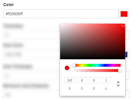
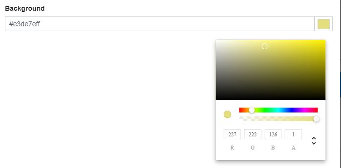
Fill Color - allows the user to customize the background color for the plot area, which fills in the gap between the X-axis and the edge of your graph.
The default value is set to transparent, but you can change it to another color, by using the color picker tool.
The color picker tool allows the user to select custom colors using the RGBS (red, green, blue, alpha channel), HSL (hue, saturation, and lightness), and HEX (hexadecimal color codes) color pickers. To switch between the HEX, RGBA, and HSL color pickers you can use the arrows button.
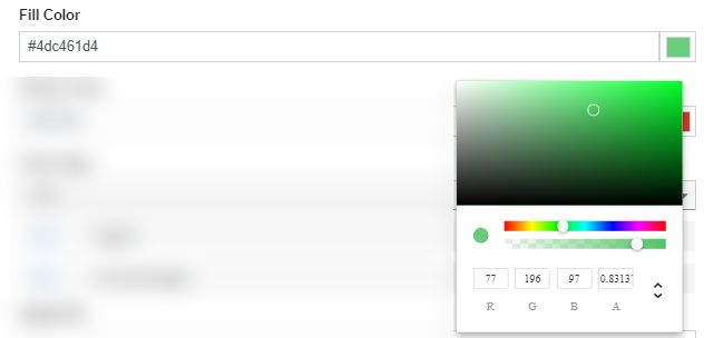
To apply changes at the level of the Fill color parameter, click the Save button. The chart is updated, to display the newly selected color.
Stroke Color - allows the user to customize the color of the lines, dots or bars, displayed by the chart.
The default value is set to a randomly selected color, but you can customize it, by using the color picker tool.
The color picker tool allows the user to select custom colors using the RGBS (red, green, blue, alpha channel), HSL (hue, saturation, and lightness), and HEX (hexadecimal color codes) color pickers. To switch between the HEX, RGBA, and HSL color pickers you can use the arrows button.
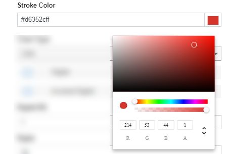
To apply changes at the level of the Stroke color parameter, click the Save button. The chart is updated, to display the newly selected color.
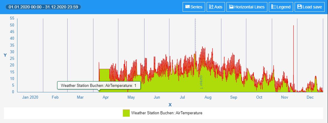
Chart type - allows the user to customize the graphical representation of the chart data, by choosing from the following types:
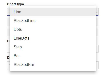
Line - the line chart, or line graph, connects several distinct data points, presenting them as one continuous evolution. To be more explicit, the time-series variable is marked on the X-axis, and the data-series variable is marked on the Y-axis. Once all points are plotted, a single line is drawn through the points from left to right to show change over time.
By default, the chart type is set to Line.
Stacked Line - the stacked line chart follows the same structure as the line chart (X-axis -for time-series variable and Y-axis - for data-series variable, plot and connect) but will consist of more than one line plotted, on the same graph. Each line represents a different measurement. The stacked line chart can help you visualize a stark comparison, in data sets over the same time range.
Dots - the dot chart consists of data points plotted on a fairly simple scale, using filled-in circles.
Line Dots - the line dots chart consists of data points connected by a line, plotted on a fairly simple scale, using filled-in circles.
Step - the step chart is a line chart that does not use the shortest distance to connect two data points. Instead, it uses vertical and horizontal lines to connect the data points in a series forming a step-like progression. The vertical parts of a step chart denote changes in the data and their magnitude.
Bar - the bar chart is a chart or graph that presents categorical data with rectangular bars with heights or lengths proportional to the values that they represent. Bar charts are one of the most common data visualizations and can be used to quickly compare data across categories, highlight differences, show trends and outliers, and reveal historical highs and lows at a glance.
Stacked Bar - the stacked bar chart is a variant of the bar chart. A standard bar chart compares individual data points with each other. In a stacked bar chart, parts of the data are adjacent (in the case of horizontal bars) or stacked (in the case of vertical bars, aka columns); each bar displays a total amount, broken down into sub-amounts.
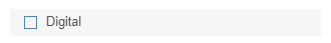
Digital - enables or disables whether the values are manipulated into a Digital line or not.
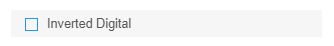
Inverted Digital - enables or disables the Invert digital representation option to define whether the historical values are inverted or not.
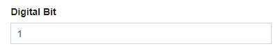
Digital bit - sets the Digital bit. The default value is set to 1.
Tip
The value is considered to be a digital 1. Any other signal/log value will be treated as 0 on the digital chart.
Digits - sets the number of digits displayed after the comma, by the chart values. The default value is set to 10.
Click the Axis button of the Chart component, to open the Axis Settings dialog.
Using the Axis Settings dialog, you can either add a new axis or customize the default Y-axis. For the current tutorial, we shall customize the default Y-axis, using the following settings:
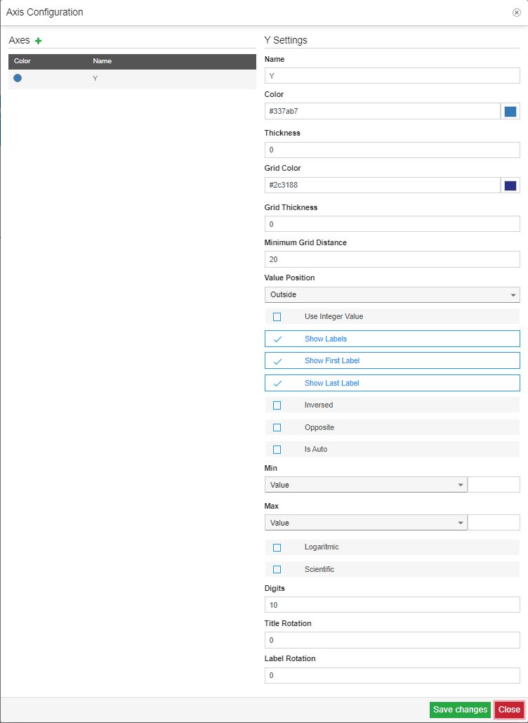
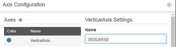
Name - sets the name of the axis. By default, the name is set to "Y", but you can change the name, by typing it in the designated field.
Color - sets the color of the vertical axis, allowing the user to select it, using the color picker tool.
The color picker tool allows the user to select custom colors using the RGBS (red, green, blue, alpha channel), HSL (hue, saturation, and lightness), and HEX (hexadecimal color codes) color pickers. To switch between the HEX, RGBA, and HSL color pickers you can use the arrows button.
To apply changes at the level of the Axis Color parameter, click the Save button. The chart axis is updated, to display the newly selected color.
Thickness - sets the thickness of the Y-Axis, expressed in pixels. By default, the value is set to 0, but you can increase or decrease the value manually.
Grid Color - sets the color of the chart grid, allowing the user to select it, using the color picker tool.
The color picker tool allows the user to select custom colors using the RGBS (red, green, blue, alpha channel), HSL (hue, saturation, and lightness), and HEX (hexadecimal color codes) color pickers. To switch between the HEX, RGBA, and HSL color pickers you can use the arrows button.
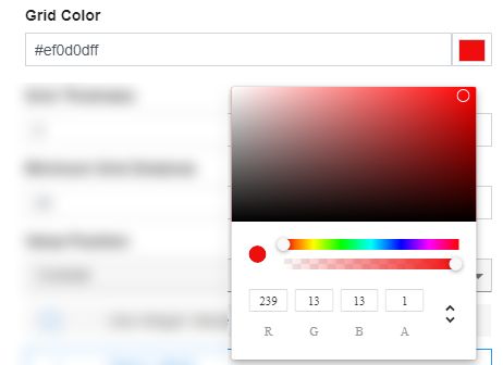
To apply changes at the level of the Grid Color parameter, click the Save button. The chart grid is updated, to display the newly selected color, if the Grid Thickness parameter's value is higher or equal to 1.
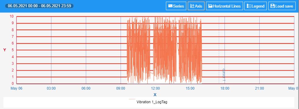
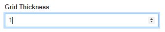
Grid Thickness - sets the thickness of the chart grid, expressed in pixels. By default, the value is set to 0, which means that the grid lines are not visible. To enable their visibility, the value of the Grid Thickness parameter should be higher or equal to 1.
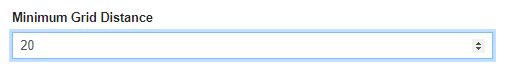
Minimum Grid Distance - sets the value of the minimum distance between the grid lines on the chart surface. The default value is set to 20 pixels, but it can be increased or decreased, by either manually filling in the expected distance, or by using the up/down arrows, of the dedicated field.
Value Position - sets the position of the values to either Outside or Inside the bootstrap grid.
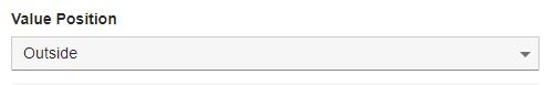
By default, the values are positioned Outside of the bootstrap grid, but they can be changed to the Inside.
Use Integer Values - enables or disables the usage of Integer values. By default, the Use Integer Values parameter is disabled. To enable it, simply mark the designated check-box.

Tip
An integer number is a number that can be written without a fractional component. For example, 21, 4, 0, and −2048 are integers, while 9.75, 5+1/2, and √2 are not.
Show Labels - enables or disables the chart labels display. By default, the Show Label parameter is enabled. To disable it, simply unmark the designated check-box.

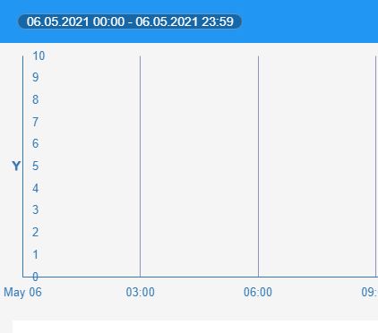
Show First Label - enables or disables the display of the first chart label. By default, the Show First Label parameter is enabled. To disable it, simply unmark the designated check-box. If the first chart label is 0, having this parameter disabled, will remove the 0 labels from the chart.

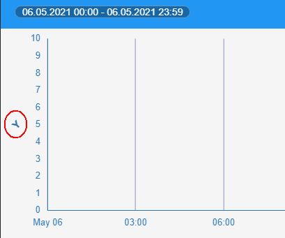
Show Last Label - enables or disables the display of the last chart label. By default, the Show Last Label parameter is enabled. To disable it, simply unmark the designated check-box. If the last chart label is 10, having this parameter disabled, will remove the 10 labels from the chart.

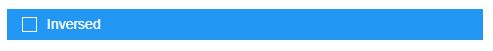
Inversed - enables or disables the direction of the chart labels.
Tip
After enabling the Inversed option the chart representation on the Y-axis is inverted. If the Y-axis starts with 0 to 10, after enabling the Inversed option the Y-axis should start with 10 to 0.
Opposite - enables or disables the orientation of the Y-Axis. By default, the Y-Axis is displayed on the left side of the chart. By enabling this parameter, the orientation of the Y-Axis will be changed and it will be displayed on the right side of the chart.

Is auto - sets the behavior of the Min / Max Axis values. If the property is disabled, the user can customize the Signal Min / Max range, using the below selectors. If the property is enabled, the Min / Max selectors will be disabled and the Axis values will automatically apply the Signal Min / Max range.

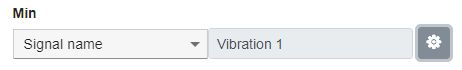
Min - allows the user with the possibility to select the minimum value of the Y-Axis labels, by choosing from the following options:
the actual value (numerical).
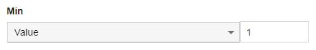
the Signal name, where the Signal can be set, using the Signal Selector dialog.
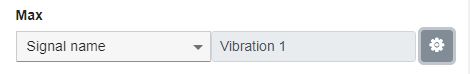
Max - allows the user with the possibility to select the maximum value of the Y-Axis labels, by choosing from the following options:
the actual Value (numerical).
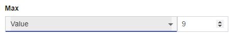
the Signal name, where the Signal can be set, using the Signal Selector dialog.
Logarithmic - enables or disables the Logarithmic scale representation.
Tip
A logarithmic scale is a way of displaying numerical data over a very wide range of values in a compact way—typically the largest numbers in the data are hundreds or even thousands of times larger than the smallest numbers.
Scientific - enables or disables the Scientific scale representation.
Tip
A scientific scale representation is a set of numbers that help to measure or quantify various objects. A scale on the graph shows the way the numbers are used in data.
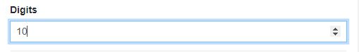
Digits - sets the number of digits displayed after the comma, by the Y-Axis labels. The default value is set to 10.
Title rotation - sets the angular rotation of the Y-Axis chart title. The default value is set to 0 but it can be increased or decreased, as desired.
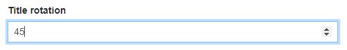
The positive values will rotate the title to the right side, while the negative values will rotate the values to the left side.
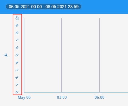
Label rotation - sets the angle rotation of Y-Axis chart labels. The default value is set to 0 but it can be increased or decreased, as desired.
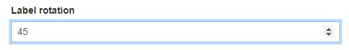
The positive values will rotate the labels to the right side, while the negative values will rotate the labels to the left side.
To apply changes in the Axis Settings dialog, please make sure to click the Save button.
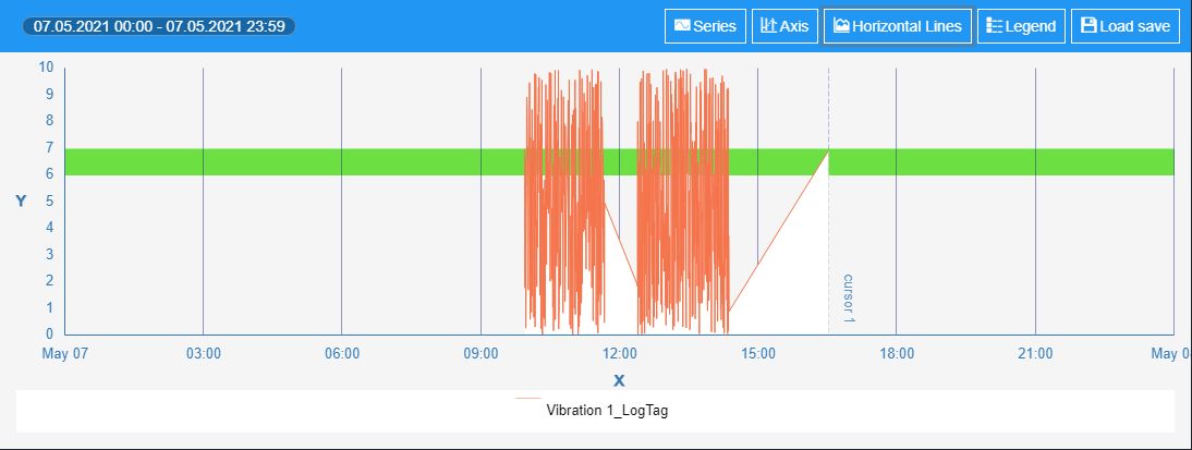
Click the Horizontal Line button of the Chart component, to open the Horizontal Lines Settings dialog.
Tip
Horizontal Lines are banded markers that indicate various important data areas (for example danger/safe regions). The horizontal lines can be configured as either regions or lines.
Since horizontal lines are connected with the axes, if the axis scale changes, the region/line will be moved accordingly.
Using the Horizontal Line Settings dialog, you can add new Horizontal Line Markers, or update the existing ones. For the current tutorial, we shall add new Horizontal Lines, by clicking the Add button.
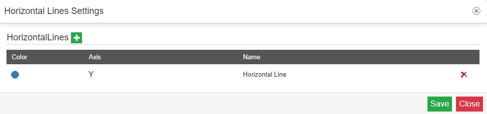
In this view, a new horizontal line is added. To proceed with further editing options, click it, to expand the view, in the Horizontal Line Settings dialog:
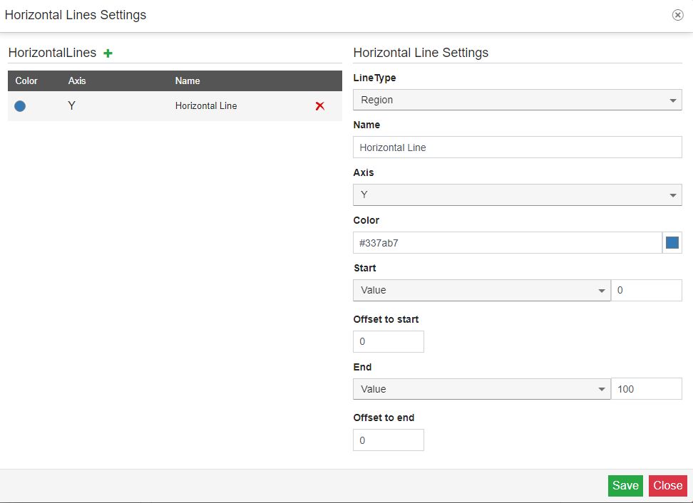
Line Type - allows the user to choose from two-line types, which have similar behavior (from a graphics point of view), but they are different, from their settings perspective.
Region - when choosing the line type "Region", you will need to define both the Start and End values.
Line - when choosing the line type "Line", you will only need to define the Start value.
Name - sets the name of the Horizontal Line.
Axis - sets the axis to which the region/line belongs.
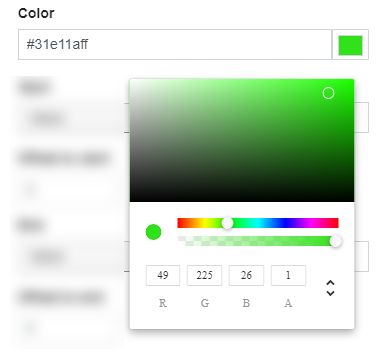
Color - sets the color used for representing the region/line on the chart, using the color picker tool.
The color picker tool allows the user to select custom colors using the RGBS (red, green, blue, alpha channel), HSL (hue, saturation, and lightness), and HEX (hexadecimal color codes) color pickers. To switch between the HEX, RGBA, and HSL color pickers you can use the arrows button.
Start - sets the starting point of the region/line. Can be either:
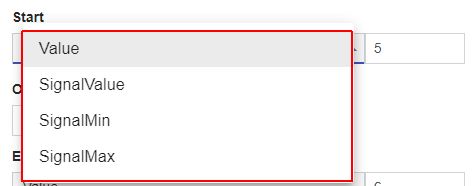
an actual Value (numerical).
the Signal Value, where the Signal can be set, using the Signal Selector dialog. The Signal value will be used to determine the start point of the region/line.
the SignalMin value. The minimum Signal value will be used to determine the start point of the region/line.
the SignalMax value. The maximum Signal value will be used to determine the start point of the region/line.
Offset to start - applies the start offset value. This field support both negative and positive values, where the positive values advance to the right side of the chart, and the negative values advance to the left side of the chart.
End - sets the ending point of the region/line. Can be either:
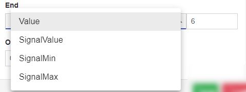
an actual Value (numerical)
the Signal Value, where the Signal can be set, using the Signal Selector dialog. The Signal value will be used to determine the endpoint of the region/line.
the SignalMin value. The minimum Signal value will be used to determine the endpoint of the region/line.
the SignalMax value. The maximum Signal value will be used to determine the endpoint of the region/line.
Offset to end - - applies the end offset value. This field support both negative and positive values, where the positive values advance to the right side of the chart, and the negative values advance to the left side of the chart.
To apply changes in the Horizontal Lines Settings dialog, please make sure to click the Save button. The Chart will be updated to display the added regions/lines.
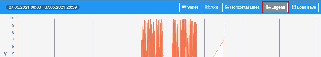
Click the Legend button of the Chart component, to customize the Chart legend display.
The Legend Settings dialog allows you to customize the chart legend, as follows:
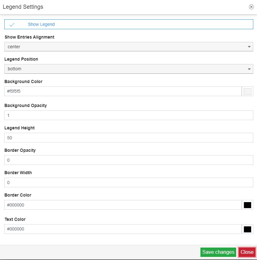
Show Legend - enables or disables the display of the legend. By default, the property is enabled.
Show entries alignment - allows the possibility to set the chart entries (text and labels) alignment, selecting from the drop-down list options:
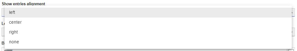
Left - displays the legend entries on the left side of the chart.
Center - centers the legend entries. This is also the default value.
Right - displays the legend entries at the right side of the chart.
None - displays the legend entries at the left side of the chart.
Legend Position - allows the possibility to set the chart Legend alignment, selecting from the drop-down list options:
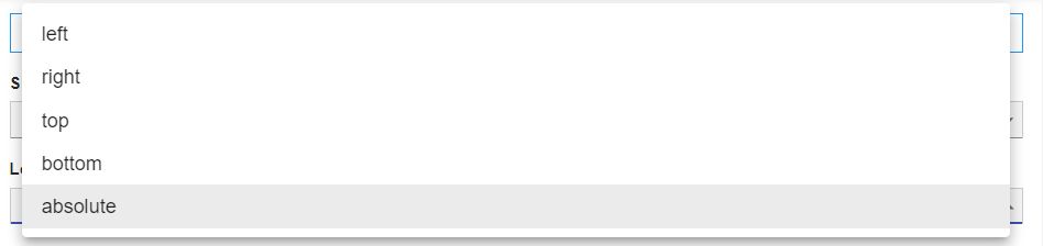
Bottom - displays the legend at the bottom of the chart. This is also the default value.
Absolute - the legend is positioned relative to the nearest positioned ancestor.
Top - displays the legend at the top of the chart.
Right - displays the legend on the right side of the chart.
Left - displays the legend on the left side of the chart.
Background color - allows the possibility to customize the background color, of the chart legend, by using the color picker tool.
The color picker tool allows the user to select custom colors using the RGBS (red, green, blue, alpha channel), HSL (hue, saturation, and lightness), and HEX (hexadecimal color codes) color pickers. To switch between the HEX, RGBA, and HSL color pickers you can use the arrows button.
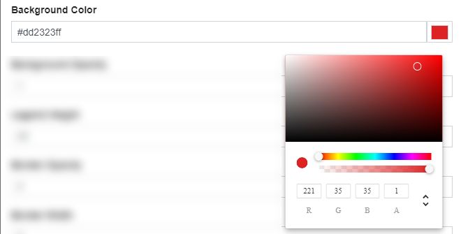
After clicking the Save button of the Legend Settings dialog, the background color of the legend element will be accordingly updated.
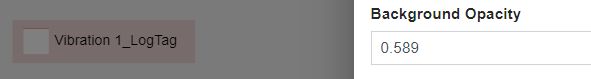
Background opacity - sets the opacity of the legend background. The Opacity values should be numbers from 0 to 1 representing the opacity of the component. When the component has a value of 0 the element is completely invisible.
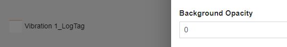
On the other hand, a value of 1 is completely opaque (solid). By default, the Component's opacity is set to value 1.
Legend height - sets the height of the area, where the chart Legend is displayed.
Border Opacity - sets the opacity of the legend border. The Opacity values should be numbers from 0 to 1 representing the opacity of the component. When the component has a value of 0 the element is completely invisible. On the other hand, a value of 1 is completely opaque (solid). By default, the Component's opacity is set to value 0.
Border Width - sets the width of the legend border. The border width can be set up by using the up and down arrows to increase and decrease, or by manually typing the desired value.
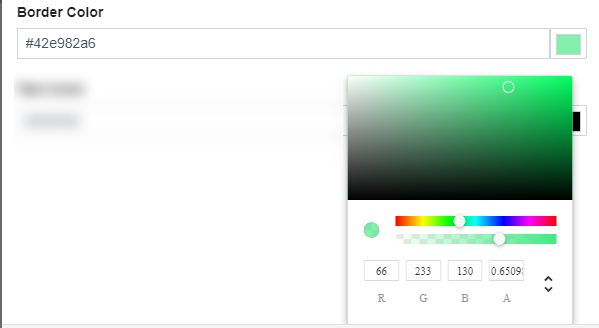
Border Color - allows the possibility to customize the border color of the chart legend, by using the color picker tool.
The color picker tool allows the user to select custom colors using the RGBS (red, green, blue, alpha channel), HSL (hue, saturation, and lightness), and HEX (hexadecimal color codes) color pickers. To switch between the HEX, RGBA, and HSL color pickers you can use the arrows button.
Text Color - sets the color of the textual information, displayed by the Chart Legend.
To apply changes in the Legend Settings dialog, please make sure to click the Save button.
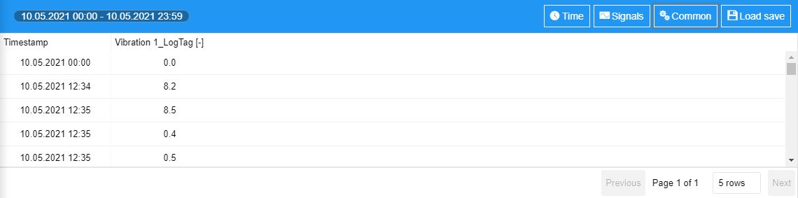
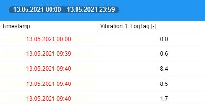
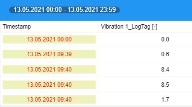
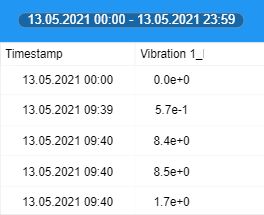
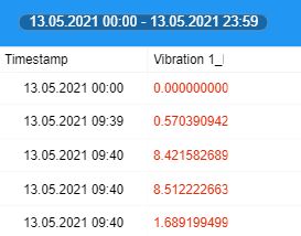
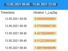
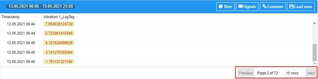
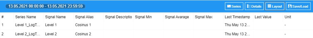
The Data table component allows you to read Signal(s) values in a tabular format.
Tip
The Data table component lists all the time series for each Signal plotted by the chart. The Timestamp column can be ordered chronologically, by clicking the column header. The values listed in the Signal column(s) can be ordered increasingly / decreasingly, by clicking the column header.
This component allows you to proceed with the following configurations:
Click the Time button, of the Data table component, to open the Timestamp Column Settings dialog. In this view, you can proceed with the following settings:
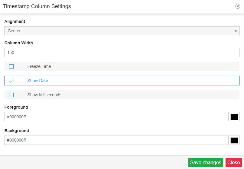
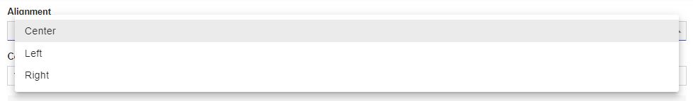
Alignment - sets the alignment of the data, in the table view. You can choose from the following options: Center, Left , or Right.
Column Width - sets the width of the TimestampData Table columns. The width is measured in pixels and can be either manually filled in, or increased/decreased, by using the up / down arrows.

Tip
The Timestamp column width can be also adjusted manually, by dragging the boundary, on the right side of the column header, until the column reaches the desired width. To decrease the width, drag to the left.
Freeze Time - allows you to lock the Timestamp column, so that, when you scroll down or over to view the rest of your table, the Timestamp column remains on the screen. By default, the Freeze Time option is disabled.

Show Date - enables or disables the display of the date, for the Timestamp column entries. By default, the Show Date option is enabled. By disabling it, the Timestamp entries will only display the Time.

Show Milliseconds - enables or disables the display of milliseconds, for the Timestamp column entries. By default, the Show Milliseconds option is disabled.

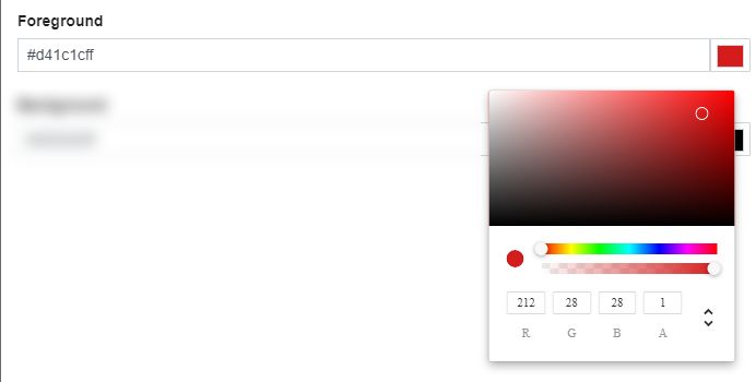
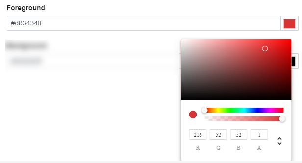
Foreground - allows you to change the foreground color of the Timestamp column entries, using the color picker tool.
The color picker tool allows the user to select custom colors using the RGBS (red, green, blue, alpha channel), HSL (hue, saturation, and lightness), and HEX (hexadecimal color codes) color pickers. To switch between the HEX, RGBA, and HSL color pickers you can use the arrows button.
After clicking the Save button of the Timestamp Column Settings dialog, the changes at the level of the Foreground color are applied.
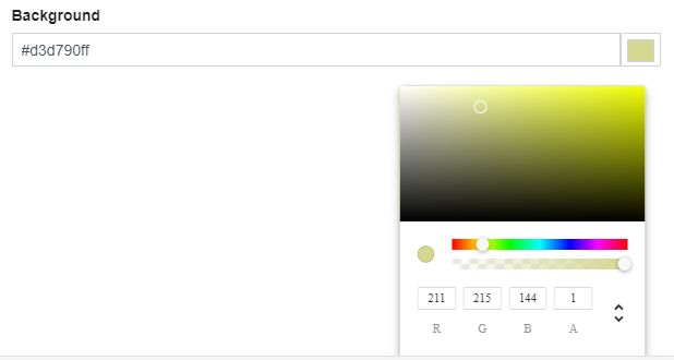
Background - allows you to change the background color of the Timestamp column entries, using the color picker tool.
The color picker tool allows the user to select custom colors using the RGBS (red, green, blue, alpha channel), HSL (hue, saturation, and lightness), and HEX (hexadecimal color codes) color pickers. To switch between the HEX, RGBA, and HSL color pickers you can use the arrows button.
After clicking the Save button of the Timestamp Column Settings dialog, the changes at the level of the Background color are applied.
To apply changes in the Timestamp Column Settings dialog, please make sure to click the Save button.
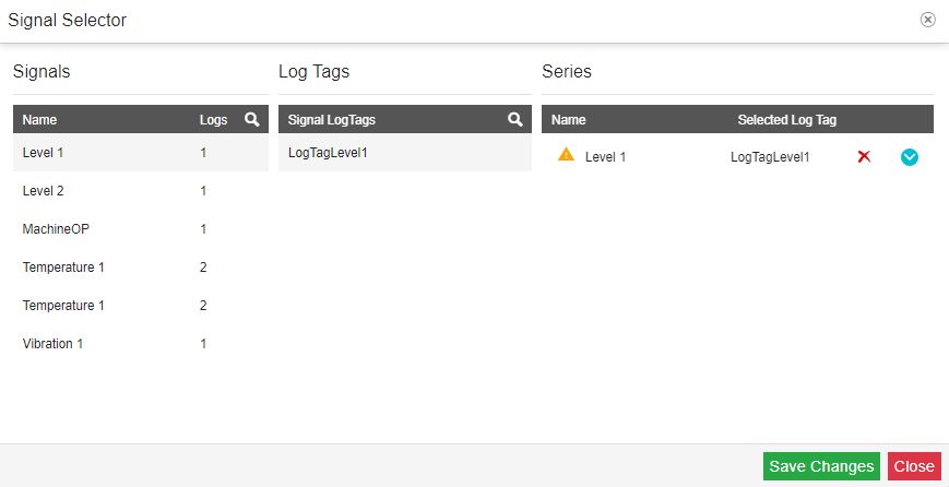
Click the Settings button, of the Data table component, to open the Signals Settings dialog. In this view, you can proceed with the following settings, for each individual Signal column:
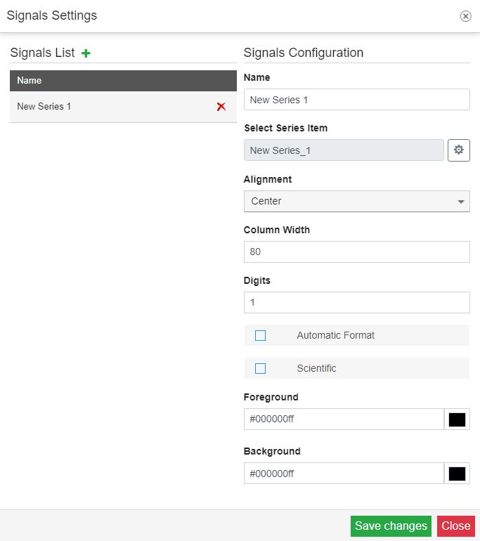
Display Name - allows you to customize the name of the data series, of the selected Signal. Changes at the level of this property will be reflected in the column header, of the Data Table component.
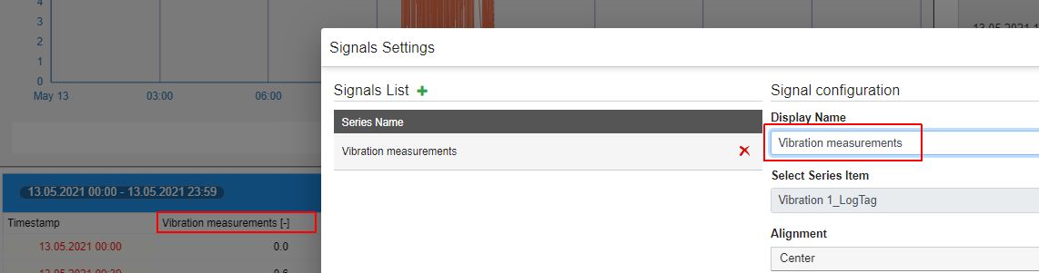
Select Series Item - allows you to change the data series, of the selected Signal, by clicking the cog icon button.
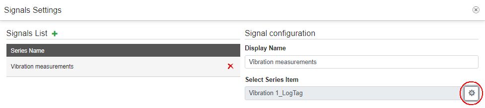
After the Signal Selector dialog is opened, you can proceed with selecting another Signal and clicking the Save changes button, to confirm the change.
Note
When working with an HTML Trending project on an i4scada environment, the Signal Selector dialog will only expose Signals that are assigned to Logs. Further on, you will be required to select the Signal and the Log, to apply the data series.
Alignment - sets the alignment of the data, in the table view, for the selected Signal. You can choose from the following options: Center, Left , or Right.
Column Width - sets the width of the selected Signal column. The width is measured in pixels and can be either manually filled in, or increased/decreased, by using the up / down arrows.
Tip
The Signal column width can be also adjusted manually, by dragging the boundary, on the right side of the column header, until the column reaches the desired width. To decrease the width, drag to the left.
Digits - sets the number of digits displayed after the comma, by the data table values, for each selected Signal. The default value is set to 1, but it can be manually changed or increased/decreased, using the up / down arrows.
Automatic Formatting
Scientific - enables or disables the scientific formatting, of the Data Table values, for the selected Signal. By default, this property is disabled. To enable it, mark the Scientific check-box
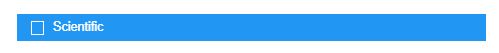
After clicking the Save button of the Signals Settings dialog, the Scientific formatting is enabled.
Tip
The Scientific format displays a number in exponential notation, replacing part of the number with E+n, in which E (exponent) multiplies the preceding number by 10 to the nth power.
Foreground - allows you to change the foreground color of the Signal column entries, using the color picker tool.
The color picker tool allows the user to select custom colors using the RGBS (red, green, blue, alpha channel), HSL (hue, saturation, and lightness), and HEX (hexadecimal color codes) color pickers. To switch between the HEX, RGBA, and HSL color pickers you can use the arrows button.
After clicking the Save button of the Signal Settings dialog, the changes at the level of the Background color are applied.
Background - allows you to change the background color of the Signal column entries, using the color picker tool.
The color picker tool allows the user to select custom colors using the RGBS (red, green, blue, alpha channel), HSL (hue, saturation, and lightness), and HEX (hexadecimal color codes) color pickers. To switch between the HEX, RGBA, and HSL color pickers you can use the arrows button.
After clicking the Save button of the Signal Settings dialog, the changes at the level of the Background color are applied.
To apply changes in the Signals Settings dialog, please make sure to click the Save button.
Click the Common button, of the Data table component, to open the Common Settings dialog. In this view, you can proceed with the following settings:
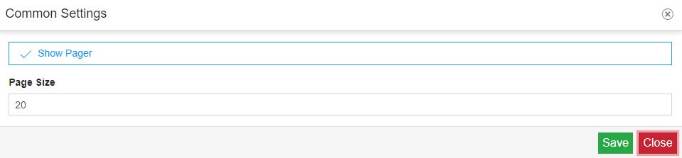
Show Pages - enables or disables the display of the bottom pager, where the following paging elements are available: the rows counter, the direction controls (that provide forward (Next) and backward (Previous) navigation, and numeric controls that allow users to move to a specific page.
By default, this option is enabled.

Page Size - sets the maximum amount of entries that can be displayed on one table page. All the entries that exceed the value entered for this property, will be rendered on another table page. The default value is set to 20 entries, but it can be manually customized, or increased/decreased, using the up / down arrows.

To apply changes in the Common Settings dialog, please make sure to click the Save button.
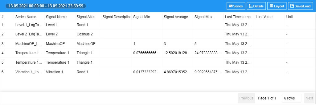
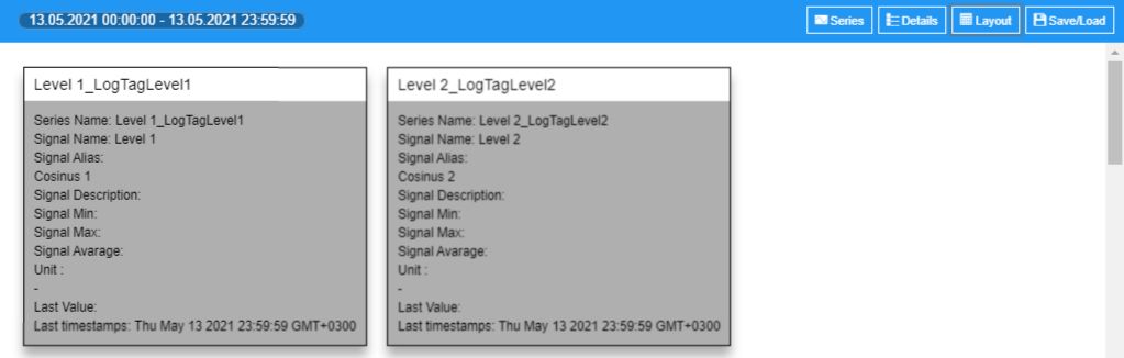
The Series details component displays information regarding the data series (Signals) configured inside the toolbox and reflected by the Chart and Data Table components.
The component allows you to proceed with the following settings:
Click the Series button, of the Series details component, to open the Series Selection dialog. In this view, you can disable and enable the series. By default, all the HTML Trending visualization series are listed.
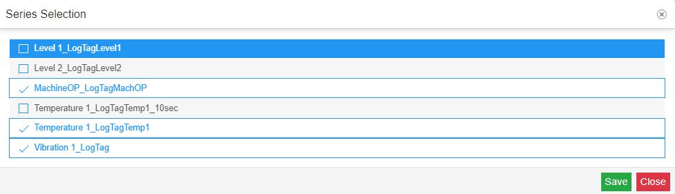
To apply changes at the level of the series list, please make sure to click the Save button.
Click the Details button, of the Series details component, to open the Details Selection dialog. In this view, you can customize the columns of the table, by disabling and enabling the listed options.
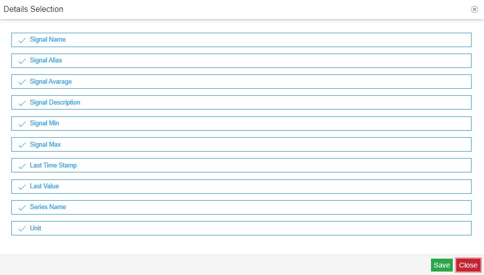
By default, the following columns are displayed by the table:
Signal Name - shows the name of the Signal
Signal Alias - shows the alias of the Signal
Signal Average - shows the average value of the Signal
Signal Description - shows the description of the Signal
Signal Min - shows the lowest value, registered by the Signal, within the plotted time interval
Signal Max - shows the highest value, registered by the Signal, within the plotted time interval
Last Time Stamp - shows the timestamp when the last value was registered
Last Value - shows the last value registered by the Signal
Series Name - shows the name of the data series
Unit - shows the unit of measure, used by the Signal
To apply changes at the level of series list details, please make sure to click the Save button.
Click the Layout button, of the Series details component, to open the Layout Selection dialog. In this view, you can customize the display mode of the data series, of the Series details component, by choosing from the following options:
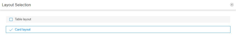
Table layout - by default, the series details are displayed in a tabular view mode.
Card layout - you can change the tabular view and set the card layout, to view each series in a card view mode.
To apply changes at the level of series list details, please make sure to click the Save button.
The Cursor details component displays information regarding the cursors configured inside the toolbox and reflected by the Chart.
The component allows you to proceed with the following settings:
Click the Cursors button, of the Cursor details component, to open the Cursors Selection dialog. In this view, you can disable and enable the cursors. By default, all the cursors are listed.
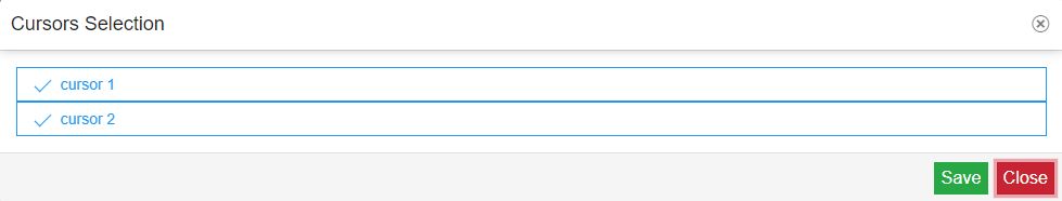
To apply changes at the level of the cursors list, please make sure to click the Save button.
Click the Details button, of the Cursors details component, to open the Details Selection dialog. In this view, you can customize the columns of the table, by disabling and enabling the listed options.
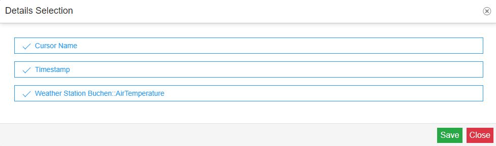
By default, the following columns are displayed by the table:
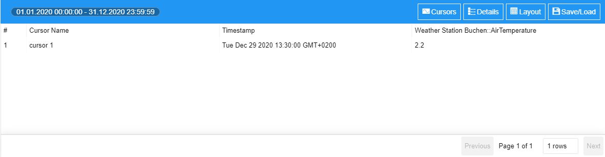
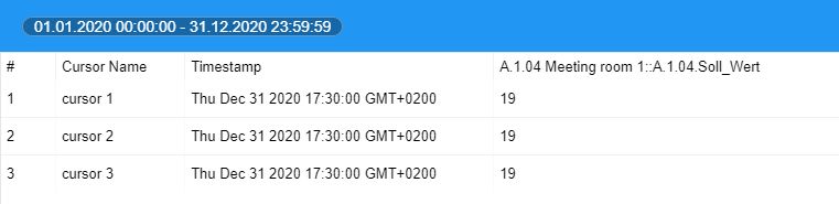
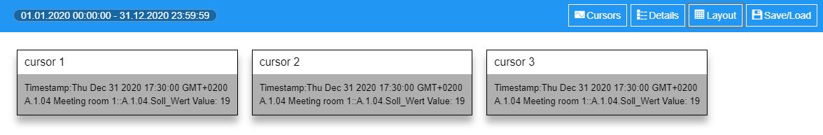
Cursor Name - the name of the cursor.
Timestamp - the date when the Signal value was registered, for the current cursor.
Signal - the Signal value, registered for the current cursor. If multiple Signals are used by the current trending project, a new column will be automatically added.
To apply changes at the level of cursors details, please make sure to click the Save button.
Click the Layout button, of the Cursors details component, to open the Layout Selection dialog. In this view, you can customize the display mode of the cursors, of the Cursors details component, by choosing from the following options:
Table layout - by default, the details of the cursor are displayed in a tabular view mode.
Card layout - you can change the tabular view and set the card layout, to view each cursor in a card view mode.
Using Client-side Signals to extract Historical information
Check out this article and learn how to enhance your HTML Trending visualizations, using temporary local signals, also known as Client-Signals.
To enhance your HTML Trending visualization, using Client-side Signals to expose the Cursors details, please proceed as follows:
Tip
For more details about the Historical Client-side Signals, please visit the HTML Trending overview article, here.
Open the previously designed HTML Trending project, where the five Historical components were already configured.
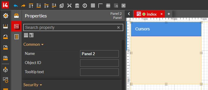
Add to the project page a Panel component and double-click it to open the Properties panel. We shall proceed with a few visual changes:
Increase the size of the Header height. For this tutorial, we shall set the Panel's header to a 50 pixels height.
Change the Header background color, to a color of your choice.
Add a description for the Panel component, in the Header title field.
For a bit more contrast, change the Panel's Background color, to a color of your choice.
Next, add to the project page two Label components. For this tutorial, we added the labels on top of the previously configured Panel component.
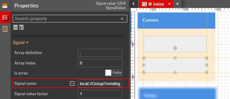
Double click the firstLabel component, to open the Properties panel. Proceed with the following settings:
Fill in the Signal name field, the client-side signal used for extracting the cursor values (local://${this.groupName}_${serie.name}_Cursor_${cursor.name}_Value ).
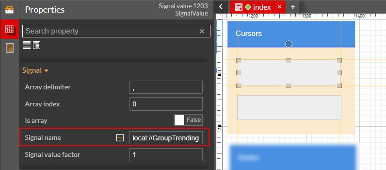
For this tutorial, we have replaced the placeholders, with our data.

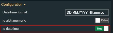
Double click the secondLabel component, to open the Properties panel. Proceed with the following settings:
Fill in the Signal name field, the client-side signal used for extracting the cursor timestamp (local://${this.groupName}_${serie.name}_Cursor_${cursor.name}_Timestamp).
For this tutorial, we have replaced the placeholders, with our data.

Since we expect a date type value, set the Is datetime property to true.
Make sure to save all your changes, before building and publishing your project, to the target environment.
Open the run-time HTML Trending visualization and load some time and data series, using the Toolbox component. The cursor that was set for the Client-side Signal syntax, should also be available, for the current project.
Tip
For more details, please also check the previous tutorial.
The labels of the Panel component will display the last cursor value along with its last timestamp.