i4designer Layout and design tutorials
Check out this article and learn more details on how to design your projects by properly using various layout features.
Using the alignment and distribution features
Check out this article and learn more details about the alignment and distribution features, available in the quick actions toolbar.
Tip
For more details about the alignment and distribution options, please also visit the dedicated article, here.
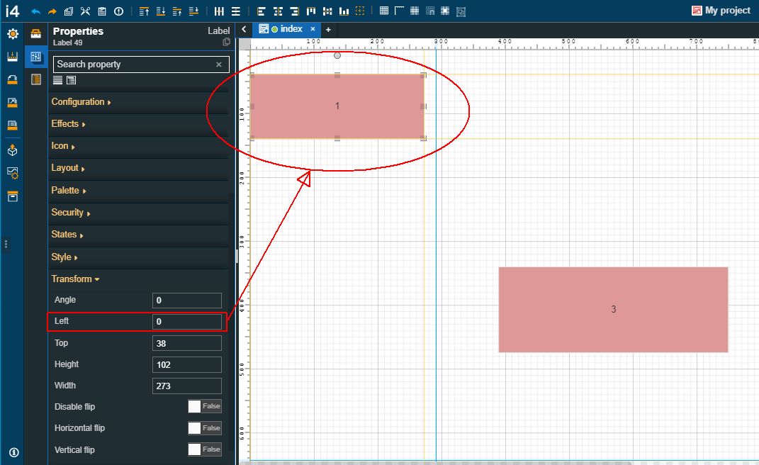
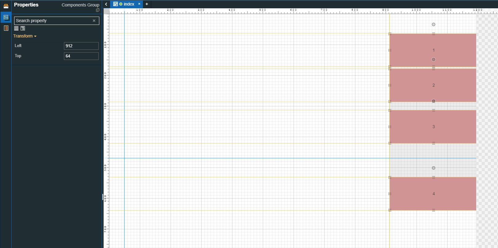
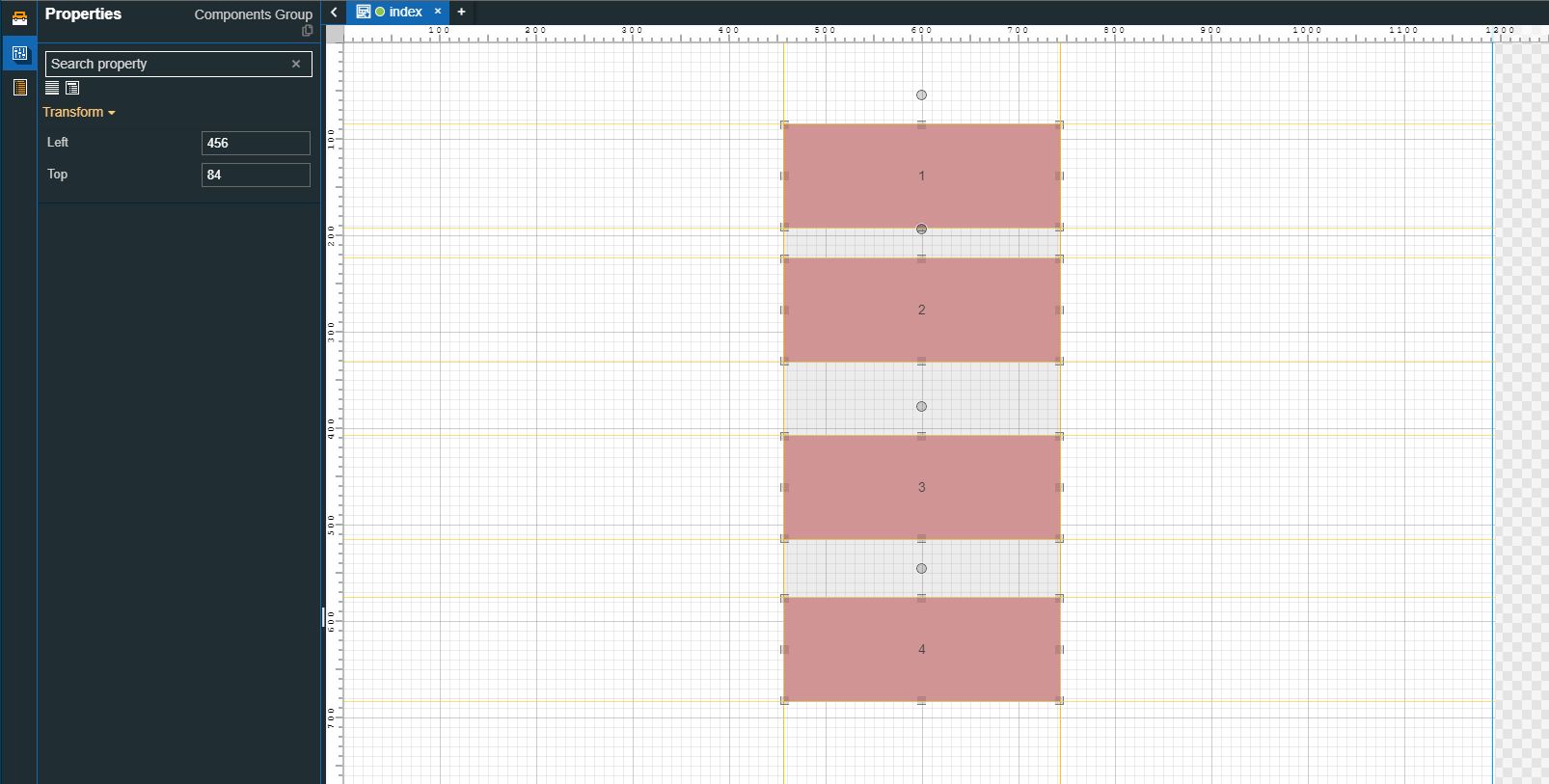
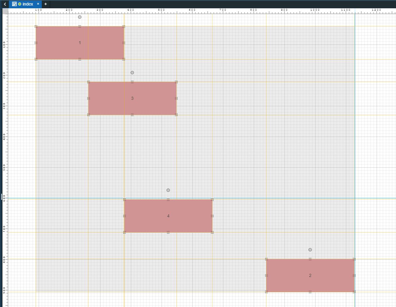
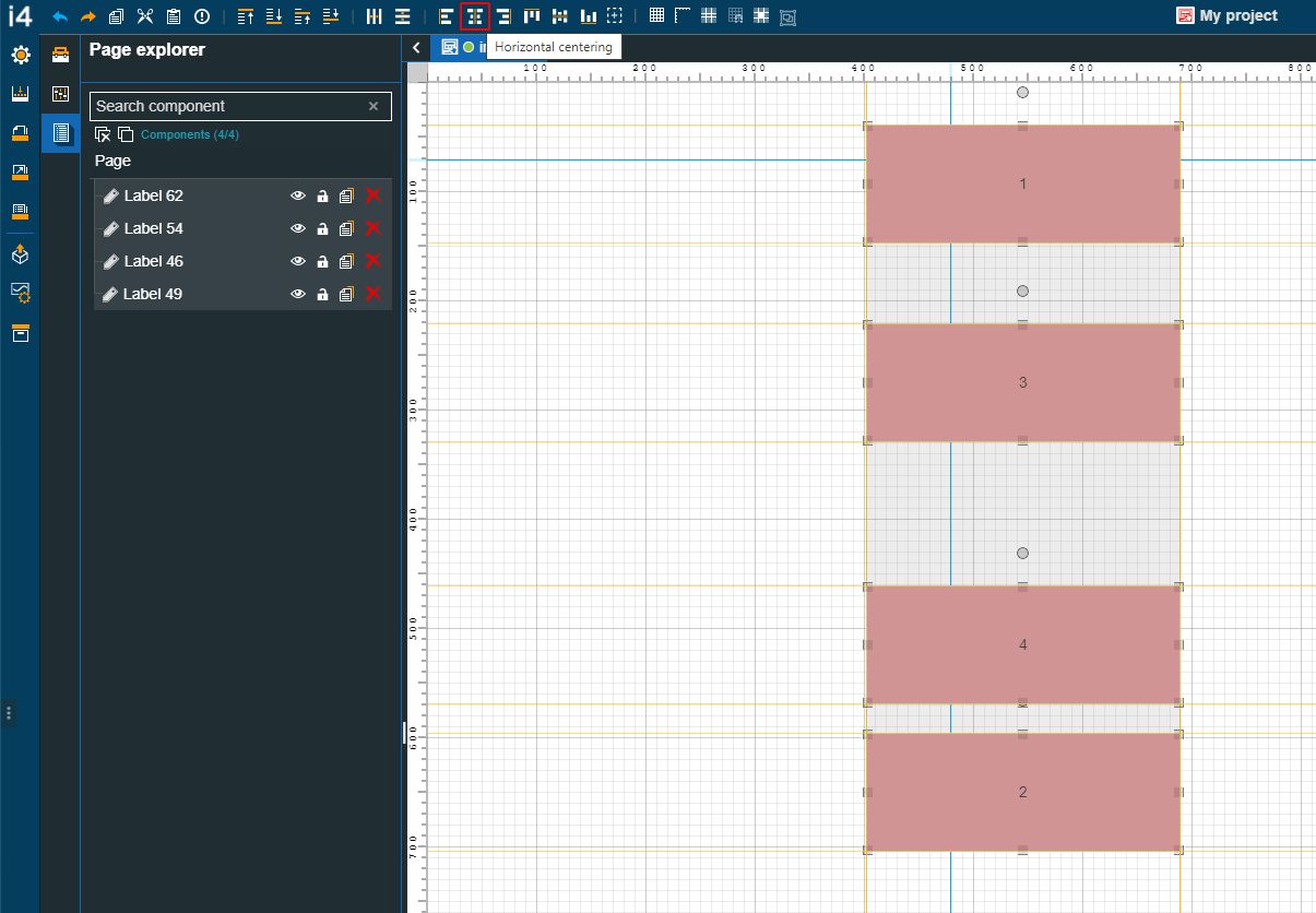
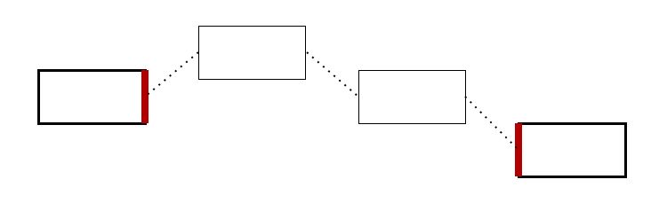
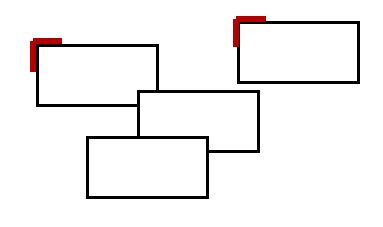
To demonstrate the alignment and distribution features, we prepared an i4designer project, using four identical Label components. Each Label has a number associated, representing the order in which they were added to the project page.
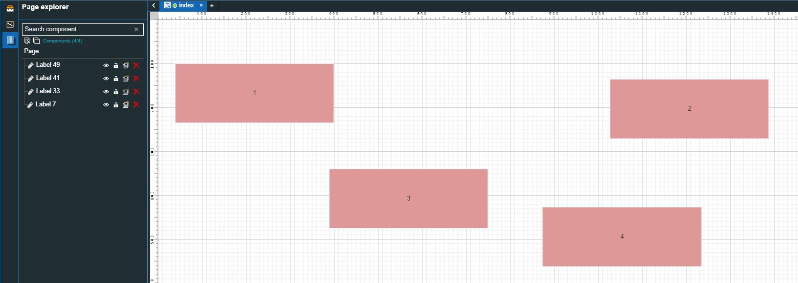
The project page
Since the Labels were randomly positioned throughout the drawing space, we shall use the alignment and distribution options, available in the quick actions bar, to adjust their position, as follows:
Aligning components relative to the page
Check out this article and learn more details on how to align your i4designer components in a vertical direction, using the alignment options.
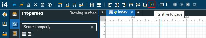
This tutorial will show how to align objects in i4designer projects using the Relative to page feature. This article can help you create neater projects, by using the following alignment commands available in the i4designer quick actions toolbar:
Align to left
Align to right
Align to top
Align to left
Vertical centering
Horizontal centering
Relative to page
Aligning components individually
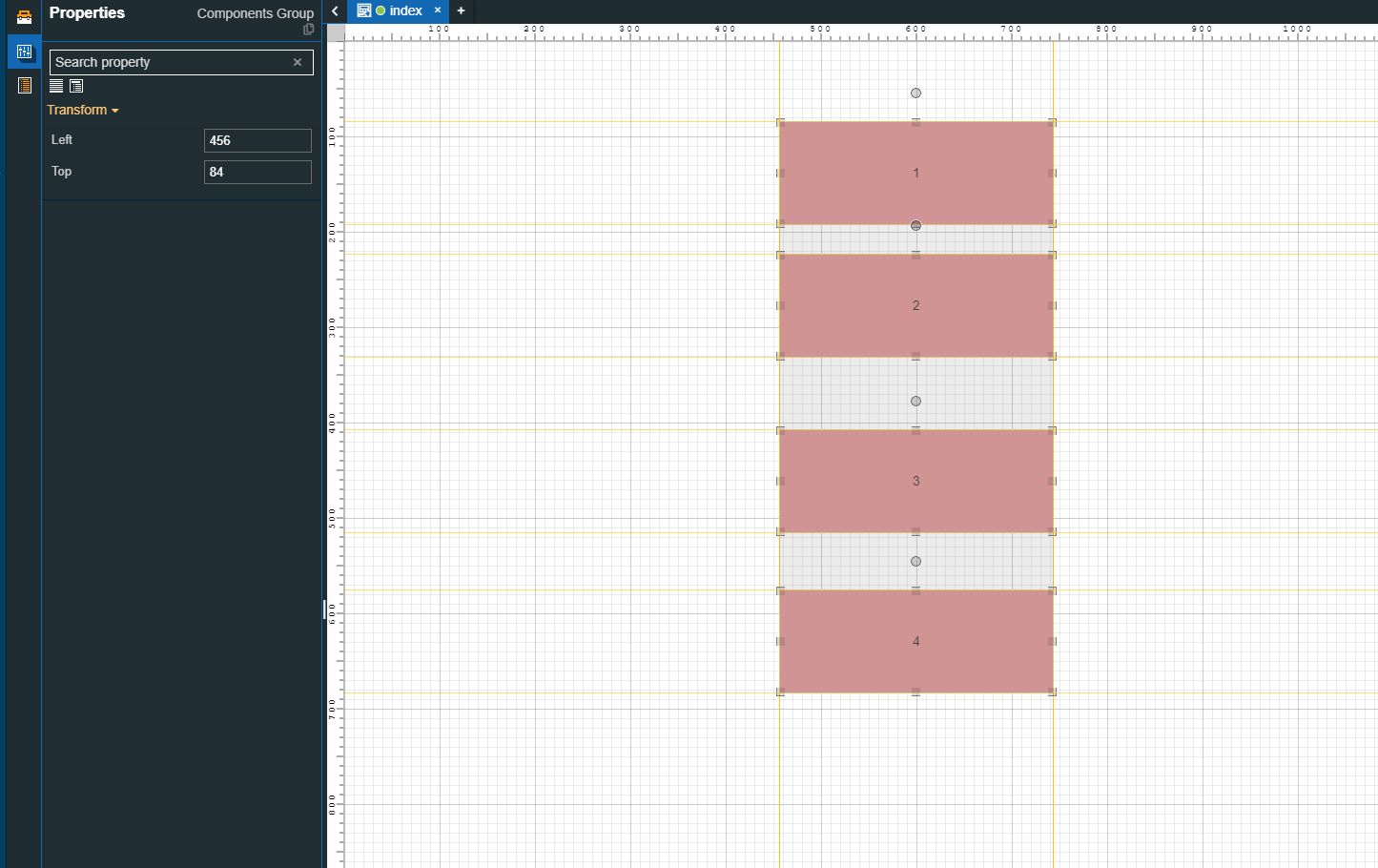
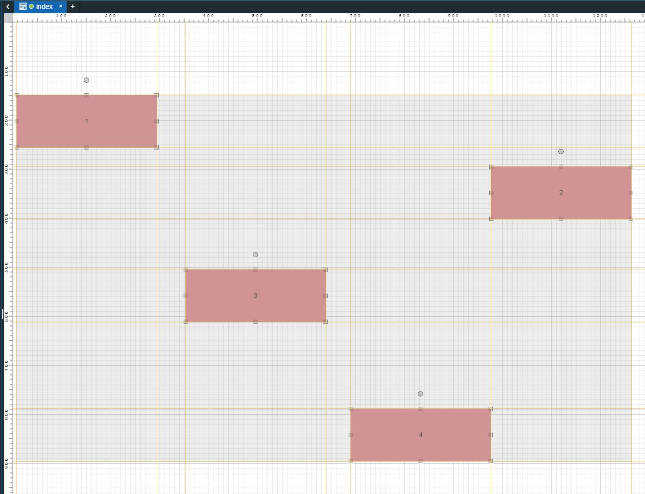
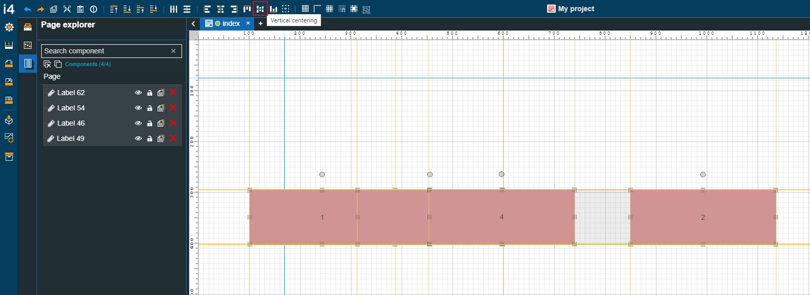
For this tutorial, we randomly distributed four identical Label components on the drawing surface.
The drawing surface
To easily adjust the position of each component, please proceed as follows:
Enable the Relative to page alignment mode.
Important
When aligning components on the drawing surface, the user can choose to align them relative to the page, or relative to another component.
When the Relative to page alignment mode is enabled, the selected components will consider the page borders, as exemplified by the current tutorial.
Select the first Label component, by clicking it once, and click the Align to left toolbar button.
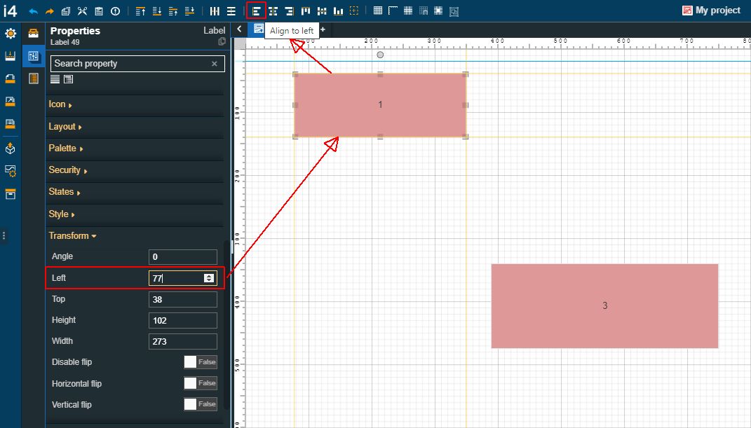
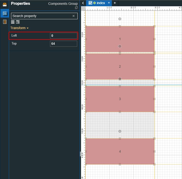
The position of the Label is changed. The position adjustment is also visible in the Properties panel, under the Transform category. The value of the Left property is changed, therefore the component is perfectly aligned with the left page border.
Select the second Label component and click the Align to right toolbar button.
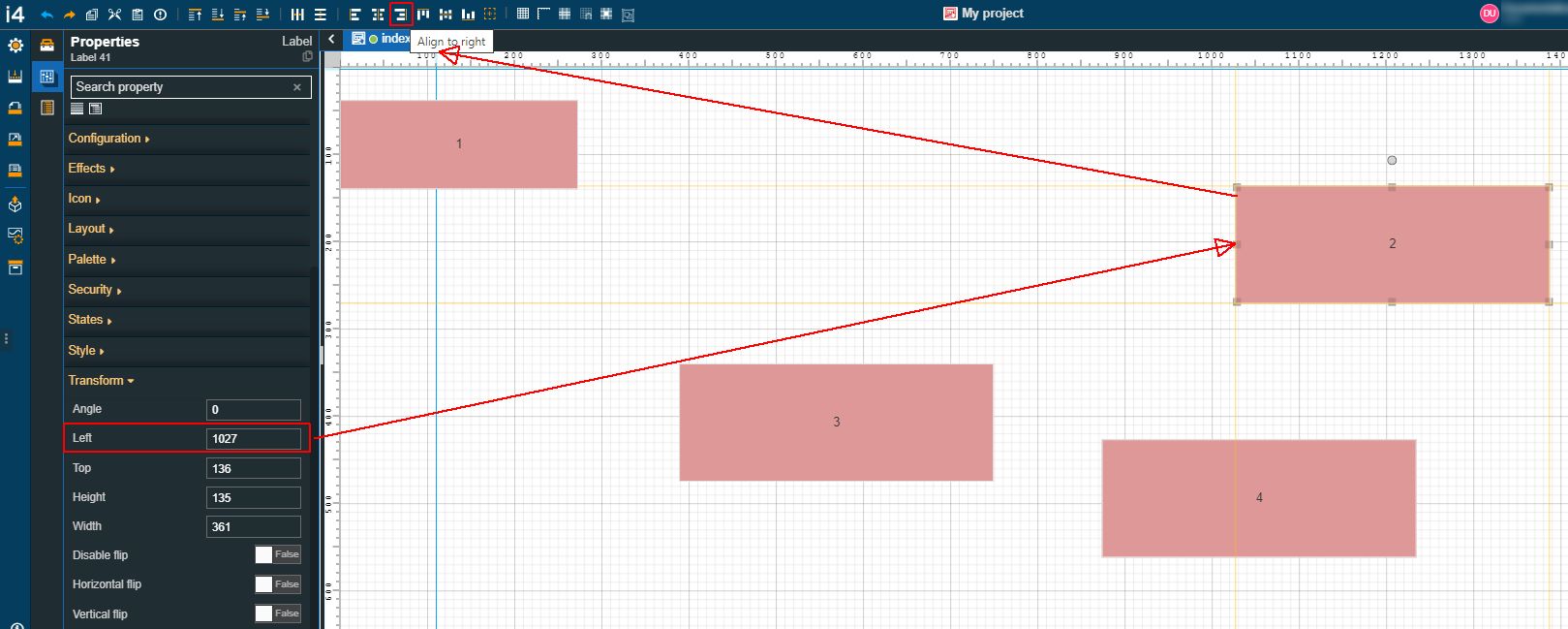
The position of the Label is changed. The position adjustment is also visible in the Properties panel, under the Transform category. The value of the Left property is changed, therefore the component is perfectly aligned with the right page border.
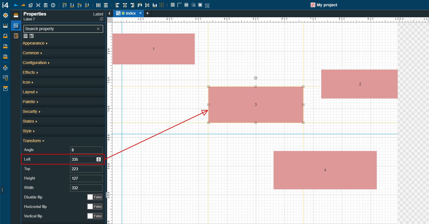
Select the third Label component, by clicking it once, and click the Horizontal centering toolbar button.
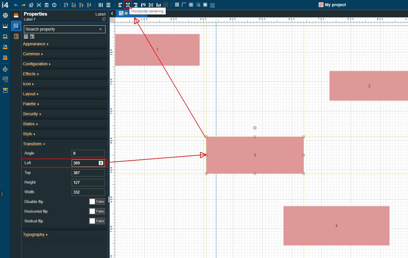
The position of the Label is changed. The Label is moved to the center of the project page, to an equal distance between the left and right borders.
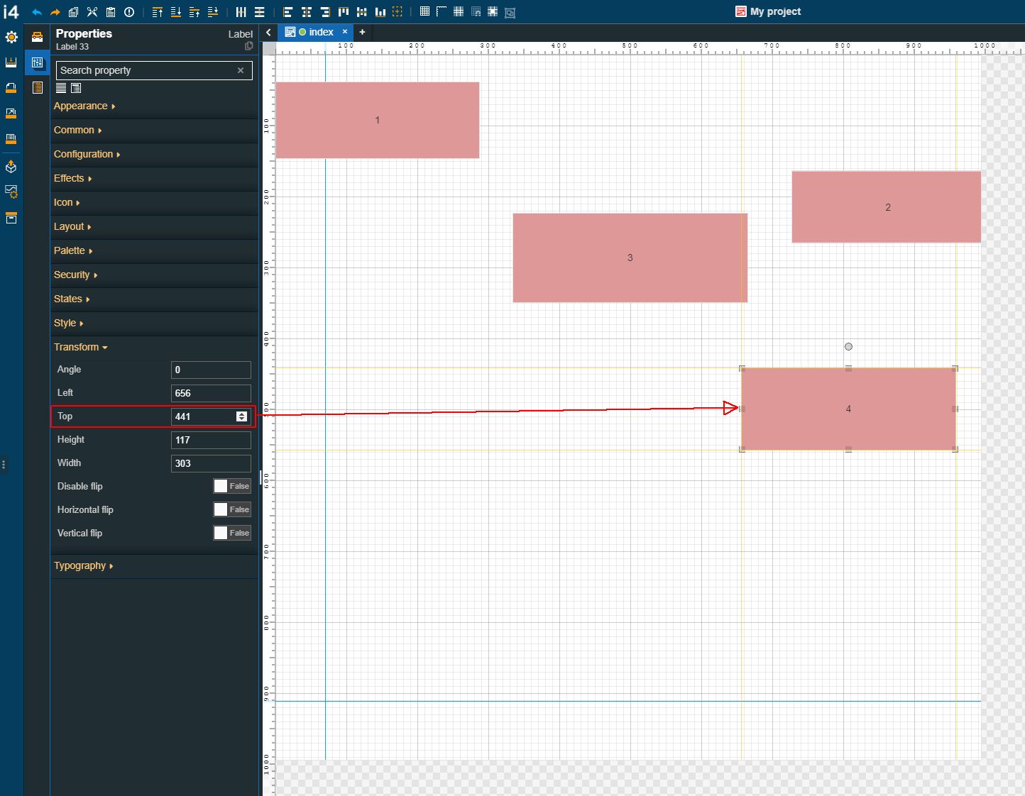
Select the fourth Label component, by clicking it once, and click the Align to top toolbar button.
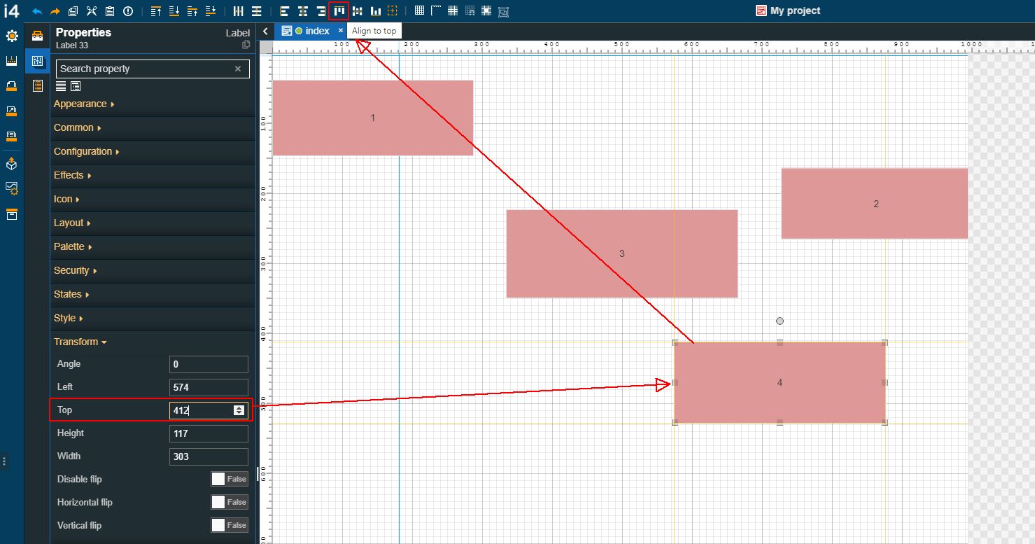
The position of the Label is changed. The position adjustment is also visible in the Properties panel, under the Transform category. The value of the Top property is changed, therefore the component is perfectly aligned with the top page border.
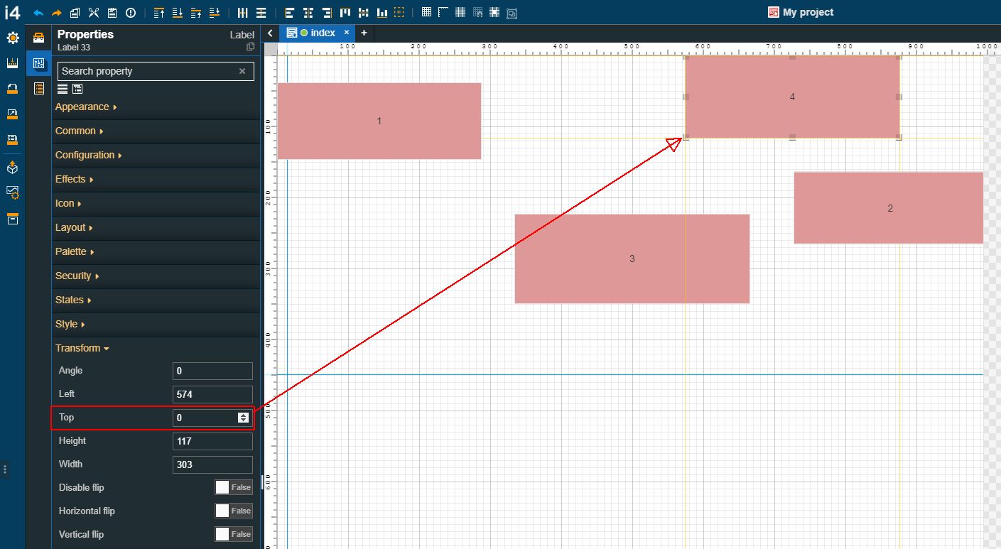
Select again the fourth Label component, by clicking it once and click the Align to bottom toolbar button.
The position of the Label is changed. The position adjustment is also visible in the Properties panel, under the Transform category. The value of the Top property is changed, therefore the component is perfectly aligned with the bottom page border.
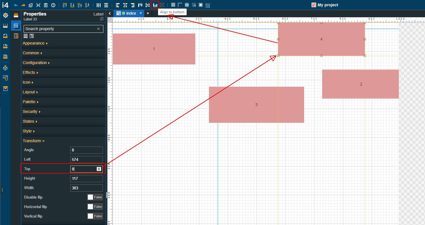
To move the fourth Label component to the center of the page, select it and click the Vertical centering toolbar button.
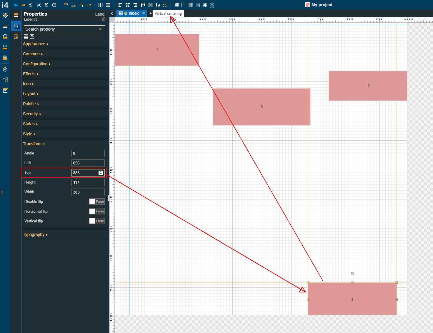
The position of the Label is changed. The Label is moved to the center of the project page, to an equal distance between the top and bottom borders.
Aligning multiple components
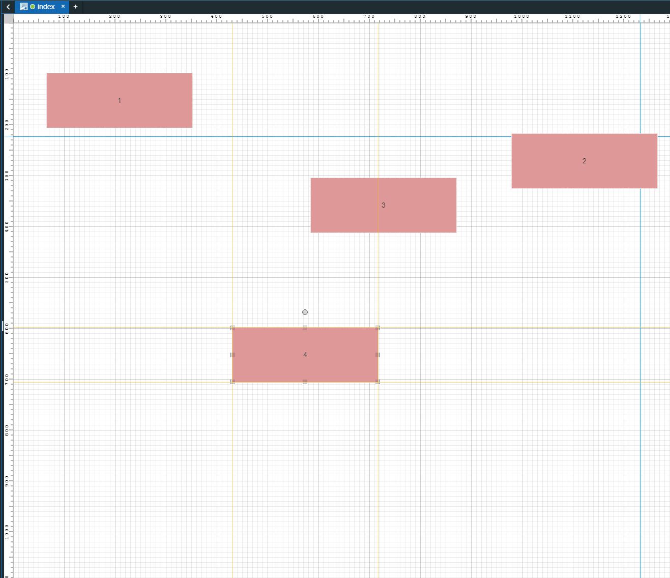
For this tutorial, we shall proceed with the four Label components that we have previously randomly distributed on the drawing surface.
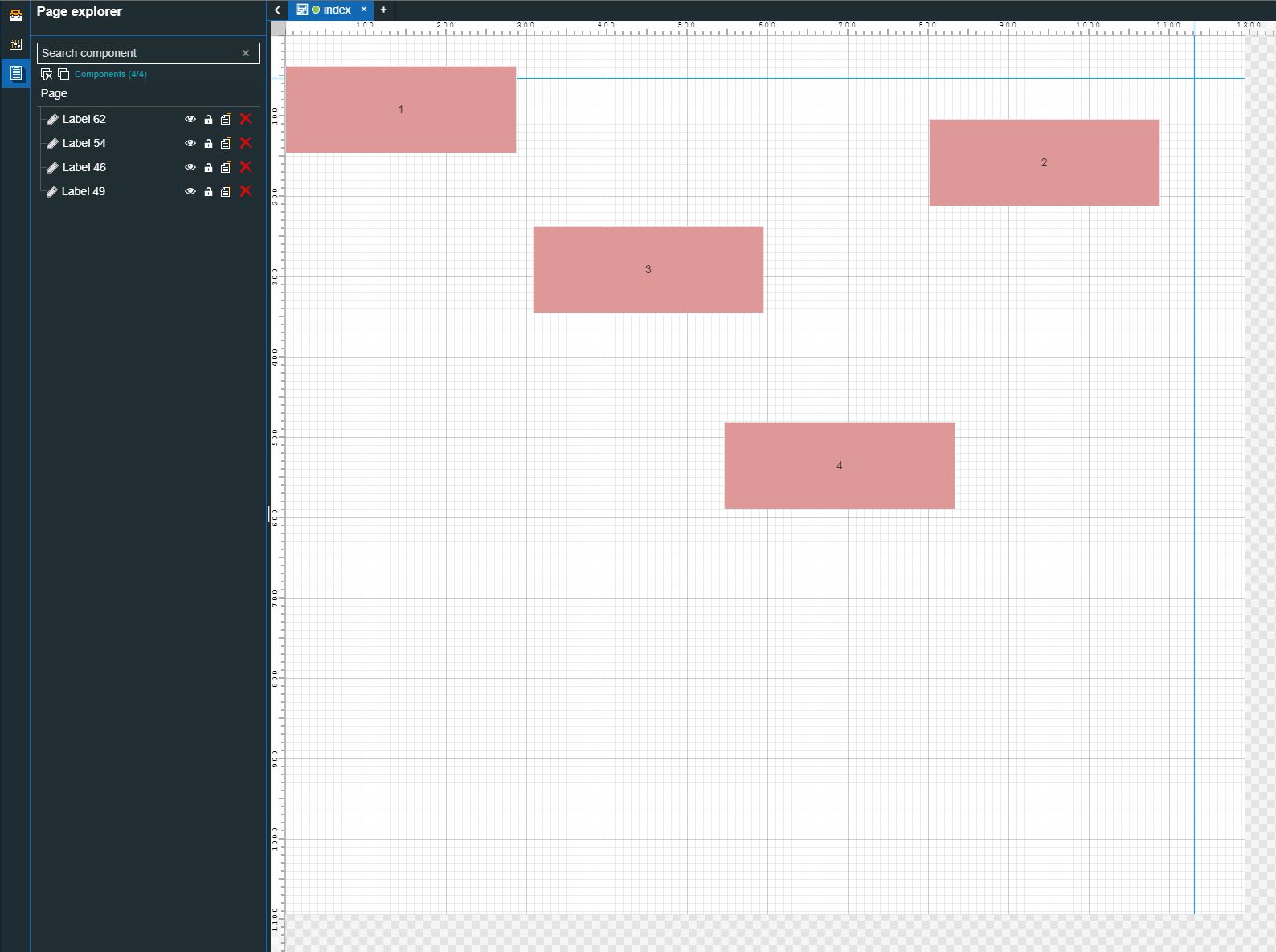
The drawing surface
Please proceed as follows to align multiple components:
Enable the Relative to page alignment mode.
Important
When aligning components on the drawing surface, the user can choose to align them relative to the page, or relative to another component.
When the Relative to page alignment mode is enabled, the selected components will consider the page borders, as exemplified by the current tutorial.
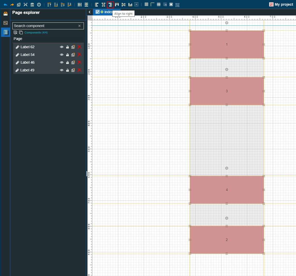
Select all components and click the Align to left
 toolbar button.
Tip
You can select multiple components either by holding down the right/left mouse button and dragging a selection rectangle over the components of interest or by holding down the CTRL keyboard button and individually clicking the components of interest.
The position of the selected components is changed. The position adjustment is also visible in the Properties panel. The value of the Left property is changed, therefore the components are perfectly aligned with the left page border.
Select all components and click the Align to right
 toolbar button.
The position of the selected components is changed. The position adjustment is also visible in the Properties panel. The value of the Left property is changed, therefore the components are perfectly aligned with the right page border.
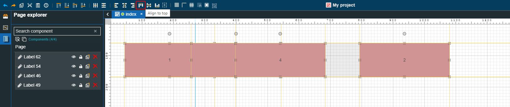
Select all components and click the Align to top
 toolbar button.
The position of the selected components is changed. The position adjustment is also visible in the Properties panel. The value of the Top property is changed, therefore the components are perfectly aligned with the top page border.
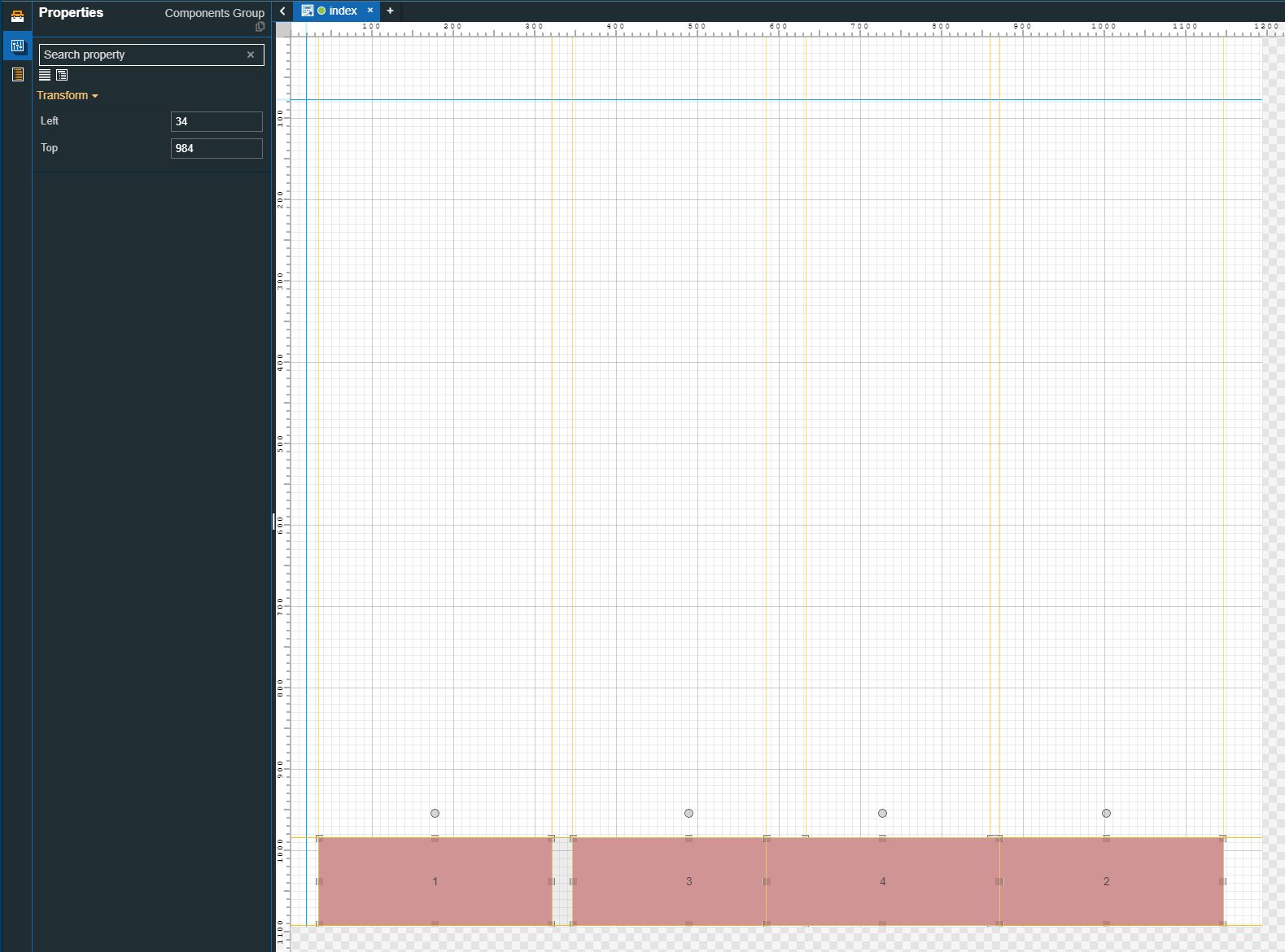
Select all components and click the Align to bottom
 toolbar button.
The position of the selected components is changed. The position adjustment is also visible in the Properties panel. The value of the Top property is changed, therefore the components are perfectly aligned with the bottom page border.
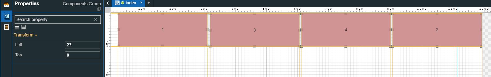
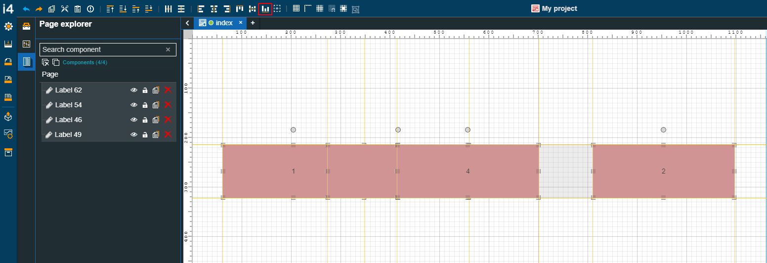
Select all components and click the Horizontal centering
 toolbar button.
The position of the Labels is changed. The Labels are moved to the center of the project page, to an equal distance between the left and right borders.
Select all components and click the Vertical centering
 toolbar button.
The position of the Labels is changed. The Labels are moved to the center of the project page, to an equal distance between the top and bottom borders.
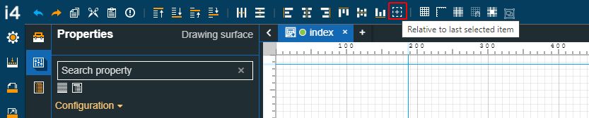
Aligning components relative to the last selected item
Check out this article and learn more details on how to align your i4designer components relative to the last selected item.
This tutorial will show how to align objects in i4designer projects, using the Relative to last selected item alignment feature. This article can help you create neater projects, by using the following alignment commands available in the i4designer quick actions toolbar:
Align to left
Align to right
Align to top
Align to left
Vertical centering
Horizontal centering
Relative to last selected item
Tip
The best procedure to create neat projects is to combine the benefits of the alignment and the distribution commands.
For this tutorial, we randomly distributed four identical Label components on the drawing surface. We shall demonstrate to you how to align the components, considering the position of the last selected Label component, as follows:
Enable the Relative to last selected item alignment mode.
Important
When aligning components on the drawing surface, the user can choose to align them relative to the page, or relative to another component.
When the Relative to last selected item alignment mode is enabled, the selected components will consider the last selected item.
To control the selection order, the user should select the components by means of CTRL+Click. Otherwise, the components will be aligned relative to the last component added on the project page.
Select all four Label components, by means of CTRL+Click. For this tutorial, the last selected component is the first Label.
Click the Align to left toolbar button.
The position of all the Label components is changed. The alignment considers the left border of the last selected item.
Further on, you can play with the position of the four Label components to try out the Align to right, Align to top, Align to bottom, Horizontal centering, and Vertical centering alignment options. These alignment modes will function as follows:
The Align to right option aligns all the selected components with the right border of the last selected component.
The Align to top option aligns all the selected components with to top border of the last selected component.
The Align to bottom option aligns all the selected components with the bottom border of the last selected component.
The Horizontal centering option aligns all the selected components with the horizontal center of the last selected component.
The Vertical centering option aligns all the selected components with the vertical center of the last selected component.
Distributing components
Check out this article and learn more details on how to distribute your i4designer components in a vertical direction, using the distribution options.
This tutorial will show you how to distribute components, at equal distances from one to another. This article can help you create neater projects, by using the following distribute commands available in the i4designer quick actions toolbar:
Horizontal distribution
Vertical distribution
Tip
The best procedure to create neat projects is to combine the benefits of the alignment and the distribution commands.
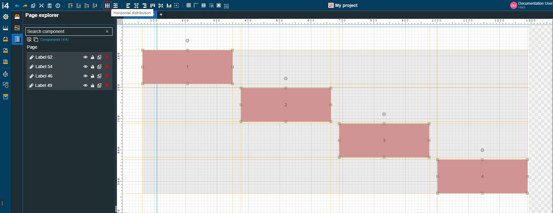
For this tutorial, we have four identical Label components randomly positioned on the drawing surface. We shall demonstrate to you how to equally distribute the components, as follows:
Select all components and click the Horizontal distribution toolbar button.
Tip
You can select multiple components either by holding down the right/left mouse button and dragging a selection rectangle over the components of interest or by holding down the CTRL keyboard button and individually clicking the components of interest.
Even though the components are not aligned, their position on the horizontal axis is changed, while maintaining an equal distance from one another.
Tip
When horizontally distributing components, the right margin of the component positioned near the left page border and the left margin of the component positioned near the right page border are considered.
Horizontal distribution
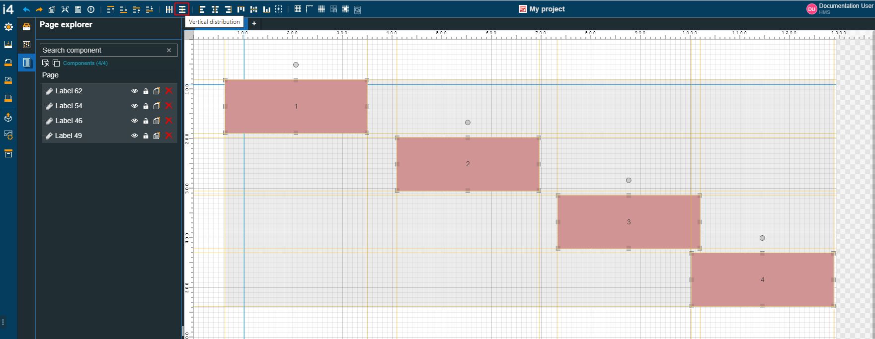
Next, select all components and click the Vertical distribution toolbar button.
Even though the components are not aligned, their position on the vertical axis is changed, while maintaining an equal distance from one another.
Tip
When vertically distributing components, the bottom margin of the component positioned near the top page border and the top margin of the component positioned near the bottom page border are considered.
Vertical distribution
Warning
It may be the case that the sum of the selected component's width is higher than the distance between the top/bottom or left/right extremes. In this case, the distribution is performed, as follows:
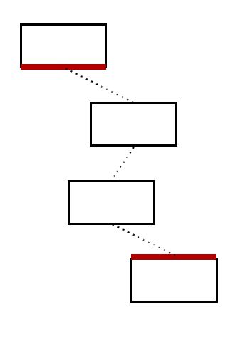
Vertical distribution considers the left top corners of the components positioned to the top and bottom page borders.
Vertical distribution for unequivalently positioned components
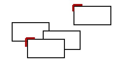
Horizontal distribution considers the left top corners of the components positioned to the left and right page borders.
Horizontal distribution for unequivalently positioned components
Using the layout settings
Check out this article and learn how to take advantage of the Page mode and Layout mode properties to build a more responsive project, from a layout point of view.
This article will guide you through the needed steps to take advantage of the Page mode and the Layout mode properties, in order to design a better and more responsive project.
The main goals of this tutorial are to:
have a component, pinned as a header and stretched horizontally
have a component, pinned as a footer and stretched horizontally
have the main area between the header and the footer, featuring a tab component capable of stretching to the remaining content of the page.
If you are interested in designing such a page for your project, please proceed as follows:
Open a new i4designer project, in design-mode.
By default, the Page Properties panel is displayed.
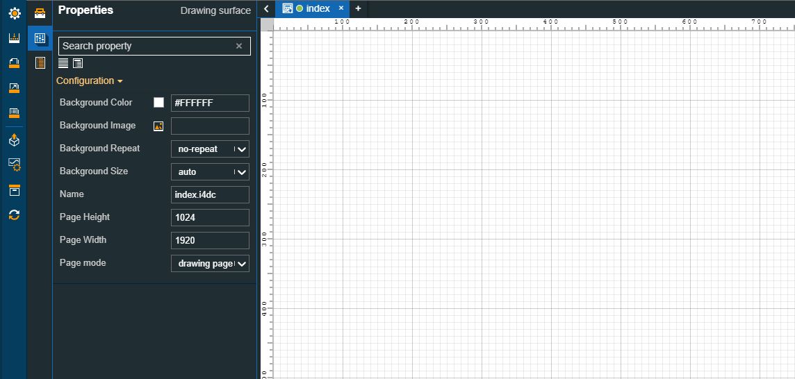
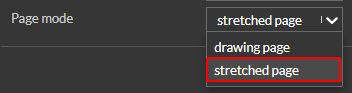
Change the Page mode setting and select the "stretched page" option.
Go to the Pages menu and add a new folder. For this tutorial, the folder name will be set as "Widgets".
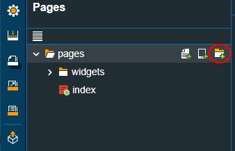
Under the Widgets folder add three new pages, as follows:
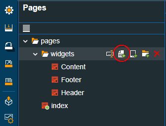
the "Content" page
the "Header" page
the "Footer" page
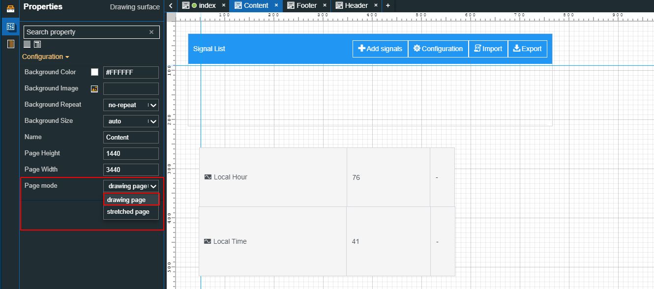
Select the Content page in edit mode. Since it will be used as the main page frame, set the Page mode property to the drawing page option. Add your project components to the page and configure them as desired.
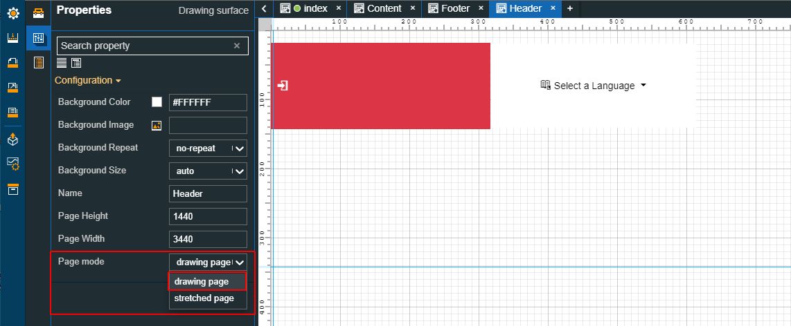
Select the Header page in edit mode and set the Page mode property to the drawing page option. Add your project components to the page and make sure to pin them to the top of the page, using the Layout mode property.
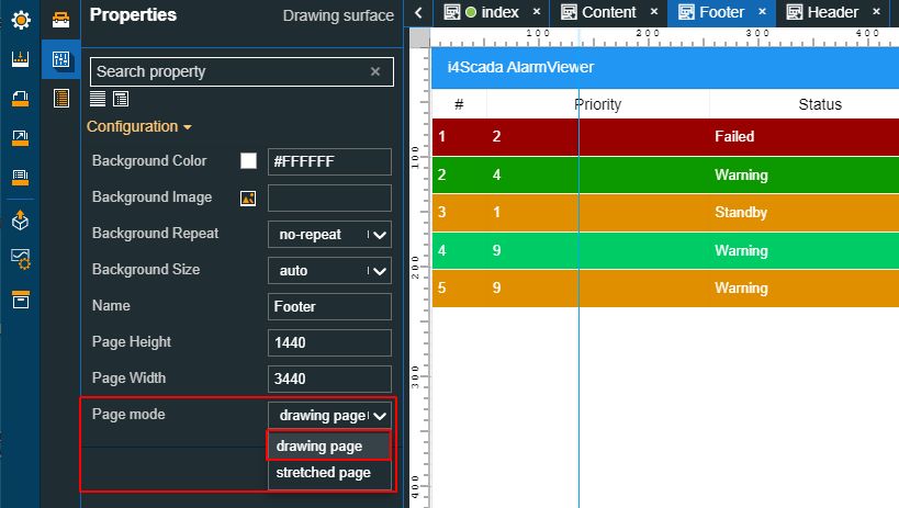
Select the Footer page in edit mode and set the Page mode property to the drawing page option. Add your project components to the page and make sure to pin them to the bottom of the page, using the Layout mode property.
Next, return to the main project page (the Index page) and add three Frame components, as follows:
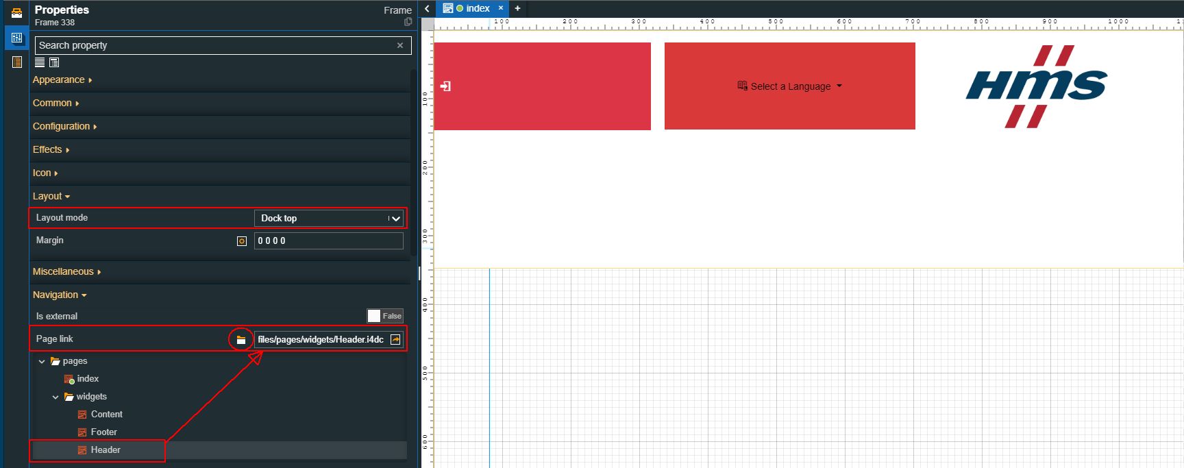
The first frame will be used as a header, so set the Layout mode property to the Dock top option. To establish a link between the Header page and the Header frame, set the Page link property to point to the Header widget page.
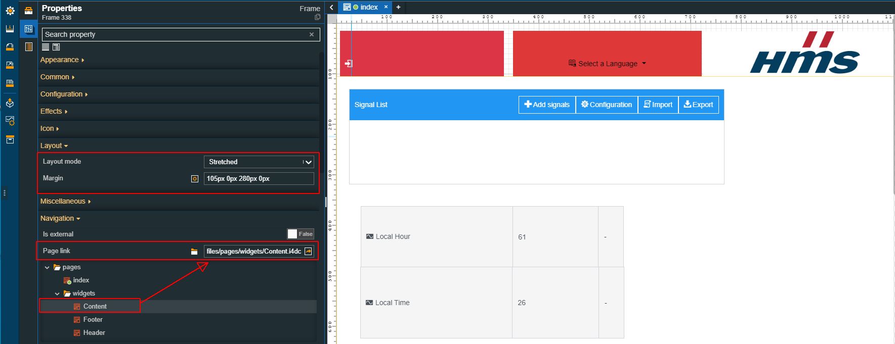
The second frame will be used as the mainframe, so set the Layout mode property to the Stretched option. Further on, using the Margin property, adjust the position of the frame. To establish a link between the Content page and the Content frame, set the Page link property to point to the Content widget page.
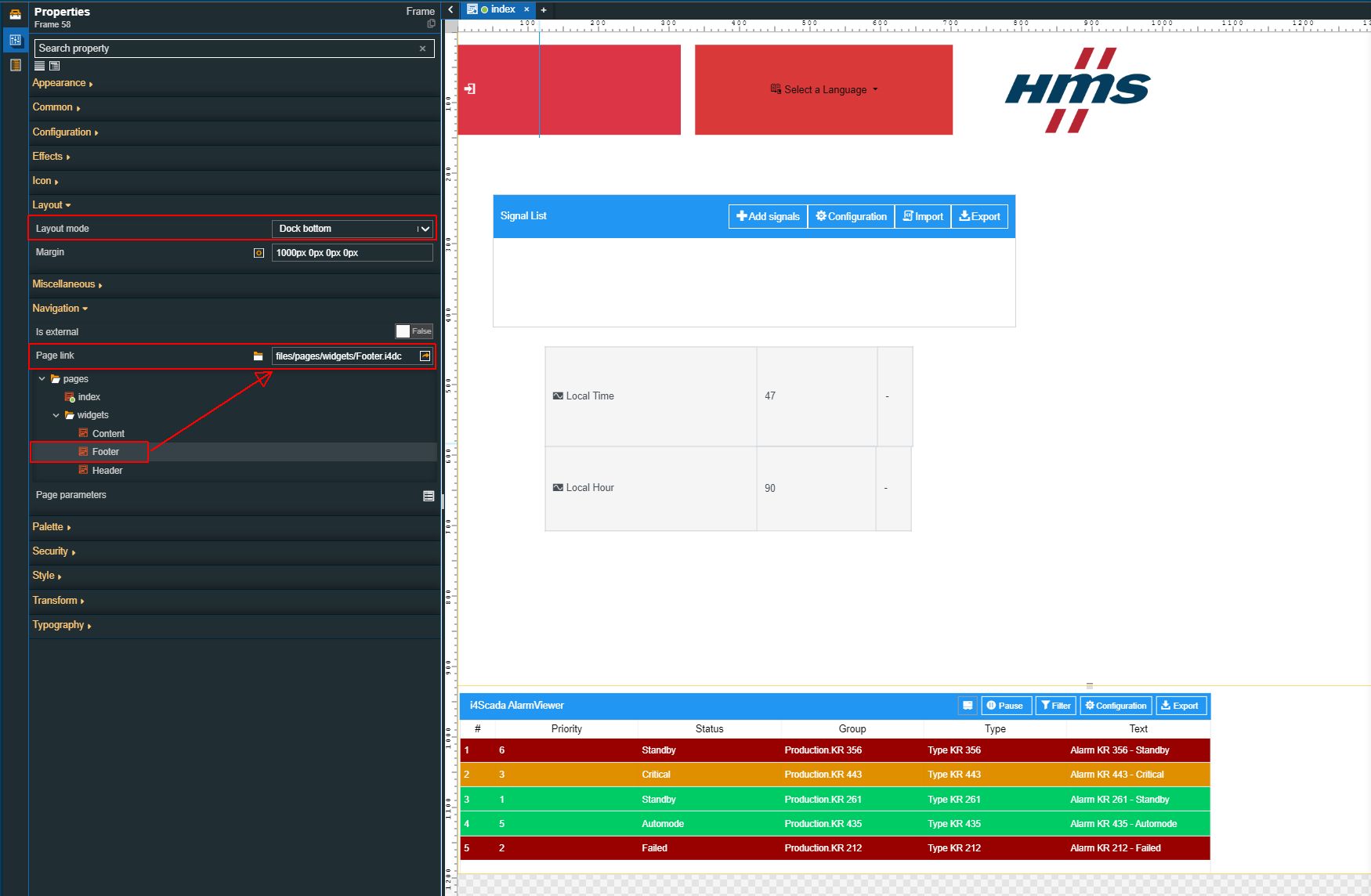
The third frame will be used as a footer, so set the Layout mode property to the Dock bottom option. To establish a link between the Footer page and the Footer frame, set the Page link property to point to the Footer widget page.
Warning
Please notice that the contents of the widget pages will be cut down from view if the space allocated to the frame is exceeded.
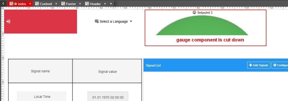
For example, if the Header page contains a larger component, the run-time project will not display it, or cut it down.
Build and publish the project.
Tip
For more details on how to publish projects, please visit the dedicated tutorials, here.
Finally, open your visualization, and let's check the run-time results.
Using the transformation settings
Check out these articles and learn more details about the properties under the Transformation section, used by all the system components.
To create a professional visualization, the components need to be properly positioned and sized just right. To help you achieve this goal, i4designer provides a set of Transformation settings, available for all the available components.
Moving components around the drawing area
Check out this article and learn more details on how to move components around the drawing space, in order to properly position them.
You can move components around the drawing area, using several different methods. Regardless of the chosen method, moving components does not impact their characteristics or other customizations.
Open your project in Designer and go to the Toolbox panel, in the contextual actions area.
Drag a component on the drawing surface of the page. For this tutorial, we shall use a graphic component, such as the Robot.
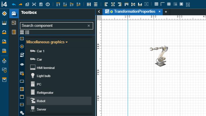
Tip
By default, the component's height and width are equal (50 pixels). You can resize it either by dragging the component's corners, on the drawing surface or by increasing the value of the Height/Width properties in the Transform category.
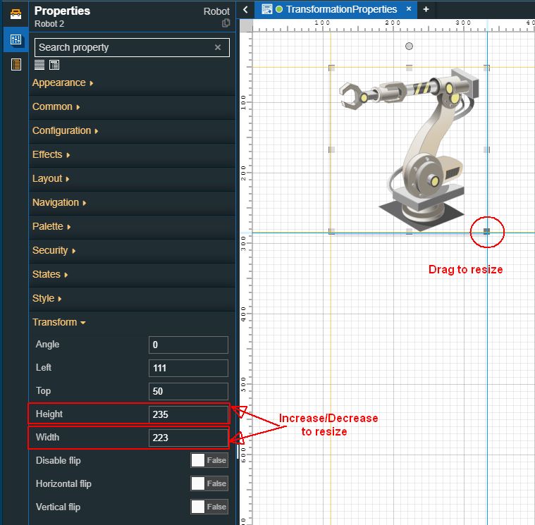
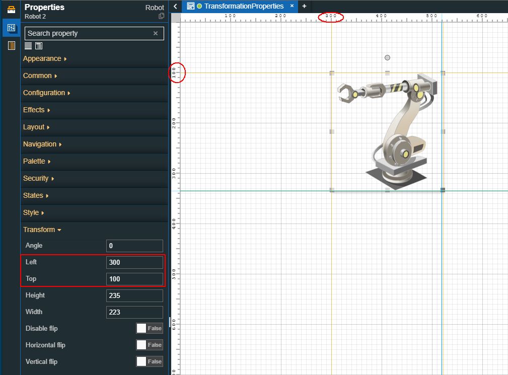
Open the Properties panel of the Robot component to change its position.
To move the component to a precise location, use the Left property to adjust the component position on the horizontal coordinate, and the Top property to move it vertically.
Therefore, set the value of the Left property to 300 and the value of the Top property to 100.
Tip
You can also click and drag the component around the drawing area. When you release the mouse button the component's position will be automatically saved. The Left /Top properties in the Transform category will specify the exact horizontal and vertical coordinates values.
Rotating components
Check out this article and learn how to use the Transformation properties to rotate the page components at the degree angle of your choice.
The components' angle can be adjusted using different methods. Regardless of the chosen method, moving components does not impact their characteristics or other customizations.
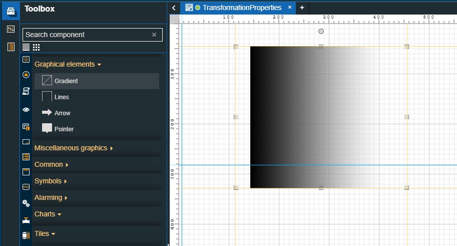
Open your project in Designer and go to the Toolbox panel, in the contextual actions area.
Drag a component on the drawing surface of the page and resize it as desired. For this tutorial, we shall use a graphic element, such as the Gradient component.
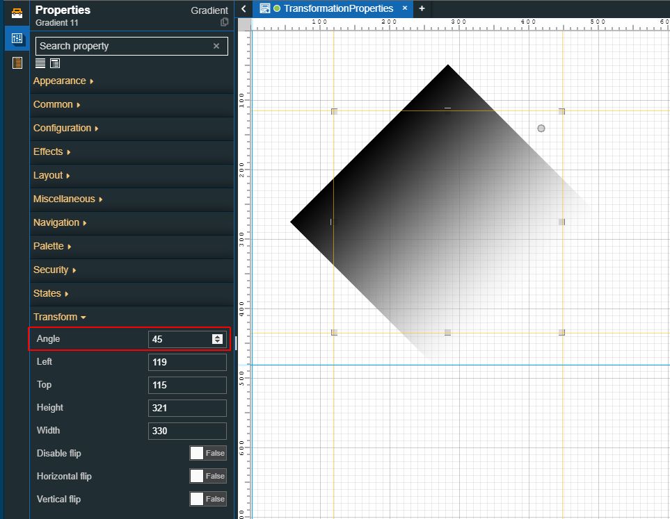
Open the Properties panel of the Robot component to change its rotation angle.
To change the rotation angle to a precise value, use the Angle property and set it to value
Tip
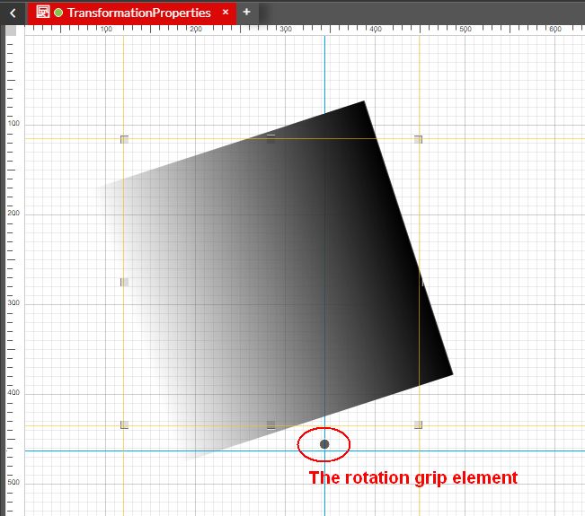
You can also rotate the component using the component's rotation grip.
Flipping components
Check out this article and learn more details about the components flipping options available under the Transform category of each component.
Another powerful transformation feature provided to you by the i4designer tool is the flipping feature. Some of your project visualizations might require flipping components on a vertical or a horizontal axis, with the scope to create a mirror image or to adjust the pointing direction of your components.
By enabling the "Disable flip" property your components will be kept in a locked position (flip-wise).
Important
Currently, when flipping a component that uses fixed positioning, such as Layout Modes other than Default, will not translate over their flip axis since their position is fixed.
The flip functionality does not flip the textual contents of your components, therefore your texts will not be affected by flipping actions.
Please follow the steps below for a quick guide on how to use the flipping feature while designing your project visualization:
Open your project in Designer and go to the Toolbox panel.
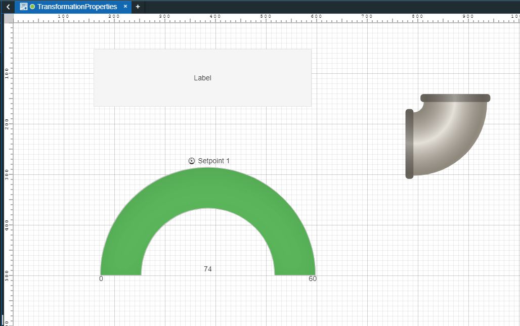
Drag your components on the drawing surface. For this tutorial, we will use a Label component, a Gauge component, and a PipeJoint90 component.
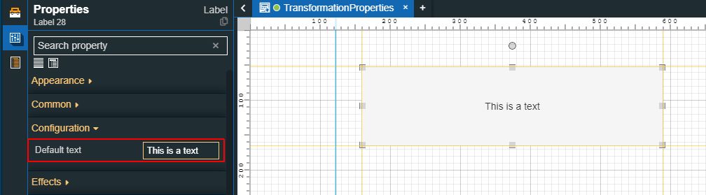
Select the Label component and configure it as follows:
Double-click the Label component to open the Properties panel.
Identify the Default text property and type in your text.
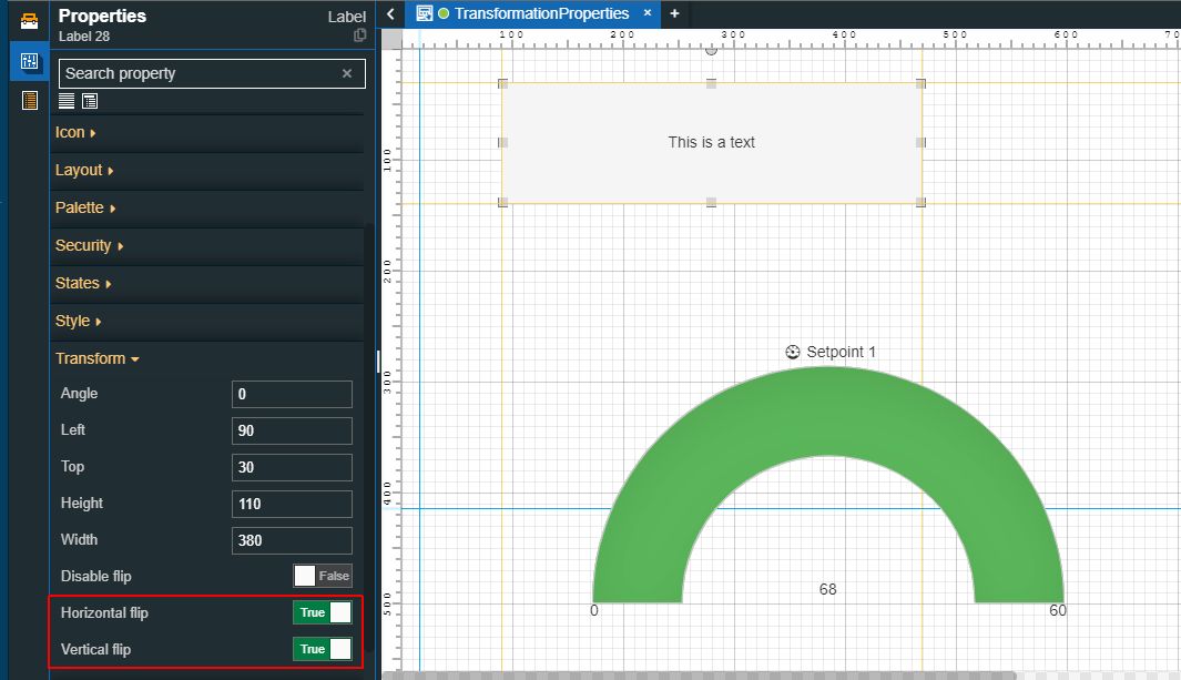
Go to the Transform category and enable the Horizontal flip and/or Vertical flip properties. Even though the Disable flip property was not enabled, the textual information displayed by the component is not flipped.
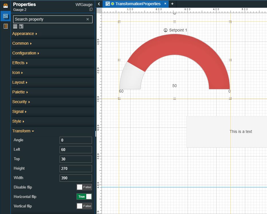
Select the Gauge component and configure it as follows:
Double-click the Gauge component to open the Properties panel.
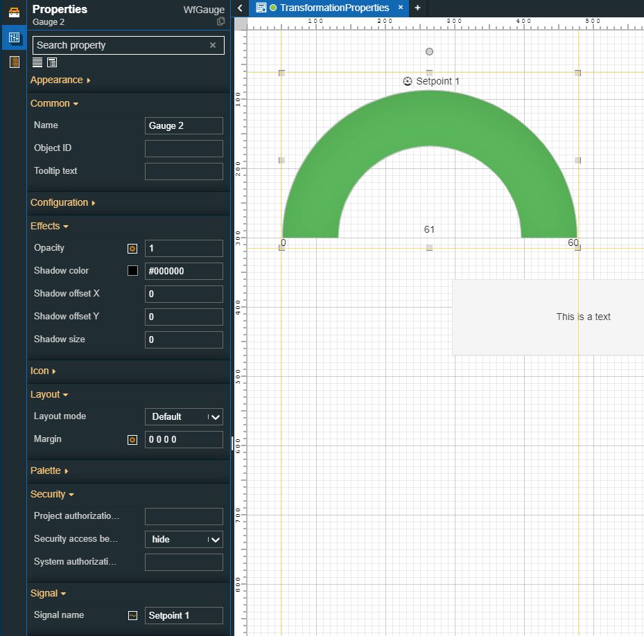
Go to the Transform category and enable the Horizontal flip property. The component is flipped on the horizontal axis, as visible in the screenshot below. The textual information will not be inverted by this action.
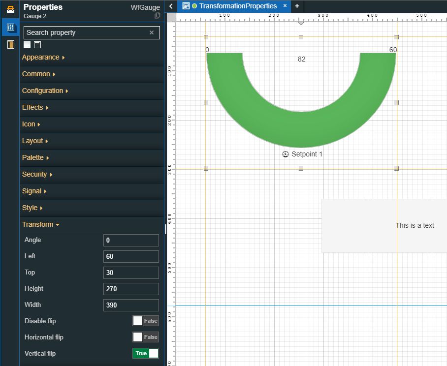
Next, enable the Vertical flip property. The component is flipped on the vertical axis, as visible in the screenshot below. The textual information will not be inverted by this action.
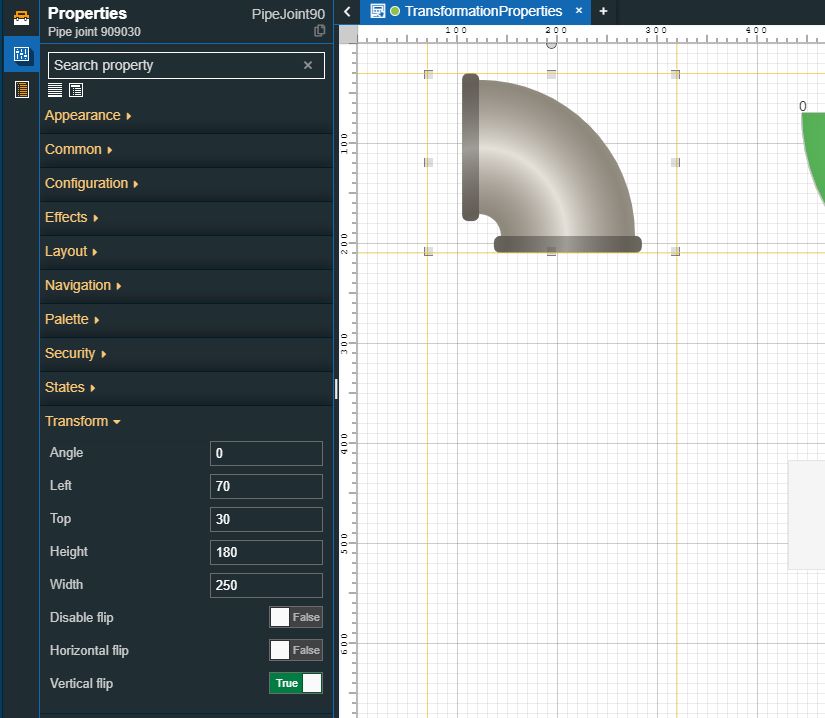
Select the PipeJoint90 component and configure it as follows:
Double-click the PipeJoint90 component to open the Properties panel.
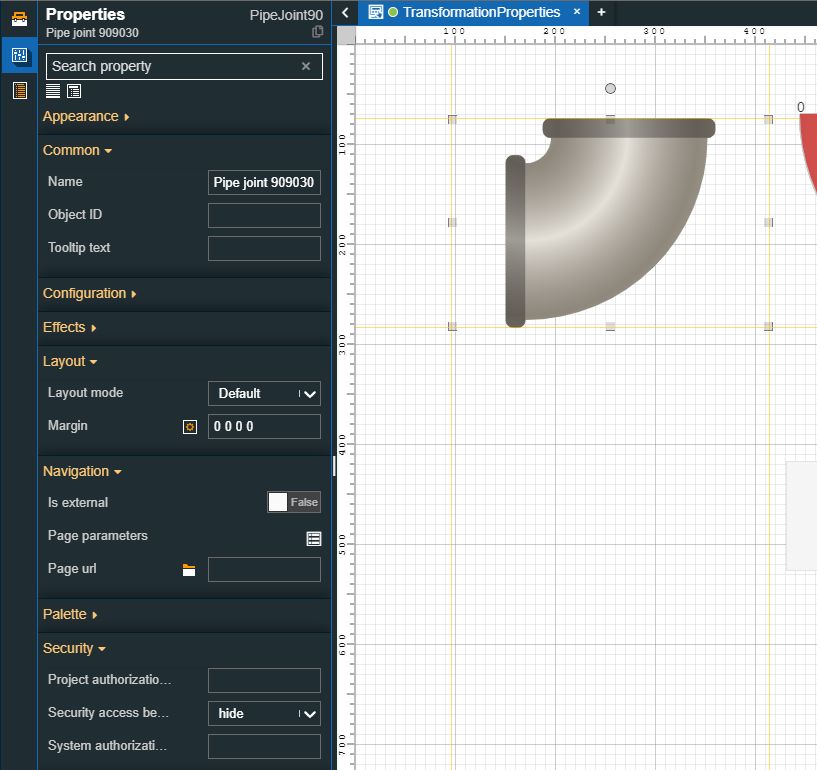
Go to the Transform category and enable the Horizontal flip property. The component is flipped on the horizontal axis, as visible in the screenshot below.
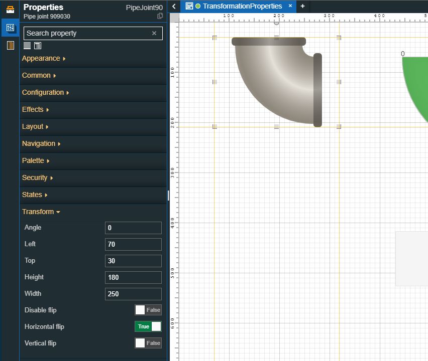
Next, enable the Vertical flip property. The component is flipped on the vertical axis, as visible in the screenshot below. The textual information will not be inverted by this action.
Mirroring components
Check out this article and learn how to mirror components on your project page, using the power of the copy and flip functions.
Using the Copy and Flip functions, you can mirror your components on your project visualization, as follows:
Open your project in Designer and go to the Toolbox panel, in the contextual actions area.
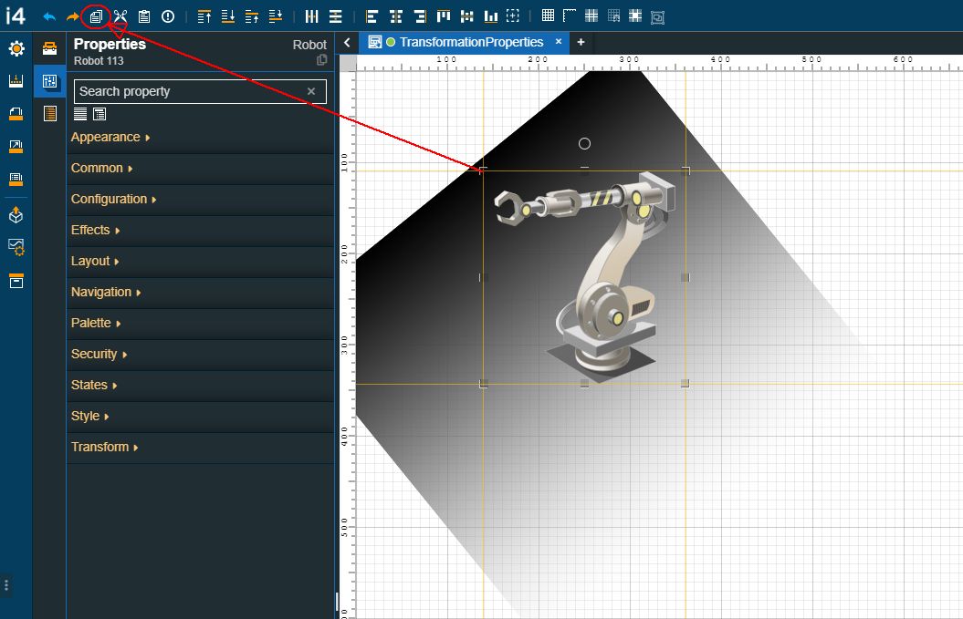
Drag a component on the drawing surface of the page. For this tutorial, we shall use a graphic component, such as the Robot.
Resize it as desired, using either the Height/Width properties or simply dragging the component's corners until it reaches the expected size.
Next, make sure that the Robot component is selected and click the Copy button in the quick actions toolbar.
Tip
You can also copy the component by using the keyboard shortcut CTRL+C.
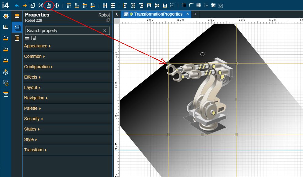
Add the component copy to the project page by clicking the Paste button in the quick actions toolbar.
Tip
You can also paste the component by using the keyboard shortcut CTRL+V.
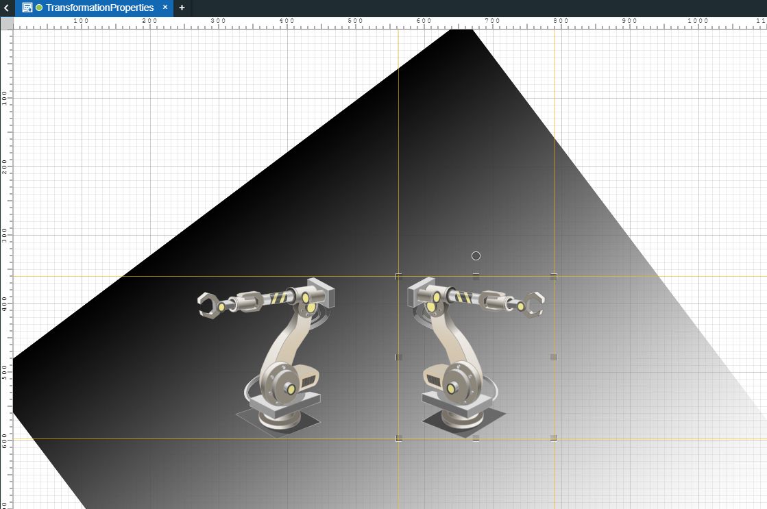
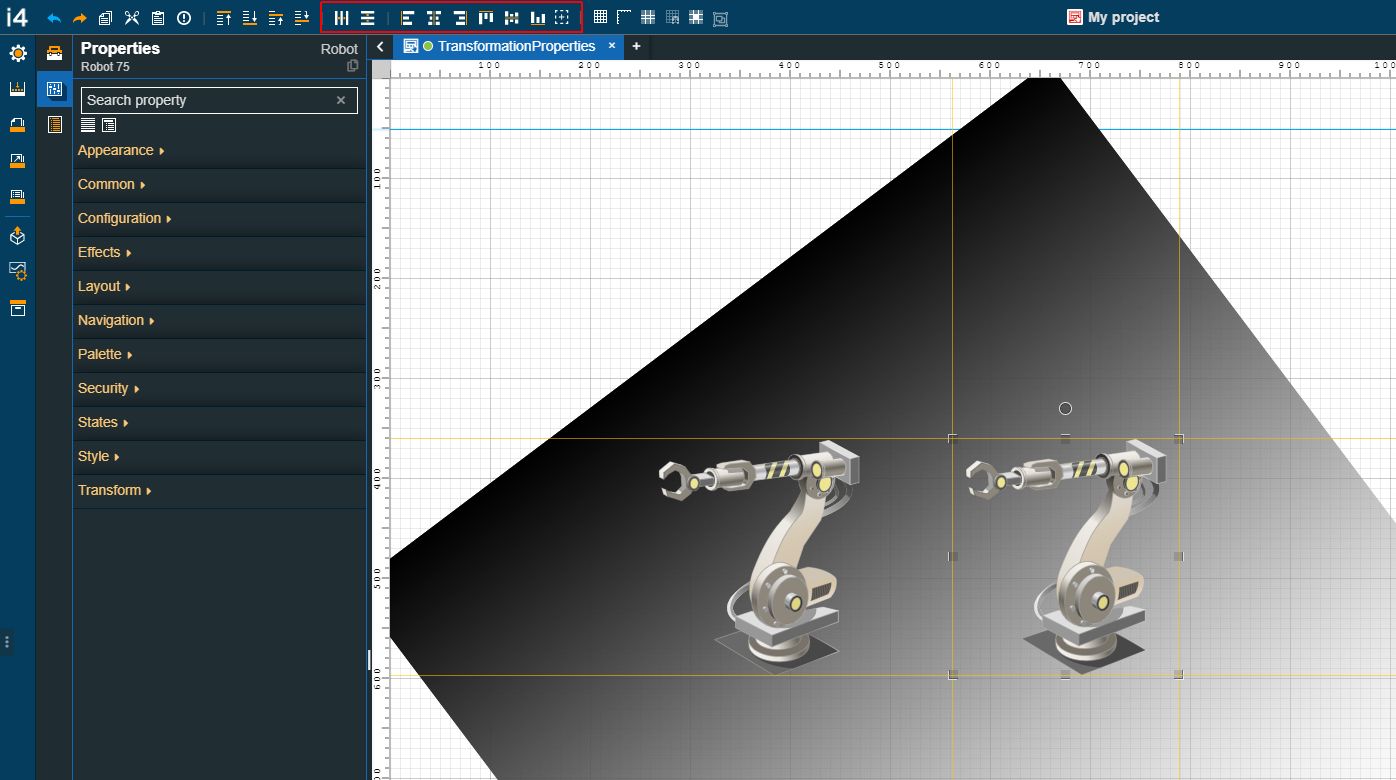
As soon as we have two identical Robot components on the page, we shall adjust their position, as desired.
Tip
You can use the alignment and distribution features to adjust the position of the components.
Last but not least, select the second added Robot component and enable the Horizontal flip property, under the Transform category of the Properties panel.
As a result, the second Robot will be flipped horizontally, resulting in a mirror image of the first Robot component.