i4designer Utilities components tutorials
Check out these articles and learn how to use the Local script and Local array splitter components in your projects.
These tutorials demonstrate how to use the Utility components to achieve the following:
Convert a numerical signal value to binary, using the Local script component
Break the obtained binary value into multiple arrays, using the Local array splitter
Using the Local script to convert a signal value from numerical to binary
Check out this article and learn how to use the Local script component to convert a signal value from numerical to binary.
To convert the value of a signal from numerical to binary, please follow the below-described steps:
Open an i4designer project in design mode. For the present tutorial, we shall use an i4scada platform project.
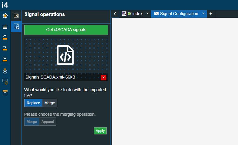
Go to the Signal configurations menu and open it, in order to upload your target system signals in the Designer. As we are working on a SCADA platform project, we shall upload the i4scada Demo project Signals.
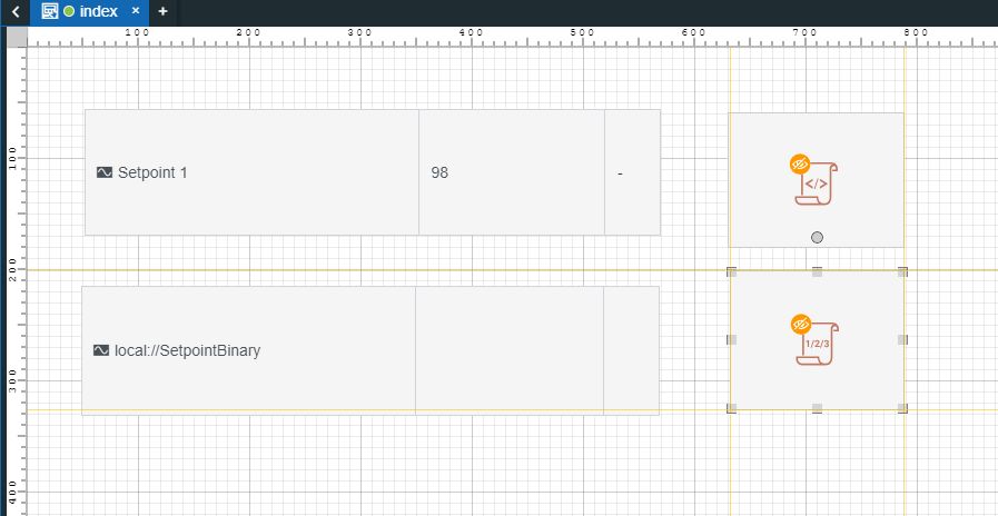
After the needed signals have been uploaded return to the default project page and drag the following components:
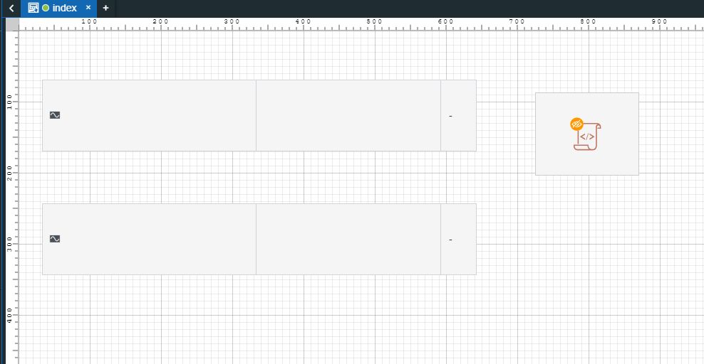
two Signal control components
one Local script component
Now let's proceed with configuring the first Signal control component, as follows:
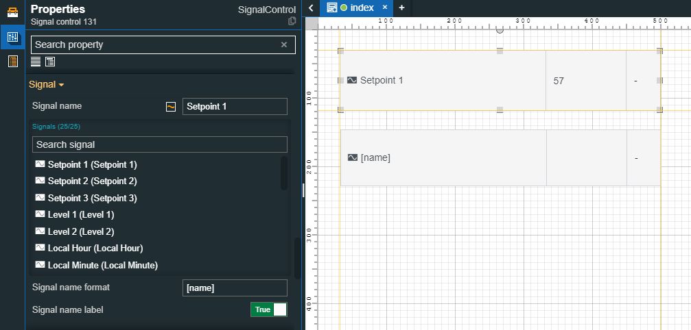
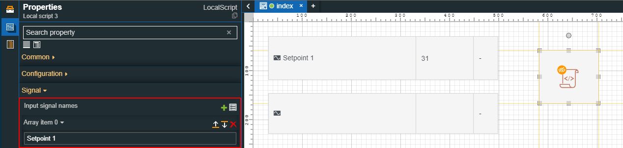
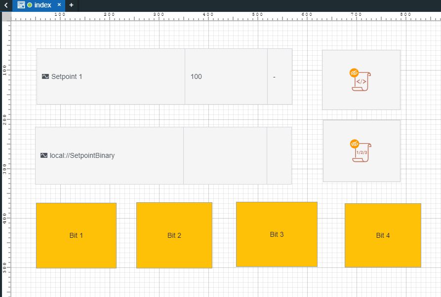
Select your desired signal at the Signal name property. For this demonstration, we shall select the i4scada Demo project signal "Setpoint 1".
Set the Signal name label property to True, in order that we have a better overview of each project component.
Set the Mode property to ReadWrite mode in order that we can both read and write signals.
Make sure you saved the settings done so far.
To configure the Local script component, proceed as follows:
Tip
The Local script component provides the user with access to an Input signal name series, hence, each time one of the Input signal values is changing, the user will have access to the Input signal values and to other complex signal services.
Select the same signal as the one used for the first Signal control component, for the Input signal name field (in our case, the "Setpoint 1").
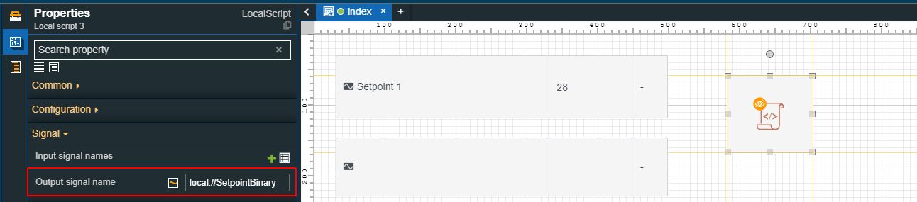
Fill in a Client-side signal in the Output signal name field.
Tip
A Client-side signal is a signal that only exists in the client application and has a lifetime that is directly related to the session lifetime. Client-side signals are identified by the case-sensitive prefix: "local://". For more details about Client-side signals please visit the documentation article of the Local script component.
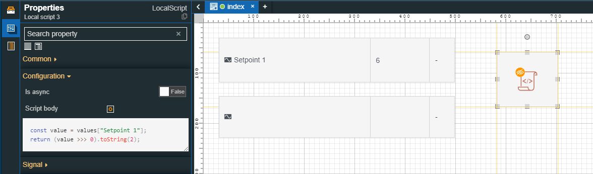
Fill in the Script body used to convert values from numerical to binary.
The Script body editor can support any Java script.
Tip
For the present tutorial, we used the following script:
const value = values["Setpoint 1"];
return (value >>> 0).toString(2);
Hence, each time the value of Setpoint 1 the script will be retriggered to return its binary conversion.
Make sure you saved the settings done so far.
In order to test our results, in simulation mode, let's proceed with configuring the second Signal control component, as follows:
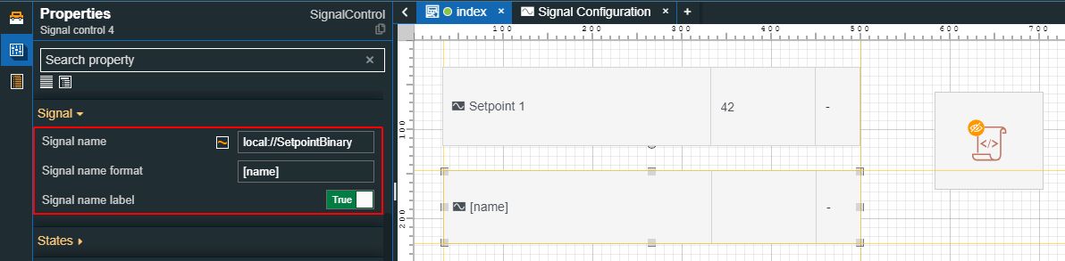
Fill in the Signal name field of the Client-side signal used as Output for the Local script component. In our case, we shall use the "local://SetpointBinary" signal.
Set the Signal name label property to True, in order that we have a better overview of each project component.
Set the Mode property to ReadWrite mode in order that we can both read and write signals.
Set the Is alphanumeric property to True.
Make sure you saved the settings done so far.
Now let's proceed with building and publishing our project, to check it at run-time, as well.
Tip
For more details on how to build and publish your i4designer projects, please also visit our tutorials section here.
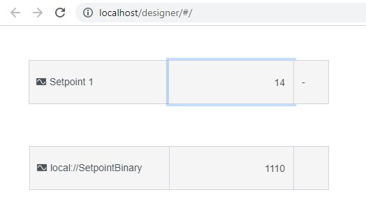
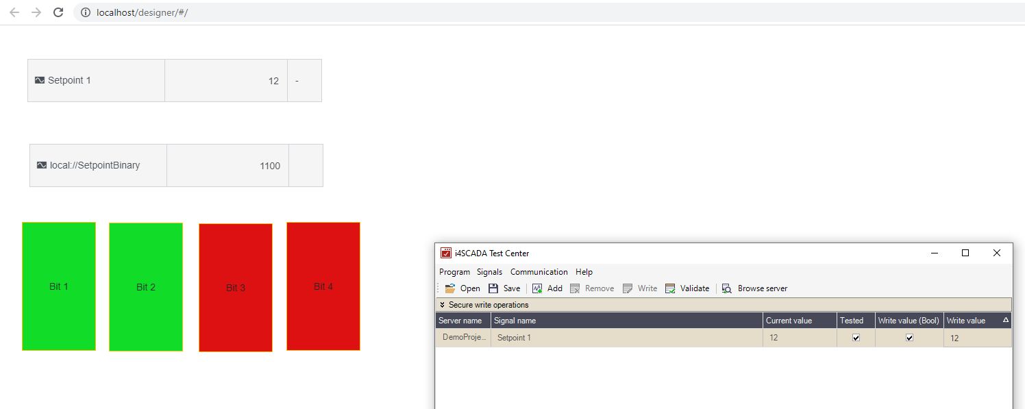
At run-time, the value of the first Signal control component converts the value of the second Signal control component from numeric to binary.
Using the Local array splitter to break binary values into single bits
Check out this article and learn how to break a binary value into single bits, using the Local array splitter component.
The Local array splitter component allows the user to break a binary value into single bits.
During the previously created i4designer project we have already converted the values of a numerical signal into a binary value, using the Local script component. In our case, the second Signal Control component outputs the binary value of the Client-side signal "local://SetpointBinary".
Our goal is to break the Input signal "local://SetpointBinary" into multiple Output signals, each getting its value as single bits:
Input signal - local://SetpointBinary
Output signal 1 - SetpointBinaryValue_1
Output signal 2 - SetpointBinaryValue_2
Output signal 3 - SetpointBinaryValue_3
Output signal 4 - SetpointBinaryValue_4
Now, let's start building our project:
Open the previously created i4designer project in design mode.
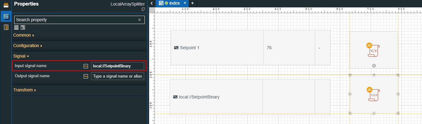
Add a Local array splitter component to the project page and proceed with the following settings:
Increase the Array max size up to the desired value. In our case, we shall increase it up to value 4.
Configure the Array name template, considering the form that the Input signal should have at run-time. In our case, we shall fill in the SetpointBinaryValue_{Index} value.
Tip
The Array name template is built on the basis of the following syntax:
Input signal name + {Input signal index}
In order to automatically parse the Input signal name, the {InputSignalName} placeholder can be used.
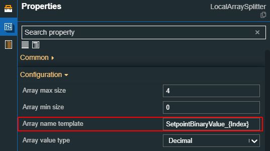
Make sure to set the Array value type to String or Integer, as our Input signal generates binary values.
Fill in the Input signal name, which in our case is the binary values Client-side signal - local://SetpointBinary.
Proceed with other configurations and make sure to save your changes. As our Input signal does not require any separator, quotes, and delimiters, we shall leave these fields either empty or unchanged.
Tip
For more details about the properties of the Local array splitter component, please also visit our article here.
Next, add four Toggle button components on your project page. Our goal is to enable a set of states for each Toggle button component in order that the color is changed from green when the Signal value is 0 to red when the Signal value is 1. Now, let's configure them as follows:
Open the Properties panel for the first Toggle button component and proceed as follows:
Change the Button text in order that it displays a piece of more meaningful information. In our case, we named it Bit 1.
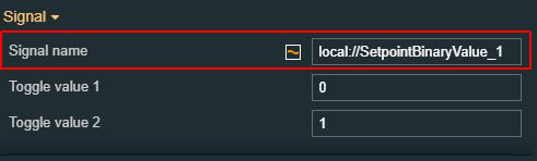
Set the Signal name. In our case, we used the Input Signal Array name, added at step 2b.
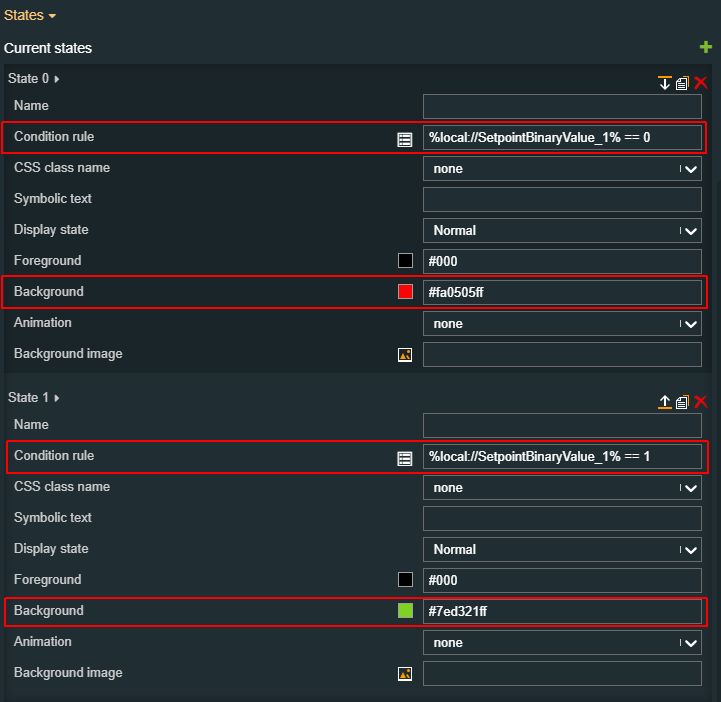
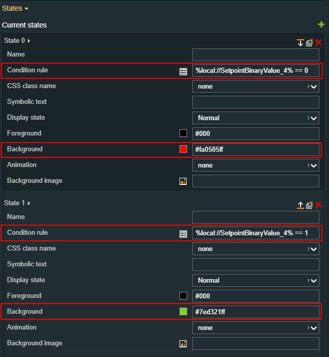
Add two new states to capture the signal value change by filling in the condition rules.
For the present tutorial, we added:
State 1: Condition rule %local://SetpointBinaryValue_1% == 0 changes the component's color to Red
State 2: Condition rule %local://SetpointBinaryValue_1% == 1 changes the component's color to Green.
Open the Properties panel for the second Toggle button component and proceed as follows:
Change the Button text in order that it displays more meaningful information. In our case, we named it Bit 2.
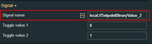
Set the Signal name. In our case, we used the Input Signal Array name, added at step 2b.
Add two new states to capture the signal value change by filling IN the condition rules.
For the present tutorial, we added:
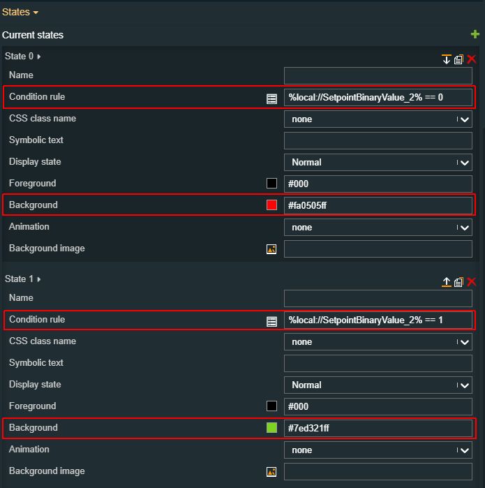
State 1: Condition rule %local://SetpointBinaryValue_2% == 0 changes the component's color to Red
State 2: Condition rule %local://SetpointBinaryValue_2% == 1 changes the component's color to Green.
Open the Properties panel for the third Toggle button component and proceed as follows:
Change the Button text in order that it displays more meaningful information. In our case, we named it Bit 3.
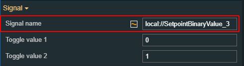
Set the Signal name. In our case, we used the Input Signal Array name, added at step 2b.
Add two new states to capture the signal value change by filling in the condition rules.
For the present tutorial, we added:
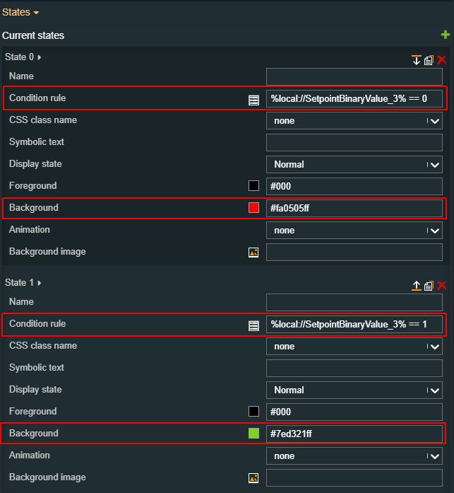
State 1: Condition rule %local://SetpointBinaryValue_3% == 0 changes the component's color to Red
State 2: Condition rule %local://SetpointBinaryValue_3% == 1 changes the component's color to Green.
Open the Properties panel for the fourth Toggle button component and proceed as follows:
Change the Button text in order that it displays more meaningful information. In our case, we named it Bit 1.
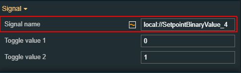
Set the Signal name. In our case, we used the Input Signal Array name, added at step 2b.
Add two new states to capture the signal value change by filling in the condition rules.
For the present tutorial, we added:
State 1: Condition rule %local://SetpointBinaryValue_1% == 0 changes the component's color to Red
State 2: Condition rule %local://SetpointBinaryValue_1% == 1 changes the component's color to Green.
Make sure you save all the changes and proceed with publishing your project.
Tip
For more details on how to build and publish your i4designer projects, please also visit our tutorials section here.
At run-time, we can follow up the colors of the Toggle buttons changing, as soon as the inserted conditions are met.
Using the Custom CSS component
Check out this step-based tutorial to learn how to change the default color of the project page, using the Custom CSS component.
The Custom CSS component allows you to customize the appearance of your project and the appearance of other components, without the worry of general system and project updates overwriting your customizations.
Tip
Please ensure that your custom CSS script is applied and overrides any existing CSS rules by using the “!important“ flag.
Using the Custom CSS component to change the color of your project page
To inject a different color into the background of your project page, please proceed as follows:
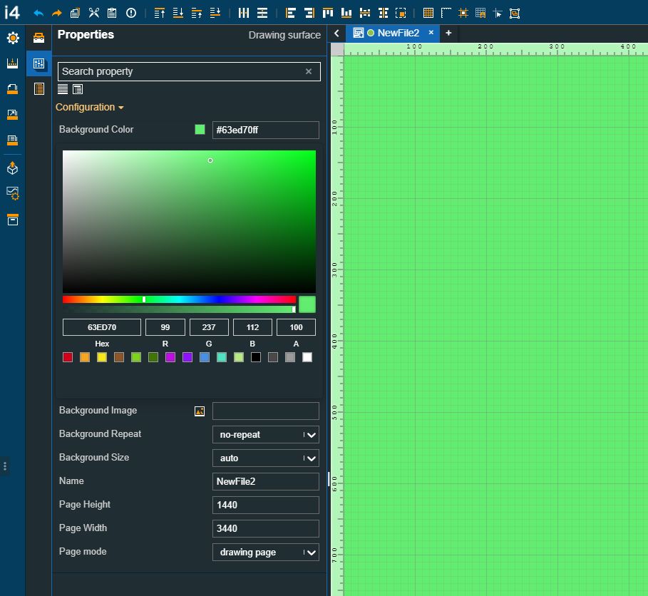
Open an i4designer project in Designer.
Go to the Project Properties panel and select a color for the default project page.
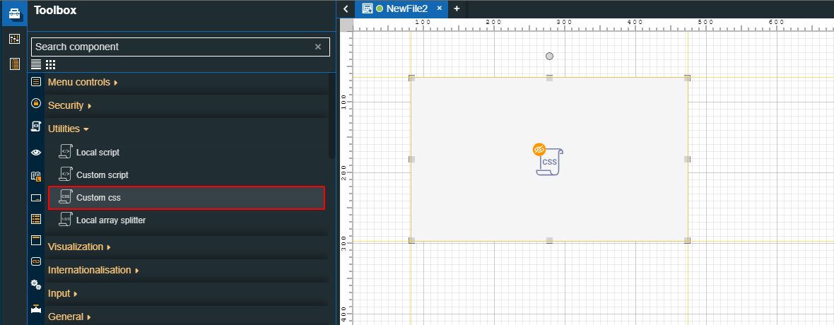
Open the Components Toolbox panel and drag the Custom CSS component to the project page.
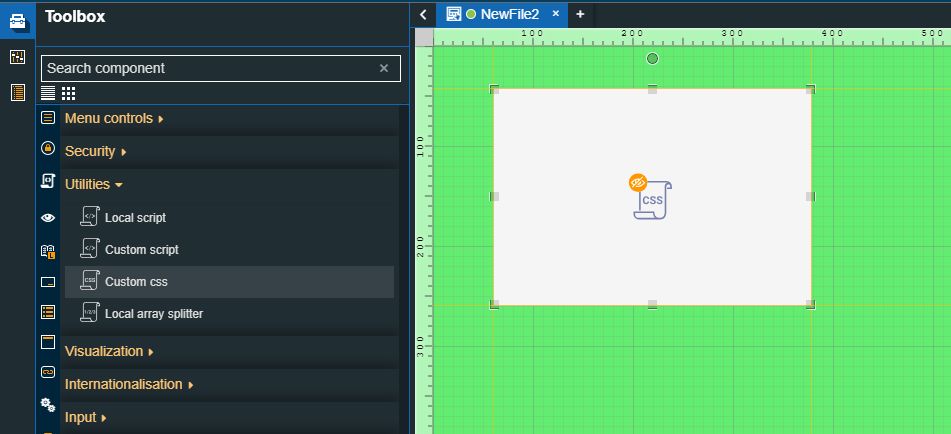
Tip
The component can be added anywhere on the drawing surface since it will not be visible at run-time.
Double-click the Custom CSS component to open the Properties panel. In this view, proceed with the following settings:
Add your script to the CSS body field. For this tutorial, we added the following script:
.i4d-artboard-container {
  background-color: red !important;
}
The above script was composed as follows:
Selector - the class selector for the project page, which in our case is "i4d-artboard-container"
Declaration block - containing the property (background-color) and the property value (red)
Tip
Please ensure that your custom CSS script is applied and overrides any existing CSS rules by using the “!important“ flag.
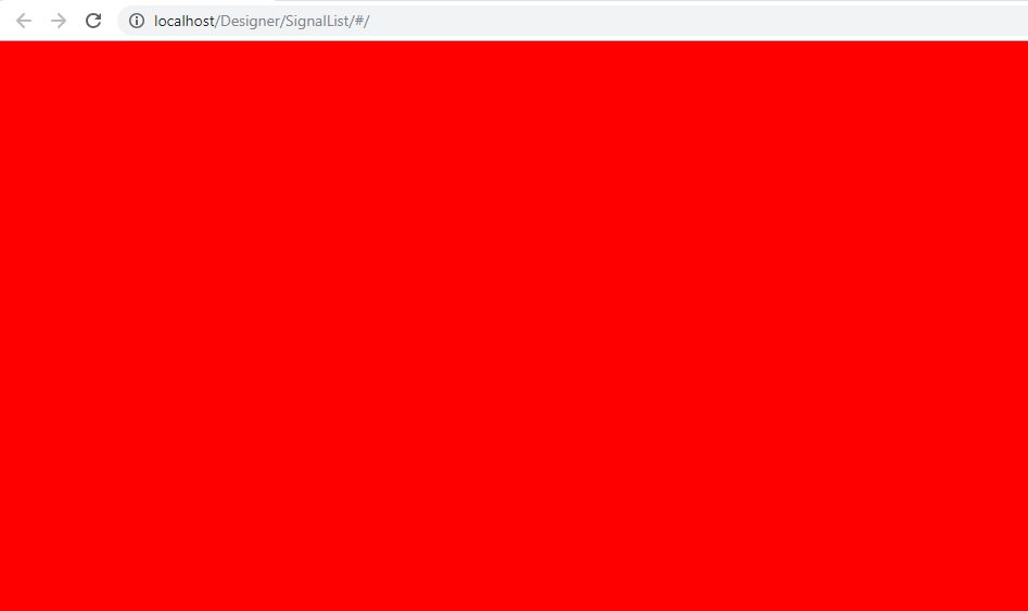
Therefore, our run-time expectation is to have a red project page, despite the fact that the page color was set to green.
Make sure to save your changes.
Next, build and publish the project to your target environment.
Tip
For more details, please also check the dedicated tutorials, here.
Open the project visualization. The project page's color is red.
Using the Custom CSS component to change the color of a component, using the component's ID
To inject a different color into a component on your project page, please proceed as follows:
Open an i4designer project in Designer.
Open the Components Toolbox panel and drag the Custom CSS component to the project page.
Tip
The component can be added anywhere on the drawing surface since it will not be visible at run-time.
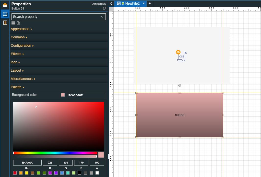
Next, add a Button component to the project page and change its default color.
Double-click the Custom CSS component to open the Properties panel. In this view, proceed with the following settings:
Add your script to the CSS body field. For this tutorial, we added the following script:
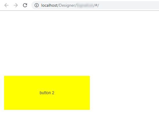
#WfButton12 button {
   background-color: yellow !important;
}
The above script was composed as follows:
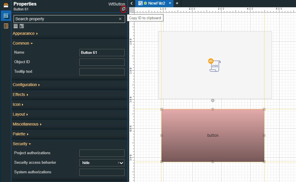
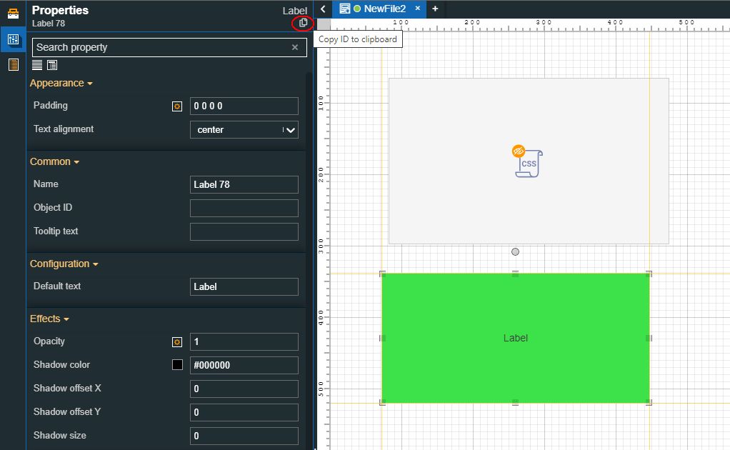
Selector - the ID of the element we want to style can be obtained by selecting the design-time component and copying its ID, along with the component type.
Declaration block - containing the property (background-color) and the property value (yellow)
Tip
Please ensure that your custom CSS script is applied and overrides any existing CSS rules by using the “!important“ flag.
Therefore, our run-time expectation is to have a yellow button component, despite the fact that the component's color was set to pink.
Make sure to save your changes.
Next, build and publish the project to your target environment.
Tip
For more details, please also check the dedicated tutorials, here.
Open the project visualization. The Button component's background color is yellow.
Using the Custom CSS component to change the color of a component, using the component's element
To inject a different color to a component on your project page, please proceed as follows:
Open an i4designer project in Designer.
Open the Components Toolbox panel and drag the Custom CSS component to the project page.
Tip
The component can be added anywhere on the drawing surface since it will not be visible at run-time.
Next, add a Label component to the project page and change its default color.
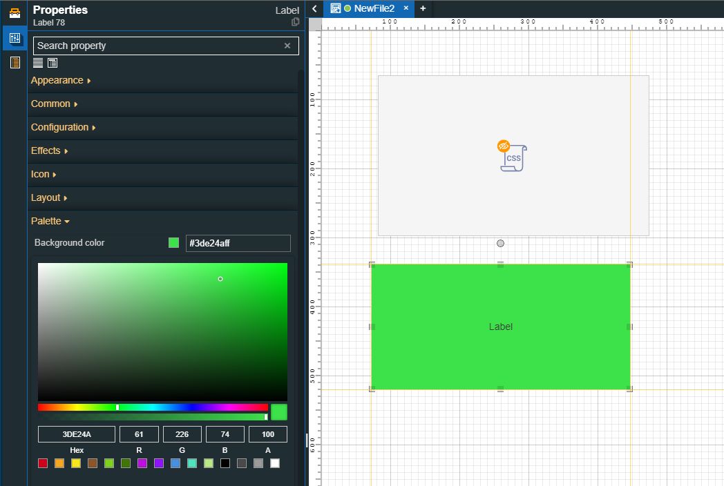
Double-click the Custom CSS component to open the Properties panel. In this view, proceed with the following settings:
Add your script to the CSS body field. For this tutorial, we added the following script:
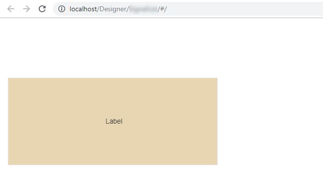
#Label11 div.stretched {
   background-color: #e8d6b2ff !important;
}
The above script was composed as follows:
Selector - the ID of the element we want to style can be obtained by selecting the design-time component and copying its ID, along with the component element.
Declaration block - containing the property (background-color) and the property value (#e8d6b2ff)
Therefore, our run-time expectation is to have a beige label component, despite the fact that the component's color was set to green.
Tip
Please ensure that your custom CSS script is applied and overrides any existing CSS rules by using the “!important“ flag.
Make sure to save your changes
Next, build and publish the project to your target environment.
Tip
For more details, please also check the dedicated tutorials, here.
Open the project visualization. The Label component's background color is beige.
Using the Custom Script component
Check out this article and learn how to use the Custom Script component to append a script body to customize another component.
The Custom Script component allows you to customize the behavior of other components, without the worry of general system and project updates overwriting your customizations.
Since the trigger method for the Custom script component is different from the ones used by the Local script component, please follow the below-described steps to obtain (get) the value of a Signal and write a different value for it, using a custom script, in asynchronous mode.
Open an i4designer project in Designer.
Open the Components Toolbox panel and drag the Custom Script component to the project page.
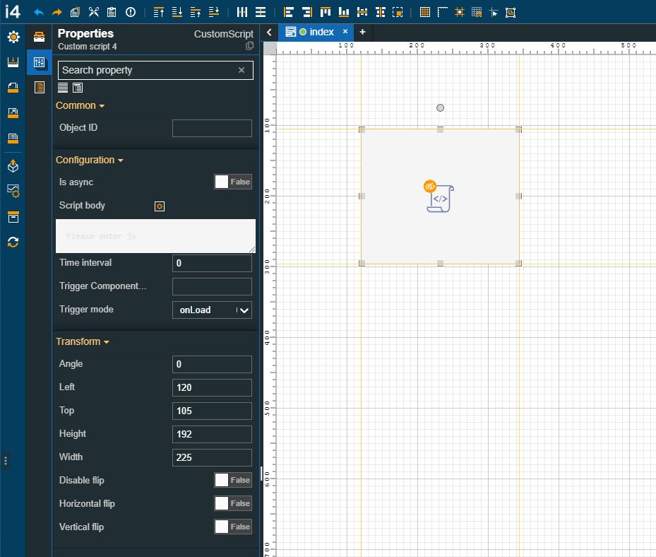
Tip
The component can be added anywhere on the drawing surface since it will not be visible at run-time.
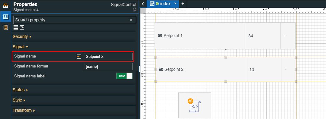
Add two Signal control components on the project page, as well, and configure them as follows:
Double-click the first Signal control component to open the Properties panel. Select your Signal and enable the ReadWrite mode.
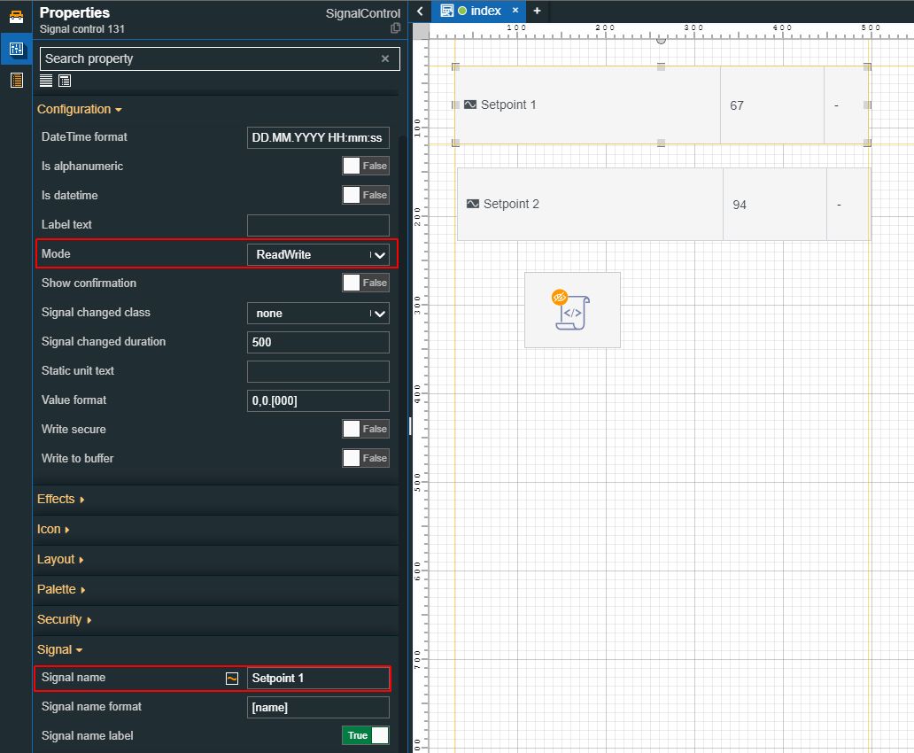
Double-click the second Signal control component to open the Properties panel and select your Signal.
Tip
The first Signal control component will be used to view the value of a Signal, and the other one will be used for writing the new value(s).
Next, double-click the Custom script component to open the Properties panel and proceed as follows:
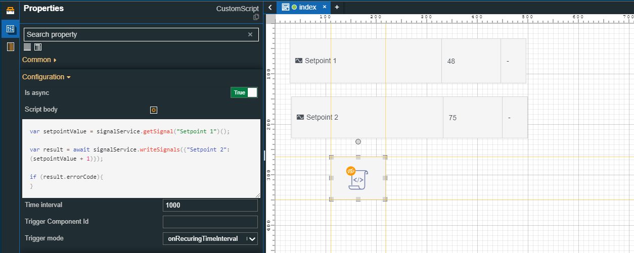
Enable the Is async property.
Fill in your JS script.
Set the Time interval property to 1000 milliseconds and the Trigger mode property to the "onRecuringTimeInterval" setting. This means that every 1000 milliseconds the second Signal value will be changed, according to our script.
Make sure that your changes are saved.
Next, build and publish the project to your target environment.
Tip
For more details, please also check the dedicated tutorials, here.
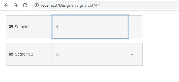
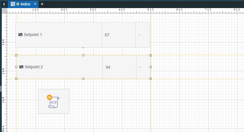
Open the project visualization. The two Signal control components display the current Signal value, where "Setpoint 1" has a value of "0" and within one second, "Setpoint 2" displays a value of "1", as defined by the script.
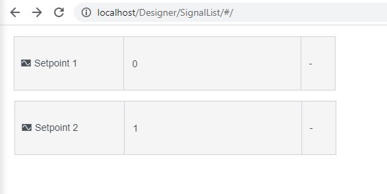
Change the value of "Setpoint 1" to "5". Within a second, the value of "Setpoint 2" is updated to "6".