HTML Alarm and Report Manager at design-time
Refresh your memory and read this article, before jumping head-first into the i4scada SmartEditor HTML Alarm and Report Manager project.
The scope of this article is to describe the i4scada SmartEdtor Alarms and Reports extensions. They can be found in the i4scada SmartEditor Toolbox under category Alarms and Reports, as follows:
Important
The i4-core handles the connection between your visualization and the i4scada Server. Without it, the communication with the i4scada Server is not possible!
The extension must be placed on any i4scada project page that contains other i4scada extensions, which need to interact with the Server.
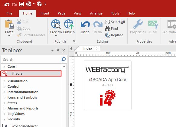
i4-core extension
The SmartEditor wf-alarm-state-manager
The wf-alarm-state-manager extension provides the user with a set of simple operations that will be described within the run-time article.
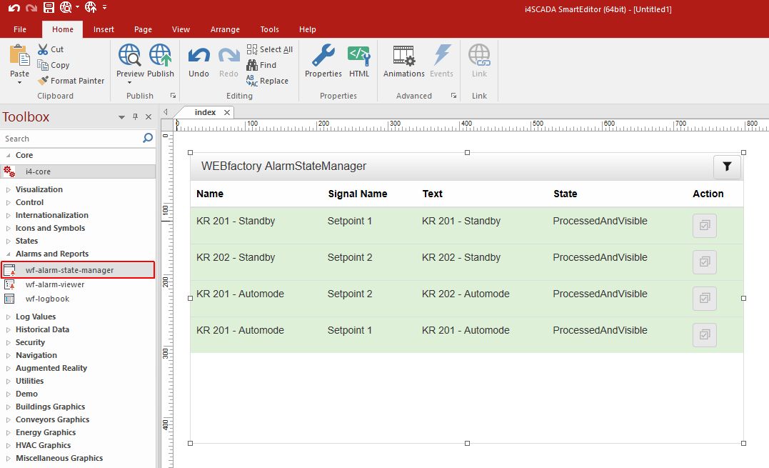
The wf-alarm-state-manager
The wf-alarm-state-manager extension can be configured at design-time, using the Object Properties window, opened by double clicking the extension, on the design surface, or by means of right-click and selecting the Object Properties option from the contextual view pop-up dialog.
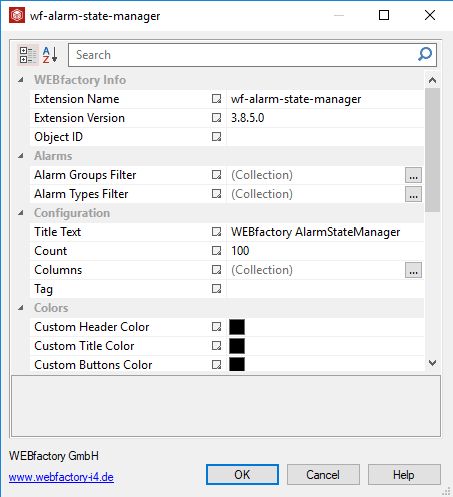
The Object Properties window
The wf-alarm-state-manager properties are described in the below table:
Category | Property | Description |
|---|---|---|
WEBfactory Info | Extension Name | Displays the default name of the extension "wf-alarm-state-manager". However, the user can manually update the name of the extension. |
Extension Version | Displays the Ewon by HMS Networks extension version. | |
Object ID | Sets the Object ID of the component. By defining an object ID for the control, it can be passed as SignalPrefix when using parameter passing in navigation. The value of the Object ID can be used via a placeholder [OID] in other properties of this extension. The placeholder is supported in all signal properties, symbolic text and states. | |
Alarms | Alarm Groups Filter | Sets the alarm group that will be used as initial alarm filter. This filter will be applied automatically when running the extension in the web browser. The filter can be applied by using the collection option, by providing the Group Name as specified in i4scada Studio. The Group Name may contain the placeholder character "*" in order to apply the filter for all the Alarm Groups in the i4scada server. |
Alarm Types Filter | Sets the alarm types that will be used as initial alarm filter. This filter will be applied automatically when running the extension in the web browser. The filter can be applied by using the collection option, by providing the Alarm Type Name as specified in i4scada Studio. The Group Name may contain the placeholder character "*" in order to apply the filter for all the Alarm Types in the i4scada server. | |
Configuration | Title Text | Sets the text to be displayed for the extension header. The default Title Text is "WEBfactory AlarmStateManager" but the user can manually update it as desired. |
Count | Sets the maximum amount of displayed entries. The default value is set to 100 but the user can manually increase the value or by using the up and down arrows. | |
Columns | Sets the columns that will be displayed by the table. By default all the columns are applied, but the user can update them by using the collection option. The user can select the columns from the drop-down list options: Alarm Tag, Signal Name, State, Text. | |
Tag | Defines the Alarm Tag filter that will be used as initial alarm filter. This filter will be applied automatically when running the extension in the web browser. In order to apply this property the user needs to manually fill in the Alarm Tag Name as specified in the i4scada Studio. | |
Colors | Custom Header Color | Sets a custom color for the header bar. The color can be selected from the Color picker tool. For the changes to be applied, the "panel-custom" panel style must be selected. |
Custom Title Color | Sets a custom color for the extension title. The color can be selected from the Color picker tool. For the changes to be applied, the "panel-custom" panel style must be selected. | |
Custom Buttons Color | Sets a custom color for the extension buttons. The color can be selected from the Color picker tool. For the changes to be applied, the "panel-custom" panel style must be selected. | |
Custom Buttons Foreground | Sets a custom color for the buttons foreground. The color can be selected from the Color picker tool. For the changes to be applied, the "panel-custom" panel style must be selected. | |
Layout | Settings Button Visibility | Sets the settings button visibility, if the property is set to True. |
Header Visibility | Sets the header visibility, if the property is set to True. | |
Height | Sets the height of the extension, expressed in pixels. | |
Appearance | Button Bar Style | The predefined style of the top button bar of the extension. The available options can be selected from the drop-down list: btn-custom, btn-danger, btn-default, btn-info, btn-primary, btn-success and btn-warning. |
Custom CSS | Allows the possibility to set a custom CSS code that can be used to add additional styling to the extension. | |
Font Family | Allows the user to select the Font Family of the extension textual information, selecting from the options available in the drop-down list. | |
Font Size | Sets the size of the Fonts inside the panel of the extension, without affecting the text in the header. The Font size property can be updated by manually filling in the desired value or by using the up / down arrows. | |
Panel Style | The style of the panel encapsulating the extension. The property value can be selected from the drop-down list options: panel-default, panel-custom, panel-danger, panel-info, panel-primary, panel-success, panel-warning. | |
Tile CSS | Sets the CSS Class for the tile alarm element. | |
Row CSS | Sets the CSS Class for the row alarm element. |
The SmartEditor wf-alarm-viewer
The wf-alarm-viewer extension enables a set of operations that will be described within the run-time article.
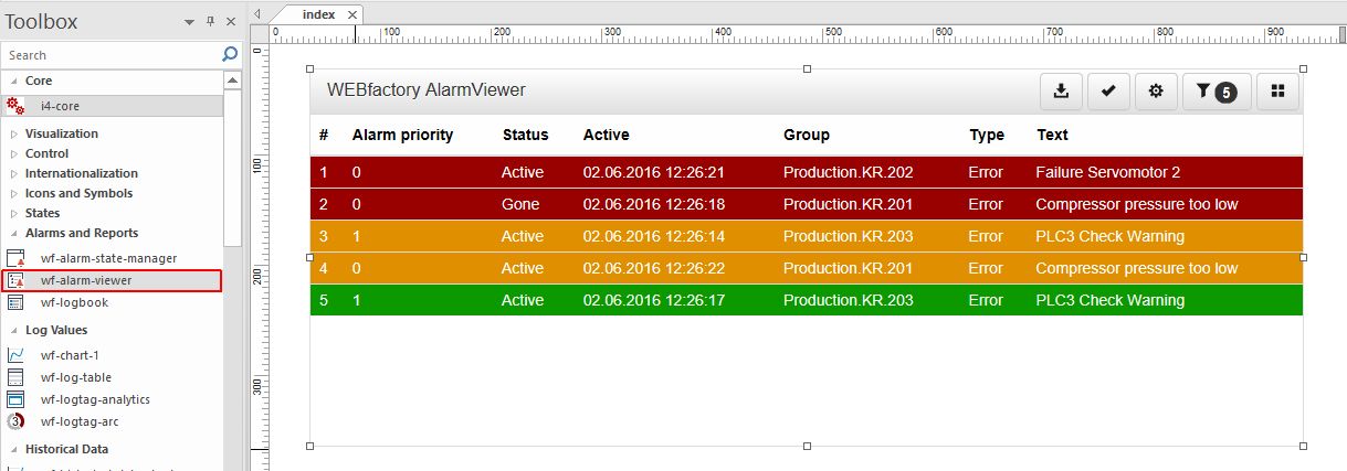
The wf-alarm-viewer
In order to process the configuration settings of the wf-alarm-viewer extension the user can either double click the extension on the design surface or by means of right-click and selecting the Object Properties option from the contextual view pop-up dialog.
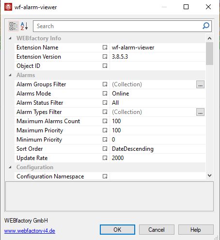
The Object Properties window
The wf-alarm-viewer properties are described in the below table:
Category | Property | Description |
|---|---|---|
WEBfactory Info | Extension Name | Displays the default name of the extension "wf-alarm-viewer". However, the user can manually update the name of the extension. |
Extension Version | Displays the Ewon by HMS Networks extension version. | |
Object ID | Sets the Object ID of the component. By defining an object ID for the control, it can be passed as SignalPrefix when using parameter passing in navigation. The value of the Object ID can be used via a placeholder [OID] in other properties of this extension. The placeholder is supported in all signal properties, symbolic text and states. Example: Setpoint [OID] | |
Alarms | Alarm Groups Filter | Sets the Alarm Group that will be used as initial alarm filter. This filter will be applied automatically when running the extension in the web browser. The filter can be applied by using the collection option, by providing the Group Name as specified in i4scada Studio. The Group Name may contain the placeholder character "*" in order to apply the filter for all the Alarm Groups in the i4scada server. |
Alarms Mode | Sets the method used for getting the alarms. The user can select between the drop-down list options: Online or Offline. When the Online option is set, the current alarms will be retrieved cyclically, using the Update rate value as one polling cycle. When the Offline option is set, only the historical alarms will be loaded from the database. | |
Alarms Status Filter | Sets the Alarm status that will be used as initial alarm filter. This filter will be applied automatically when running the extension in the web browser. Can be: All, Active, ActiveOrNotAcknowledged, gone and NotAcknwoledged. | |
Alarm Types Filter | Sets the alarm types that will be used as initial alarm filter. This filter will be applied automatically when running the extension in the web browser. The filter can be applied by using the collection option, by providing the Alarm Type Name as specified in i4scada Studio. The Group Name may contain the placeholder character "*" in order to apply the filter for all the Alarm Types in the i4scada server. | |
Maximum Alarms Count | Sets the maximum amount of alarms to be retrieved. | |
Maximum Priority | Sets the maximum priority of the alarms to be displayed. This property acts like a priority filter. | |
Minimum Priority | Sets the minimum priority of the alarms to be displayed. This property acts like a priority filter. | |
Sort Order | Sets the order in which alarms are displayed. Can be DateDescending or PriorityDescending. | |
Update Rate | Sets the update rate in milliseconds. This property will be taken into consideration only if the Alarms Mode is set to "Online". | |
Configuration | Configuration Namespace | Sets the abstract environment in which the configuration is uniquely saved. The namespace can be used to organise multiple extension configurations. |
Initial Configuration | Sets the configuration that is applied to the extension by default, when running it inside the visualization. | |
Parameters | Specifies the parameters which allow a certain configuration to be loaded. The parameters selection can be applied by using the collection option and setting the parameter name. | |
Show Only Own Configurations | Defines whether only own configurations are displayed, if setting property to True. | |
Date Time Format | Specifies optional date and time format for the alarm timestamps - e.g. DD.MM.YYYY hh:mm:ss. Available tokens are YYYY, YY, Y, Q, MM, MMM, MMMM, D, DD. Further information are available under https://momentjs.com/docs/ in chapter Year, month and day tokens. | |
Title Text | Sets the text displayed by the component header. | |
Sound File Path | Defines the name or the path of the sound which will be played by the alarms, at run-time, based on the hostname of the Webservice. | |
Play Sound | Allows the user to enable or disable if a sound should be played when a new alarm starts. | |
Loop | Allows the user to play the alarm sound in a loop until the alarm is acknowledged or gone. | |
Link Target | Allows the user with possibility to select the link target method, selecting from the drop-down list options: _blanc, _parent, _self and _top. | |
Export File Name | Defines the name of the exported file. | |
Export Column Delimiter | Defines the delimiter of the columns in the export file. | |
Export Date Time Format | Specifies optional date and time format for the alarm timestamps - e.g. DD.MM.YYYY hh:mm:ss. Available tokens are YYYY, YY, Y, Q, MM, MMM, MMMM, D, DD. Further information are available under https://momentjs.com/docs/ in chapter Year, month and day tokens. | |
Export project Authorization | Project authorization of the user which are required for showing the export button. This option is used in combination with the option \'exportButtonVisibility\'. | |
Start Offset | Selects the type of the start offset interval. Possible targets: seconds, minutes, days, weeks, month and years. | |
Start Offset Interval | Numeric value for the start offset property. | |
End Offset | Selects the type of the end offset interval. Possible targets: seconds, minutes, days, weeks, months and years. | |
End Offset Interval | Numeric value for the end offset property. | |
Rolling Time Window | Allows the user with possibility to enable or disable if the time window is rolling and it is not fixed. | |
Colors | Custom Header Color | Sets a custom color for the header bar. Selection of the color can be processed using the color picker tool. In order to apply this change the "panel-custom" panel style must be selected. |
Custom Title Color | Sets a custom color for the title. Selection of the color can be processed using the color picker tool. In order to apply this change the "panel-custom" panel style must be selected. | |
Custom Buttons Color | Sets a custom color for the extension buttons. Selection of the color can be processed using the color picker tool. In order to apply this change the "panel-custom" panel style must be selected. | |
Custom Buttons Foreground | Sets a custom color for the buttons foreground. Selection of the color can be processed using the color picker tool. In order to apply this change the "panel-custom" panel style must be selected. | |
Acknowledged Alarm Background | Sets a custom color for the background of the acknowledged alarms. The selection of the color can be processed using the color picker tool. In order to apply this change, the "panel-custom" panel style must be selected. | |
Acknowledged Alarm Foreground | Sets a custom color for the foreground of the acknowledged alarms. Selection of the color can be processed using the color picker tool. In order to apply this change, the "panel-custom" panel style must be selected. | |
Acknowledged and Gone Alarm Background | Sets a custom color for the background of the acknowledged and gone alarms. The selection of the color can be processed using the color picker tool. In order to apply this change, the "panel-custom" panel style must be selected | |
Acknowledged and Gone Alarm Foreground | Sets a custom color for the foreground of the acknowledged and gone alarms.The selection of the color can be processed using the color picker tool. In order to apply this change the "panel-custom" panel style must be selected | |
Active Alarm Background | Sets a custom color for the background of the active alarms. Selection of the color can be processed using the color picker tool. In order to apply this change the "panel-custom" panel style must be selected. | |
Active Alarm Foreground | Sets a custom color for the foreground of the active alarms. Selection of the color can be processed using the color picker tool. In order to apply this change the "panel-custom" panel style must be selected. | |
Inactive Alarm Background | Sets a custom color for the background of the inactive alarms. Selection of the color can be processed using the color picker tool. In order to apply this change the "panel-custom" panel style must be selected. | |
Inactive Alarm Foreground | Sets a custom color for the foreground of the inactive alarms. Selection of the color can be processed using the color picker tool. In order to apply this change the "panel-custom" panel style must be selected. | |
Layout | Acknowledgement Button Visibility | Allows the user with possibility to define if the button for acknowledgement of all visible alarms should be shown. |
Configuration Button Visibility | Allows the user with possibility to define if the button for configuration manager should be shown. | |
Export Button Visibility | Allows the user with possibility to define if the button for export should be shown. | |
Settings Button Visibility | Allows the user with possibility to define if the button for settings should be shown. | |
Fields | Defines the fields in a tile / box view by using the collection tool and selecting from the predefined drop-down list items. | |
Filter Alarm Groups By User | Defines whether the alarms filtered by Alarm group rights of the logged in user is applied. | |
Columns | Defines the columns displayed by the alarms table, using the collection tool and selecting from the predefined drop-down list items. | |
Column Filter | Defines the applied column filter, selecting the desired filter from the predefined drop-down listed items. | |
Column Filter Visibility | Displays the column filter selection box and input filed in filter Settings, while at run-time. | |
Column Header Visibility | Enables or disables the visibility of the table header. | |
Column Filter Pattern | Defines the pattern for filtering the specified column. The asterisk symbol can be used as a placeholder for all elements. | |
Group Filter Visibility | Enables or disables the alarm group selection box in filter settings. | |
Header Visibility | Enables or disables the visibility of the chart panel header. | |
Priority Filter Visibility | Enables or disables the visibility of the alarm priority selection box in the filter settings. | |
Row Number Visibility | Enables or disables the visibility of the number in front of each table row. | |
State Filter Visibility | Enables or disables the visibility of the alarm state selection box in the filter settings. | |
Type Filter Visibility | Enables or disables the visibility of the alarm type selection box in the filter settings. | |
Template Switch Visibility | Enables or disables the visibility of the switch for the tiles and table view. | |
View Mode | Selects the alarm items format to be displayed at run time, selecting from the drop-down list options: Table and Grid. | |
Table Cell Vertical Padding | Sets the vertical padding of the table cells allowing control over the rows height. The expressed value is measured in pixels. | |
Appearance | Button Bar Style | Sets the predefined style of the top button bar of the extension, allowing the user the possibility to select from the drop-down list options: btn-default, btn-custom, btn-danger, btn-info, btn-primary, btn-success and btn-warning. |
Custom CSS | Sets the custom CSS code that can be used to add additional styling to the extension. | |
Font Family | Allows the user to select the Font Family of the extension textual information, selecting from the options available in the drop-down list. | |
Font Size | Sets the size of the Fonts inside the panel of the extension, without affecting the text in the header. The Font size property can be updated by manually filling in the desired value or by using the up / down arrows. | |
Panel Style | The style of the panel encapsulating the extension. The property value can be selected from the drop-down list options: panel-default, panel-custom, panel-danger, panel-info, panel-primary, panel-success, panel-warning. | |
Tile CSS | Sets the CSS Class for the tile alarm element. | |
Row CSS | Sets the CSS Class for the row alarm element. | |
Security | Project Authorization | The project authorization required for displaying the extension. If the logged in user does not have this project authorization, the extension will not be visible. If the property is left empty, the component will be visible to all users. |
System Authorization | The system authorization required to display the extension. If the logged in user does not have this system authorization, the extension will not be visible. If the property is left empty, the component will be visible to all users. |
The SmartEditor wf-logbook
The wf-logbook extension is a real-time multi-user communication environment for Ewon by HMS Networks web applications. It allows chat-like communications in real time, while logging all the messages for later reading.
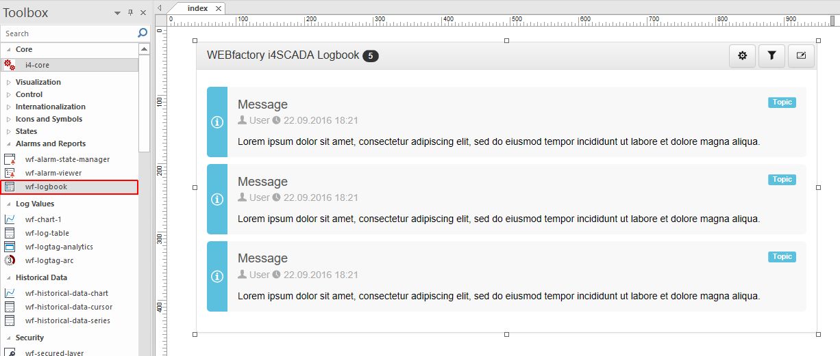
The wf-logbook extension
Using the various settings in design-time, the Ewon by HMS Networks LogBook can be customized to visually fit in any project and satisfy any requirements, from the Object Properties window.
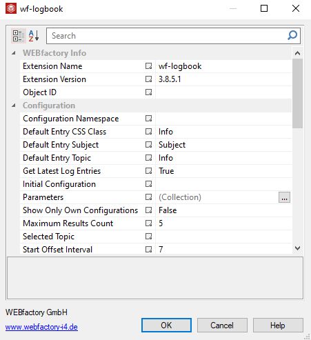
The Object Properties window
The table below describes all the design-time properties of the wf-logbook extension:
Category | Property | Description |
|---|---|---|
WEBfactory Info | Extension Name | Displays the default name of the extension "wf-logbook". However, the user can manually update the name of the extension. |
Extension Version | Displays the Ewon by HMS Networks extension version. | |
Object ID | Sets the Object ID of the component. By defining an object ID for the control, it can be passed as SignalPrefix when using parameter passing in navigation. The value of the Object ID can be used via a placeholder [OID] in other properties of this extension. The placeholder is supported in all signal properties, symbolic text and states. Example: Setpoint [OID] | |
Configuration | Configuration Namespace | Sets the abstract environment in which the configuration is uniquely saved. The namespace can be used to organise multiple extension configurations. |
Default Entry CSS Class | Sets the CSS styling that will be applied by default to any new entry. The available CSS classes with predefined styles are: Danger, Info, Primary, Success and Warning. | |
Default Entry Subject | Sets the default subject for any new logbook entries. The user can select the desired subject by selecting from the drop down list options: Info, Warning, Danger, Error, Critical and Maintenance. | |
Default Entry Topic | Sets the default topic for any new logbook entries. The user can select the desired subject by selecting from the drop down list options: Info, Warning, Danger, Error, Critical and Maintenance. | |
Get Latest Log Entries | If set to True, the Log table will always show the most recent entries, taking into consideration the maximum number of results to be displayed (Maximum Results Count). | |
Initial Configuration | Sets the configuration that is applied to the extension by default, when running it inside the visualization. | |
Parameters | Specifies the parameters which allow a certain configuration to be loaded. The parameters selection can be applied by using the collection option and setting the parameter name. | |
Show Only Own Configuration | Defines whether only own configurations are displayed, if setting property to True. | |
Maximum Results Count | Sets the maximum number of entries to be retrieved. | |
Selected Topic | Filters the Logbook entries by the Topic specified in this property. The messages from other topic will not be listed in the control at run-time. | |
Start Offset Interval | Selects the type of the start offset interval. Possible targets: seconds, minutes, days, weeks, month and years. | |
Table Update Rate | Sets the time in milliseconds between two consecutive database queries. | |
Time Range Offset Unit | Sets the unit of time applied to the Start Offset Interval value, used to offset the time interval for which the data will be displayed. Can be Days, Minutes, Months, Seconds, Weeks and Years. | |
Title Text | Sets the title displayed by the extension header. | |
Colors | Custom Header Color | Sets a custom color for the header bar. Selection of the color can be processed using the color picker tool. In order to apply this change the "panel-custom" panel style must be selected. |
Custom Title Color | Sets a custom color for the title. Selection of the color can be processed using the color picker tool. In order to apply this change the "panel-custom" panel style must be selected. | |
Custom Buttons Color | Sets a custom color for the extension buttons. Selection of the color can be processed using the color picker tool. In order to apply this change the "panel-custom" panel style must be selected. | |
Custom Button Foreground | Sets a custom color for the buttons foreground. Selection of the color can be processed using the color picker tool. In order to apply this change the "panel-custom" panel style must be selected. | |
Layout | Configuration Button Visibility | Allows the user with possibility to define if the button for configuration manager should be shown. |
Header Visibility | Enables or disables the visibility of the table header. | |
Settings Button Visibility | Allows the user with possibility to define if the button for settings should be shown. | |
Appearance | Button Bar Style | Sets the predefined style of the top button bar of the extension, allowing the user the possibility to select from the drop-down list options: btn-default, btn-custom, btn-danger, btn-info, btn-primary, btn-success and btn-warning. |
Custom CSS | Sets the custom CSS code that can be used to add additional styling to the extension. | |
Font Family | Allows the user to select the Font Family of the extension textual information, selecting from the options available in the drop-down list. | |
Panel Style | The style of the panel encapsulating the extension. The property value can be selected from the drop-down list options: panel-default, panel-custom, panel-danger, panel-info, panel-primary, panel-success, panel-warning. | |
Security | Project Authorization | The project authorization required for displaying the extension. If the logged in user does not have this project authorization, the extension will not be visible. If the property is left empty, the component will be visible to all users. |
System Authorization | The system authorization required to display the extension. If the logged in user does not have this system authorization, the extension will not be visible. If the property is left empty, the component will be visible to all users. |