Info popover modal dialogs
Check out this article and learn more about the possibility to add a pop-up info menu to your extensions using the wf-popover-info-layer extension.
The wf-popup-info-layer extension can be used as a container for the i4scada SmartEditor extensions. At run-time, this layer extension opens a pop-up menu, which contents are configurable at design-time. Just as the previously described Modal dialogs functionality, the scope of the pop-up info menu is to reduce the amount of extensions, on the project page.
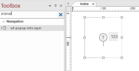
The wf-popup-info-layer at design-time
The wf-popup-info-layer extension is available in the Toolbox panel under the Navigation category. At design time, the extension Object Properties can be configured to define the object layout, colors, appearance, dialog and security.
This extension features also a set of three placeholder parameters:
Object ID - the value of this parameter can be used as a placeholder [OID] inside other properties of the extensions contained by the wf-popup-info-layer.
Tip
Check out this tutorial and learn how to use the Object ID as a parameter placeholder.
Signal Prefix - the prefix is used to construct Signal names in the signal lists of trends. Also the value of this parameter can be used as a placeholder [SP] inside other properties of the extensions contained by the wf-popup-info-layer.
Tip
Check out this tutorial to learn how to user the Signal Prefix as a parameter placeholder.
Object Name ID - the value of this parameter can be used as a placeholder [ONID] inside other properties of the extensions contained by the wf-popup-info-layer.
Tip
Check out this tutorial to learn how to user the Object Name ID as a parameter placeholder.
Additionally, the user can also configure the popover settings, as follows:
Show popover - allows the user to enable or disable the display of the popover modal dialog. By default this option is set to true.
Popover placement - sets the position of the opened popover in relation with the popover button. By default this option is to right, but the user can decide to display the popover at the bottom, left or top.
Popover CSS Class - optional CSS class name for the popover dialog container.
Popover Header Class - sets the style of the Popover Dialog header.
Close Button CSS Class - sets the CSS class for the close button.
Popover Style - sets the style of the opened popover. By default this option is set to value primary, but the user can decide to display the popover as danger, default, info, success, variant-dark or warning.
When the user clicks on the extension contained by the wf-popup-info-layer, at run-time, a menu pops up displaying the following options:
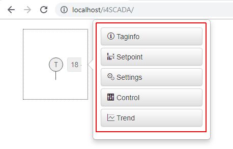
The pop up info menu
Taginfo
Setpoint
Settings
Control
Trend
The contents of the pop-up menu can be enabled or disabled in the Object Properties panel of the extension, as described in the below sections.
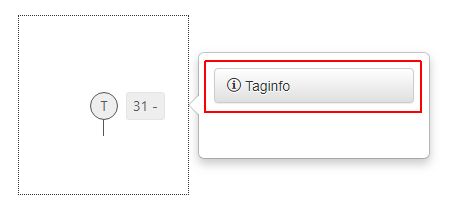
The Taginfo button
The Taginfo scope is to enable a list of all Signals with their live values. The Signal list provides the user with a set of functionalities, such as filtering, enabling advanced security and writing Signal values, that we shall describe in this article.
Signal list opened by the Taginfo option
To enable this button the user needs to set the property Tag Info to true, in the Object Properties panel of the wf-popup-info-layer extension, under Info Dialogs category.
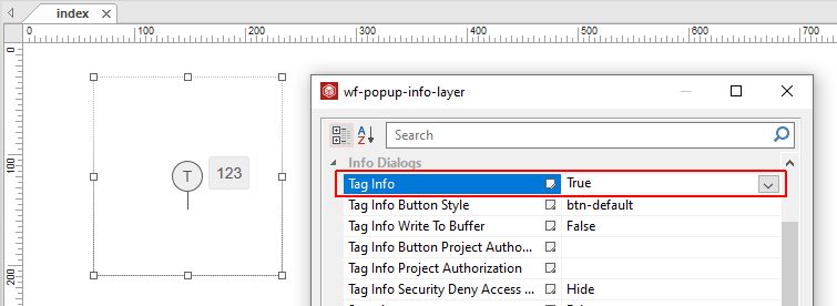
Taginfo menu enabled
By clicking the contained extension, at run-time, the modal dialog pops up displaying the Taginfo button.
The Taginfo button
Further on, the user can set the button style, choosing from the drop-down list options of property Tag Info Button Style.
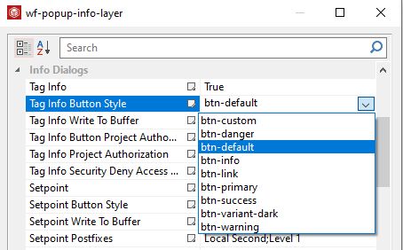
The Button Style options
Hence, by selecting a different style, such as the "btn-info" style, the run-time button appearance is updated correspondingly.
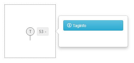
Button style "btn-info"
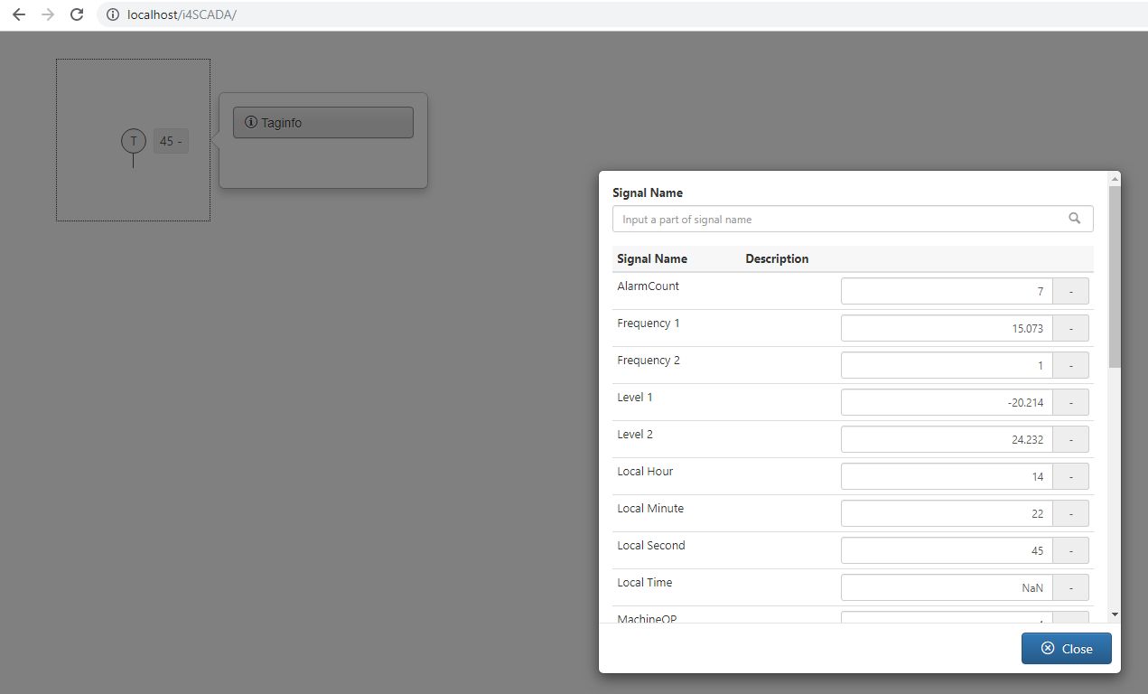
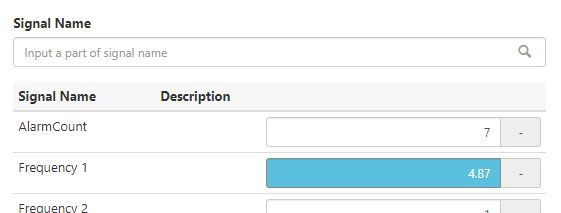
By clicking the Taginfo button at run-time, the list displaying all the Signals in the current database pops up. The values of the Signals are displayed in real-time.
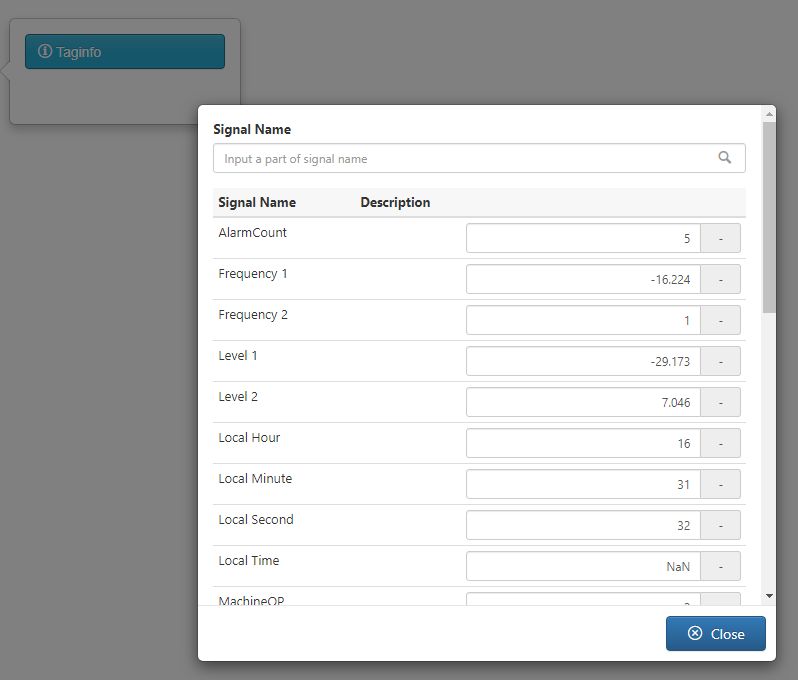
The Taginfo Signal list with real-time values
The Taginfo Signal list view provides a simple filtering mechanism allowing the user to search Signals by typing in the name or part of a Signal name.
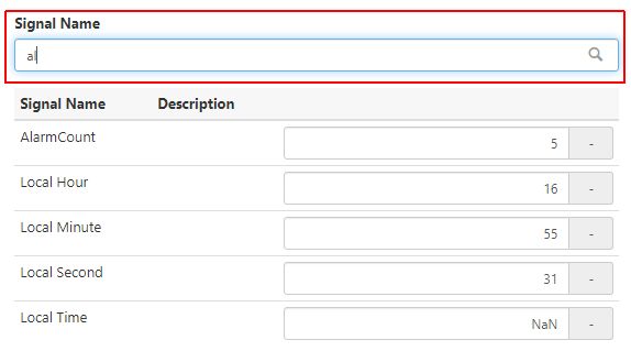
Example of a filter applied to the Signal List
In this view, the user can also manually write Signal values and confirm them by clicking the commit  button. The avoid confusion, an orange highlight is applied to the new Signal value field. The highlight is removed when the Signal update is stored in the server.
Write Signal values
Note
It may be the case that the new entered Signal value is reset by the server to a different value than the entered one. To indicate the user that the written value was reset, a visual feedback is provided by means of a short blink and by removing the new value highlight.
The Tag Info Write To Buffer property enables the batch buffer writing, when it is set to value true.
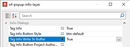
Batch buffer writing enabled
Having this option enabled, the user can manually input one or multiple values at runtime, that will be buffered locally and written in the database only after clicking the Apply button.
Batch buffer writing
Note
If the Signal list view is closed by the user, before applying the new values, the updated fields are highlighted in blue, in order to let the user know that new values are currently buffered locally.
Example of buffered value
The Taginfo button can be configured from Security point of view by means of the following Object Properties properties:
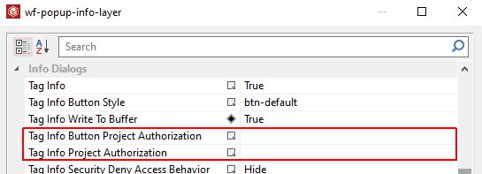
Taginfo Security settings
Tag Info Button Project Authorization - allows the user with possibility to input a Project Authorization required for displaying the button. If the logged in user does not have this Project Authorization, the button will not be visible. If the property is left empty, the button will be visible to all users.
Tag Info Project Authorization - allow the user with possibility to input a Project Authorization required for displaying the Tag Info controls. If the logged in user does not have this Project Authorization, the button will not be visible. If the property is left empty, the button will be visible to all users.
The Setpoint button
The Setpoint button enables a list of Signals with their real-time values.
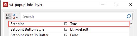
To enable the Setpoint button the user needs to set the property Setpoint to true, in the Object Properties panel of the wf-popup-info-layer extension, under Info Dialogs category.
Enabling the Setpoint button
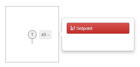
Having this option enabled, the run-time project will display the Setpoint button in the pop-up info modal dialog.
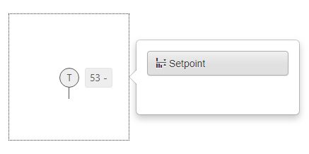
The Setpoint button at runtime
The button appearance can be customised by changing the value of the Setpoint Button Style Object property.
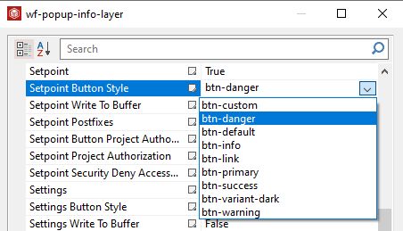
The Setpoint Button Style property
The appearance of the Setpoint button will reflect the changes only at run-time, when its style can be seen.
Button style "btn-danger"
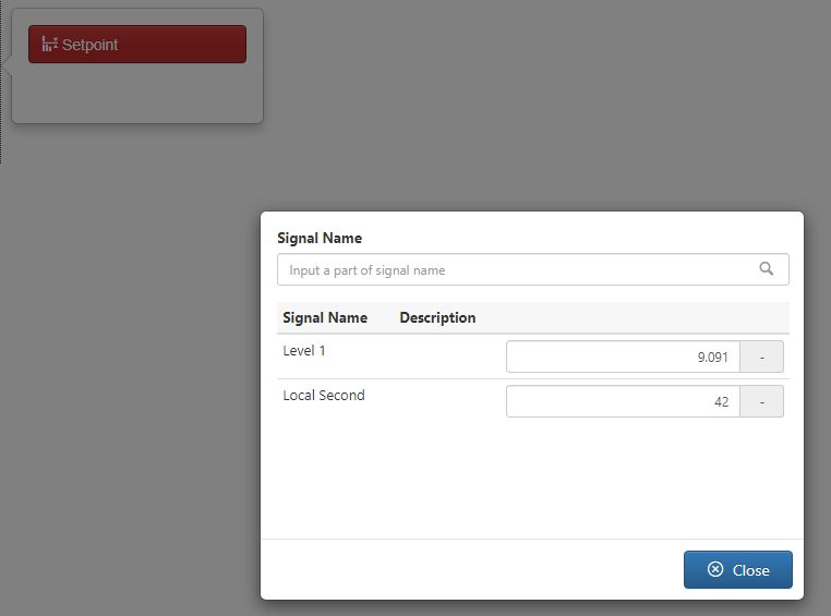
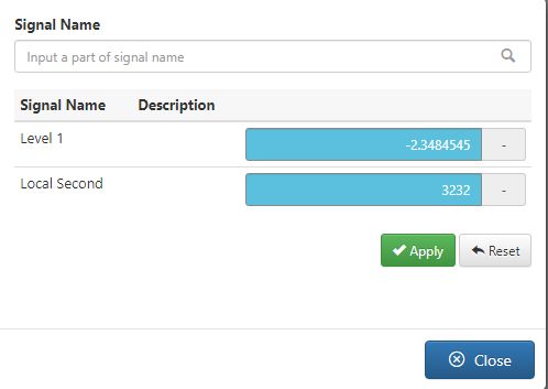
By clicking the Setpoint button, at run-time, the list of all the Signals in the database will pop-up. In this view, the user can read and write Signal values, in real-time.
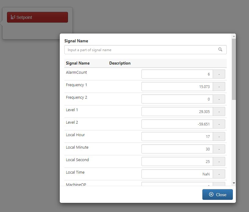
The Setpoint Signal list view
Unlike the Taginfo button, the Setpoint Object Properties allow the user with possibility to define the Signals to be displayed in the list view. This can be achieved by filling in the Signal names in the Setpoint Postfixes property, at design-time. This field allows input of multiple Signals, separated by semicolon ";", as visible in below screenshot.
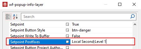
The Setpoint Postfixes property
At run-time, the Signals list will only display the Signals defined as Setpoint Postfixes.
The list of Setpoint Postfixes
The Signal list provides a simple filtering mechanism allowing the user to search by Signal name or part of Signal name.
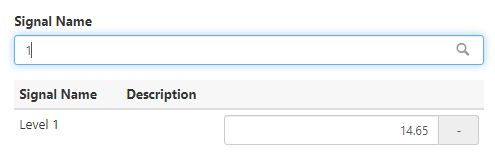
Example of filtered Setpoint Signal list
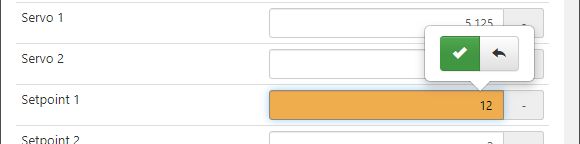
At run-time the user can also manually input Signal values that will be automatically applied to the server. To indicate the fact that a new value is being typed, an orange highlight is applied on the Signal value field. To confirm the new value the user must click on the green confirmation button.
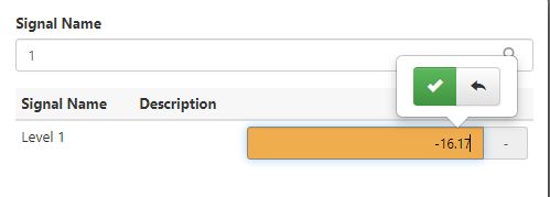
Writing new values
Note
It may be the case that the new entered Signal value is reset by the server to a different value than the entered one. To indicate the user that the written value was reset, a visual feedback is provided by means of a short blink and by removing the new value highlight.
As the Taginfo Signal list, the Setpoint list allows the user with possibility to write buffer values for the listed Signals, by enabling property Setpoint Write to Buffer.
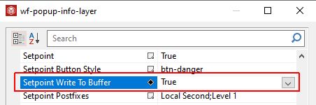
The Setpoint Write to Buffer property
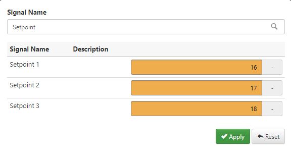
Hence, the new Signal values will not be immediately applied to the Server, but they will be buffered locally. A blue highlight is applied to mark the Signal values that have been changed but not yet applied.
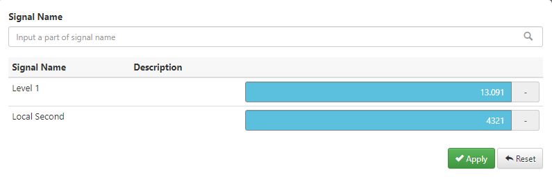
Applying the buffered Signal values can be done by clicking the bottom Apply button.
Buffered Values
Further on, the Setpoint button and list contents can be also configured from security point of view, as follows:
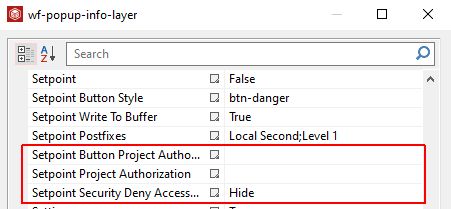
The Setpoint security properties
Setpoint Button Project Authorization - allows the user with possibility to input a Project Authorization required for displaying the button. If the logged in user does not have this Project Authorization, the button will not be visible. If the property is left empty, the button will be visible to all users.
Setpoint Project Authorization - allow the user with possibility to input a Project Authorization required for displaying the Tag Info controls. If the logged in user does not have this Project Authorization, the button will not be visible. If the property is left empty, the button will be visible to all users.
Setpoint Security Deny Access Behavior - sets the behaviour of the element when the logged in user does not belong to the project authorization indicated by the respective property. In this case, the element can be either disabled or hidden.
The Settings button
The Settings scope is to enable a list of Signals displaying Signals with their live values. Each of the Signal lists provide the user with a set of functionalities, such as filtering, enabling advanced security and writing Signal values.
To enable the Settings button the Object Property Settings needs to be set to true, for the wf-popup-info-layer SmartEditor extension, under Info Dialogs category.
Enabling the Settings button
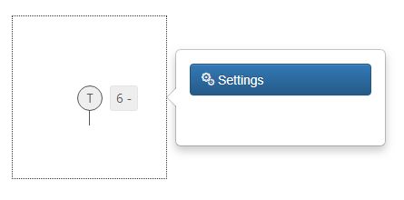
Having this option enabled, the run-time project will display the Settings button in the pop-up info modal dialog.
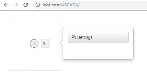
The Settings button at run-time
The user can also customise the Settings button appearance by changing the style in the Settings Button Style Object Property. The selection of the property is set to btn-default, but user can select another style from the drop-down list.
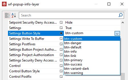
Settings Button Style property
By changing the style of the Settings button to option btn-primary, the appearance of the button at run-time is changed.
Button style "btn-primary"
By clicking the Settings button, at run-time, the list of all the Signals in the database will pop-up. In this view, the user can read and write Signal values, in real-time.
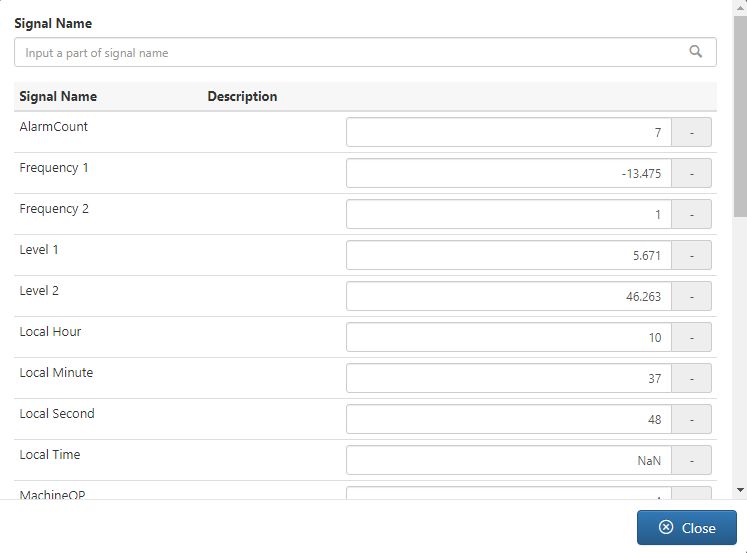
The run-time Signal list
The Signals list provides a simple filtering mechanism allowing the user to search for Signals by name or a part of the Signal name.
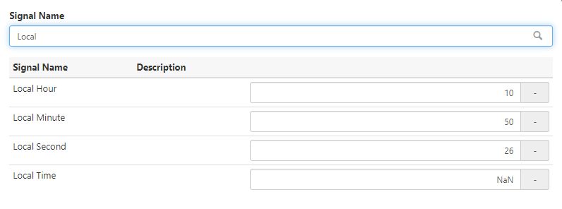
Example of filtered list of Signals
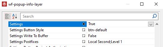
Similar with the Setpoint button, the Settings Object Properties allow the user to define a set of Signals to be displayed in the list view. This can be achieved by filling in the Signal names in the Settings Postfixes property, at design-time. The user can add in this field multiple Signals separated by semicolon ";", as displayed in below screenshot.
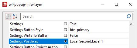
The Settings Postfixes property
By publishing the SmartEditor project, the list of Signals popping up by clicking the Settings button will only list the applied Signals.
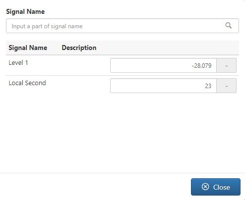
The Postfixes Signals list
At run-time the user can also manually input Signal values that will be automatically applied to the server. To indicate the fact that a new value is being typed, an orange highlight is applied on the Signal value field. To confirm the new value the user must click on the green confirmation button, hence removing the highlight.
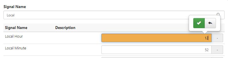
Changing the Signal value
Note
It may be the case that the new entered Signal value is reset by the server to a different value than the entered one. To indicate the user that the written value was reset, a visual feedback is provided by means of a short blink and by removing the new value highlight.
As the Taginfo and the Setpoint Signal list, the Settings list allows the user with possibility to write buffer values for the listed Signals, by enabling property Settings Write to Buffer.
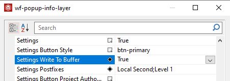
The Setting Write to Buffer property
Enabling this setting will allow the user to add new Signal values, that can be buffered locally. A blue highlight will mark the buffered values, until the Apply button is selected to confirm the values delivery to the server.
Buffered Signal values
Last but not least, the Settings button can be configured from security point of view, as follows:
The Settings security settings
Settings Button Project Authorization - allows the user with possibility to input a Project Authorization required for displaying the button. If the logged in user does not have this Project Authorization, the button will not be visible. If the property is left empty, the button will be visible to all users.
Settings Project Authorization - allow the user with possibility to input a Project Authorization required for displaying the Tag Info controls. If the logged in user does not have this Project Authorization, the button will not be visible. If the property is left empty, the button will be visible to all users.
Settings Security Deny Access Behavior - sets the behaviour of the element when the logged in user does not belong to the project authorization indicated by the respective property. In this case, the element can be either disabled or hidden.
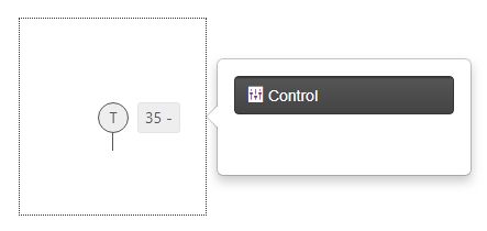
The Control button
The scope of the Control button is to enable a set of custom Signal settings that can be processed in a modal dialog, opened when user clicks the extension contained in the layer.
The Control button can be enabled by setting the Object Property Control to true, under the Info Dialog category of the wf-popup-info-layer extension.
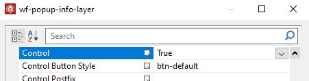
Enabling the Control button
Having this option enabled, the run-time project will display the Control button in the pop-up info modal dialog.
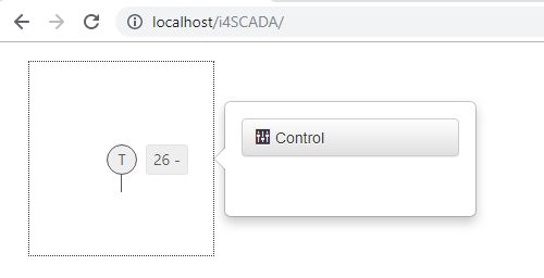
The Control button at run-time
The Control button appearance can be customised by changing the values of the Control Button Style property. The user can select the desired style from a list of predefined values.
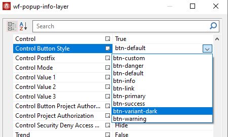
The Control Button Style property
By selecting the 'btn-dark" style, the Control Button appearance is updated at run-time.
The Control Button Style "btn-dark"
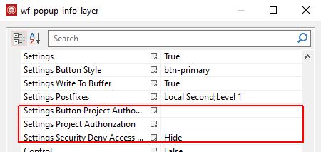
The security settings available for the Control button and contents are as follows:
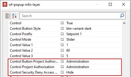
The Control security settings
Control Button Project Authorization - allows the user with possibility to input a Project Authorization required for displaying the button. If the logged in user does not have this Project Authorization, the button will not be visible. If the property is left empty, the button will be visible to all users.
Control Project Authorization - allow the user with possibility to input a Project Authorization required for displaying the Tag Info controls. If the logged in user does not have this Project Authorization, the button will not be visible. If the property is left empty, the button will be visible to all users.
Control Security Deny Access - sets the behaviour of the element when the logged in user does not belong to the project authorization indicated by the respective property. In this case, the element can be either disabled or hidden.
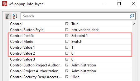
The Control button guards three use cases enabled by means of the Control Mode Object property. The drop-down list is populated with the following options: Switch, Slider and 3-State.
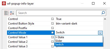
The Control Mode property
The Switch mode
The Switch mode can be configured as follows:
The Switch Control mode
Control Postfix - defines the Signal name shown in the modal Control.
Important
Switch mode cannot be applied for multiple Signals.
Control Mode - applies the Switch mode for the modal Control.
Control Value 1 - defines the value applied as OnValue
Control Value 2 - defines the value applied as OffValue
At run-time, by clicking the Control button a modal dialog pops-up where the user can turn On or Off a Signal value.
Tip
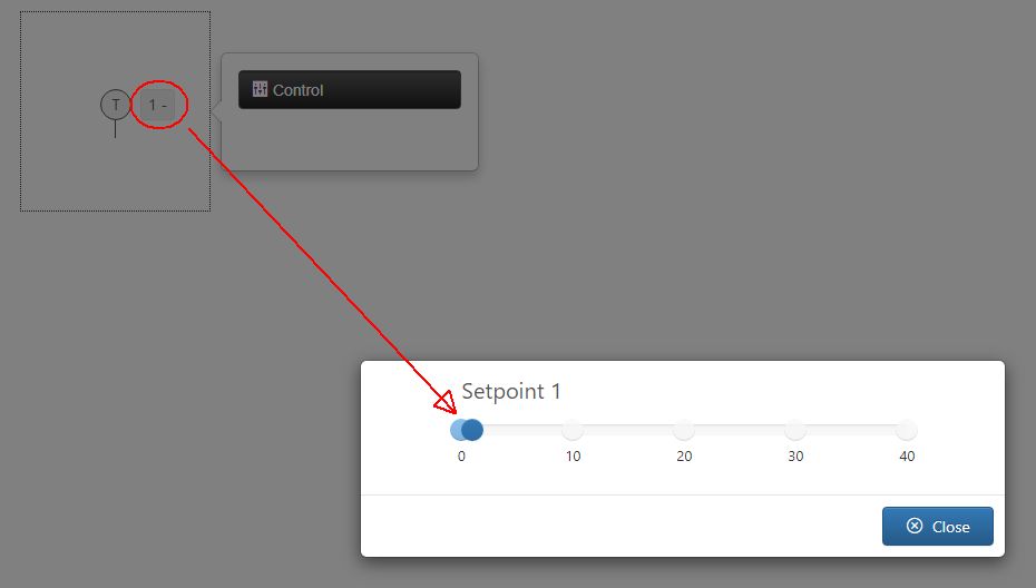
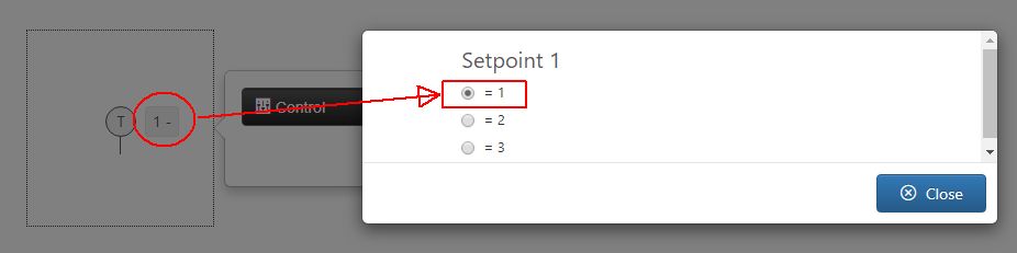
This example shows the Signal "Setpoint 1" which value is currently set to Off = 0.
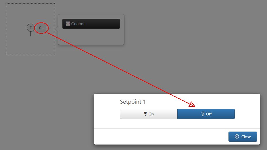
Setpoint 1 value is Off
By clicking the On button, the value will be switched to On = 1. The value change will be parsed to the server immediately.
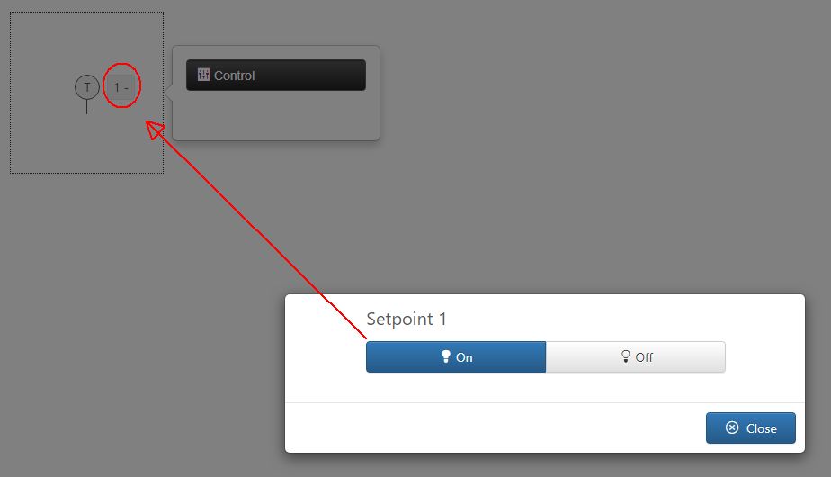
Setpoint 1 value is turned On
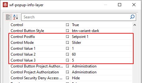
The Slider mode
The Control Slider mode can be configured as follows:
The Control Slider settings
Control Postfix - defines the Signal name shown in the modal Control.
Important
Slider mode cannot be applied for multiple Signals.
Control Mode - applies the Slider mode for the modal Control.
Control Value 1 - defines the Slider Start value.
Control Value 2 - defines the Slider End value.
Control Value 3 - defines the Slider step value. Based on the selected value in this field, that slider will be capable to increase / decrease the Signal value from step to step.
At run-time, the Control button enables a modal dialog with a horizontal slider control, used to follow up or adjust a Signal value in real time.
Tip
This example shows the Signal "Setpoint 1" which value is 1. The Slider control reflects the Signal value, as well.
Slider set to Setpoint 1 with value 1
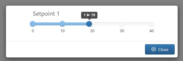
To change the Signal value, the user can drag the slider indicator up to value 19.
Changing the Setpoint 1 value
The value of the Signal "Setpoint 1" is changed in real-time and updated to display the selected value.
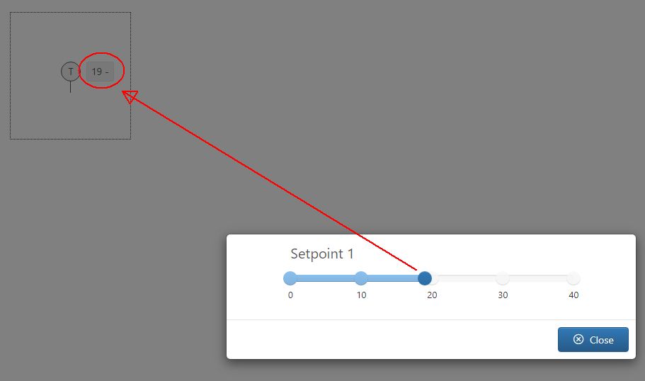
Setpoint 1 value changed to value 19
The 3-State mode
The 3-State mode can be configured as follows:
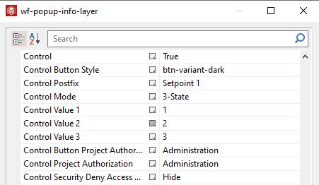
The 3-State mode configuration properties
Control Postfix - defines the Signal name shown in the modal Control
Important
3-State mode cannot be applied for multiple Signals.
Control Mode - applies the 3-State mode for the modal Control
Control Value 1 - defines the State 1 value
Control Value 2 - defines the State 2 value
Control Value 3 - defines the State 3 value
At run-time the Control button opens a modal dialog where all 3 defined states are listed as radio-buttons, allowing the user to change the configured Signal value, using the 3 states.
Tip
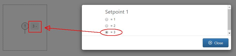
This example shows the Signal "Setpoint 1" whose value is currently set to 1. By opening the popup info modal dialog, the radio-buttons list reflects the Signal value, as State 1.
State 1 active
To change the Signal value to 3 the respective radio button needs to be checked. The value of the Signal is also passed to the server, and updated accordingly.
State 3 active
The Trend button
The scope of the Trend button is to enable the display of trend chart showing value fluctuations of a set of Signals, after clicking the run-time extension contained in the info layer.
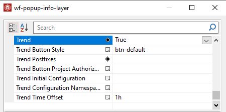
To enable the Trend button the Object Property Trend needs to be set to true, for the wf-popup-info-layer SmartEditor extension, under Info Dialogs category.
The Trend button enabled
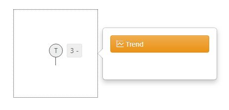
Having this option enabled the run-time project will display the Trend button.
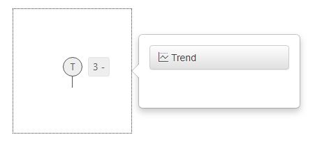
The Trend button at run-time
The appearance of the Trend button can be configured in SmartEditor under the Object Properties of the wf-popup-info-layer extension, by changing the value of the Trend Button Styles property.
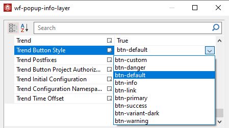
The Trend Button Style property
At run-time, the Trend button will inherit the appearance injected by the selected style.
The Trend button with "btn-warning" style
By clicking the Trend button an info dialog pops up displaying the trend chart of the configured Signal values. By default, the trend chart displays all the Studio Signals, having an active Log Tag.
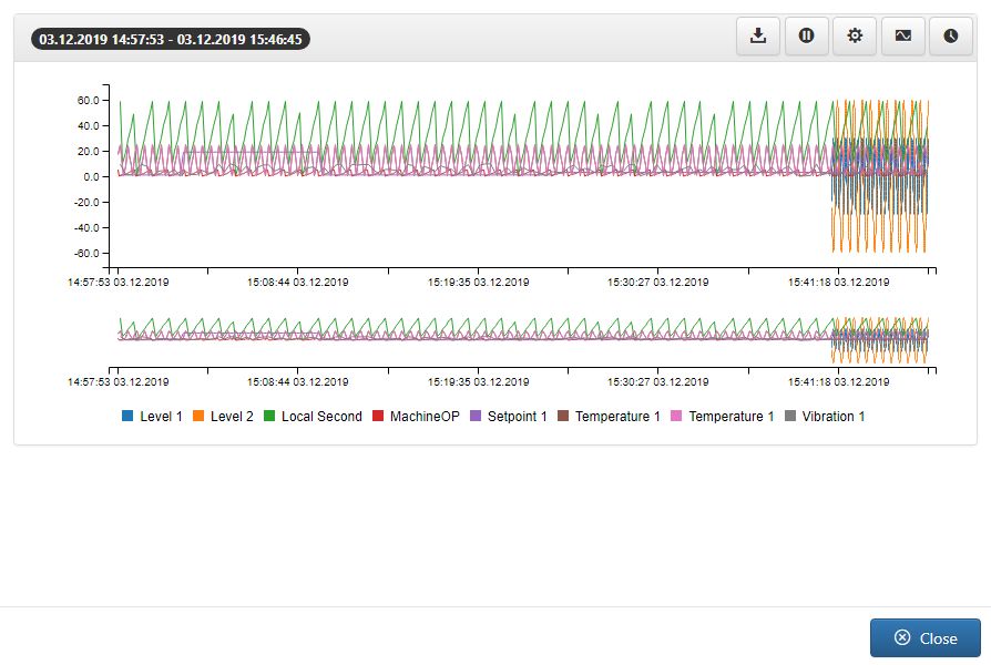
The Trend Chart pop-up dialog
By default, the run-time Trend Chart displays the live log value measurements for a predefined time range. While at design-time the user can select the Trend Time Offset, selecting from the drop-down list options: 1 hour, 2 hours, 8 hours, 12 hours and 24 hours.
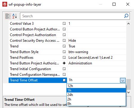
The Trend Time Offset property
The Object Properties panel of the wf-popup-info-layer extension hosts the Trend Postfixes property which allows the user to customise the Signals that will be illustrated by the Trend chart. The user can add any amount of Signal names as long as they are separated by the semicolon symbol ";".
Important
The Trend chart will NOT display Signals without an active Log Tag.
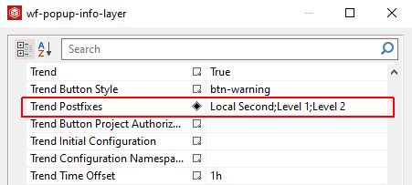
The Trend Postfixes property
By publishing a SmartEditor project having Trend Postfixes defined, will generate a chart showing only the configured Signals measurements.
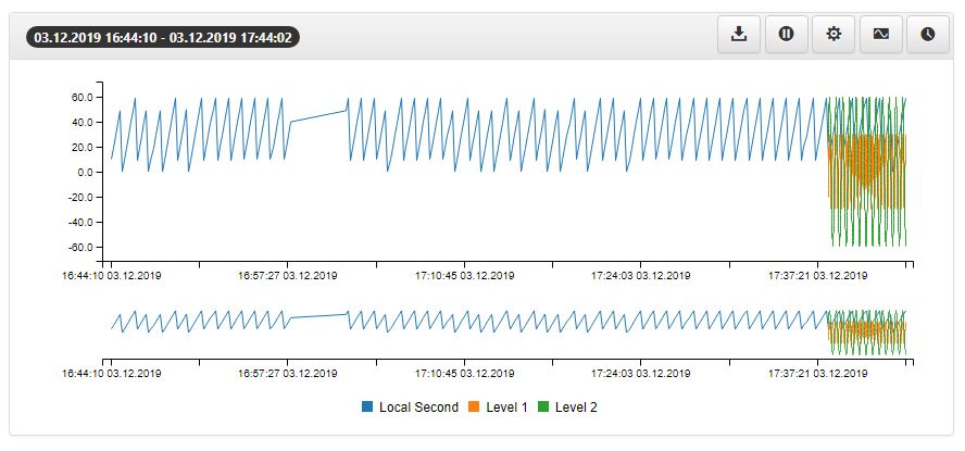
Trend chart with configured Postfixes
The Trend chart toolbar provides the user with the following options
Export - allows the user to export the current chart contents via CSV format. By clicking the Export toolbar button, the download will be immediately organized directly in browser.
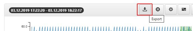
The Export button
Pause - allows the user to pause the Signals log flow.
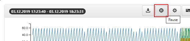
The Pause button
As soon as the Pause button is pressed, the following options are enabled in the toolbar:
Start and Next toolbar buttons
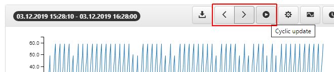
Start - allows the user to resume the cyclic update of the Signal log flow.
Next time span backwards - allows the user to skip through the Signal log flow (1hour and 30 minutes) backwards.
Next time span forwards - allows the user to skip through the Signal log flow (1hour and 30 minutes) forwards.
Configurations Manager - allows the user to save and reuse particular chart configurations, considering the time interval and other involved settings. By clicking the Configurations Manager button a 3 TABs dialog is opened:
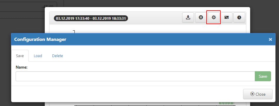
The Configurations Manager dialog
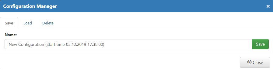
Save - in this view, the user can preserve the currently applied filters. To save the new configuration, a new name is required. By means of the Save button the user can preserve the Configuration, while the Close button will close the dialog without saving any changes.
Saving a new configuration
Load - in this view, the user can select from previously saved configurations and reuse them. To load a saved configuration the user can simply click the Load button. The filtering configuration is immediately applied to the Trend chart.
Note
By enabling the option to Show only own configurations the list is updated to display only those configurations defined by the currently logged in user.
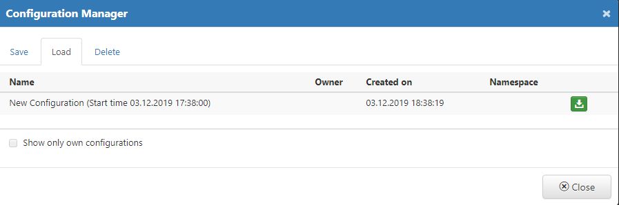
Loading configurations
Delete - at any point, the user can decide to remove unwanted configurations, by switching to the TAB Delete and clicking the Remove button.
Note
By enabling the option Show only own configurations the list is updated to display only those configurations defined by the currently logged in user.
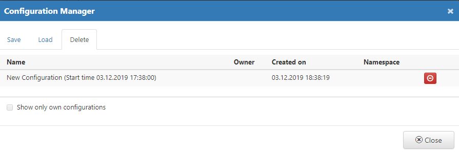
Deleting configurations
The Configurations saved at run-time can be added to the wf-popoup-info-layer extension, under Object Property Trend Configuration Namespace.
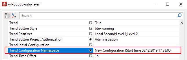
The Trend Configuration Name property
Log Tag Settings - allows the user to manage the applied Signals and add new ones. The Signal Settings dialog provides the user with the following options:
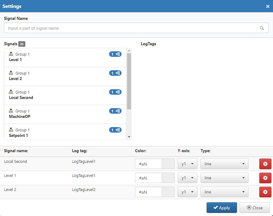
Signals Settings dialog
Search by signal name - allows the user to filter the Signals list by Signal name or part of a Signal name.
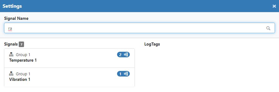
Example of filtered Signals list
Adding new Signals to the Trend chart - allows the user to select a Signal and its Log Tag and adds it to the list of Signals for the Trend chart.
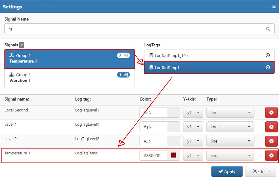
Adding new Signals to the Trend chart
Manage the chart Signals - allows the user to change a set of Signal chart settings:
Color can be selected from a color picker tool.
Axis can be selected from the drop down list, selecting from axis y1 or y2.
Type can be selected from the drop down list choosing from the following options: line, step, spline, bar, area, area-spline, area-step.
Remove chart Signals - allows the user to remove Signals from the list applied for the Trend chart, by clicking the Delete button.
Settings - allows the user with possibility to change multiple chart settings.
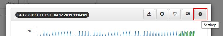
The Settings button
By clicking the Settings toolbar button, the Settings dialog is opened where the user can organize the following chart settings:
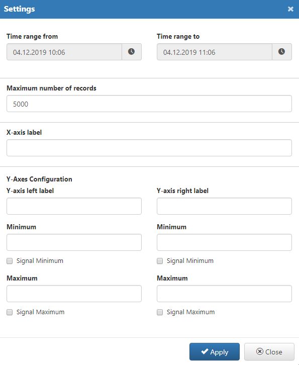
The Settings dialog
Time range from and Time range to - these settings allow the user to customize the Start and End date.
Maximum number of records - this setting allows the user to define a maximum amount of records that can be processed by the Trend chart.
X-axis label - allows possibility to add a label for the X-axis
Y-axes Configuration
Y-axis label - allows possibility to add a label for the Y-axis
Y-axis right label - allows possibility to add a label for the Y-axis right
Minimum for Y-axis - allows possibility to set the minimum Signal value for the Y-axis
Minimum for Y-axis right - allows possibility to set the minimum Signal value for the Y-axis right
Maximum for Y-axis - allows possibility to set the maximum Signal value for the Y-axis
Maximum for Y-axis right - allows possibility to set the maximum Signal value for the Y-axis right
The view in the Trend chart pop-up modal dialog is split up as follows:
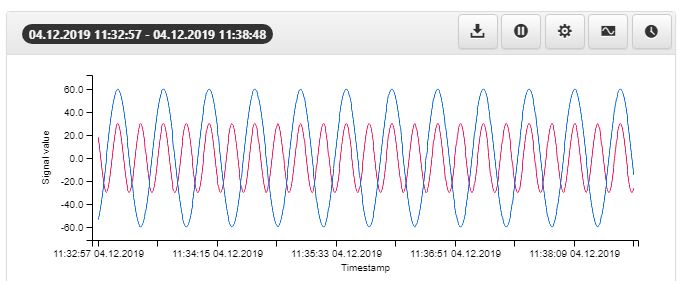
The central view of the Trend dialog is the main chart displaying Signal Log Tag values, in real time. The main chart supports a maximum of two vertical axes (left and right).
The main Trend chart
By hovering the mouse cursor above the chart, a tooltip is displayed providing the user with information upon the timestamp, the SignaI name and the log tag value.
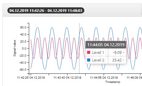
The Trend chart tooltip
The zoom chart is displayed at the bottom of the main chart. In this view, the user can narrow down (zoom in) on a specific area of the time range. The zoomed area can be expanded or moved anywhere in the original time interval.
The zoom chart shows the overall data trends and helps the user to easily locate a specific section by displaying the general data variation for the whole time range. The main chart's resolution and data is updated for every change in the zoom chart.
When dragging a rectangle on the zoom chart, the selected area becomes highlighted. The zoom manipulation is done using the left and right limit bars. The limit bars can be dragged using the mouse to the desired location within the time range. The zoomed area can also be panned by dragging it using the mouse. The changes in the zoom chart are applied to the main chart automatically.
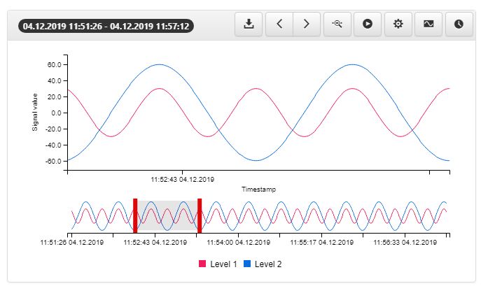
The zoom chart
By zooming in the certain area of the chart, the toolbar displays an additional button is added, allowing the user to Reset Zoom.
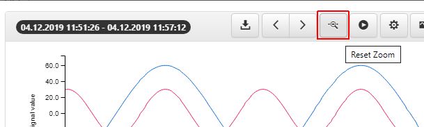
The Reset Zoom button
At the bottom of the main and the zoom chart the chart legend displays the selected Signals. While hovering the mouse cursor over a legend label, the line trend corresponding to that Signal will be emphasized in the chart by dimming down the other trend lines.
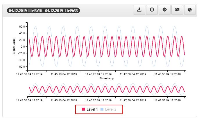
The Chart legend
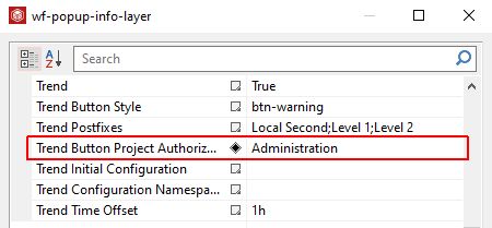
Last but not least, the Trend button allows possibility to enable a visibility security setting by adding an authorization for the Trend Button Project Authorization property, at design-time. The selected Project Authorization will be at run-time required for displaying the button. If the logged in user does not have this Project Authorization, the button will not be visible. If the property is left empty, the button will be visible to all users.
The Trend Button Project Authorization property