Historical data at run-time
Check out this article in order to learn more details about the management options provided to you by the i4scada SmartEditor Historical Data management components.
After preparing the Historical Data extensions as described in the Historical data at design-time article, the i4scada SmartEditor project is ready to be published.
The Historical Data chart
Check out this article in order to learn more details about the behaviour and options available for the run-time Historical Data Chart.
The main area of the Historical Data chart component is the graph where all the data series, cursors and horizontal marker lines can be visualized in both online and offline mode.
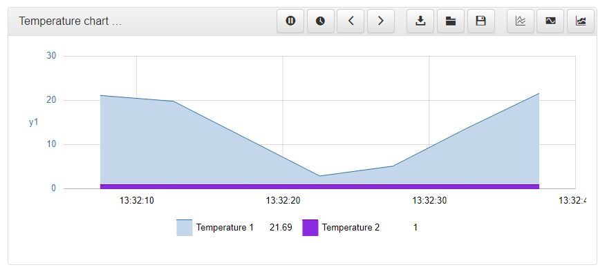
The Historical Data chart at run-time
The data series displayed in the chart are based on Signals and their logs measured throughout specific time frames: offline (historical) and online.
When the control is configured to work in offline mode, the data is loaded once and then rendered. A new reload will only occur when the zoom area is changed or when the time interval is changed.
In online mode, the chart will display new data points as time elapses and new values come in. When the chart display is full to the right, the chart will automatically advance the time window, consequently making room for new incoming data points. Old data that goes outside the length of the specified time window will be discarded from the chart.
The chart is plotted on a time horizontal axis and at least one vertical axis. The user can add multiple vertical axes both at design-time and run-time, using the Axes configuration window.
The Historical Data chart allows the display of a set of tooltips, configurable at design-time. The tooltips are displayed when hovering the data series of the charts, indicating the exact cursor position (the white on black labels) and the value of the Signal for the hovered timestamp.
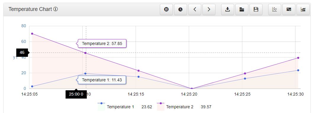
Chart tooltips
The user can zoom in particular data series, by narrowing down on a specific area of the time range.
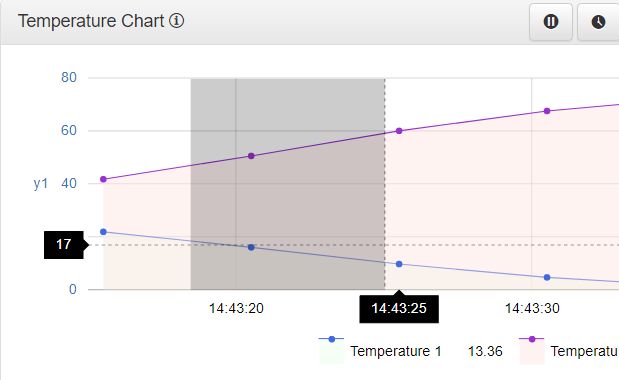
Zoom in
The narrowed area can be expanded again by using the blue Zoom out button.
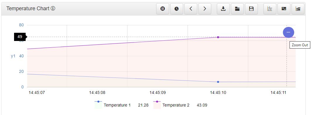
Zoom out
The Historical Data chart toolbar provides the user with the following options:
Cyclic update - The Cyclic update or Play button enables the chart online mode.

The Cyclic update button
Refresh - The Refresh button updates the chart data, when the online mode is paused.

The Refresh button
Pause - The Pause button temporarily stops the online mode, and no requests for updates will occur.
Note
When resuming the updates, the time series will be automatically adjusted based on the online configuration, and normal operation will be resumed.

The Pause button
Time settings - The Time settings button opens the Time settings pop-up window, where the user can select a time range for the chart data.
In the Time settings window, the user can select one of the predefined drop-down list time range options: Custom range, Year, Month, Week, Day, Current, Yesterday, or Current Day. Additionally, the user can select a Start and End time range, using the calendar selectors.
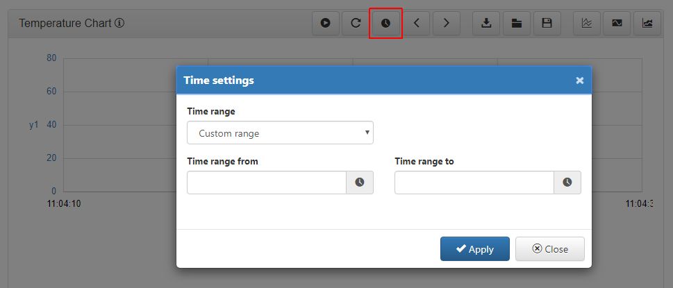
The Time settings pop-up window
Back - The Back button triggers an automatic pause of the online mode and consequently goes back in time, considering the time span defined by the Start Offset Interval and End Offset Interval properties.

The Back button
Forward - The Forward button sends the chart time series forward, considering the time span defined by the Start Offset Interval and End Offset Interval properties.
Warning
Clicking the Forward button while in online mode, will trigger an automatic pause of the time series, but will not be capable to display any data from the future.

The Forward button
Export - The Export button triggers an export of the historical data for the specified time series. As soon as the Export button is clicked, the export will start directly in browser.
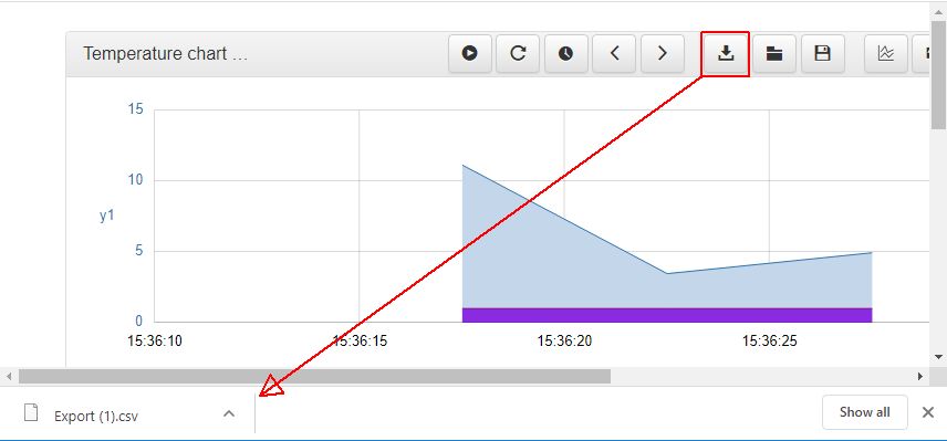
The Historical Data chart export
Load configuration - Opens the Load configuration pop-up window where all previously saved configuration definitions are listed. The scope of the Load configurations panel is to allow the user to load configurations or to remove them. Creation of new configurations is not in scope of this window.

The Load configuration window
Note
If no chart configurations were previously saved, the list will be empty.
Each configuration definition features the following information:
the configuration name
the configuration owner, if any security settings were enabled for the current SmartEditor project
the date of creation
Save configuration - Opens the Save configuration pop-up window where the user can save the current chart configurations, with the scope to reuse them, by means of the Load configurations option. In this view, the user only needs to fill in the configuration name and click the Apply button to preserve the changes.
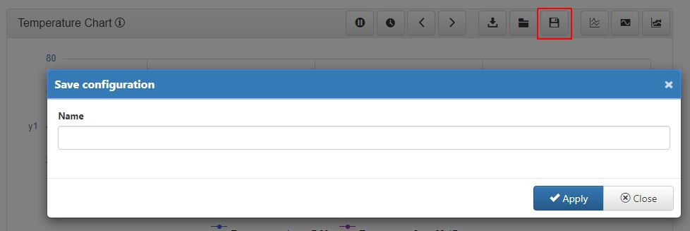
The Save configuration window
Tip
The user can set a default configuration name, at design time, by filling in the desired value for the Configuration Name property, under the Security category of the Object properties panel.
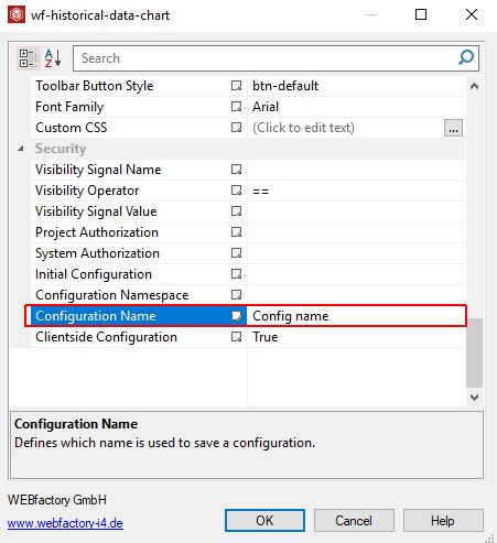
The Object properties panel
Axes dialog - Opens the Axes dialog pop-up window, where the user can add new axes, remove and configure the the existing ones.
Tip
The current settings will reflect the configurations organised at design-time.
In this view, the user can organise the following actions and settings:
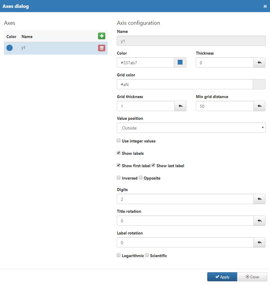
The Axes dialog
Add new axes by clicking the
 button.
Remove existing axes by clicking the
 button.
update the Name of axes added at run-time.
change the Color of the axis, using the color picker tool.
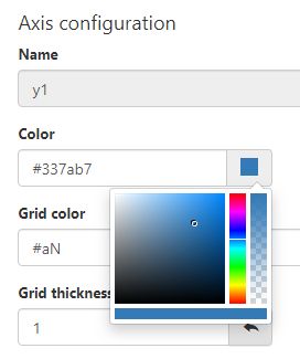
The Axis color picker tool
change the axis Thickness by filling in the value expressed in pixels.
change the Color of the chart grid, using the color picker tool.
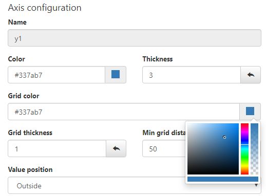
The Grid color picker tool
change the Grid thickness by filling in the value expressed in pixels.
set the Minimum grid distance by filling in the value expressed in pixels.
select the Value position choosing from the drop-down list values:

The Value position
Outside the bootstrap grid
Inside the bootstrap grid
enable or disable usage of Integer values
enable or disable the Labels display
enable or disable the First and Last label display
enable or disable whether the axes labels are Inverted or not.
enable or disable whether the axes are displayed on the Opposite corner or not.
set the amount of Digits displayed by the axes
set the degree of chart Title rotation expressed in pixels
set the degree of chart Label rotation expressed in pixels
enable or disable the Logarithmic scale representation
enable or disable the Scientific scale representation
Tip
The Reset field contents button
 can be used to rectify any incorrectly filled in values, at any point before applying the axes configuration.
After defining the desired axes and configuring them, the user can preserve the changes by clicking the Apply button. To leave the Axes dialog window without making any changes, the user can click the Cancel button.
Series dialog - Opens the Series dialog pop-up window, where the user can add new data series, remove and configure the existing ones.
Tip
The current settings will reflect the configurations organised at design-time.
In this view, the user can organise the following actions and settings:
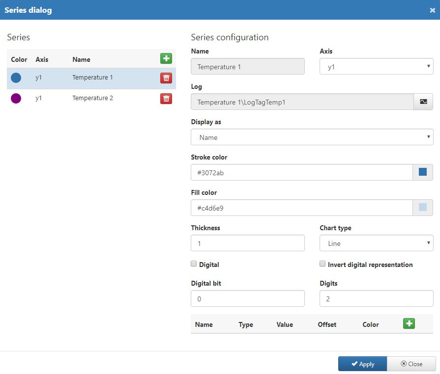
The Series dialog
Add new series by clicking the
 button.
Remove existing series by clicking the
 button.
update the Name of series added at run-time.
select the Axis where the series should be displayed.
select the series Log from the Select log pop-up window. The Log can be selected from the list of Signals and LogTags. The user can also apply filters to the Signals list in order to easily pin-point the desired Signal. Hence, the user can filter the list by Signal Group or Signal Name.
Note
The Select Log window will only display the Signals having an associated Log Tag.
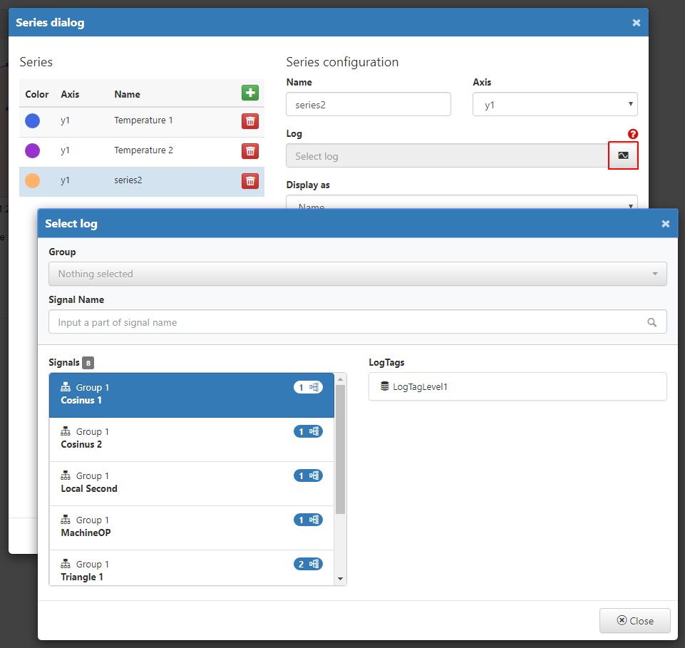
The Select Log window
select the Display type of series choosing from the drop-down list options: Signal Name, Signal Alias or Signal Description.

Display as selector
change the series Stroke color, using the color picker tool
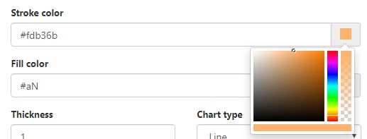
Stroke color
change the series Fill color, using the color picker tool
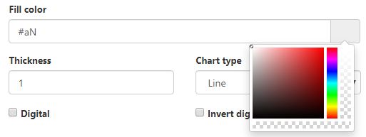
Fill color
set the Thickness of the series stroke, by filling in the desired value expressed in pixels.
set the Chart type selecting from the drop-down list options: Line, StackedLine, Step, Bar, StakedBar, Dots and LineDots.
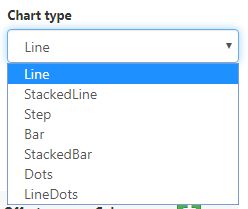
Chart type
enable or disable whether the values are manipulated into a Digital line or not.
enable or disable the Invert digital representation option to define whether the historical values are inverted or not.
set the Digital bit.
Note
The value considered to be a digital 1. Any other signal/log value will be treated as 0 on the digital chart.
set the amount of Digits displayed by the chart values.
add and configure the horizontal marker lines:

The Series line marker configuration
Tip
A Line marker is a line that is drawn on the chart plot and bound to some value on an axis. It may be used to show a trend or mark an important value.
Name of the horizontal marker line;
Type of the marker line, selecting from the drop-down list options: Value, Signal min, Signal max, Interval min, Interval max, Interval avg;
Value of the marker line;
Offset of the marker line (e.g. "seconds");
Color of the marker line.
Tip
The Reset field contents button
 can be used to rectify any incorrectly filled in values, at any point before applying the series configuration.
After defining the desired series and configuring them, the user can preserve the changes by clicking the Apply button. To leave the series dialog window without making any changes, the user can click the Cancel button.
Regions dialog - Opens the Regions dialog pop-up window, where the user can add new regions, remove and configure the existing ones. Chart regions are a collection of important areas that can be pinned to the plot.
Tip
The current settings will reflect the configurations organised at design-time.
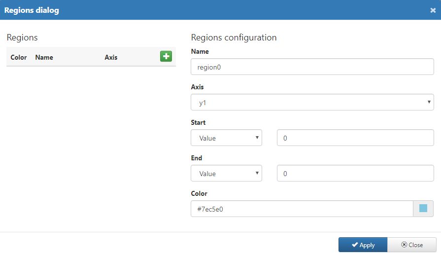
The Regions dialog
Each region can be configured using the following options:
Add new regions by clicking the
 button.
Remove existing regions by clicking the
 button.
update the Name of regions added at run-time.
select the Axis where the region should be displayed.
set the starting point of the region:
can be either Value or Signal Value
the start value
set the ending point of the region:
can be either Value or Signal Value
the end value
set the Color used for representing the Region on the chart, using the color picker tool.
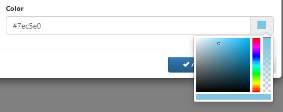
Region color
Tip
The Reset field contents button
 can be used to rectify any incorrectly filled in values, at any point before applying the region configuration.
After defining the desired regions and configuring them, the user can preserve the changes by clicking the Apply button. To leave the Axes dialog window without making any changes, the user can click the Cancel button.
At the bottom of the Historical Data chart the user can add a chart legend, as described by the wf-historical-data-chart extension article. The chart legend displays the data series used by the chart and allows the user to toggle on or off the representation of Signal Logs, by clicking on the respective legend label.
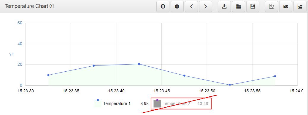
Example of toggled of legend label
The Historical Data Cursor component
Check out this article in order to learn more details about the historical data cursor component and its run-time behaviour.
At run-time, the data and time series providers can be exposed as series data by creating data cursors. The Historical Data Cursor component works through a tight relation with the Historical Data chart component.
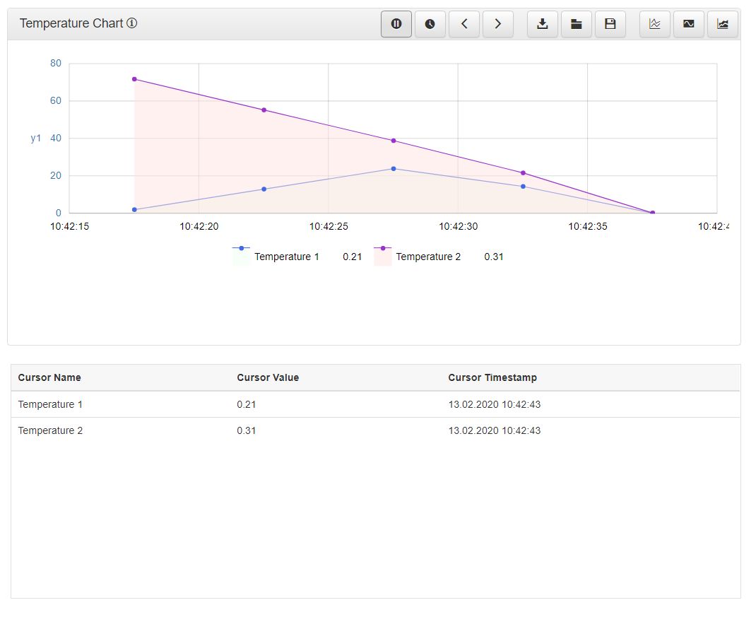
The Historical Data Cursor component
As the Historical Data Chart is the Cursor data provider, the user needs to consider a set of design-time settings, before publishing the Historical Data SmartEditor project.
The wf-historical-data-chart extension
The first step in configuring the Historical Data Cursor element should actually take place in the series data provider component, which is the wf-historical-data-chart extension.
While at design-time, the user needs to open the Series Configuration window of the Object Properties panel of the wf-historical-data-chart extension. The configured series are displayed in this window, allowing the user to open them one by one in edit mode.
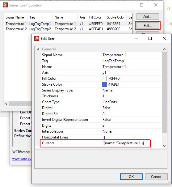
Edit Chart data series
Among the data series properties, the user can add Cursors using an array of the following objects: name, timestamp, offset and offsetInterval.
The array of cursors should follow a particular format convention that allows the system to correctly interpret the data.
Tip
Example cursor:
[{name: 'CursorName'}]Example cursor:
[{name: 'CursorName', timestamp: 'yyyy-MM-ddTHH:mm:ss'}]Example cursor:
[{name: 'CursorName', offset: 'seconds', offsetInterval: '1'}]The wf-historical-data-cursor extension
While editing the Object Properties of the wf-historical-data-cursor extension, the user needs to fill in the Group name and Control name of the cursor component.
In order to establish the connection between the Chart and the Cursor components the user needs to reuse the Chart Group Name and the Control Name, as follows:
Chart Group Name must match the Cursor Group Name
Chart Control Name must match the Cursor Control Name

Group Name and Control Name properties
The run-time Historical Data Cursor
Having the above settings properly defined, the Historical Data Cursor should display real time cursor data, in complete synchronization with the Historical Data Chart.
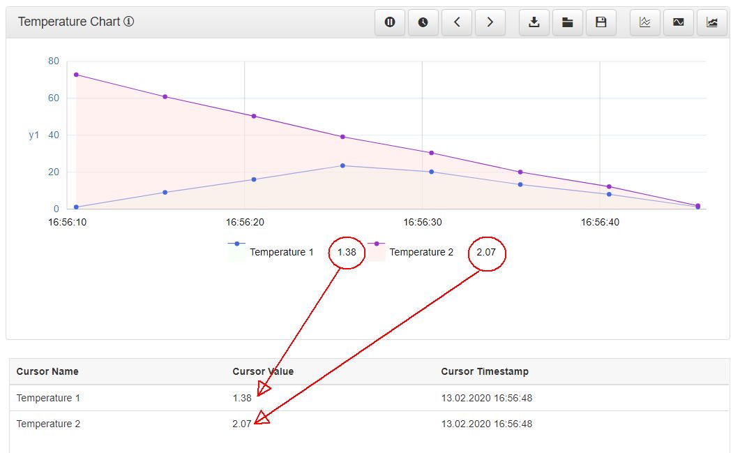
The run-time Historical Data Cursor component
Concerning the display mode of the component, the user can choose between 3 options, while at design-time:
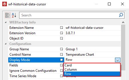
Display Mode property
Row

Column

Card

The Historical Data Series component
Check out this article in order to learn mode details about the Historical Data Series component and its run-time behaviour.
Fairly similar to the Historical Data Cursor component, the Series details is a lightweight component which can display information regarding the data series configured inside the chart. Being the data provider of the Data series, the component table will reflect the Signals and Signal values configured for the chart component, considering that the appropriate design-time settings have been organised.
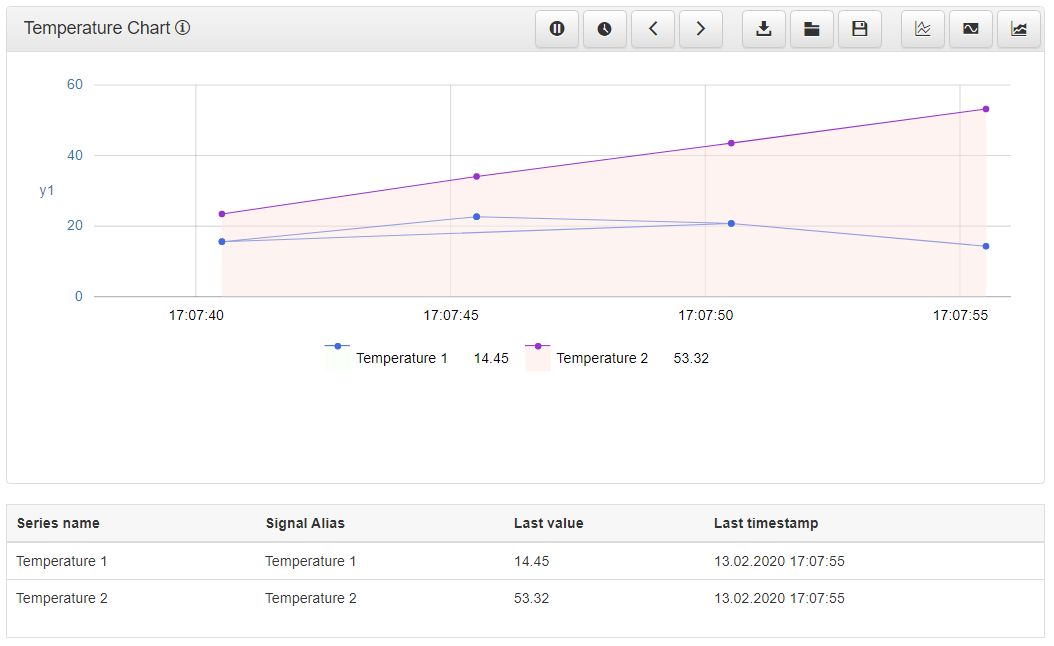
The Historical Data Series component
The wf-historical-data-series extension
While editing the Object Properties of the wf-historical-data-series extension, the user needs to fill in the Group name and Control name of the cursor component.
In order to establish the connection between the Chart and the Series components the user needs to reuse the Chart Group Name and the Control Name, as follows:
Chart Group Name should be the Series Group Name
Chart Control Name should be the Series Control Name

Group Name and Control Name properties
The run-time Historical Data Series
Having the above settings properly defined, the Historical Data Series should display real time series data, in complete synchronization with the Historical Data Chart.
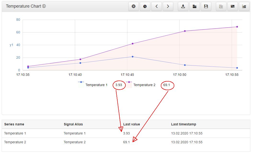
The run-time Historical Data Series component
Concerning the display mode of the component, the user can choose between 3 options, while at design-time:
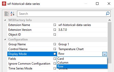
Display Mode property
Row

Column

Card
