Analysis Modules Overview
Here is a quick overview in the Analysis Modules section, providing more details about the most commonly met graphical representations in i4connnected.
The i4connected Analysis modules provide the user with a wide range of graphical representations, featured as methods to show and represent values, increases, decreases, or comparisons of certain variables. The most commonly met graphical representations in the i4connected portal are:
Bar charts - allows the user to compare items between different groups or to track changes over time.
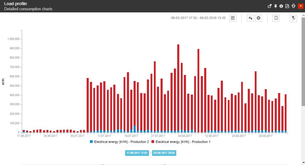
The Load profile
Line charts - allows the user to compare changes over the same period for more than one group of items.
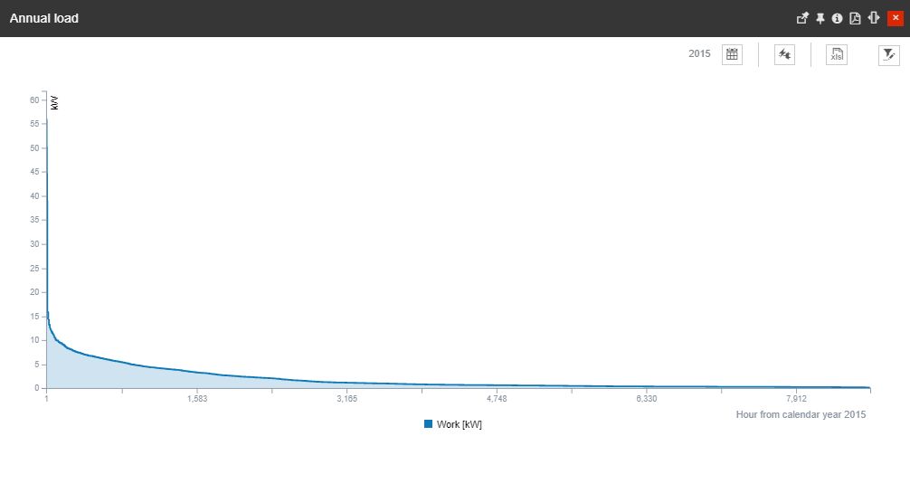
The Annual Load
Sankey diagrams - allow the user to visually represent consumption flows for more than one group of items.
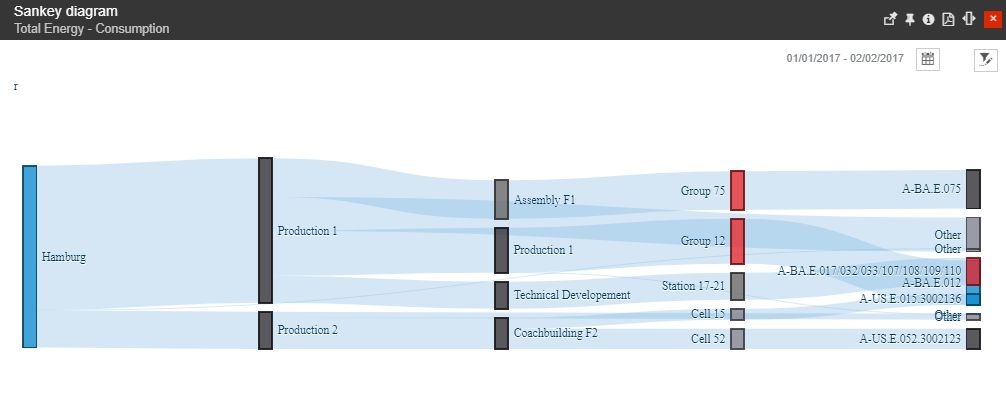
The Sankey diagram
Carpet plots - allow the user to illustrate the interaction between independent and dependent in a two-dimensional plot.
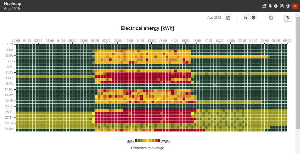
The Carpet plot
Gantt charts - allow the user to illustrate the dependency relationships between activities and current schedule status.

The Event Gantt
Analysis Modules parameters
The i4connected dashboards can be configured by the system administrator by preselecting a set of parameters. These settings can be organized by opening the analysis tiles in edit mode.
Tip
For more details regarding the Edit Tiles function, please also visit the article here.
Under the Parameters selector section of the Edit tile panel, the system administrator can organize multiple, and various settings.
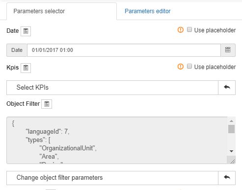
The Edit Tile panel
Out of these, here are the most relevant parameters that can be configured:
Choosing the KPIs
Choosing the KPIs to be preselected
Choosing the Measure Group
Choosing the Measure Type
Choosing the Start and End dates
Choosing the Item types (Organizational Unit, Area, Site or Device)
Choosing the Items