Raw Data
The Raw Data Chart panel displays a chart providing an analysis of one or multiple Signals using their raw values, as read directly from the Device.
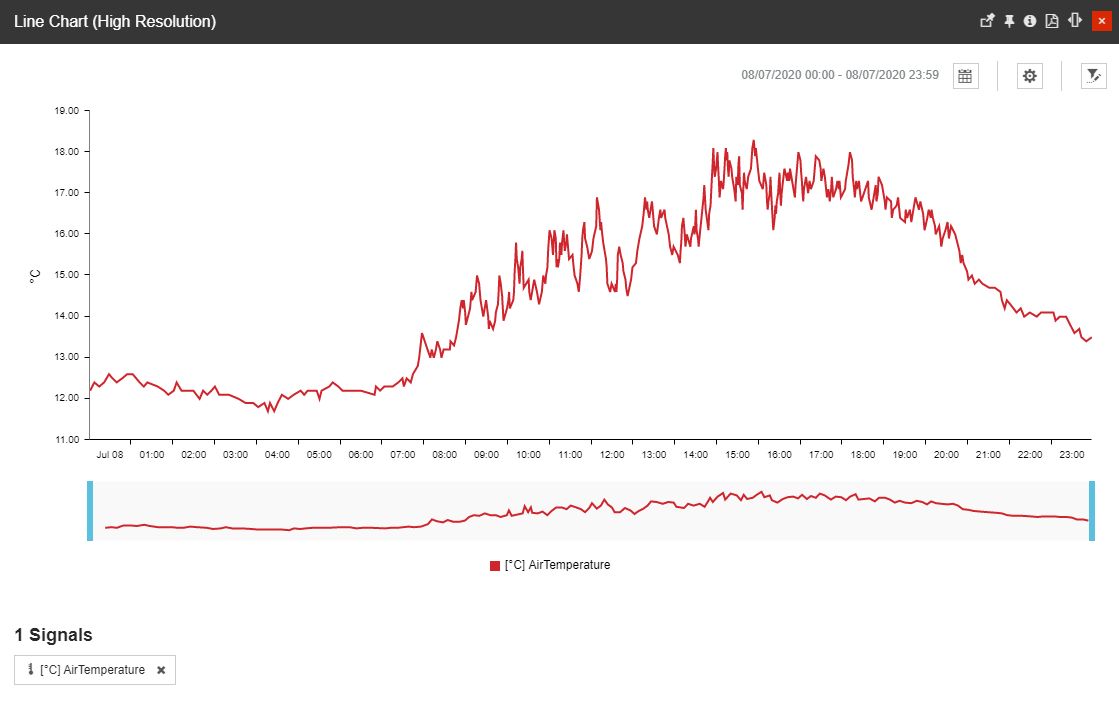
This article describes the Raw Data chart available by clicking the dedicated tile. The Raw Data Chart is a high-resolution chart providing an analysis of one or multiple Signals using their raw values, as read from the Device.
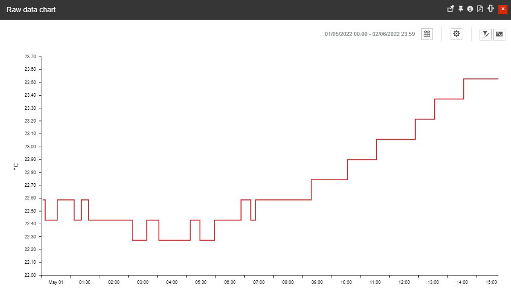
The Raw Data chart panel
The toolbar of the Raw Data chart panel allows the following selections:
selection of the Time frame using the Calendar button - the view is expanded to display the following time frame options:

The Calendar view
From / To selectors - allow a customized time frame selection, where the user can choose the Start and End date and time. Settings done in this area will reset any filters applied at the level of the Calendar / Relative time frame options:

The From/To selector
The Last selector allows the user to input the desired numerical value, which will set the following predefined time windows:
the last Hour(s) - shows the last hour(s) considering the closest ended interval, measured in hours.
the last Day(s) - shows the last day(s) considering the closest ended interval, measured in days.
the last Week(s) - shows the last week(s) considering the closest ended interval, measured in weeks.
the last Month(s) - shows the last month(s) considering the closest ended interval, measured in months.
the last Year(s) - shows the last year(s) considering the closest ended interval, measured in years.
Time range selectors allow the user to select predefined time ranges that start from the current date and time. The available predefined options are:
1H - one-hour time range, going back to last ended interval, measured in hours.
8h - eight hours time range, going back to the last ended interval, measured in hours.
1T - one-day time range, going back to the last ended interval, measured in hours.
1W - one-week time range, going back to the last ended interval, measured in weeks.
1M - one-month time range, going back to the last ended interval, measured in months.
3M - three months time range, going back to the last eneded interval, measured in months.
6M - six months time range, going back to the last ended interval, measured in months.
1Y - one-year time range, going back to the last ended interval, measured in years.
Relative - allows the user to select a rolling time window that starts from the exact current date and time. The available predefined options are:

The Relative selector
The Last selector allows the user to input the desired numerical value, which will set the following predefined time windows:
the last Hour(s) - shows the last hour(s) considering the current moment.
the last Day(s) - shows the last day(s) considering the current moment.
the last Week(s) - shows the last week(s) considering the current moment.
the last Month(s) - shows the last month(s) considering the current moment.
the last Year(s) - shows the last year(s) considering the current moment.
After selecting the desired time frame the user must click the Apply button to preserve the selection.
Note
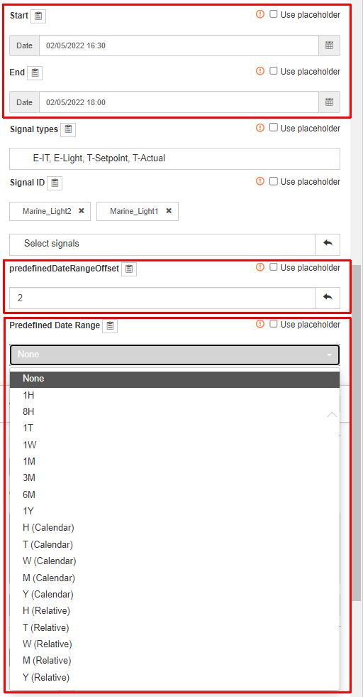
The system administrator can apply a default Time frame date, using the Raw Data chart tile parameters view.
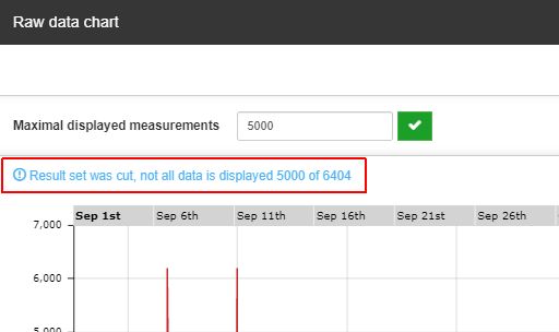
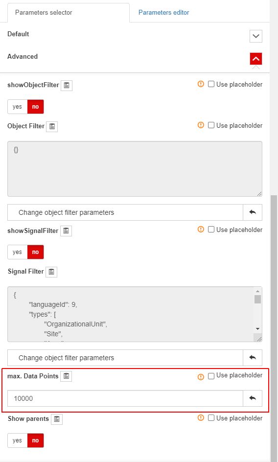
selection of the Chart settings - the view is expanded to allow the user to manually input the desired maximal measurements to be considered by the chart.

The Chart settings view
In case the maximal measurement value is lower than the actual plotted data, the result is truncated and the user is notified.
Note
The system administrator can select a default value for the Maximal displayed measurements, using the Raw Data chart tile parameters. Regardless of the default value defined by the system administrator, the user can increase/decrease the Maximal displayed measurements value, as desired.
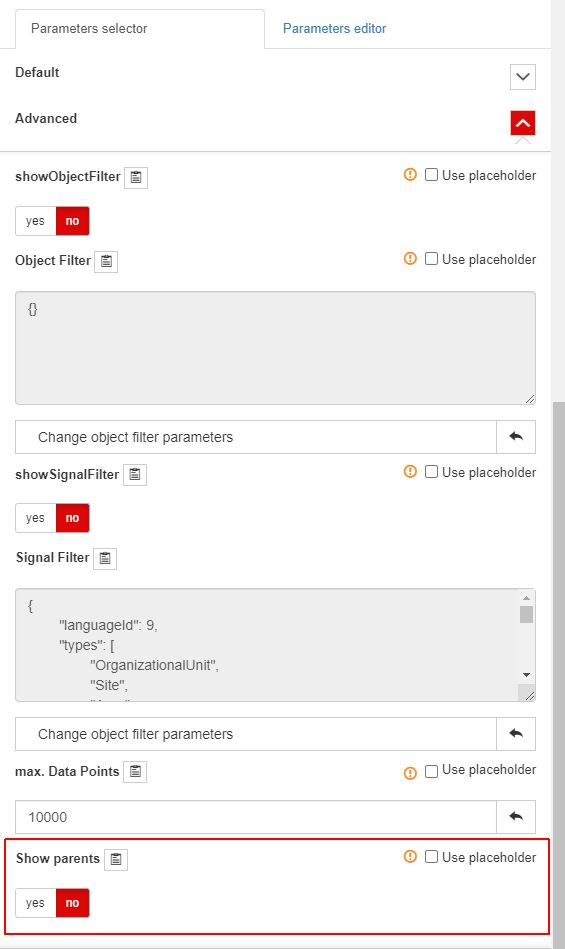
Further on, the Chart settings area allows the user the possibility to enable/disable the display of Signal parents. By enabling the Show parents option, the Signals' origins are displayed by the chart legend and the area of the selected signals.
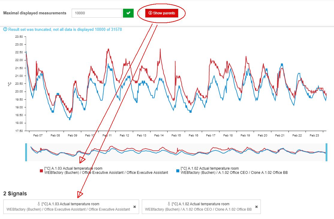
The Show parents option
Note
The system administrator can set the display of Signal parents to on or off, using the Raw Data chart tile parameters.
selection of multiple Signal(s) using either the Open signal list button or the Object filter button.

The Raw Data chart filtering options
Tip
The user can apply various filter combinations, in order to achieve the desired results.
The Open filter button opens the Object filters panel. For more details about the Object filters panel, please visit the dedicated article, here.
In this view, the user can select one or multiple entities, up to four, (Sites, Areas, Organizational Units, and/or Devices) to apply their Signals to the chart view. This filter works like a bulk selection of Signals, providing an analysis of all the Signals belonging to the selected hierarchical entity /entities.

The Open filter button and the Object filters panel
Warning
Please note that the Object filter does not limit the number of selected Signals. It will apply all the Signals used by the selected entity.
Note
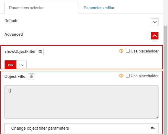
The Open filter button can be enabled by the system administrator, using the Raw Data chart tile parameters. In this view, further default object filter parameters can be customized.
Tip
The system administrator can enable an advanced filter for the Signals selected from the Object filters panel, by adding to the tile's parameters one or multiple Signal type filters.
The Signal type filter is available on the Raw Data chart tile parameters, under the Default section.
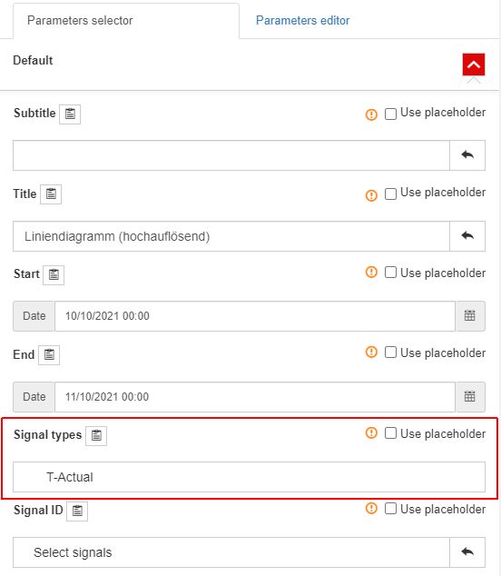
Using the Signal types selector, the system administrator can choose one or multiple entities to be applied as default Signal type filters. Therefore, when the user selects Object filters (Sites, Areas, Organizational Units, or Devices), the Raw Data chart will plot only those Signals that have the applied Signal type, and belong to the selected hierarchical entity/entities.
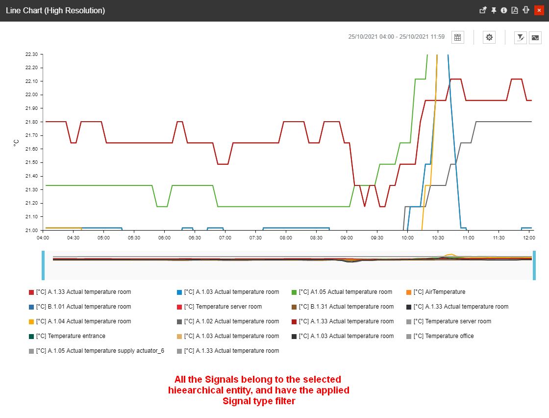
The Signal type filter will not affect the selection of Signals when using the Signal list filter panel.
The Open signal list button opens the Signal List panel where all the i4connected Signals are displayed.

The Open signal list button and the Signal List panel
Note
The Open signal list button can be enabled or disabled by the system administrator, using the Raw Data chart tile parameters.
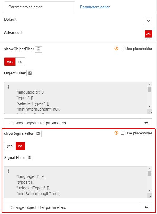
In this view, the user is allowed to select one or multiple Signals (up to 20), by selecting each Signal manually, from the list view.
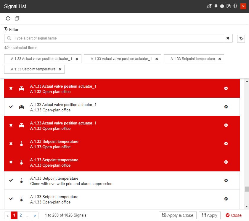
The Signal List panel
Warning
The user can not select more than 20 items in the list view. Currently, this limit is hardcoded and can not be removed.
The make it easier for the user to distinguish between selected and unselected Signals, the selected entities are highlighted in red color.
To remove the current Signal selection, the user can either manually deselect the Signals, or click the Unselect all button.
The Unselect all button
To apply the selection to the chart the user needs to press the bottom Apply and Close / Apply buttons.
The Raw Data chart represents the data obtained from an intersection between the chosen Signal raw values.
All the selected Signals are displayed at the bottom of the chart providing information about the Signal name or alias name and the used unit of measure. If the Show parents option is also enabled, the Signal source will also be displayed in this view.
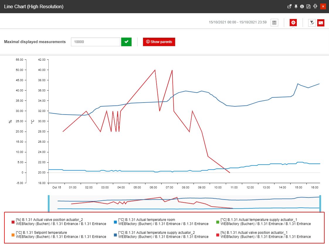
The list of applied Signal
The Raw Data line chart uses two axes, as follows:
the vertical axis represents the value per unit.
Note
The vertical axis supports multiple units of measure, each being represented separately.
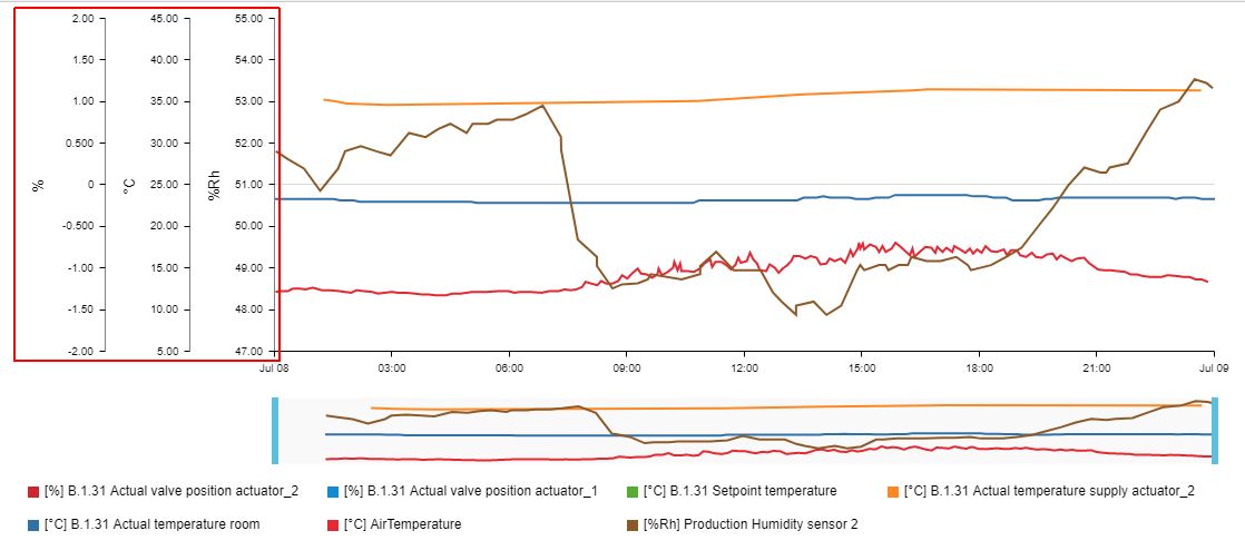
Multiple vertical axes
the horizontal axis represents the selected measurement time-stamp.
Note
The horizontal axis reflects the timeframe selection, as applied by the user.
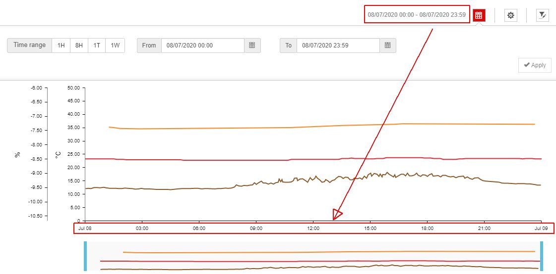
The horizontal axis displaying the zoomed-in time frame
For a more granular view of specific timeframes, the user
When multiple Signals are applied to the chart view, each Signal is represented with a different color, hence making the chart easier to read.
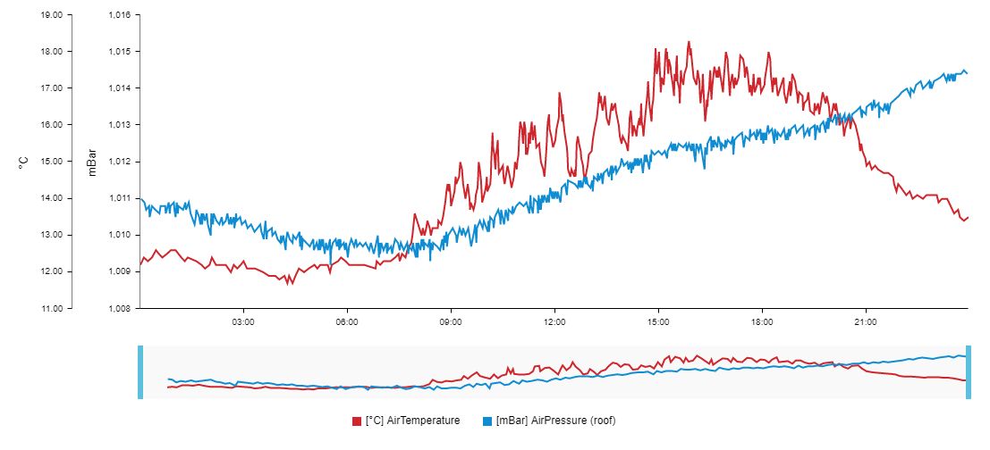
Chart lines
By hovering the mouse cursor over the chart lines three tooltips are displayed, as follows:
the chart tooltip represents the highest peak of the hovered Signal;
the vertical axis tooltip represents the exact registered value for the hovered Signal;
the horizontal axis tooltip represents the exact time of the measurement, for the hovered Signal.
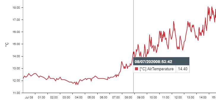
Chart tooltips
Under the chart view, the legend of selected Signals is displayed. While hovering the mouse cursor over a legend label, the line trend of that Signal will be emphasized in the chart by dimming down the other trend lines.
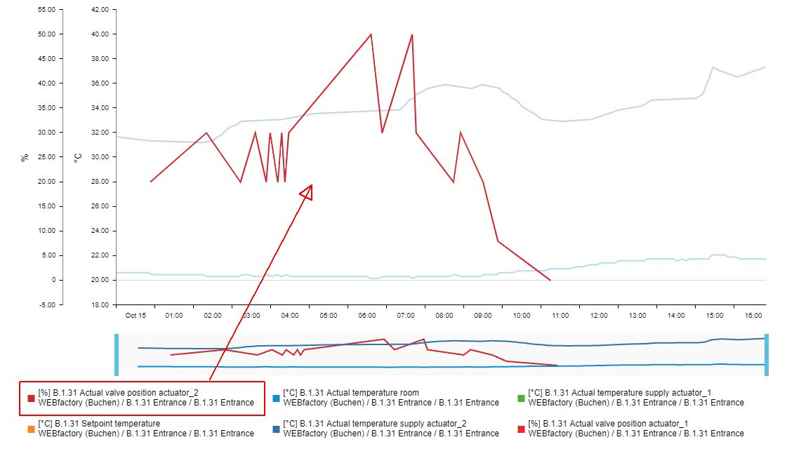
Emphasized Signal
The legend can also be used to toggle on or off the representation of Signals, by clicking on the legend labels of the corresponding Signals.
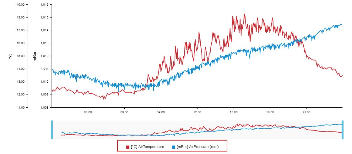
The Legend of the Raw Data chart
Note
The Raw Data Chart view can be customized by setting the desired Chart type at the level of the Signal type (s) used by the plotted signals.
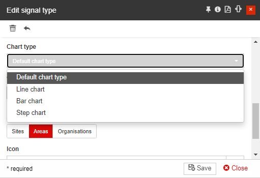
The Signal type allows the user to select the following chart types:
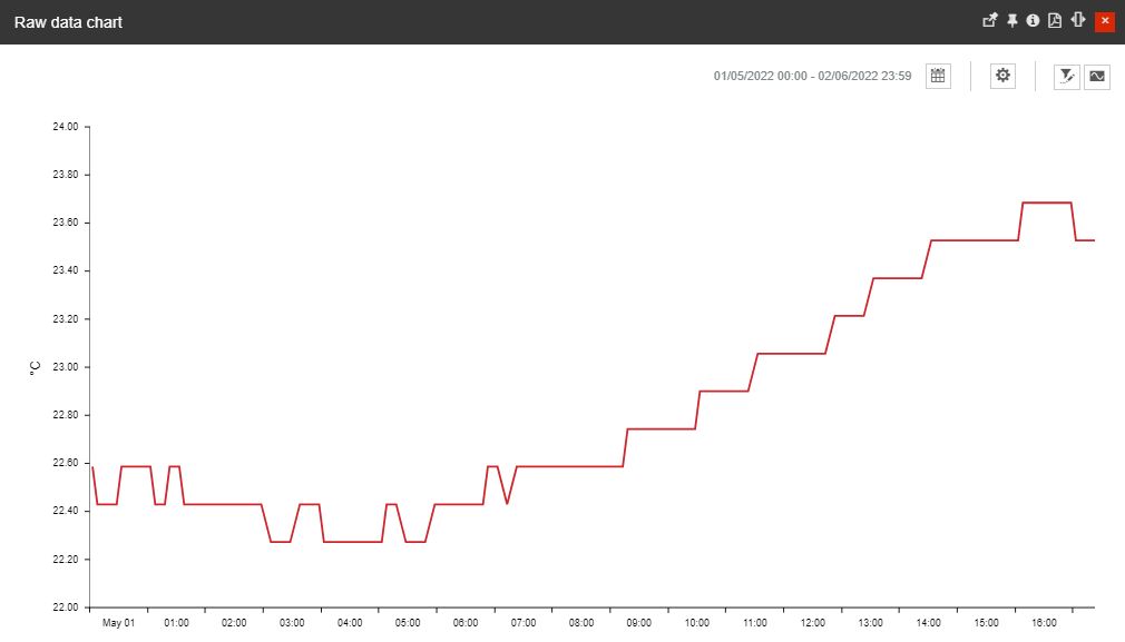
Line chart
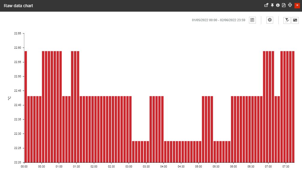
Bar chart
Step chart
