Delta Analysis
The Delta Analysis method compares measurements for either two objects on a defined time interval or for a single object on two equal time intervals.
This article describes the Delta Analysis panels from the i4connected portal.
The Delta Analysis method compares measurements for either two objects (areas, organizational units, or counters) on a defined time interval (Object Delta) or for a single object on two equal time intervals (Time Delta). The purpose of the comparison is the difference between data series (delta) in each of the two possible scenarios. Using this comparison method, the difference between data series (delta) for each of the possible scenarios can be easily analyzed.
Object Delta
The Object Delta analysis is used to display the differences between the measurements of two different objects over the same time period.
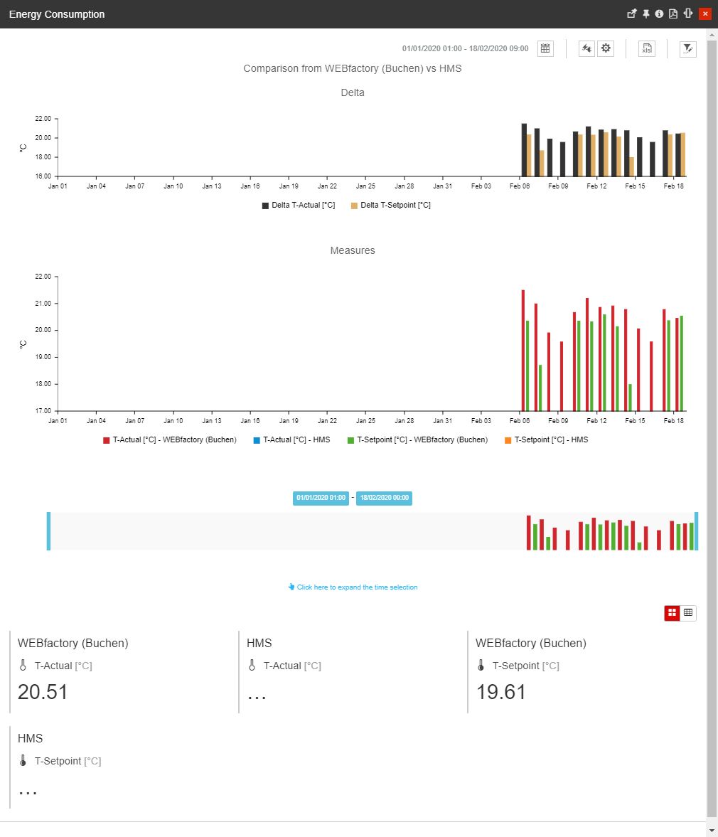
The Object Delta chart
The values illustrated by the Object Delta charts are obtained from the following contexts:
differences between the intersection of the first chosen object and the available media/KPIs
differences between the intersection of the second chosen object and the available media/KPIs
The data obtained from each intersection is referred to as data series. Thus we can say that the Object Delta chart shows the delta of two data series.
The Object Delta chart provides the user with the following operations:
the Object Filter - the most important component of the data series, is given by the objects to be compared. By clicking the Open Filter toolbar button, the Object Filter panel is opened. In this view, the user can select two entities that will be compared.

The Object filter button
Tip
For more details regarding the Object Filter, please also visit our article here.
Selection of the Time frame by clicking on the Calendar button - the view is expanded to display the following time frame options:

The Calendar button
From / To selectors allow a customized time frame selection, where the user can choose the Start and End date and time. Settings done in this area will reset any filters applied at the level of the Calendar / Relative time frame options.

The From/To selector
Resolution - selectors allow the user to select the resolution of the data rendered in the chart, based on the selection done for the From / To calendar pickers (the time interval between two consecutive measurements displayed on the time axis). The user can choose between five predefined resolutions (15 minutes, hourly, daily, weekly, monthly, and yearly) or can set the resolution to Auto.
When the Resolution is set to Auto, the system automatically adjusts the resolution based on the active Time range setting and the current zoom level.
Calendar allows the user to select the predefined time ranges that start from the current date. The available predefined options are:

The Calendar selector
the Last selector allows the user to select the predefined time ranges that start from the current date:
The available predefined options are:
the last Hour(s) - shows the last hour(s) considering the closest ended interval measured in hours.
the last Day(s) - shows the last day(s) considering the closest ended interval, measured in days.
the last Week(s) - the last week(s) considering the closest ended interval, measured in weeks.
the last Month(s) - shows the last month(s) considering the closest ended interval, measured in months.
the last Year(s) - shows the last year(s) considering the closest ended interval, measured in years.
Time range selectors allow the user to select predefined time ranges that start from the current date and time. The available predefined options are:
1H - one-hour time range, going back to the last ended interval, measured in hours.
8H - eight hours time range, going back to the last ended interval, measured in hours.
1T - one-day time range, going back to the last ended interval, measured in days.
1W - one-week time range, going back to the last ended interval, measured in weeks.
1M - one-month time range, going back to the last ended interval, measured in months.
3M - three months time range, going back to the last ended interval, measured in months.
6M - six months time range, going back to the last ended interval, measured in months.
1Y - one-year time range, going back to the last ended interval, measured in years.
Resolution selectors allow the user to select the resolution of the data rendered in the chart (the time interval between two consecutive measurements displayed on the time axis). The user can choose between five predefined resolutions (15 minutes, hourly, daily, weekly, monthly , and yearly) or can set the resolution to Auto.
When the Resolution is set to Auto, the system automatically adjusts the resolution based on the active Time range setting and the current zoom level.
Relative - allows the user to input the desired numerical value, that will set the following predefined time windows:
The Last selector allows the user to input the desired numerical value, which will set the following time windows:
the last Hour(s) - shows the last hour(s) considering the current moment.
the last Day(s) - shows the last day(s) considering the current moment.
the last Week(s) - shows the last week(s) considering the current moment.
the last Month(s) - shows the last month(s) considering the current moment.
the last Year(s) - shows the last year(s) considering the current moment.
Resolution - selectors allow the user to select the resolution of the data rendered in the chart, based on the selection done for the From/To calendar pickers (the time interval between two consecutive measurements displayed on the time axis). The user can choose between five predefined resolutions (15 minutes, hourly, daily, weekly, monthly, and yearly) or can set the resolution to Auto.
When the Resolution is set to Auto, the system automatically adjusts the resolution based on the active Time range setting and the current zoom level.
After selecting the desired time frame, the user must click on the Apply button to preserve the selected timeframe.

The Apply button
Note
Since version 5.6.15, the Object Delta dashboard supports up to 18.000 data points that cover the following resolutions:
2 series of hourly data over one year / 6 months (if more than 2 series are added, the hourly resolution is disabled)
2 series of 15-minute data over 3 months (if more than 2 series are added, the 15min resolution is disabled)
For low resolution, such as hourly per 1 year, it is recommended to use the lines as display mode because bars dramatically increase the performance.
the Media and KPI selectors - reveal the settings which allow the user to select the media and KPIs to be displayed by the charts.

The Media and KPIs selectors
Because the charts can display only four unit axes, only four measurement unit types can be selected simultaneously. However, this doesn't mean that only four media/KPIs can be selected for display. As long as the selected media/KPIs have the same or maximum of four different units, all the available media/KPIs can be selected for rendering in the chart.
When the maximum limit of four different units has been selected, the other available media/KPIs are disabled automatically.
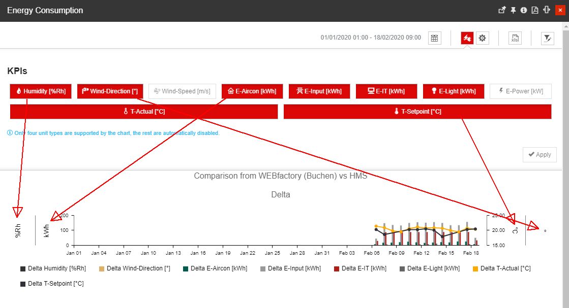
Example with multiple KPIs and four different unit types
the Chart settings button opens the section that allows the user to configure how the data series are represented in the charts.

The Chart settings view
Using the Y-Axis settings-Left, the user can configure the following options:
Left [unit] - toggles the charts mode for the media/KPIs represented on the left unit axis, choosing between lines or bars.
Using the Y-Axis settings-Right the user can configure the following options:
Right [unit] - toggles the charts mode for the media/KPIs represented on the right unit axis, choosing between lines or bars.
Important
This setting is available only if media/KPIs with multiple units are selected for display.
The other charts settings allow the user to configure the following options:
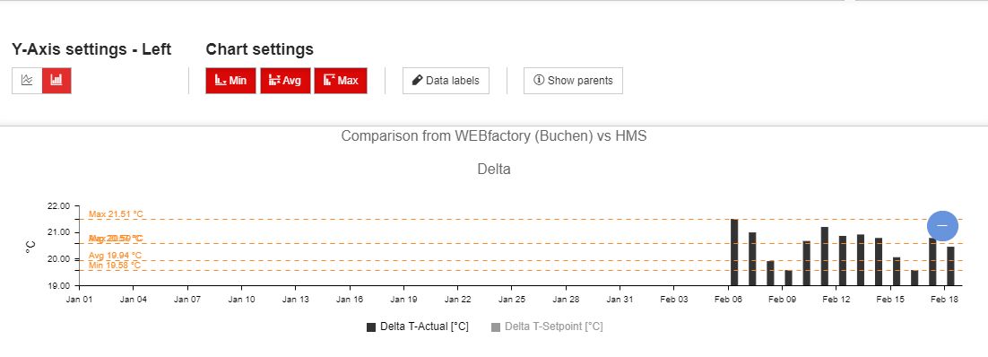
Min/Avg/Max - allows the user to enable chart lines that display the minimum, average or maximum differences (delta) between measurements for each media/KPI.
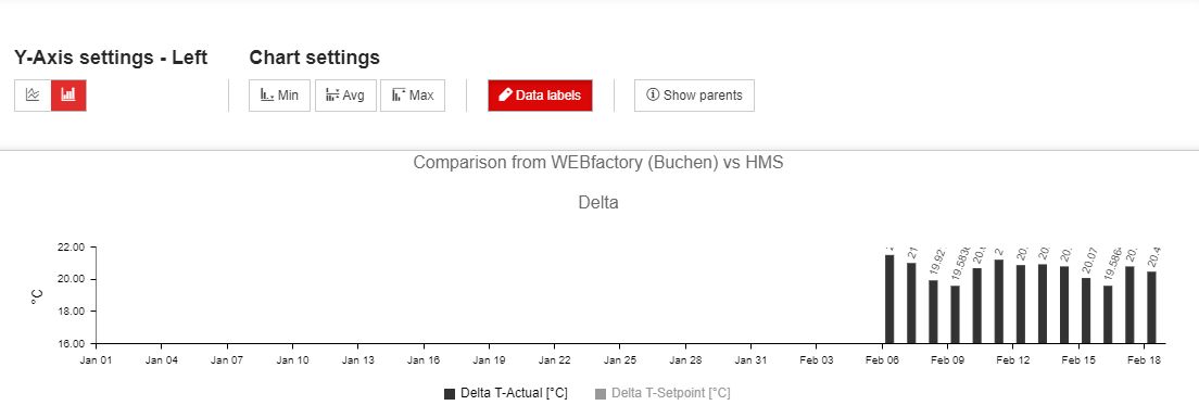
Data labels - allow the user to toggle on or off the labels that indicate the delta and measurement values at a measurement point in the charts (the displayed measurement points depend on the selected resolution). For low resolution, such as hourly per one year, the resolution of the data labels will be dramatically decreased.
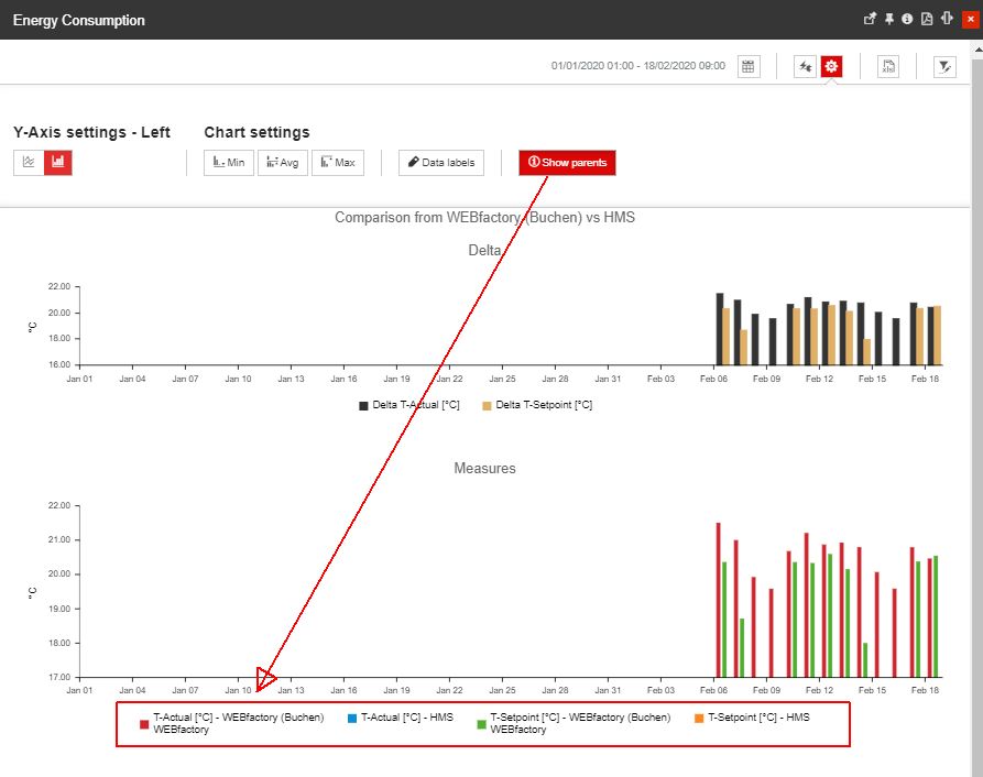
Show parents - allows the user the possibility to enable/disable the display of media/KPIs parents. By enabling the Show parents option, the chart media origins are displayed by the chart legend.
the XLS Export button exports the data displayed in the chart to an Excel format.

The XLS Export button
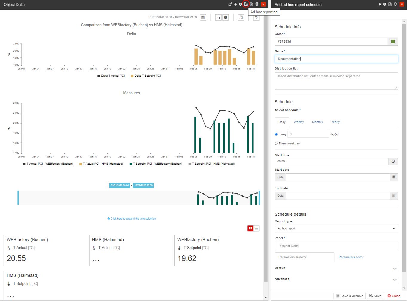
The Ad hoc reporting - by clicking the Ad hoc reporting button, in the Object Delta panel header, the Add Ad hoc report schedule panel is opened, allowing the user to schedule a report for the Object Delta chart.
Note
For more details regarding the panel's parameters, please visit the Scheduling reports article.
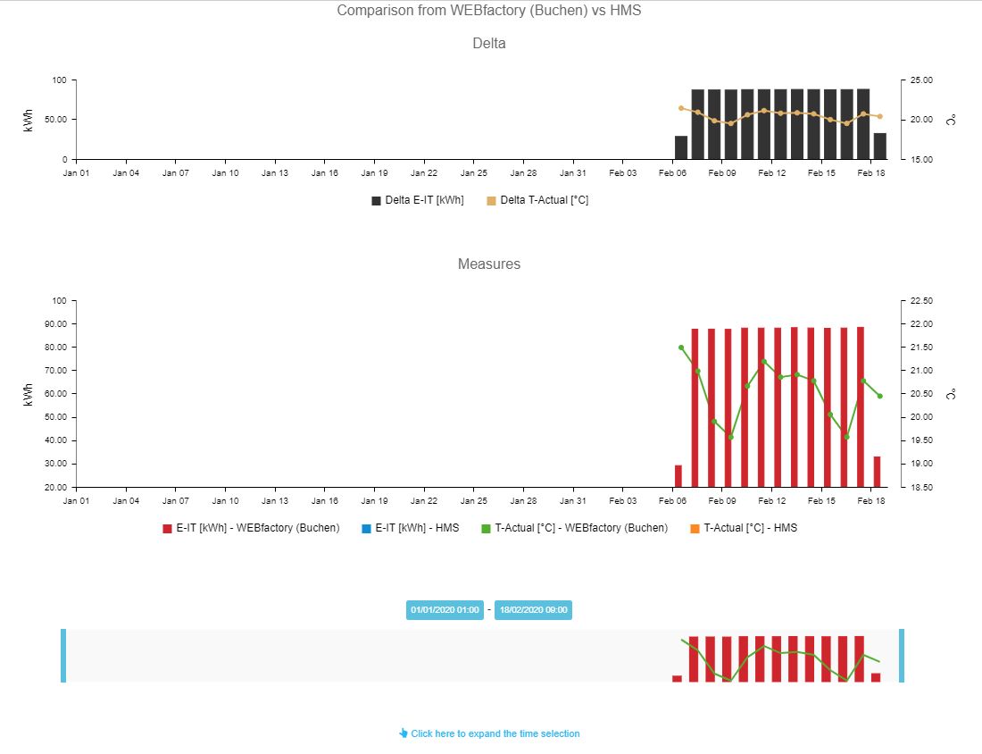
The central view of the Object Delta panel is the chart system. This is where the measurement values and the deltas of the two objects are displayed, based on the selected media/KPIs and time options, as follows:
The Delta and Measurement charts
The delta chart (top) displays the difference (delta) between the measurements taken on the two objects, using the selected media/KPI.
The measurements chart (bottom) displays the actual measurements of the two objects, using the selected media/KPI.
Both charts support a maximum of four vertical axes (two on the left side and two on the right side). The four vertical axes (unit axes) can display four different measurement units, while the horizontal axis (time axis) always displays the time-stamp of the measurement.
Additional vertical axes are automatically added when a KPI with a different measurement unit is selected from the media selection options.
A chart tooltip is displayed when hovering the mouse cursor over any of the two charts.
The delta chart tooltip displays the time stamp, media/KPIs names, the values of the measurements currently hovered, and the measurements delta of the two objects.

The Delta chart tooltip
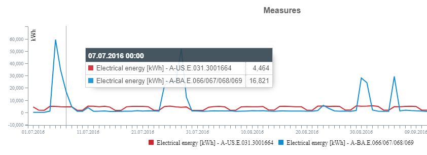
The measures chart tooltip displays the measurement time stamp, the media/KPI names, and the values currently hovered.
The Measures chart tooltip
The bottom section of the Object Delta panel represents the aggregated values of the media displayed by the chart. This section acts like a summary, stating the total or average measurements for all the objects and their media/KPIs displayed in the chart, over the complete time range.

The aggregated values view
The aggregation is done by taking into account the media/KPI type (measurement unit). If the type indicates the addition of measurements, the aggregation will be done by summing up all the measurements of the respective media/KPI. If the type indicates the average of measurements, the aggregation will be done by calculating the average value of all the measurements of the respective media.
The aggregated values can be viewed either in individual tiles (default) or in a table. The two buttons from the top-right corner of the aggregated values area allow the switching of the viewing mode.

The aggregated values in table view mode
The chart legend displays the selected media/KPIs for both charts. While hovering the mouse cursor over a legend label, the line trend corresponding to the deltas for that media/KPI will be emphasized in the chart by dimming down the other trend lines.

The chart legend
The legends can also be used to toggle on or off the representation of deltas, by clicking on the legend labels of the corresponding media/KPIs.
The zoom chart allows the user to narrow down (zoom in) on a specific area of the time range from which the measurements (and delta) are displayed. The zoomed area can be expanded or moved anywhere in the original time interval.

The zoom chart
The zoom chart shows the overall measurement trends and helps the user in locating the desired section by displaying the variation of the general measurements for the whole time range (similar to the measurements chart). The delta and measurement charts resolution and data are updated for every change in the zoom chart.
When dragging the rectangle on the zoom chart, the selected area becomes highlighted. The zoom manipulation is done using the left and right limit bars. The limit bars can be dragged using the mouse to the desired location within the time range. The zoomed area can also be panned by dragging it using the mouse. The changes in the zoom chart are applied upon clicking the Apply button. The current position (date and time) of the left and right limit bars is displayed in the labels above the zoom chart.
Time Delta
The Time Delta is used to display the differences (delta) between the measurements from a single object over two different, equal time spans.
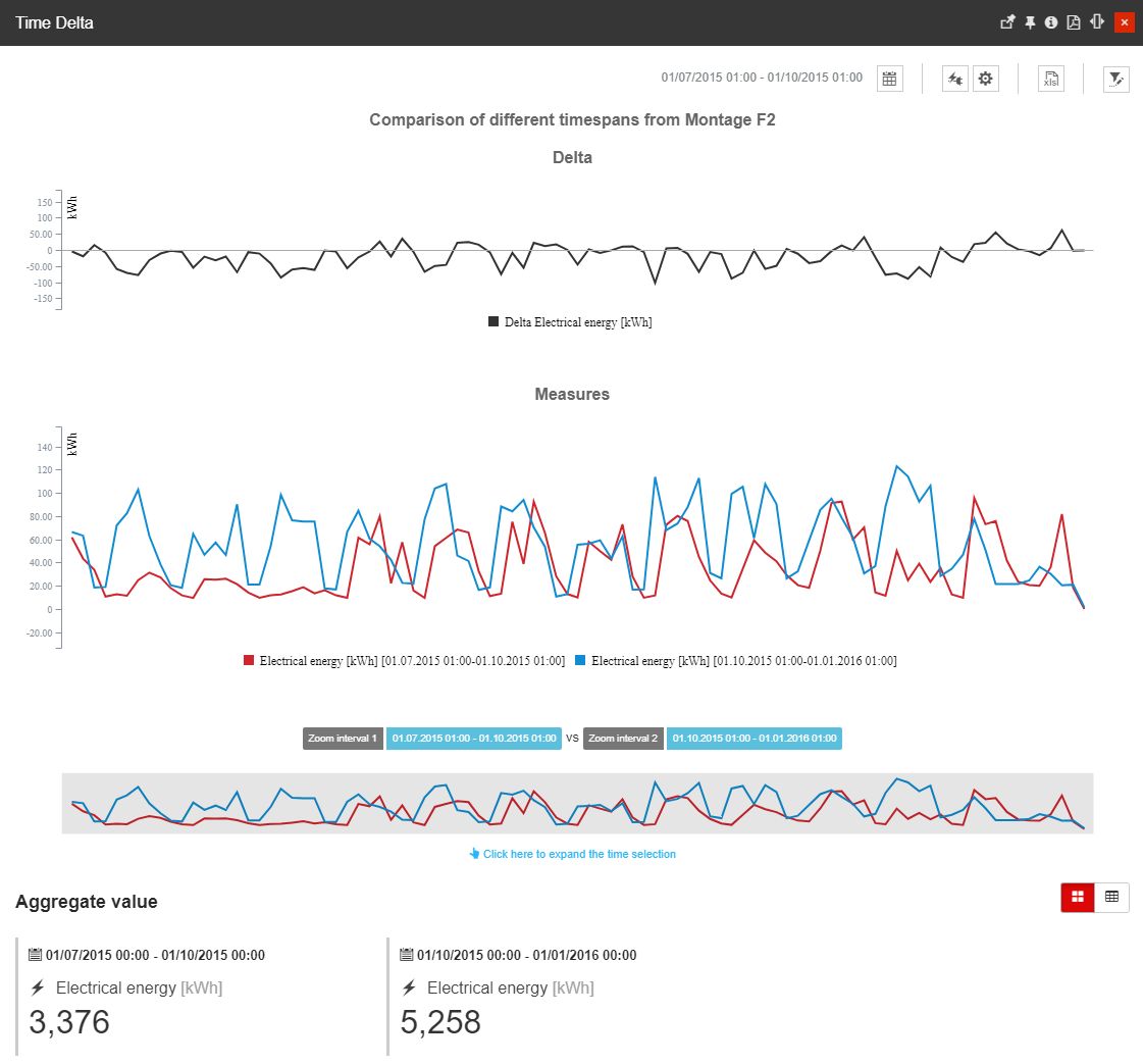
The Time Delta chart
The values illustrated by the Time Delta charts are obtained from the differences between the intersections of a single object, the available media/KPIs, and two different (but equally long) time intervals. The data obtained from each intersection is referred to as data series. Similar to the Object Delta chart, we can say that the Time Delta chart also shows the delta of two data series, but, as explained above, the data series are obtained differently.
The Time Delta chart provides the user with the following operations:
the Object Filter - By clicking the Open Filter toolbar button, the Object Filter panel is opened. In this view, the user can select one entity.

The Object filter button
Tip
For more details regarding the Object Filter, please also visit the dedicated article here.
the Calendar button - expands the panel with the following time selectors:

The Calendar view
the Start date 1 vs the Start date 2 allows the user to set the beginning date and time for the first and the second time intervals.
the Comparison period represents the length of the two intervals to be compared, allowing the user to choose from the following options:
1H - one-hour time range, going forward from the selected Start dates.
8H - eight hours time range, going forward from the selected Start dates.
1D - one-day time range, going forward from the selected Start dates.
1W - one-week time range, going forward from the selected Start dates.
1M - one-month time range, going forward from the selected Start dates.
3M - three months time range, going forward from the selected Start dates.
1Y - one-year time range, going forward from the selected Start dates.
the Resolution selectors allow the user to select the resolution of the data rendered in the chart (the time interval between two consecutive measurements displayed on the time axis). The user can choose between five predefined resolutions (15 minutes, hourly, daily, weekly, monthly , and yearly) or can set the resolution to Auto.
When the Resolution is set to Auto, the system automatically adjusts the resolution based on the active Time range setting and the current zoom level.
Note
Since version 5.6.15, the Time Delta dashboard supports up to 18.000 data points By this, if the 1Y Comparison period is selected, the hourly resolution will be automatically disabled.
For low resolution, such as hourly per 1 year, it is recommended to use the lines as display mode because bars dramatically increase the performance.
the Media and KPI selectors - reveals the settings which allow the user to select the media and KPIs to be displayed in the charts.

The Media and KPIs selectors
Because the chart can display only four unit axes, only four measurement unit types can be selected simultaneously. However, this doesn't mean that only two media/KPIs can be selected for display. As long as the selected media/KPIs have the same or maximum of four different units, all the available media/KPIs can be selected for rendering in the chart.
When the maximum limit of four different units has been selected, the other available media/KPIs are disabled automatically.
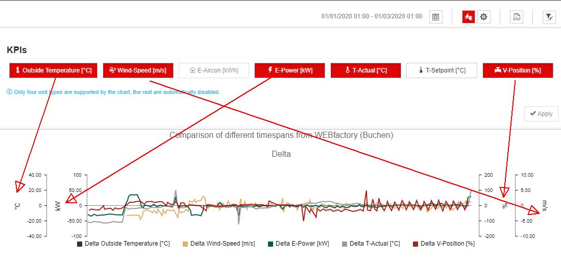
Example with multiple KPIs and four different unit types
the Chart settings button opens the section that allows the user to configure how the data series are represented in the charts.

The Chart settings view
Using the Y-Axis settings-Left, the user can configure the following options:
Left [unit] - toggles the charts mode for the media/KPIs represented on the left unit axis between lines or bars.
Using the Y-Axis settings-Right the user can configure the following options:
Right [unit] - toggles the charts mode for the media/KPIs represented on the right unit axis between lines or bars.
Important
This setting is available only if multiple media/KPIs with different units are selected for display.
The other charts settings allow the user to configure the following options:
Min/Avg/Max - allows the user to enable chart lines that display the minimum, average or maximum differences (delta) between measurements for each media/KPI.
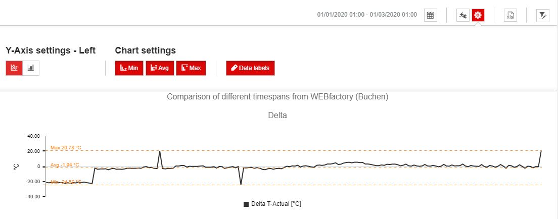
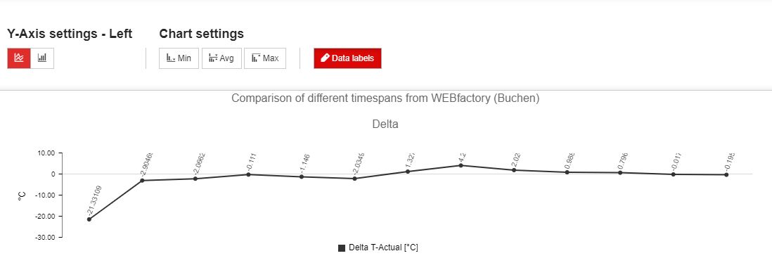
Data labels - allow the user to toggle on or off the labels that indicate the delta and measurement values at a measurement point in the charts (the displayed measurement points depend on the selected resolution). For low resolution, such as hourly per one year, the resolution of the data labels will be dramatically decreased.
the XLS Export button exports the data displayed in the chart to an Excel format.

The XLS Export button
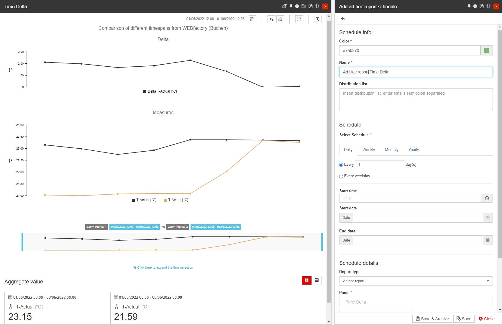
the Ad hoc reporting - by clicking the Ad hoc reporting button, in the Time delta panel header, the Add - Ad hoc report schedule panel is opened, allowing the user to schedule a report for the Time delta chart.
Note
For more details regarding the panel's parameters, please visit the Scheduling reports article.
The central view of the Time Delta panel displays the delta values chart and the measurements chart, resulting from the two compared time ranges, as follows:
The delta chart (top) displays the difference (delta) between the measurements taken over the two-time ranges, on the same single object, using the selected media/KPI.
The measurements chart (bottom) displays the actual measurement values of the two-time ranges, on the same object using the selected media/KPI.
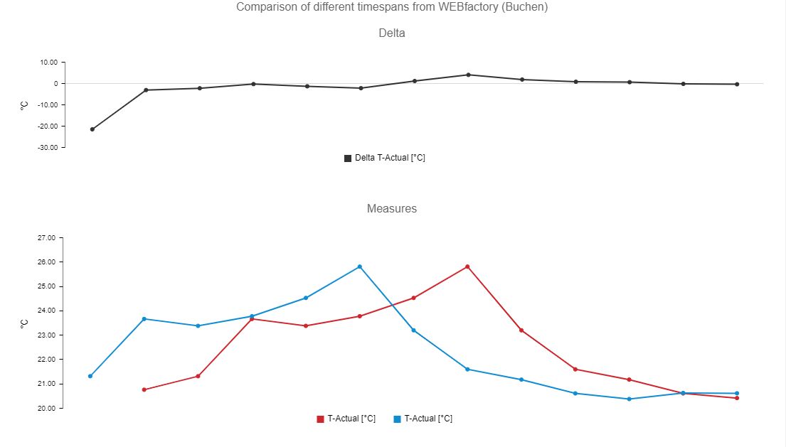
The Time Delta charts
Both charts support a maximum of two vertical axes (left and right). The two vertical axes (unit axes) can display two different measurement units, while the horizontal axis (time axis) always displays the time-stamp of the measurement.
The second vertical axis is automatically added when a KPI with a different measurement unit is selected from the media selection options.
By hovering the mouse cursor over any of the two charts, a tooltip is displayed:
The delta chart tooltip displays the time index (using the start + H:m or start + days format), media/KPIs names, the values of the currently hovered measurements, and the measurements delta of the two-time intervals at that point.

The Delta tooltip
The measurements chart tooltip displays the time index (using the start + H:m or start + days format), media/KPIs names, the timestamp of each measurement, and the value of each measurement for each of the two-time intervals, at the current point.

The Measures tooltip
The chart legend displays the selected media/KPIs. While hovering the mouse cursor over a legend label, the line trend corresponding to the deltas for that media/KPI will be emphasized in the chart by dimming down the other trend lines.

The chart legend
The legend can also be used to toggle on or off the representation of deltas, by clicking on the legend labels of the corresponding media/KPIs.
The zoom chart allows the user to narrow down (zoom in) on a specific area of the time range from which the delta and measurement values are displayed. The zoomed area can be expanded or moved anywhere in the original time interval.

The zoom chart
The zoom chart displays the overall measurement trends and helps the user in locating the desired section by displaying the general variation of the two measurements (same object, different time ranges, similar to the measurement chart). The resolution and data of the delta and measurement charts are updated for every change in the zoom chart.
When dragging a rectangle on the zoom chart, the selected area becomes highlighted. The zoom manipulation is done using the left and right limit bars. The limit bars can be dragged using the mouse to the desired location within the time range. The zoomed area can also be panned by dragging it using the mouse. The changes in the zoom chart are applied upon clicking the Apply button.
The current position (date and time) of the left and right limit bars is displayed in the labels above the zoom chart, for each of the two time periods.
The bottom section of the Time Delta panel represents the aggregated values of the media displayed by the charts. This section acts like a summary, stating the total or average measurements for all the media/KPIs displayed in the chart, over the complete time range.

The Aggregate values section
The aggregation is done by taking into account the media/KPI type (measurement unit). If the type indicates the addition of measurements, the aggregation will be done by summing up all the measurements of the respective media/KPI. If the type indicates the average of measurements, the aggregation will be done by calculating the average value of all the measurements of the respective media.
The aggregated values can be viewed either in individual tiles (default) or in a table. The two buttons from the top-right corner of the aggregated values area allow the switching of the viewing mode.

The aggregated values in table view mode