Opening tiles in management mode
Check out this article and learn all that you need to know about the management of Tiles and how you can change their size, position, parameters, and even remove them.
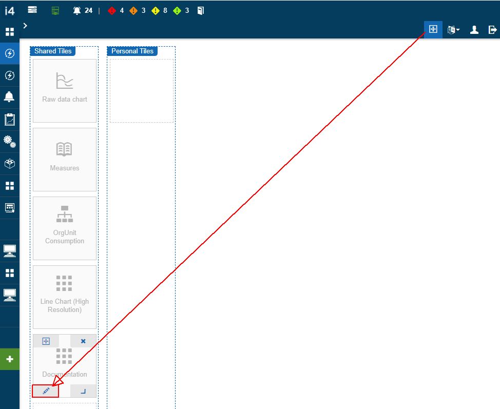
The process of editing Tiles is done directly in the UI. The edit layout mode, is accessed using the Edit layout option, displayed in the global menu bar.

The Edit tiles option
The Edit layout mode consists in two sections:
The Shared Tiles - this area allows possibility to add and manage tiles that will be shared will all the system users. To be able to add new tiles in this section, the user needs to have the Manage shared tiles permission enabled on a global level. When creating a tile from the Shared tiles section, this tile will be added to the Shared tiles.
The Personal Tiles - this section sets a tile to type Personal and will make the tile available only for the creator user. Personal tiles do not expect Role assignments, as they will inherit the owner's roles.
As soon as the Edit layout option is selected, all the page tiles are displayed in Layout mode allowing the user with the following edit options:
The pen symbol
 can be used to adjust Tile properties and parameters;
The cross symbol
 can be used to change the Tile position, in the grid;
The corner symbol
 can be used to manually adjust the Tile size;
The X symbol
 allows the user to delete the selected Tile;
The lock symbol
 allows the user to manage the selected Tile roles.
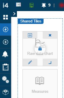
Edit Tiles mode
Editing tiles
Open this article to learn how to edit tiles and how to manage their parameters. It is not complicated once you learn how to do it by yourself!
The user can edit a Tile by clicking the pen symbol  in the Edit layout mode.
The Edit tile panel is opened at the right side of the screen, allowing the user to organize a set of changes at the level of Tile properties and JSON parameters.
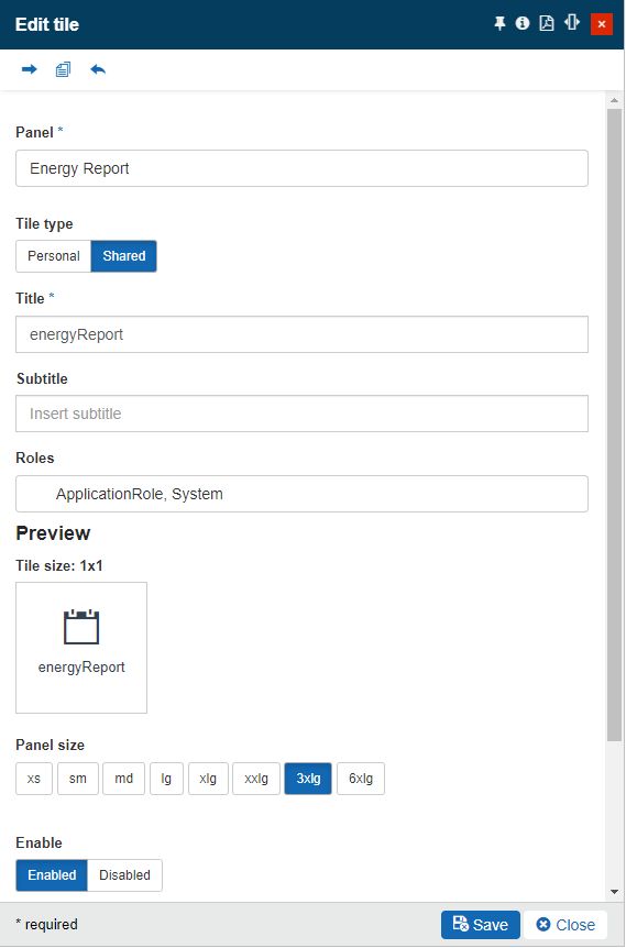
Edit Tile panel
The toolbar of the Edit Tile panel features the following options:

Edit Tile toolbar
Move Tile - the scope of this function is to allow the user to move a Tile from the current page to another page.
By clicking this option, the Move Tile panel is opened. In this view, the user can select the move destination page. By default, the selector is empty.
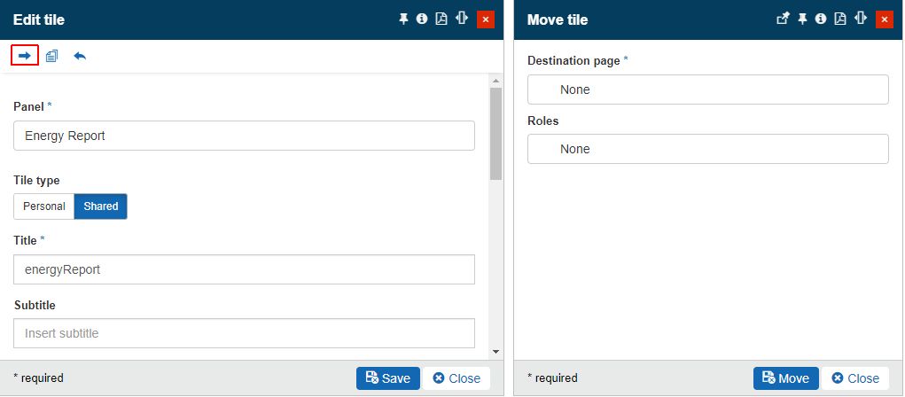
Move Tile panel
To select a destination page, where the Tile should be moved, click on the selector to open the Page List panel.
The Page List panel displays the list of all pages available in the current i4connected project. For a better overview, the user can also filter the page list, by using the search function. The list can also be refreshed by clicking the Refresh toolbar button or updated with new pages, via the Add toolbar button.
To select the desired Roles, click on the selector to open the Roles panel, where the user can select/unselect the listed roles. For a better overview, the user can also filter the roles, by using the search function. The Roles list can also be refreshed by clicking the Refresh toolbar button.
As soon as the desired page and role have been identified in the list view, click on it to close the Page List panel and to add the selected page and role, to the Move Tile panel.
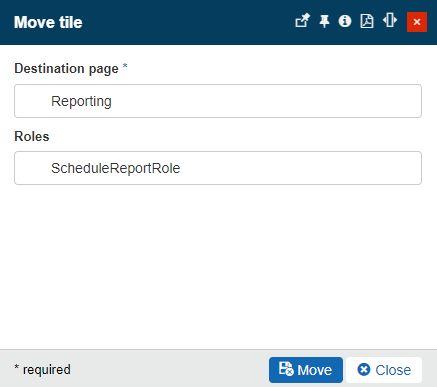
Destination page selected
To proceed with the move action, the user can click the Move button in this panel. To cancel the move and close the Move Tile panel, the user can click the Close button.
Copy Tile - the copy function allows the user to copy a Tile from the current page to another. This way, the Tile will be available on both pages.
Clicking this toolbar button opens the Copy Tile panel, where similar to the Move Tile panel, the user is required to select a destination page, and Roles where the Tile is to be copied.
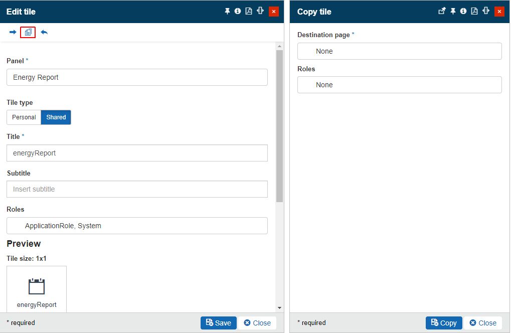
Copy Tile panel
Clicking the Destination page selector opens the Page List panel. The Page List panel displays the list of all pages available in the current i4connected project. For a better overview, the user can also filter the page list, by using the search function. The list can also be refreshed by clicking the Refresh toolbar button or updated with new pages, via the Add toolbar button.
To select the desired Roles, click on the selector to open the Roles panel, where the user can select/unselect the listed roles. For a better overview, the user can also filter the roles, by using the search function. The Roles list can also be refreshed by clicking the Refresh toolbar button.
As soon as a selection is done, the Page List panel is closed and the Copy Tile panel is updated with the required Destination page.
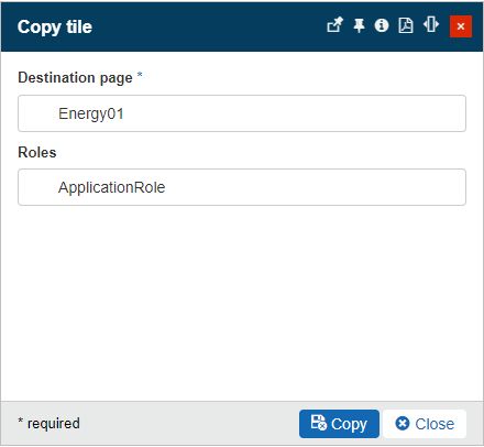
Destination page selected
To confirm the copy action, the user can click the Copy button. To discard changes and close the Copy Tile panel, the Close button can be closed.
Reset - the scope of the Reset function is to allow the user the possibility to revert all changes organized in the Edit Tile panel. However, a reset will be effective only if the changes are not yet saved.
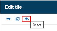
Further on, the Edit Tile panel allows the user to update the Tile properties, as follows:
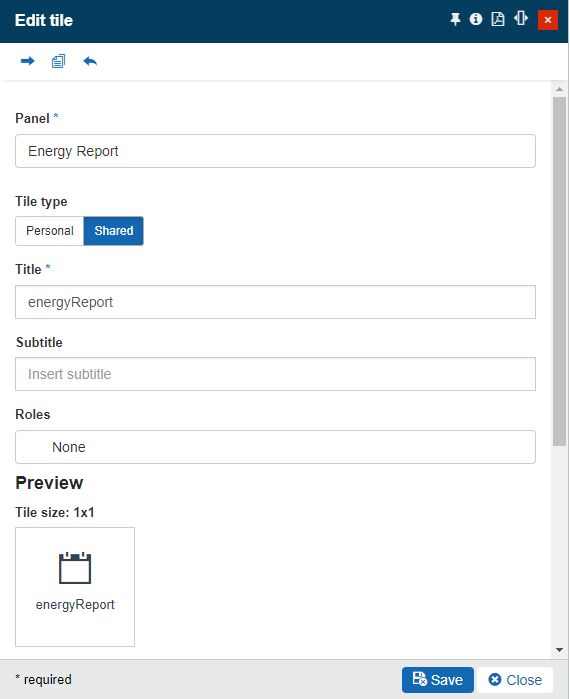
Edit Tile properties
Panel - The Panel parameter will be prefilled with the panel used by the currently selected Tile.
Tile type - Tiles can be either Personal or Shared. The selected value is highlighted in green color.
Tiles of type Personal are visible only to the currently logged-in user. On the other hand, the Shared Tiles will be visible to all users, that have the assigned Tile roles.
Note
If the user has the Manage shared panels permission enabled can edit both personal and shared panel.
Title - The Tile name, displayed when the panel is opened.
Subtitle - The Tile subtitle, displayed when the panel is opened.
Assign roles - The roles attributed to the respective Tile. The scope of the role assignment is to control which of the project users will have access to view the Tile.
The roles are selected from the Select roles panel, opened on the right side of the screen.
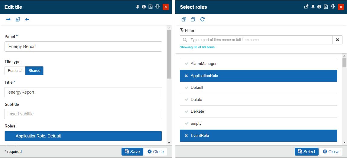
The Tile Roles panel
Besides the above-indicated properties, further preview settings are also available:
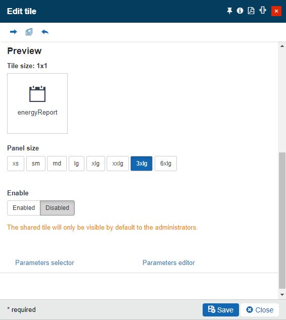
Edit Tile preview properties
Tile size - Allows the user to manually update the size of the respective Tile. The default Tile size is 1x1, which is also the minimum value, but it can be adjusted to higher values such as 1x2, 2x1, 2x2, 3x1, and the maximum of 3x2.
Panel size - Allows the user to select the size of the current panel. Users can select from the available options, starting with the smallest value of xs (extra small) and ending with the highest 6xlg (6 times large).
Enable status - defines if the Tile is active (enabled) or inactive (disabled). A disabled Tile is grayed out in the Tiles grid.
Note
Tiles can have a custom class to feed them with some visibility particularities. To do that, an i4connected system admin can write their custom CSS in the accentClasses.json file.
Last, but not least, while editing a Tile, the user can maintain a set of JSON parameters.
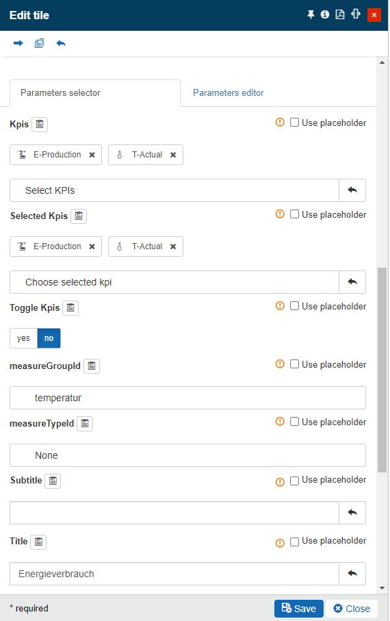
Edit Tile parameters
In this area of the panel user can decide how to edit the JSON parameters of the Tile panel:
Parameter selector tab
The available parameter selectors, depend on the selected Tile, each Tile panel having its particularities. However, the following types of selectors can be distinguished:
Date type selectors - the selection of a date is done in the calendar.
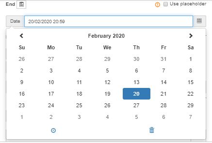
Calendar view
List selectors - the selection is done from a separate panel, containing the electable elements. The user can select one or more elements from the list.
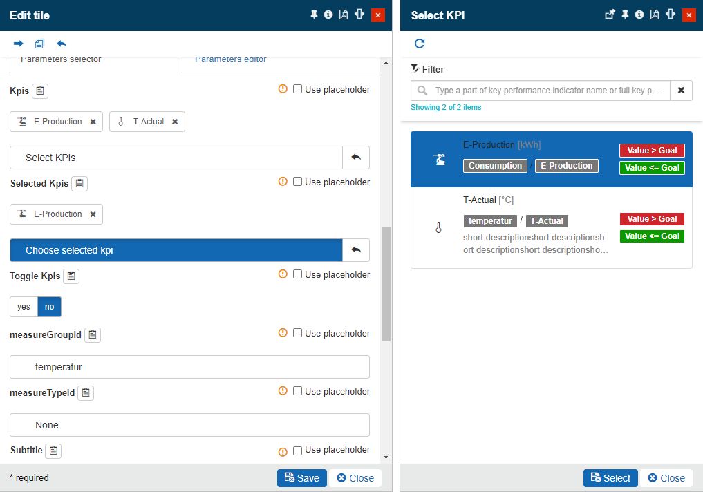
List selector
Drop-down list selectors - the selection is done from a drop-down list.
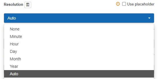
Drop-down list selector
Textual fields - free text can be inserted in this field.

Text field
Numerical fields - numerical characters can be inserted in this field.

Numerical field
Boolean selectors - the user is provided with two selection options.

Boolean selector
Filter selectors - these fields consist of a JSON structure, generated on basis of parameter selections. Basically, the user can define various sets of filter settings, which are automatically parsed in JSON format.
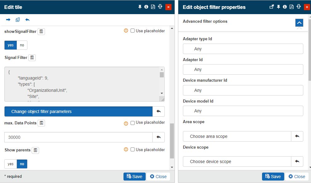
Filter selector
In the parameter selector area, three constant options can be recognized:
Copy to clipboard button - allows the user to copy to clipboard the respective field tag. The scope of this function is to ease the process of manual definition of the JSON structure, in the Parameters editor area.
Hovering over the Copy to clipboard button, a tooltip is displayed, indicating exactly which is the content that will be copied. Clicking the Copy to clipboard button is followed by a confirmation message, indicating whether the action was performed successfully or not.
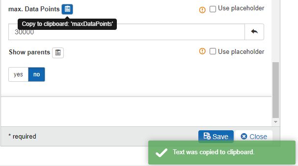
Copy to clipboard
Use placeholder option - allows the user to connect the parameters of a tile to a particular entity, by means of placeholders.
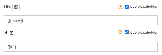
Use placeholder
The advantage provided by this functionality is to reduce the number of pages, in case the i4connected application is running on large projects, acting (globally) in building/facility management or remote service.
Depending on the entity, we can distinguish the following placeholder parameters:
Organizational Units, Sites, and Areas
{{id}} - UUID of the entity
{{name}} - the name of the entity
Organizational Units
{{alias}} - the alias of the Organizational Unit
A parameter is defined with opening and closing double curly brackets: e.g. {{parameter}}.
Array parameters can be defined by opening and closing double curly brackets and square brackets: e.g.{{[ {{parameter1}}, {{parameter2}} ]}}. Each array item will be separated by a comma, so a valid array parameter could be: {{[ {{id}}, {{name}} ]}}.
The replacement is done using the string replacement before the object is deserialized, into a JavaScript object.
Parameter replacements are optional arguments, basically key-values of an object which map the placeholder name to an actual value. The values can be of any type: e.g. JavaScript objects, arrays, or values.
The responsibility of applying parameter replacements goes to the tile view model (e.g. the panel navigation tile). The panel navigation tile checks if any placeholders are present, and if so, it calls the page system to obtain the replaced parameter ID and use the returned ID when performing the navigation.
The page infrastructure exposes a mechanism to obtain the replaced parameters, based on the following algorithm:
Obtain the un-encoded JSON string from the original parameter ID.
Perform all placeholder replacements inside the JSON string.
Perform a server round-trip to obtain or generate a new parameter ID, matching the replaced JSON string.
Return the new parameter.
Note
Given the fact that any existing values are lost when marking the Use placeholder checkbox, this function should be used wisely. This warning is also visible in the Parameters selector area, by hovering over the
 symbol, next to the Use placeholder checkbox.
Placeholder warning
To remove a placeholder, the user can simply unmark the Use placeholder checkbox. The placeholder will be cleared and the field remains empty, until further changes. The value of the parameter will be changed to value "null".
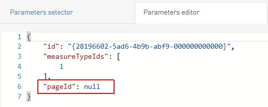
Parameter with "null" value
For a step-based tutorial of placeholder usage, please also visit the tutorial under ???.
Reset button - allows user to reset any unsaved values, at the length of one click. The Reset function will also allow the user to revert to the parameter value that existed before a placeholder was used.

Reset button
Parameter editor tab
The parameter editor reflects the JSON structure, generated based on parameter selections, organized in the Parameter selector area. The user can also manually edit the JSON structure.
Note
The changes organized in the Parameters editor are consistent with the ones in the Parameters selector and vice-versa.
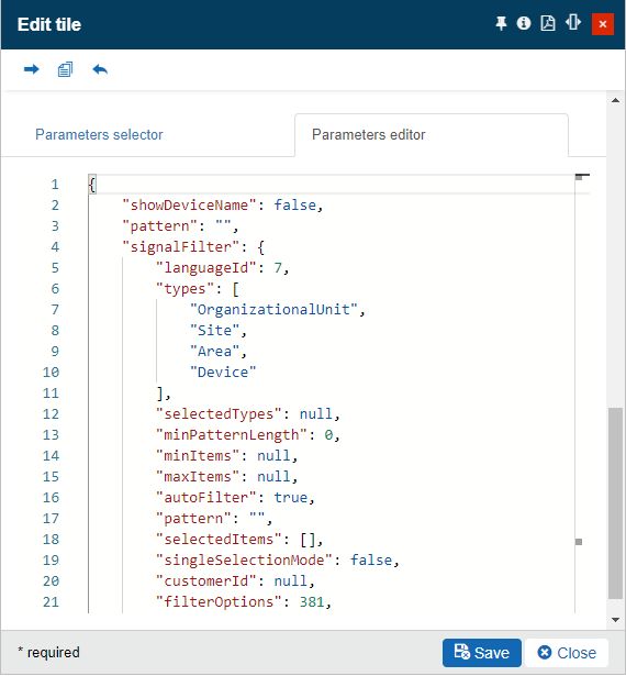
Parameter editor
To preserve the changes at the level of Tile properties and panel parameters, the user has to click the Save button. In order to exit the Edit Tile panel, without saving the changes, the user can click the Close button.
Adjusting tiles position
Learn how to adjust the positioning of your tiles inside your pages, by reading this article and trying it by yourself!
As indicated, the Tiles position can be manually adjusted by the user, by selecting the cross symbol  of the Tile, while in edit mode.
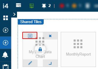
Adjust Tile position option
As soon as the cross symbol has been selected, the Tile can be dragged and dropped to the new position. The permitted Tile position is highlighted in red, as in the below screenshot.
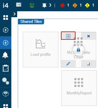
Drag and Drop Tile
The changes organized at the level of the Tile position are automatically preserved, by leaving the Tiles edit mode, without any additional saving actions.
Adjusting tiles size
Open this article and learn how to adjust the size of your tiles and which are the available sizes that you can apply.
The size and orientation of the tiles can be adjusted, using the corner symbol  .
.
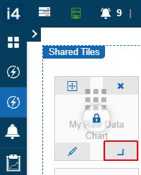
Adjust Tile size button
To enlarge a Tile, the user can drag the corner symbol to acquire the desired size, up to a maximum stretch value of 2x2.
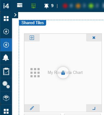
Enlarge Tile
To narrow a Tile, the user can drag the corner symbol to acquire the desired size, down to a minimum stretch value of 1x1.
The Tiles can be stretched to the following size values: 1x1, 1x2, 2x1, and 2x2.
Once the size of a Tile has been defined, no further saving actions are necessary as changes are automatically preserved.
Deleting tiles
Do you have unnecessary tiles on your pages? Learn how to remove them permanently without any ounce of effort!
The redundant Tiles can be removed, by clicking the X symbol  , while in Tiles edit mode.
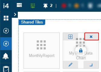
Delete Tiles button
By clicking the Delete Tile button, a new panel is opened on the right side of the screen. The Delete Tile panel provides the user with a mandatory deletion confirmation code.
After typing the confirmation code in the field and clicking the Delete button, the Tile is permanently removed. The Tile deletion is an operation that cannot be reversed.
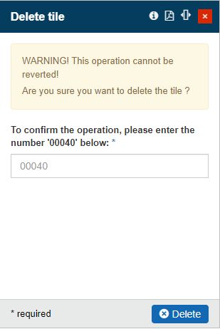
Delete Tile panel
Managing tiles roles
Check out this article and learn how to manage the roles assigned to a tile of type shared in a fast and easy manner.
As earlier indicated tile visibility is secured based on role assignments. As roles can only be assigned to tiles of type shared, we can distinguish two methods of tile roles management:
by accessing the Edit tile panel, as described in the Edit tiles article.
by accessing the Tile roles panel.
The Tile roles panel can be accessed by clicking the Lock symbol  displayed on a tile, while in edit tiles mode. The Tile roles option is available only for users having the Manage shared tiles permission enabled.
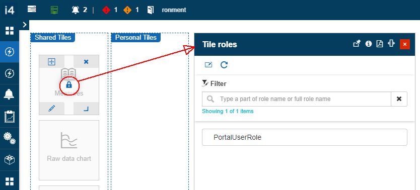
The Tile roles panel
In this view, the list of all roles already assigned to the selected tile is displayed.
By clicking the Change toolbar button, the Select roles panel is opened displaying all the roles available for assignment.
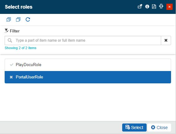
The Select roles panel
Important
The list of roles depends on the currently logged-in user permissions. Users having the Configure security permission enabled, will see a complete list of all system roles. Users that do not have this permission enabled will only see the roles of the currently logged-in user, along with their linked roles.
After choosing the desired roles, the user can click the Select button to proceed with the assignment or the Close button to abort the operation.