Energy Ranking Dashboard
The Energy Ranking Dashboard displays a set of best and worst entries, over a specified time helping you to identify the biggest energy consumers.
This article describes the functionality and operation of the Energy Ranking Dashboard, from the i4connected portal.
The Energy Ranking Dashboard has as scope to show a list of best and worst entries, at the level of energy consumption, for a defined time frame.
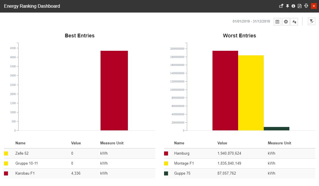
The Energy Ranking Dashboard
The Energy Ranking Dashboard panel provides the user with the following options:
selection of the Time frame - allows the user to select a custom time frame, by clicking the Calendar button and selecting the Apply button to preserve the selected options. In this view, the user can select the following time frame combinations:

The Calendar button
Time range - specific time ranges can be selected, from the following available options:
1H - last hour
8H - last 8 hours
1T - last day
1W - last week
1M - last month
3M - last three months
6M - last six months
1Y - last year
From / To selectors
selection of the maximum number of entries supported by the charts. The user can manually type in the number of Organizational Units to be considered by the charts.

Number of entries selector
This field is restricted to a maximum value of 50 entries. If a higher value is added, an error message is displayed.

Error message
Depending on the number of entries selected by the user, the main Organizational Units will be the first ones to be considered for the measurements.
Selection of the KPIs that the charts can use for the best and worst measurements. The list allows the selection of one single item at a time. As soon as the desired item is selected, the chart data is automatically updated, breaking down the consumption to reflect the selected KPI.

KPIs selectors
Selection of the Objects that make the subject of the measurement, by clicking the Open filter button. The Object filters panel allows the user with the possibility to select the Organizational Unit(s) to be measured.
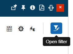
The Open filter button
Tip
For more details regarding the Object Filter, please also visit our article here.
The Energy Ranking Dashboard panel is split in two columns, as follows:
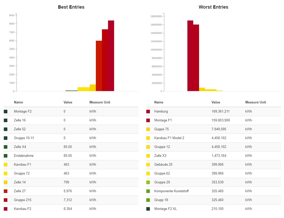
Energy Ranking panel central view
Best Entries - the Organizational Units with the lowest energy consumption values.
Best Entries chart - charts the highest values as red bars and the lowest values as green bars.
Best Entries list - the Organizational Units that were included in the ranking are increasingly listed, from the lowest consumption value to the highest.
Worst Entries - the Organizational Units with the highest energy consumption values.
Worst Entries chart - charts the highest values as red bars and the lowest values as green bars.
Worst Entries list - the Organizational Units that were included in the ranking are decreasingly listed, from the highest consumption value to the lowest.
By hovering the mouse cursor over the chart, a tooltip is displayed, listing all the chart entries and their values.
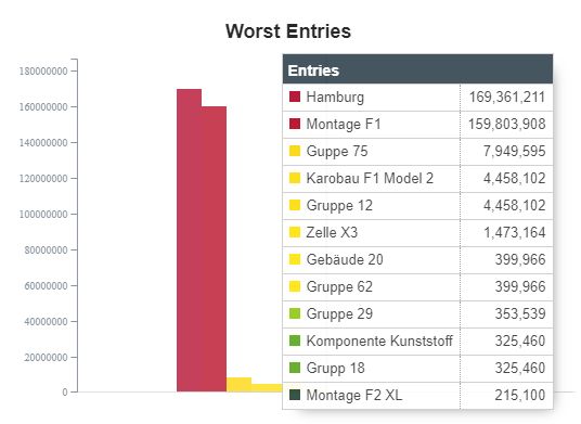
The Chart tooltip
The user can interact with the Entries lists in order to toggle on / off the chart bars by clicking on the corresponding list entries.
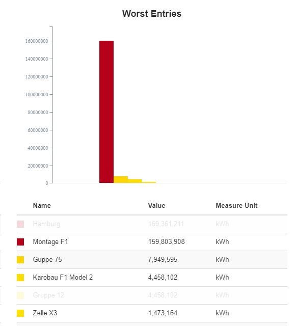
Toggle On / Off the list entries