Detailed Consumption Monthly
The Detailed Consumption dashboard provides an overview of monthly consumption of multiple media types compared with a set of predefined goals.
This article describes the functionality and operation of the Detailed Consumption panels from the i4connected portal. The Detailed Consumption analysis functionality of the i4connected portal displays the consumption of a site/organizational unit/area broken down in individual media types and presented against the defined goals.
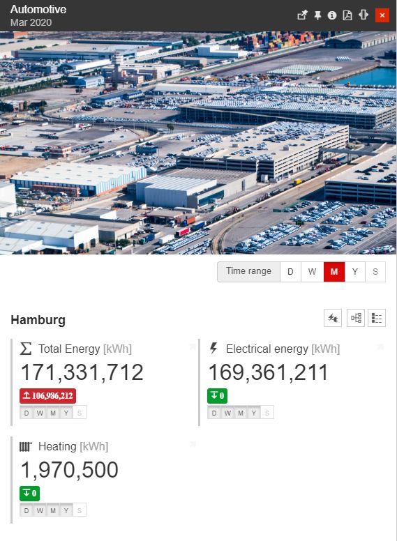
The Detailed consumption monthly
The Detailed Consumption tile is available in each media section of the portal and opens the Detailed Consumption panel. In this view the user can read the following information:
the consumed media type (with symbol, name, and unit)
the current consumption (the consumption from the previous complete month)
the difference between the current consumption (previous month) and the goal (the month before the previous month). If the goal has been exceeded, the exceeded value is displayed in a red highlight, otherwise, the green highlight is displayed.
the time periods from which the data is available. If the period selected in the time selector is grayed out in the tile, no data will be displayed in that tile.
The Detailed Consumption panel uses a tile-based layout. The available tiles display the detailed consumption from the period selected in the time selector.
The predefined time periods available in the time selector can be individually activated by the administrator for each available media. By default, the following time periods are available:
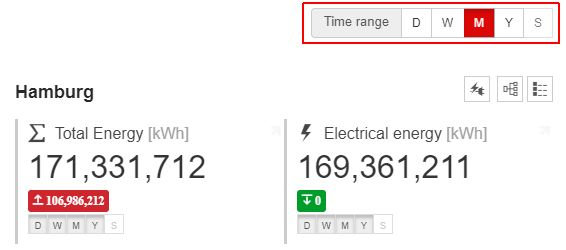
The Time range selectors
D - last day
W - last week
M - last month
Y - last year
S - last shift (see Shift Definition for more information about the shift schedules)
Each tile (which is configured to do so) will display the time ranges when data exist, which can be activated from the time selector. If a specific time period is grayed out in the tile's indicator, that KPI won't have data available in that particular time range.
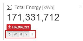
The available time ranges
The Detailed Consumption panel allows the user to select the measurement group from which to display the data. This is done using the dedicated measurement groups menu, accessed via the Measurements group button in the structure's header. Selecting a different measurement group from the menu, the panel's tiles are updated to reflect the new data.
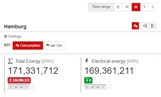
The KPI selector
Further on, the user can expand the current object view, to see the consumption data for its children (Organizational Units or Areas) by clicking the Drill Down button. The drill-down functionality can be used until reaching the last level of the parent object.
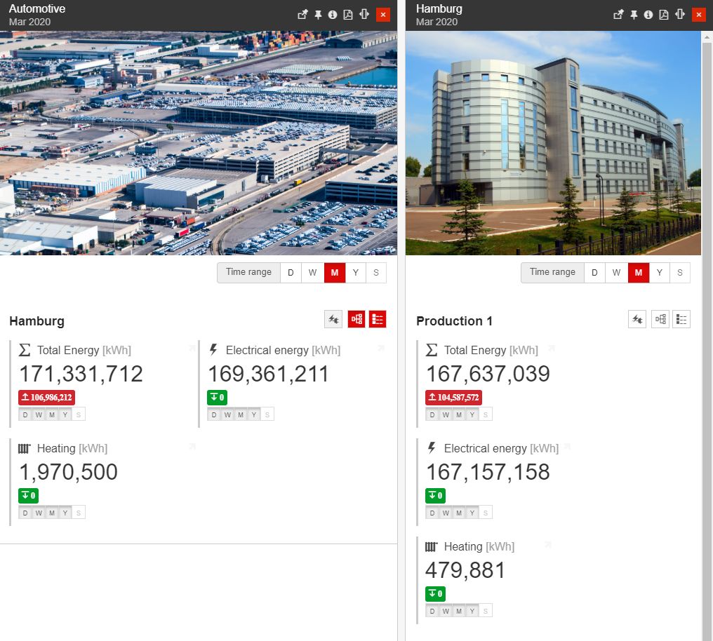
Example of drill-down functionality
When selecting a tile, the user will be taken to the Yearly Consumption Breakdown chart.
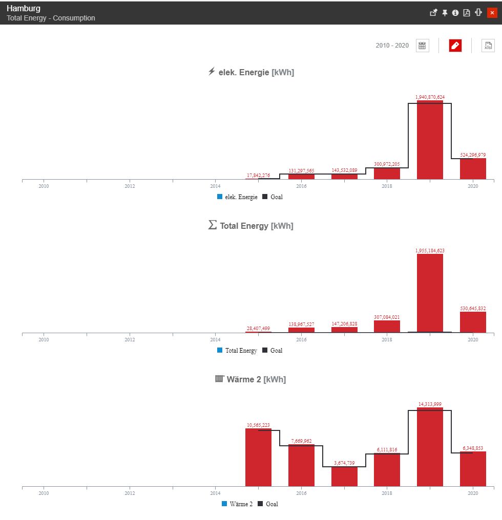
The Yearly Consumption Breakdown chart
Here, the consumption data is displayed on a yearly basis, broken down into all the available media types. The displayed data depends on the measurement group selected in the Consumption panel. By default, the chart displays the consumption against the goal for each available KPI, starting with the goal's starting year up to the current year. The chart can be opened at any drill-down level, thus displaying the detailed consumption of any available object structure.
The data for each media type is compared with the defined goal for that media type (the black line). The yearly consumption below the goal is represented with green while the yearly consumption above the goal is represented with red.
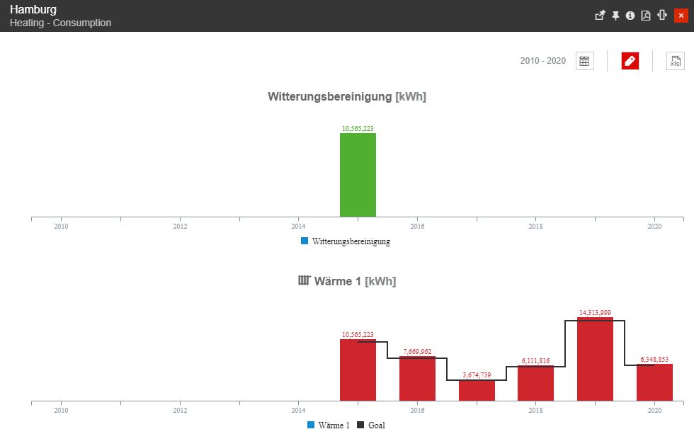
Colors of the Yearly Consumption chart
The toolbar of the Yearly Consumption chart allows the user to organize the following operations:
change the From / To time frame, by clicking the Calendar button.
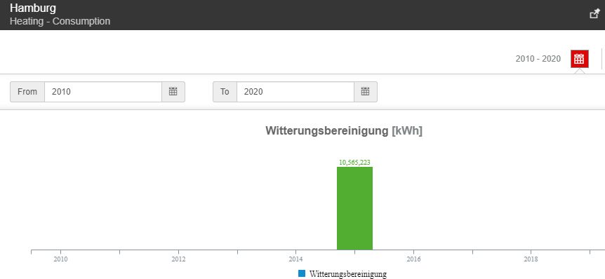
Time selectors
toggle chart labels by clicking the Show labels button.
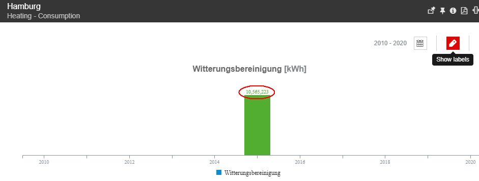
Show labels
export the chart data to XLS by clicking the Export button.

The Excel export option
The chart displays the data on a time axis (horizontal), which shows the years, and sets it against a predefined goal. The displayed media type is listed above the chart while the rendered lines/bars are listed below the chart. If hovering the chart's bars, the tooltip will indicate the name of the hovered month and the value of the KPI for that month.

The Chart tooltip
When clicking a chart column, the KPI Monthly charts will be displayed. These charts show the monthly breakdown of the consumption from the selected year, rendered against the goal.
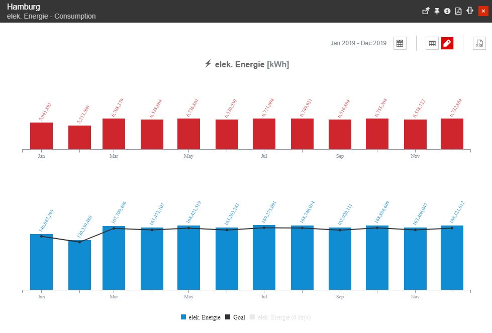
The Monthly chart
The top chart displays the monthly consumption relative to the goal, rendering the differences between the two:
the months with consumption below the goal are represented with green
the months with consumption above the goal are represented with red
The KPI Monthly charts provide the standard chart options via the top menu buttons:

The Monthly chart toolbar
The Calendar button - opens the calendar menu which allows the user to select a different time range from which the consumption and goal to be displayed in the charts.
The Time range options offer three predefined time span values: the current year, the previous year, and the year before the previous year.
The From and To time pickers allow the user to manually select a time range.
The Table button - toggles the display of data in a tabular format below the chart.
The Labels button - toggles the display of value labels in the chart.
The Export button - exports the data displayed in the chart to an XLS format which can be opened and processed with Microsoft Excel.