Base Load
The Base Load chart displays energy consumption during periods of inactivity (for example, consumption over weekends) spread over a specified time span.
This article explains the Base Load functionality inside the i4connected portal. The Base Load panel is accessible by selecting the dedicated tile, usually available on the Energy page.
The Base Load panel provides a straightforward way of visualizing the consumption per site, area, or organizational unit, during periods of inactivity (for example, consumption over weekends).
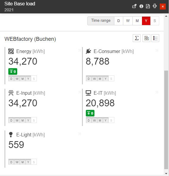
The Base Load main panel
The Base Load panel shows the consumption of each area, site, or organizational unit of the customer for the last period of inactivity. The list of areas, sites, or organizational units can be drilled down when they have children, so the user can get granular insight into the consumption of each entity, during the last inactivity period.

The entity consumption
The objects displayed by the Base Load panel are filtered based on the logged-in user's permissions, so each user will only see the areas, sites, or organizational units of interest.
The top side of the Base Load panel features a Media Group Options button on the right side. Here, the user is able to select the media group to be displayed in the object tiles. By default, the first media group in the list is selected, which in the Base Load panel's case is Consumption.
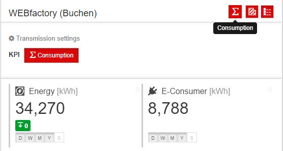
The KPIs view
The Consumption tile(s) displayed in the Base Load panel shows the quantified measure group along with the measurement unit, the measured base load value, and the difference between the quantified values and the goal values. This evolution of the difference is shown as an average value on a colored background, representing the positive (green) or negative (red) evolution compared to the goal.
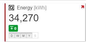
The Consumption displayed in detailed view mode
Clicking on the object tile from the panel's list will open the Base Load Dashboard, which shows the consumption details during the inactivity periods. The Base Load Dashboard shows the evolution of the inactivity periods consumption for the current object, on weekly basis, over longer time spans. By default, the inactivity period consumption is displayed over the time span of the current year.
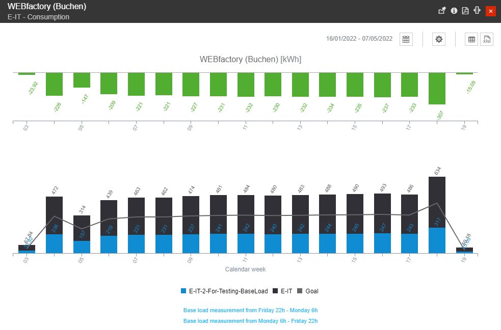
The Base Load Dashboard
Tip
Below the Base Load Dashboards, a brief description of each chart is displayed
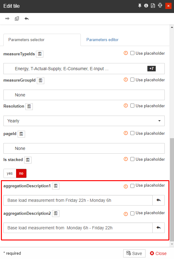
The description can be customized by managing the "aggregationDescription1" and "aggregationDescription2" parameters, available when opening the Base Load tile in Edit mode.
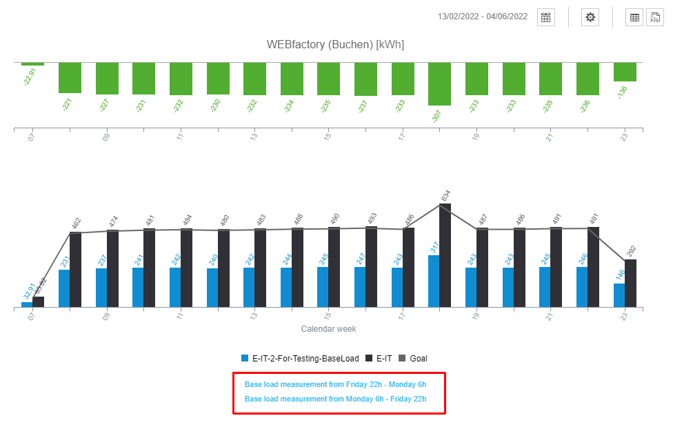
The Base Load dashboard can also display multiple custom KPIs inside the charts and the table view. By default, these KPIs will be visible but disabled in the Base Load charts, and always visible in the Base Load table view.
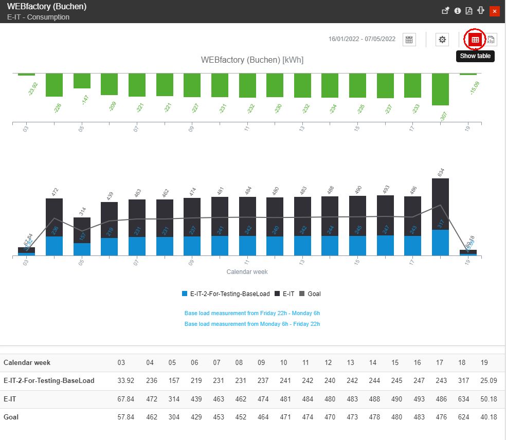
The Base Load table
Even if the database names of the custom KPIs are predefined, their translation can represent anything, as well as the calculations. So the custom KPIs can be set up to show any other calculation required by the project.
The consumption evolution is displayed in two different charts:
the Delta chart is the top dashboard. This chart will quickly display the weeks where the inactivity period consumption is higher or lower than the minimum consumption.

The Delta chart
the value vs. goal chart is the bottom dashboard. In this view, the consumption during the inactivity periods is compared with the goal values.

The Values versus Goals chart
Tip
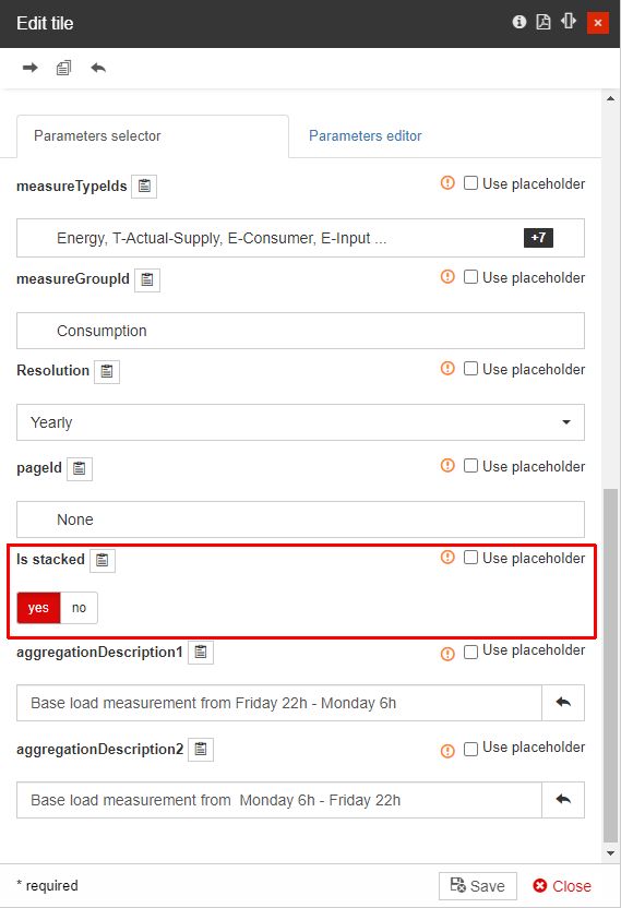
The system can enable or disable the view of the "value vs. goal chart" as "is stacked" column chart using the Parameters selector area.
For a better overview, the user can activate or deactivate the KPIs, by clicking the bottom selectors.

Total Energy and Goal active
By hovering the mouse cursor over the chart bars a detailed table view pops up.
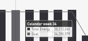
The Pop-up dialog displaying details of the selected chart bar
Besides the actual chart views, the user is provided with a set of options, allowing the user to change the following settings:
Change the default time range - By clicking the Calendar button, at the top of the panel, the view is expanded to display a set of Calendar selectors.
The Time range selectors allow the user to set up a predefined time range:
2Y - the second previous year
1Y - the previous year
15W - the last 15 weeks
Current year
Further on, the user can select custom Start and End dates, using the From / To calendar views.

The Calendar view
Configure the charts display mode - By clicking the chart settings button opens the chart settings, where the user can organize the following settings:
Show Data labels button - enables or disables the display of chart data labels.
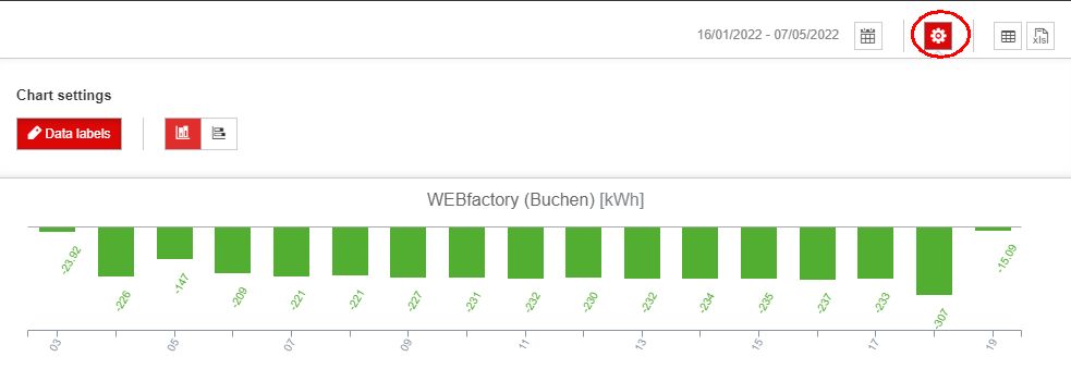
Example of Base Load chart without Labels
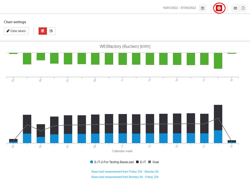
Toggle charts orientation to Vertically
Charts orientation set to Vertical
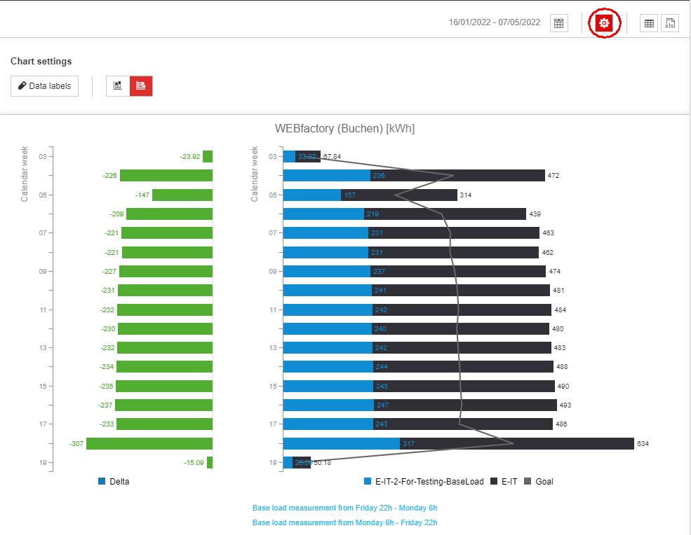
Toggle charts orientation to Horizontally
Charts orientation set to Horizontal
Show table button - enables or disables the display of an explication table, at the bottom of the dashboards.
Tip
The custom KPIs which are available in the value vs. goal chart will be displayed in the table, even if they are not displayed in the chart.
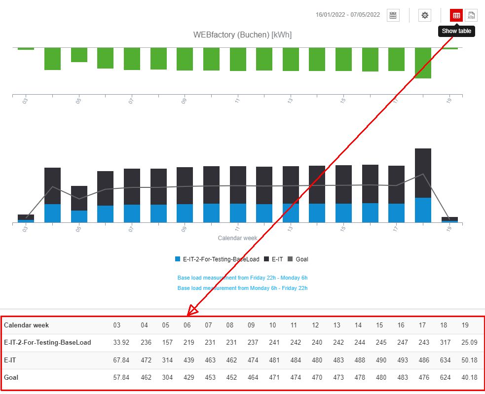
The Show table button and the table
The export to XLS button allows the user to export the dashboard data to Excel, using an XLSX file type.

The Excel export button
The exported Excel file will list all the enabled KPI values, in comparison with the Minimum expected value and the Delta between actual consumption and the goal, as visible in the below example.
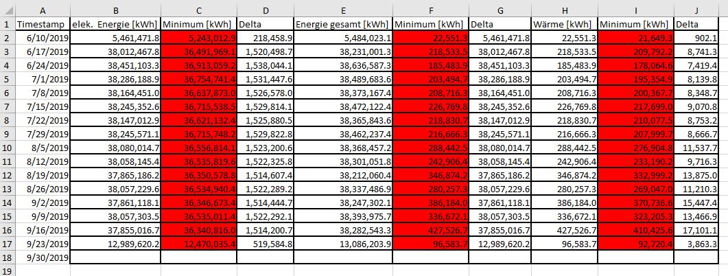
Example of the Base Load consumption of an Organizational Unit, exported view Excel