The page components
Check out the main page components that you will surely encounter in the i4connected application.
After logging into the i4connected application the pre-defined interface displays a set of primary components. Read more details in these articles.
The global menu bar
Learn about the informational elements and actions provided to you in the global menu bar of the i4connected application.
The global menu is the taskbar positioned on the top of the i4connected portal and it acts as a program header, where the user may find several informational elements and actions, such as:

Global menu bar
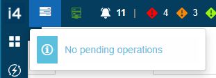
Background operations - unfolds a drop-down list that displays run-time information, upon any existing background operations.
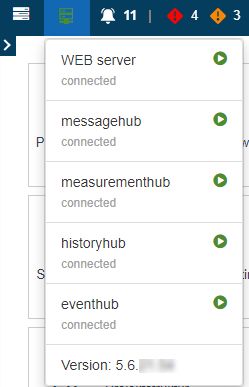
Server module states - unfolds a drop-down list that displays run-time information, upon any existing server module states. Additionally, in this view, the user can read information about the current system version.
Notifications – in the upcoming chapters, we shall learn that the user may define a notification message, for the portal, that will be displayed as a continuously rolling text, in the global menu bar.
Tip
For more details on notifications management, please also visit the Portal notifications article.

Edit layout - allows the user the possibility to add new tiles to an i4connected page.

Tip
More details about the Pin tiles functionality can be found under the Add new tiles article.
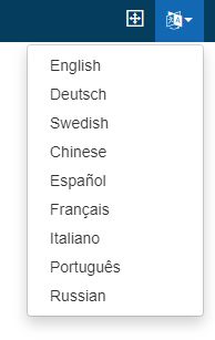
Language selector – by default, the portal will be opened in the user's pre-defined language or the language selected at login. However, while logged in, the user may change the portal language by selecting it from the drop-down list.
User profile – by clicking the User toolbar button, the User info panel is opened.

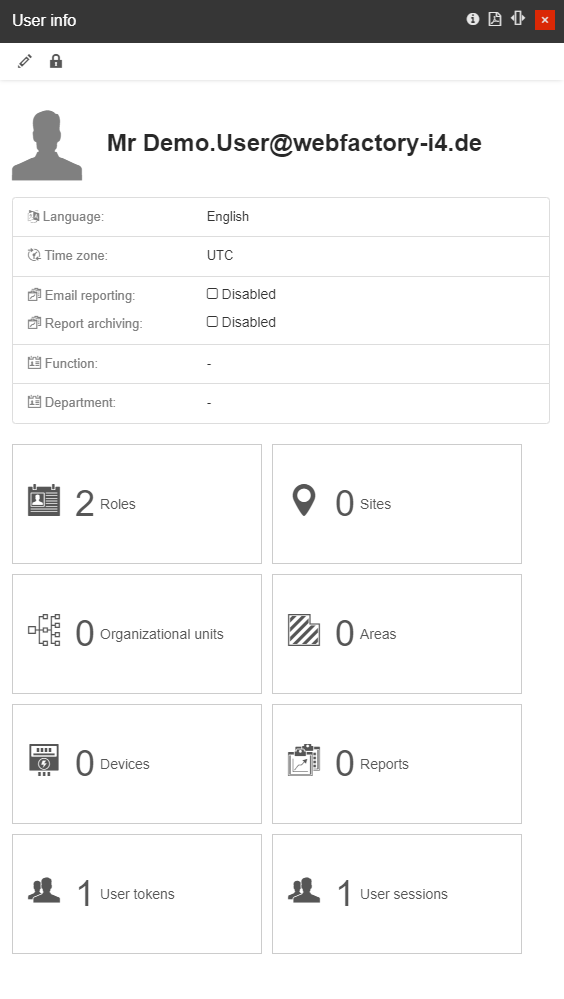
The User info panel displays details of the currently logged-in user and a set of management options:
The Edit button allows the user to open the Edit user preferences panel, where the following information can be updated:
Default language - lists all the languages enabled in the database.
Time zones - lists all the time zones enabled in the database.
Display name - allows the user to choose the following 4 options: Username, First name, Last name, and First name + Last name.
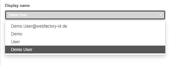
Note
By choosing one of the available options under the Edit user preferences panel, you will choose the way your username is displayed all around/throughout/all over the system. In case you want to keep your email address private, we recommend you to choose the First name + Last name option.
the Change password button, allowing the user to open the Change password panel and update his / her password. The visibility of this button is guarded by the "Change password" permission.
the Roles tile, allowing the user to view his / her assigned roles and permissions. Depending on the permissions level, the User can also manage the assigned Roles.
the Sites tile, allowing the user to view his / her assigned Sites. Depending on the permissions level, the user can also manage the assigned Sites.
the Organizational Units tile, allowing the user to view his / her assigned Organizational Units. Depending on the permissions level, the user can also manage the assigned Organizational Units.
the Areas tile, allowing the user to view his / her assigned Areas. Depending on the permissions level, the user can also manage the assigned Areas.
the Devices tile, allowing the user to view his / her assigned Devices. Depending on the permissions level, the user can also manage the assigned Devices.
the Reports tile allowing the user to view his / her assigned Reports. Depending on the permissions level, the user can also manage the assigned Reports.
the User tokens tile, allowing the user to view and manage the User tokens issued for the i4connected Client authentication.
The User tokens panel lists all the refresh tokens and reference tokens associated with the currently accessed account, displaying details about the ClientId, used Browser and Browse version, Operating system, ClientIP, Issued date, and Expiration date. Further on, the user can manually revoke refresh tokens, in case they have been exposed to malicious adversaries.

Tip
A refresh token is a special kind of token used to obtain a renewed access token. The user can request new access tokens until the refresh token is blacklisted.
the User sessions allowing the user to view and manage the User sessions generated, for the i4connected.
The User sessions panel lists all the login sessions associated with the currently accessed account, providing information about the Session Id, Last session activity, and Expiration date. Each session can be individually removed by clicking the Revoked button.
Logout– at the very right side of the global menu bar, the user may decide to log out of the current session.

The main menu
The main menu is a set of fully customizable pages usually displayed on the left side of the page, allowing users to change analysis areas.
The i4connected main menu is a set of fully customizable pages, that is usually displayed on the left side of the page. The scope of the main menu is to change the area of analysis pages. It can be parameterized to switch between the analysis module of the main media.
The order of the buttons, the icons, and the captions are fully customizable.

Main menu - example
By default, the size of the main menu is minimized, but the user can enlarge it by clicking on the Expand menu option.

The Expand menu option
As soon as the Expand menu option is selected, the main menu view is enlarged.
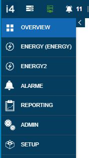
The Main menu
The pages menu
Open this article to get to know the analysis pages area and understand what is the role of this view.
The analysis pages area is a dynamic interface that changes based on the page selected from the main menu. Each page can display any set of tiles that may be easily added, removed, and customized, by a user having administrative rights.
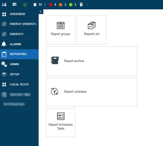
Analysis page area - example
The start page
Understand the start page of the i4connected portal and the elements and available actions, provided to you in this view.
The start page is also a fully customizable interface, where the user can define information upon their facility. The start page is split up into several areas, that can also be parameterized and customized on user needs and expectations.
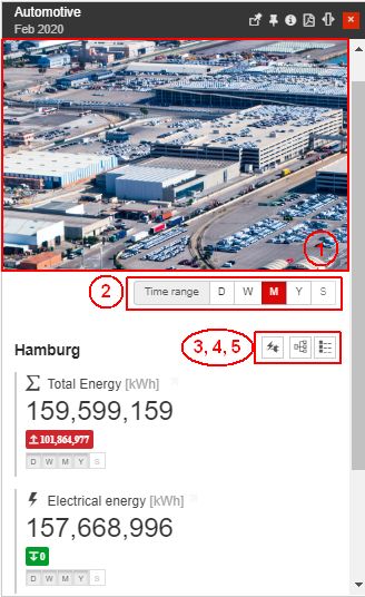
Start page - example panel
Photo / Graphic of the facility
The time range of the displayed analysis (consumption), is switchable to day, week, month, and year
Possibility to switch between the KPIs
Possibility to reveal available organizational units
Possibility to view facility details
The selection components
Learn how to navigate through the i4connected panels using the selected components. Check out this article for more details.
The user can navigate through the i4connected panels with the help of a set of selected components. The i4connected portal offers many alternative ways for selecting items and opening panels:
The simple selection - a vertical list of items allowing the user to select one listed item, for further processing. The selected item is highlighted marking the selection.
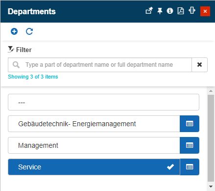
The simple select list
The multiple selections - a vertical list of items allowing the user to select one or more listed items, for assigning or applying them to other items. The selected items are highlighted, marking the selection.
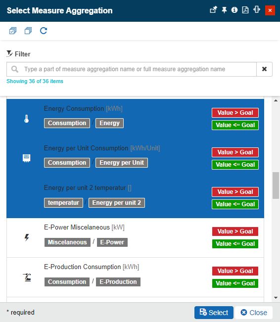
The multiple select lists
The radio-button selection - a graphical control element that allows the user to choose only one of a predefined set of mutually exclusive options.
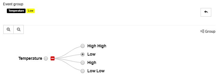
The radio-button select list
The drop-down list selection - a graphical control element, that allows the user to choose only one value from a predefined list of values.
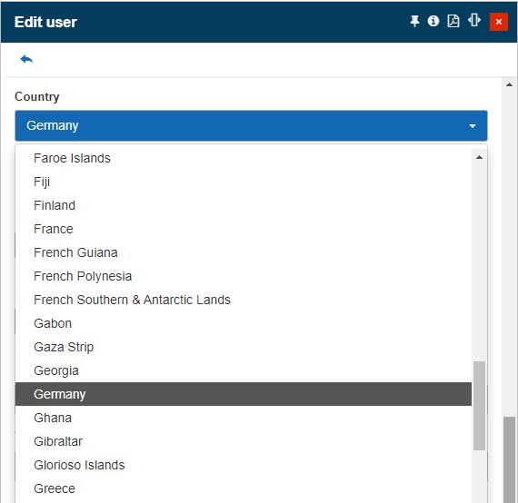
The drop-down list
The toggle-button selection - a graphical control element, that allows the user to choose only one value, out of a set of a predefined set of mutually exclusive options.
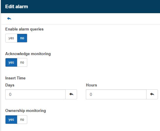
The toggle-button select list
The items list selection - allows the user to select a value from a list, opened in a separate panel. To open the list panel, the user can click on the selection field.

The Items list selection
The reset button - allows the user to reset the value defined for a field.

The Reset button
Detailed view mode selection - allows the user to open the selected Item in a detailed view mode.
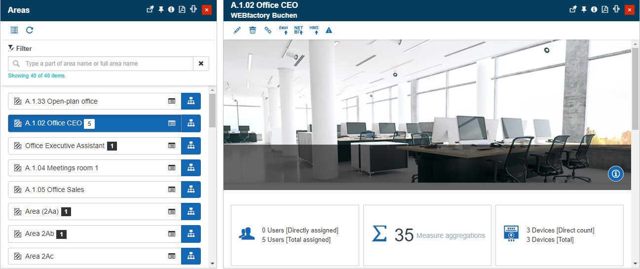
The Detailed view mode selection
Edit mode selection - allows the user to open the selected item, directly in edit mode.
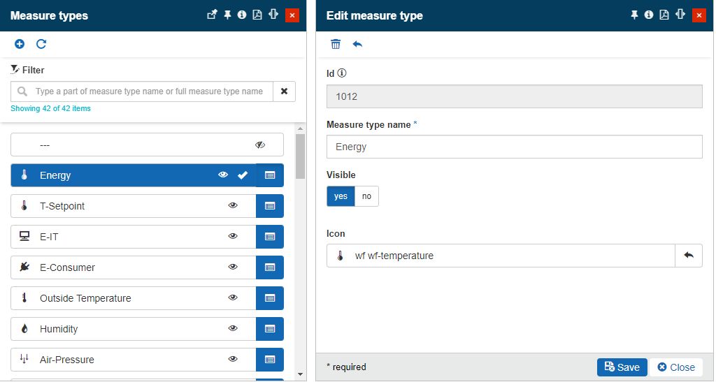
The Edit mode selection