Sankey Diagram
The Sankey diagram analysis dashboard shows the energy consumption of the organizational units, through all layers of the organization.
The present article describes the functionality and operation of the Sankey Diagram from the i4connected portal.
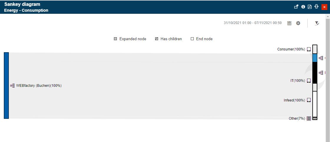
The Sankey diagram shows the energy consumption of Organizational Units or Areas, through all the layers of the organization. Its purpose is to provide a quick visual way of tracking the distribution of consumption allowing the user to easily identify the top consumers.
This diagram can be accessed by selecting the dedicated tile, usually available on an Energy page.
Sankey diagram
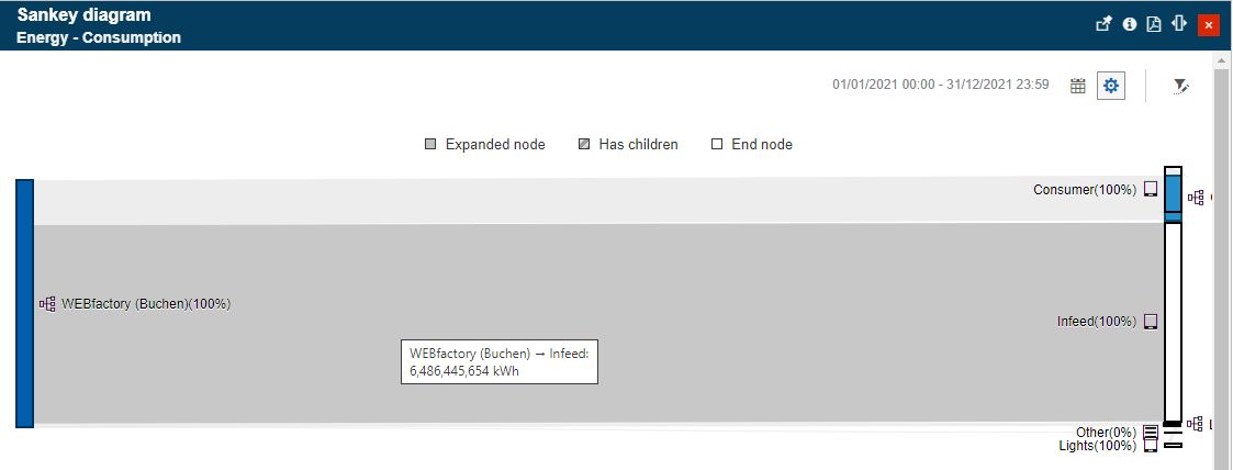
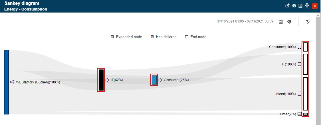
The Sankey diagram will start with two levels of the hierarchical structure, showing the direct relationship from the root. Clicking on one leaf, the diagram expands its structure to the next level, rendering through Areas or Organizational Units and expanding its leaves up to the assigned devices.
Note
The node expansion considers the i4connected security settings and the user permissions, allowing the user to expand the tree up to the highest level where his/her permissions are extended.
The Sankey diagram supports unlimited drill-down functionality, hence the panel is equipped with a vertical scroll bar.
The toolbar of the Sankey diagram allows the user to make the following display and filtering settings:
change the time frame for the energy consumption flow. By clicking the Calendar button, the following time selectors are displayed:
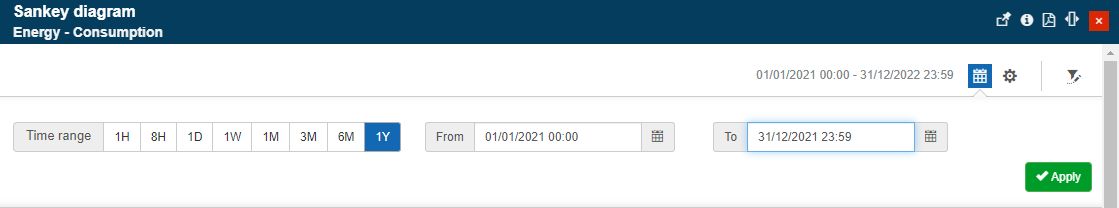
The Calendar button
Time range - allows the user with the possibility to select from the following options:
1H - last hour
8H - last 8 hours
1T - last day
1W - last week
1M - last month
3M - last three months
6M - last six months
1Y - last year
From / To selectors - allows the user with the possibility to select a customized time frame, where the Start and End date can be manually selected by the user.
change the diagram Settings allows the user to:
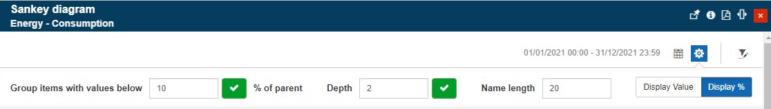
The diagram settings
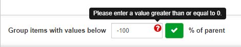
provide a global threshold percentage used to collapse small nodes together, by filling in the desired percentage value of the parent, in order to group items having values below the defined threshold. This field expects a greater than or equal to 0, otherwise, all negative values will be rejected and an error message will be displayed.
set the diagram depth measured in the number of calculated nodes. By default, the diagram starts with two levels of the hierarchy, showing the direct relationship from the root.
toggle between value and percentage display.
change the Objects that the diagram refers to. By clicking the Open filter button, the Object Filters panel is opened allowing the user to select up to 5 Organizational Units.
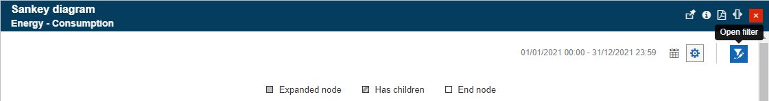
The Open filter button
Tip
For more details concerning the Object filter panel please also visit the dedicated article here.
The diagram supports the display of multiple Organizational Units or Areas, using two graphical elements, as follows:
the ribbons - the width of the ribbons represents the energy consumption magnitude, so the bigger the ribbon, the larger the registered consumption. Each ribbon is colored in light gray. By hovering the mouse cursor over a ribbon, it is highlighted with a darker shade of gray, and a tooltip is displayed to provide information on the measured objects, the consumption value, and the unit of measure.
Sankey diagram ribbons and their tooltip
the nodes - each ribbon is framed by two nodes showing the transition from one object to another. The user can drag the nodes on the surface of the diagram in order to create a customized display.
Sankey diagram nodes
Each individual node displays its total contribution in the context of the parent node. The value can be either displayed as a percentage or numerical value, by toggling the Value / Percentage buttons, available in the diagram Settings area.
The Sankey diagram nodes also have an icon associated, which provides information about the represented object:
 - Organizational Unit
 - Area
 - Device
When hovering a node, a tooltip is displayed providing the user with information about the hovered node, the consumption value, the unit of measure, and the exact consumption percentage value.
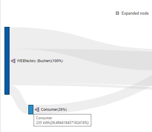
Node tooltip
Tip
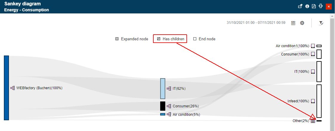
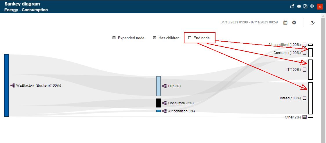
The Sankey diagram node types can be easily identified based on their design mode. The legend, displayed at the top of the diagram, illustrates the node types:
Expanded node - the nodes that have already been expanded and their understructure was added to the diagram have a filled-in design mode, usually highlighted by a randomly applied color.
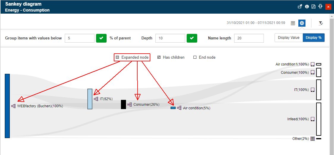
Has children - the nodes that have not yet been expanded, by they have children to show, expose a striped pattern.
End node - nodes that have been expanded up to their last leaf in the structure are displayed as a clear vertical line.
The parameters of the Sankey diagram panel can be customized in the Edit tile panel, by a user equipped with the appropriate administrative rights.
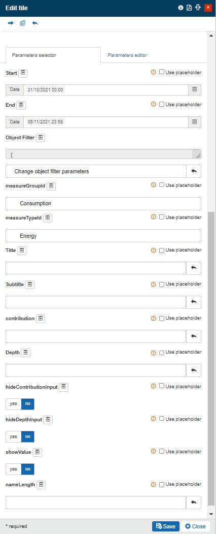
The Edit tile panel
The below table provides more details about the Sankey parameters that ensure a pre-parametrization of the diagram:
Name | Type | Description |
|---|---|---|
Start | Datetime | Allows the user to optionally pre-define a start date for the time range. |
End | Datetime | Allows the user to optionally pre-define an end date for the time range. |
objectFilter | ObjectFilterParameters | The parameters for the object filter |
measureTypeId | Guid | Allows the user to select the Measure Aggregation used for rendering the Sankey diagram. Selection is done from the Measure Type list. |
measureGroupId | Guid | Allows the user to select the Measure Group used for rendering the Sankey diagram. Selection is done from the Measure Group list. |
Title | String | Allows the user to pre-define a panel title. |
Subtitle | String | Allows the user to pre-define a panel subtitle. |
contribution | Integer | Allows the user to pre-define the default global threshold value, used to collapse small nodes together, in order to group items having values below the defined threshold. |
Depth | Integer | Allows the user to pre-define the default amount of calculated nodes. |
hideContributionInput | Boolean | Allows the user to toggle on / off the display of the Contribution selector, in the Sankey diagram Settings area. |
hideDepthInput | Boolean | Allows the user to toggle on / off the display of the Depth selector, in the Sankey diagram Settings area. |
showValue | Boolean | Allows the user to toggle on / off the display of the node value, rather the percentage:
|