Energy Distribution Dashboard
The Energy Distribution dashboard represents the energy consumption and distribution, for a specified time frame using a circular statistical graphic.
The present article describes the functionality of the Energy Distribution Dashboard, from the Energy Analysis page of the i4connected portal.
The scope of this dashboard is to show the energy consumption and distribution values, for a predefined time frame.
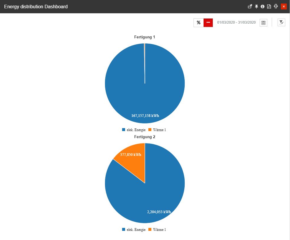
The Energy distribution dashboard
The Energy Distribution Dashboard panel provides the user with the following options:
toggling between Absolute and Percentage values display can be organized by using the
 button.
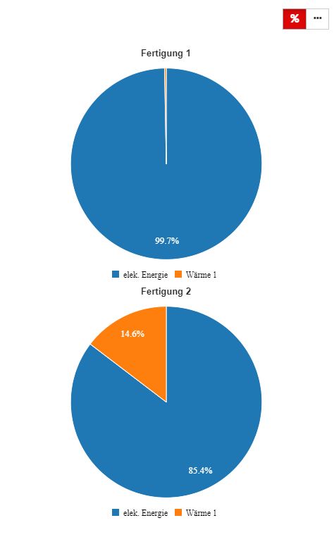
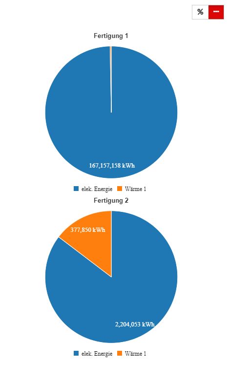
Percentage values (left) and Absolute values (right)
selection of the Time frame - allows the user to select a custom time frame, by clicking the Calendar button and clicking the Apply button to preserve the selected options. In this view, the user can select the following time frame combinations:

The Calendar button
Time range - specific time ranges can be selected, from the following available options:
1H - last hour
8H - last 8 hours
1T - last day
1W - last week
1M - last month
3M - last three months
6M - last six months
1Y - last year
From / To selectors
selection of the Objects that make the subject of the measurement, by clicking the Open filter button.

The Open filter button
The Object filters panel allows the user the possibility to select the Organizational Unit(s), Site(s), and Areas(s) to be measured from an Energy distribution point of view.
Important
For more details regarding the Object Filter, please also visit our article here.
The Energy Distribution Dashboard allows the selection of one or multiple objects, regardless of their type. The user can combine in the same view Sites, Organizational Units and Areas, to obtain the energy distribution measurements.
By hovering the mouse cursor over the Energy Distribution pie charts a tooltip is displayed, indicating the value of the respective KPI.
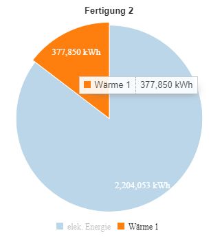
The Energy Distribution dashboard tooltip
At the bottom of the pie chart, the legend is displayed, revealing the media/KPIs. While hovering the mouse cursor over a legend label, the line trend corresponding to the measurement for that media/KPI will be emphasized in the chart by dimming down the other trend lines.
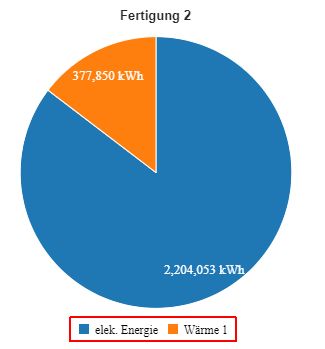
The pie chart legend
Using this dashboard the user can easily identify the large consumers and obtain a precise report of the data, expressed either in absolute values or percentage values.