Carpet Plot
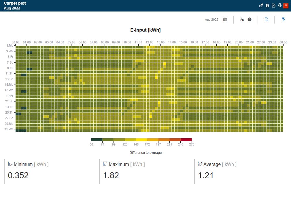
The Carpet Plot dashboard uses a high-resolution heat map to display the energy consumption for a month, expressed in periods of 15 minutes.
This article describes the Carpet Plot panel from the i4connected portal. Usually available on the Energy page, the user can access this panel, by clicking the dedicated tile.
The Carpet Plot panel uses a high-resolution heat map to display the energy consumption for a month span, expressed in periods of 15 minutes (hence the high resolution). The consumption plotted for each 15-minute interval is color-coded based on a percentage scale that can be adjusted by the user. This allows the user to quickly spot high discrepancies in consumption and pinpoint possible monitoring failures by tracking the consumption pattern. The consumption data is represented for one or more objects selected in the Filter panel, summing up the data of what multiple objects are represented.

The Carpet Plot dashboard
The Carpet Plot heat map represents the data obtained from an intersection between the chosen objects, the selected month, and the available KPIs. The data obtained from this intersection is referred to as data series. If multiple objects are selected in the Filter panel, the data series sums up each object's consumption.
The central view of the Carpet Plot panel is the heat map. This is where the data series are displayed based on the selected objects, KPIs, and time options. In this view, the user can tweak the data series and the rendering using the provided time, KPI, and chart options.

The heat map plot
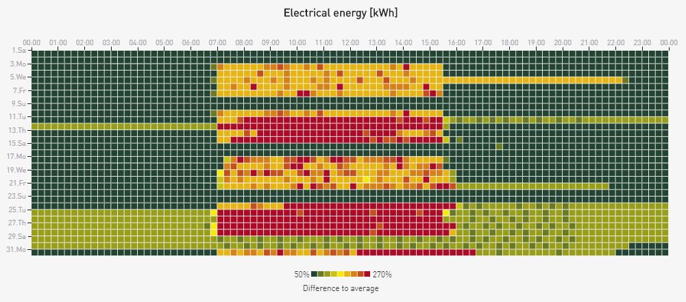
The Carpet Plot heat map color codes the consumption for each 15-minute interval using a percentage-based scale which defaults to 50% (half of the average consumption) - 270% (more than double the average consumption). The color coding goes from green to red as the consumption rises from low to high. The color coding scale can be adjusted by the user to refine the sensitivity of the heat map and detect more subtle consumption discrepancies.
As the consumption is plotted for a whole month, the heat map can form consumption patterns (night/day for example) which help the user in tracking the overall consumption and spotting the time intervals with abnormal consumption. By tweaking the color-coding scale, the user can not only detect consumption spikes but also monitor issues.
The heat map represents the data in a matrix formed by two axes:
the horizontal axis covers a complete day, split into 15-minute intervals.
the vertical axis covers a complete month, split into days.
When hovering the mouse cursor on the heat map, a chart tooltip is displayed, indicating the currently hovered time interval, the KPI name, percentage, and value.

The Chart tooltip
At the bottom of the chart, a legend is displayed indicating the current color-coding range. This range can be modified using the chart settings.
The legend can also be used to toggle on or off the representation of KPIs, by clicking on the corresponding legend labels.

The chart legend
At the bottom of the Carpet Plot panel the Maximum, Minimum, and Average values from the current data set, are displayed in a tiled manner.

The Maximum, Minimum, and Average values
The Carpet Plot panel allows the user to change the following settings:
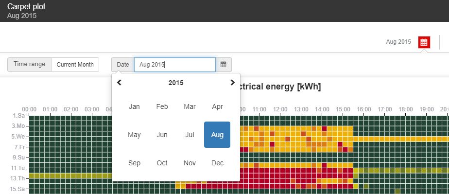
Change the default time range - By clicking the Calendar button in the toolbar of the panel, the view is expanded to display the following time settings:
Time range - allows the user to apply the Current month as a time range.

Current month selector
Date - allows the user to select a customized date, selecting the month and year, from the calendar view mode.

Select a customized date
Select the KPIs - As the Carpet Plot dashboard can represent multiple KPIs, by clicking this toolbar button, the view is extended to display the list of all the available elements. The selected elements are highlighted in red color.
Note
The dashboard can only plot one KPI at a time. Multi-selection in this context is not allowed.

The KPIs selection area
Change the Chart settings - The chart settings allow the user the possibility to configure how the data series are represented in the chart, in a report with the percentage-based scale. By clicking the Chart settings toolbar button, the view is expanded to display the following options:
Min - default value is 50% which represents half of the average consumption, but the value can be increased or decreased.
Max - the default value is 270% which represents more than double the average consumption, but the value can be increased or decreased.
To preserve the settings the user can select the Apply button. To return the Min / Max values to the last saved format, the user can press the Reset button.

The Chart range settings
The Excel export - The toolbar XLS button allows the user to export the data that is currently displayed by the chart to an XLSX format.

The Excel export button
The exported data can be viewed using Microsoft Excel (or any other spreadsheet software that supports the XLSX format).

Example of an XLSX export file
The Object Filter - The most important component of the data series is the objects to be compared. The Carpet Plot provides the user with the possibility to open that Object Filter panel where the user can select one or more objects (up to 20) to obtain the relevant data series, by clicking the Open Filter toolbar button.
Tip
For more details about the usage of the Filter Objects panel, please also visit the dedicated article.

The Object Filter toolbar button