Annual Load
The Annual Load dashboard charts the hourly consumption, over one year, from the highest to the lowest value, and can be used to represent Energy consumption.
This article describes the Annual Load panel from the i4connected portal.
The Annual Load panel displays the hourly consumption over one year for the object in the filter panel using a chart. It is a common energy diagram that represents the detailed power requirements of the object, starting with the highest value to the lowest value, over one year.
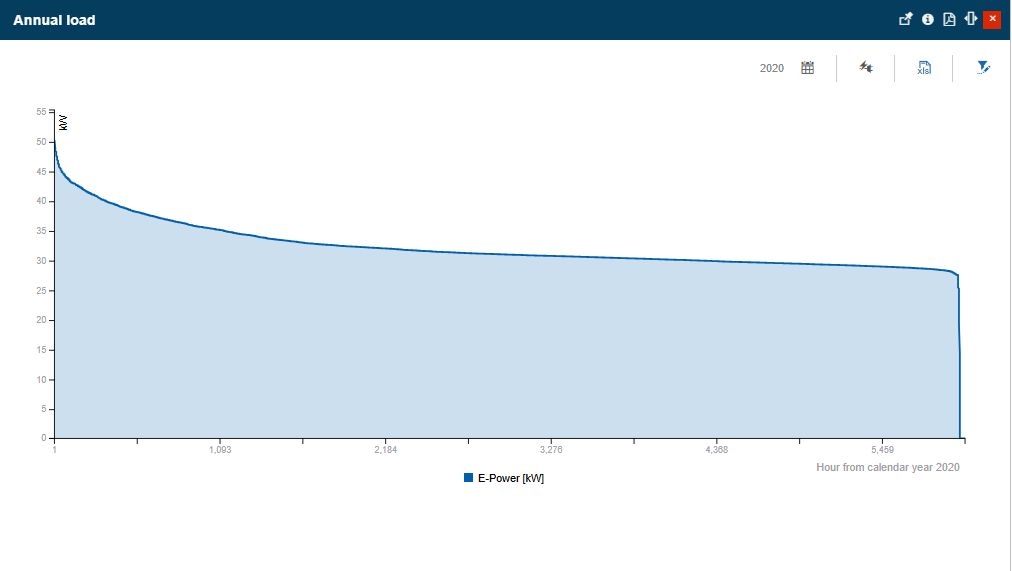
The Annual Load panel
The Calendar selector
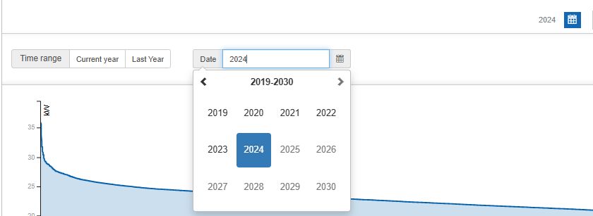
As earlier indicated, the Annual Load chart displays the hourly consumption over one year. By clicking the Calendar selector, in the toolbar of the Annual Load panel, the Time range selector is expanded.

The Calendar selector
In the Time range selector, the user can load the chart view, by selecting from the following options:
Current year

Last year

Customized Date - Allows the user to select any desired year for which the data will be displayed, using the time picker control.
The KPI selector
The KPIs toolbar button reveals the settings that allow the user to select the media/KPI to be displayed in the chart.

KPIs selector
The blue highlight marks the selected values. In this view, the user can select one or multiple KPIs.
The Data series filters
The Annual Load chart represents the data obtained from an intersection between the chosen object, the selected year, and the available KPIs. The data obtained from this intersection is referred to as data series.
Having no preselected data series, the Annual Load panel is displayed empty.

The Annual Load panel with no items selected
The Annual Load data series can be selected from the Object Filter panel, which is opened by clicking the Open filters button.
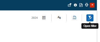
The Open filters button
Even though it is recommended to add one single Object for the plot, the Object Filter panel allows a multi-selection as well. The user can choose between Areas, Organizational Units, Sites, and Devices.
Note
In case the Annual Load should have multiple Object Filters, the user should consider selecting Objects belonging to one single type.
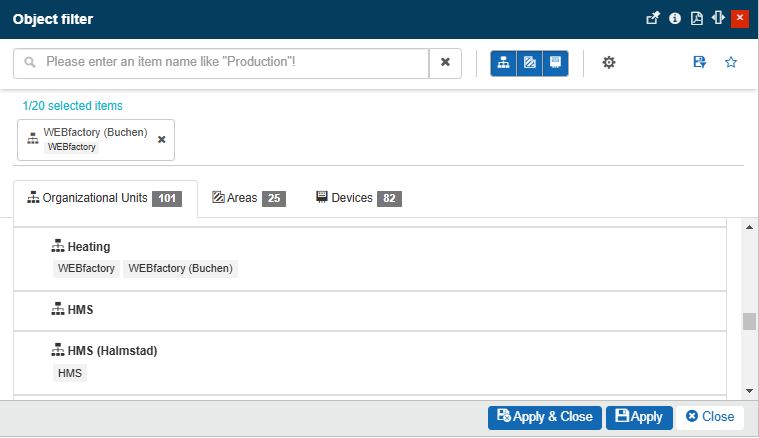
The Object Filters panel
Displaying the data series
After selecting the year, the KPIs, and the data series, the Annual Load chart is automatically loaded.
Tip
In this view, it is possible to tweak the data series chart options.
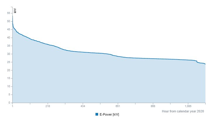
The Annual Load chart
The chart plots the hourly consumption from a one-year time span, in a descending way: the hours with the highest consumption are on the right, and the ones with the lowest consumption, are on the left. This method of plotting the data, value-based and not time-based, allows the Annual Load chart to build a consumption curve that indicates the average energy requirements of the plotted objects.
The horizontal axis of the chart represents the time axis, indicating the hours of the year. As stated above, the hours are not ordered chronologically but value-wise (from highest consumption to lowest consumption).
The vertical axis of the chart is the value axis, which indicates the actual consumption values for each hour of the year.
When hovering the mouse cursor on the chart a tooltip is displayed, indicating the exact hour and value corresponding to the hovered area.
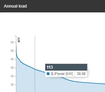
The Annual Load chart tooltip
Exporting the chart data
The Export button is placed in the Annual Load panel toolbar. It allows the user to export the data which is currently displayed by the chart to an XLS format. The exported data can be viewed using Microsoft Excel (or any other spreadsheet software that supports the XLS format).
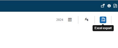
The Excel export option
The Excel export file features a column for Hours and another for the corresponding Value.
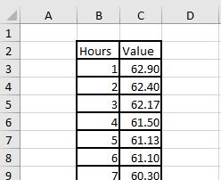
Example of an Annual Load chart XLS export file