Event Rankings Dashboard
The Event rankings dashboard displays statistical data of the events engaged in a project, using one of the two common KPIs: Count and Duration.
This article describes the Monitoring functionality of the Event ranking dashboard of the i4connected portal.
The Event Rankings panel can be accessed from the Monitoring section of the i4connected portal, using the dedicated tile. The main functionality of this panel is to display statistical data of the events engaged in the i4connected project, using one of the two common KPIs: Count and Duration.
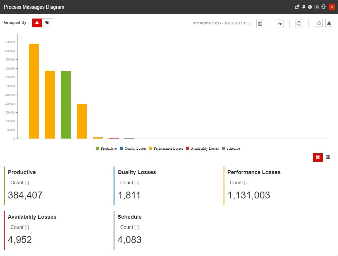
The Event Rankings Dashboard panel
The top side of the panel hosts the following options that can be tweaked to obtain a customized view of the event statistics:
Grouping options provide a quick method of grouping the displayed data by multiple options.
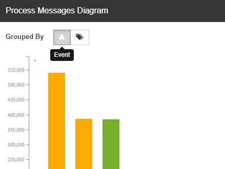
The Grouping options
Tip
In order to enable or disable multiple grouping options, the users having management rights on tiles can edit the panel parameters and select the desired groupingEntities.
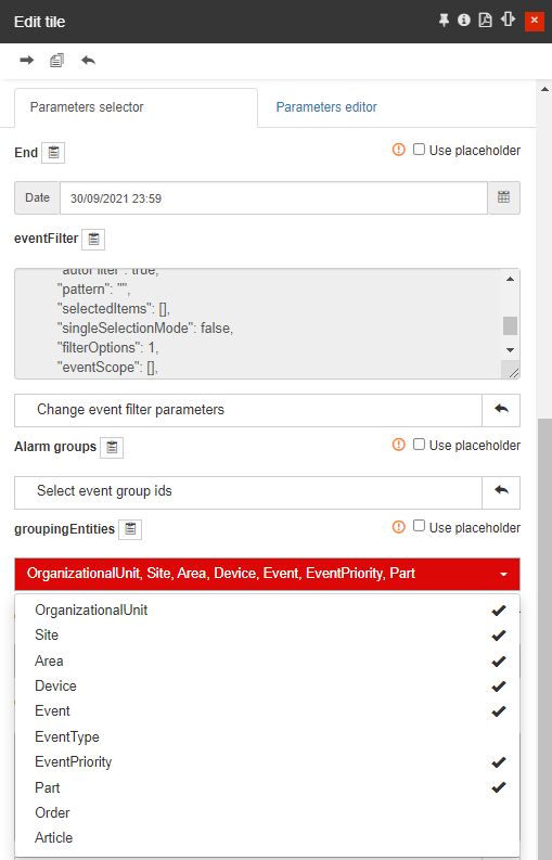
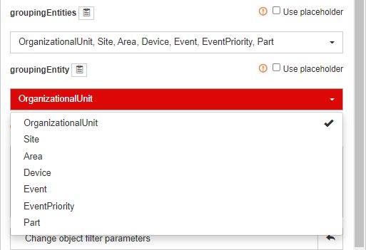
In this view, the user can select the default Entity, using the groupingEntity parameter. The groupingEntity parameter drop-down list will only show the Entities selected previously.
Calendar options that allow the user with the possibility to set up the following timeframes options:

The Calendar option
Time range selectors - provide the user with a set of predefined options:
1H - one-hour time range, going back to the last ended interval, measured in hours;
8H - eight hours time range, going back to the last ended interval, measured in hours;
1T - one-day time range, going back to the last ended interval, measured in days;
1W - one-week time range, going back to the last ended interval, measured in weeks;
1M - one-month time range, going back to the last ended interval, measured in months;
3M - three months time range, going back to the last ended interval, measured in months;
6M - six months time range, going back to the last ended interval, measured in months;
1Y - one-year time range, going back to the last ended interval, measured in years.
From / To selectors - provides the user with the possibility to select a customized time frame, selecting the Start and End date and time.
Media and KPIs button display the Media and KPIs used to calculate the event statistics.

The Media and KPIs options
Export button allows the user to export the displayed data to XLSX format.

The Excel export button
Filtering options allow the user to apply the following filters to the list:

The Filtering options
Objects filter - opens the Object Filters panel, allowing the user to select the Organizational Units, Sites, or Areas where the events are originating. Any filtering done in this panel can be saved and accessed later using the Save filter and Open favorite filters buttons from the right side of the top menu.
Tip
For more details regarding the Object Filters, please also visit the dedicated article.
Events filter - opens the Events filter panel, allowing the user to select the Events, Event Types, and Event Groups.
Tip
For more details regarding the Events Filters, please also visit the dedicated article.
The midsection of the Event Rankings panel consists of the chart. Similar to the other charts used in the i4connected portal, the Event Rankings chart displays the calculated events statistics and values, allowing the user to click on its columns for further details.
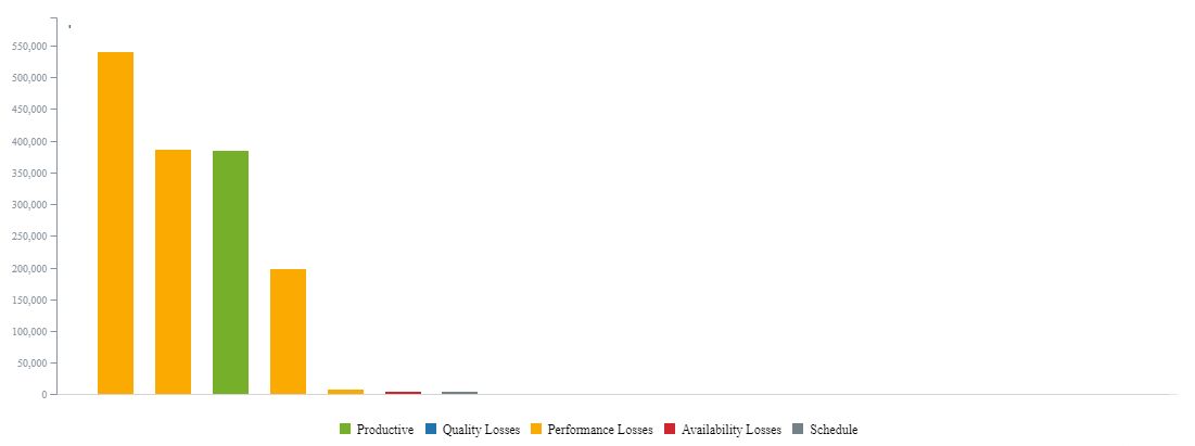
The Event rankings chart
Hovering any column will display the name and statistical value of that particular event. Clicking on any of the chart's bars will open the Event Gantt panel, where more granular data for that particular event are available.
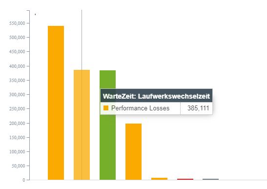
The Event rankings chart tooltip
The bottom section of the panel displays the statistical event data in a more pragmatic manner. There are two methods for visualizing the Aggregated value section:
Card mode

The Card view mode
Table mode

The Table view mode