WFCompass1
WFCompass1 provides the utility of an compass indicator. A simple usage would be showing the wind direction based on the value from a signal coming from a wind sensor. The control works with values starting from 0 to 360, the arrow indicating the exact value at a given moment. Following this concept, the WFCompass1 control will display the North position when the signal value is 0 or 360, and South when the signal value is 180.
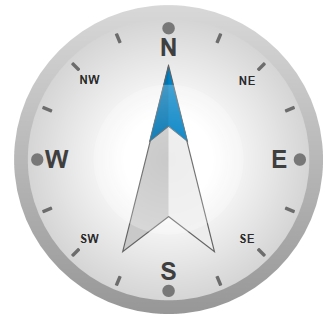
WFCompass1 control
Features
Advanced condition rules - the user can define advanced state conditions at design time for the WFCompass1 control.
Accurate compass functionality - the WFCompass1 control can provide accurate functionality when a proper signal is attached.
Complex visual customization - the user can customize the looks of the control in any way that fits the project requirements.
Advanced security - the WFCompass1 control offers the complete security options, keeping away the unnecessary complications.
Multiple states - the WFCompass1 control provides the options to configure multiple states at design time.
Design-time Features
The Design Time Features section describes the controls features at design time.
Visual customization
The WFCompass1 control allows the user to customize the appearance of the control, by editing the colors and fonts for each individual element of the control.
This feature can be found under the Appearance category (SmartEditor) or Ewon by HMS Networks category (Blend).
Visual states
The WFCompass1 control allows the user configure different visual states that can change depending on the selected signal and its value.
This feature can be found under the States category (SmartEditor) or Ewon by HMS Networks category (Blend).
Condition rules
The WFCompass1 control allows the user to setup advanced condition rules for each of the control states. When using condition rules, all the other state related settings are overridden.
This feature can be found under the States category (SmartEditor) or Ewon by HMS Networks category (Blend).
Binary Mask
When using BinaryMask, the mask signal values will be interpreted in binary mode. The control will enter the desired state when the binary mask matches the binary representation of the signal value.
This feature can be found under the States category (SmartEditor) or Ewon by HMS Networks category (Blend).
Advanced Security
The WFCompass1 allows the user to customize the security options in various ways: the control's enabled or disabled status and the visibility status can be conditioned by a signal's value. Also the authorizations based security options are available.
This feature can be found under the Security category (SmartEditor) or Ewon by HMS Networks category (Blend).
Design-time Properties
The control's properties are listed in the Properties panel:
MajorLabelsFontSize - the font size of the major labels.
MajorLabelsVisible - toggles the visibility of the major labels.
MinorLabelsFontSize - the font size of the minor labels.
MinorLabelsVisible - toggles the visibility of the minor labels.
ObjectID - allows the user to define an object ID for the WFIndicator3 control, that can be passed as SignalPrefix when using parameter passing in navigation.
PointerIsInverted - if checked, it inverts the pointer thus indicating the opposite direction.
SignalName - allows the user to select a signal (using the SignalBrowser of by typing the signal name in the text box) that will provide data for the control. The pointer will indicate the direction based on this signal's data.
SignalPrefix - allows the user to select a signal prefix that can be passed when using parameter control and parameter passing in navigation. The signal prefix can be the ObjectName, ObjectName_PageSignalPrefix, PageSignalPrefix or PageSignalPrefix_ObjectName.
SecurityAuthorizationName - allows the user to select an authorization group. The members of the selected authorization group will have access to the control.
SecurityDenyAccessBehaviour - allows the user to select a behavior that will be active when a user that doesn't belong to the above selected authorization group logs in. The action can either be disabled or hidden.
VisibilityMask - the binary mask used for displaying or hiding the control. The control uses the bitwise AND operation between the binary value of the signal set at the VisibilitySignalName property and the binary value of the mask. This bitwise AND operation must equate to the binary value of the mask in order to be true (e.g. Signal & Mask = Mask). The control is hidden when the bitwise operation is true and visible when the bitwise operation is false.
VisibilitySignalName - the signal that will control the visibility of the control. The binary value of the selected signal is used together with the VisibilityMask binary value to toggle between the control's visible or hidden states.
BinaryMask- when enabled, the signal values are treated as binary, and the MaskSignal is treated as a binary mask.
ConditionRule1 to 8 - allows the user to define more complex conditions for the control states. Standard logical operators are supported. The ParameterName from ConditionSignals editor is to be used when defining a condition rule.
ConditionSignals - allows the user to define parameter names for signals. This parameter names will be used in defining condition rules.
MaskSignal1 to 8 - the signal mask. This mask will be compared with the signal value. If the two match, the control will enter the corresponding state. When BinaryMask is enabled, both MaskSignal and signal value will be interpreted as binary values.
StateSignalName1 to 8 - The signal name corresponding to each control state. The signal name can be different for each state, or can be the same.
ShowPopup - enables the popup page.
PopupModality - allows the user to select the display method for the popup. The options are Modal or Modeless.
PopupParameters - the user can define a parameter containing a name and a value. This parameter can be passed to the popup page opened by the button.
PopupSource - select the popup page to be opened when the button is pressed at run time.
PopupTitle - the title of the popup page.