WFDynamicSymbols
The Dynamic Symbols category contains graphical standardized symbols useful for representing schematics and plans of various SCADA areas. Besides providing the graphical representations of elements, the Dynamic Symbols also feature signal driven visual states, basic security options and the ability to transfer parameters to pop-up windows.
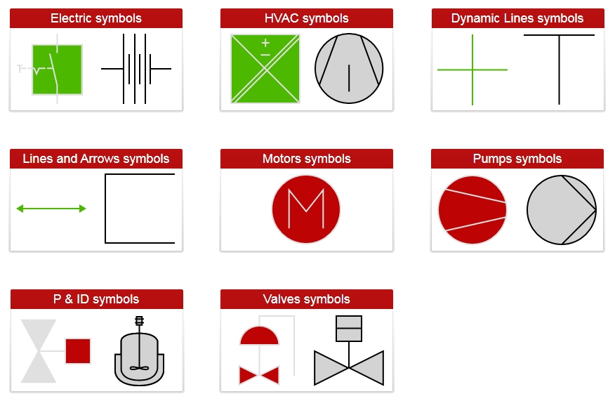
The eight symbol types contained by the Dynamic Symbols category are:
Electric symbols
HVAC symbols
Dynamic Lines symbols
Lines and Arrows symbols
Motors symbols
Pumps symbols
P & ID (piping and instrumentation diagram) symbols
Valves symbols
All the symbols contained by this category expose the same set of design-time and run-time properties.
Visual Structure
The appearance of the Dynamic Symbols is standardized and follows the international guidelines of graphic symbols for process displays.
The Dynamic Symbols sub-categories
Run-time Features
The Dynamic Symbols can have multiple visual styles which, at run time, can help visualizing different conditions.
The Dynamic Symbols with and without visual states
Also, if configured at design time, the Dynamic Symbols controls can open pop-up windows when being clicked. The symbols can also be configured to pass parameters in the pop-up window's context in order to create complex visualizations without designing different views for each pop-up.
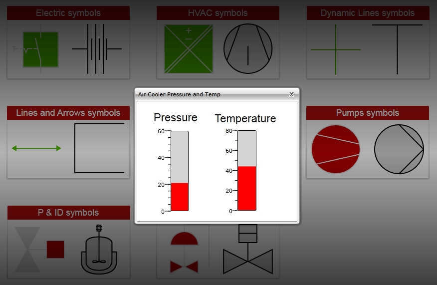
Pop-up windows opened by clicking the Dynamic Symbols
Design-time Features
At design time, in either Ewon by HMS NetworksSmartEditor or Expression Blend, the Dynamic Symbols expose the same functionality:
Custom colors, opacity and line thickness.
Security options like access for specific authorization names and denied access behaviors.
Advanced visual states configuration.
Template (pop-up windows) and parameter communication options.
Some of the Dynamic Symbols may have additional properties available at design time, for example the Lines and Arrows expose the option to enable or disable the arrow heads.
Design-time Properties
The Dynamic Symbols properties are available in the Properties panel:
LineThickness - allows the user to set the line thickness of the control's lines.
PopupModality - allows the user to select the display method for the template. The options are Modal or Modeless.
PopupParameters - the user can define a parameter containing a name and a value. This parameter can be passed to the Pop-up page opened by the button.
PopupSource - select the Pop-up page to be opened when the button is pressed at run time.
PopupTitle - the title of the Pop-up page.
ShowPopup - enables the Pop-up page.
SecurityAuthorizationName - allows the user to select an authorization group. The members of the selected authorization group will have access to the control.
SecurityDenyAccessBehaviour - allows the user to select a behavior that will be active when a user that doesn't belong to the above selected authorization group logs in. The action can either be disabled or hidden.
ObjectID - allows the user to define an object name for the control, that can be passed as SignalPrefix when using parameter passing in navigation.
SignalPrefix - allows the user to select a signal prefix that can be passed when using parameter control and parameter passing in navigation. The signal prefix can be the ObjectName, ObjectName_PageSignalPrefix, PageSignalPrefix or PageSignalPrefix_ObjectName.
States - allows the user to configure multiple states for the control.
BlinkingFrequency - the blink speed.
Condition - the condition for entering the state.
ConditionParameters - allows the user to create conditions for entering in different states. The condition must have a name and a signal.
ConditionType - the type of the condition. It can be either SignalName or Equation.
IsBlinking - if checked, the control will blink when it will be in this state.
IsEnabled - if checked, the control will be enabled when it will be in this state.
IsVisible - if checked, the control will be visible when it will be in this state.
StateName - the name of the state.
AlternateBackground - the background color for the alternate blink state.
AlternateForeground - the foreground color for the alternate blink state.
Background - the background color for the current state.
Foreground - the foreground color for the current state.
The ArrowSize, StrokeDashArray, IsArrow1Visible and IsArrow2Visible properties of the Arrows symbols from the Lines and Arrows subcategory are available in the Miscellaneous category in Blend.