SmartEditor User Interface
Check out this article and learn about the WEBfactory 2010SmartEditor user interface components.
The SmartEditor window is divided in tool panels and canvas. The tool panels provide the main functionality of the SmartEditor, like navigation, toolbox, properties or logs. The page area is where the actual design of the visualization is happening.
The User Interface is flexible, all the panels are able to be pinned/unpinned on the sidebar. Pinning/unpinning a panel is made by clicking the pin/unpin button in the top-right corner of the panel. The panels can be closed using the X - close button next to the pin/unpin button, and can be later opened from the View tab from the Ribbon.
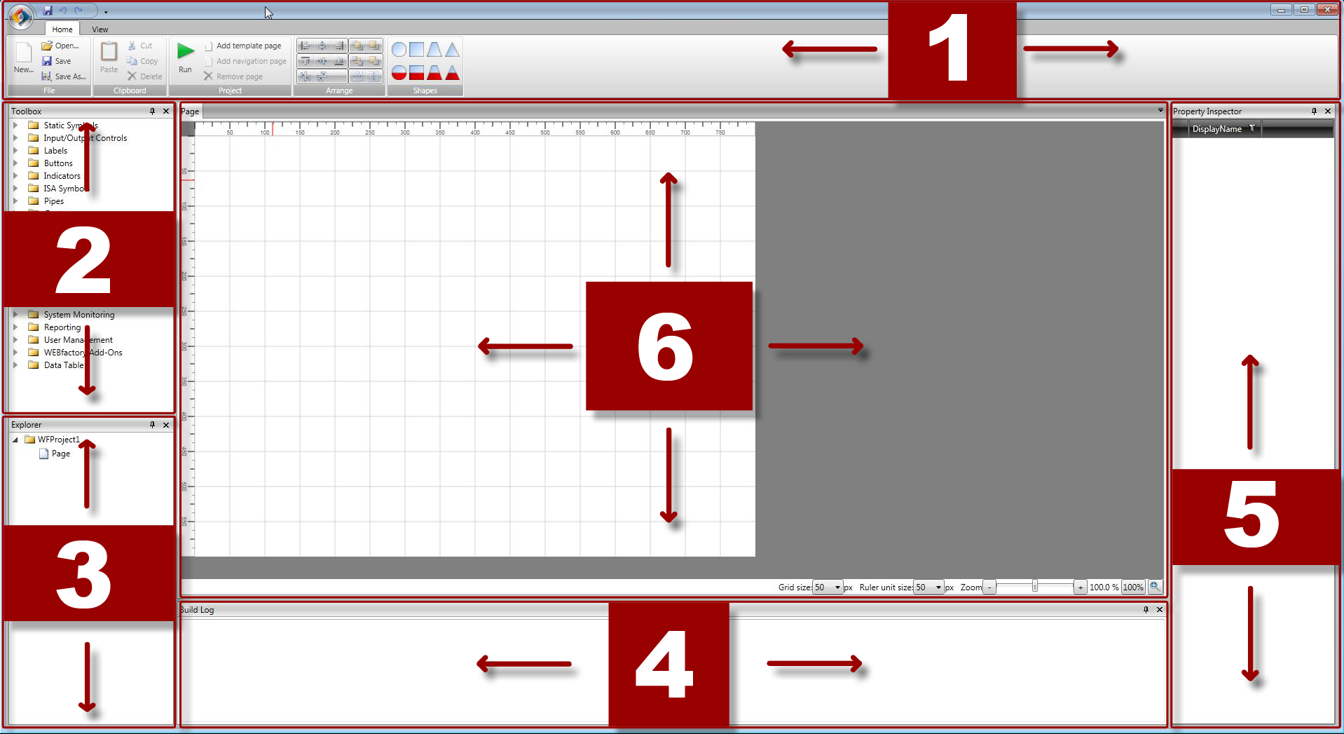
WEBfactory 2010SmartEditor tool panels and canvas
The Ribbon. Click here to view to the User Interface guide for the Ribbon
The Toolbox. Click here to view to the User Interface guide for the Toolbox
The Explorer. Click here to view to the User Interface guide for the Explorer
The Build Log. Click here to view to the User Interface guide for the Build Log
The Property Inspector. Click here to view to the User Interface guide for the Property Inspector
The Page. Click here to view to the User Interface guide for the Page
The Ribbon
Check out this article and learn everything that you need to know about the WEBfactory 2010 SmartEditor Ribbon.
Commonly used by Microsoft starting with Office 2007 up to Windows 8, the Ribbon is the tabbed toolbar of the application.
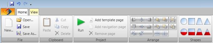
WEBfactory 2010SmartEditorRibbon - Home
In WEBfactory 2010SmartEditor , the ribbon has two tabs: Home and View.
The Home tab is the default tab of the Ribbon and it contains the basic tools, separated in 5 categories:
File: provides the basic functionality of creating a new project, opening an existing project, saving a opened project, and saving a opened project as another project (using a different name or file format).
Clipboard: provides the basic functionality of copying to clipboard, pasting from clipboard, cutting or deleting objects.
Project: provides the particular functionality of running the current project in a preview mode, adding new template pages to the current project, adding navigation pages to the current project or removing pages from the current project.
Arrange: provides the particular functionality of aligning the objects from the page to a certain point or line. The alignment can be either vertical (1) or horizontal (2), and relative to the limit of one of the objects or to the calculated center of a group of objects.
The arrange category provides the option of equal distribution of objects either vertically or horizontally (3), or placing objects in the foreground (4) or background (5).
The last buttons in the Arrange category provide the possibility of scaling an object to the same size as another selected object. The scaling can be made either horizontal, vertical or both (6).
Shapes: provides the particular functionality of creating shapes, by dragging them onto the page area. The shapes can be either static or animated (with animated fill).
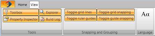
The View tab is divided in three categories: Tools , Snapping and Grouping and Language.
Tools: provides the option of hiding or displaying the tools panels in the main window of SmartEditor . The Toolbox, Property Inspector, Explorer and Build Log can be turned on or off by clicking on the corresponding buttons in the Tools category.
Snapping and Grouping: provides the toggles for grid lines, ruler guides, and for snapping to the grid or ruler.
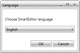
Language: provides the option of changing the display language of SmartEditor .
The View tab
The Language options
All the project handling commands can be accessed by clicking on the Ribbon Orb (New Project, Open Project, Save, Save As, Exit and Recent Projects).
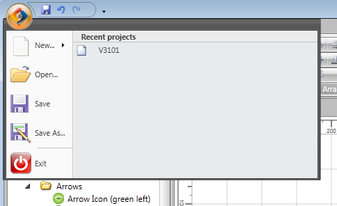
The Ribbon Orb is located in the top-left corner of the window
Quick Access for Save, Undo and Redo is located in the top part of the Ribbon, on the right side of the Orb.
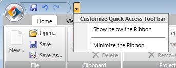
Quick Access tool bar, the Customize menu
By clicking on the down arrow next to the Quick Access tool bar, the user can customize the appearance of the Ribbon, by displaying the Quick Access tool bar below or above the Ribbon, or minimizing the Ribbon.
The Toolbox
Check out this article and learn everything that you need to know about the WEBfactory 2010 SmartEditor Toolbox.
The Toolbox is an expanding menu containing all the controls available for creating a visualization with WEBfactory 2010SmartEditor .
WEBfactory 2010SmartEditor Toolbox
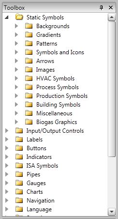
The controls from the Toolbox are sorted in 20 categories, using suggestive names. Each category of controls is divided in sub-categories, for an easier sorting. The categories and sub-categories can be expanded by clicking on the expand/collapse arrow in front of the name.
For example, the Static Symbols category has 12 sub-categories, each with its own controls.
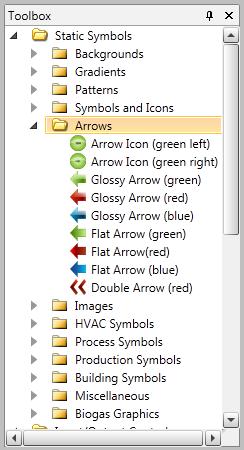
The controls under the Arrows sub-category contained in the Static Symbols category.
To place a control on the page, click the chosen control and drag it on to the page. Complex visualizations can be built by combining the controls from the Toolbox.
The Explorer
Check out this article and learn everything that you need to know about the WEBfactory 2010 SmartEditor Explorer.
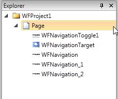
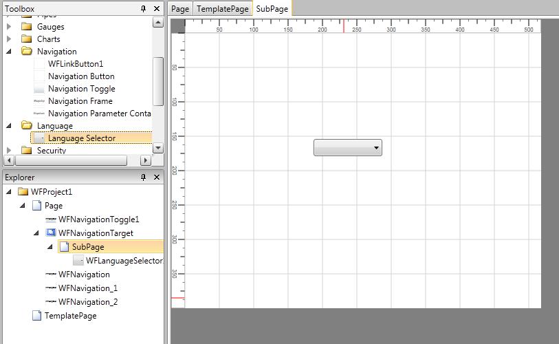
The Explorer panel is the tool that displays the whole structure of the project. The Explorer is structured as a child-parent tree, just like the Toolbox.
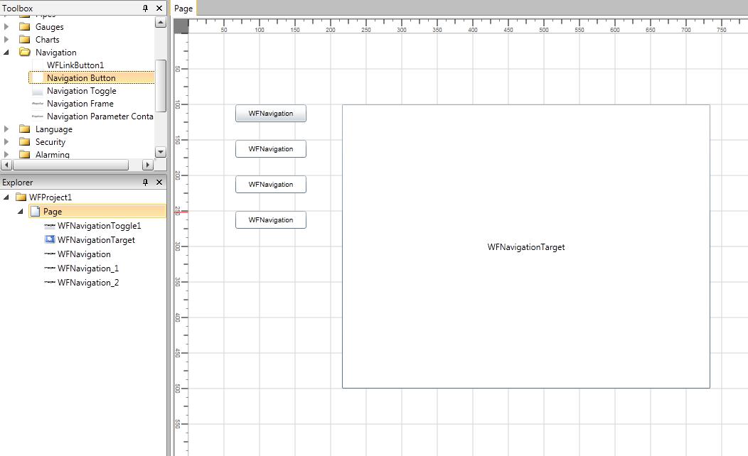
The Explorer panel (on the left side, below the Toolbox), displaying the list of elements and the child-parent relation between them
In the example above, it is easy to see the elements in the example project listed in the Explorer panel (below the Toolbox).
The Page of the project contains one Navigation Toggle (WFNavigationToggle1), one Navigation Target (WFNavigationTarget) and three Navigation Buttons (WFNavigation, WFNavigation1 and WFNavigation2). The Explorer panel lists the existing elements in the correct order and with the current relations between them.
The Page containing the five elements
The main functionality of the Explorer panel is to organize the project elements.
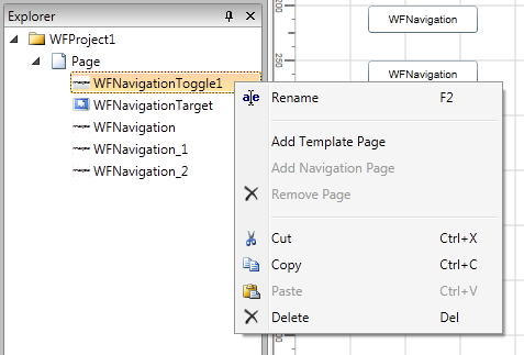
Contextual menu in the Explorer panel
The contextual menu can be opened by right clicking on any of the elements of the project. Operations like renaming, cutting, deleting, copying and pasting can be executed to the selected element using the contextual menu. Each of this operations have assigned a specific shortcut (eg. Copy - Ctrl + C).
The other three options available in the contextual menu are Add Template Page, Add Navigation Page and Remove Page.
Add Template Page - adds a Template Page to the project. The Template Page is a pop-up page used by some specific WEBfactory 2010 controls.
More details can be found in the WEBfactory 2010SmartEditor Controls section of this guide.
Add Navigation Page - this option is active only when right clicking on a WFNavigationTarget control (the WFNavigationTarget control is basically a frame that requires a SubPage to hold its content).
By selecting Add Navigation Page, a new SubPage will be added to the project, having the same size as the WFNavigationTarget frame. All the controls inserted in the new Navigation Page/SubPage will be displayed in the WFNavigationTarget control, in the main page. The Navigation Page will appear as a SubPage in the Explorer panel.
More details can be found in the WEBfactory 2010SmartEditor Controls section of this guide.
Navigation Page (SubPage), child of a WFNavigationTarget control, containing a Language Selector control.
Remove Page - removes any of the above page types added to the project.
The Build Log
Check out this article and learn everything that you need to know about the WEBfactory 2010 SmartEditor Build Log.
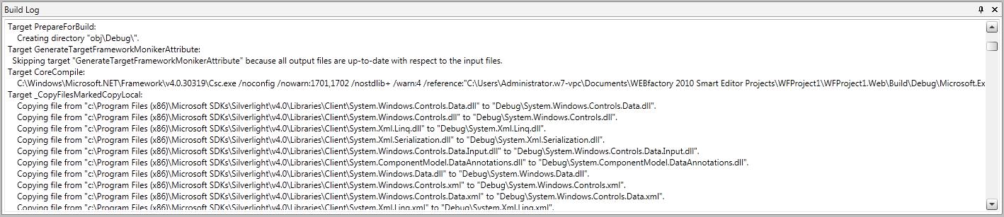
The Build Log panel displays the information behind the process of building the application designed in WEBfactory 2010SmartEditor . It lists the details of the process, helping the user find the eventual errors or warnings that may occur during the build process.
WEBfactory 2010SmartEditor Build Log
Just like all the other panels, the Build Log panel can be pinned or turned off using the buttons form the top-right corner.
The Property Inspector
Check out this article and learn everything that you need to know about the WEBfactory 2010 SmartEditor Property Inspector.
The Property Inspector panel is the most used panel from WEBfactory 2010SmartEditor . It lists the properties of all the selected object and enables the user to change or adjust them to fit the project.
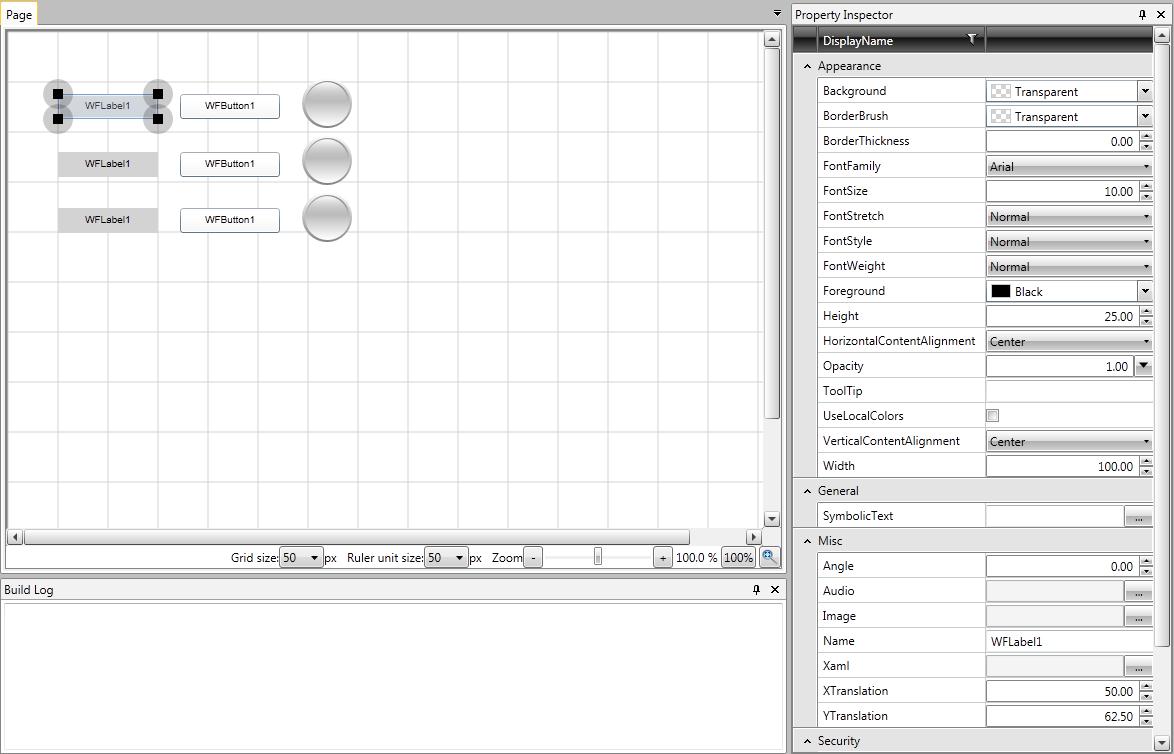
The Property Inspector displaying the properties of WFLabel1 label.
The example above shows the Property Inspector panel listing the properties of the label WFLabel1. All the controls in WEBfactory 2010SmartEditor can be edited here.
To edit the properties of a control, drag the control onto the Page and click on it. The Property Inspector will display the properties listed under categories.
The properties listed are divided in categories, each concerning specific set of properties. The categories listed by the Property Inspector depend on the selected control. Some controls may have more properties than other, thus, the Property Inspector will display additional categories or properties.
There are some properties that are common to all controls, some of those being listed under the Appearance category, Misc category, Security and Template.
More detailed information about the controls properties in the WEBfactory 2010SmartEditor Controls section.
A particularity of the Property Inspector panel is the top bar. It provides the possibility of filtering the properties using various options.
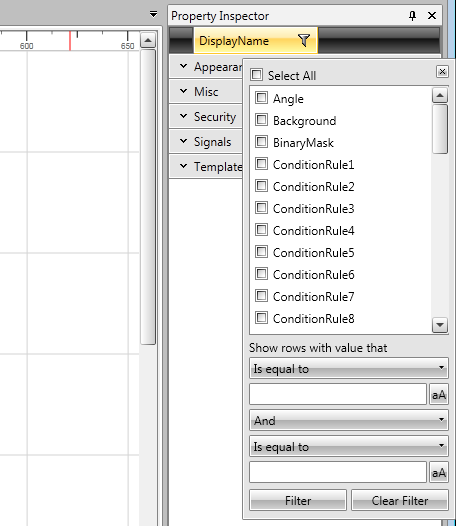
The filtering options of the Property Inspector
In order to access the filtering options, click on the symbol on the right side of the Display Name text, in the top bar of the Property Inspector.
Select the filtering conditions, or create a logical condition by entering the logics of the filtering in the text fields below.
Select Filter to apply the filtering or Clean Filter to cancel the filtering options.
Click anywhere outside the filtering dialog to close it.
The Page
Check out this article and learn everything that you need to know about the WEBfactory 2010 SmartEditor Page.
The Page in WEBfactory 2010SmartEditor is the work area, or the canvas. Every other panel in SmartEditor revolves around the Page panel.
All the controls are dragged and arranged on the Page. Every item placed on the Page will be build and run when building the visualization.
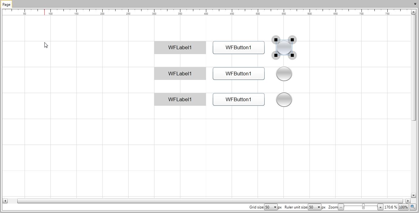
WEBfactory 2010SmartEditorPage panel
Adding controls to the page is done by dragging and dropping controls from the Toolbox panel.
The whole content of the page, and the child-parent relations between the elements of the content can be seen in the Explorer panel.
Grid and Ruler can be enabled on the Page. To enable the Grid and Ruler, select the View tab in the Ribbon and toggle on the grid lines and ruler guides, from the Snapping and Grouping category (see The Ribbon for more information).
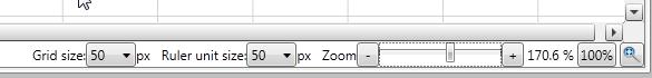
The grid size and the ruler size can be adjusted from the bottom bar of the Page.
The Page bottom bar
Zoom controls are also available in the Page bottom bar. The zoom can be controlled using three methods:
Using the zoom bar and the + and - buttons;
Using the 100% button for quick zooming to 100%;
Using the magnifying glass button next to the 100% button, to fit the page in the available space on the screen.