WEBfactory 2010 Controls Library Overview
Check out this article and get an overview over the WEBfactory 2010 Controls Library before starting to use them.
WEBfactory 2010 provides an ample library of Silverlight controls for SCADA projects, available in , Microsoft Blend and Microsoft Visual Studio.
While in , the controls library is available by default (built in), Microsoft's Blend and Visual Studio projects require references to the controls library's DLL files in order to have access to WEBfactory 2010's Silverlight controls. Read more about using the controls library in the section below.
All WEBfactory 2010 controls share some of the common set of features and properties described below in this article. Besides the shared features and properties, each control provides its own particular functionality. These particular features and properties are described for every control in their individual articles.
For a quicker visual reference of the WEBfactory 2010 Controls Library, check out the preview section here:
The WEBfactory 2010 Controls Library articles are updated constantly, so stay tuned for the latest information on all the WEBfactory 2010 controls!
Using the WEBfactory 2010 controls library
The WEBfactory 2010 control library can be used directly in or in Microsoft's Blend and Visual Studio.
SmartEditor
SmartEditor provides the simplest way of working with the controls library. Every control is available in the Toolbox panel by default, without any referencing or other user intervention. Simply drag the desired control from the Toolbox on the Page and configure it in the Properties panel.
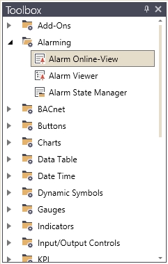
SmartEditor controls library available in WEBfactory 2010The
Blend
To use the WEBfactory 2010 controls library in Blend, the user must reference the control library DLL files in the Silverlight Application project. See Adding references in Blend projects.
The required DLL files are located by default at: C:\Program Files (x86)\WEBfactory 2010\Silverlight\Standard
After referencing the DLL files in the project, the controls will be available in Blend's Assets panel.
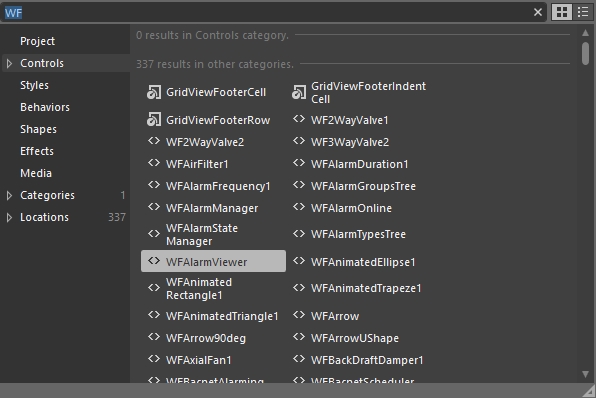
The Blend's Assets panel displaying the WEBfactory 2010 controls library
Visual Studio
To use the WEBfactory 2010 controls library in Visual Studio, the user must reference the control library DLL files in the Silverlight Application project. See Adding references in Visual Studio projects.
The required DLL files are located by default at: C:\Program Files (x86)\WEBfactory 2010\Silverlight\Standard
After referencing the DLL files in the project, the controls are accessible in XAML via namespaces.
<UserControl
    xmlns="http://schemas.microsoft.com/winfx/2006/xaml/presentation"
    xmlns:x="http://schemas.microsoft.com/winfx/2006/xaml"
    xmlns:d="http://schemas.microsoft.com/expression/blend/2008"
    xmlns:mc="http://schemas.openxmlformats.org/markup-compatibility/2006"
    xmlns:sdk="http://schemas.microsoft.com/winfx/2006/xaml/presentation/sdk"
    x:Class="SilverlightApplication2.MainPage"
    mc:Ignorable="d"
    d:DesignHeight="300" d:DesignWidth="400"

    xmlns:WFAlarms="clr-namespace:WFSilverlight.Alarms;assembly=WFAlarms">

    <Grid x:Name="LayoutRoot" Background="White">
        <WFAlarms:WFAlarmViewer></WFAlarms:WFAlarmViewer>
    </Grid>
</UserControl>
Once the appropriate namespace is declared, Visual Studio will provide suggestions when accessing the declared namespace in XAML, displaying all the controls available in that namespace.
Visual Studio displaying the controls via intellisense
Common control features
Most of the controls inside the WEBfactory 2010 control library have common run-time features that provide rich functionality in SCADA visualizations.
Dynamic visual states
Many WEBfactory 2010 controls like Dynamic Symbols, Indicators or various buttons, feature rich visual states that can be dynamically influenced by signal values. This feature is extremely valuable when visualization elements need to reflect different operating states. The visual states are editable at design-time via two methods: using direct states properties or using the States Editor.
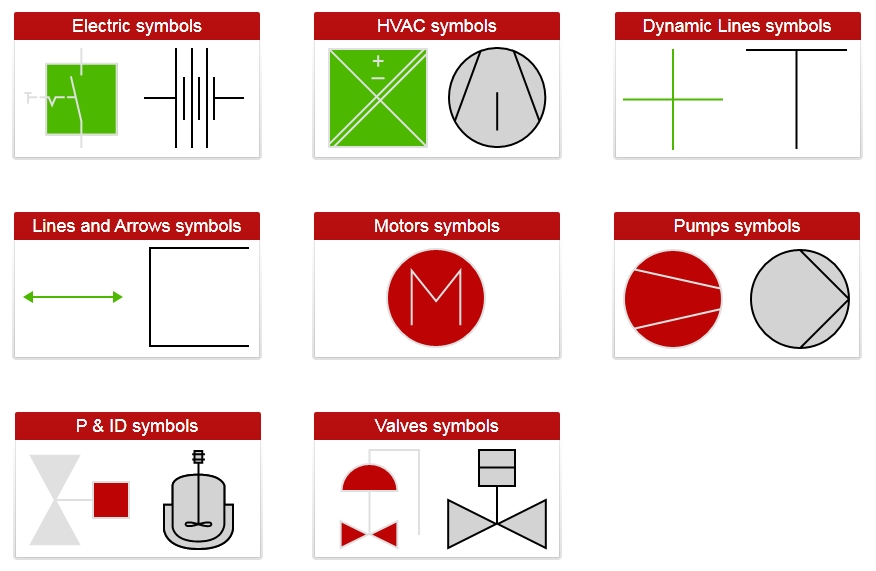
Various visual states of the Dynamic Symbols
The following articles make good use of the dynamic visual states in a realistic scenario, so check them out for more guidance:
Pop-up windows
Another common feature of the WEBfactory 2010 controls is the ability to open pop-up windows when clicked and pass parameters to the content of those windows. These windows can provide additional information about the control or can even host complex controls like WFAlarmViewer.
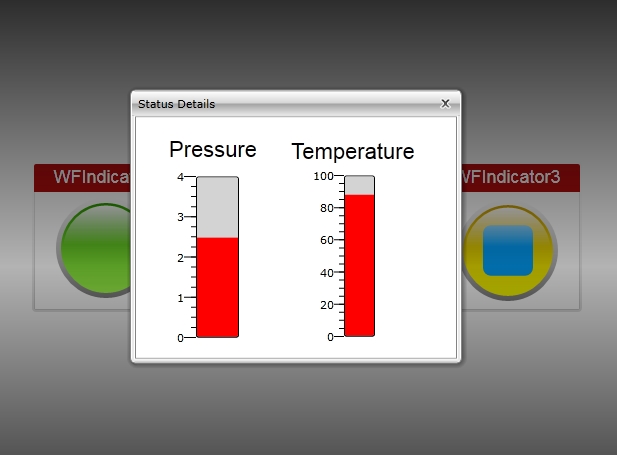
Pop-up window opened by WFIndicator2
The following article describes the usage of pop-up windows, so check it out for more details:
Run-time security
One of the most common features is WriteSecure, which adds an extra security layer to visualizations. When this option is enabled, the user can write the value of a signal only after confirming its password. The run-time security can also be enhanced by conditioning the control's visibility or state using authorization groups or signal value masks.

WriteSecure at run time
The article linked below describes the usage of the security settings at design-time, so make sure to check it out:
Multi-language support
All WEBfactory 2010 controls are translatable at run-time. Using symbolic texts, the WEBfactory 2010 control can instantly adapt their texts to the language selected by the user at run-time.
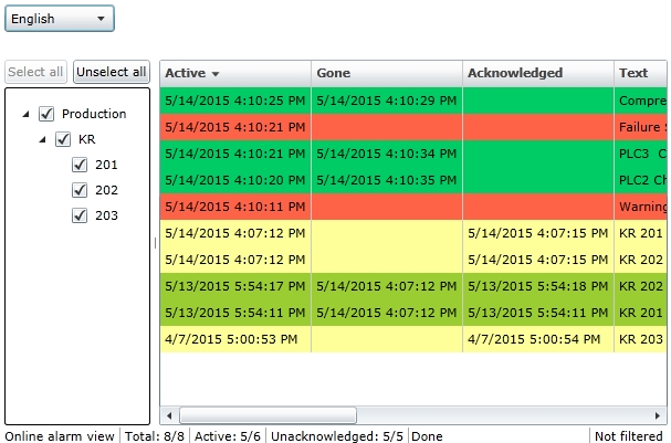
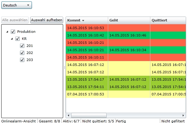
The WFAlarmViewer control switching between English and German at run-time
Custom visual styles
All WEBfactory 2010 controls can be styled to match the project's visual code. Customizing the colors, fonts faces, text sizes and layout can be easily achieved using the dedicated Appearance and Layout properties at design-time, in any editor tool.
If using Blend or Visual Studio, the customization can go even further with the ability to create custom skins for every control available.
Common control design-time properties
All the controls inside the WEBfactory 2010 controls library share a set of basic properties or property categories. These properties are usually available in all three editor tools and refer to the layout, appearance, signals and other common configurations that most controls support. Besides this set of common properties, each control may have its own parametrization options which will be detailed in the appropriate articles.

, Blend and Visual StudioSmartEditor controls properties in WEBfactory 2010
The tables below lists all the common design-time properties of the WEBfactory 2010 controls, along with their description and availability in the property categories of SmartEditor, Blend and Visual Studio.
Appearance properties
The Appearance properties allow the user to customize the visual style of the controls at design-time. Some control may expose more detailed appearance properties, which are described in control's specific section. Other control may expose only some of the below properties. The most common ones are listed in the table below.
Name | Description | SmartEditor | Blend and Visual Studio |
|---|---|---|---|
Background | Provides the option to change the control's background color using the brush editor. The background can be set to full color, gradient or to saved templates. | Appearance properties | Brush properties |
Foreground | Provides the option to change the control's foreground color using the brush editor. The background can be set to full color, gradient or to saved templates. | Appearance properties | Brush properties |
UseLocalColors | Applies the custom background and foreground colors to the control. | Appearance properties | Not available |
Opacity | Adjusts the opacity of the control. The values can range between full opacity to full transparency. The scale is numeric in SmartEditor (from 0 to 1) and percentual in Blend and Visual Studio. | Appearance properties | Appearance properties |
ToolTip | The text displayed at run-time when hovering the mouse cursor over the control. | Appearance properties | Common properties |
BorderBrush | Adjusts the color of the border using the brush editor. The border can be set to full color, gradient or to saved templates. | Appearance properties | Brush properties |
BorderThickness | Adjusts the thickness of the border. | Appearance properties | Appearance properties |
Font properties | Provide the option to customize the font used for displaying texts in the controls that display texts. The font parameters that can be customized are:
| Appearance properties | Text properties |
Layout properties
The Layout properties allow the user to configure the position, angle and alignment of the control and it's contents at design-time.
Name | Description | Available in SmartEditor | Blend and Visual Studio |
|---|---|---|---|
Width | Adjusts the width of the control | Layout properties | Layout properties |
Height | Adjusts the height of the control | Layout properties | Layout properties |
XTranslation | Adjusts the control's position on the X axis. | Layout properties | Transform properties |
YTranslation | Adjusts the control's position on the Y axis. | Layout properties | Transform properties |
Angle | Adjusts the angle of the control relative to the X axis. | Layout properties | Transform properties |
HorizontalContentAlignment | The horizontal alignment options for the control's content. Can be: Left, Center, Right and Justified. | Layout properties | Layout properties |
VerticalContentAlignment | The vertical alignment options for the control's content. Can be: Top, Center, Bottom and Justified. | Layout properties | Layout properties |
General properties
The General properties allow the user to configure the translatable text displayed by the control at run time.
Name | Description | SmartEditor | Blend and Visual Studio |
|---|---|---|---|
SymbolicText | The text displayed by the control. If the symbolic text is defined in the database and has associated translations, the text will be automatically translated to the available languages when switching the languages at run-time. | General properties | - General propertiesWEBfactory 2010 |
Misc properties
The Misc properties allow the user to configure the control's name at design-time. The control can be further referenced in the project using this name.
Name | Description | SmartEditor | Blend and Visual Studio |
|---|---|---|---|
Name | The name of the control. This name can be used when referencing the control in your project. Some features (like passing parameters in navigation) require named controls to work. | Misc properties | Properties panel |
Security properties
The Security properties allow the user to set up advanced security for most WEBfactory 2010 controls.
Name | Description | SmartEditor | Blend and Visual Studio |
|---|---|---|---|
EnableMask | Sets the binary mask that toggles the control's state. When the binary mask matches the binary value of the EnableSignalName signal (binary AND operation), the control is disabled. Else, the control is enabled. IMPORTANT: A binary mask condition can be satisfied by more than one value, as long as the proper bits match in both values. | Security properties | WEBfactory 2010 - Security properties |
EnableSignalName | The signal whose value is used along the EnableMask value in the binary AND operation that toggles the control's state on (enabled) or off (disabled). | Security properties | WEBfactory 2010 - Security properties |
SecurityAuthorizationName | The project authorization whose members have access to the control. | Security properties | WEBfactory 2010 - Security properties |
SecurityDenyAccecssBehavior | The behavior of the control when the logged in user doesn't belong to the project authorization indicated by the SecurityAuthorizationName property. In this case, the control can be either disabled or hidden. | Security properties | WEBfactory 2010 - Security properties |
VisibilityMask | Sets the binary mask that toggles the control's visibility. When the binary mask matches the binary value of the EnableSignalName signal (binary AND operation), the control is hidden. Else, the control is visible. IMPORTANT: A binary mask condition can be satisfied by more than one value, as long as the proper bits match in both values. | Security properties | WEBfactory 2010 - Security properties |
VisibilitySignalName | The signal whose value is used along the EnableMask value in the binary AND operation that toggles the control's visibility on (visible) or off (hidden). | Security properties | WEBfactory 2010 - Security properties |
WriteSecure | If enabled, provides an extra layer of security by asking the user to confirm its password for every writing operation. | Security properties | WEBfactory 2010 - Security properties |
Signals properties
The Signals properties allow the user to assign a signal name to the control. The signal name can be its original name (alias) or can be composed from prefix and base.
Name | Description | SmartEditor | Blend and Visual Studio |
|---|---|---|---|
SignalPrefix | A prefix that can be automatically added to the signal name to form prefixed signal names. For example, if the name of a signal in the Studio project is Water.Temperature, this name can be composed using the Water SignalPrefix and the .Temperature SignalName. In SmartEditor, the available signal prefixes are:
In Blend and Visual Studio, the available signal prefixes are the StringPlaceholdersResolver placeholders:
| Signals properties | WEBfactory 2010 - Signals properties |
ObjectName or ObjectID | A name that can be passed as a parameter in template pop-ups and navigation pages or as a signal prefix. | Signals properties | WEBfactory 2010 - Signals properties |
SignalName | The the name of the signal that will be used by this control for displaying and/or writing values. This property can be also used for defining signal names using the SignalPrefix property. The name of the signal can be directly typed in the text field or can be selected using the Signal Browser. | Signals properties | WEBfactory 2010 - Signals properties |
Can be available under the Signals properties or under their own category. The States properties are described below, in a separate section. | Signals properties | WEBfactory 2010 - Signals properties |
* Some older WEBfactory 2010 controls might a different set States properties. These different properties will be described in the control's section.
States properties
The States properties allow the user to configure multiple visual states which can be controlled by signal values. They can be usually found under the Signals category and are available only for those control that support visual states. Some older WEBfactory 2010 control might have different parametrization for visual states.
Name | Description | SmartEditor | Blend and Visual Studio |
|---|---|---|---|
States | Allows the user to configure different visual states that can be activated by comparing a signal value to a constant or to a different signal value. The visual states are created using the State Editor. Each state has the following parameters:
| Signals properties | WEBfactory 2010 - States properties |
Template properties
The Template properties allow the user to set up pop-up windows that will open at run-time when clicking the control. The pop-up windows can inherit parameters from the parent control. These parameters can be used to define the contents of the pop-up window.
Name | Description | SmartEditor | Blend and Visual Studio |
|---|---|---|---|
ParameterValues or PopupParameters | In SmartEditor, the ParameterValues property allows the user to choose new values for Template Parameters (parameters for Signal Names, Symbolic Texts and Alarm Types defined in a Template page). The new values of the Template Parameters are passed to the Template page when opening it from the configured control. This facilitates the usage of the same Template Page in multiple situations. In Blend or Visual Studio, the PopupParameters property also allows the user to create the parameters to be passed in the pop-up page. The parameters are no longer restricted to Signal Names, Symbolic Texts and Alarm Types. | Template properties | WEBfactory 2010 - General properties |
Template or PopupSource | Allows the user to select an existing Template page to be opened as pop-up at run time. In Blend and Visual Studio, the page must be referenced using the ProgectName.PageName syntax. | Template properties | WEBfactory 2010 - General properties |
TemplateModality or PopupModality | The display method for the template page. The options are Modal or Modeless. | Template properties | WEBfactory 2010 - General properties |
TemplateTitle or PopupTitle | The title to be displayed in the title bar of the pop-up window. | Template properties | WEBfactory 2010 - General properties |