Custom Control Development: Programming the Silverlight Custom Control
Check out this article and learn how to start programming the Silverlight Custom Control.
In the previous part of the Custom Control Development series, we have created the UI of a simple control that should be able to read and write a value to a signal powered by WEBfactory 2010 Server. In this second part, we will focus on implementing this desired functionality.
Unlike the design part of the control, the programming of the control is difficult to achieve using Blend for Visual Studio (thus possible). This is why we strongly recommend using Visual Studio for any programming task.
The programming stage is split into three steps, following the logical workflow of building the control's functionality:
Implementing the user interface and actions - in this step we will reference the UI elements in the code, create the handler for clicking the button and make sure that it is disposed in the end.
Creating the control's properties - in this step we will create the properties that the control will expose when used from Blend or Visual Studio. These properties will allows the user to set the name of the signal to be used buy the control.
Implementing the functionality - in this step we will call the methods of the Ewon by HMS Networks Client SDK to execute the read and write operations.
Implementing the user interface and actions
Open the previously created solution in Visual Studio. Using the Solution Explorer, open CustomControl.cs. By default, the CustomControl.cs will have the following contents:
using System;
using System.Collections.Generic;
using System.Linq;
using System.Net;
using System.Windows;
using System.Windows.Controls;
using System.Windows.Documents;
using System.Windows.Input;
using System.Windows.Media;
using System.Windows.Media.Animation;
using System.Windows.Shapes;

namespace SilverlightControlLibrary
{
    public class CustomControl : Control
    {
        public CustomControl()
        {
            this.DefaultStyleKey = typeof(CustomControl);
        }
    }
}
The first step is to declare fields (variables) to hold all the elements created in the previous part inside the CustomControl class: the TextBlock, TextBox, and Button. The fields will have a predefined corresponding type and a meaningful name.
private TextBlock Value;
private TextBox Input;
private Button Button;
As we have created the fields for our UI elements, we need to assign each actual UI element to its respective field when the control is loaded and the XAML is applied at run time. To achieve this, we will create the OnApplyTemplate() method and load the UI elements by their name, when the method is triggered (when the control loads).
public override void OnApplyTemplate()
{
    base.OnApplyTemplate();
    Value = GetTemplateChild("Value") as TextBlock;
    Input = GetTemplateChild("Input") as TextBox;
    Button = GetTemplateChild("Button") as Button;
}
The three UI elements are now defined, but we must treat one more UI aspect: the action of the Button - the click event. We will define an empty event handler (which we will fill in later) for this click event.
void Button_Click(object sender, RoutedEventArgs e)
{
}
To also load this event when the control loads, we need to register it in the OnApplyTemplate() method.
Button.Click += new RoutedEventHandler(Button_Click);
Finally, we need to make sure that the click event gets unregistered when the control is closed. To achieve this, the CustomControl needs to inherit the IDisposable class.
public class CustomControl : Control, IDisposable
Once inherited, the IDisposable class will allow us to create the dispose structure. We will start by creating the Dispose method that will call the DisposeResources method and tell Garbage Collector not to finalize the current object and wrap that method in a region called Dispose.
public void Dispose()
{
    DisposeResources();
    GC.SuppressFinalize(this);
}
The DisposeResources method will call the actual disposing methods.
protected virtual void DisposeResources()
{
    DisposeEvents();
}
Finally, we will create the DisposeEvents method that will unregister the click event of the Button if the operation was not already done.
private void DisposeEvents()
{
    if (Button == null) return;
    Button.Click -= new RoutedEventHandler(Button_Click);
}
Now, as the UI elements are applied in the code, the events are registered and disposed when not needed, the general functionality of the control is complete. So far, the code should look like this:
Creating the control's properties
The control's properties are available at run-time inside property categories. In this tutorial, we will create one property called SignalName that will allow us to specify the signal to be used. Before creating the first property, we must define the attribute that states the category where the following property will be placed.
[System.ComponentModel.Category("Sample Property Category")]Create the SignalName property using the getter and setter.
public string SignalName
{
    get { return (string)GetValue(SignalNameProperty); }
    set { SetValue(SignalNameProperty, value); }
}
Now we need to define the dependency property SignalNameProperty used by the getter and setter. We will set the default value (property metadata) to Setpoint 1, a signal name available in the WEBfactory 2010 Demo Project.
public static readonly DependencyProperty SignalNameProperty =
    DependencyProperty.Register(
    "SignalName",
    typeof(string),
    typeof(CustomControl),
    new PropertyMetadata("Setpoint 1"));
Now, as the properties are defined, the code should look like this:
Implementing the functionality
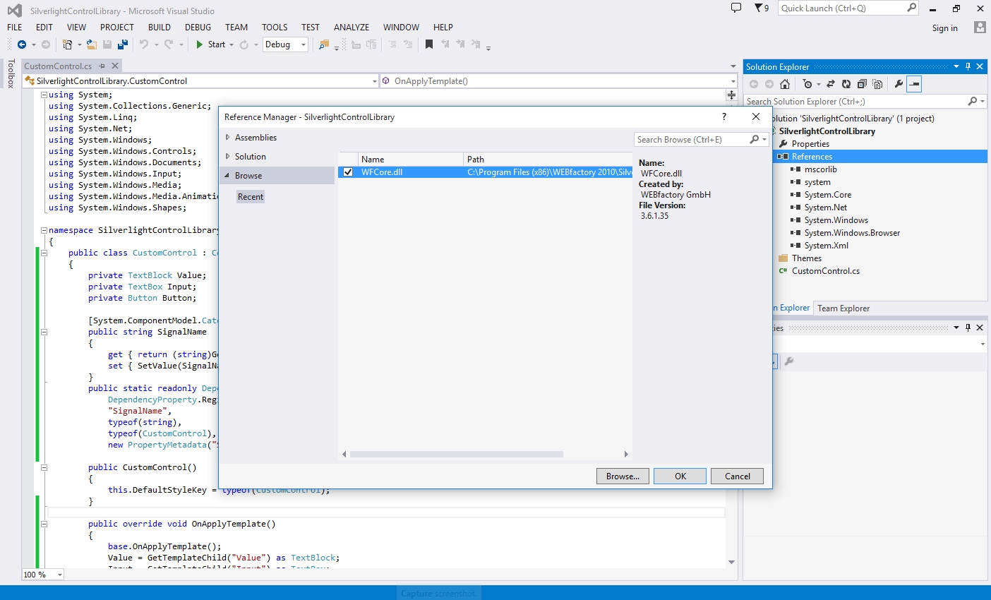
The first step in implementing the WEBfactory 2010 functionality is adding the required references to the project. Using the Reference Manager, add the WFCore.dll file as reference to the control library project.
By default, the WFCore.dll file is available at C:\Program Files (x86)\WEBfactory 2010\Silverlight\Standard.
Next we need to access a new namespace (WFSilverlight.Core) from the library previously added as reference. Add the following using declaration.
using WFSilverlight.Core;
Now we have access to the Ewon by HMS Networks connector. To use it in our project, we first need create a field (variable) to hold it.
private WFConnector wfConnector;
Initialize the connector when the control loads (in the OnApplyTemplate() method) by calling a new method that will be defined next.
InitializeConnector();
Now create the initialization method to be called by the OnApplyTemplate() method. It is important that the connector is initializing only at run-time.
void InitializeConnector()
{
    if (!System.ComponentModel.DesignerProperties.GetIsInDesignMode(this))
    {
        wfConnector = new WFConnector(false);
    }
}
In the same initialization method, register the connector's signal change handler that will be triggered when the signal value changes, and will return a method that will update the control with the new value. The handler will use the signal name passed by the SignalName property defined earlier.
wfConnector.RegisterSignalChangedHandler("", SignalName, SignalChanged);Now define the method returned by the signal changed handler. This method will update the text property of out TextBlock (named Value) with the new signal value.
void SignalChanged(string name, object value)
{
    if (value != null)
    {
        Value.Text = Value.ToString();
    }
}
Next, we need to address the signal writing. For this, we will use the previously created (and empty) Button_Click event handler to call a connector method that will initialize the writing of a new value to the signal. The signal to be updated is provided by the SignalName property and the value to be written is provided by our TextBox. Lastly, we need to call a method that validates the value input.
wfConnector.WriteSignal("", SignalName, Input.Text, Validation);Create the validation method called by the connector's WriteSignal() method. This validation method must make sure that the value that is submitted for writing exists and is an integer. This method will notify the user about the submission's outcome using a message box.
private void Validation(Exception error, int[] results)
{
    if (results[0] == 0)
    {
        MessageBox.Show("Value Submitted");
    }
    else
    {
        MessageBox.Show("Please type a real value");
    }
}
Finally, we need to unregister the signal changed handler and dispose the connector as it is no longer needed. We will start by calling a new DisposeConnector() method in the previously created DisposeResources() method.
DisposeConnector();
The DisposeConnector() method will make sure that the connector was not previously disposed and will unregister the signal change handler and dispose the connector. After the disposing the connector, we need to set the connector to null so the method knows that the connector was already disposed next time it is called.
private void DisposeConnector()
{
    if (wfConnector == null) return;
    wfConnector.UnregisterSignalChangedHandler("", SignalName, SignalChanged);

    wfConnector.Dispose();
    wfConnector = null;
}
Now the custom control is complete with functionality. Check out the full code below:
The CustomControlLibrary solution can now be built. To build the solution, press F6 or using the Visual Studio menu, go to Build > Build Solution. The resulted DLL file, SilverlightControlLibrary.dll, will be available in the Bin > Debug folder of the solution.
The Silverlight custom control can be now used in visualization projects made with Expression Blend or Visual Studio. To be able to use it in SmartEditor, an additional WPF custom control library must be developed.