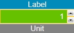
WFNumericUpDown1
The WFNumericUpDown1 control is able to display and edit the value of a signal at run time, allowing the user to increase or decrease the value by one unit. The WFNumericUpDown1 control also allows the user to display a label and unit for the signal's value, while providing comprehensive security options. Last but not least, the WFNumericUpDown1 control provides a complex visual state editor, allowing the control to change its appearance based on the trigger value settings.
WFNumericUpDown1
Features
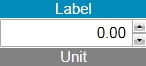
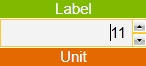
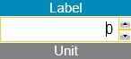
Label, Unit, Format and Precision
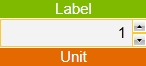

The control can display the label and unit using symbolic texts and customizable unit and label areas. The precision and format (Standard Numeric Format Strings) of the value set at design time are also reflected by the control at run time.
Small and Large Increments
The control can increase or decrease the value of the signal using small increments, triggered by the up/down arrows or the mouse wheel or large increments, triggered by the Page Up or Page Down keyboard buttons. Both increments can be set up at design time.
Visual States
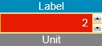
The control has the ability to change its visual states depending on a signal's value.
Advanced Security
The control offers advanced security options like enabling, disabling, showing or hiding the control based on a signal's value, authorization based behavior and secured value writing.
Pop-up options
The control can also trigger pop-up windows in either modal or modeless way.
Design-time Properties
The control's design time properties are available in the Properties panel:
ButtonHeight- the height of the write confirmation buttons.
ButtonWidth- the width of the write confirmation buttons.
CornerRadius - the rounding of the control's input corners.
Format - allows the user to specify a format for the value written and displayed by the control. Click here to read more about the Standard Numeric Format Strings.
InputBorderThickness- allows the user to specify a thickness value for the control's input field border.
InputPadding - the padding of the control's input field.
LabelFontSize - the font size of the Label text.
LabelPadding - the padding of the control's label.
LabelPosition - the position of the label. Can be Top, Left or Bottom.
LabelSymbolicText - the symbolic text for the label.
LabelTextAlignment - the text alignment of the label text. Can be Left, Right, Center or Justified.
LabelVisibility - allows the user to hide or show the label. Can be Visible or Collapsed.
LabelWidth - the width of the label element.
LargeChange - sets the increment applied when using the Page Up and Page Down keyboard keys.
Maximum - the maximum value to be displayed/set by the control.
Minimum - the minimum value to be displayed/set by the control.
PopupModality - allows the user to select the display method for the popup. The options are Modal or Modeless.
PopupParameters - the user can define a parameter containing a name and a value. This parameter can be passed to the popup page opened by the button.
PopupSource - select the popup page to be opened when the button is pressed at run time.
PopupTitle - sets the pop-up window title.
Precision - the number of decimals of the number.
ShowPopup - enables the popup page.
SmallChange - sets the increment applied when using the up/down arrows or the mouse wheel.
UnitFontSize - the font size of the unit text.
UnitPadding - the padding of the control's unit text.
UnitPosition - the position of the unit. Can be Top, Right or Bottom.
UnitSymbolicText - the symbolic text for the unit.
UnitTextAlignment - the text alignment of the unit text. Can be Left, Right, Center or Justified.
UnitVisibility - allows the user to hide or show the unit. Can be Visible or Collapsed.
UnitWidth - the width of the Unit element.
EnableMask - the binary mask used for enabling or disabling the control. The control uses the bitwise AND operation between the binary value of the signal set at the EnableSignalName property and the binary value of the mask. This bitwise AND operation must equate to the binary value of the mask in order to be true (e.g. Signal & Mask = Mask). The control is disabled when the bitwise operation is true and enabled when the bitwise operation is false.
EnableSignalName - the signal that will control the enabled or disabled state of the control. The binary value of the selected signal is used together with the EnableMask binary value to toggle between the control's enabled or disabled states.
SecurityAuthorizationName - allows the user to select an authorization group. The members of the selected authorization group will have access to the control.
SecurityDenyAccessBehaviour - allows the user to select a behavior that will be active when a user that doesn't belong to the above selected authorization group logs in. The action can either be disabled or hidden.
VisibilityMask - the binary mask used for displaying or hiding the control. The control uses the bitwise AND operation between the binary value of the signal set at the VisibilitySignalName property and the binary value of the mask. This bitwise AND operation must equate to the binary value of the mask in order to be true (e.g. Signal & Mask = Mask). The control is hidden when the bitwise operation is true and visible when the bitwise operation is false.
VisibilitySignalName - the signal that will control the visibility of the control. The binary value of the selected signal is used together with the VisibilityMask binary value to toggle between the control's visible or hidden states.
WriteConfirmation - if enabled, the user will have to confirm the change of values.
WriteConfirmationPosition - the position of the write confirmation buttons. Can be Top, Right or Bottom.
WriteSecure - allows the user to enable an extra security layer. If active, the user will be asked to confirm the login password in order to modify any signal.
ObjectID - allows the user to define an object name for the control, that can be passed as SignalPrefix when using parameter passing in navigation.
SignalName - allows the user to select a signal (using the SignalBrowser of by typing the signal name in the text box). The selected signal's value will be displayed/written by the control at run time.
SignalPrefix - allows the user to select a signal prefix that can be passed when using parameter control and parameter passing in navigation. The signal prefix can be the ObjectName, ObjectName_PageSignalPrefix, PageSignalPrefix or PageSignalPrefix_ObjectName.
Value - the value to be displayed if no signal is attached.
States - allows the user to configure multiple states for the control.
BlinkingFrequency - the blink speed.
Condition - the condition for entering the state.
ConditionParameters - allows the user to create conditions for entering in different states. The condition must have a name and a signal.
ConditionType - the type of the condition. It can be either SignalName or Equation.
IsBlinking - if checked, the control will blink when it will be in this state.
IsEnabled - if checked, the control will be enabled when it will be in this state.
IsVisible - if checked, the control will be visible when it will be in this state.
StateName - the name of the state.
AlternateBackground - the background color for the alternate blink state.
AlternateForeground - the foreground color for the alternate blink state.
Background - the background color for the current state.
Foreground - the foreground color for the current state.