Custom Control Development: Designing the Silverlight Custom Control
Check out this article and learn more details about the Custom Control Development when designing the Silverlight Custom Control.
The first part of the Custom Control Development article series focuses on designing a simple control using the Silverlight framework. This simple control will serve as example for using the WEBfactory 2010 Client SDK and for understanding the best practices advised by Ewon by HMS Networks.
The design of the control must reflect the functionality it provides. In this tutorial series, we will create a control that is able to read and write a signal value from WEBfactory 2010 Server. Based on this functionality requirements, the control needs the following elements:
a text box to display the signal's value
an input box to enter the new value
a button to write the new value to the signal
This control design can be achieved using the Silverlight framework in Microsoft's Visual Studio (2012 or newer) or in Blend for Visual Studio (2012 or newer). As a best practice, we always recommend using the latest software versions available.
Using Microsoft Visual Studio 2013
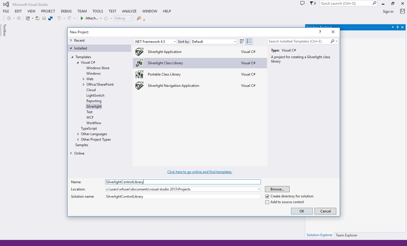
Open Microsoft Visual Studio 2013 and create a new Silverlight Class Library project. We will name it SilverlightControlLibrary (the name can be different but keep in mind that it will be used further in the code).
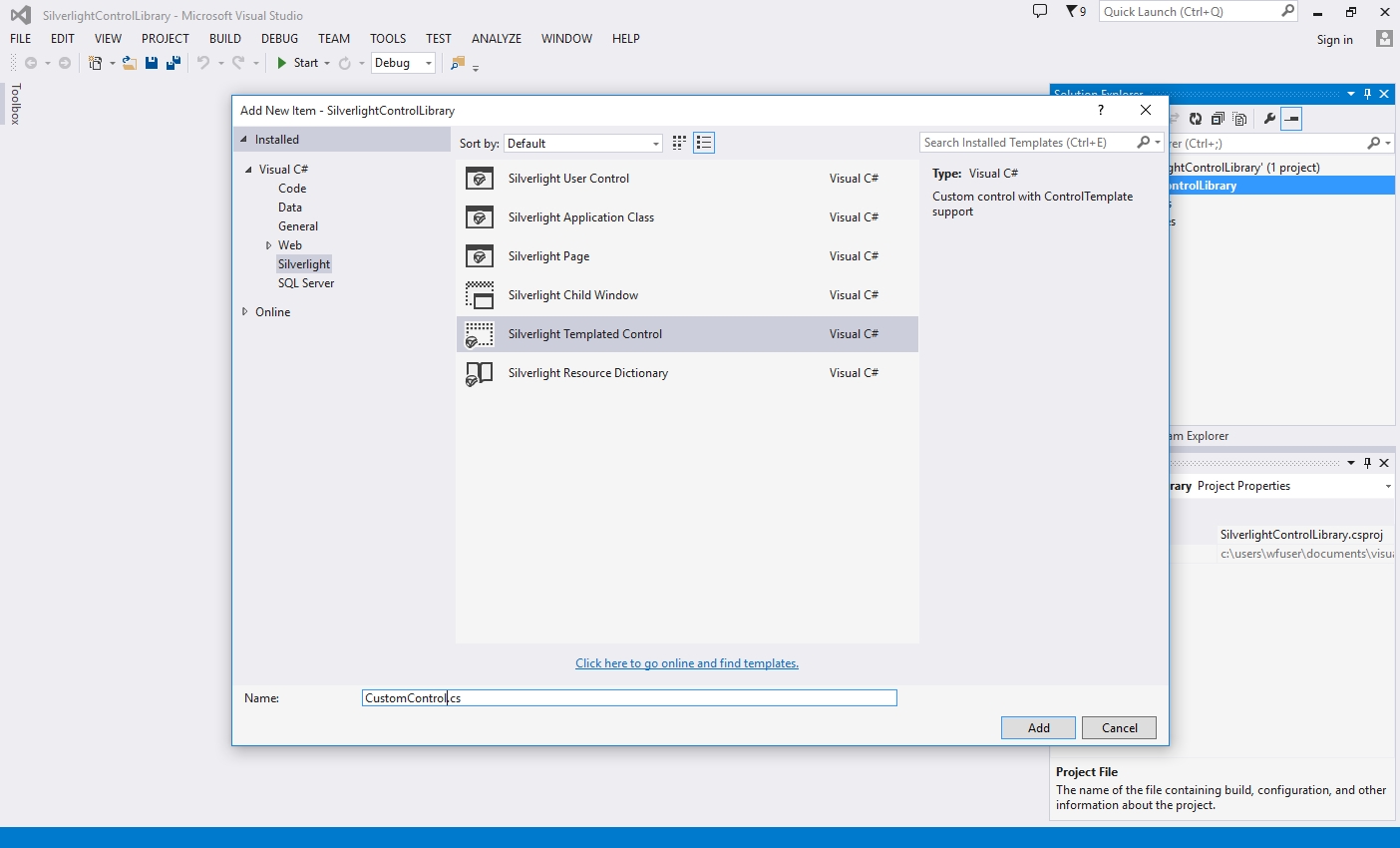
In the new solution, delete the Class1.cs file which was automatically created and add a new Silverlight Templated Control. We will name it CustomControl (the name can be different but keep in mind that it will be used further in the code).
The Silverlight Templated Control is the backbone of our custom control. It will provide the structure for the user interface (Generic.xaml) and for the logics (CustomControl.cs)
Open the Generic.xaml from the Themes folder available in the Solution Explorer. The user interface is already set up for us, so we only need to add the desired elements.
The Generic.xaml containing the user interface is linked to the logic code via the common namespace (SampleClassLibrary in this example).
Add a Grid element inside the existing Border in the Generic.xaml. Every element will be placed inside a grid row, so the grid must have three rows defined. Set the column's width to 100 pixels and the rows height to 100 pixels, so we can contain the UI elements in a manageable size.
<Grid>
	<Grid.ColumnDefinitions>
		<ColumnDefinition Width="100" />
	</Grid.ColumnDefinitions>
	<Grid.RowDefinitions>
		<RowDefinition Height="30" />
		<RowDefinition Height="30" />
		<RowDefinition Height="30" />
	</Grid.RowDefinitions>
</Grid>
Now add the first element, the TextBlock, on the first row of the grid. Name it Label. The element's name will allow us to reference it later in code.
<TextBlock x:Name="Value"
	Grid.Row="0"
	Grid.Column="0" />
Add the TextBox element on the second row of the grid and name it Textbox.
<TextBox x:Name="Input"
	Grid.Row="1"
	Grid.Column="0" />
Add the final element, the Button, on the third row of the grid. Name it Button and add a meaningful text content.
<Button x:Name="Button"
	Grid.Row="2"
	Grid.Column="0"
	Content="Submit Value" />
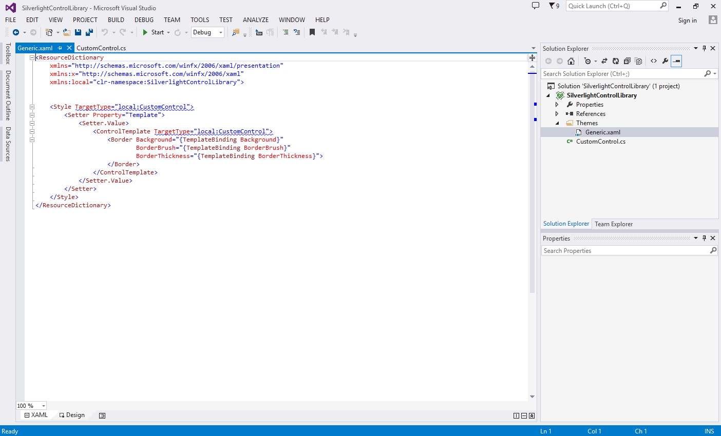
As all the elements of the UI are in place, the XAML code should look like this:
The next step is to program the control, so follow this link to get started:
Using Blend for Visual Studio 2013
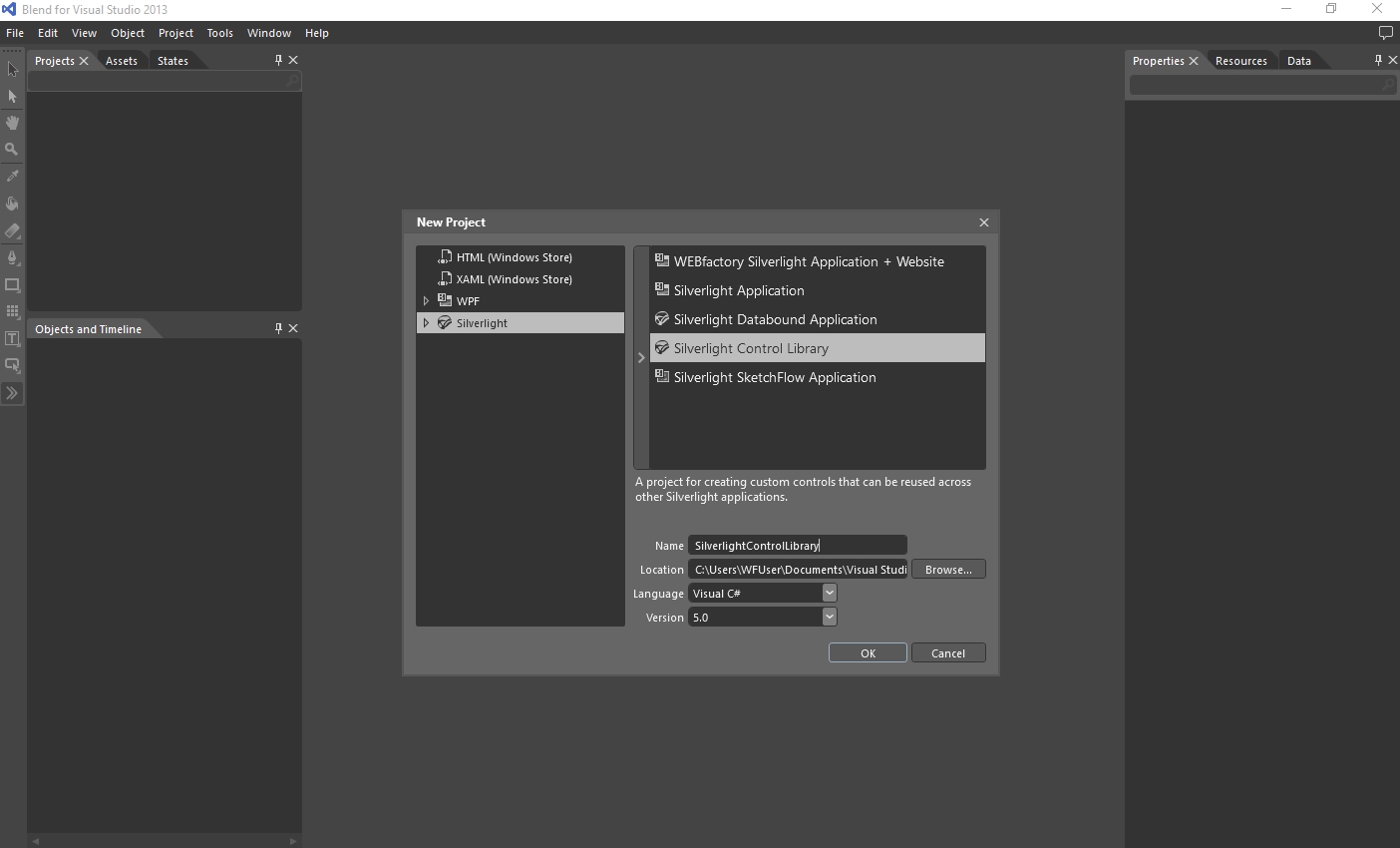
Open Blend for Visual Studio 2013 and create a new Silverlight Control Library project. We will name it SilverlightControlLibrary (the name can be different but keep in mind that it will be used further in the code).
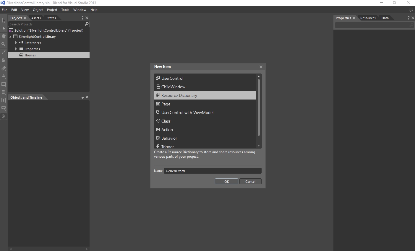
In the new solution, delete the MainControl.xaml file which was automatically created. Add a new folder name Themes and inside it, add a new Resource Dictionary named Generic.
In Visual Studio, the Silverlight Templated Control is the backbone of our custom control. It provides the structure for the user interface (Generic.xaml) and for the logics (CustomControl.cs). In Blend, we need to manually recreate that same structure.
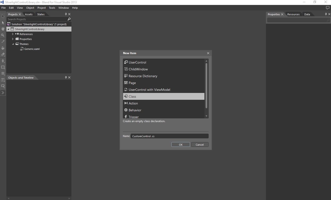
Next, add a new Class to the project, named CustomControl (the name can be different but keep in mind that it will be used further in the code) to the project. This class will be linked to the resource dictionary created above.
The C# Class will open by default. All the logic of the control will go in here, but this part will be the subject of the next section.
To be able to apply the Style that we will create in the Generic.xaml as a Template, we need to make our new class inherit the Control base class. Inside the CustomControl.cs, add the inheritance to the public CustomControl class.
public class CustomControl : Control
Next we need to connect the Generic.xaml resource dictionary to the newly created class by declaring the same namespace in the Generic.xaml as in the CustomControl class. Open the Generic.xaml in code view and add the common namespace.
xmlns:local="clr-namespace:SilverlightControlLibrary"
By using the same namespace, the XAML is now connected to the code source and the UI elements can be programmed. The <!-- Resource dictionary entries should be defined here. --> line can be deleted as it is only a comment with no functionality.
Inside the resource dictionary, we need to create the styling structure that will hold our UI elements.
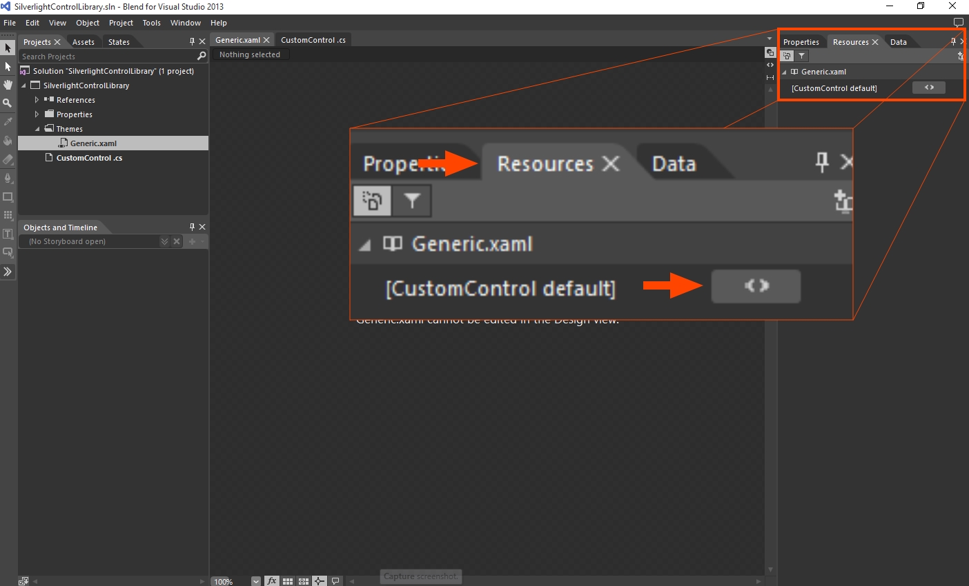
<Style TargetType="local:CustomControl">
	<Setter Property="Template">
       	<Setter.Value>
			<ControlTemplate TargetType="local:CustomControl">

			</ControlTemplate>
        </Setter.Value>
    </Setter>
</Style>
Now we need to switch the Generic.xaml to Design view. Upon switching, Blend will tell you that the Generic.xaml cannot be edited in the Design view. To make the Generic.xaml editable in Design view, follow the next steps:
Click the Resources tab at the bottom of the Resources panel, expand the Generic.xaml node and click on the button corresponding to [CustomControl default] resource dictionary.
If the [CustomControl default] resource dictionary button is not available in the Resources tab (the dictionary is marked by a yellow warning symbol), build the solution and try again.
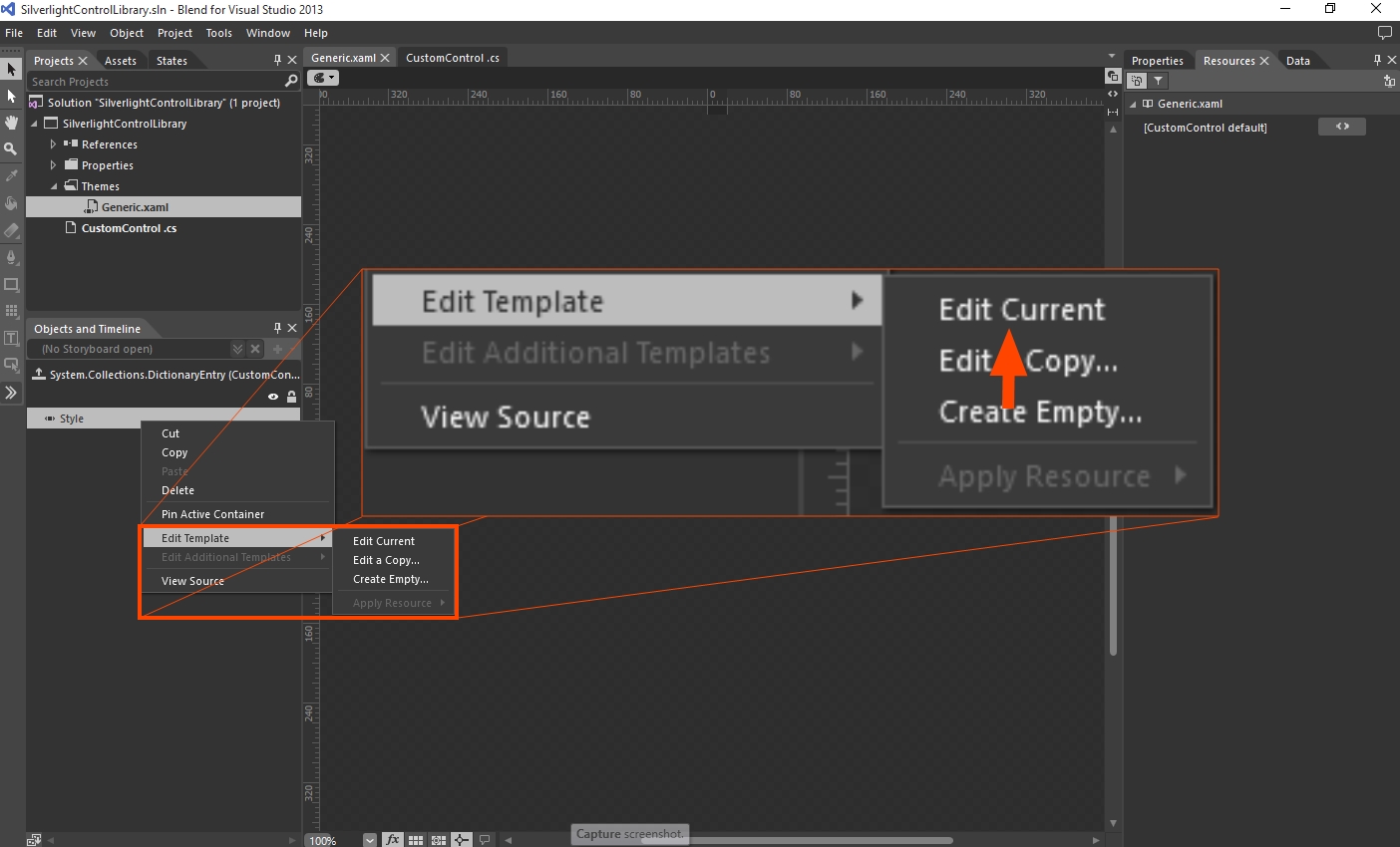
We need to edit the Style of the resource dictionary, so head into the Objects and Timeline panel and right-click the Style object. Select Edit Template > Edit Current.
Now we can edit the Generic.xaml template and add the UI elements.
Inside the editable Template, add a Border element to define our control's area (the Border is directly available in the Toolbox, under the Grid element - select it and double-click the button to place a default Border) and set it's size to auto.
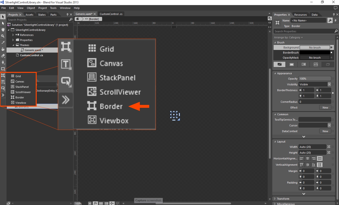
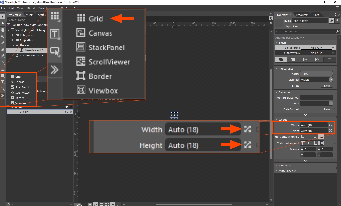
Inside the Border element, add a Grid container for the UI elements (the Grid is directly available in the Toolbox - double-click the button to place a default Grid) and set it's size to auto.
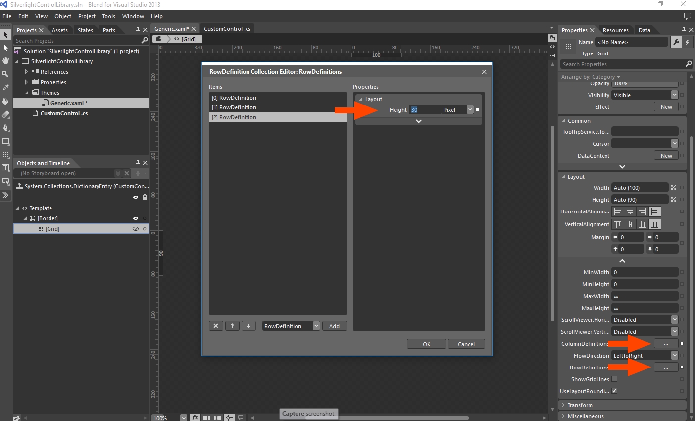
In the Grid's Properties panel, expand the Layout properties (using the arrow at the bottom of the Layout section) and use the ColumnDefinitions and RowDefinitions collection editors to define one column and three rows to house the UI elements. Set the column's width to 100 pixels and each row's height to 30 pixels. This will help us contain the UI elements at a manageable size.
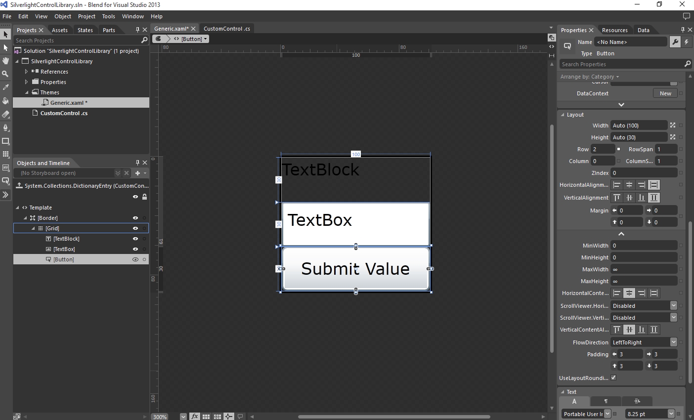
Now it's time to populate the Grid with the UI elements. Add a TextBlock in the first row, a TextBox in the second row and a Button in the third row. You can use the Toolbox to add the three elements and the Layout properties to place them in the appropriate rows (Row and Column properties) and scale them to fit the available space (Width/Height on Auto and Alignment to Stretch).
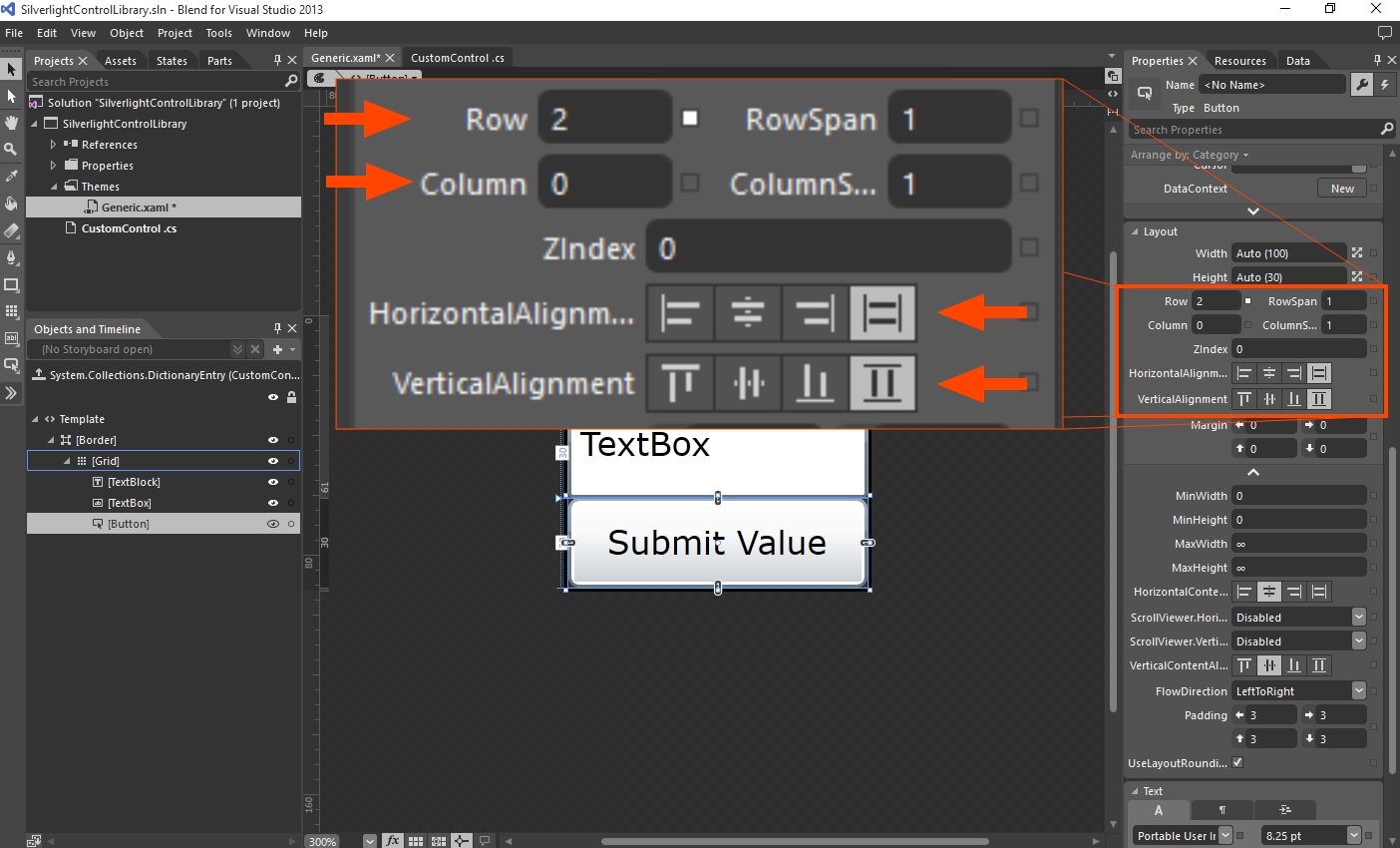
The layout of our custom control should look like this:
Upon returning to the root scope, Blend will not be able to display the Generic.xaml contents that we have just added in the Design view, unless the Resource Dictionary is edited again.
The next step is to program the control, so follow this link to get started: Programming the Silverlight Custom Control