WFInput1
WFInput1 is an numeric and textual input control that allows the user to customize the layout of the control at design time. The control also displays the current value in the input field. The units, label and precision can be set up at design time.
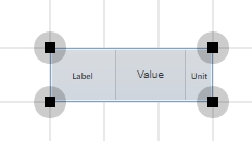
WFInput1 control
Features
Visual customization - users can customize the look of the control at design time. The Label, Value and Unit can be positioned as desired using the design time properties of the control. The colors and fonts can also be customized as required.
Signal writing - the WFInput1 control can write the inserted numeric or string value to a selected signal that supports the value type.
Advanced security - the WFInput1 control offers the complete security options, keeping away the unnecessary complications.
Multi-language support - the units and precision separator is automatically adjusted to match the desired culture.
Value format - the control supports all the C# compliant numeric and text formats.
Run-time Features
The run-time features section describes the controls features at run time.
Label and unit
The WFInput1 control can display a Label for quickly identifying the control in the visualization. The Unit can also be represented at run time. Both Label and Unit position and looks can be customized in design time.
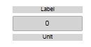
WFInput1 control displaying the Label and Unit
Value format
The WFInput1 control supports the Standard Numeric Format Strings, which allows the control to write various format standards like currency, hexadecimals or exponential values (etc).
Writing signals
The WFInput1 control allows the user to write a numeric or textual value to a signal and displays the current signal value. When the user inserts a value in the control, the control will enter the edit mode, easily recognized by the yellow background color. When not in edit mode, the control will display the current value of the signal.
WFInput1 control
The signal to be written is configurable at design time.
Secure signal writing
The WFInput1 control can be configured to add an extra security layer when writing a signal (input a numeric value at run time).
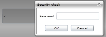
WriteSecure at run time
The security options are configurable from design time.
Design-time Features
The design-time features section describes the controls features at design time.
Visual customization
The user has the possibility to control the looks of the WFInput1 control. Using the options provided by Ewon by HMS Networks , the user is able to change the colors and fonts used by the WFInput1 control.
This feature can be found under the Appearance category (SmartEditor) or Brush category (Blend).
Custom layout
The position and size of the control elements (Label, Input, Unit) can be set up at design time. The user can also customize the text alignment and padding of each element.
This feature can be found under the Layout category (SmartEditor) or WEBfactory 2010 - General category (Blend).
Format options
The format option allows the user to write the value in the WFInput1 control using the C# compliant standards in numeric and string formatting. Click here to read more about the Standard Numeric Format Strings.
This feature can be found under the General category (SmartEditor) or WEBfactory 2010 - General category (Blend).
Signal writing
The WFInput1 control allows the user to configure a signal in order to write the value to the signal at run time.
This feature can be found under the Signals category (SmartEditor) or WEBfactory 2010 - Signal category (Blend).
Units
The WFInput1 control provides the option to set up the units for the numeric value inserted at run time. The unit symbolic text must be previously defined in Ewon by HMS NetworksStudio.
This feature can be found under the General category (SmartEditor) or WEBfactory 2010 - General category (Blend).
Precision
The WFInput1 control provides the option to set up the number of decimals the value will be written with.
This feature can be found under the General category (SmartEditor) or WEBfactory 2010 - General category (Blend).
Advanced Security
The WFInput1 allows the user to customize the security options in various ways: the control's enabled or disabled status and the visibility status can be conditioned by a signal's value. Also the authorizations based security options are available.
This feature can be found under the Security category (SmartEditor) or WEBfactory 2010 - Security category (Blend).
Design-time Properties
The WFInput1 properties are available in the Properties panel:
ButtonHeight- the height of the write confirmation buttons.
ButtonWidth- the width of the write confirmation buttons.
CornerRadius - the rounding of the control's input corners.
Format - allows the user to specify a format for the value written and displayed by the control. Click here to read more about the Standard Numeric Format Strings.
InputBorderThickness- allows the user to specify a thickness value for the control's input field border.
InputMode - the type of values the control's input field can accept. Can be Numeric or Text.
InputPadding - the padding of the control's input field.
InputTextAlignment - the text alignment of the Input field text. Can be Left, Right, Center or Justified.
LabelFontSize - the font size of the Label text.
LabelPadding - the padding of the control's label.
LabelPosition - the position of the label. Can be Top, Left or Bottom.
LabelSymbolicText - the symbolic text for the label.
LabelTextAlignment - the text alignment of the label text. Can be Left, Right, Center or Justified.
LabelVisibility - allows the user to hide or show the label. Can be Visible or Collapsed.
LabelWidth - the width of the label element.
Precision - the number of decimals of the number.
UnitFontSize - the font size of the unit text.
UnitPadding - the padding of the control's unit text.
UnitPosition - the position of the unit. Can be Top, Right or Bottom.
UnitSymbolicText - the symbolic text for the unit.
UnitTextAlignment - the text alignment of the unit text. Can be Left, Right, Center or Justified.
UnitVisibility - allows the user to hide or show the unit. Can be Visible or Collapsed.
UnitWidth - the width of the Unit element.
EnableMask - the binary mask used for enabling or disabling the control. The control uses the bitwise AND operation between the binary value of the signal set at the EnableSignalName property and the binary value of the mask. This bitwise AND operation must equate to the binary value of the mask in order to be true (e.g. Signal & Mask = Mask). The control is disabled when the bitwise operation is true and enabled when the bitwise operation is false.
EnableSignalName - the signal that will control the enabled or disabled state of the control. The binary value of the selected signal is used together with the EnableMask binary value to toggle between the control's enabled or disabled states.
SecurityAuthorizationName - allows the user to select an authorization group. The members of the selected authorization group will have access to the control.
SecurityDenyAccessBehaviour - allows the user to select a behavior that will be active when a user that doesn't belong to the above selected authorization group logs in. The action can either be disabled or hidden.
VisibilityMask - the binary mask used for displaying or hiding the control. The control uses the bitwise AND operation between the binary value of the signal set at the VisibilitySignalName property and the binary value of the mask. This bitwise AND operation must equate to the binary value of the mask in order to be true (e.g. Signal & Mask = Mask). The control is hidden when the bitwise operation is true and visible when the bitwise operation is false.
VisibilitySignalName - the signal that will control the visibility of the control. The binary value of the selected signal is used together with the VisibilityMask binary value to toggle between the control's visible or hidden states.
WriteConfirmation - if enabled, the user will have to confirm the change of values.
WriteConfirmationPosition - the position of the write confirmation buttons. Can be Top, Right or Bottom.
WriteSecure - allows the user to enable an extra security layer. If active, the user will be asked to confirm the login password in order to modify any signal.
ObjectID - allows the user to define an object name for the control, that can be passed as SignalPrefix when using parameter passing in navigation.
SignalName - allows the user to select a signal (using the SignalBrowser of by typing the signal name in the text box). The selected signal's value will be displayed/written by the control at run time.
SignalPrefix - allows the user to select a signal prefix that can be passed when using parameter control and parameter passing in navigation. The signal prefix can be the ObjectName, ObjectName_PageSignalPrefix, PageSignalPrefix or PageSignalPrefix_ObjectName.
Value - the value to be displayed if no signal is attached.
States - allows the user to configure multiple states for the control.