Expresion Blend Tutorials
Check out this article and learn more details and tips about using the Expression Blend when building SmartEitor projects.
StringPlaceholdersResolver Examples and Tutorials
Check out this article and learn how to use StringPlaceholdersResolver following up a set of examples.
Before exemplifying the StringPlaceholdersResolver possibilities, we need to define some signals to work with in the examples below.
For our examples, we will imagine machine with two parameters: Oil Temperature and Water Temperature. We will use the Ewon by HMS NetworksStudio Demo Project Temperature 1 and Temperature 2 signals, and we will rename them in Oil.Temp and Water.Temp.
Open the Ewon by HMS NetworksStudio Demo Project. Select Group 1 under .\Ewon by HMS Networks .Sim.DA.1 in the Server List.
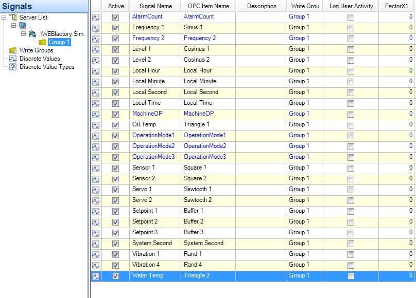
Ewon by HMS Networks Demo project
Find the Temperature 1 and Temperature 2 and rename them in Oil.Temp and Water.Temp (double-click on Signal Name to edit).
Now we can use this two signals in the following examples:
Example 1 - [OID] ObjectID placeholder - Using multiple instances of a control in the same page
Example 2 - [N] Name placeholder - Using multiple instances of a control in the same page
Example 3 - [PN] Parent Name placeholder - Using multiple instances of a grid (containing controls) in the same page
Example 4 - [PCN] Parent Control Name placeholder - Using multiple instances of a page for navigation
Example 5 - [PC:ParameterName] Parameter Control and parameter passing in navigation
[OID] ObjectID placeholder - Using multiple instances of a control in the same page
Check out this tutorial and learn how use multiple instances of a control in the same page using an ObjectID placeholder.
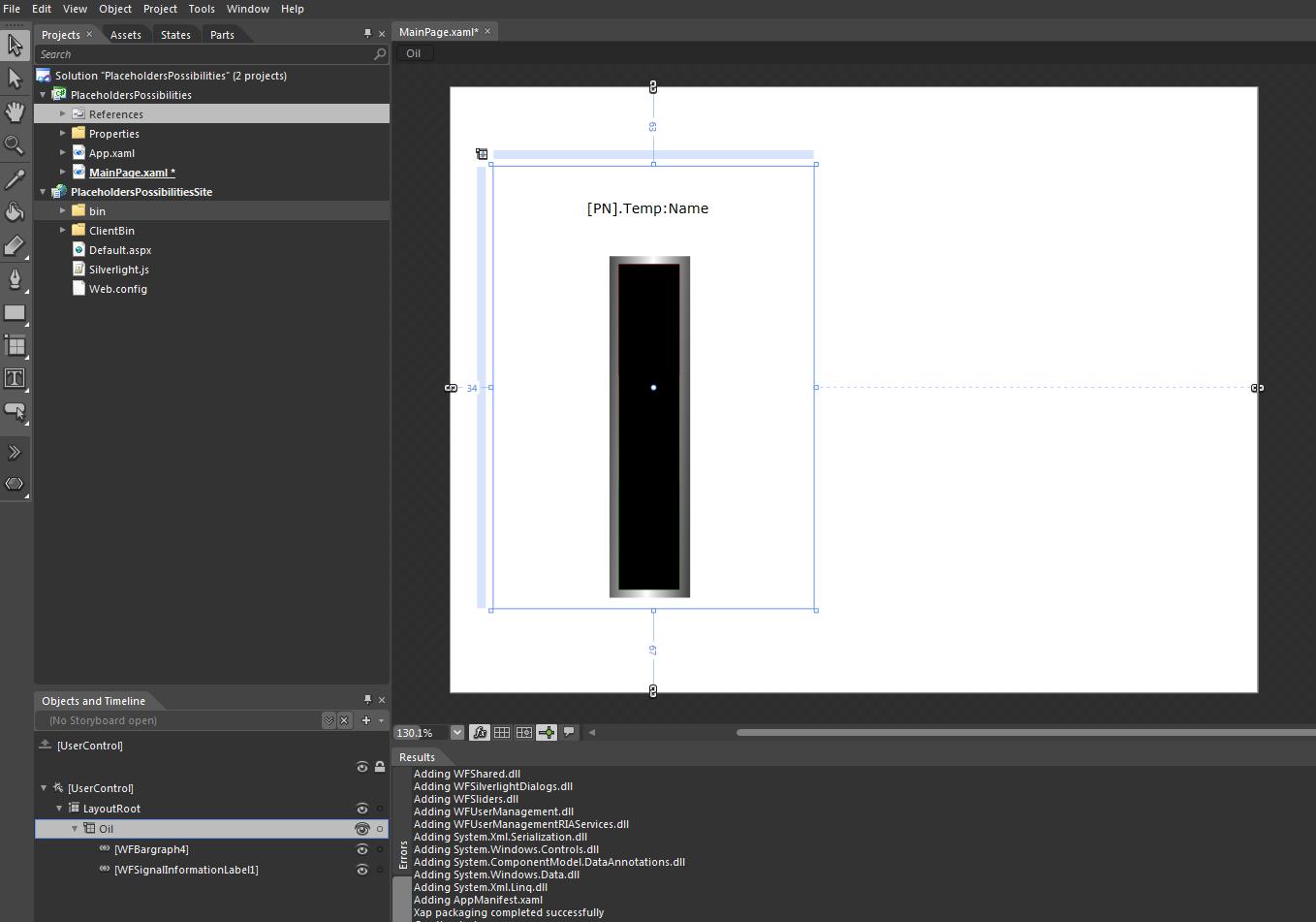
In Expression Blend, create a new project, reference the dlls from WEBfactory 2010 //Standard and place a WFBargraph4 control on the page.
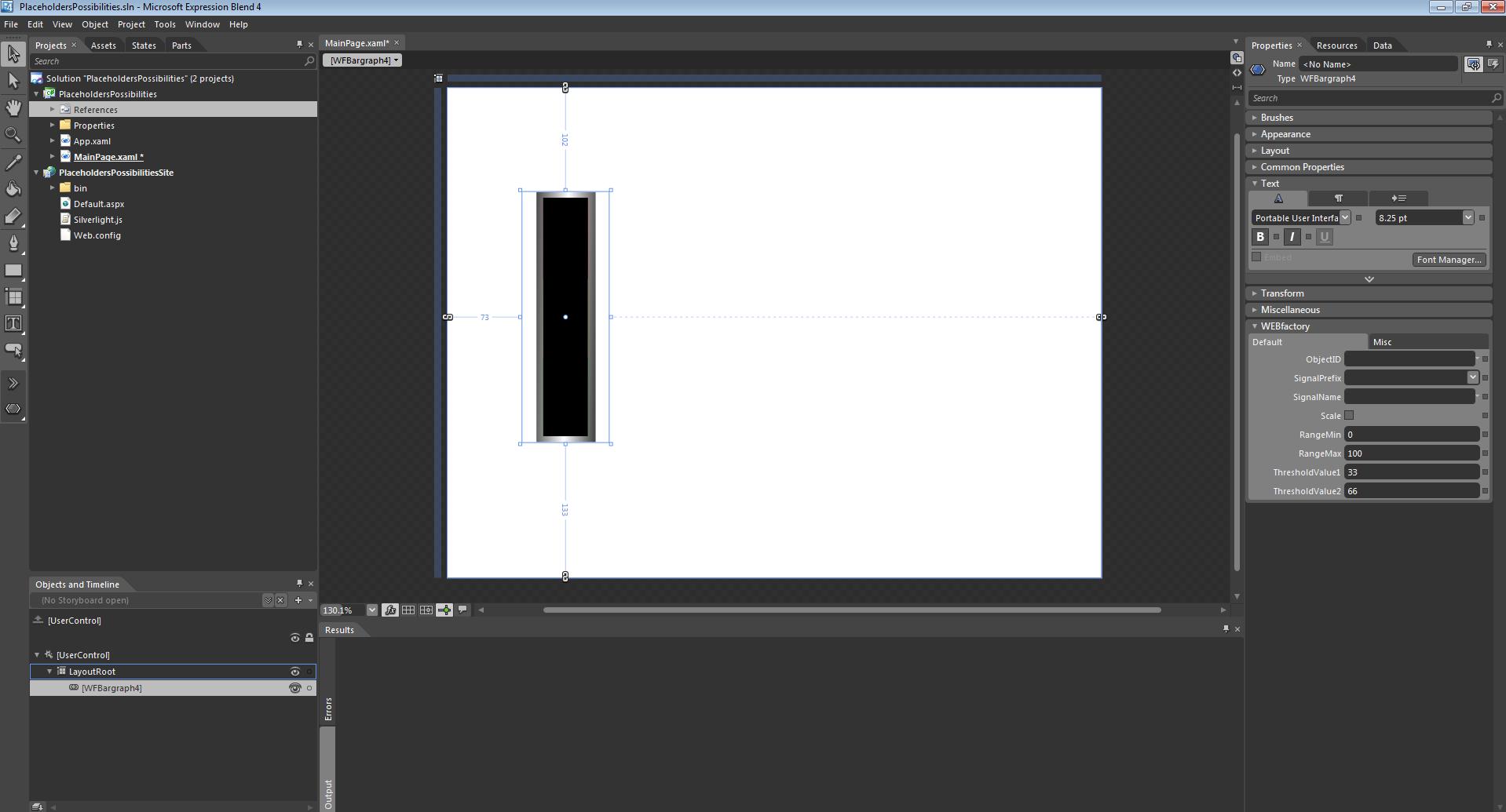
WFBargraph4 control in Expression Blend
In this example, the WFBargraph4 control will display the oil temperature from an imaginary machine.
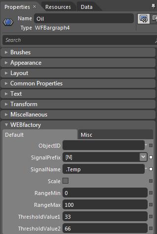
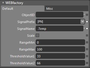
Select the control and expand the Ewon by HMS Networksand tab from the Properties panel. Enter "Oil" in the ObjectIDfield under the Default tab.
Because our object ID is "Oil" and the signal we need is named Oil.Temp, we need to select the placeholder [OID] from the SignalPrefix dropdown menu, and enter ".Temp" in the SignalName field.
Press F5 to build and see the results.
Using this setup, at runtime, the [OID] placeholder will be replaced with the ObjectID of the control (in this case "Oil"), resulting the name of the desired signal: Oil.Temp.
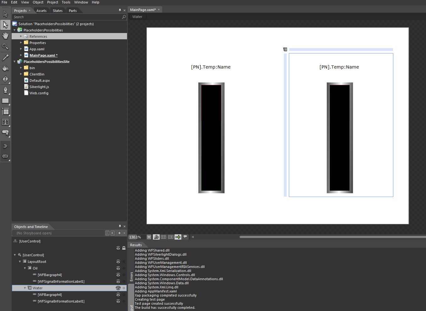
Now that we have the first control working and displaying the value of the desired signal, we can create the second control.
This time, because the initial control was setup to use the [OID] placeholder for defining the signal name, we will only need to duplicate (copy and paste) the first control, and change its ObjectID to "Water".
By default, it will have no ObjectID. In the Ewon by HMS Networks tab of the Properties panel, change the ObjectID of the control to "Water". As the SignalNPrefix was already defined to use the ObjectID placeholder, at runtime, it will automatically update the SignalName for the new control to Water.Temp.
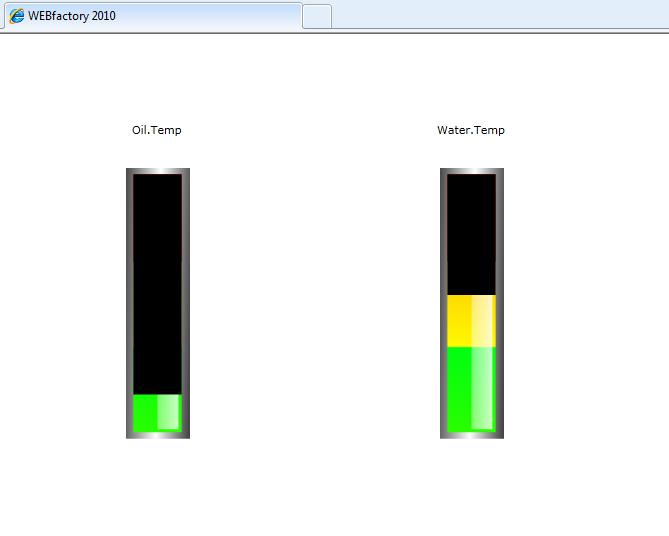
Hit F5 to build and run the project. The first control will display the data from the Oil.Temp signal and the second control will display the data from the Water.Temp signal.
Using the [OID] placeholder method, a control can be set up once and copied over and over again, for any signal name with the same format. For example, if we had one more signal named Air.Temp, we would only need to copy the control once again, and define its ObjectID as "Air".
[N] Name placeholder - Using multiple instances of a control in the same page
Check out this tutorial and learn how use multiple instances of a control in the same page using a Name placeholder.
An even easier method of using the same control over and over again for different signals is using the Name placeholder [N].
In a new project, add as references the dlls from WEBfactory 2010 //Standard and place a WFBargraph4 control on the page.
This time, head into the Properties panel and change the name of the control to "Oil".
In the Ewon by HMS Networks > Default tab, leave the ObjectID empty and select [N] from the SignalPrefix dropdown menu. Enter the SignalName ".Temp" just like in the previous example.
Press F5 to run the visualization.
In this example, the signal name is composed from the controls Name and the SignalName defined in the control properties. This way, when duplicating the control, only the name needs to be changed in order to use a different signal.
Duplicate the control and rename it "Water".
Press F5 to run the visualization again. You will see the first control displaying the Oil.Temp value and the second control displaying the Water.Temp value.
[PCN] Parent Control Name placeholder - Using multiple instances of a page for navigation
Check out this tutorial and learn how use multiple instances of a control in the same page using a Parent Control Name placeholder.
In Expression Blend, create a new project and reference the dlls from WEBfactory 2010 //Standard.
For this example, we will create a navigation, containing two pages: one for Oil and one for Water.
Place the following controls in the main page:
two WFNavigation controls
one WFNavigationTarget control
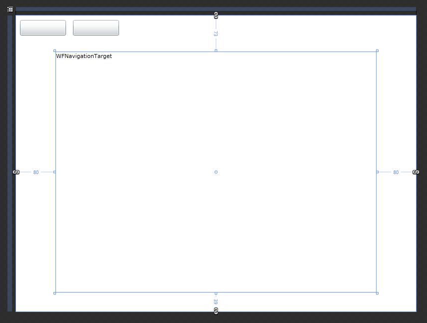
Select the WFNavigationTarget and rename it as "target".
The two WFNavigation controls are the navigation buttons, and the WFNavigationTarget control will be the content frame.
Next we need to create a new page with the actual controls inside.
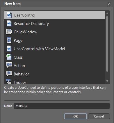
Right-click on the project in the Projects panel and select Add New Item.... Create a new UserControl named OilPage.
Adjust the size of the new control to fit the size of the WFNavigationTarget.
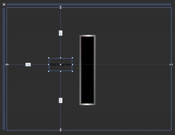
Place the WFBargraph4 and the WFSignalInformationLabel1 controls in the new page, and set the SignalName to ".Temp" and the SignalPrefix to "[PCN]" for both controls.
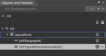
[PCN] placeholder will pass as SignalPrefix the name of the Parent Control. The parent control is the top UserControl in the Objects and Timeline panel.
In the Objects and Timeline panel, select the top UserControl and rename it "Oil".
Save the new page and return to the main page using the top navigation tabs.
Now that we have one navigation page, we will link it to the first WFNavigation button. Select the fisrt WFNavigation and go to the Ewon by HMS Networks tab from the Properties panel.
Click on the button corresponding to the Navigations (Collections).
In the Navigation Collection Editor, click on the Add another item button from the bottom part of the left side. In the Properties panel of the dialog, enter the Source page using the format ProjectName.PageName.
In the Target field enter "target" (as we have renamed the WFNavigationTarget as "target").
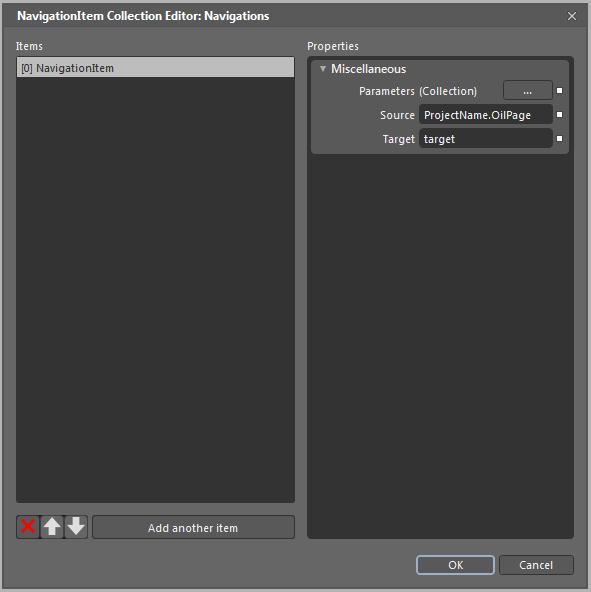
By creating a NavigationItem in the Navigation Collection Editor, the WFNavigation control will have assigned a Source and a Target. This means that when the navigation button is clicked, it will display the Source page in the Target area. In our case, the OilPage in the WFNaviationTarget.
Select OK to close the Navigation Collection Editor.
Before testing the first page of the navigation, there is one more step to perform: select the target control (WFNavigationTarget) and go to the Ewon by HMS Networks tab in the Properties panel. Set the default page to OilPage by using the same syntax as in the Navigation Collection Editor - ProjectName.OilPage.
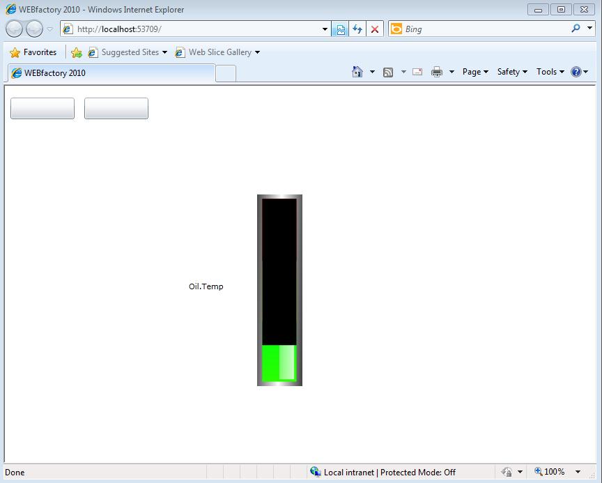
Run the visualization to see the results. You will notice that by default, the OilPage is displayed (thanks to the setting above).
Now it is time to make use of the [PCN] placeholder.
In the Projects panel, right-click the OilPage.xaml file and copy it. Paste it below, and rename it to WaterPage.
Inside the WaterPage, select the top UserControl named "Oil" and rename it to "Water".
Return to the MainPage and redo the steps for setting up the navigation button, this time for the second WFNavigation control and using WaterPage instead of OilPage.
After the second WFNavigation control is set up, run the visualization again. This time, both buttons work, and both pages display the correct signals.
[PN] Parent Name placeholder - Using multiple instances of a grid (containing controls) in the same page
Check out this tutorial and learn how use multiple instances of a control in the same page using a Parent Name placeholder.
In Expression Blend, create a new project, reference the dlls from WEBfactory 2010 //Standard and place a Gridcontrol on the page.
Inside the grid, place a WFSignalInformationLabel1 control and a WFBargraph4 control.
We are using the Grid control as a method to group the other controls. Placing controls inside a grid control will give the possibility of handling many controls as one single element. Combined with the usage of the placeholders, it can reduce the workload when creating multiple controls.
In the WFSignalInformationLabel1, expand the Ewon by HMS Networkstab from the Properties panel, and enter ".Temp" in the SignalName field, and [PN] in the SignalPrefix field. Make sure that the SignalInformation is set to "Name".
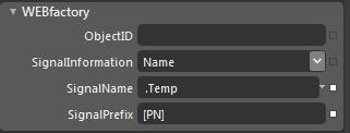
Using the [PN] placeholder, the SignalName used by the control will be composed from the declared SignalName ".Temp" and the SignalPrefix ParentName, which is, in this case, the name of the Grid control. Because the SingalInformation is set to Name, the control will display the Name of the signal.
Now select the WFBargraph4 control, and head in the Ewon by HMS Networkstab from the Properties panel.
Select [PN] as SignalPrefix, and enter ".Temp" in the SignalName field.
Because both WFSignalInformationLabel1 and WFBargraph4 are children of the Grid control, using the [PN] (ParentName) placeholder will make both controls inherit the name of their parent - the Grid control - as the SignalPrefix.
Select the Grid control and name it Oil.
Press F5 to run the visualization. Because the Grid control (parent) is named "Oil", both controls will use the same signal name: "Oil.Temp".
Duplicate the grid and change its name to Water.
Run the visualization. The two control groups will display the values of the two different signals: Oil.Temp and Water.Temp.
[PC:ParameterName] Parameter Control and parameter passing in navigation
Check out this tutorial and learn how use a Paramenter Control name in paramter passing in navigation.
In Expression Blend, create a new project and reference the dlls from WEBfactory 2010 //Standard.
To illustrate the possibilities of the usage of Parameter Control [PC:ParameterName], we will create a navigation structure.
The navigation will use a single source page, containing the controls, and it will adapt the page to different signals by passing the parameters from the main page to the navigation source page. More exactly, it will get the name of the navigation button and pass it as a signal prefix for the controls in the source page.
Insert in the MainPage a WFNavigation control and a WFNavigationTarget control.
Rename the WFNavigationTarget control as "target".
Now create the navigation source page. Right-click on the project in the Projects panel and select Add New Item.... Create a new UserControl named GenericControls. This will be our navigation source page.
Adjust the size of the new control to fit the size of the target from the MainPage.
Place the WFBargraph4 and the WFSignalInformationLabel1 controls in the new page, and set the SignalName to ".Temp" for both controls. Also make sure to add the [PC:ParameterName] placeholder in the SignalPrefix fields of the both controls.
For the parameter passing to be possible, we need to add another control to the navigation source page: the WFNavigationParameter control. The WFNavigationParameter control is an invisible control that passes the parameters defined in the ParameterItem Collection Editor.
Add the WFNavigationParameter control to the navigation source page. Place it anywhere on the page, it will be invisible at runtime.
The navigation source page containing the WFBargraph4, WFSignalInformationLabel1 and the WFNavigationParameter
Now that the navigation source page is create, we need to link it to the navigation controls in the MainPage. Head on to the MainePage and select the WFNavigation control. Go to the Ewon by HMS Networks tab from the Properties panel.
Linking the navigation page to the navigation button
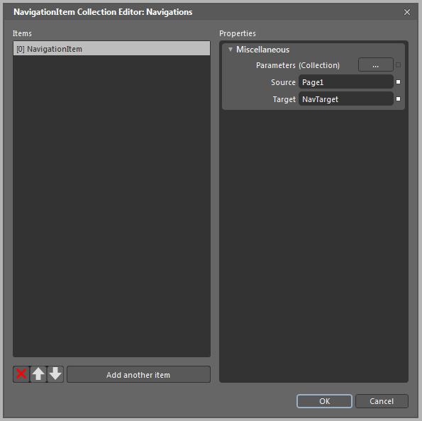
Click on the button corresponding to the Navigations (Collections). In the Navigation Collection Editor, click on the Add another item button from the bottom part of the left side. In the Properties panel of the dialog, enter the Source page using the format ProjectName.PageName. In our case ProjectName.GenericControls. In the Target field enter "target" (as we have renamed the WFNavigationTarget as "target").
Navigation Collection Editor
While in the Navigation Collection Editor, we need to define the parameter to be passed to the navigation source page.
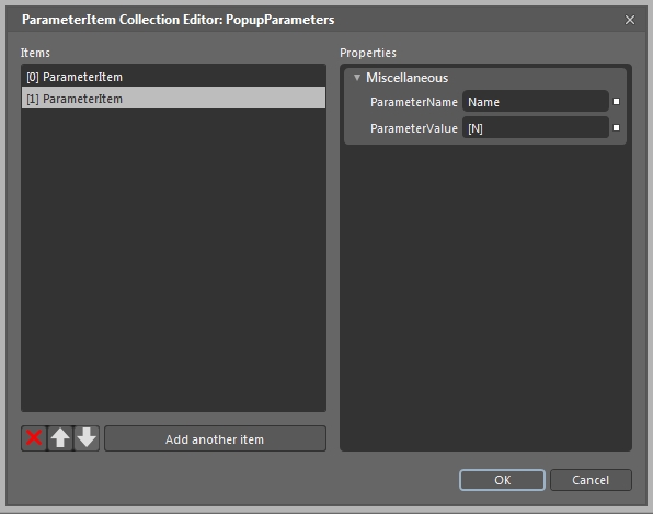
Click on the button corresponding to Parameters (Collection) (in the top-right side of the window). The ParameterItem Collection Editor window will open. Here we need to add a new parameter item.
Click on Add another item (bottom-left side of the window). In the ParameterName field enter "ButtonName" and in the ParameterValue enter the placeholder [N].
This will create a parameter that will use the name of the WFNavigation control (which is a navigation button) and pass it through the WFNavigationParameters control to the controls inside the GenericControls page. If the button is renamed, the new name will be passed as a signal prefix to the controls inside the navigation source page.
Creating the parameter item
Click OK to close the two opened windows.
As the ButtonName is the name of the parameter, replace the ParameterName from the placeholder [PC:ParameterName] with ButtonName!
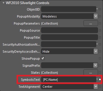
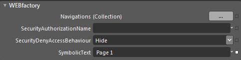
In the MainPage we need to make sure that our WFNavigation control is properly named. Knowing the signals we are using are Oil.Temp and Water.Temp, we will rename the WFNavigation control to "Oil". Also, in the Ewon by HMS Networks tab of the Properties panel, enter the button title in the SymbolocText field. This SymbolicText will be displayed on the button. In our case, the SymbolicText is "Oil Page".
The button title
The MainPage should look like this:
The MainPage containing the navigation elements set up properly
Run the visualization (F5) and click on the Oil Page button in the web browser.
As expected, the name of the button is passed to the navigation source page controls as a signal prefix, thus composing the signal name.
To demonstrate the real possibilities of the [PC:ParameterName], duplicate the WFNavigation control (named now "Oil"), and rename it as "Water". Change the SymbolicText to "Water Page" too, and run the visualization again.
When clicking on the Water Page button, the parameter passed to the same navigation source page changed from "Oil" to "Water". This method can be used for creating large scale visualization without having to create a control for each signal.
Animating irregular shapes in Expression Blend
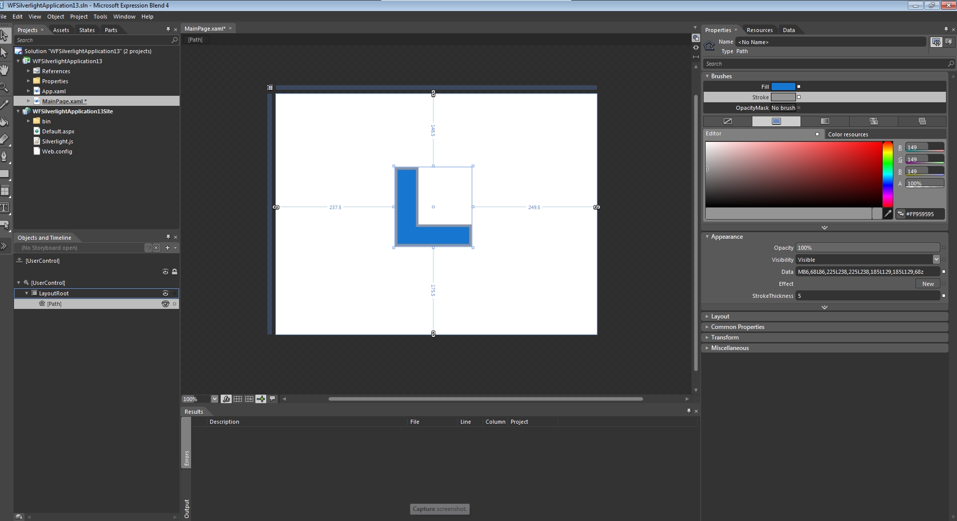
The easiest technique of animating any irregular shape in Expression Blend is using an existing animated shape and change its appearance. The appearance alteration will be made by replacing the layout data of the animated control's objects with the layout data of the irregular shape.
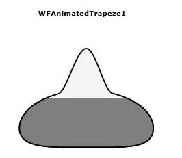
For this example, we will use the WFAnimatedRectangle1 control as our animated control. The irregular shape can be drawn using the pen tool.
Prepare the project
First, create a new Ewon by HMS Networks silverlight application + website project in Expression Blend and add the .dll libraries from the /Standard foler of the WEBfactory 2010 installation directory.
Add the WFAnimatedTrapeze1 control on the MainPage surface.
Draw an irregular path using the shape tools and the pen tool.
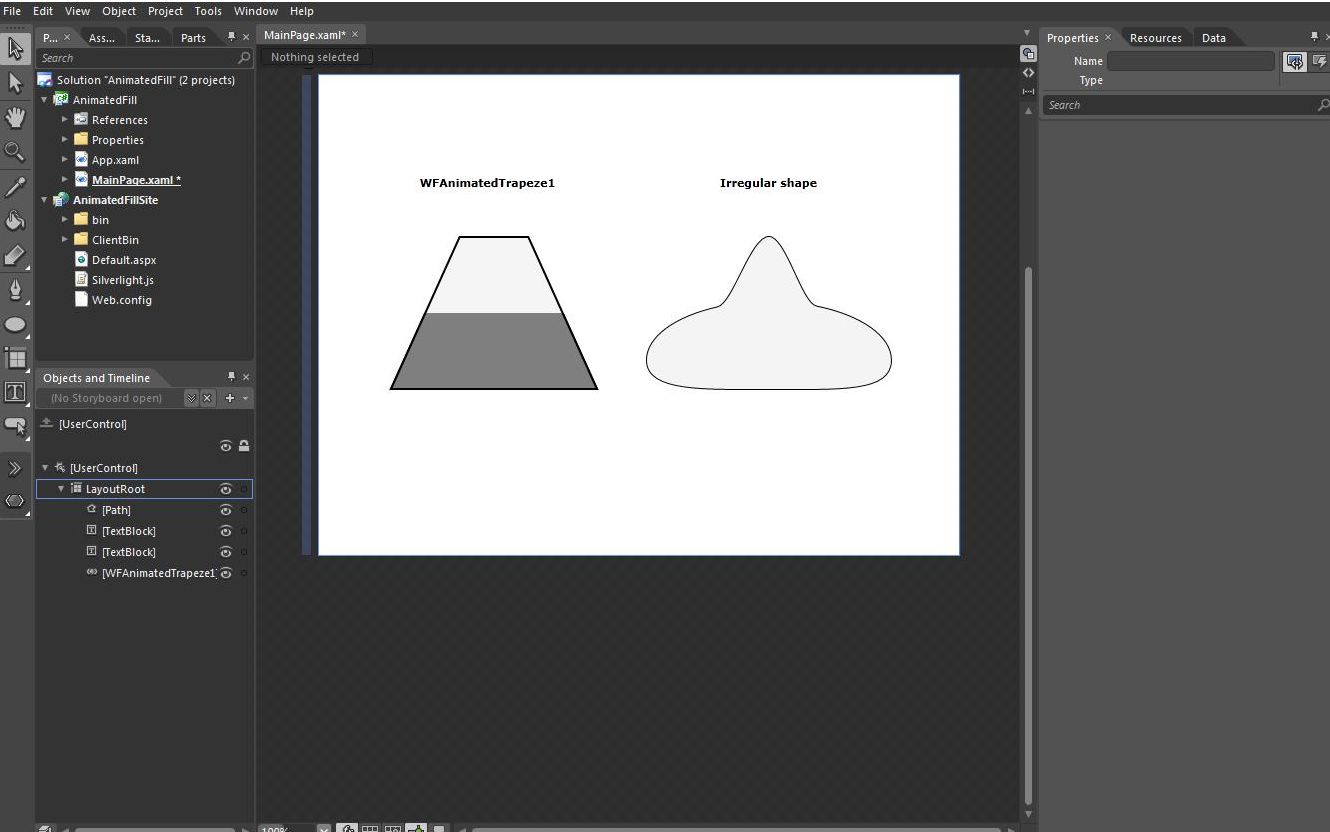
The Expression Blend project
Locate and copy the layout data
Select the irregular shape and head on to the Properties panel. Expand the Appearance category if collapsed.
Under the Appearance category, the Data field should exist. Copy the information from the Data field to clipboard.
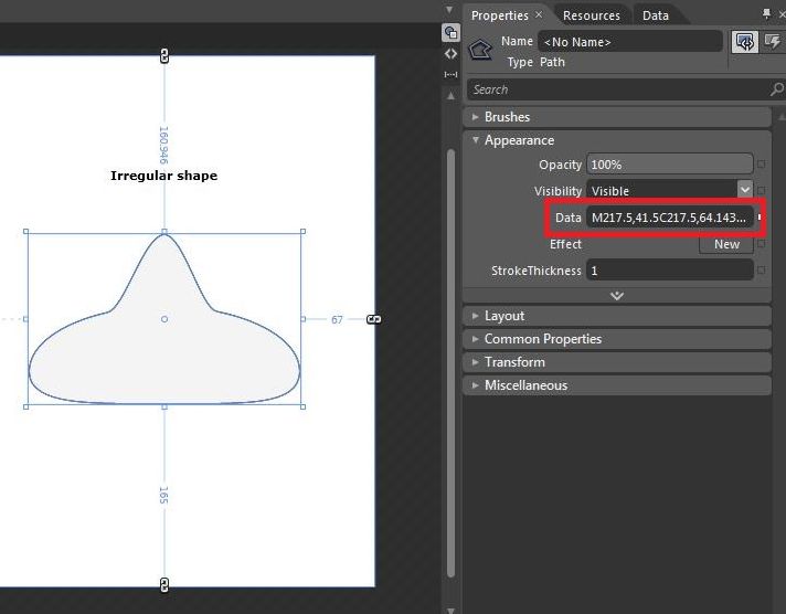
Copy the dada from the Data field
Replace WFAnimatedTrapeze1 's appearance data with the data copied from the irregular shape
To replace the appearance data in WFAnimatedTrapeze1 we first need to edit its template:
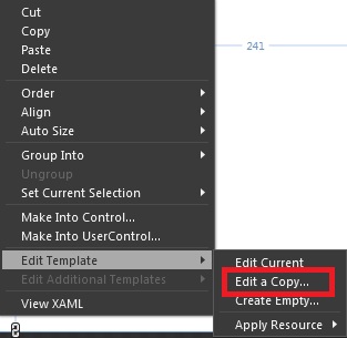
Right-click on the WFAnimatedTrapeze1 control and select Edit Template > Edit a Copy....
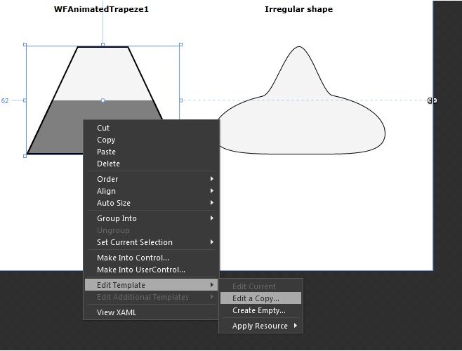
Editing the control's template
In the WFAnimatedTrapeze1's template, select the PrimitiveElement object. In the Properties panel, expand the Appearance category and find the Data field. Paste the copied information in the PrimitiveElement's Data field.
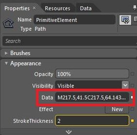
PrimitiveElement's Data field
Select the uxFill object from the WFAnimtatedTrapeze1's template, and repeat the above process.
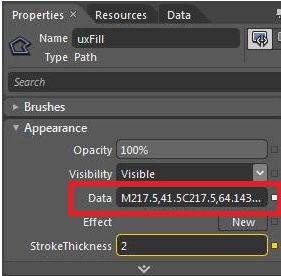
uxFill's Data field
Now the WFAnimatedTrapeze1 has the shape of the irregular shape. The fill animation works just like in the original shape.
Animated fill on irregular shape at runtime
Creating Animations based on Ewon by HMS Networks signals in Expression Blend
Check out this article and learn how to create animations based on WEBfactory signals in Expression Blend.
WEBfactory 2010 offers two methods of creating animations based on Ewon by HMS Networks signals. The first method implies working with the WFTimeline1 control and trades control for simplicity. The second method is working with the WFIndicator1 control. Though this second method is somehow complex, it allows a high level of customization.
Creating animations using the WFTimeline1 control in Expression Blend
In a new Expression Blend project, right-click the References item from the Projects panel and click on Add Reference... .
Adding references to the Blend project
Navigate to the Ewon by HMS Networks installation folder > > Standard. Select all the content of the Standard folder and click Open to add as references.
Using the Assets panel, search for the WFTimeline1 control and drag it to the MainPage.
The WFTimeline1 control in the Assets panel
The WFTimeline1 control can be placed outside the MainPage limits also. It doesn't need to be visible in order to work.
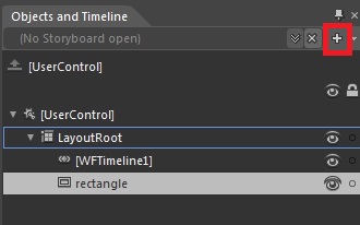
Place the object that will be animated on the MainPage (In this example, a rectangle will be used. Any other control that can be animated on a Soryboard can be used).
Create a new Storyboard for animating the Rectangle. While having the Rectangle selected, click on the + button next to the Storyboard item box, in the Objects and Timeline panel. Name the new Storyboard "DemoStoryBoard".
Adding a new Storyboard
Animate the rotation of the rectangle on the new Storyboard. While the border of the MainPage is red (the Storyboard is recording the control's alterations on the timeline), move the Timeline cursor at the time marker 1. While still having the Rectangle selected, go into the Transform property panel, select Rotate and rotate the Rectangle at 180 degrees. Notice that on the Timeline, an animation has been defined between time marker 0 and time marker 1.
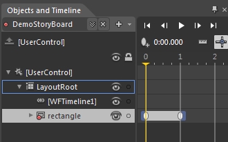
The animation displayed on the Timeline
Stop the Storyboard recording by pressing the red recording button from the top left side of the MainPage.
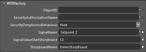
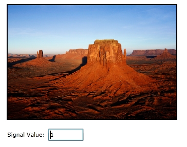
Select the WFTimeline1 control and head into the Properties panel. Expand the Ewon by HMS Networksproperties tab. Select a Ewon by HMS Networks signal for the SignalName property, enter a value for the SignalValueStartStoryboard property and select the newly created DemoStoryBoard in the StoryboardName property.
Setting up the WFTimeline1 control
Run the project and using the Ewon by HMS NetworksTest Center, enter the value used in the SignalValueStartStoryboard property for the correct Ewon by HMS Networks signal.
Creating animations using the WFIndicator1 control in Expression Blend
In a new Expression Blend project, right-click the References item from the Projects panel and click on Add Reference... .
From the Assets panel, place the WFIndicator1 control on the main page. Right-click on the control and select Edit Template > Edit a copy... .
Skinning the control
From the States panel, select the state that needs to be used in the animation. In this example, the animation will be between the State1 and State2. Alter both states according to the expected result. As the animation will be a transition between State1 and State2, the State1 should represent the initial state of the control before the animation, and State2 the final state of the control after the animation is complete. In our example, for the State2, the graphic content found in State1 has been rotated 180 degrees.
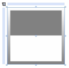
State1 of the re-skinned WFIndicator1
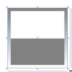
State2 of the re-skinned WFIndicator1
After the initial and final states have been designed, click on the Add transition button on the right side of the State1 bar. Make sure to add length to the transition (2 seconds in our example). The transition will animate the rotation (State1 - 0 degrees to State2 - 180 degrees).
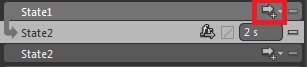
Adding transition between states
Once the transition between states has been added, notice the new Storyboard timeline from the Objects and Timeline panel. This timeline represents the transition between State1 and State2, and can be adjusted easily.
Head back to the WFIndicator1 control (by clicking on the [WFIndicator1] directional button at the top of the MainPage). While having the re-skinned WFIndicator1 control selected, expand the Ewon by HMS Networksproperty category (from the Properties panel) and click on the States tab. Select the desired signal for the StateSignalName1 and StateSignalName2, and enter the desired values in the MaskSignal1 and MaskSignal2 property fields.
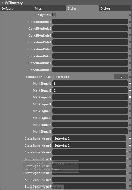
Setting up the WFIndicator1 control to animate based on Setpoint 2's value
Run the project and use the Ewon by HMS NetworksTest Center to test the animation.
Creating a picture switching control using ImageBrush in Expression Blend
Check out this tutorial and learn how use multiple instances of a control in the same page using an ObjectID placeholder.
In different situations, a project may require a control that is able to display an image and change it based on the value of a signal. There are several methods to accomplish this task without a dedicated control, but in this article we will focus on one recommended method: defining an image as an ImageBrush resource and applying it on a WFRectangle1 control.
Defining the ImageBrush resource
In our Expression Blend sample project, we have defined a folder named Image. This folder will contain the images to be defined as ImageBrushes and further used in the WFRectangle1 control. The Images folder is not required but it is recommended in order to keep the project organized.
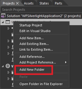
Right-click on the project in the Projects panel of Expression Blend and select Add New Folder.
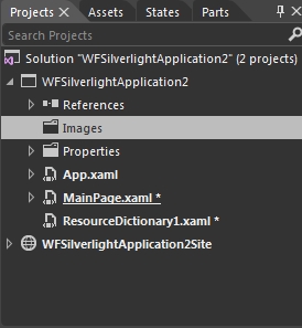
Using the contextual menu (right-click menu) on the new folder, rename it to Images.
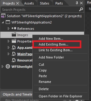
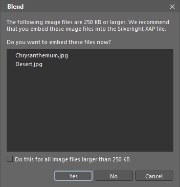
Now it's time to add the pictures we need to use in the project in this new Images folder. Right-click on the Images folder and select Add Existing Item....
In the Add Existing Item dialog, browse the computer for the desired images, select them (multiple selection is available using Shift or Control) and click Open to add them to the project.
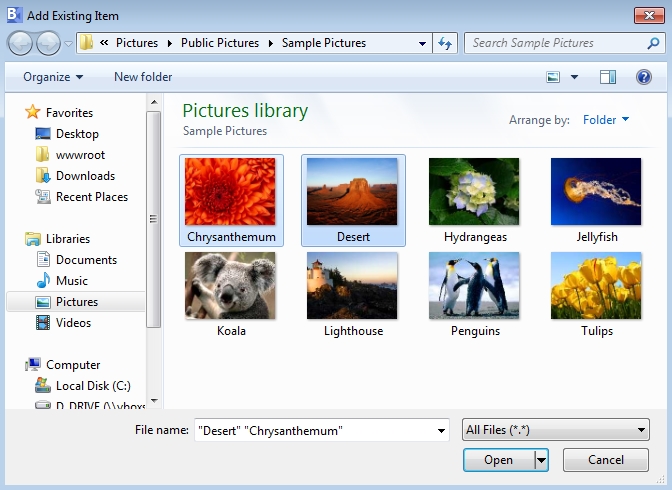
Expression Blend will ask if you want to embed images larger than 250 KB. Confirm the dialog by clicking Yes.
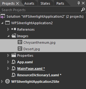
Now the images are added in the project and can be found in the Images folder.
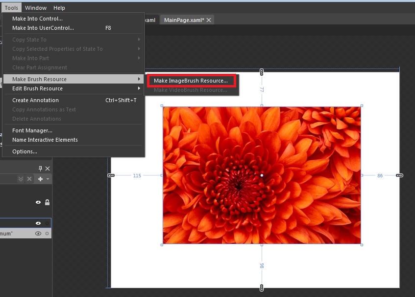
Next we need to define the images as ImageBrush resources. Place the first image on the MainPage canvas. While having the image selected, go in the Tools menu and select Make Brush Resource > Make ImageBrush Resource....
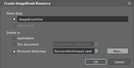
In the Create ImageBrush Resource dialog, name the new brush and select where to define the brush. In this example, we will use a Resource dictionary, as it provides the opportunity to reuse the same resources in multiple projects. Click OK to confirm.
If the Resource dictionary option is not available, it means that no resource dictionary is defined. Click on the New... button to create a new one.
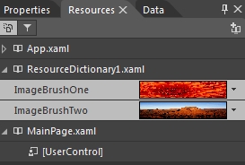
Repeat the last two steps (6 and 7) for all the images that need to be defined as ImageBrush resources. The ImageBrush resources will be visible in the Resources panel in Expression Blend.
Using the ImageBrush resources in WFRectangle1 states
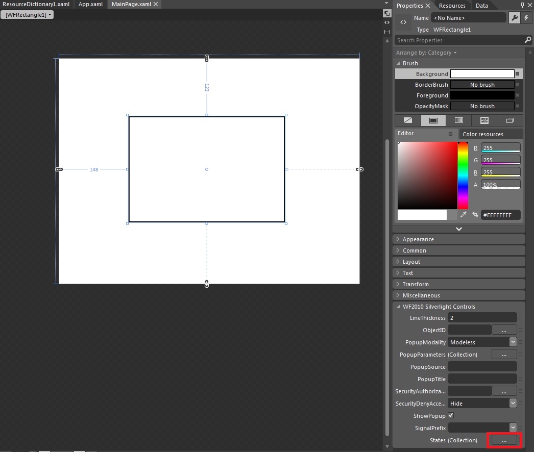
We will use the WFRectangle1 control in order to be able to set up different states, each one showing one ImageBrush for a signal value.
Place the WFRectangle1 control on the MainPage canvas. Wile the control is selected, go to the WF2010 Silverlight Controls properties category in the Properties panel. Click on the States button to add the required states.
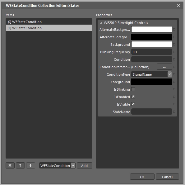
In the WFStateCondition Collection Editor, add two states using the Add button.
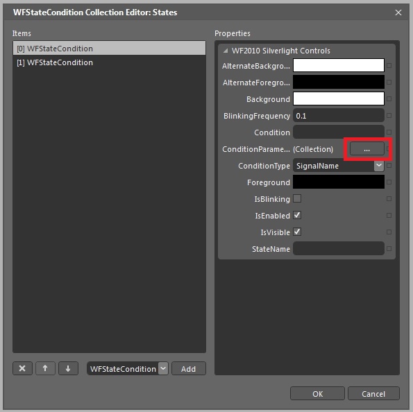
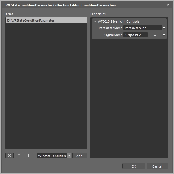
For the first state, let's set up the trigger condition: open the ConditionParameter Editor using the corresponding button.
In the ConditionParameter Collection Editor, add a new condition parameter using the Add button. Add a parameter name and select the desired signal to trigger the state. Confirm the dialog by pressing OK.
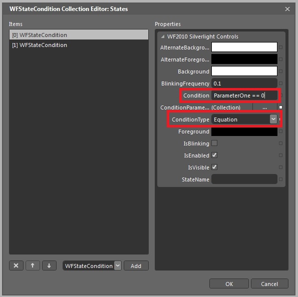
Next, set the ConditionType to Equation and add the required condition to trigger the state. In our case, we want the first state to be triggered when the signal value is 0 (ParameterOne == 0, as ParameterOne has the signal assigned).
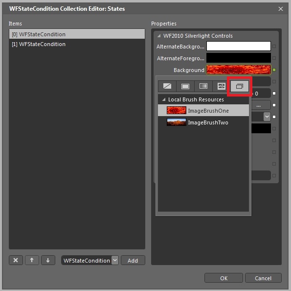
Now that the triggering condition is set up for the first state, we need to display the first ImageBrush when this state is on. Click on the Background color box. In the pop-up window, select the Brush Resources tab and select the first ImageBrush.
Now that the first state is set up, repeat the steps 3, 4, 5 and 6 to configure the other state, using the appropriate condition and ImageBrush.
Confirm the states settings by clicking OK.
When running the project, the WFRectangle1 control will display the two images using the ImageBrush resources configured in the control's states properties.
Creating a simple zoom effect in Expression Blend
Check out this article and learn how to create a simple zoom effect in Expression Blend.
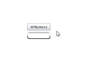
Grouping elements into a grid
In the new Expression Blend Silverlight project, place two Ewon by HMS Networks controls on the canvas. In our example, the controls placed are WFButton1 and WFNumericDisplay1.
Align the controls in the desired position and select both of them. Right-click on the selected controls and go to the Group Into option form the contextual menu. Select the Grid for grouping.
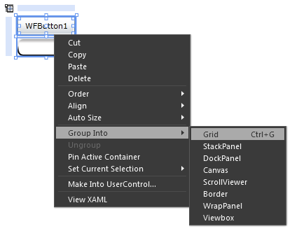
Groupping two controls into a grid element
Creating the states for the Grid
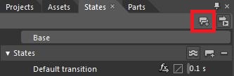
Select the Grid element that contains the two controls and go to the States panel (in the top-left part of Expression Blend's visual interface). Click on the Add State Group button to create a new state group. Name the states group States.
The state group will contain the two states that will be created in the next step. The two states will represent the normal (Small) size and the scaled (Big) size of the Grid.
Creating a new states group
To create the two states, click on the Add States button from the States group. Create two states using this method, and name the first state Big and the second state Small.
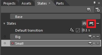
Creating the Big and Small states
OPTIONAL: The transition time and effects between the two states can be adjusted using the Default transition element from the States group. In the current scenario, the transition time is set to 0.1 seconds.
Select the Big state and scale the grid containing the two controls to the desired size. This will be the zoomed state. Leave the Small state as it is. The Small state will be the normal zoom state.
After setting the sizes for the two states, the MainPage will display the size changes if a state is selected.
Adding the GoToStateAction behavior and assigning the mouse events to the states
To bind the trigger (MouseEnter and MouseLeave) to the states of the grid, a GoToStateAction behavior needs to be added to the project.
Open the Assets panel and go to Behaviors.
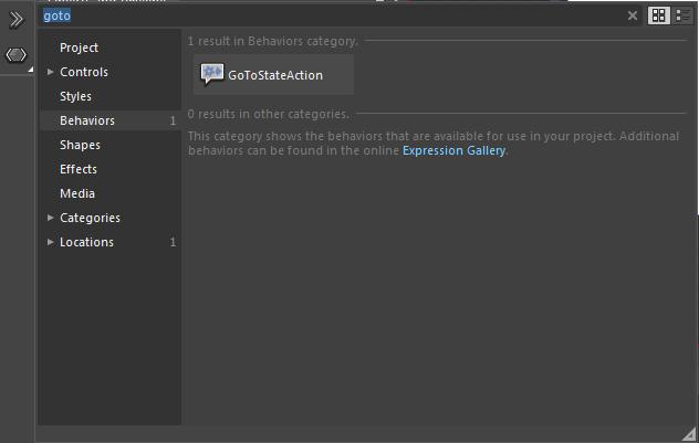
The GoToStateAction behavior under the Behaviors category
Add two GoToStateAction behavior elements to the project, as children of the Grid element.
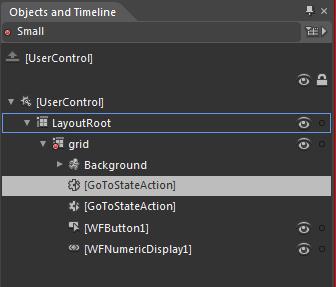
The two GoToStateAction elements as children of the Grid
Select the first GoToStateAction element and go to the Properties panel. To assign the Big state, make the following changes:
Select the Grid to be the SourceObject (Trigger category).
Choose the MouseEnter EventName (Trigger category).
[UserControl] must be selected in the TargetObject (Common Properties category).
Select the Big state under the StateName (Common Properties category).
Enable or disable the UseTransition (Common Properties category) option.
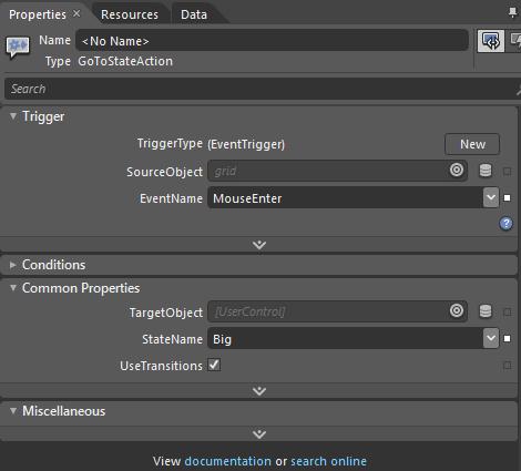
The properties settings for the first GoToStateAction element
Make the same adjustments to the second GoToStateAction element, but this time make sure to select the EventName as MouseLeave and the StateName as Small.
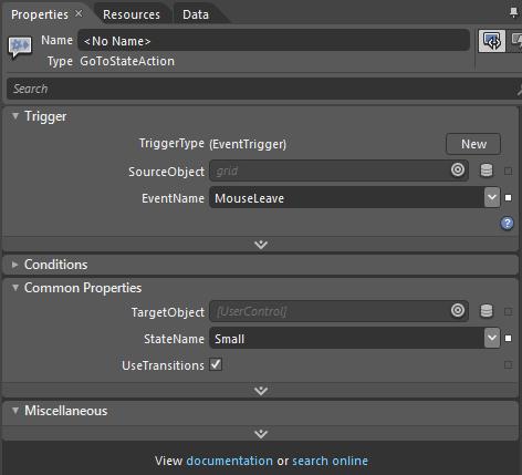
The properties settings for the second GoToStateAction element
Run the project by pressing F5. When hovering over the controls, the grid will expand to the desired size and shrink back when the mouse is moved out.
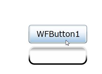
Mouse cursor hovering over the controls
Opening a PDF or a TXT file from a Silverlight visualization
Check out this article and learn how to open a PDF or a TX file from a Silverlight visualization.
This tutorial will guide you through the process of creating a Silverlight visualization containing a button for opening a .pdf file and a button fro opening a .txt file.
The .pdf and .txt files should be placed in the root wwwroot folder of inetpub (C:\inetpub\wwwroot). For guiding purposes, we will name the files Test.pdf and Test.txt.
Creating the Silverlight application
Create a new Ewon by HMS Networks Silverlight Application + Web project in Expression Blend (Visual Studio can be used as well). For this tutorial, our project will be named "OpenPDFandTXT".
Add as references the following .dll files from the WEBfactory 2010 //Standard folder:
WFButtons.dll
WFCore.dll
WFMath.dll
WFShared.dll
To open the files, we will use the WFlinkButton1 control. Place two WFLinkButton1 controls on the MainPage. Each one will be programmed to open one file. Name the buttons OpenPDF and OpenTXT and set the contents to some relevant text.
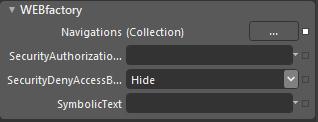
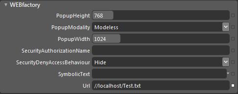
The WFLinkButton1 controls have their specific properties under the Ewon by HMS Networks category in the Properties panel. This properties allow the user to configure the method of opening the link, the address of the link and the security authorizations for the control.
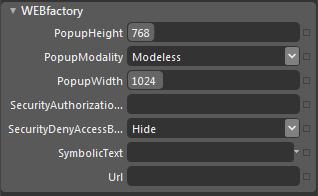
WFLinkButton1 properties
WFLinkButton1 properties:
PopupHeight - the height of the opened window
PopupModality - the method of displaying the opened window
PopupWidth - the width of the opened window
SecurityAuthorizationName - sets the authorization for a specific authorization group
SecurityDenyAccessBehavior - sets the security behavior for the selected authorization group
SymbolicText - allows the user to add a symbolic text
Url - the target of the link button
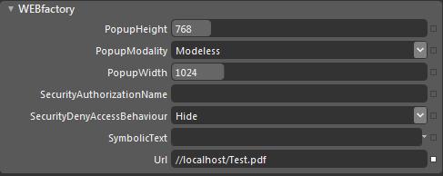
In order to make the .pdf file open when clicking the OpenPDF button, enter the Url path in the Url textfield: because the file is in the wwwroot folder of inetpub, the path will bee //localhost/Test.pdf. The rest of the settings should be left as default.
To program the OpenTXT button to open the Test.txt file, enter the Url path of the .txt file, just like we did with the OpenPDF example.
OpenPDF button with the Url inserted
OpenTXT button with the Url inserted
Press F5 to build and execute the application. In the browser, test the two buttons.
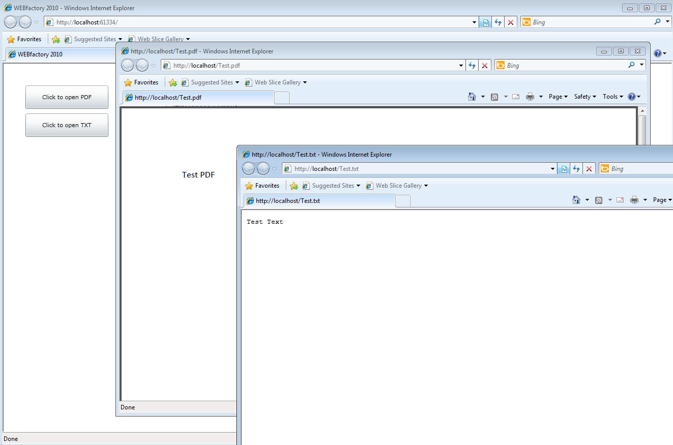
The two WFLinkButton1 controls working
Opening Windows On Screen Keyboard (OSK) or any other local exe file from code
Check out this article and learn how to open windows on screen keyboard or any other local exe file from code.
Security settings
Opening the on screen keyboard from code is very important when preparing visualizations for touch screen devices. In code, this is done by listening for an event and reacting to that event.
In order to make possible the interaction between the Silverlight visualization and the Windows system, some security settings need to be adjusted.
Open Internet Options from Control Panel > Network and Internet. In the Internet Options window, go to the second tab named Security.
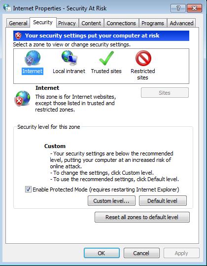
Internet Options Security
Select Internet for the zone, and click on the Custom level... button from the Security level from this zone area.
In the Settings list , navigate to the ActiveX controls and plug-ins section, and enable all the options under this section.
Select OK to confirm and Apply to apply the changes. Confirm the security warning.
Now go to Trusted sites and repeat the procedure from the Internet zone.
There is one more tweak to do in order to bypass the Windows security: copy the .exe file you need to launch (osk.exe in our example) to a different location than System32 folder. This is necessary because the System32 folder is protected. In out example, we will copy the osk.exe to a folder named Example on the C: drive.
Opening the On Screen Keyboard from code
Create a new Silverlight Application (or Ewon by HMS Networks Silverlight Application) project. Name the project StartExe.
Add a Button, a Text Block and a Text Box on the page.
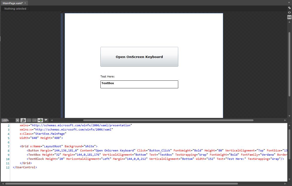
Expression Blend test project
Create a Click event for the button in XAML.
Open the MainPage.xaml.cs file and add the following using:
using System.Windows.Browser
Program the click event to execute the StartExe method:
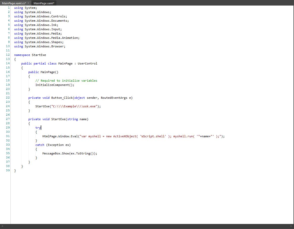
private void Button_Click(object sender, RoutedEventArgs e)
        {
             StartExe("C:\\\\Example\\\\osk.exe"); //Any exe file can be placed here
        }
Now define the StartExe method:
private void StartExe(string name)
        {
			try
			{
            	HtmlPage.Window.Eval("var myshell = new ActiveXObject( 'WScript.shell' ); myshell.run( '"+name+"' );");
			}
			catch (Exception ex)
			{
				MessageBox.Show(ex.ToString());
			}
        }
StartExe method will listen for the Button_Click event, and when it happens, it will try to launch the osk.exe using the WScript.shell. If any error encountered, a popup message will appear.
The code should look like this:
The code to launch the exe file
Build the solution and test it.
This method works for all .exe files on a local machine. The drawbacks of this method is the low security level necessary to access the system.
Passing Parameters to a popup window in Expression Blend
Check out this article and learn how to pass parameters to aopup window in Expression Blend.
The following tutorial will guide you through the process of setting up an Expression Blend project in which parameters are passed from a control from the MainPage to the controls from the popup window opened by the main control.
In order to pass parameters from a control to a popup window, we will make use of the Name placeholder [N] and Parameter Control placeholder [PC:ParameterName]. Click on the following link to find out more about placeholders:
The following tutorials is split in X sections. You can jump directly to the desired section by clicking the links below:
Setting up the project
Create a new WEBFactory Silverlight Application + Website project in Expression Blend.
Add the DLL files from the ...\WEBfactory 2010\\Standard folder as references to the new project.
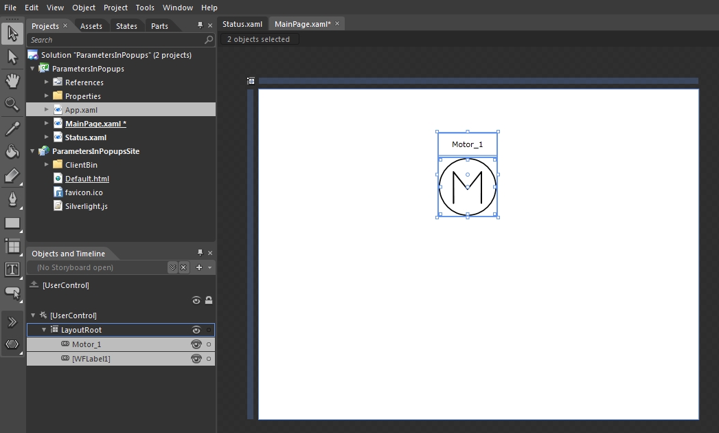
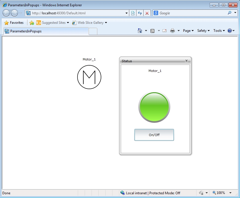
Place an WFISAMotor1 control and a WFLabel1 control on the main page.
Set the WFLabel1 control to display the Motor_1 text using its SymbolicText property from the WF2010 Silverlight Controls property category.
Name the WFISAMotor1 control Motor_1 using the Name property form the Properties panel.
Setting up the popup window
Create a new page in our project. This new page will be used as a popup window for our Motor_1 control:
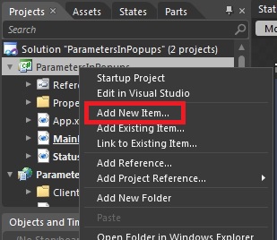
Right-click on the project name from the Projects panel. Select Add New Item....
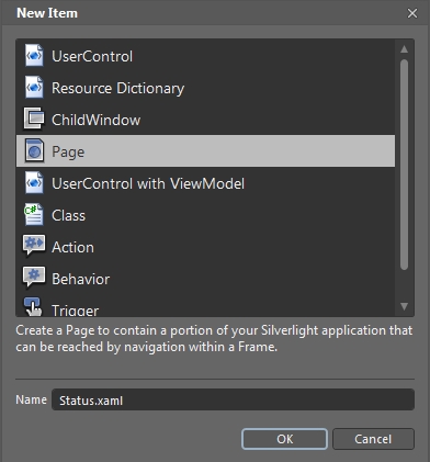
In the New Item dialog, select Page form the items list and name it Status.xaml. Click OK to add the page to the project.
In the new Status page, we will need:
a WFLabel1 control to display the name of our motor,
an WFIndicator1 control to show the status of our motor (on or off),
an WFToggleButton1 control to be able to turn on or off the motor and, finally,
an WFNavigationParameter control that will allow us to pass the parameters previously mentioned controls. The WFNavigationParameter control can be placed outside the page borders so it won't be displayed at run time.
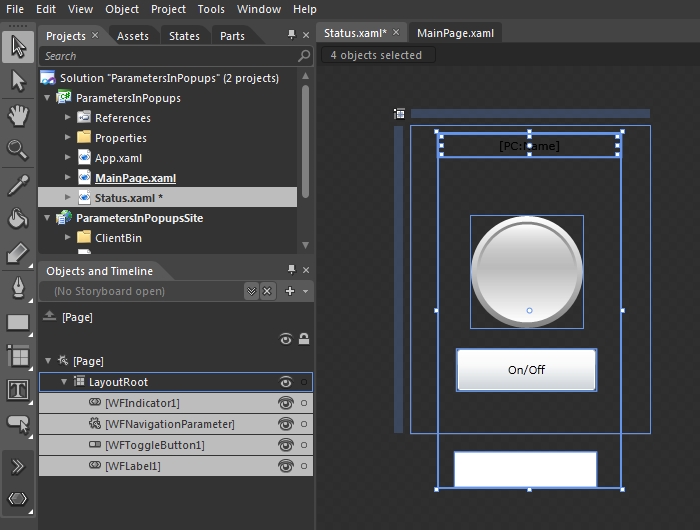
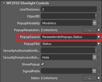
Now that our Status page is complete, go in the MainPage, select the Motor_1 control and set the PopupSource property to point to our new Status page by specifying the complete project path of the page (ProjectName.PageName).
Setting up the parameters
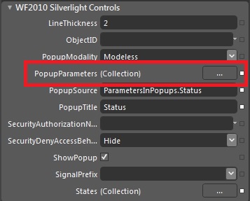
In order for the Status popup page to display name and status of our Motor_1 control, we need to define those parameters on the Motor_1 itself, using the PopupParameters collection editor.
Select the Motor_1 control from the MainPage. Click on the button corresponding to the PopupParameters property from the WF2010 Silverlight Controls property category.
In the ParameterItem Collection Editor window, add two parameters using the Add another item button.
The first parameter will represent the signal name used to monitor and control the state of the Motor_1. Set the ParameterName to Signal and ParameterValue to Setpoint 2 (or any other desired writable signal).
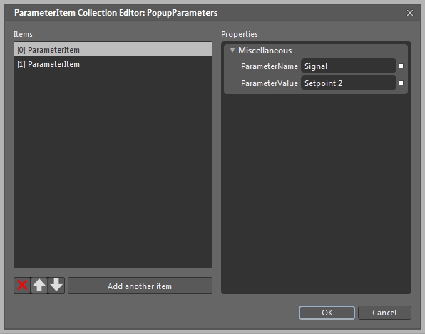
The second parameter will represent the name of the control that will be displayed in the in the header of the Status popup page by the WFLabel1 control. Set the ParameterName to Name and the ParameterValue to [N]. We will use the [N] Name placeholder in order to automatically pass the name of the control to the WFLabel1 control inside the Status popup page and also to be able to multiply the Motor_1 control without editing the Name parameter.
Click OK to confirm the changes.
Applying the parameters in the popup page
Because we have already placed the WFNavigationParameter control inside our popup page, the parameters will be successfully passed from the Motor_1 control to the controls inside the Status popup page. Next we need to apply them to the controls.
Select the WFLabel1 control. In the SymbolicText property, place the Parameter Control [PC:Name] placeholder. Note that the placeholder will pass the Name parameter.
Next, select the WFIndicator1. We will need to set up the control to display the state of the motor using not a signal name, but the Signal parameter defined in the previous section.
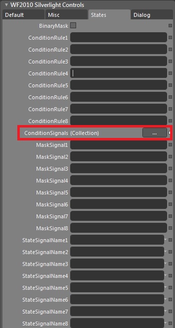
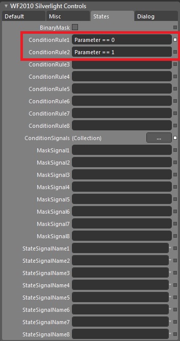
Go to the States tab in the WF2010 Silverlight Controls property category. We will set up the ConditionSignals to be used in the ConditionRules, so click on the button next to the ConditionsSignals property:
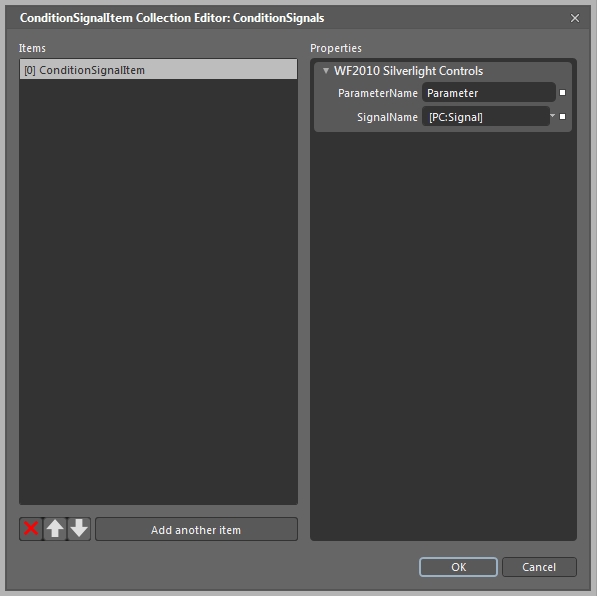
In the ConditionSignalItem Collection Editor window, create a new ConditionsSignalItem by clicking on the Add another item button. Enter Parameter as the ParameterName. In the SignalName field, enter the Parameter Control [PC:Signal] placeholder. Confirm the changes by pressing OK.
Now we will set up the conditions for the WFIndicator1 control to enter the states. We will use the Parameter defined above and will set up the control to enter the first state (green) when the Signal value is 0 and in the second state (red) when the Signal value is 1.
Now that our WFIndicator1 will show when the Motor_1 is on or off, we need a way to change the status of the Motor_1 from on to off and back. For this, we will setup the WFToggleButton1 control:
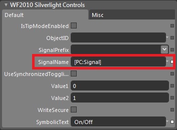
Select the WFToggleButton1 and go to WF2010 Silverlight Controls property category. In the SignalName property, we will want to use the same Signal parameter via the Parameter Control placeholder. Type [PC:Signal] in the SignalName property.
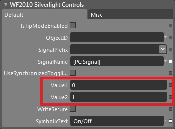
Now that we have set up the signal that we will be writing, we need to also set the values that will be written when the control is toggled. In the Value1 property, place the value 0 (remember that the Motor_1 will be off when the signal value is 0). In the Value2 property, place value 1 (the Motor_1 will be on when the signal value is 1).
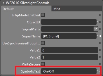
To make the WFToggleButton1 control more intuitive, write its basic function in the SymbolicText property.
Testing the popup window
Our Status popup window is set up to display the status of the motor and allow us to change it from on to off. Press F5 in Expression Blend to test the application.
When clicking on the Motor_1 symbol, the Status popup window will open and the controls that we have just set up will be working as expected: The WFLabel1 shows the name of the Motor_1, WFIndicator1 displays the state of the Motor_1 and the WFToggleButton1 allows us to toggle between the on and off states.
The project works so far, but the real test follows next. In Expression Blend, Go in the MainPage and duplicate the motor control and the label displaying its name. Name the second motor control Motor_2 and adjust the label accordingly.
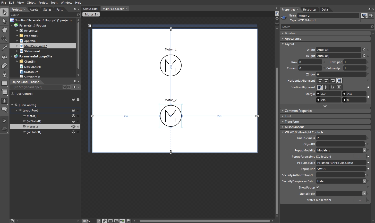
The same Status popup window will be opened when clicking on the Motor_2 control at run time. The header of the popup window will display the name Motor_2 because we have used as a Parameter the Name [N] placeholder. This allows us to change only the name of the control, and the parameter will change automatically. But in order to display the status of the second motor control, we need to change one thing: the Signal parameter for the Motor_2 control.
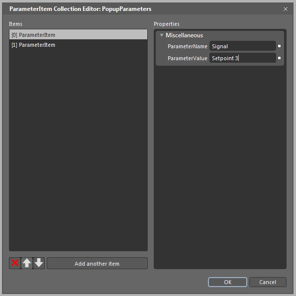
Open the PopupParameters Collection Editor for the Motor_2 control and change the ParameterValue of the first ParameterItem (with the name Signal). Make the ParameterValue to be the preferred signal for Motor_2 (Setpoint 3 in our example). Press OK to confirm the dialog.
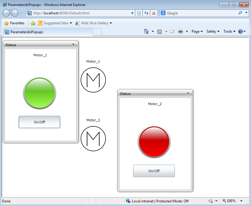
At run time, both Motor_1 and Motor_2 controls will display the same popup window, but the parameters will adjust for each control, thanks to the parameter passing capabilities of WEBfactory 2010.
Printing own controls using Ewon by HMS Networks printing framework
Check out this article and learn how to print own controls using WEBfactory printing framework.
Being able to print controls is important when dealing with important information display. The next tutorial will guide you through the steps of creating a print button and the click event that will trigger the printing of the selected control.
Preparing the project
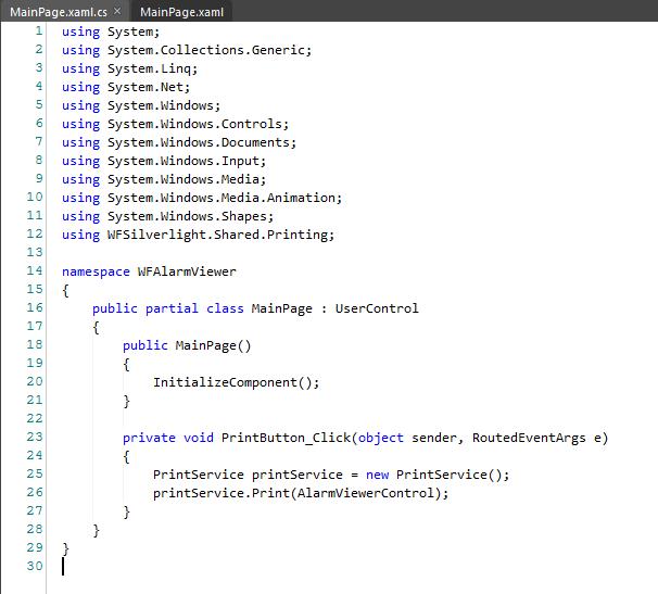
For this tutorial we will need to create a project containing a control to be printed. For the tutorial purpose, we will use the WFAlarmViewer control:
create a new Ewon by HMS Networks Silverlight Application + Site project
add references from WEBfactory 2010 /Silverlight/Standard; select all dll files and add them as references
set the page size to 1600x800
place a WFAlarmViewer control and a WFLanguageSelector (optional - to change the language from German to English)
name the WFAlarmViewer to AlarmViewerControl, for easier reference later in the printing commands.
The project should look like this:
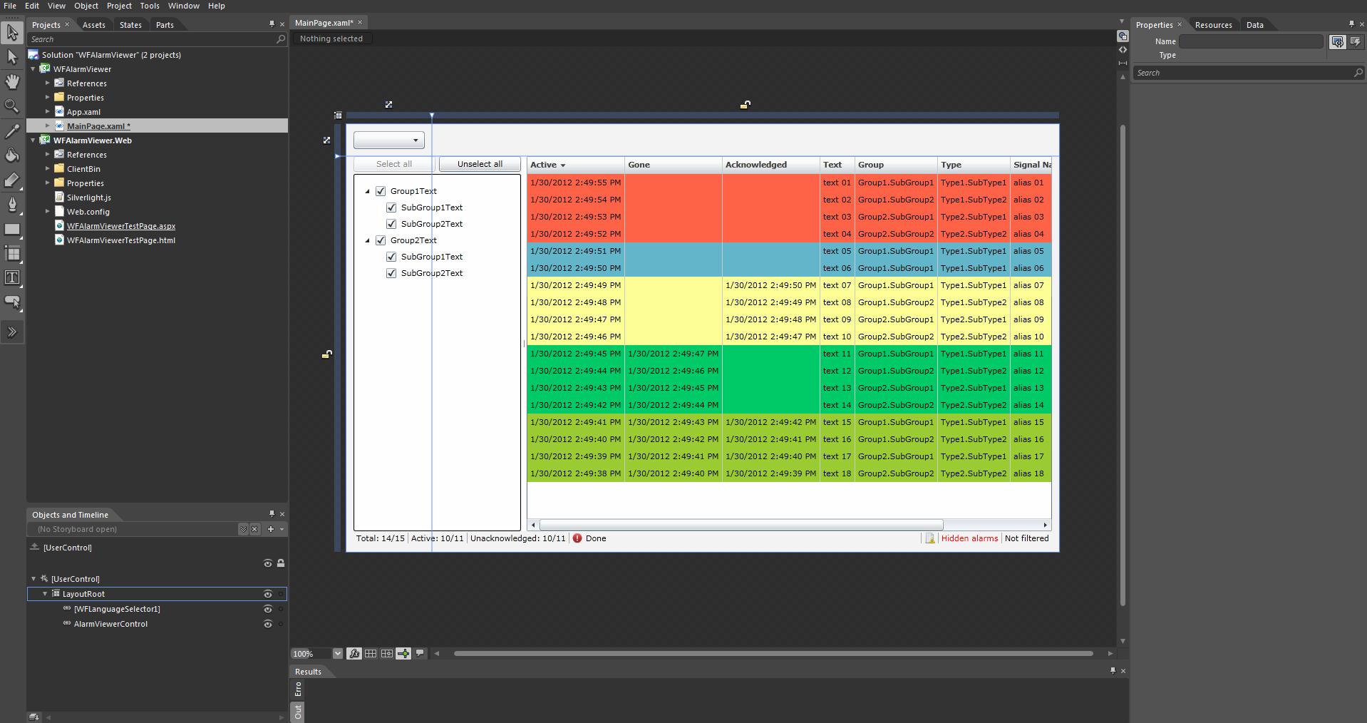
The new Alarm Viewer project
Creating the print button and functionality
Add a new button to the page, and name it PrintButton.
In the Events panel (under the Properties pannel) create a Click event PrintButton_Click.
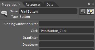
Click event for PrintButton
Select the PrintButton and go to Common Properties in the Properties panel, and enter "Print this control" in the Content text field. (The Content of the button can be anything desired)
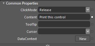
The content of the PrintButton
The project page should look like this:
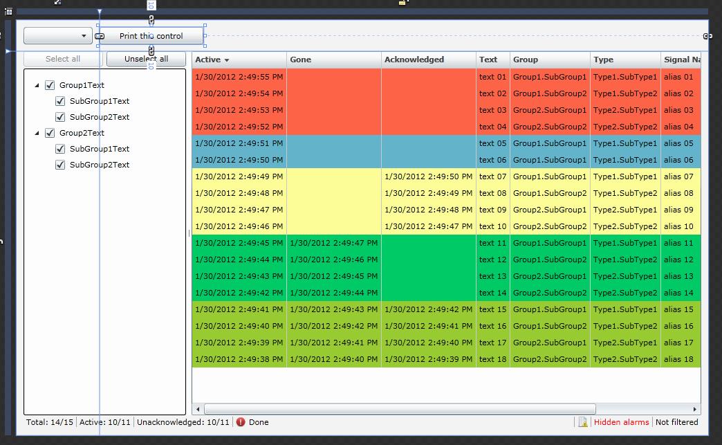
Project page with WFAlarmViewer contro, WFLanguageSelector control and the PrintButton
Now that the button for printing is created, let's write the code that will actually trigger the printing operation.
Open the MainPage.xaml.cs from the Project panel. If not visible, expand the MainPage.xaml file to reveal the .cs file.
The event handled for our PrintButton click event is already placed in code. We will need to define what that event will trigger.
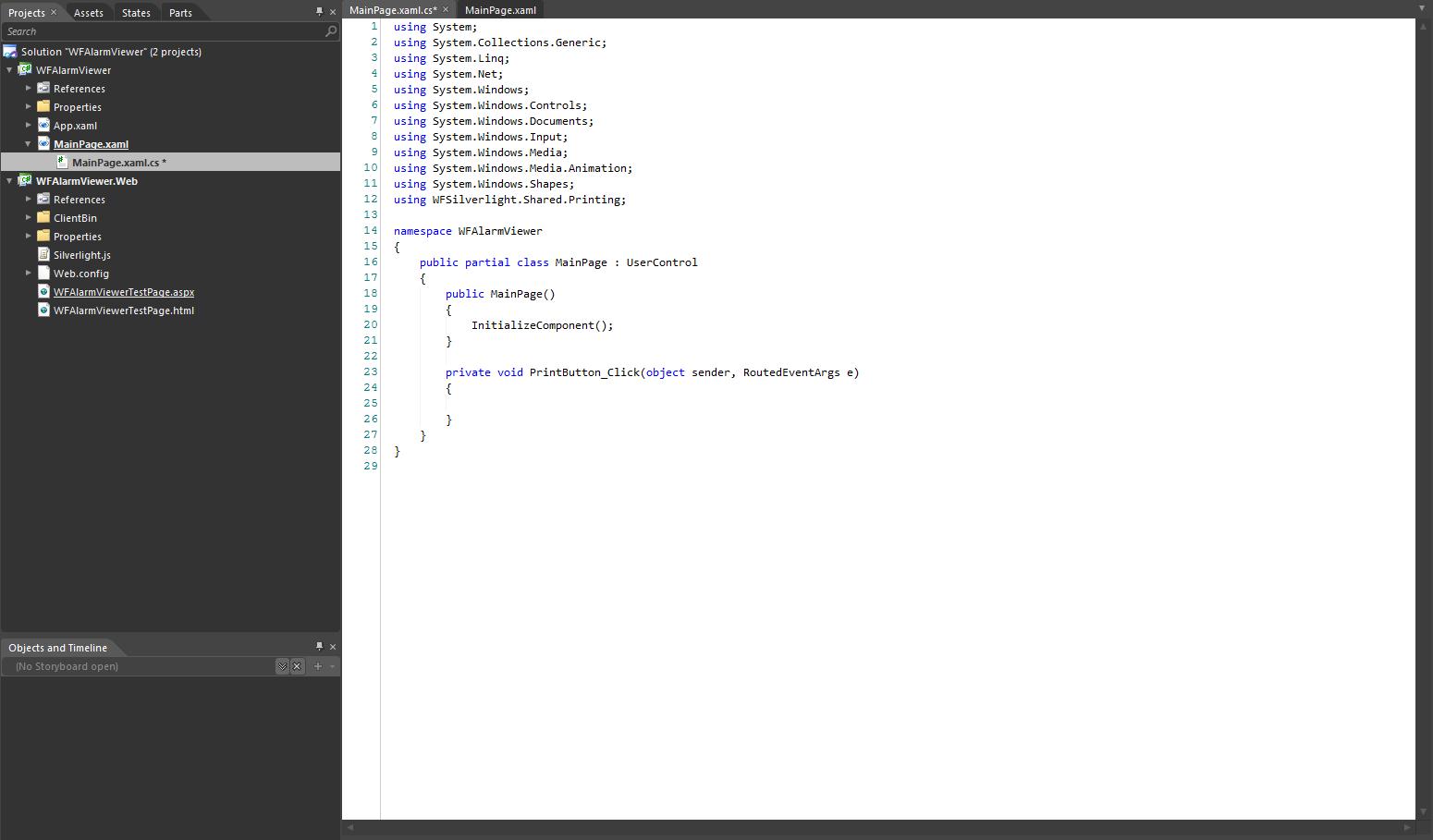
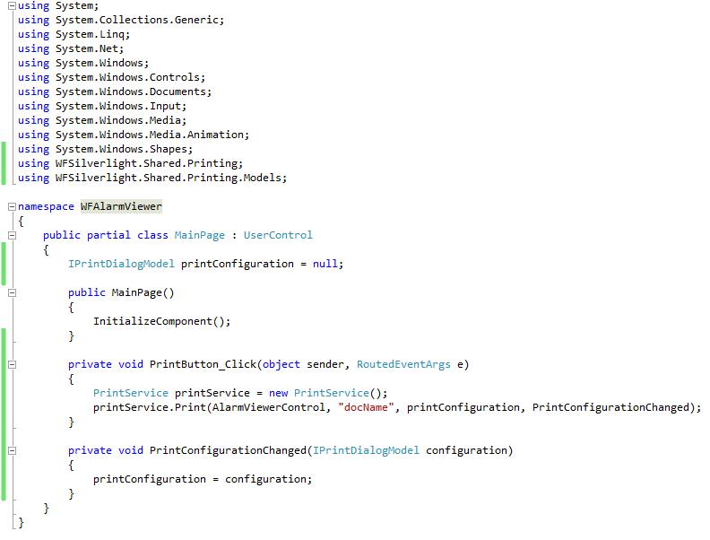
The code of the project containing the event handler
To trigger the printing process, we need to insert a using that will allow our project to use the printing possibilities of Ewon by HMS Networks controls:
using WFSilverlight.Shared.Printing;
Next we need to trigger the print service at the click event, and select the control to print:
            PrintService printService = new PrintService();
            printService.Print(AlarmViewerControl);
The WFAlarmViewer control is named AlarmViewerControl. We need to use the name to select the printable control.
The code should look like this:
The complete code of the project, including the printing capabilities
Now the project is complete. Build the project and run it.
The project at runtime
Printing a control
To print a control, click on the Print this control button.
When printing a control, the user has the possibility to create a header and a footer for the printed page. This options will be available when clicking the print button at runtime.
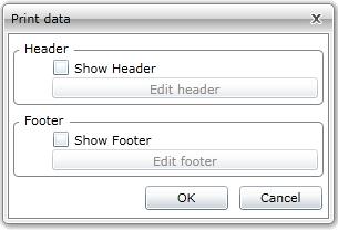
Print options
To create a Header or a Footer, select the Show Header or Show Footer. This will place the header and the footer on the page.
To edit the Header or the Footer, click Edit header or Edit footer. Both Header and Footer have the same editing options.
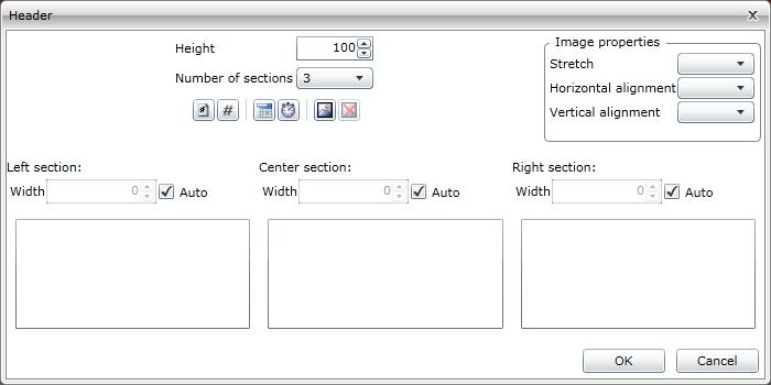
Header of Footer editing mode
Height - the height of the header/footer
Number of sections - the number of sections the header/footer is divided in. The header/footer can have 1, 2 or 3 sections.
 - inserts a page number placeholder
 - inserts a total number of pages placeholder
 - inserts a date placeholder
 - inserts a time placeholder
 - inserts an image
 - deletes an existing image
The width of the sections can be either set on auto or edited manually
Image properties
Stretch - extends the image accordingly to one of the following settings: None, Fill, Uniform, UniformToFill
Horizontal alignment - aligns the image horizontally
Vertical alignment - aligns the image vertically
After editing the controls, select OK to confirm.
Confirm the print dialog. The Windows Print window will open. Make he desired settings and click Print to start printing.
Optional step
The print settings (header and footer) can be saved as defaults using this method:
create a print configuration:
IPrintDialogModel printConfiguration = null;
add the method for changing the print configuration to the printService:
printService.Print(AlarmViewerControl, "docName", printConfiguration, PrintConfigurationChanged);
save the configuration as default using the PrintConfigurationChanged method:
	private void PrintConfigurationChanged(IPrintDialogModel configuration)
        	{
          	  	printConfiguration = configuration;
       	 }
The code with the option to save the configuration as default will look like this:
Saving the print configuration
The saved configuration will be the default one until the print settings (header and footer) are changed. The new changes will be set as default.
Using navigation in Expression Blend
Check out this article and learn how to use the navigation options using the Expression Blend tool.
To create a project with navigation, start a new Ewon by HMS Networks Application + Website in Expression Blend.
Add as references the dll files from WEBfactory 2010 installation directory > > Standard.
After the references are loaded, add on the MainePage a WFNavigationTarget control and two WFNavigation controls.
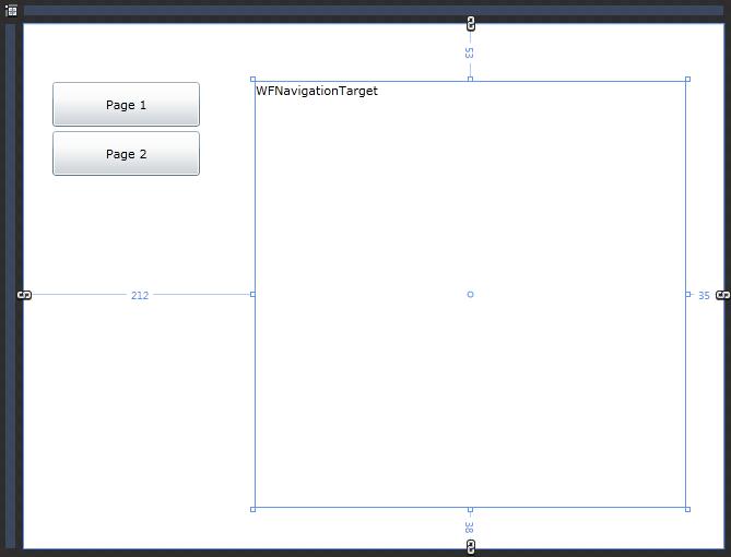
Navigation controls on the MainPage
Name the two WFNavigation controls as button1 and button2 and add SymbolicText (Properties panel > Ewon by HMS Networks tab) for the first button Page 1 and for the second button Page 2.
Name the WFNavigationTarget as NavTarget.
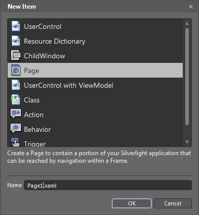
In the Projects panel, right-click on the project name and select Add New Item... . Select Page from the Add New Item menu and name it Page1.xaml.
Repeat the same procedure again to add a new page named Page2.xaml.
Adding new pages to the project
Make the two new pages to be the same size as the NavTarget.
Add a background color to the two pages, for easier identification.
Back into the MainePage, select button1 and go to the Properties panel > Ewon by HMS Networks . Click on the three dots button corresponding to the Navigations option.
Navigation option
The NavigationsItem Colletion Editor: Navigations window will open.
Navigation options
Now it is time to link the button1 to the page1.xaml we created earlier. Also here, we will tell where should Page1 be displayed - in the WFNavigationTarget.
Add Page1 in the Source textfield and NavTargetin the Target textfield, like in the picture above.
Repeat the above step for button2, adding Page2 in the Source text field instead of Page1.
Run the project (F5). If the first button is pressed, the NavTarget will display Page1. If the second button is pressed, the NavTarget will display Page2.
The WFNavigationTarge control allows us to specify a default page. This page will be displayed by default when the project is run.
To set a default page to be displayed in the NavTarget, select the NavTarget, go to the Properties panel > Ewon by HMS Networkstab, and enter the desired page in the DefaultPage text field (enter the full name of the page ex. ProjectName.Page1).
Run the project again. By default, the NavTarget will display the selected page.
Using XAML as resource in Expression Blend
Check out this article and learn how to use the XAM as resource in the Expression Blend tool.
In Expression Blend, the user has the possibility to save the geometry of a path or an existin g XAML file in a Resource Dictionary. The resources contained by the resource dictionary can be applied to other elements of the same type in the project.
Create a new XAML and use it as resource
Create a new Expression Blend project.
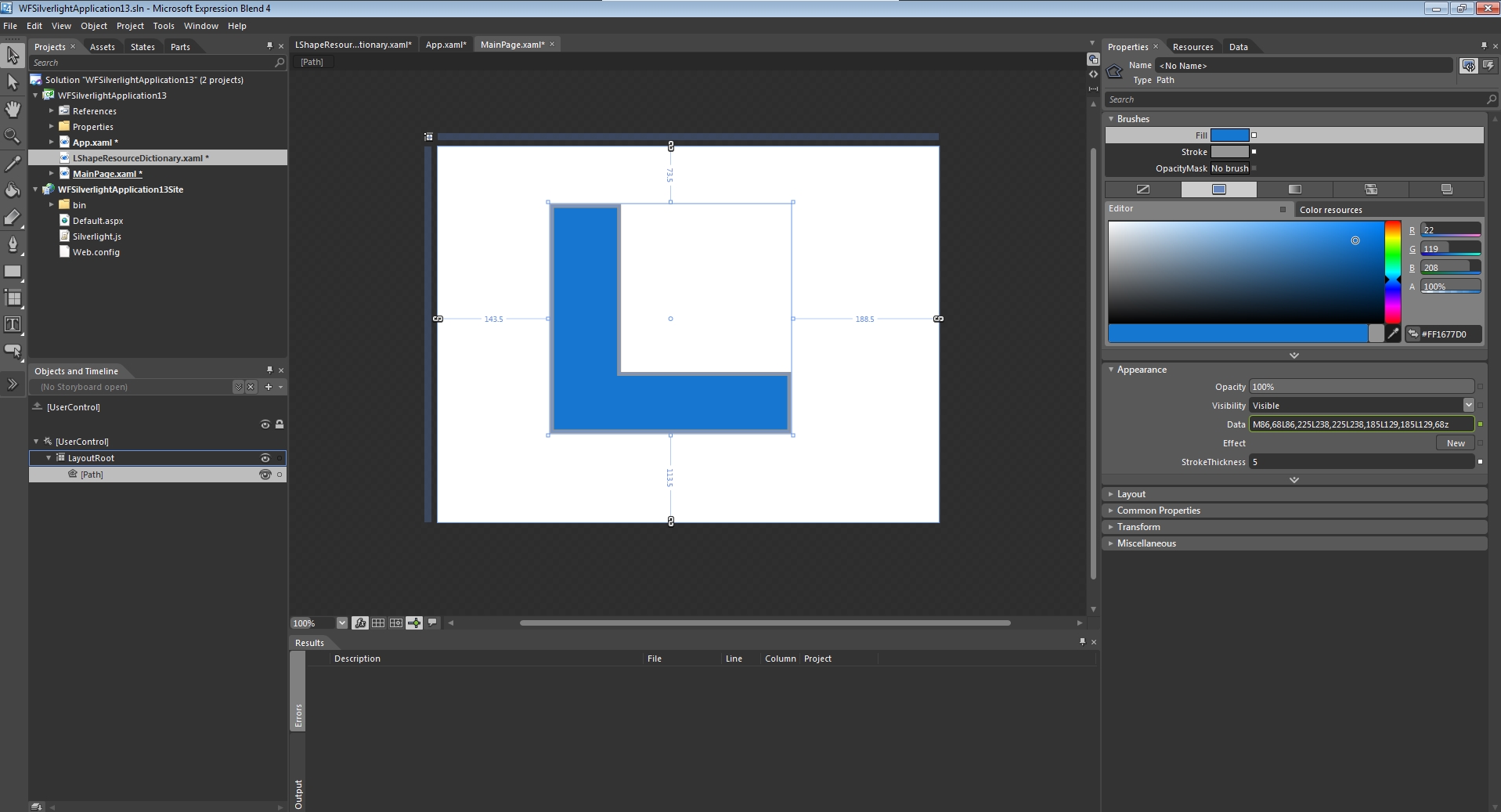
In the new project, create a path object on the main page.
The Path element
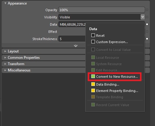
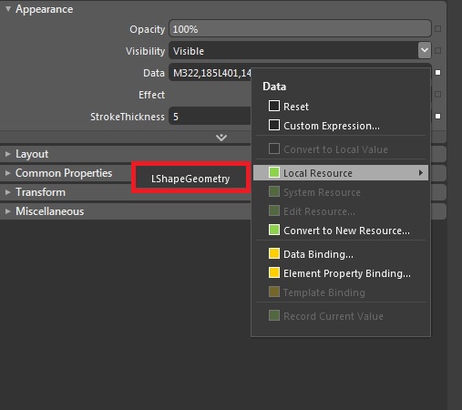
With the new Path element selected, go in to the Properties panel > Appearance category. At the Data property, click on the white square button next to the text field. Select Convert to New Resource... from the menu.
The Data property options
In the Create Geometry Resource window, name the new resource. In the Define in section, click on the New... button next to the grayed-out Resource dictionary option.
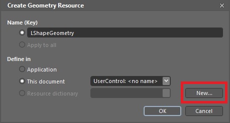
The Create Geometry Resource window
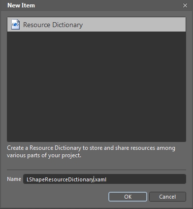
Name the new resource dictionary and click OK to confirm.
Creating a new Resource Dictionary
Back in the Create Geometry Resource window, make sure that the Resource dictionary option (from the Define in section) is pointing to the new resource dictionary, and click OK to confirm. Once confirmed, the new resource dictionary will be available in the Projects panel, in the current project.
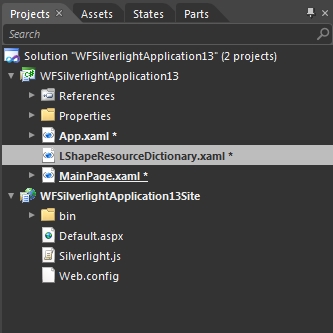
The new resource dictionary
On the MainPage, create a new random path. The previous path (from which the resource dictionary was created) is no longer necessary, as the geometrical data is kept in the new resource dictionary.
New random path
While having the new path selected, head into the Properties panel > Appearance category, and click the square button next to the Data property. From the opened menu, select Local Resources and select the previously saved geometry.
Applying the geometry saved in the resource dictionary
On the MainPage, the previously saved geometry is applied to the new random path.
Using an existing XAML file as a resource in Expression Blend
In a new Expression Blend project, right-click the project name from the Projects panel and select Add Existing Item....
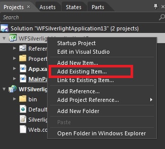
Adding an existin XAML as resource
In the Add Existing Item window, browse the system for the desired XAML file. In our example, I will use a static symbol XAML file, provided with Ewon by HMS Networks <MadCap:variable name="MyVariables.WFSmartEditor" /> (WEBfactory 2010 \<MadCap:variable name="MyVariables.WFSmartEditor" />\Views\StaticSymbols). Select the XAML file and click Open. The selected XAML file is added to the project.
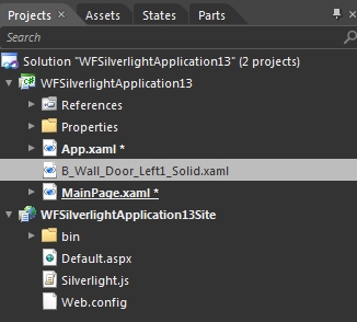
The XAML file added to the current project
Open the newly added XAML file. Right-click on the visible element and select Make Into Control... .
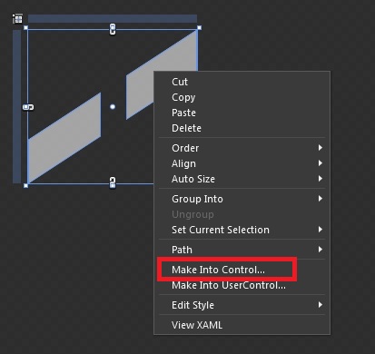
Converting the XAML to a control
In the Make Into Control window, select the desired Control type. Name the new control and define it in a new resource dictionary. To create a new resource dictionary, click on the New... button next to the Resource dictionary option.
IMPORTANT:
The control type of the new control is important. The resulting resource can be used only on the same control type!
In this example, the newly defined control type will be Button.
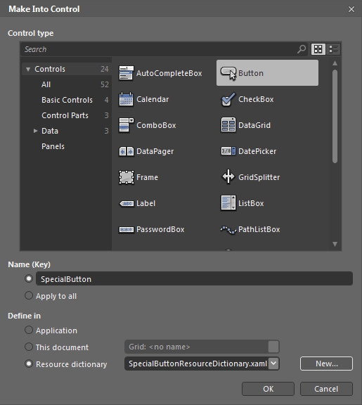
The new control, defined in a new resource dictionary as a Button
The newly created resource dictionary is added to the project.
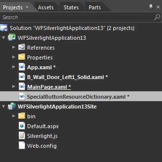
The newly created resource dictionary
Now that our resources are created, drag a standard button on the project's MainPage.
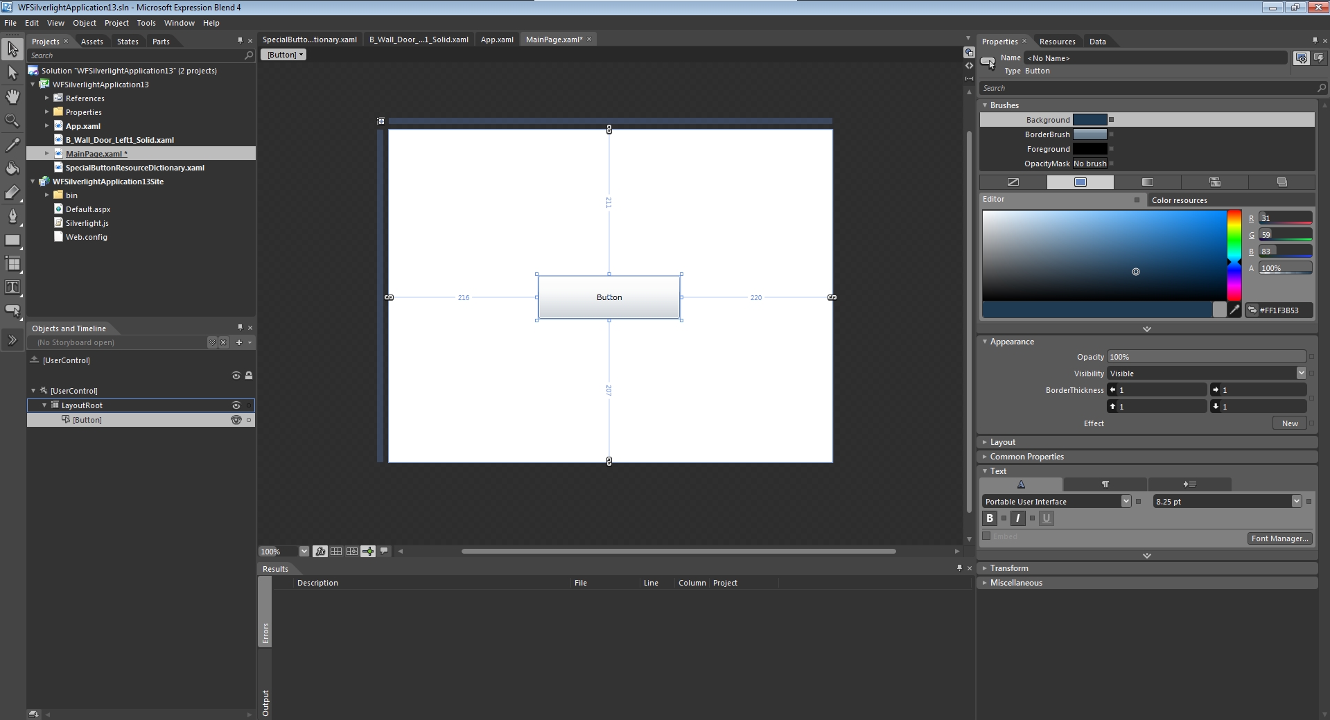
A standard Expression Blend button
To apply our resource on this standard button, right-click the button on the MainPage and select Edit Template > Apply Resource > NameOfTheResource.
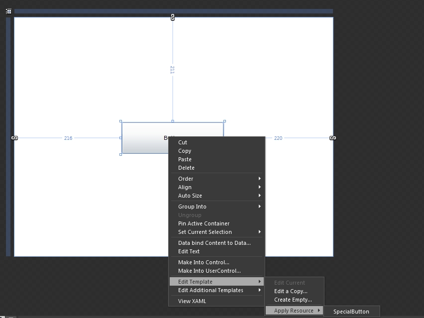
Applying the resource to a new button
Now the button will obtain the look of the original XAML that we have imported in the project. This resource can be applied on any control of type Button.
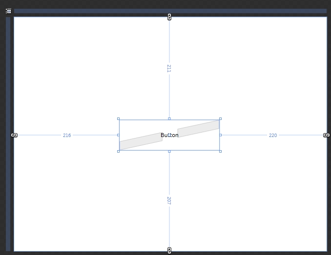
The new look of the standard button after the resource has been applied
Deploying Blend for Visual Studio projects to IIS
Check out this article and learn how to deploy Blend in order to run Visual Studio aplications to IIS.
In order to run any visualization project created with Blend for Visual Studio, the project must be deployed to Internet Information Services.
The first step after the project is built in Blend for Visual Studio is to navigate to C:\Users\UserName\Documents\Visual Studio 2013\Projects\WFSilverlightApplication and copy the folder WFSilverlightApplicationSite to C:\inetpub\wwwroot.
UserName is an example user name. This must be replaced with the real Windows user name.
The location of the project folder depends on the version of Visual Studio (and Blend for Visual Studio). It can be either Visual Studio 2013 or Visual Studio 2015, hence the difference in the project path.
WFSilverlightApplication is an example name. This must be replaced with the real name of your project.
Now it is necessary to convert the site folder into a web application. To do so, open Internet Information Services (IIS) Manager from Control Panel > System and Security > Administrative Tools.
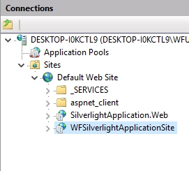
In the left panel, under Sites > Default Web Site, the WFSilverlightApplicationSite folder will be available.
Right click on the project folder and select Convert to Application.
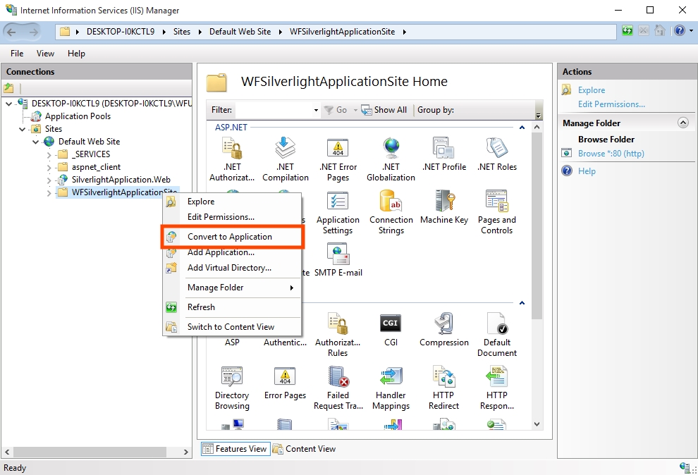
Convert the visualization project to application
In the Add Application window, click on Select... .
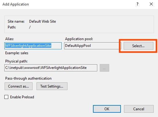
Add Application window in IIS
Select Ewon by HMS Networks_AppPool from the Application Pool drop-down menu and press OK.
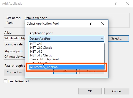
Select Application pool
Confirm the Add Application dialog by pressing OK. The folder inside the Connection panel will change into an application.
The new IIS application
Some specific visualization applications may require additional settings to be done in IIS. See Deploying the User Manager Visualization to IIS for reference.
Running the new application
To run the new application, go to Content View in IIS, right-click Default.aspx and select Browse.
To access the application from a remote machine via local network or Internet, open a web browser and access the IIS root folder using the HTTP protocol:
http://[computer name or IP]/WFSilverlightApplicationSite/Default.aspx
http://[computer name or IP]/WFSilverlightApplicationSite
[computer name or IP] designates the actual ip/computer name of the machine running the IIS.
If the application will be accessed via Internet or from a location that is in a different network than the machine running the IIS, the router must be configured in order to allow access to the IIS from outside the local network (port forwarding).
The process of deploying is complete. Now the application can be accessed from any location.
Enabling Virtual Keyboard in a control
Check out this article and learn how to enable the virtual keyboard in a control, using the Expression Blend tool.
This tutorial will guide you through the necessary steps for enabling the Ewon by HMS Networks Virtual Keyboard in a control. For demonstrative purpose, we will create an Expression Blend (or Visual Studio) project with two input controls:
WFNumerciBox1
WFTextBox1
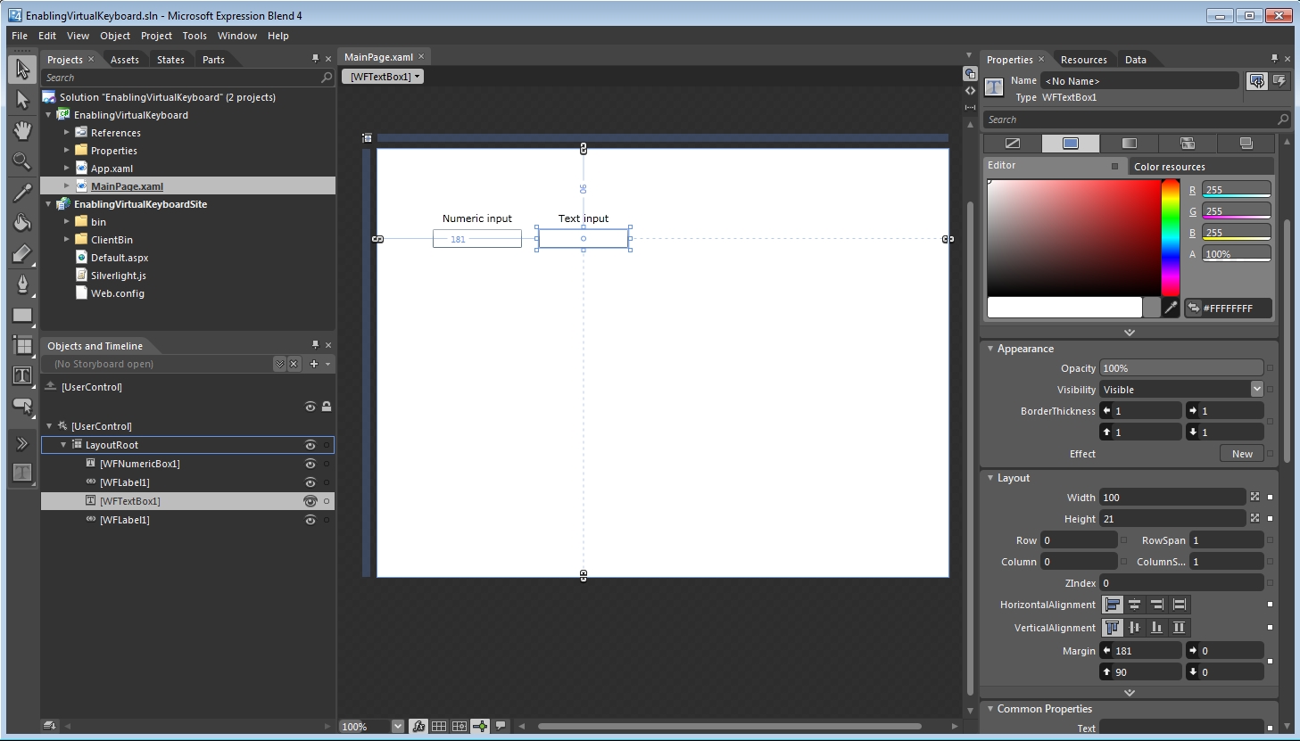
Expression Blend project with two input controls
In order to enable the virtual keyboard on this two input controls, we need to make sure that the virtual keyboard is enabled in Ewon by HMS NetworksStudio. To learn more about enabling the virtual keyboard in Ewon by HMS NetworksStudio, follow this link:
Before proceeding, make sure that the WFShared.dll is referenced in the project. The Ewon by HMS Networks Virtual Keyboard needs the WFShared assembly.
To activate the virtual keyboard for the two controls, we need to get under the hood of our project: switch the Expression Blend view mode to XAML code.
Define the namespace for WFShared by adding the following line at the top of the document:
xmlns:wfshared="clr-namespace:WFSilverlight.Shared;assembly=WFShared"
Locate the WFNumericBox1 control in the XAML code, and add the following property to it (by using the Numeric keyboard type in the WFNumericBox1 control, we can be sure that the user won't mistakenly type letters in the input box):
wfshared:KeyboardService.VirtualKeyboardType="Numeric"
Locate the WFTextBox1 control and add the following property to it:
wfshared:KeyboardService.VirtualKeyboardType="Alphanumeric"
The complete XAML code should look like this:
<UserControl
	xmlns="http://schemas.microsoft.com/winfx/2006/xaml/presentation"
	xmlns:x="http://schemas.microsoft.com/winfx/2006/xaml"
	xmlns:wfshared="clr-namespace:WFSilverlight.Shared;assembly=WFShared"
	xmlns:WFInputOutput="clr-namespace:WFSilverlight.InputOutput;assembly=WFInputOutput"
	xmlns:d="http://schemas.microsoft.com/expression/blend/2008"
	xmlns:mc="http://schemas.openxmlformats.org/markup-compatibility/2006"
	xmlns:WFLabels="clr-namespace:WFSilverlight.Labels;assembly=WFLabels" mc:Ignorable="d"
	x:Class="EnablingVirtualKeyboard.MainPage"
	Width="640" Height="480">

	<Grid x:Name="LayoutRoot" Background="White">
		<WFInputOutput:WFNumericBox1 HorizontalAlignment="Left" Margin="62,90,0,0"
		 TextWrapping="Wrap" Text="WFNumericBox1" VerticalAlignment="Top"
		 d:LayoutOverrides="Width" Height="21"
		 wfshared:KeyboardService.VirtualKeyboardType="Numeric"/>

		<WFInputOutput:WFTextBox1 Margin="181,90,0,0" TextWrapping="Wrap"
		 Text="WFTextBox1" VerticalAlignment="Top" HorizontalAlignment="Left" Height="21" Width="100"
		 wfshared:KeyboardService.VirtualKeyboardType="Alphanumeric"/>
	</Grid>
</UserControl>
Run the project and set the focus on the two input controls.
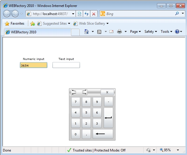
The numeric virtual keyboard
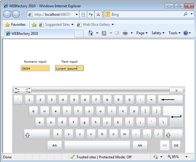
The alphanumeric virtual keyboard
Re-skinning the WFNavigationToggle1 control
Check out this article and learn how to edit the WFNavigationTogle1 control in Microsoft Blend.
The WFNavigationToggle1 control represents the core of tabbed navigation structures in WEBfactory 2010. It allows the user to quickly see which navigation page is active at any given moment, just like an usual tabbed menu.
Bus some projects may require more than the default Windows look and feel, and in this specific situations, the WFNavigationToggle1 control must be re-skinned using Microsoft Expression Blend. The following tutorial will guide you thought the steps required to re-skin and use the WFNavigationToggle1 control in Microsoft's Expression Blend.
In the following example, we will edit the WFNavigationToggle1 control to have a different color when in the Checked state.
Preparing the Expression Blend project
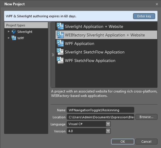
Open Expression Blend and create a new WEBfactory Silverlight Application + Website project (the example project will be named WFNavigationToggle1Reskinning).
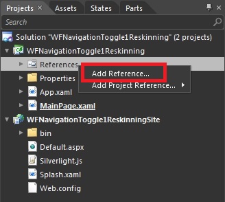
In the new project, go to the Projects panel and right click the References folder. Select Add Reference....
In the Add Reference dialog, go to WEBfactory 2010\\Standard and select the following DLL files:
WFShared.dll
WFMath.dll
WFCore.dll
WFNavigation.dll
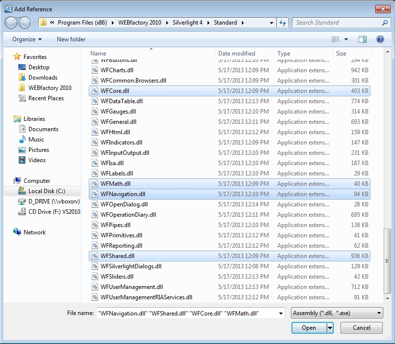
Click Open to confirm and add the DLL files as references to the project.
Once the references are added, we can proceed and search for the WFNavigationToggle1 in the Assets panel.
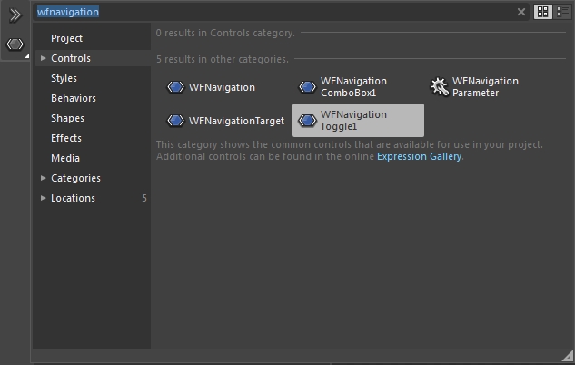
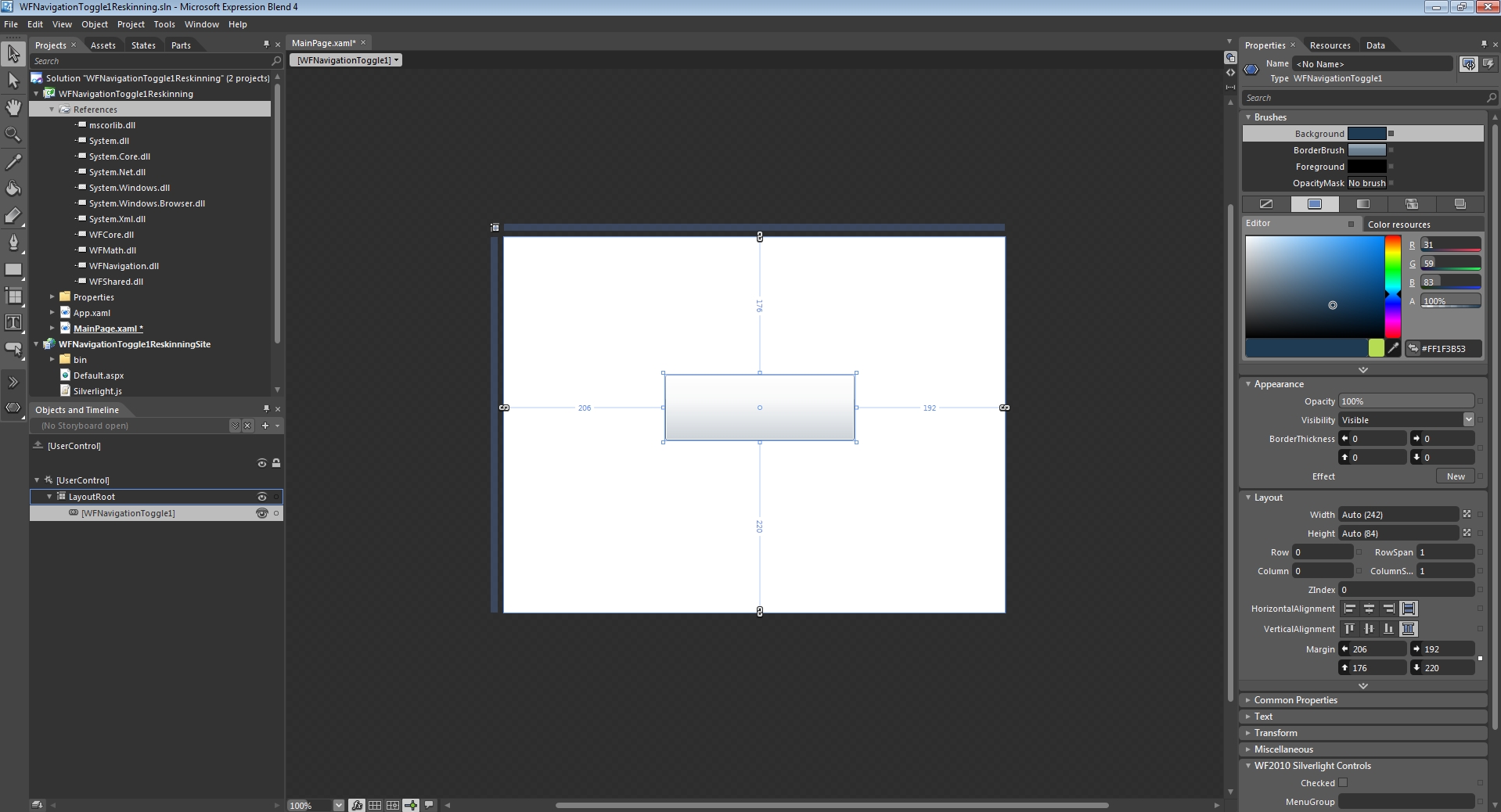
Drag the control on the MainPage.
Editing the control's template
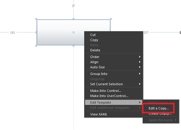
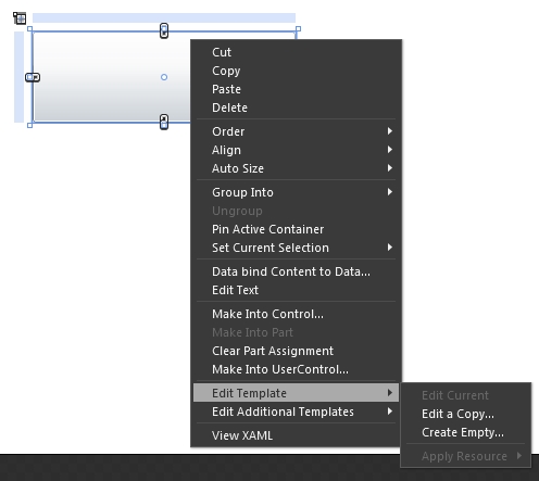
To re-skin the control, we need to be able to edit the control's template. In order to do so, right click on the control and select Edit Template > Edit a Copy... .
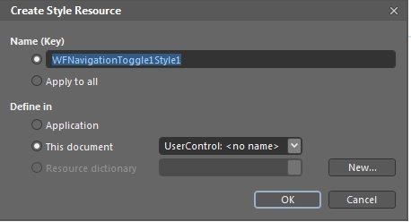
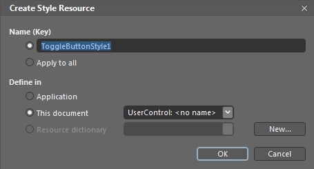
When editing a copy of the control's template, we're basically creating a new style resource that can be available for applying to every WFNavigationToggle1 control in the project or even in the whole application. The new style resource can also be saved as a Resource dictionary for later usage.
In the Create Style Resource dialog, name the new style and define it in this document. Click OK to confirm.
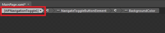
Once inside the template, we can notice that we have another button element named NavigateToggleButtonElement (see the Objects and Timeline panel).
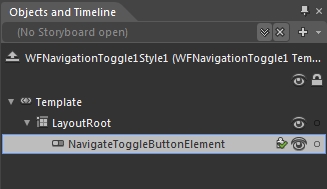
In order to re-skin our WFNavigationToggle1 control, we need to edit this NavigateToggleButtonElement control. To do so, we will repeat the above step: Right click on the NavigateToggleButtonElement and select Edit Template > Edit a Copy....
Name the new style resource of the button element and define it in the current document.
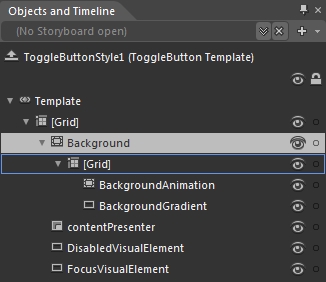
Now we are inside the template that needs to be edited in order to re-skin the WFNavigationToggle1 control. The elements of the template are visible in the Objects and Timeline panel.
Re-skinning the Checked state
Because our goal is to make the WFNavigationToggle1 control to have a different color when in the Checked state, we need to make sure that we operate on the correct state.
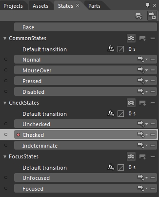
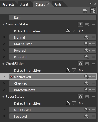
Select the States panel and, under the CheckStates category, select the Checked state.
Notice the Checked state recording is on notification from the top-left corner of the MainPage. This recording is enabled when a state is selected, and records any modifications made to that state.
While in the Checked state, select the rectangle tool from the left-side toolbar and draw a rectangle on top of our control. This rectangle will hold our desired color when the control is in the Checked state.
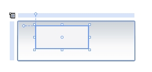
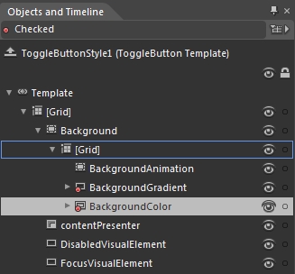
Notice the rectangle element is placed inside the Grid that contains the BackgroundGradient element (see the Objects and Timeline panel). Rename the rectangle to BackgroundColor.
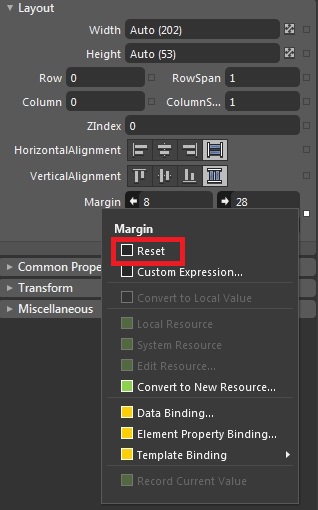
Now we need to adjust the size of the BackgroundColor element to fit the size of our control. While having selected the BackgroundColor element, go to the Layout properties in the Properties panel. Make sure that the Width and Height properties are set on Auto and reset the Margin properties.
To reset the Margin properties, click on the white square on the right side of the properties to open the properties menu. Select Reset. The BackgroundColor element will fit the size of it's parent (the Grid element).
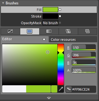
Select the desired color for the BackgroundColor element using the color picker form the Brushes properties.
Now our BackgroundColor element is set for the Checked state, but we need to make sure that it will be visible only when the WFNavigationToggle1 control is in the Checked state. To do so, select the Unchecked state from the States panel.
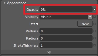
Expand the Appearance property category and set the BackgroundColor's Opacity to 0.
This way, the BacgroundColor element will be visible only in the Checked state.
Testing the re-skinned control
To test the re-skinned control, we will add another WFNavigationToggle1 control and apply the same style resources to it.
Return to the WFNavigationToggle1 control in the MainPage by clicking on the first element of the bread-crumbs.
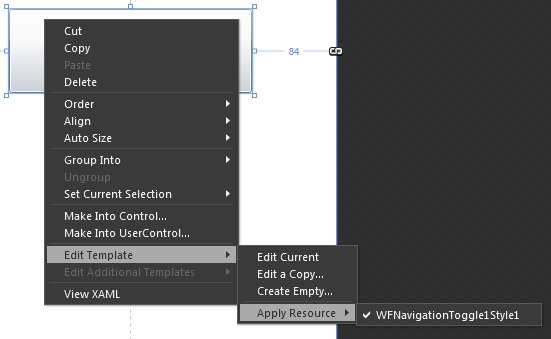
Add a new WFNavigationToggle1 control next to the re-skinned one. Select the new WFNavigationToggle1 control and right-click on it. Select Edit Template > Apply Resource > WFNavigationToggle1Style1.
Press F5 to build and test the project. The color of the controls in the Checked state is now changed.