Bargraph Controls
The Bargraph controls are indicator controls that display the value of a signal as a quantized value on a bar graph. The change of signal values drive the animation which fill up the bar graph in the limits defined by the user at design-time.
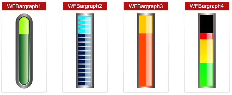
The Bargraph type of controls include the four following controls:
WFBargraph1
WFBargraph2
WFBargraph3
WFBargraph4
All four controls expose the same set of properties at design-time, with the exception of WFBargraph4 which has two additional design-time properties.
Visual Structure
The four Bargraph controls displaying the same signal value as a quantized value on a bar graph.
Run-time Features
The Bargraph controls display the value of the selected signal in a graphical way, appealing to the user but keeping the precise functionality of an professional indicator control.
The control also feature contrasting color schemes with optional value scales. The design of the controls makes them useful in applications where the signal values must be kept in a certain range.
Design-time Features
At design time, in either Ewon by HMS NetworksSmartEditor or Expression Blend, the Bargraph controls expose the same functionality:
Range customization - the user can adjust the range of the indicators to fit the desired scenario.
Advanced security - the controls offer the complete security options, keeping away the unnecessary complications. One of the important security features is the possibility to adjust the visibility of the controls using another signal value.
In addition to the base features stated above, the WFBargraph4 control also allows the user to adjust the two limits that separate the control in three zones (green, yellow and red).
Design-time Properties
The Bargraph controls properties are available in the Properties panel:
RangeMax - the maximum potential value of the signal.
RangeMin - the minimum potential value of the signal.
Scale - toggles the values scale at run time.
SecurityAuthorizationName - allows the user to select an authorization group. The members of the selected authorization group will have access to the control.
SecurityDenyAccessBehaviour - allows the user to select a behavior that will be active when a user that doesn't belong to the above selected authorization group logs in. The action can either be disabled or hidden.
VisibilityMask - the binary mask used for displaying or hiding the control. The control uses the bitwise AND operation between the binary value of the signal set at the VisibilitySignalName property and the binary value of the mask. This bitwise AND operation must equate to the binary value of the mask in order to be true (e.g. Signal & Mask = Mask). The control is hidden when the operation is true and visible when the operation is false.
VisibilitySignalName - the signal that will control the visibility of the control. The binary value of the selected signal is used together with the VisibilityMask binary value to toggle between the control's visible or hidden states.
ObjectID - allows the user to define an object ID for the control, that can be passed as SignalPrefix when using parameter passing in navigation.
SignalPrefix - allows the user to select a signal prefix that can be passed when using parameter control and parameter passing in navigation. The signal prefix can be the ObjectName, ObjectName_PageSignalPrefix, PageSignalPrefix or PageSignalPrefix_ObjectName.
SignalName - allows the user to select a signal (using the Signal Browser or by typing the signal name in the text box). The selected signal's value will be displayed by the control at run time.
Particular Properties
ThresholdValue1 - the value at which the green section stops and the yellow section begins.
ThresholdValue2 - the value at which the yellow section stops and the red section begins.