WFDataTable
The WFDataTable control displays the logged values of the selecteds signal in a grid.
WFDataTable control
Features
Run time settings - the WFDataTable control allows the user to set up the signals and the display method for the signals by using the complete settings solution provided in the options bar at run time.
Multi-column grid view - the WFDataTable features a multi-column grid view that allows the user to see in the same time the logged values for different signals.
Quick sorting - the user can sort the grid with only one click on the column header. The sorting will be done depending on the column header the user chooses for sorting: it can be done either by time, identification number or signal value.
Data export - the WFDataTable control features an export option that allows the user to save the data from the control in several file formats: Excel, ExcelXML, Word, Csv and Html. The WFDataTable control can export all the available data or just the data selected from the grid.
Time interval - the user is able to select the time interval from which the WFDataTable control will display the data for the selected signals.
Load and save configuration - the user is able to save at run time a configuration in the database and load it later, or in a different session.
Printing - allows the user to print the data content of the control, having the possibility to apply custom headers and/or footers to the page. Also, the possibility of printing the WFDataTable with column captions on each page is available.
Visual Structure
The Visual Structure section describes the layout of the control at run time, providing detailed naming and descriptions. The WFDataTable control displays the logged values of the selected signal in a tabular way. The control is divided in three main parts:
Options Menu
Main View (grid of values)
Navigation
WFDataTable control
The options menu
The WFDataTable Options menu
Copy Selection - This button activates only when one or more lines are selected from the data table. Copying to clipboard in Silverlight requires user permission.
Settings - Click for more - Allows the user to set up a configuration for the WFDataTable control and customize its appearance.
Select time interval - Click for more - Allows the user to select the time interval for displaying the data in the WFDataTable .
Print data - Click for more - Allows the user to print the data from the WFDataTable and tweak the printing settings.
Export data - Click for more - Allows the user to export the data from the WFDataTable to various file formats.
Load configuration - Click for more - Allows the user to load a configuration from the database.
Save configuration - Click for more - Allows the user to save the current configuration to the database.
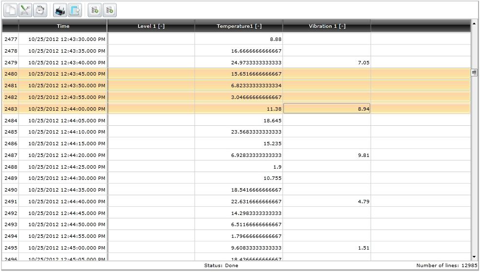
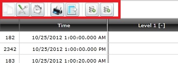
Main view
The main view of the WFDataTable control consists in a grid of values logged at a specific time. The columns displayed by the grid of values are the time column and the signal columns.
WFDataTable main view
All WFDataTable ’s columns can be sorted ascendant or descendant by clicking on the column header.
The Index column marks the line number. The total number of lines displayed by the control is listed at the bottom-right side of the main view.
The status indicator is displayed at the bottom of the main view.
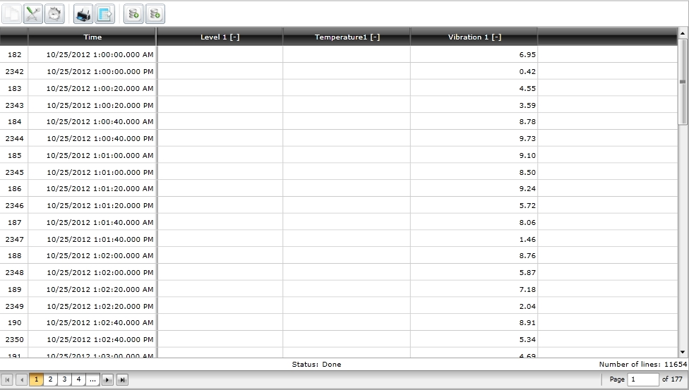
Navigation
The navigation controls of the WFDataTable are displayed only when the Show DataPager option is enabled (Settings > Common).

WFDataTable navigation bar
The navigation controls are placed below the main view (the grid of values), and allow the user to navigate through the WFDataTable pages.
Run-time Features
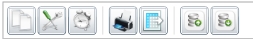
The run-time features section describes the controls features at run time. The base functionality of the WFDataTable control can be adjusted using the Option bar.
WFDataTable options bar at run time
The WFDataTable control exposes the following options at run time:

This button activates only when one or more lines are selected from the data table. Copying to clipboard in Silverlight requires user permission.

The Settings window is organized in three tabs:
Signal Columns
Time Columns
Common
1. Signal Columns
The signal management operation (add, delete, move up or down) are focused on the left side of this window, the right side displaying the signal details.
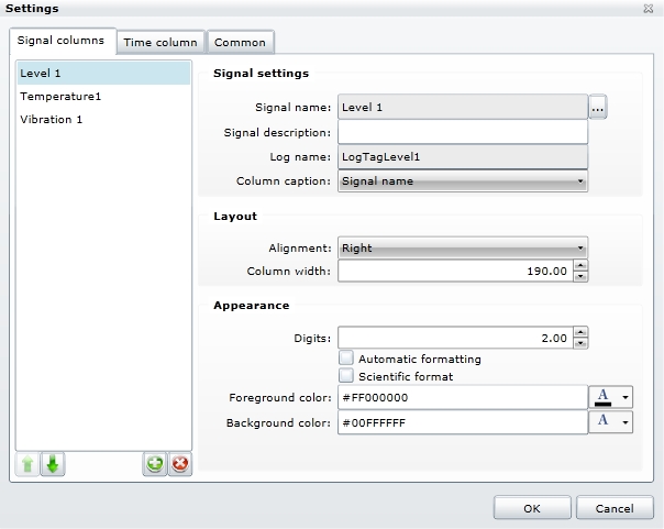
Settings - Signal columns
Signal settings:
Signal name – the user can select the signal name by clicking the browse button. The Signal browser window will open, allowing the user to browse the connectors for signals.
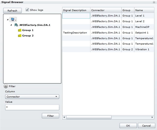
Signal Browser
Signal description – the description of the signal can be added here.
Log name – the name of the log assigned to the selected signal.
Column caption – the tile of the column assigned to the signals value in the DataTable.
Alignment – allows the user to set the default text alignment throughout the table.
Column width – allows the user to set the default column width.
Digits – allows the user to select the number of digits for the signal values.
Automatic formatting – displays the values as they are stored in the data base. Overrides the Digits option.
Scientific format – allows the user to select the scientific representation of the values.
Foreground color – enables the user to select a custom color for the foreground of the control (text color).
Background color – enables the user to select a custom color for the background of the control.
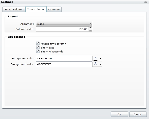
2. Time Column
The Time Column tab allows the user to make layout and appearance settings for the Time column of the DataTable.
Settings - Time Column
Alignment – allows the user to select the alignment of the text inside the Time column.
Column width – allows the user to select the width of the Time column.
Freeze time column – the time column stays fixed at the beginning of the table if the user scrolls horizontally through the table page.
Show date – toggles the date on or off.
Show Milliseconds – toggles the milliseconds on or off.
Foreground color – enables the user to select a custom color for the foreground of the control (text color).
Background color – enables the user to select a custom color for the background of the control.
3. Common
The Common tab offers the possibility to edit the page size and toggle on or off the DataPager.
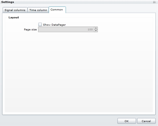
Settings - Common
Show DataPager – if on, this option will divide the DataTable entries in pages (the size of a page can be specified in the Page size option) and activates the navigation.
Page size – allows the user to select the maximum number of lines to be displayed in one page. The maximum number is 100.

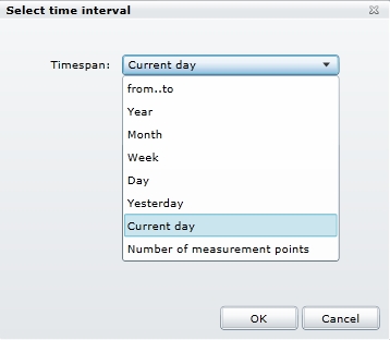
When selecting the Timespan option from the Time Interval dialog, the dropdown menu will list the options for displaying the data.
Select time interval dialog
From…to - allows the user to select a time range using exact start and end points. The logged data (historical data) from that period will be displayed in the main graphic.
Year – allows the user to select a specific year to be displayed in the timeline of the main graphic. This option will display the logged (historical) data from the whole year.
Month – allows the user to select a specific month to be displayed in the timeline of the main graphic. This option will display the logged (historical) data from the whole month.
Week – allows the user to select a specific week to be displayed in the timeline of the main graphic. This option will display the logged (historical) data from the whole week.
Day – allows the user to select a specific day to be displayed in the timeline of the main graphic. This option will display the logged (historical) data from the whole day.
Yesterday – displays the data from the day before the current day.
Current day – displays the data from the current day, up to the point representing the current time of selection.
Number of measurements points – displays the last X (value specified in the field) log recordings.

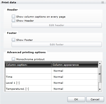
The Print option allows the user to print the data content of the control, having the possibility to apply custom headers and/or footers to the page. Also, the possibility of printing the DataTable with column captions on each page is available.
Print dialog
Show column captions on every page – displays the titles of the column on each printed page.
Show Header – toggles the header on or off.
Edit header – available only if the Show Header option in enabled.
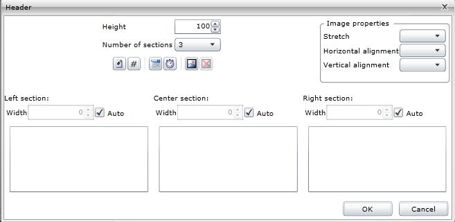
Edit header dialog
Height - the height of the header/footer
Number of sections - the number of sections the header/footer is divided in. The header/footer can have 1, 2 or 3 sections.
 - inserts a page number placeholder
 - inserts a total number of pages placeholder
 - inserts a date placeholder
 - inserts a time placeholder
 - inserts an image
 - deletes an existing image
The width of the sections can be either set on auto or edited manually
Stretch - extends the image accordingly to one of the following settings: None, Fill, Uniform, UniformToFill
Horizontal alignment - aligns the image horizontally
Vertical alignment - aligns the image vertically
Show Footer – toggles the footer on or off.
Edit Footer – available only if the Show Footer option in enabled.
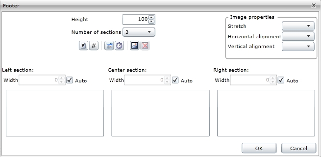
Edit footer dialog
Height - the height of the header/footer
Number of sections - the number of sections the header/footer is divided in. The header/footer can have 1, 2 or 3 sections.
- - inserts a page number placeholder
- - inserts a total number of pages placeholder
- - inserts a date placeholder
- - inserts a time placeholder
- - inserts an image
- - deletes an existing image
The width of the sections can be either set on auto or edited manually
Stretch - extends the image accordingly to one of the following settings: None, Fill, Uniform, UniformToFill
Horizontal alignment - aligns the image horizontally
Vertical alignment - aligns the image vertically
Monochrome printout – toggles monochrome printing on or off.
Column appearance – allows the user to customize the appearance of each column. The options are Normal, Always Visible or Hidden.
Normal – the columns are printed normally on the page, from left to right, as the table fits to page.
Always Visible – preserves the column on each printed page. The time column can be useful when set to Always Visible.
Hidden – the hidden column is not printed.

The Export Data dialog allows the user to export all or just selected data from the DataTable control in several file formats: Excel, Excel XML, Word, Csv, Html.
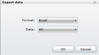
Export data dialog

Load Configuration option allows the user to load an existing configuration from the database.
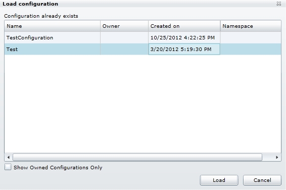
Load configuration dialog
The Load Configuration dialog provides a simple filtering option, the Only show own configurations. When enabled, the Load Configuration window will list only configurations owned by the current user.

The Save Configuration option allows the user to save the current configuration to the database. The saved configuration can be loaded later using the Load Configuration option, or can be set as default user configuration at design time.
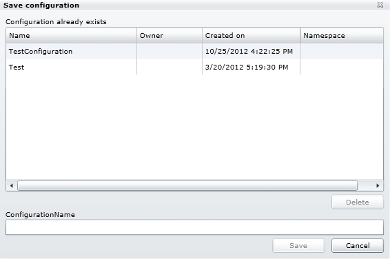
Save configuration dialog
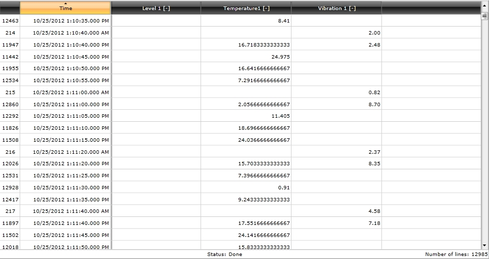
Grid sorting
The WFDataTable control allows sorting by clicking on the header of any column in the grid. This functionality allows the user to display the lowest or highest values of a signal on top, or sort the values depending on their time stamps or index number.
Page navigation
When displaying a fixed number of logs in the WFDataTable grid, the bottom navigation bar allows the user to easily navigate between pages using the dedicated controls, or jump to a specific page by typing the number in the Page box.
Design-time Features
The design-time features section describes the controls features at design time.
Initial configuration
The user has the ability to load an initial configuration which will be applied on the WFDataTable control at run time.
This feature can be found under the Apeparance category (SmartEditor) or Miscellaneous category (Blend).
Page size
The WFDataTable control can be set up to display a certain number of values per page. The default value for PageSize is 100, but the user is able to adjust the value to it's own needs. The ShowPager option will display the page navigation bar when PageSize value is set.
This feature can be found under the Apeparance category (SmartEditor) or Miscellaneous category (Blend).
Security
The WFDataTable allows button security customization using the ButtonSettings option. The user is able to define specific security settings for each button, relaying on the SecurityAutorizationName for making the button available to the user.
This feature can be found under the Security category (SmartEditor) or Ewon by HMS Networks category (Blend).
Design-time Properties
The control's design time properties are available in the Properties panel:
ButtonsConfiguration – allows the user to input a username in the SecurityAuthorizationName and an alternative behavior in the SecurityDenyAccessBehavior field, for each button from the options menu of the control:
Export
Load
Print
Save
Settings
TimeSelection
The SecurityDenyAccessBehavior options are:
Hide – the button is not displayed, if the other user than the one specified in the SecurityAuthorizationName uses the DataTable control.
Disable - the button is displayed but disabled, if the other user than the one specified in the SecurityAuthorizationName uses the DataTable control.
The ButtonsConfiguration also allows the user to select for each button whether to be visible or not.
ClientSideConfiguration - if set to on, the configuration will be stored on the local machine’s Isolated Storage. The loading of the configuration will be made from the local Isolated Storage.
ConfigurationNamespace - the namespace the configuration was saved under.
InitialConfiguration – this option allows the user to enter the name of a saved configuration, this configuration being loaded as default configuration for the DataTable control. The configuration can be later changed at runtime.
ShowPager – if on, this option will divide the DataTable entries in pages (the size of a page can be specified in the Page size option) and activates the navigation.
PageSize – allows the user to select the maximum number of lines to be displayed in one page. The maximum number of displayed lines per page at runtime is 100
DataTable Workflow
Get logs
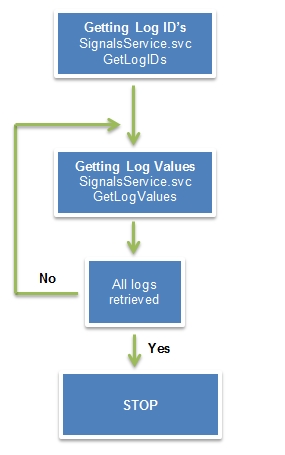
Web Services | Methods |
|---|---|
SignalsService.svc | GetLogIDs() List of SignalLogTagFilterDTO:
GetLogValues() List of LogID’s and other parameters. |
The GetLogValues method returns paged data, in a determined period of time or elements.
If a page returns empty it means that there is no data in the requested time frame. The GetLogValues method will be called for minimum 1 element from the left time (startDate) to the end of the global time frame (endDate). Then the method will retrieve paged data until the next empty frame.
Write logs
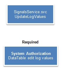
Web Services | Methods |
|---|---|
SignalsService.svc | UpdateLogValues() Parameters:
|