Tag Controls
The Tags category contains 2 versatile controls useful when denominating elements in complex schematics. The WFTag1 and WFTag2 controls can be customized to obtain the perfect tag for your project. To complement the basic functionality, the two tag controls also feature multiple signal-driven states.
Visual Structure
The appearance of the Tags controls can be manipulated using their design time properties.
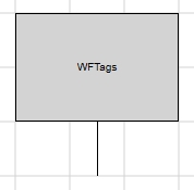 WFTag1 | 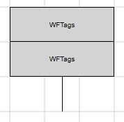 WFTag2 |
Design-time Features
At design time, in Expression Blend, the Tags controls expose the same functionality:
Custom colors, fonts, shape and line thickness (Appearance category in SmartEditor or WF2010 Silverlight Controls category in Expression Blend).
Security options like access for specific authorization names and denied access behaviors (Security category in SmartEditor or WF2010 Silverlight Controls category in Expression Blend).
Visual states configuration (Signals category in SmartEditor or WF2010 Silverlight Controls category in Expression Blend).
Template and parameter communication options (Template category in SmartEditor or WF2010 Silverlight Controls category in Expression Blend).
Follow the Related Topics links from the bottom of this page to see the Tags controls and their properties at design time.
Run-time Features
The Tags controls can have multiple visual styles, which at run time, can help visualizing different conditions.
Three different states of the Tags controls from the Tags category
Also, if configured at design time, the Tags controls can open pop-up windows when being clicked.
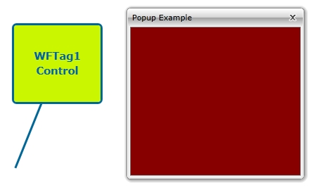
Pop-up windows opened by clicking the Tags controls
Design-time Properties
The control's design time properties are available in the Properties panel:
LineThickness - allows the user to specify a thickness value for the control's border and for the pointer line.
ObjectID - allows the user to define an object name for the control, that can be passed as SignalPrefix when using parameter passing in navigation.
PointerAngle - the angle of the pointer line relative to the tag rectangle.
PointerLength - the length of the pointer line.
PopupModality - allows the user to select the display method for the template. The options are Modal or Modeless.
PopupParameters - the user can define a parameter containing a name and a value. This parameter can be passed to the Pop-up page opened by the button.
PopupSource - select the Pop-up page to be opened when the button is pressed at run time.
PopupTitle - the title of the Pop-up page.
SecurityAuthorizationName - allows the user to select an authorization group. The members of the selected authorization group will have access to the control.
SecurityDenyAccessBehaviour - allows the user to select a behavior that will be active when a user that doesn't belong to the above selected authorization group logs in. The action can either be disabled or hidden.
ShowPopup - enables the Pop-up page.
SignalPrefix - allows the user to select a signal prefix that can be passed when using parameter control and parameter passing in navigation. The signal prefix can be the ObjectName, ObjectName_PageSignalPrefix, PageSignalPrefix or PageSignalPrefix_ObjectName.
States - allows the user to configure multiple states for the control.
AlternateBackground - the background color for the alternate blink state.
AlternateForeground - the foreground color for the alternate blink state.
Background - the background color for the current state.
BlinkingFrequency - the blink speed.
Condition - the condition for entering the state.
ConditionParameters - allows the user to create conditions for entering in different states. The condition must have a name and a signal.
ConditionType - the type of the condition. It can be either SignalName or Equation.
Foreground - the foreground color for the current state.
IsBlinking - if checked, the control will blink when it will be in this state.
IsEnabled - if checked, the control will be enabled when it will be in this state.
IsVisible - if checked, the control will be visible when it will be in this state.
StateName - the name of the state.
SymbolicText, SymbolicText1, SymbolicText2 - the text to be displayed in the tag. Translatable if chosen from the symbolic texts available in the database.
TextAlignment - the alignment of the textual content. The options are: Left, Center, Right.