WFPath1
The WFPath1 control allows the user to represent custom shapes inside a SCADA visualization, by using path data from any drawing XAML. Besides the path data representation, the WFPath1 control also features multiple signal-driven states, security features and template/popup possibilities.
Visual Structure
The WFPath1 control visual structure depends directly on the path data assigned to the control at design dime.
Run-time Features
The WFPath1 control can have multiple visual styles, which at run time, can help visualizing different conditions.
Three different states of the WFPath1 control
Also, if configured at design time, the WFPath1 control can open pop-up windows when being clicked.
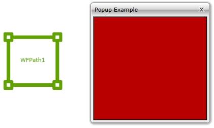
Pop-up windows opened by clicking the WFPath1 control
Design-time Features
At design time, the WFPath1 control exposes the following functionality:
Path representation, using path data, along with thickness, stroke/dash and stretch control (Path category in SmartEditor).
Custom colors, fonts, shape and line thickness (Appearance category in SmartEditor).
Security options like access for specific authorization names and denied access behaviors (Security category in SmartEditor).
Visual states configuration (Signals category in SmartEditor).
Template and parameter communication options (Template category in SmartEditor).
Follow the Related Topics link from the bottom of this page to see the WFPath1 control and its properties at design time.
The WFPath1 control is available only in WEBfactory 2010SmartEditor.
Design-time Properties
The control's design time properties are available in the Properties panel:
Background - allows the user to choose a background color for the control. The Background is bound to the path color.
Foreground - allows the user to choose a foreground color for the control. The foreground is applied to the text.
UseLocalColors - enables the color customization made by the user at run time.
Opacity - adjusts the opacity of the control.
ToolTip - allows the user to specify a tool tip text that will be displayed at run time when hovering with the mouse cursor over the control.
BorderBrush - allows the user to choose a color for the border line of the control.
BorderThickness - allows the user to specify the thickness of the border line.
FontFamily - allows the user to select the font family for the text displayed by the control.
FontSize - allows the user to specify a font size for the text displayed by the control.
FontStretch - allows the user to specify a stretch option for the text displayed by the control.
FontStyle - allows the user to specify a font style for the text displayed by the control.
FontWeight - allows the user to specify a font weight for the text displayed by the control.
Stroke - the color of the stroke that can border the path.
StrokeDashArray - defines the dashed stroke pattern. The value of this property indicates the size of the stroke/dash segment. The StrokeDashArray property accepts an multiple values (array), each of the value defining the size of the corresponding stroke/dash. For example, the value 3 would make all the alternative strokes and dashes of size 3 while the value (array) 1 2 3 would set the first element (stroke) to size 1, the second element (dash) to size 2 and the third element (stroke) to size 3. The pattern would then repeat itself.
IsTextVisible - toggles the visibility of the text.
SymbolicText - the text to be displayed in the control. Translatable if chosen from the symbolic texts available in the database.
Width - allows the user to specify the width of the control. The unit is pixels.
Height - allows the user to specify the height of the control. The unit is pixels.
XTranslation - allows the user to adjust the position on the X axis. The unit is pixels.
YTranslation - allows the user to adjust the position on the Y axis. The unit is pixels.
Angle - allows the user to rotate the control on the page.
HorizontalContentAlignment - allows the user to set up the horizontal alignment of the content. The options are: Left, Center, Right and Justified.
VerticalContentAlignment - allows the user to set up the vertical alignment of the content. The options are: Top, Center, Bottom and Stretched.
TextAlignment - the alignment of the textual content. The options are: Left, Center, Right.
Padding - the distance in pixels between the content and the control's border.
Name - the name of the control.
Data - the path data to be represented by the control. The data can be obtained from any XAML path.
LineThickness - the thickness of the stroke that borders the path.
Stretch - the scale and proportion of the path inside the control. The options are:
None - the path will maintain its original size and proportion.
Fill - the path will fill the available space inside the control, altering its original proportion and size.
Uniform - the path will scale to fill the available space inside the control while maintaining its original proportion.
UniformToFill - the path will scale to fill all the available space inside the control while maintaining its original proportion. The path might become larger than the control itself and some parts might not be displayed.
StrokeDashOffset - the offset of the stroke/dash array.
SecurityAuthorizationName - allows the user to select an authorization group. The members of the selected authorization group will have access to the control.
SecurityDenyAccessBehaviour - allows the user to select a behavior that will be active when a user that doesn't belong to the above selected authorization group logs in. The action can either be disabled or hidden.
SignalPrefix - allows the user to select a signal prefix that can be passed when using parameter control and parameter passing in navigation. The signal prefix can be the ObjectName, ObjectName_PageSignalPrefix, PageSignalPrefix or PageSignalPrefix_ObjectName.
ObjectName - allows the user to define an object name for the control, that can be passed as SignalPrefix when using parameter passing in navigation.
States - allows the user to configure multiple states for the control.
StateName - the name of the state.
SignalName - the signal that will control the state.
Comparator - the comparator that will be applied on the signal value. The comparator will apply the selected operation between the value of the selected signal and the value provided in the SignalValue field of the state. The available comparators are:
Different
Equal
GreaterThan
GreaterThanOrEqual
LessThan
LessThanOrEqual
AndWord
AndDWord
SignalValue - the value that will be compared with the selected signal value. If the comparison between the signal value and the value provided in the SignalValue field is true, the state will be applied.
Backgroun - the background color for the current state.
Foreground - the foreground color for the current state.
IsVisible - if checked, the control will be visible when it will be in this state.
IsEnabled - if checked, the control will be enabled when it will be in this state.
IsBlinking - if checked, the control will blink when it will be in this state.
BlinkingFrequency - the blink speed.
AlternateBackground - the background color for the alternate blink state.
AlternateForeground - the foreground color for the alternate blink state.
ParameterValues - the user can define a parameter containing a name and a value. This parameter can be passed to the template page opened by the button.
ShowTemplate - enables the template page.
Template - select the template page to be opened when the button is pressed at run time. The template page must exist in the SmartEditor project.
TemplateModality - allows the user to select the display method for the template. The options are Modal or Modeless.
TemplateTitle - the title of the template page.