Using the WFNavigationToggle1 control in tabbed navigation structures
The WFNavigationToggle1 control allows the user to build tabbed navigation structures in Ewon by HMS NetworksSmartEditor. The following tutorial will demonstrate how to build a project with two different tabbed navigation structures using the WFNavigationToggle1 control.

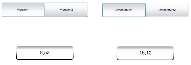
The final result of the tutorial
The example project will use two tabbed navigation structure to display four different signal values. To achieve this, we need to have the four signals defined in Ewon by HMS NetworksStudio (Vibration1, Vibration2, Temperature1 and Temperature2) and pass the signal names as parameters from the tab buttons to the opened pages.
Setting up the basic navigation structure
In Ewon by HMS NetworksSmartEditor, create a new project.
Go to the Toolbox panel and expand the Navigation category. Add a WFNavigationToggle1 control and WFNavigationTarget1 control on the Page.
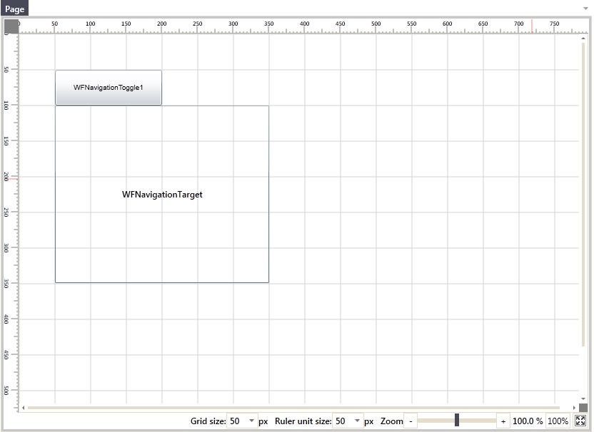
The basic controls on the project Page
We will create our first tabbed navigation which will have two tabs. For this, we need to duplicate the WFNavigationToggle1 control and name the controls appropriately:
the two WFNavigationToggle1 controls will be named Tab1 and Tab2
the WFNavigationTarget control will be named Frame1.
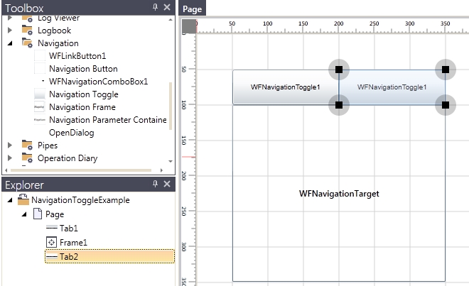
The three controls of our navigation with proper names
Note that the proper naming of the control is a best practice and can be a life saver when dealing with big projects containing many controls.
Next, we need to create a navigation SubPage for each tab buttons. Select the Frame1 and, in the ribbon bar, click on the Add navigation page button.
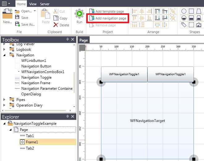
In the Explorer panel, right click on the SubPage created and select Rename. Name it SubPage1.
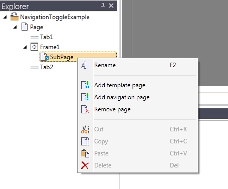
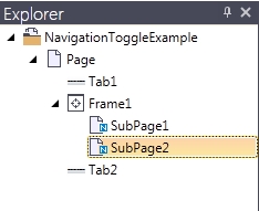
Using the same procedure as above, add another SubPage to the same Frame1 control and name it SubPage2.
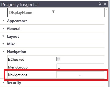
Now we have all the controls and pages needed to set up the first tabbed navigation structure. On the project Page, select the first WFNavigationToggle1 control (Tab1) and expand the Navigation category from the Property Inspector panel. Click on the Navigation button to open the Navigation Editor.
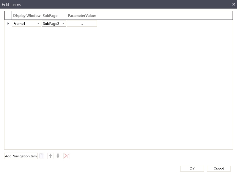
In the Navigation Editor, click on the Add NavigationItem to add a new navigation item. Select the Frame1 as the Display Window and SubPage1 as the SubPage. Click OK to confirm.

Following the same procedure, define the navigation for the second Tab2 button. This time, select the SubPage2 as the SubPage in the navigation item definition.
Because our Frame1 control will not display any page by default at run time, we need to make sure that SubPage1 is selected as default page for the Frame1 control. To do that, select the Frame1 control, expand the Configuration category from the Property Inspector and select the SubPage1 as the DefaultPage.

And because the SubPage1 will be displayed by default inside the Frame1, we will make the Tab1 button also to be checked by default. Select the Tab1 control, expand the Navigation category from the Property Inspector and enable the IsChecked property.

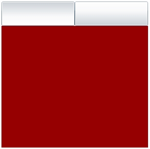
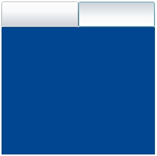
Before testing our first tabbed navigation structure, we need to color the background of the two SubPages differently, so the change in the Frame1 is visible (as the SubPage1 and SubPage2 are empty for now). The background color is only for testing purposes.
Click on the Run button from the Ribbon menu or press F5 to build and test the project. The application will start with the first Tab1 button checked and the SubPage1 displayed in the frame. Test the navigation to make sure that it works properly.
Adding Symbolic Texts and passing parameters
In the first section of the tutorial we went though the process of creating a basic tabbed navigation structure. In this second part, we will use the tabbed navigation to display different data in each tab:
the first tab will display the value of the Vibration1 signal
the second tab will display the value of the Vibration2 signal
To achieve this, we will need to bind both Tab1 and Tab2 WFNavigationToggle1 controls to the same SubPage, configure parameters for the two buttons and place a control inside the SubPage that will display the value.
Select the Tab1 button, expand the General category from the Property Inspector and click on the browse button of the SymbolicText property.
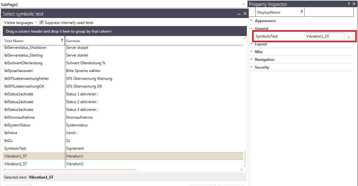
Select the desired symbolic text (in our case, Vibration1_ST, the name of the signal we will use for this tab) and click OK to confirm the selection.
Repeat the same procedure for the Tab2 button, selecting the appropriate symbolic text.
To be able to use the symbolic texts and the translation system, the symbolic texts need to be defined in Ewon by HMS NetworksStudio.
While having the Tab2 button selected, go to the Navigations properties and edit the existing navigation item to point to the same SubPage1 as the Tab1 button.

Next, we need to define parameters for the two Tab1 and Tab2 buttons to pass to the SubPage1 navigation page. Select the Tab1 button and open the Navigations editor. Click on the ParameterValues browse button.

In the ParameterValues editor, click on Add NavigationParameter to add a new parameter. Name the parameter Parameter1 and put as Value the name of the signal we will use in this first tab (Vibration1 in our example). Click OK to confirm.
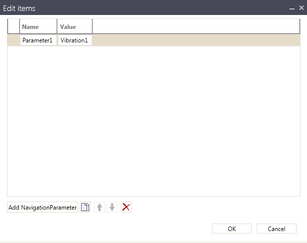
Repeat the same procedure for the second Tab2 button, this time use another signal name as the value of the Parameter1 navigation parameter (Vibration2 in our example).
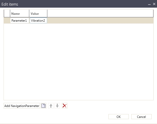
We have configured our two WFNavigationToggle1 controls parameters. Next, we need to make sure that the parameters are interpreted in the SubPage1 navigation page and passed to the control that will display the signal value.
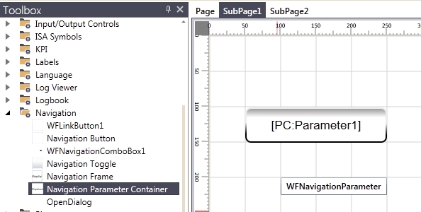
Open the SubPage1, set the background color back to white and add a WFNumericDisplay1 control (from the Input/Output Controls category > Output sub-section).
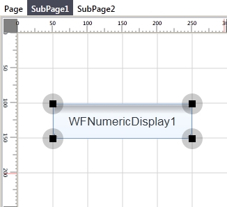
The WFNumericDisplay1 control will display the value of our Vibration1 and Vibration2 signals.
Rename the WFNumericDisplay control to Value1.
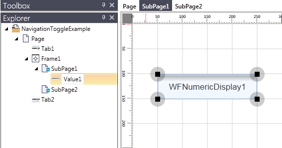
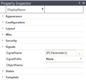
With the Value1 control selected, go to the Property Inspector and expand the Signals property category. We will need to use the Parameter Control placeholder in order to interpret the parameter passed by the Tab1 and Tab2 buttons. Because our parameter is named Parameter1, we will use the following placeholder in the SignalName property: [PC:Parameter1].
Before testing our parameter-enabled navigation, we need to add the key component in passing navigation parameters: the WFNavigationParameter control. This control will interpret the parameters and pass them to the Value1 control which will display them using the placeholder.
Drag a WFNavigationParameter control on the SubPage1. The control will be invisible at run time, so it can be placed anywhere on the SubPage1.
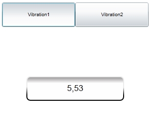
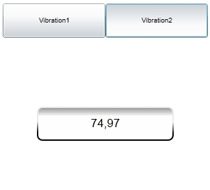
Press the Run button from the Ribbon menu or the F5 key to build and test the project. Notice how each tab displays the value of it's signal, just like expected.
Duplicating the navigation structure
Now that our tabbed navigation is working as expected, we will duplicate it and create another similar tabbed navigation structure for displaying the values of the Temperature1 and Temperature2 signals.
On the main Page, select the Tab1, Tab2 and Frame1 controls and duplicate them (Copy and Paste).
Rename the Tab1_1 and Tab2_1 buttons to Tab3 and Tab4 and Frame1_1 to Frame2.
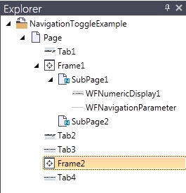
For the Tab3 and Tab4 buttons, edit the Navigations properties to point to the Frame2 and SubPage2 navigation page.
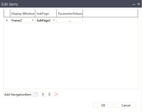
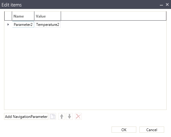
Edit the ParameterValues for both Tab3 and Tab4 and make the Name of the parameter Parameter2 and the Value of the Parameter2 to be the signal name of the signal used in the second tabbed navigation (in our example Temperature1 and Temperature2).
In the Explorer panel, select the SubPage2 and drag it under the Frame2. Select the Frame2 and make the SubPage2 as DefaultPage.


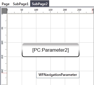
Now copy the contents of the SubPage1 on the SubPage2 navigation page and make the background back to white. Select the WFNumericDisplay1_1 control and edit the SignalName placehoder to point to the Parameter2 parameter.
Before testing our project, we need to make one more setting to the WFNavigationToggle1 controls. As these controls act like tab buttons, only one control can be active (checked) at a time.
Having two different navigation structures with a total of 4 WFNavigationToggle1 controls will not work as expected unless the WFNavigationToggle1 controls of each navigation structure are grouped together. This way, in each of the two resulting groups, one control will be active at a time, as desired.
To achieve this, we need to select both Tab1 and Tab2 buttons, expand the Navigation category of the Property Inspector and set the MenuGroup property to 1 (any string or numerical value is supported).

We will do the same for the Tab3 and Tab4 buttons, this time using value 2 for the MenuGroup property.

Press the Run button from the Ribbon menu or the F5 key to build and test the project. Both tabbed navigation structures work as expected.
